
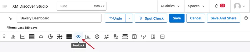
Feedback Widget (Studio)
What's on this page
About Feedback Widgets
Feedback widgets display customer feedback and interactions right on a Studio dashboard. Users can click the interactions most interesting to them to view a larger document and learn more about the interaction. You can customize your widget to highlight the most relevant feedback, or set it up to interact with other widgets.

Creating a Feedback Widget
Qtip: For general steps on creating a new widget and editing the Properties tab, see Adding a Widget.
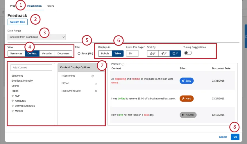
This widget gives you many different ways to display your feedback. Below we’ll cover the basic steps to set this widget up, with links out to more information on each option.
Qtip: Click Auto Title to keep the automatically generated report title.
Qtip: Set your widget to ignore the dashboard date range to ensure that the dashboard date range replaces the date range defined here.
Qtip: For more information on document volume, see Displaying Total Volume on Widgets (Studio).
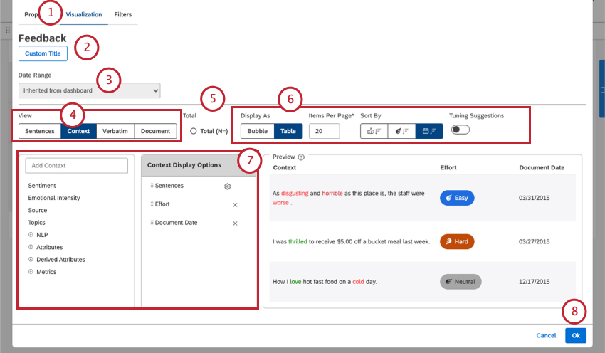
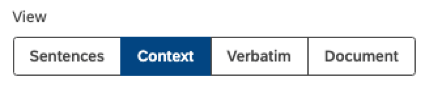
Selecting a Feedback View
The “view” determines how feedback appears in your widget, and how much appears at once. Depending on the view you choose here, different display options will be available.

- Sentences: Show individual sentences. This view can also provide insight into the sentiment and effort scores of sentences.

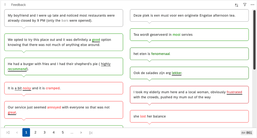
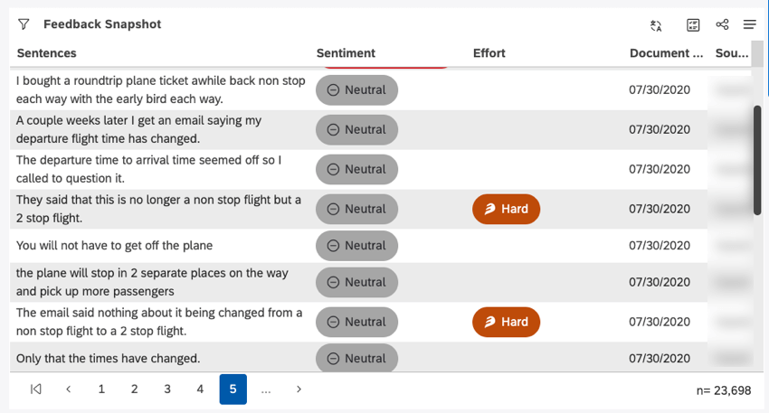
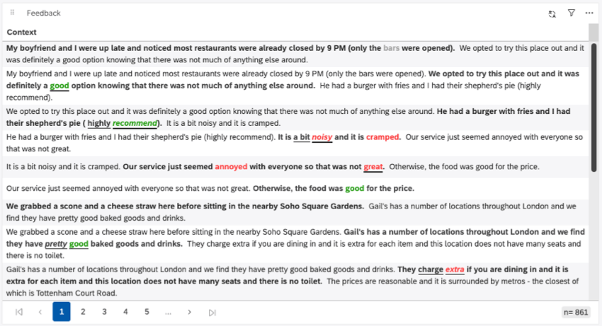
- Context: Display sentences in the context of 2 adjacent sentences (1 sentence before and 1 after). This view can also provide insight into the sentiment and effort scores of sentences.
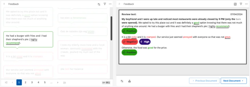
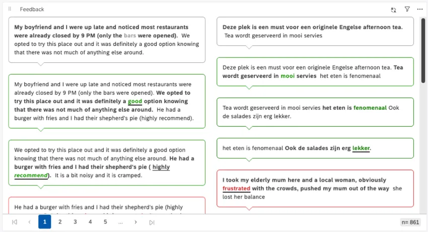 Qtip: For sentence and context views, you’ll often see multiple sentences from the same document will often appear as separate entries. In the context screenshot, you can see how the first 2 bubbles are referring to the same review. That’s because both of these sentences meet the filters’ criteria.
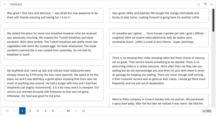
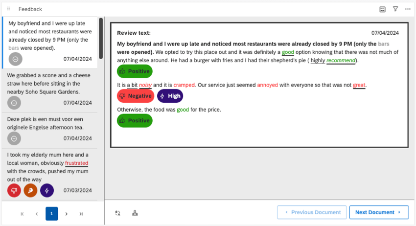
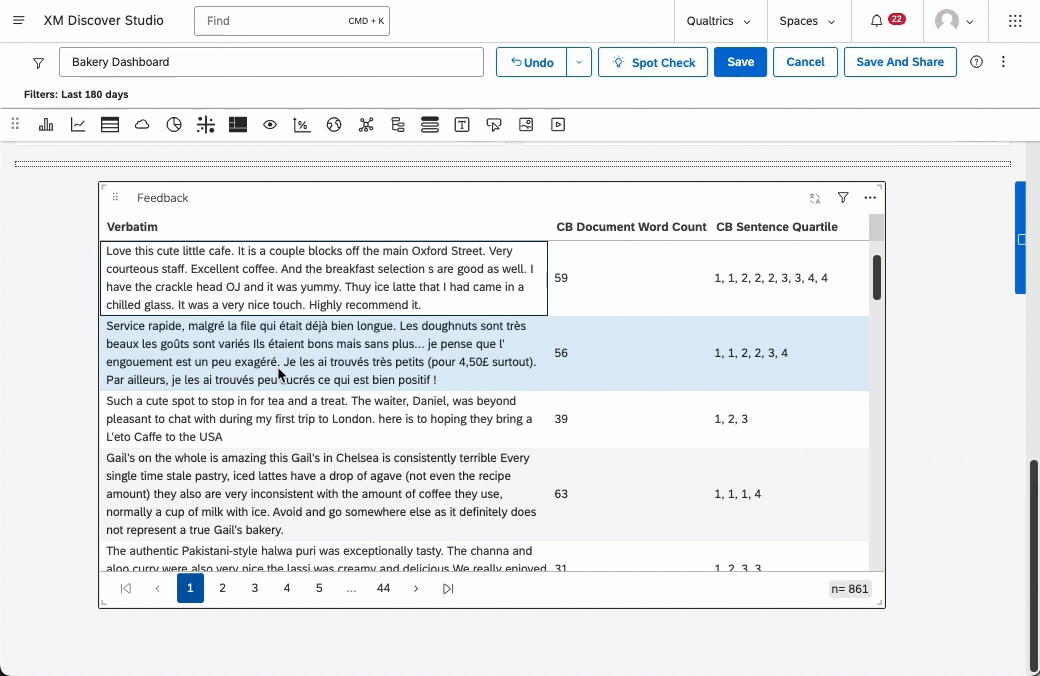
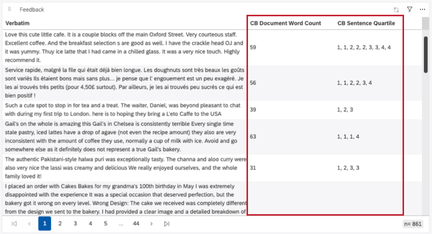
- Verbatim: Show an entire verbatim or textual feedback field. If a document contains only 1 verbatim, then the verbatim view is the same as the document view. This view doesn’t highlight sentiment and effort.
- Document: Display an entire document.


Metadata for Each View
This table shows the metadata you can display as context in each view. Note that the display options are also listed for many of these, since they affect this list. (For example, bubble and table displays often can’t display the same data.)
Example: Sentiment and effort are calculated and evaluated per sentence. These aren’t aggregated per document, and aren’t available for verbatim and document feedback views.
| Sentences and Context – Bubble | Sentences and Context – Table | Verbatim – Bubble | Verbatim – Table | Verbatim – Pane and Document | |
|---|---|---|---|---|---|
| Sentiment | Yes | Yes | No | No | No |
| Effort | Yes | Yes | No | No | No |
| Emotional Intensity | Yes | Yes | No | No | No |
| Source | Yes | Yes | Yes | Yes | No |
| Document Date | Yes | Yes | Yes | Yes | No |
| Topics | No | Yes | No | Yes | Yes |
| NLP | No | Yes | No | Yes | Yes |
| Attributes | No | Yes | No | Yes | Yes |
| Derived Attributes | No | Yes | No | Yes | Yes |
| Metrics | No | Yes | No | Yes | Yes |
| Scorecards | No | No | No | No | Yes |
Choosing Feedback Display Options
Once you’ve chosen a feedback view, you have a few more options you can adjust to determine how feedback is displayed.
Bubble
The Bubble setting is available for sentence, context, and verbatim views. It displays information as columns of speech bubbles.

For the bubble display, you can set the number of columns the bubbles appear in, and the number of items per page. If you add more items per page than can fit, the widget will scroll.
Table
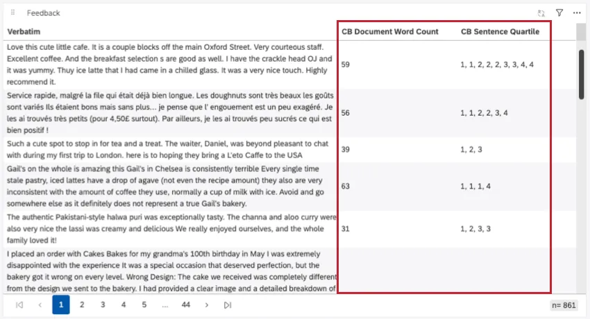
The Table setting is available for sentence, context, and verbatim views. It displays responses as one column of rows on a table. You can also add columns of metadata to your tables.
For the table display, you can set the number of items per page. If you add more items per page than can fit, the widget will scroll.
Qtip: For bubbles and tables, the maximum number of items per page is 200.
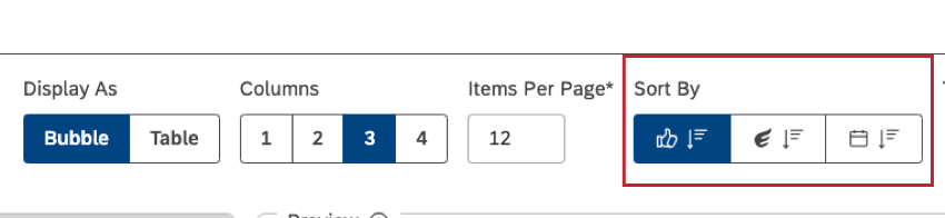
Sorting
For many of the widget views, you can change how information is sorted.

The sorting options are listed in the order they appear:
- Sentiment: Only compatible with sentence and context.
- Effort Score: Only compatible with sentence and context.
- Document Date: Compatible with all views, including sentence, context, verbatim, and document.
Qtip: To switch between ascending and descending sorting, click the same button 1 more time.
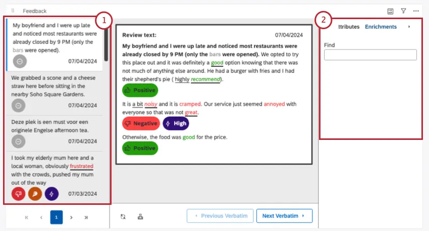
Pane Options
These settings are only available if you’re using a verbatim view in the Pane setting, or if you’re using document view. These settings make new panes appear on your widget.

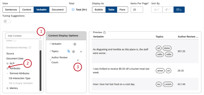
We’ll list the settings, with each number corresponding to the pane that’s added in the screenshot below.
Adding Context to Feedback
When you set up your feedback widget, you get to decide what information you want to display in addition to your feedback.
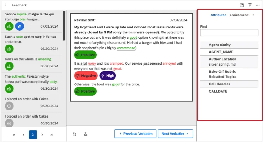
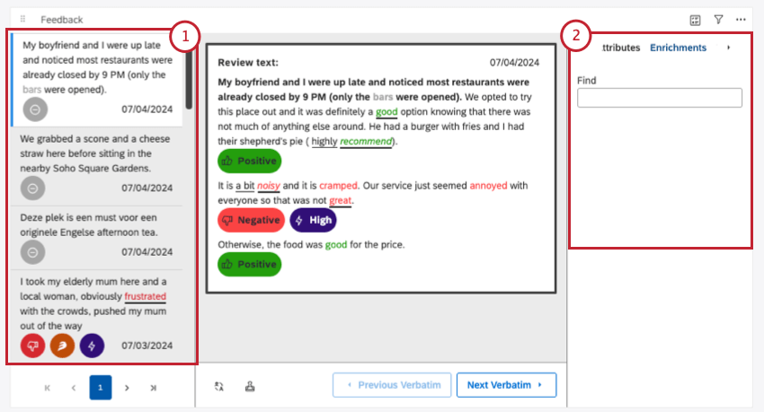
When you open the document explorer, the context pane shows additional information about a feedback document, such as topics and metadata.
In table-style widgets, context appears in new columns. Each field gets its own column.
Qtip: How you set up your context pane also affects the filters your dashboard viewers will be able to use with this widget.
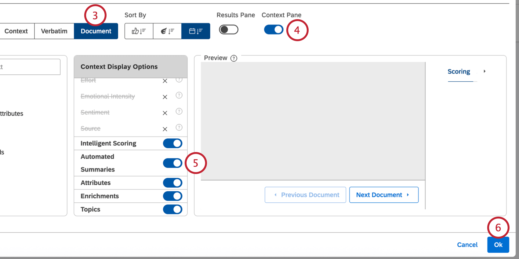
Enabling the Context Pane
Depending on the widget view you choose, you enable the context pane in different ways.
When your widget’s in document view, or your verbatim is set to display panes, you can choose to hide or show the context pane using the Context Pane setting highlighted below.

You do not have to enable context for sentence and context views. The context pane always appears when you open a document. The same is true for most verbatim views, with one exception.
For table displays, context appears as new columns. If you haven’t added context to the widget, context will not appear.
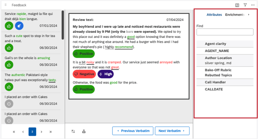
Selecting metadata to display in the context pane
Here, we’ll cover how you can add metadata to every kind of feedback widget.
Qtip: Keep in mind that if you don’t select anything, the context pane will be empty. Your context pane may also be empty if you select metadata not present in your dataset.
Qtip: Not all metadata is available for all widget setups. Metadata will be grayed out if it’s unavailable. See a list of metadata compatible with each widget setup.
- Sentiment: Show overall sentence sentiment and enable viewers to apply sentiment-based quick filters.
- Effort: Display the sentence effort score and enable viewers to apply effort-based quick filters.
- Source: Show the feedback source (for example, Facebook or Twitter).
- Document Date: To display the feedback date.
- Topics: Display related topics.
- NLP: Show attributes automatically derived from feedback by the XM Discover Natural Language Processing (NLP) engine:
- Words: Display specific word types mentioned in customer feedback.
- Enrichment: Show specific types of content mentioned in customer feedback.
- Language: Display feedback language.
- Attributes: Display structured attributes available in customer feedback.
- Derived Attributes: To show attributes derived from other attributes or classification models.
- Metrics: Display standard calculations and derived metrics.
- Scorecards: Show rubrics in the Intelligent Scoring section of the Context pane.
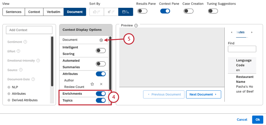
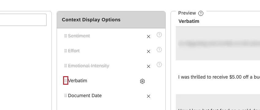
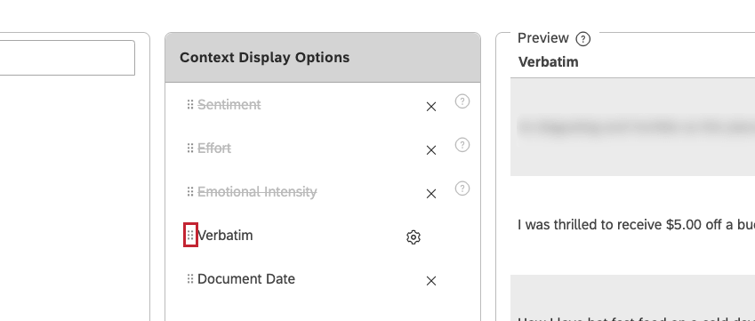
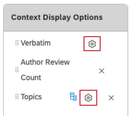
Qtip: In just about every widget setup, you can change the order of context you add by clicking and dragging the move icons, as shown below.
Sentences and Context Display Options
These are the settings available for sentence and context views.

- None (default): Display attribute values as plain text.
- Image: Display attribute values as images. See Displaying Images in Tables for more details.
- Link: Display attribute values as clickable links. Qtip: If you wish to display a URL in the feedback widget in table view, provide the URL in a case-sensitive attribute in Designer.
- Default: Display values as they were provided.
- lowercase: Display values using only lowercase letters.
- UPPERCASE: Display values using only uppercase letters.
- Sentence case: Capitalize the first letter of the first word only.
- First Letter Of Every Word: Capitalize the first letter of every word. Letters following a hyphen or an underscore are also capitalized. For example: Wind-Powered, April_Surveys.
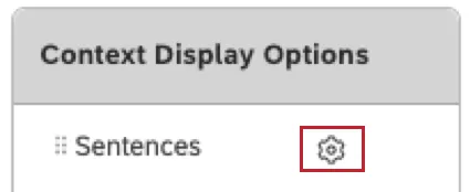
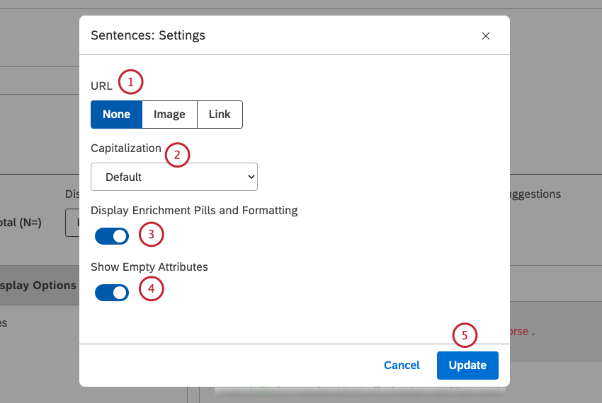
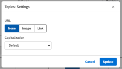
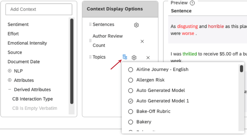
Verbatim, Document, and Topic Settings

In verbatim and document views, there’s only the URL and Capitalization settings described in the previous section. This is also what the setting looks like if you add topics and click the gear next to it.

Filter Topics
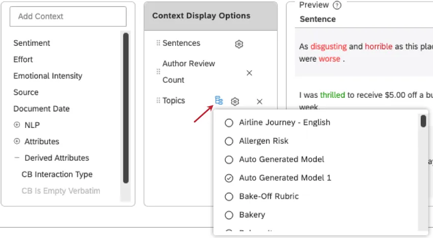
This setting is available in the Table setting for sentence and context views. Here, you can select classification models to display.
Selecting Specific Feedback to Display
After saving the feedback widget, you can manually select which feedback to include or exclude from the widget.
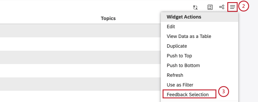
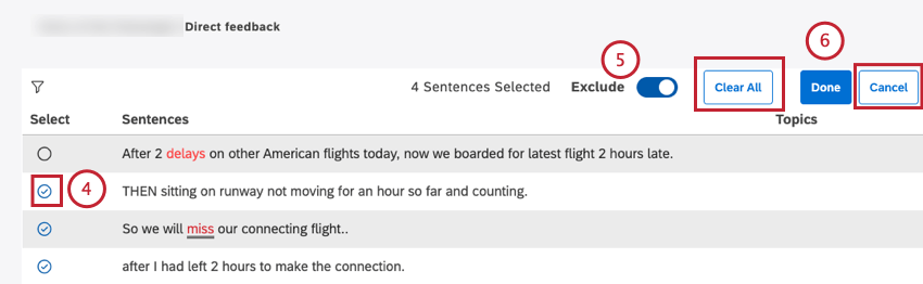
Qtip: You can click Clear All to clear all selections.
Qtip: Click Cancel to cancel feedback selection.
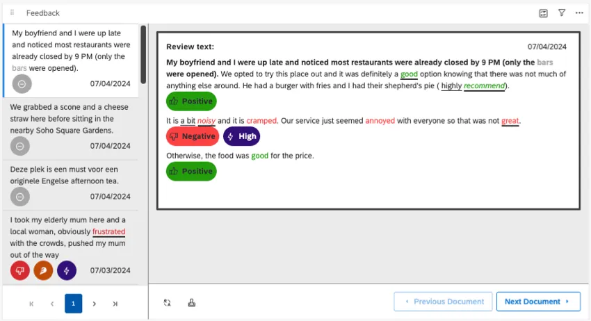
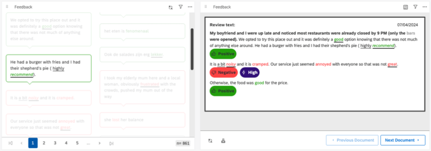
Understanding the Document View
You can explore specific documents using an interface called the document explorer. You can open this view from your feedback widget in 2 ways:
- Selecting Feedback: No matter whether your feedback widget displays short sentences or longer context, you can double-click to see the document explorer.

- Document View: If you set your widget to document view during setup, it will always be in a document explorer format.
To learn how to use the document explorer, see the following resources:
- Navigating Document Explorer
- Different Sentence Views
- Navigating Feedback by Topics and Enrichments
- Customizing Document Explorer
- Exporting Data from Document Explorer
- Clipping, Saving, & Sharing Documents
- Viewing Scorecards per Document
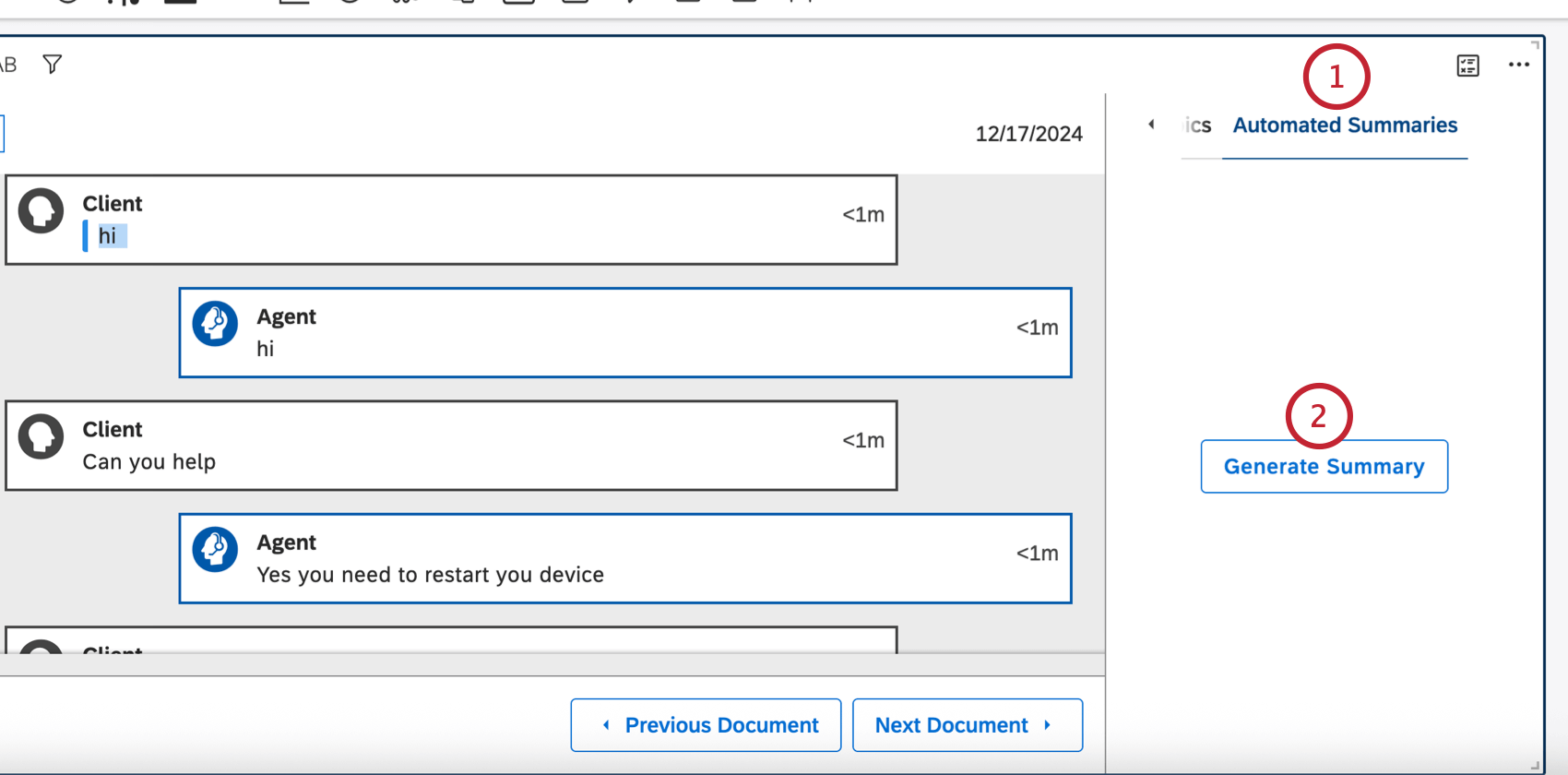
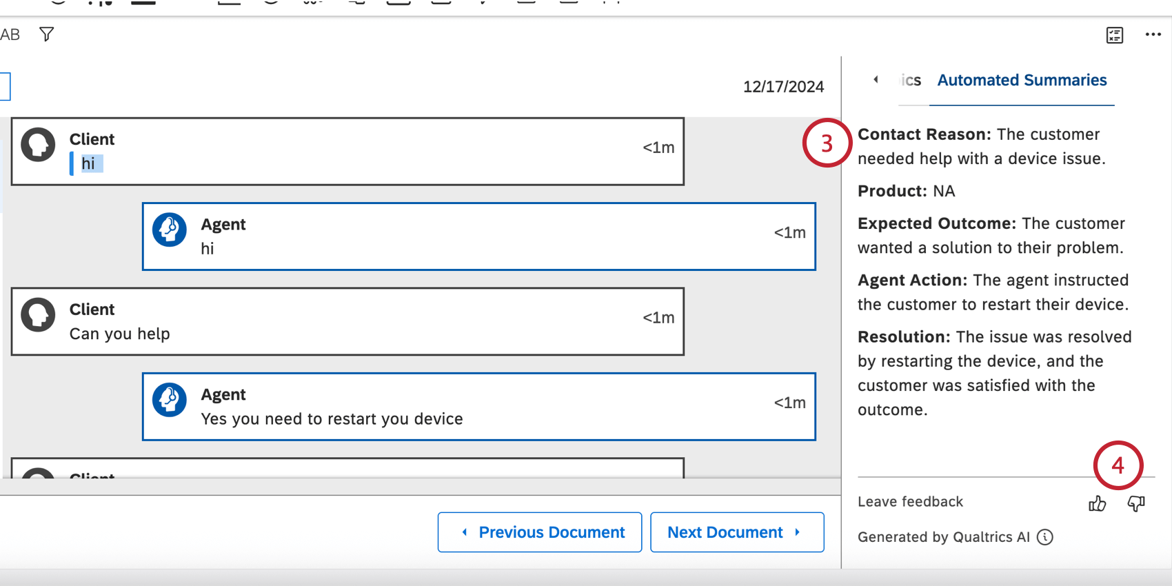
Automated Summaries
You can use automated summaries to create concise, AI-generated summaries from call and chat transcripts in your feedback widget. This enables your analysts to quickly understand the topics discussed in a conversation, the conversation’s outcome, and any resulting actions taken.
Qtip: Your widget must be in document view to use automated summaries.
Enabling Automated Summaries
Qtip: To use this feature, the Automated Interaction Summaries account permission must be enabled.
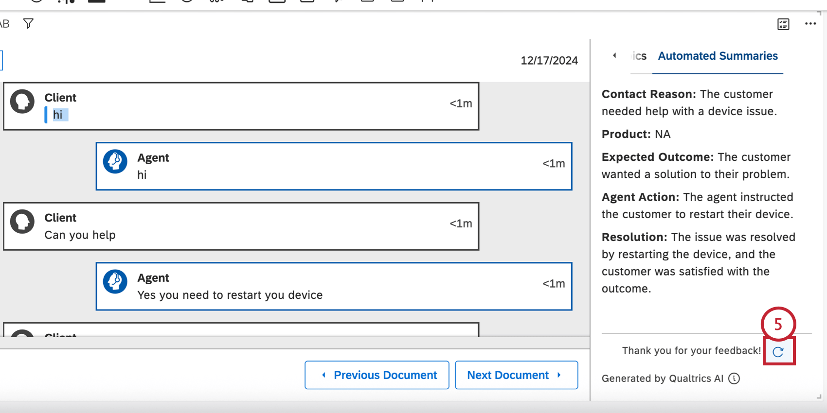
Using Automated Summaries
Qtip: At this time, summary outputs are only available in English. You can use automated summaries on conversations in English and Latin American Spanish, but all outputs will be in English.
Once automated summaries are enabled on a widget, you can generate a summary for any call or chat transcripts displayed in the widget:
Filters Available for Dashboard Viewers
Qtip: Which metadata can be used in filtering depends on what you display in your context pane.
Your dashboard viewers can filter the feedback by sentiment, effort, or emotional intensity using quick filters.
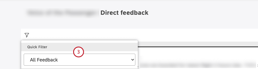
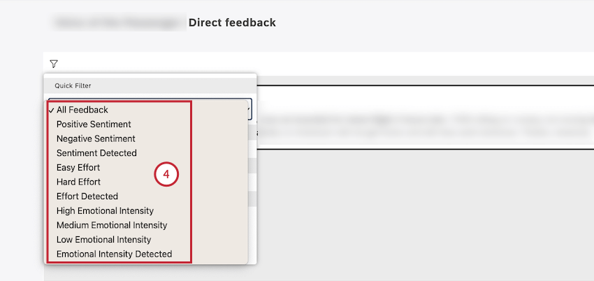
- All Feedback: Show all sentences (including records with empty verbatim).
- Positive Sentiment: Display only sentences with a positive sentence sentiment score.
- Negative Sentiment: Show sentences with a negative sentence sentiment score.
- Sentiment Detected: Display all sentences except for empty verbatim stubs.
- Easy Effort: Show only sentences where the effort score is easy or very easy.
- Hard Effort: Display only sentences where the effort score is hard or very hard.
- Effort Detected: Show all sentences where an effort score is detected.
- High Emotional Intensity: Display only sentences where emotional intensity is high.
- Medium Emotional Intensity: Show only sentences where emotional intensity is medium.
- Low Emotional Intensity: Display only sentences where emotional intensity is low.
- Emotional Intensity Detected: Show all sentences where emotional intensity is detected.
Filtering One Feedback Widget By Another
In Studio, you can use widgets as filters for other widgets. This functionality makes your dashboard much more interactive, enabling visitors to drill down into their data.
One common use case is to filter one feedback widget by another.
Example: You link a sentence view table-style widget and a document view widget. Clicking a sentence in the first widget shows the corresponding document in the second widget.
Note that this will not open the document to the exact sentence you clicked, nor highlight the sentence you clicked in any way.
Qtip: Remember that you can always add a results pane to a document widget instead. This will take you to a more exact location. We also recommend using the document view where needed.
Troubleshooting Linked Feedback Widgets
If you decide to filter a feedback widget by another feedback widget, there are a few things to keep in mind:
- View: If your 2 feedback widgets are set to different views, this can affect what happens when you filter them by each other. Example: Using a sentence widget to filter what appears in a document widget.

- Filters: Quick filters and widget filters can affect the data displayed in the widget. If the 2 widgets have different filters from each other, they’re not going to always have similar results. Example: Your first widget is filtered to only show 2023 data. The second widget is filtered to only show 2024 data. If you clicked feedback in the first widget, you wouldn’t be able to return results in the second.
- Feedback Selection: Feedback selection lets you customize the exact documents included in a widget. If either widget has a customized feedback selection, you might not get the results you expect, since they’re pulling from different lists of documents.
FAQs
What is considered a document?
What is considered a document?
That's great! Thank you for your feedback!
Thank you for your feedback!