
Heatmap Widget (Studio)
What's on this page
About the Heatmap Widget
Qtip: To modify dashboard widgets, a user must have an Edit Dashboard permission and be granted Can Edit permission for the specific dashboard. For information about widget permissions, see Editing Widget Properties.
Attention: To ensure optimal Studio performance, there is a limit on the number of widgets that can be added to each dashboard. For more information, see Maximum Widgets per Dashboard.
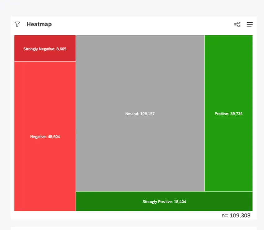
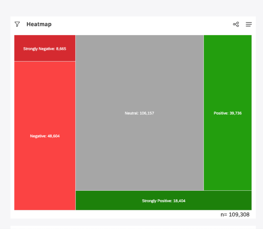
You can display data as boxes, sized and colored according to the metrics you select, using the heatmap widget. A heatmap is a good way of displaying hierarchical data as nested boxes when there are a lot of categories.
For information about editing widget properties, resizing or rearranging a widget, using a widget as a filter, creating a copy of a widget, applying filters to a widget and more please see Widgets Basic Overview (Studio).
Adding a Heatmap Widget
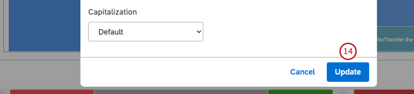
Qtip: Click Ok at the bottom-right of each of the Properties, Visualization and Filters tabs to apply the settings in each of these tabs, and then click Save at the top of the dashboard.
Properties Tab
You can edit selector widget properties in the Properties tab. For information about adding a widget, please see Adding a Widget.
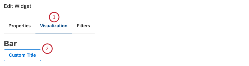
Visualization Tab
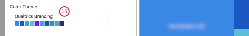
You can define report settings in the Visualization tab.
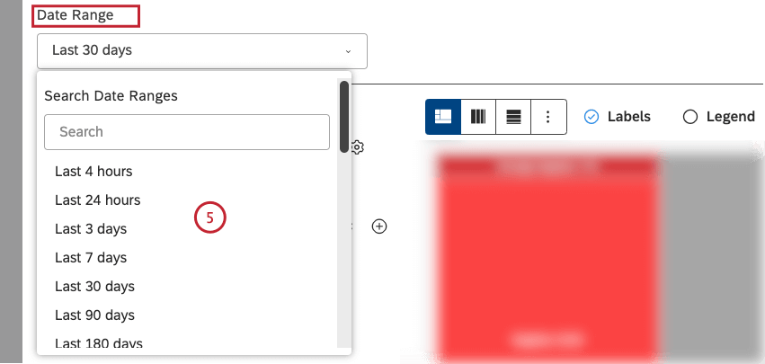
Qtip: Unless you set your widget to ignore the dashboard date range, the dashboard date range completely replaces the date range defined here.
Qtip: For an overview of available calculations, see Calculations (Studio).
Qtip: Click the plus ( + ) icon to view more options.
Qtip: Calculation options that are not likely to be useful are grayed out. A calculation is grayed out when it is either empty or contains only a single value under the current filters (both widget-level and dashboard-level). This should help you focus your reports on the more meaningful metrics without having to apply the trial and error method. You can select grayed out calculations if you need to.
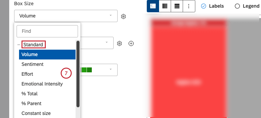
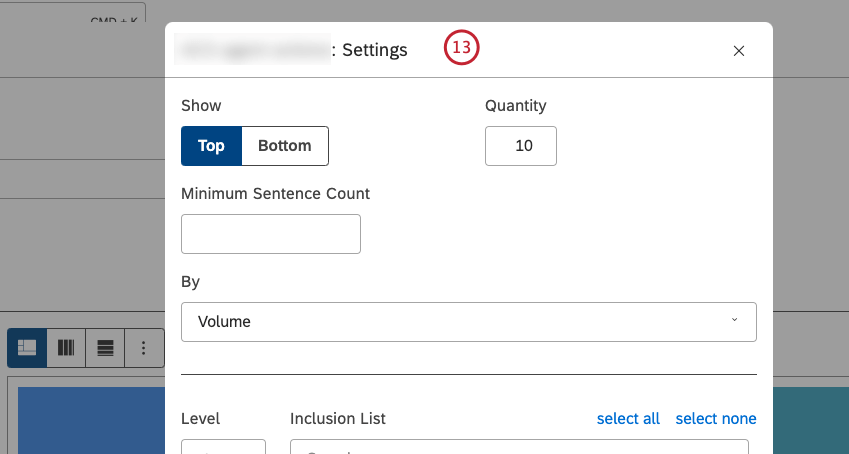
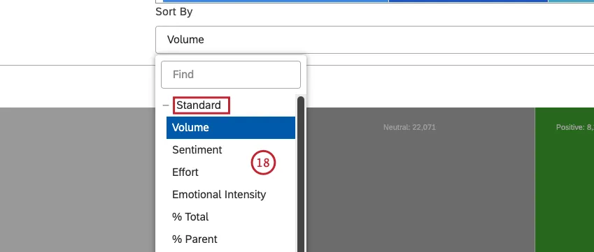
- Volume: Sort by the number of records related to the selected groupings.
- Sentiment: Sort by the average sentiment of sentences from records related to the selected groupings.
- Effort: Sort by the average Effort score of sentences from records related to selected groupings.
- Emotional Intensity: Sort by the average Emotional Intensity of sentences from documents related to selected groupings.
- % Total: Sort by the volume percentage in relation to a report’s total.
- % Parent: Sort by the volume percentage in relation to a parent item.
- Constant size: Make all boxes the same size. This lets you create a heatmap widget with equal-sized boxes that are useful for Widget: Use as Filter functionality.

Qtip: You can define default settings for calculations based on specific attributes on the Projectspage.
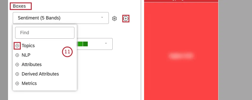
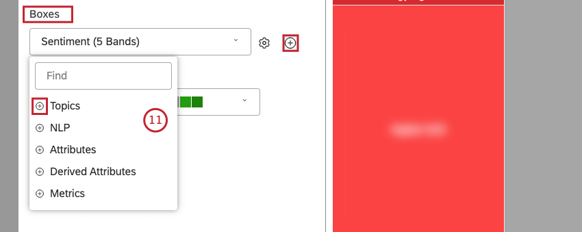
- Topics
- NLP
- Attributes
- Derived Attributes
- Metrics
Qtip: For an overview of available data groupings, see Grouping Data.
Qtip: Click the plus (+) icon to view more options.
Qtip: Click the add (+) icon next to the gear icon to add up to 3 nested boxes. Groupings maintain a parent-to-child relationship from top to bottom. When viewing a nested report, a user can drill down to zoom in on a selected grouping.
Qtip: Grouping options that are not likely to be useful are grayed out. A grouping is grayed out when it is either empty or contains only a single value under the current filters (both widget-level and dashboard-level). This should help you focus your reports on the more meaningful data groupings without having to apply the trial and error method. You can select grayed out groupings if you need to.
Qtip: If primary grouping is by any NLP option, secondary grouping is not available for performance reasons.
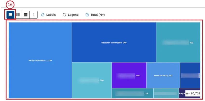
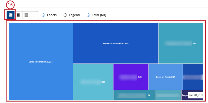
- Heatmap – Slice and Dice: Select this option to use a freeform arrangement of blocks within a heatmap.
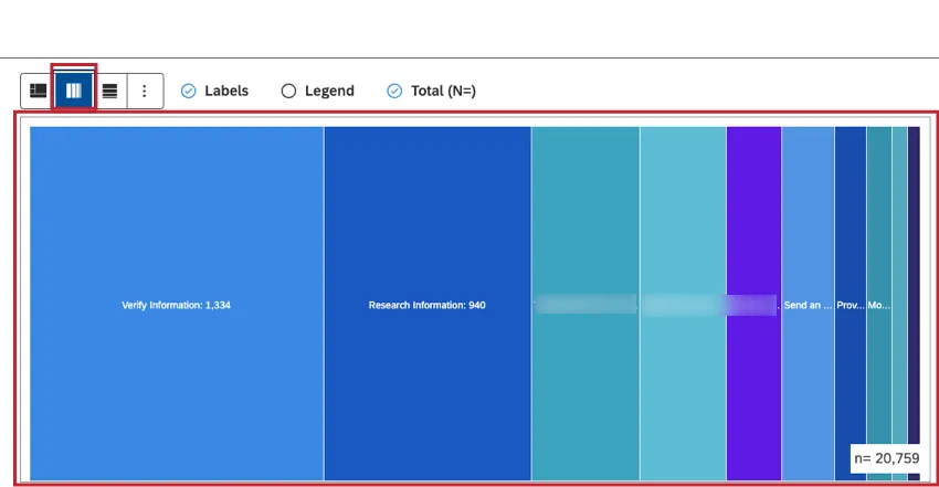
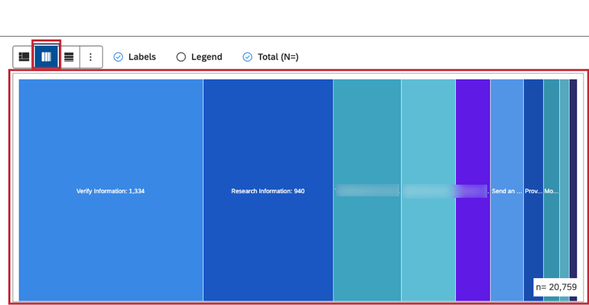
- Heatmap – Single Row: Select this option to arrange blocks as vertical columns within a single row.
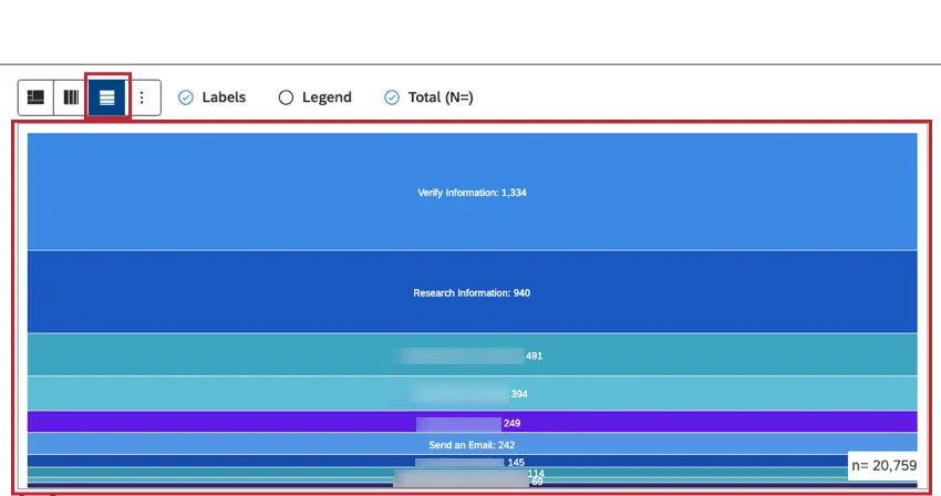
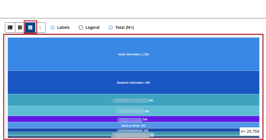
- Heatmap – Single Column: Select this option to arrange blocks as horizontal rows within a single column.
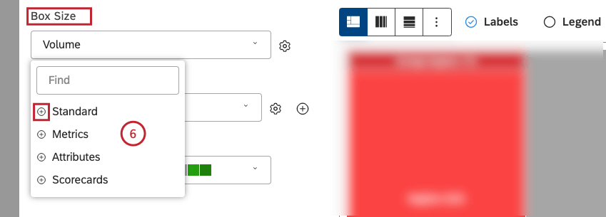
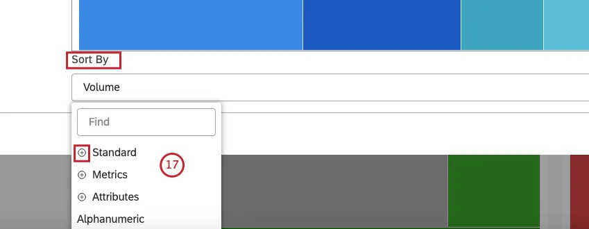
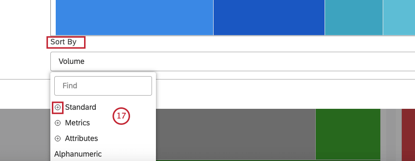
- Standard: See step 20 below for information about sorting options.
- Metrics: To sort by a metric defined in Studio.
- Attributes: To sort by averages of a numeric attribute.
- Scorecards: To sort by the selected scorecard outcomes:
- % Passing – [rubric name]: Sort by the percentage of documents that passed the selected rubric’s target.
- % Failing – [rubric name]: Sort by the percentage of documents that failed the selected rubric’s target.
- Alphanumeric: to sort primary groupings alphanumerically, using the natural order.
Qtip: Click the plus ( + ) icon to view more options.
Qtip: Select ASCto apply ascending sorting. Select DSC to apply descending sorting.
- Volume: Sort by the number of documents related to the selected groupings.
- Sentiment: Sort by the average sentiment of sentences from documents related to the selected groupings.
- Effort: Sort by the average Effort score of sentences from documents related to selected groupings.
- Emotional Intensity: Sort by the average Emotional Intensity of sentences from documents related to selected groupings.
- % Total: Sort by the volume percentage in relation to a report’s total.
- % Parent: Sort by the volume percentage in relation to a parent item.

- Click More Graphs to switch to other widget types while retaining the current report settings (where applicable).
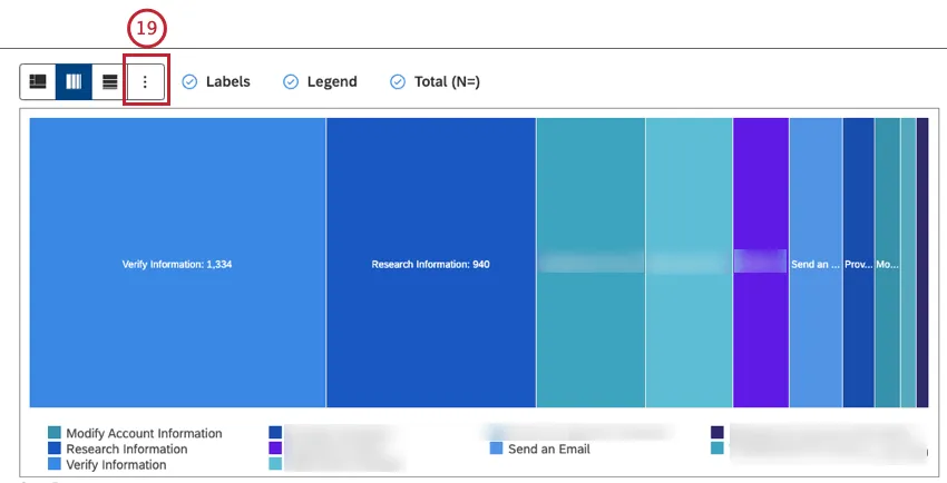
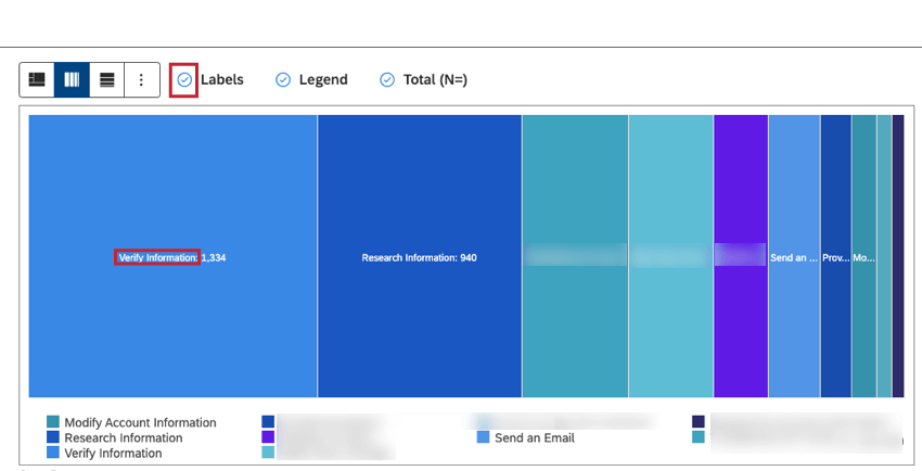
- Select the Labels checkbox to show numeric labels next to report items.
 Qtip: Deselect the Labels checkbox to hide numeric labels next to report items.
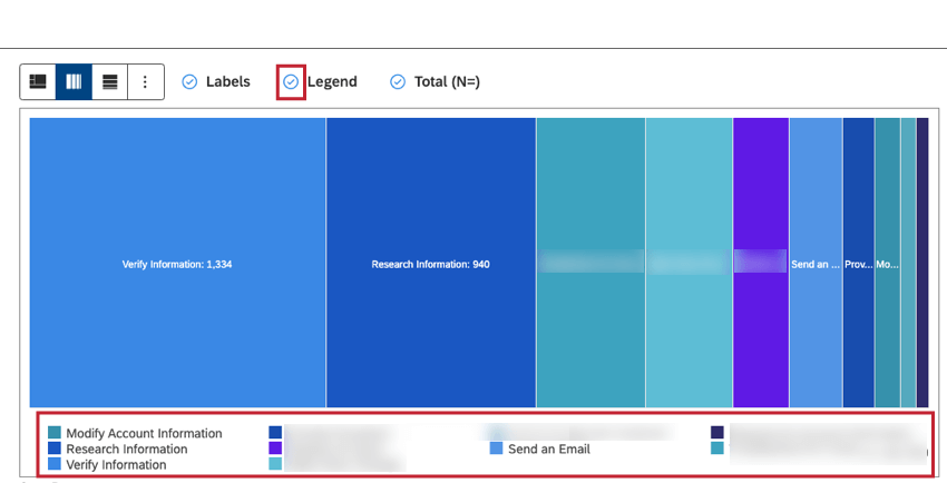
- Select the Legend checkbox to show a chart legend.Qtip: Deselect the Legend checkbox to hide a chart legend.
 Qtip: Viewers can hide and show specific report items by clicking them in a legend.
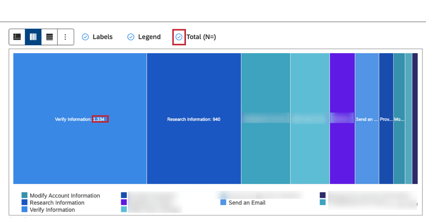
 - Select the Total (N=) checkbox to show the total number of documents that match report conditions and filters. For more information, see Document Volume.
 Qtip: Deselect the Total (N=)checkbox to hide the total number of documents that match report conditions and filters.Qtip: To set the default dashboard-wide value for new widgets, use the n= setting in dashboard properties.

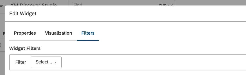
Filters Tab
In the Filters tab, you can further narrow down report data. For information on widget filters properties, please see Applying Filters to a Widget.
That's great! Thank you for your feedback!
Thank you for your feedback!