
Summary Tab
What's on this page
About the Summary Tab
The Summary tab is the landing page you arrive on when you first go to your XM Directory. It contains recommendations, graphs, and data on your distributions. You can also quickly view any segments, lists, and samples that you mark as favorite.
The Summary tab can be reached by clicking Summary in the upper-left corner. In addition to email, SMS and WhatsApp distributions contribute to the statistics on this page, with the exception of the Open Email Rate.
Qtip: The numbers are updated nightly and may not reflect as soon as you make a change.
Jump Back In
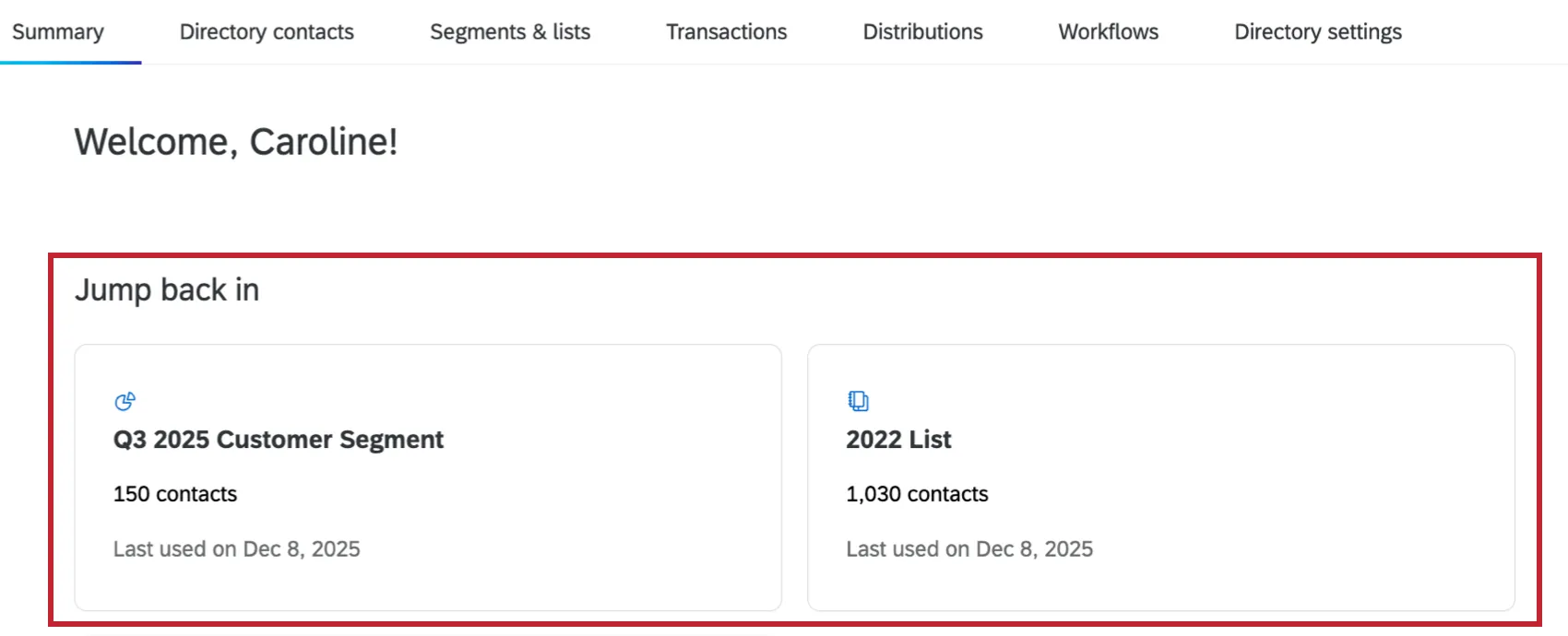
This section displays lists, segments, samples, or workflows you were recently working on. Clicking one will take you directly to it.
For example, if you create, rename, import or export contacts from a list, search within a list, or more, you will see that list appear in this section the following day.
Suggestions
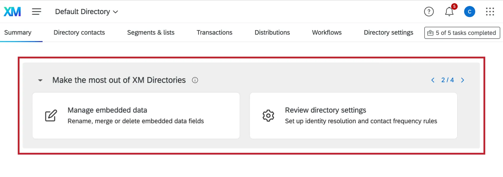
This section provides recommended next steps based on your directory usage. Use the arrows in the top right to view additional suggestions. Click a suggestion to be taken to that specific part of your directory. The following suggestions may appear:
- Create a list: Add contacts to start sending surveys.
- Create a sample: Create a subset from your list.
- Manage embedded data: Rename, merge, or delete embedded data fields.
- Review directory settings: Set up identity resolution and contact frequency.
- Set up an import workflow: Import contacts automatically with workflows.
- Search and filter contacts: Find specific contacts with AI-generated search.Create a segment: Set up custom rules for a specific list or sample.
- Connect Segment to CX dashboard: Publish your segment dataset to dashboards.
Contact Statistics
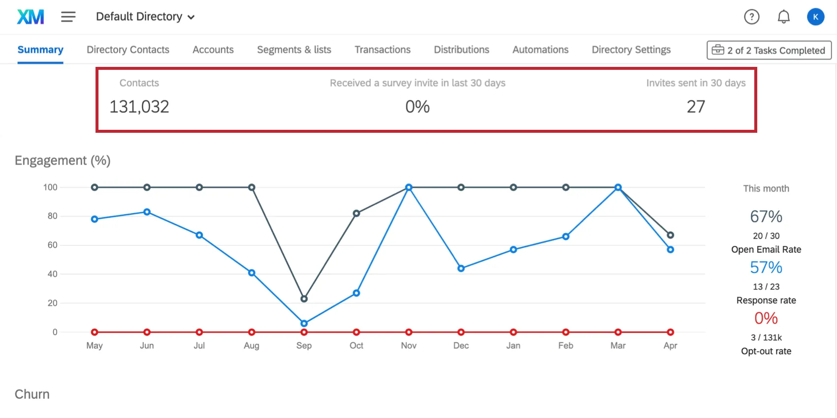
- Contacts: The number of contacts in your directory.
- Received a survey invite in the last 30 days: The percent of contacts in your directory who received a survey invite in the last 30 days.
- Invites sent in 30 days: The number of invites sent over the last 30 days.
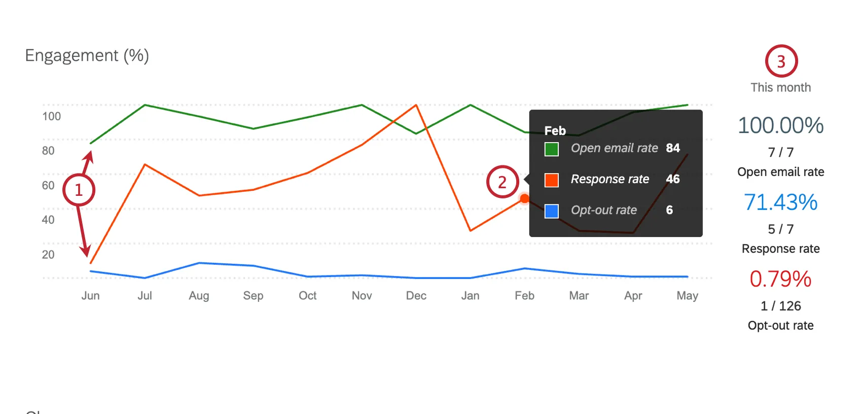
Engagement (%)
This line graph displays the percentage of engagement for a 12 month period. The following rates are included:
- Open Email Rate: The rate at which emails are opened, indicated by whether an email is opened on the recipient side. This rate does not take into consideration if the respondent clicks the survey link. Open Email Rate includes email invites, reminder emails, and non-survey emails.
- Response Rate: The rate at which respondents start your survey relative to the number of initial survey invites. This rate increments when a survey link is clicked in an email invitation.
- Opt-out Rate: The rate at which respondents opt-out of your distributions.
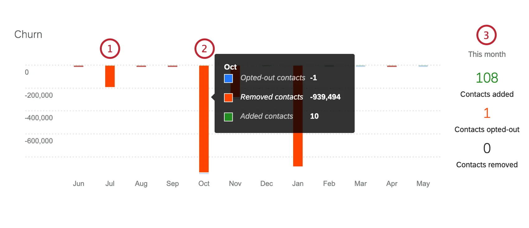
Churn
This bar graph displays numbers of contacts added, removed, and opting out within the directory over a 12 month period.
FAQs
When I click on Contacts, all I see is a failed login page. How can I access my XM Directory account?
When I click on Contacts, all I see is a failed login page. How can I access my XM Directory account?
What’s XM Directory? / Where’s Target Audience?
What’s XM Directory? / Where’s Target Audience?
That's great! Thank you for your feedback!
Thank you for your feedback!