
Scoring Overview Table (360)
What's on this page
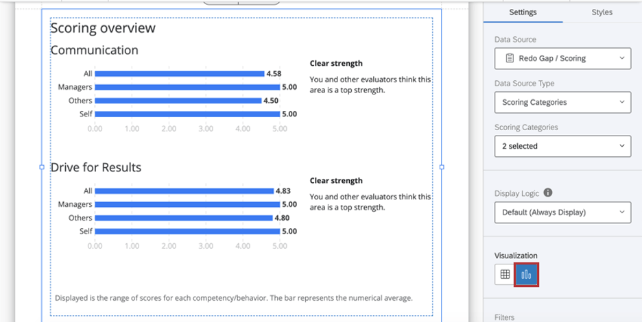
About the Scoring Overview Table
The Scoring Overview table displays a comparison of scores between rater groups and helps the subject identify strengths and weaknesses amongst those scores. The table can either display the recode values for each item in a scoring category, or each scoring category overall.
Qtip: Scoring overview tables can only be used in 360 reports.
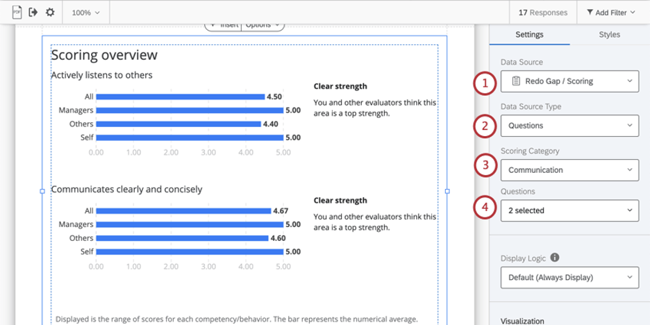
Data Source
You must set up scoring categories before you use a scoring overview table in your report. The scoring overview table can show data in two different ways:
Qtip: Scoring overview tables only show data from one 360 project at a time. If you want to compare scores or items across different surveys, you should add a separate scoring overview table for each survey you want to compare.
Overview of Questions in a Scoring Category
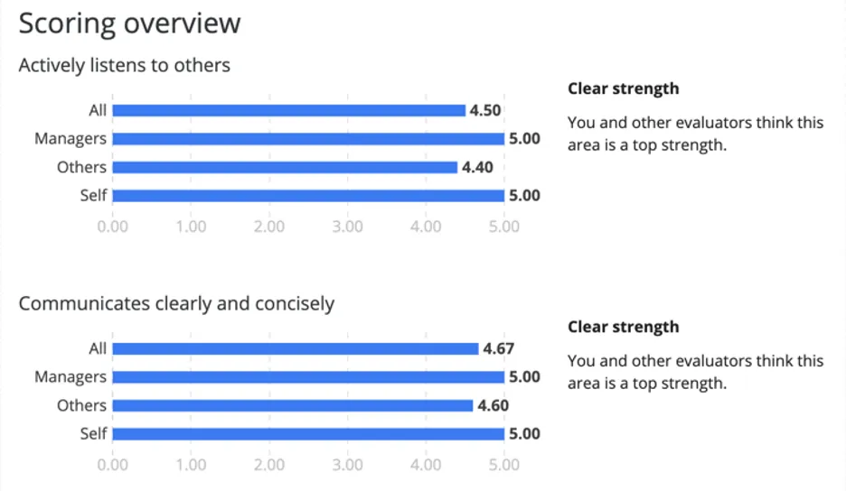
Example: “Actively listens to others” and “Communicates clearly and concisely” are items in the Communication scoring category.
Qtip: The Questions data source displays the recode values of the selected questions in the scoring category.
Qtip: If your x-axis values look larger than you’d expect an average score to be, check your survey questions’ recode values. These are safe to edit any time during, before, or after data collection.
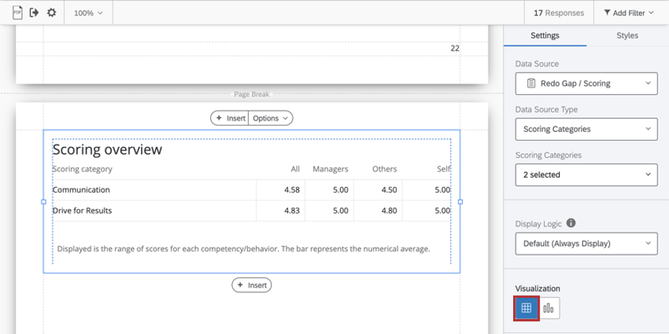
Overview of Scoring Categories
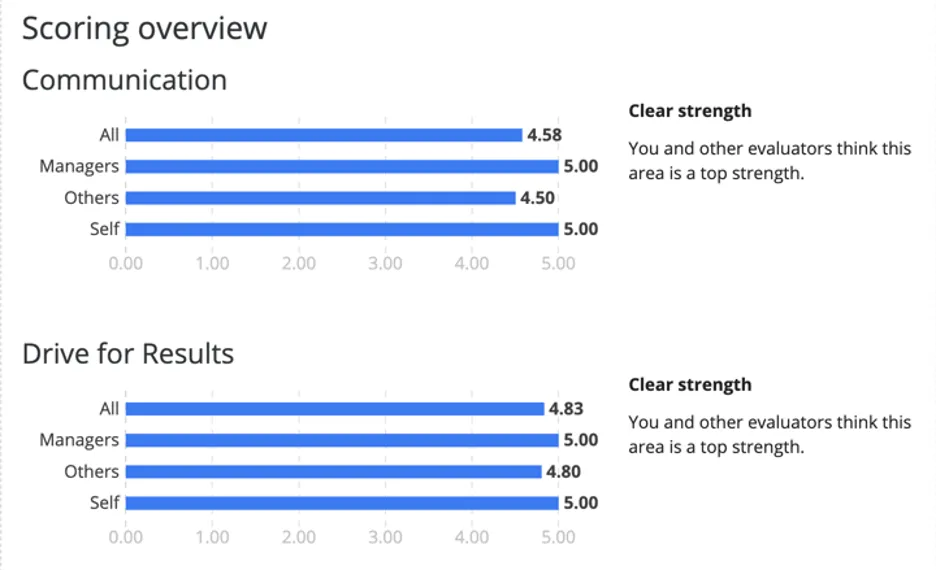
Example: Communication and Drive for Results are two different scoring categories in a 360 evaluation. Here, we’re showing the average score each rater group gave this subject on these two categories.
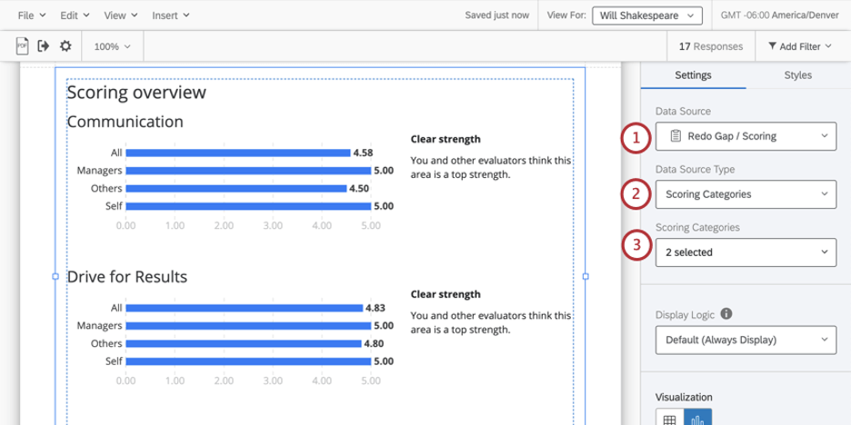
Qtip: The Scoring Categories data source displays the overall scores of the selected scoring categories.
Display Logic
Display logic is a means of hiding a chart or table if not enough responses have been collected yet. It works the same way in this visualization as it does in all other 360 visualizations. See the linked page for more details.
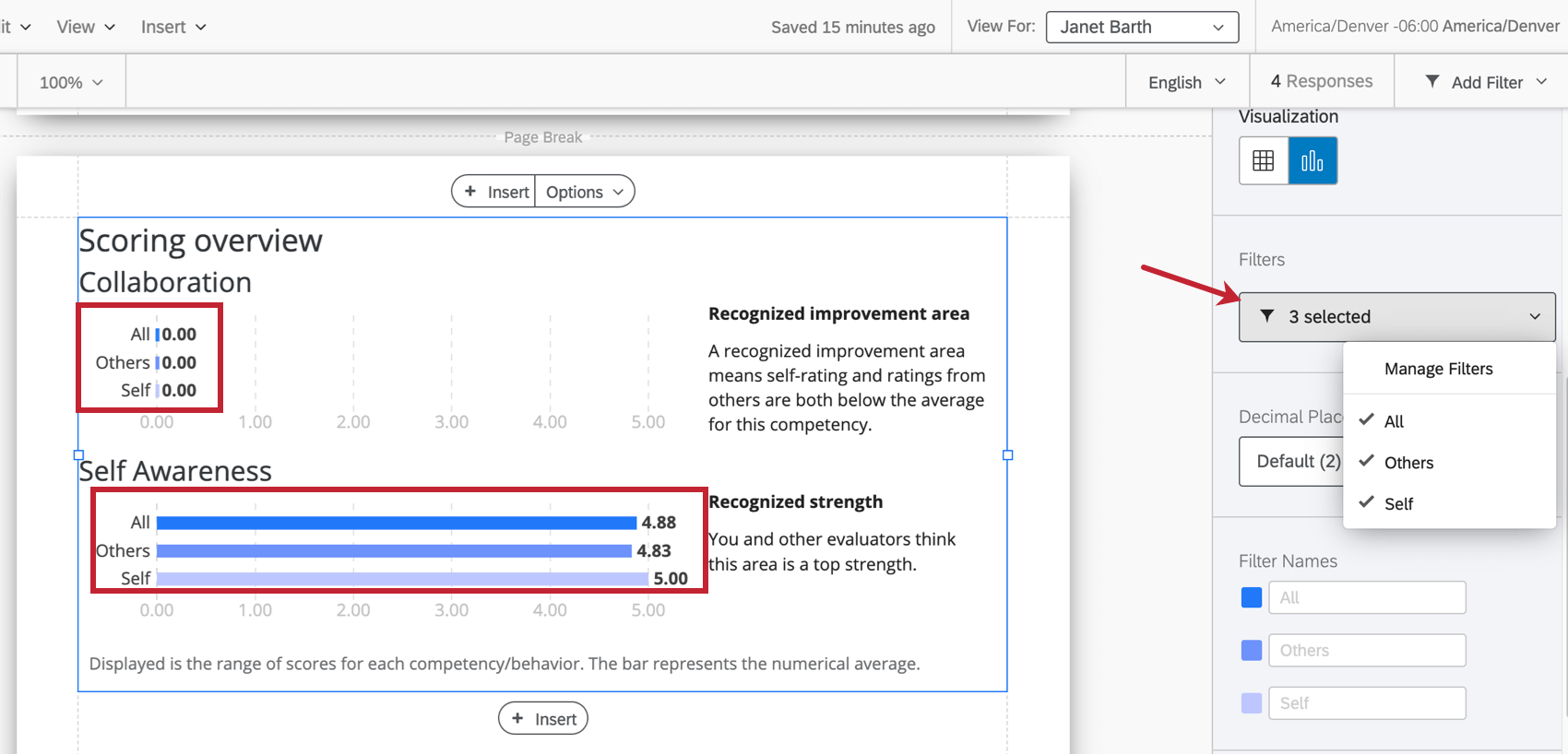
Filters
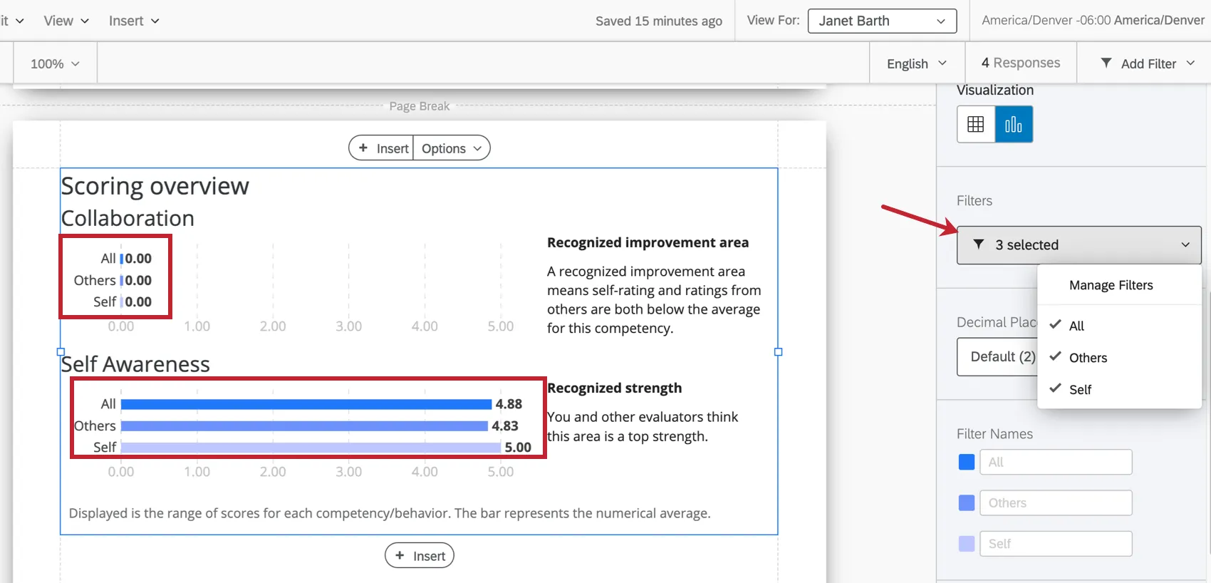
Filters are important in 360 for deciding what relationships you want to use to break out data in charts and tables. By default, we include filters for Self (the subject’s self-assessment), Others (all other evaluations of the subject, excluding the self-assessment), and All (all evaluations of the subject).
If you want to filter by another relationship (e.g., Managers, Peer, Colleagues, custom relationship), you will need to create a new rater group.
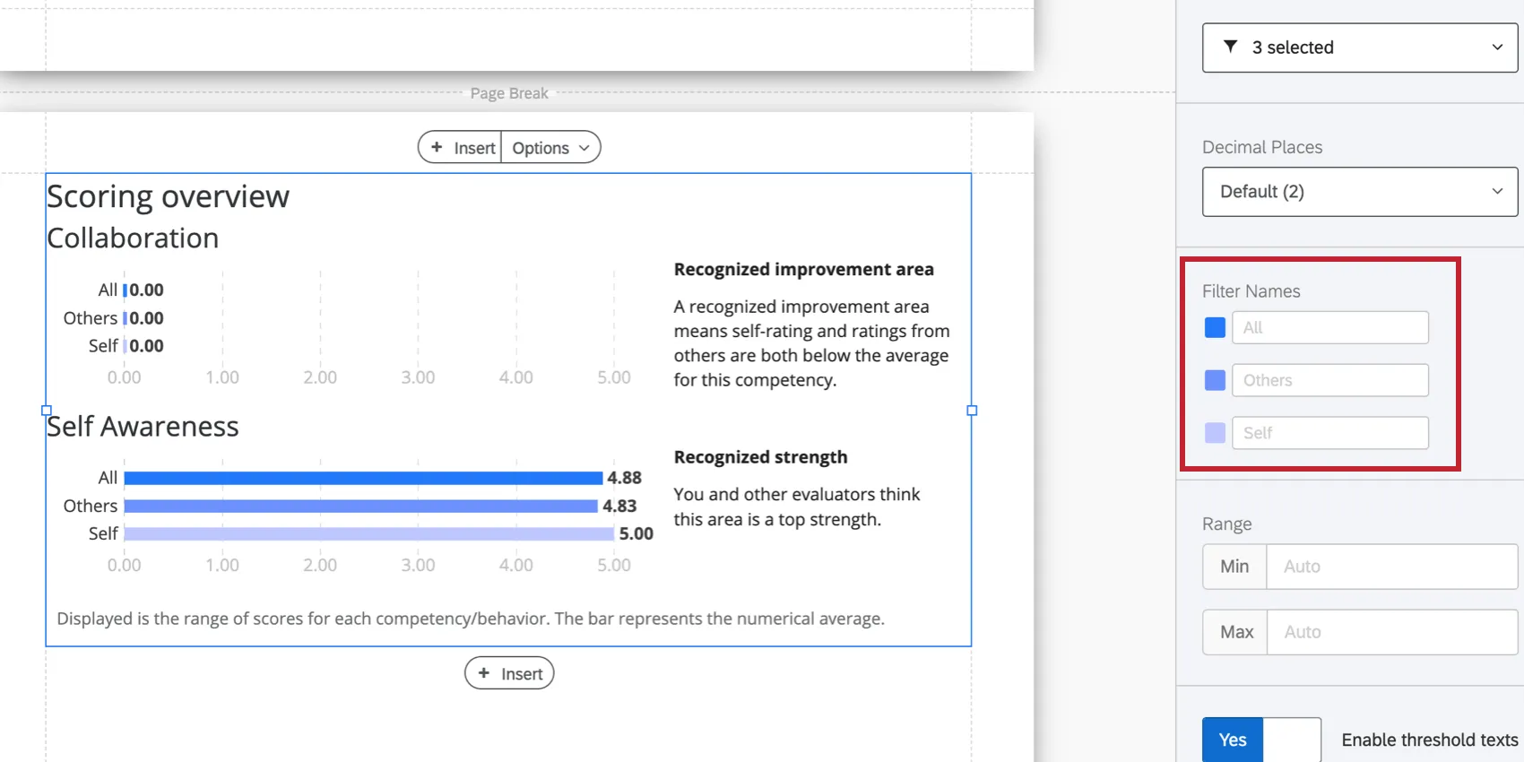
Filter Names
Once you’ve selected your filters, you can adjust how they’re named on the visualization. You can also click the color next to each filter to change the color associated with each option.
Visualization Type
The scoring overview table comes with two different visualizations: table or chart.
Table
Each row of the table is a scoring category or item, and each column will show the average score for each rater group selected.

Chart
Each bar represents an average. The x-axis of your chart is average score.

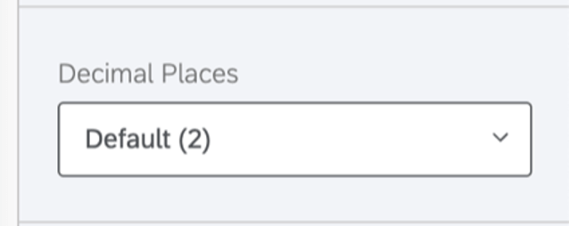
Decimal Places
Adjust the number of decimal places displayed in numbers on the table. Pick from 0 to 5.
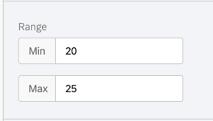
Range
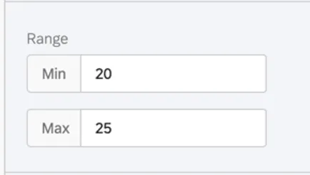
The range will adjust the x-axis of the chart. You can erase the value you’ve entered to allow the chart to automatically set a minimum and maximum value.
Qtip: Remember that your edits are applicable to all subjects’ reports – if you make your range too narrow, the chart may look good to some subjects and not others.
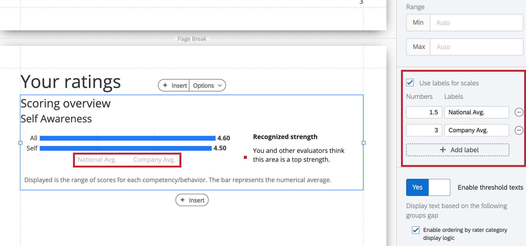
Labels for Scales
Enable Use labels for scales to replace the numbers on the horizontal scale with relevant labels.

Strength and Weakness Thresholds
If you’ve selected the chart visualization, you can decide if you’d like to identify the gaps between how two filter groups rated the subject. By default, this is a means of comparing how the subject evaluated themselves. This comparison allows you to identify different kinds of strengths and weakness by seeing where those evaluations are in agreement, and where those evaluations diverged.
To use this feature:
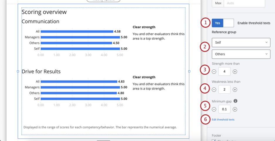
Qtip: Think about your scoring categories. How many points are on the scales? (E.g., 1 – 7 options, or 1- 5?) What’s the maximum value? What’s a realistic indication of strength? Are there industry standards for the measure you’re using? For example, maybe it’s rare to get an average rating of 5 / 5, so strengths are anything above 4.
Qtip: Think about your scale’s range again. If a subject says they score 5 / 5 on Communication and other evaluators say they score an average of 4.9 / 5, would you want this difference to be highlighted as an unrecognized weakness? Or is the difference between these ratings negligible?
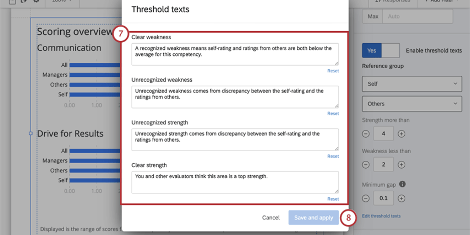
- Clear weakness: A recognized weakness means self-rating and ratings from others are both below the average for this competency.
- Unrecognized weakness: Unrecognized weakness comes from discrepancy between the self-rating and the ratings from others.
- Unrecognized strength: Unrecognized strength comes from discrepancy between the self-rating and the ratings from others.
- Clear strength: You and other evaluators think this area is a top strength.
Qtip: Use the Reset button to reset to the default text.
Footer
The footer contains the following text, which explains how the agreement chart works so subjects can better understand their reports. Select or deselect the Footer checkbox to either hide or display this footer.
Displayed is the range of scores for each competency/behavior. The bar represents the numerical average. Qtip: You can add your own custom text using a text area.
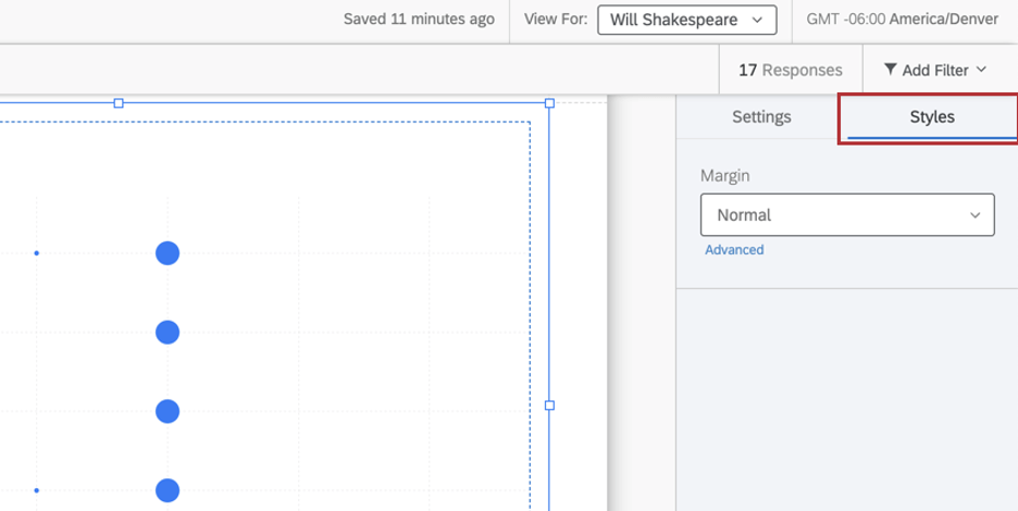
Styles
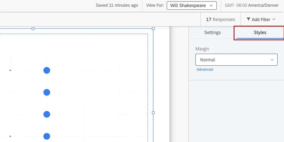
Switch to the Styles tab to adjust the margins around the edge of your chart. Switch to Advanced to adjust margins on each side independently of each other.
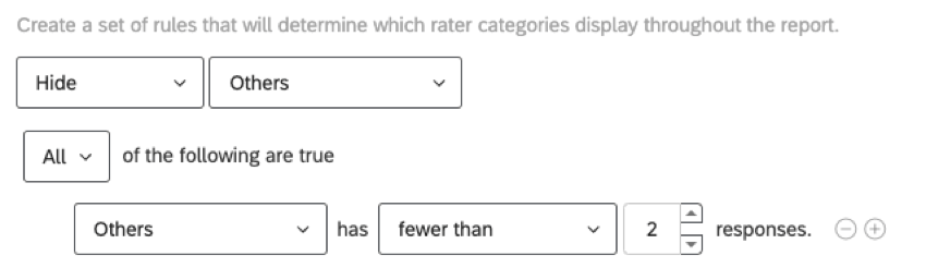
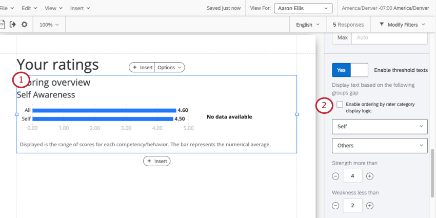
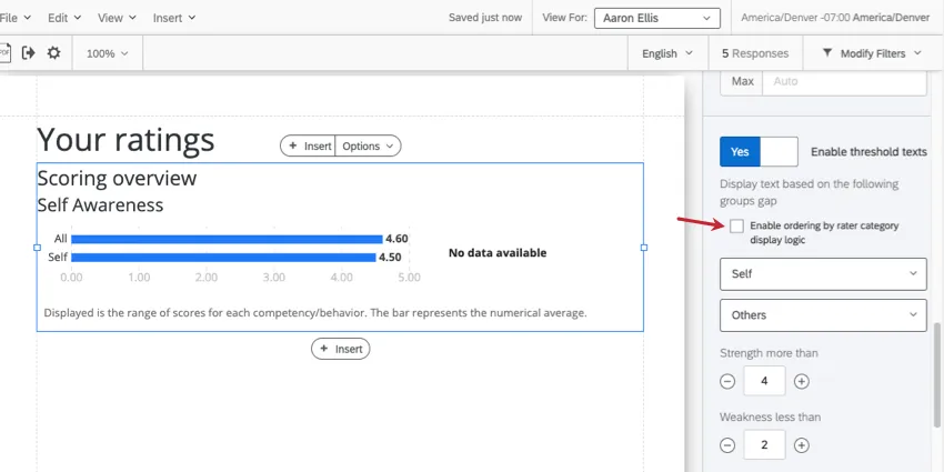
Enable Ordering by Rater Category Display Logic
Rater category display logic can be used to hide or display certain data in your report. For example, you can choose to hide evaluation data for “Others” if 2 or fewer participants matching this description have responded to the 360.

The scoring overview table has messages (called “threshold text”) that vary based on a comparison of how the subject evaluated themselves and how others evaluated the subject. Sometimes, because rater category display logic is hiding certain data points, there isn’t a clear comparison to make, and the table doesn’t have text to display.
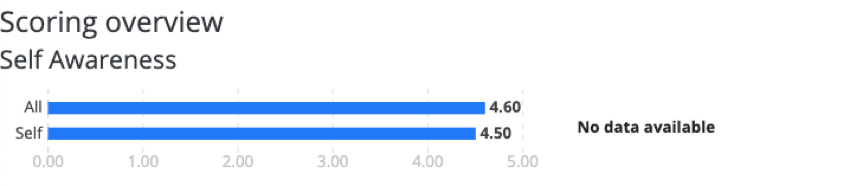
Example: “Others” doesn’t have enough responses, so there’s no bar for “Others” in our table. We only see “Self” and “All” (which itself is a combination of “Self” and “Others”). This made our threshold text appear as “No data available.”

However, you can tell the table what threshold text to use if rater category display logic is hiding certain data. Just follow the steps below.
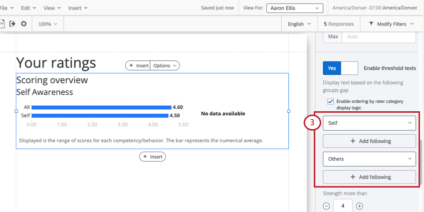
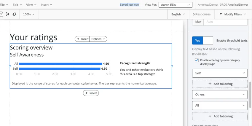
Example: “Others” is a hidden field, so we click Add Following underneath it. “Self” is appearing just fine in our table, so we won’t add a backup for it.
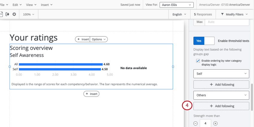
Example: Our only option is “All.” This is a combination of “Self” and “Others” combined together for anonymity.
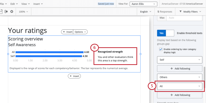
Example: We are now comparing “Self” and “All” to figure out the right threshold text. In this case, we’ve identified a “Recognized strength.”
Qtip: You cannot drag and drop the order of rater categories and backup fields.
Qtip: To remove or change these settings, you can turn this setting off and then on again to reset it to the default. Note that you will lose all changes you made to rater category ordering if you turn this setting off!
Qtip: We do not recommend changing the default fields, just the backups. In the screenshot below, you shouldn’t edit “Self” or “Others,” but you can add more fields after each of them, and you can edit “All.”
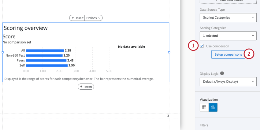
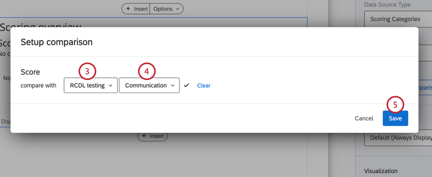
Comparisons
You can add a secondary metric to your scoring overview table to compare performance. You can show historical changes (e.g., where you are in this cycle compared to last cycle) or compare two related metrics (e.g. how you score in this area vs. how important the area is for your success).
Qtip: The names of the field groups need to match exactly in both the source project and the comparison project.

Qtip: If your scoring overview table is displaying questions, then you’ll also need to choose a question to compare against.
That's great! Thank you for your feedback!
Thank you for your feedback!