
Engagement Headlines Widget
What's on this page
About Engagement Headlines Widgets
The engagement headlines widget helps you to present key metrics to managers in a simple and engaging way that drives managers to focus on taking action based on insights.
To present insights to managers, Qualtrics performs an analysis on your data and presents 3 areas of celebration and 3 areas for opportunity. This analysis takes a holistic approach that considers favorability scores, comparison scores, impact on key metrics, and actionability. After identifying the areas for action, managers can create action plans and idea boards from within the widget itself to drive effective change.
Qtip: Unsure which Employee Experience projects have this widget? See our Widget Types and Project Compatibility table. In addition to the projects listed on the linked table, this widget is also available for dashboards in the EX25 XM Solution.
Widget Customization
Attention: We recommend only adding 1 engagement headline widget on a dashboard page.
Qtip: After adding this widget to your dashboard, make sure to resize it so that the whole widget is visible.
For basic widget instructions and customization, visit the Widgets Overview support page. Continue reading for widget-specific customization.
Key metrics
You can choose up to 5 key metrics to display in your widget. You can select any of your dashboard categories as a key metric.
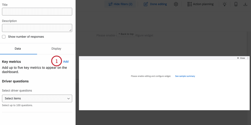
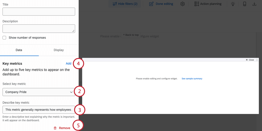
Qtip: The order you add metrics to your widget determines the order they appear in your dashboard.
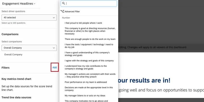
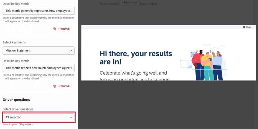
Driver questions
You can choose up to 100 driver questions to display in your widget. These questions will be analyzed to determine strengths and opportunities.
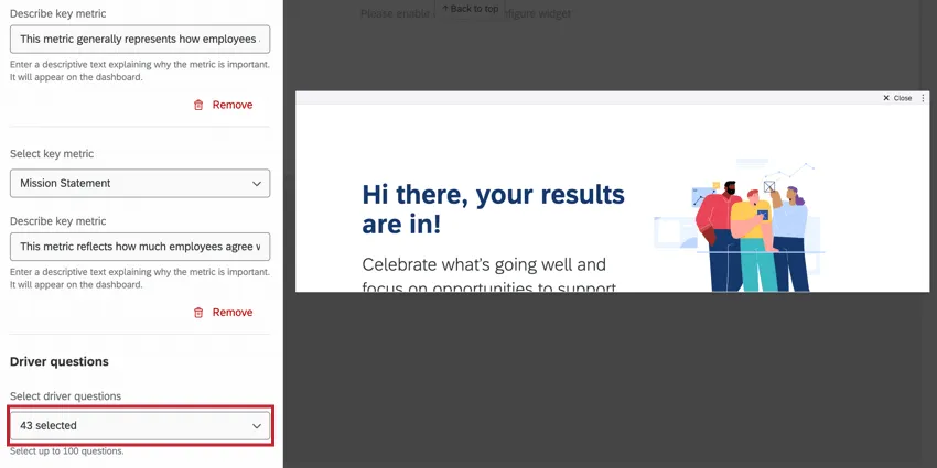
Qtip: NPS questions are not supported for engagement headlines widgets.
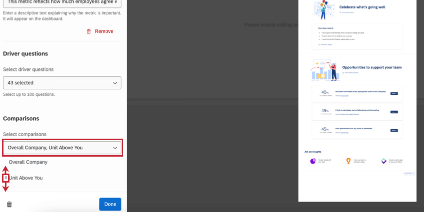
Comparisons
You can add up to 3 comparisons or benchmarks to display in your widget, which allows you to compare your team’s performance against other business units and benchmark goals.
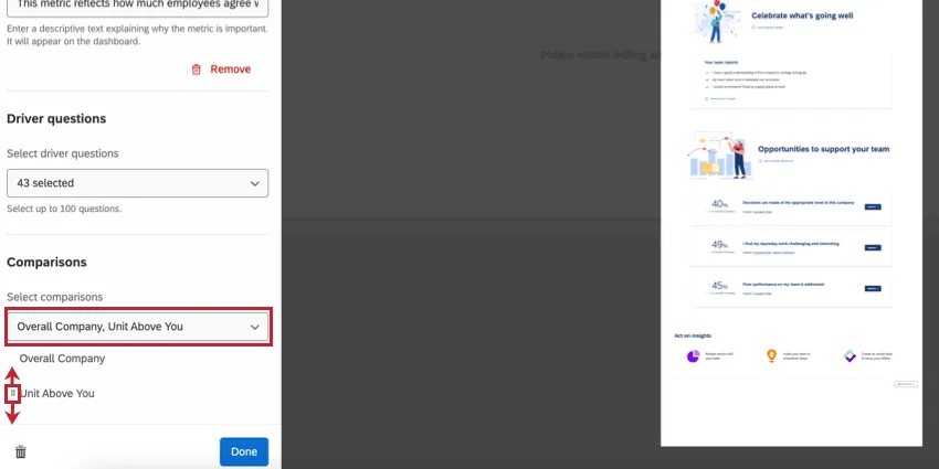
After adding comparisons, you can rearrange the order they appear in your widget by dragging and dropping the icon to the left of the comparison name.
Qtip: Dynamic comparison benchmarks are not supported for this widget and will not appear in this list.
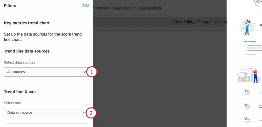
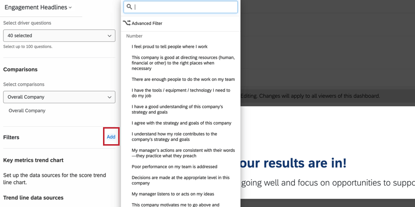
Filters
By default, this widget includes all data mapped to your dashboard. You can filter the widget to limit the data that appears in it (for example, to display data from only 1 data source, or to filter the widget to show data for a certain subset of employees).
To add a widget filter, click Add in the Filters section and then build your filter. See Adding Widget-Level Filters for step-by-step instructions.
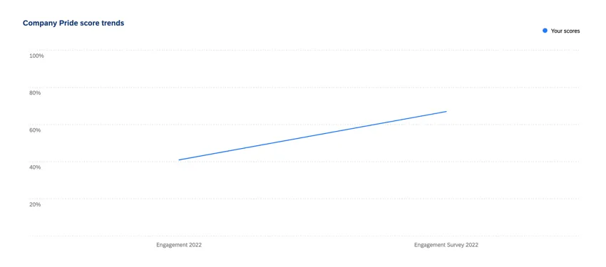
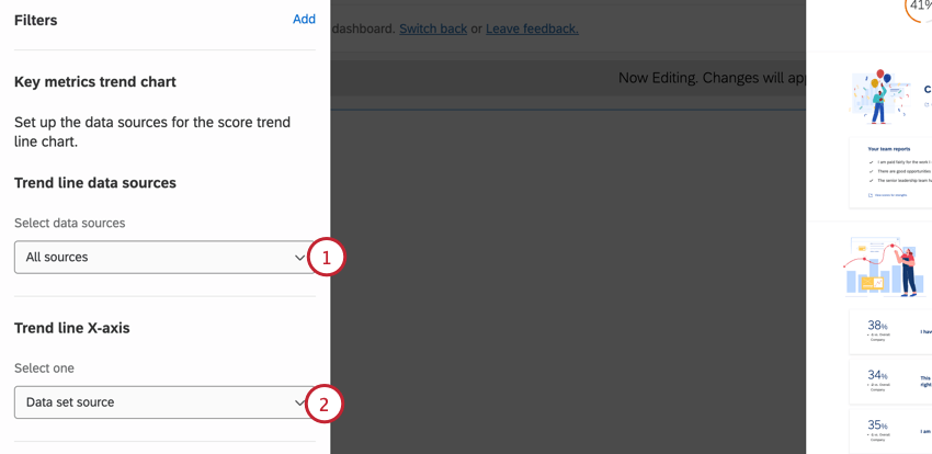
Trend Lines
If you have multiple data sources connected to your dashboard, then you can view the change in your company’s performance for over time. Follow the steps below to add trend analysis to your engagement headlines widget:
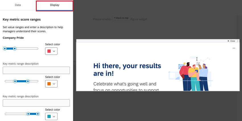
Key metric score ranges
You can adjust the color scale and labels for each key metrics in the Display tab.

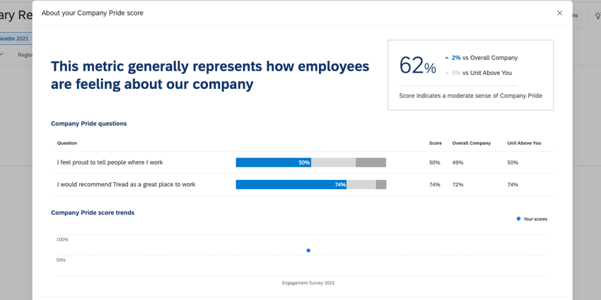
For each metric, there are 3 different value ranges for you to configure, corresponding to different response thresholds. These ranges are based on the metric’s favorability score in relation to the thresholds you set.
You can give each range a description (up to 110 characters) by typing in the associated box. You can adjust the color for a given range by using the Select color dropdown to choose a new color.
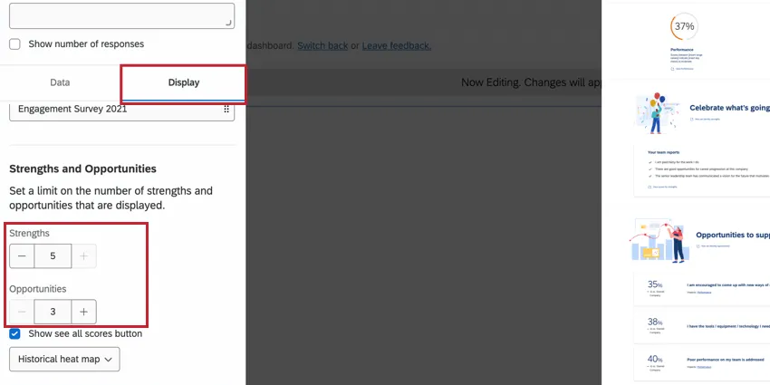
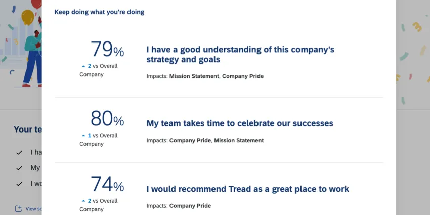
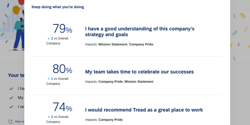
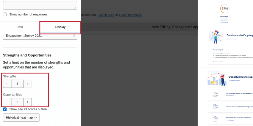
Strengths and Opportunities
By default, this widget displays 3 strengths and 3 opportunities. You can increase this up to 5 each.
To change the number of strengths and opportunities, go to the Display tab and then adjust the numbers in the Strength and Opportunities section.
Using an Engagement Headlines Widget
This section outlines how to use the engagement headlines widget as a manager.
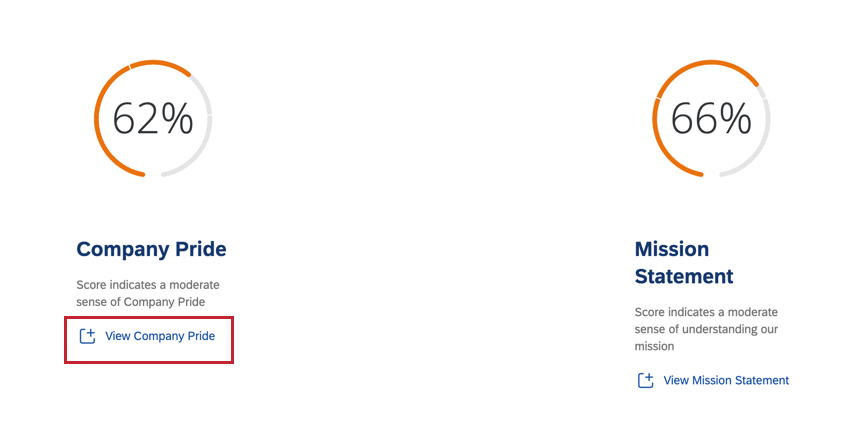
Example: In the above example, both metrics are in the “moderate” threshold.
- When drilling into a key metric, you’ll see the different questions that make up that key metric. Additionally, you’ll see how your current scores compare against up to the comparisons or benchmarks you’ve added to your widget.

- If the widget builder added a trend line, then you can also see your company’s performance for this outcome metric over time.
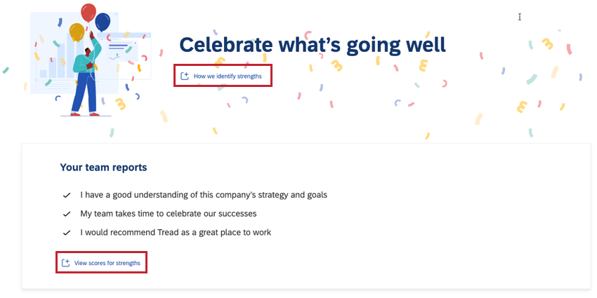
- If you click the View scores for strengths link, you can drill down into the specifics of your team’s strengths. This will open a visualization that shows you the specific score for each strength, which key metrics this strength impacts, and how this strength compares to the first comparison you have configured.
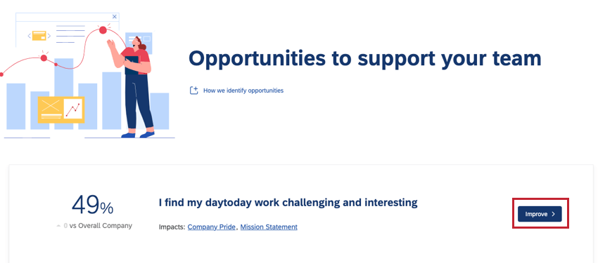
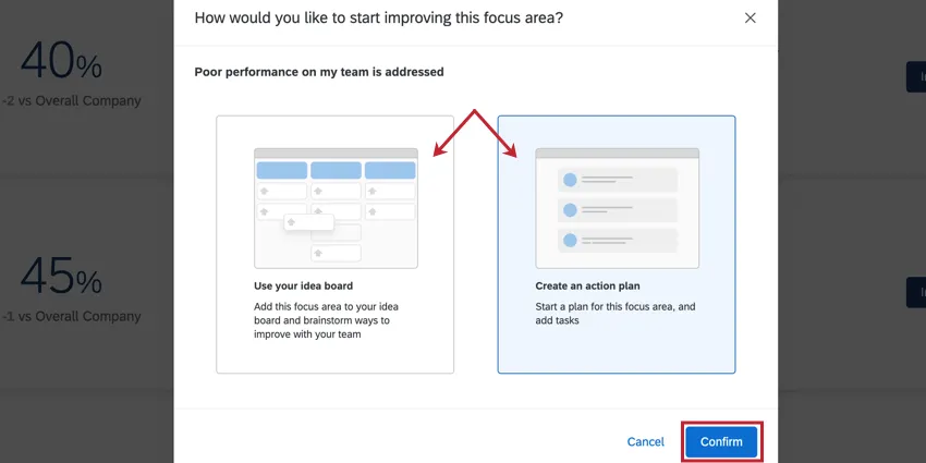
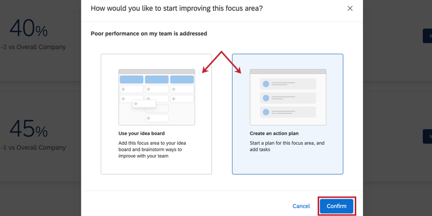
- When taking action on an opportunity, you can choose to create either an action plan, or add the opportunity to your idea board.
 Qtip: If your dashboard does not have action planning or idea boards enabled, then you will not see these options in your widget.
Suggested Setup for EX25 Content
If using the EX25 XM Solution content, this section covers how to set up the descriptions and scales of your widget so it matches the EX25 methodology. You will configure these in the Display tab of your widget.
Recommended Key Metric Descriptions
You can use the text in this section when adding descriptions for each key metric.
- Engagement: Engagement measures employees’ sense of accomplishment, motivation, and whether they would recommend the company.
- Inclusion: Inclusion measures whether employees feel they can be accepted and succeed as themselves, no matter their background.
- Intent-to-Stay: Intent-to-Stay responses can reveal long-term commitment or turnover risk.
- Expectations: Expectations measure whether employees feel that their experience at work matches their expectations.
- Well-being: Well-being measures employees’ energy and positivity about their work and relationships.
Recommend Key Metric Value Ranges & Descriptions
You can use the following value ranges and descriptions when configuring the scales for each key metric which are based on the Qualtrics global external benchmark.
- Engagement
- Less than or equal to 67%: Score indicates that engagement can be improved
- Between 68-76%: Score indicates a moderate sense of engagement
- Greater than or equal to 77%: Score indicates a strong sense of engagement
- Inclusion
- Less than 72%: Score indicates that inclusion can be improved
- Between 73-81%: Score indicates a moderate sense of inclusion
- Greater than or equal to 82%: Score indicates a strong sense of inclusion
- Intent-to-Stay
- Less than 65%: Score indicates that less than 66% of the team plans to stay 3+ years
- Between 66-74%: Score indicates that between 66-74% of the team plans to stay 3+ years
- Greater than or equal to 75%: Score indicates that more than 74% of the team plans to stay 3+ years
- Expectations
- Less than 40%: Score indicates that for some, work may not exceed expectations
- Between 41-49%: Score indicates that for some, work exceeds expectations
- Greater than or equal to 50%: Score indicates that for most, work exceeds expectations
- Well-being
- Less than 72%: Score indicates that well-being can be improved
- Between 73-81%: Score indicates a moderate sense of well-being
- Greater than or equal to 82%: Score indicates a strong sense of well-being
Threshold Range Methodology
These ranges are determined using the following methodology:
- When a % Favorable score is 5 or more % points higher than the benchmark, it is considered “strong.”
- When a % Favorable score is within ±4 % points of the benchmark, it is considered “moderate.”
- When a % Favorable score is 5 or more % points lower than the benchmark, it is considered “can be improved.”
That's great! Thank you for your feedback!
Thank you for your feedback!