
Selector Widget (Studio)
What's on this page
About the Selector Widget
Qtip: To modify dashboard widgets, a user must have an Edit Dashboard permission and be granted Can Edit permission for the specific dashboard. For information about widget permissions, see Editing Widget Properties.
Attention: To ensure optimal Studio performance, there is a limit on the number of widgets that can be added to each dashboard. For more information, see Maximum Widgets per Dashboard.
You can use the selector widget to display a selection of report items without any calculations. The primary purpose of this widget is to use it as a filter for other reports to create interactive dashboard experiences for your viewers with great flexibility and design choices.
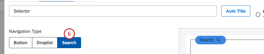
The selector widget supports these navigation types:
- Button: Display report items as a group of rounded buttons. For more information, see the Adding a Button Selector section below.
- Droplist: Display report items as items in a drop-down list. For more information, see the Adding a Droplist Selector section below.
- Search Selector: Display a search box that enables users to directly search for values across multiple attributes. For more information, see the Search Selector and Adding a Search Selector sections below.
For information about editing widget properties, resizing or rearranging a widget, using a widget as a filter, creating a copy of a widget, applying filters to a widget and more, see Widgets (XM Discover).
Adding a Button Selector
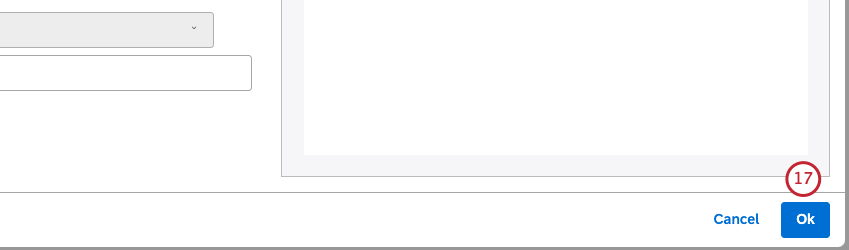
Qtip: at the bottom-right of each of the Properties, Visualization and Filters tabs to apply the settings in each of these tabs, and then click Save at the top of the dashboard.
You can add a selector widget and set its navigation type to Button to display report items as buttons.
Properties Tab
You can edit selector widget properties in the Properties tab. For information about adding a widget, please see Adding a Widget.
Visualization Tab
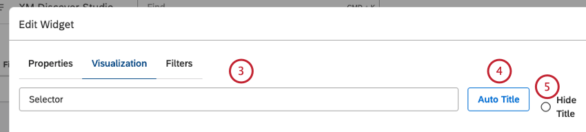
You can define report settings in the Visualization tab.
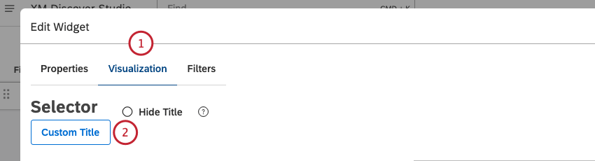
Qtip: Hover over the widget in Edit mode to view the hidden title.
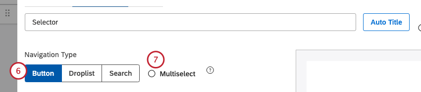
Qtip: Multiple selections have an OR relationship.
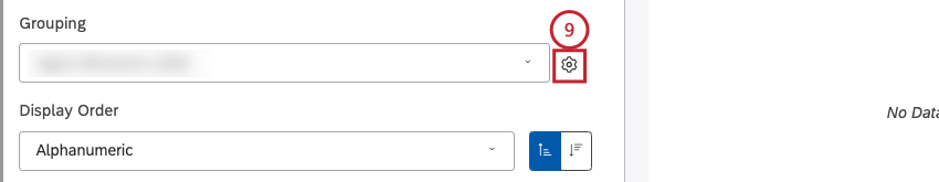
Qtip: Click the plus ( + ) icon to view more options.
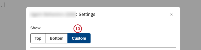
Qtip: When the custom inclusion list is used, the widget shows the same values every time the dashboard is opened. Using a custom inclusion list automatically ignores filters to ensure that you always see the custom values you define. When Customis selected, the Filters tab is disabled.
Qtip: Using a custom inclusion list can speed up a dashboard because the widget doesn’t require an analytics request (provided the widget’s color palette or display order is not based on any metrics).
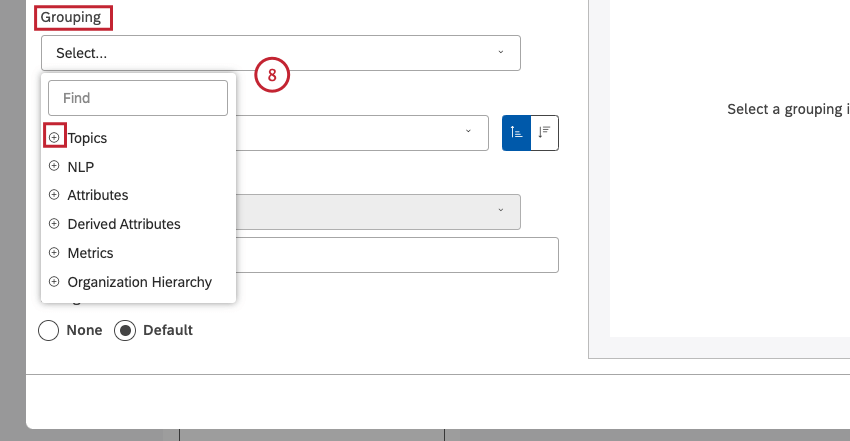
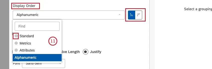
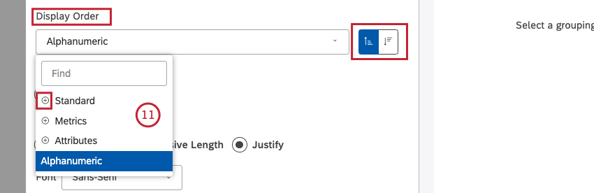
- Standard
- Metrics: Sort by a metric defined in Studio.
- Attributes: Sort by averages of a numeric attribute.
- Alphanumeric (default, ascending): Sort primary groupings alphanumerically, using the natural order.
- Model Display Order: Sort based on the display order of the topic model in Designer.
Qtip: Click the plus ( + ) icon to view more options.
Qtip: Click Sort Ascendingfor ascending sorting (A to Z). Click Sort Descending for descending sorting (Z to A).
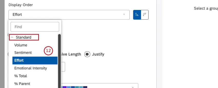
- Volume: Sort by the number of records related to the selected groupings.
- Sentiment: Sort by the average sentiment of sentences from records related to the selected groupings.
- % Total: Sort by the volume percentage in relation to a report’s total.
- % Parent: Sort by the volume percentage in relation to a parent item.
- Effort: Sort by the average Effort score of sentences from records related to selected groupings.

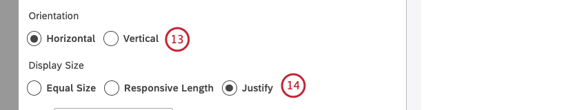
- Equal Size (horizontal orientation only): Display items as buttons of equal size. This only applies for items that are arranged along the horizontal axis.
- Responsive Length (horizontal orientation only): Adjust the size of buttons to their contents. This only applies for items that
- Justify: Adjust the size of buttons so that they fill out the entire width of a widget

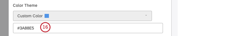
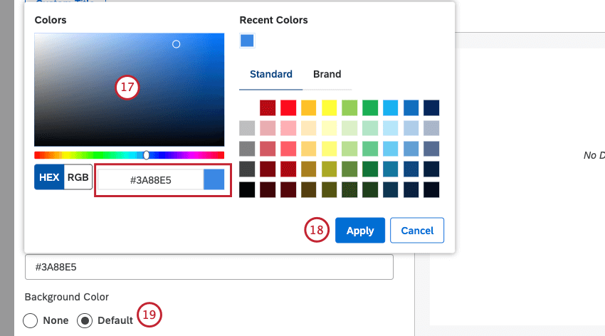
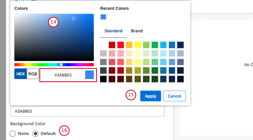
Qtip: Alternatively, you can enter the HEX code or the RGB code into the color code box.
- None: Make the widget canvas transparent.
- Default: Set the widget background to default white color (depending on your Studio’s color theme).

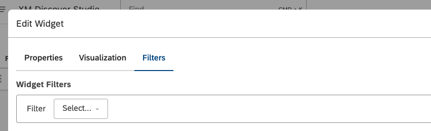
Filters Tab
In the Filters tab, you can further narrow down report data.

Qtip: Using a custom inclusion list in grouping settings automatically ignores filters and disables the Filters tab.
For information on widget filters properties, please see Applying Filters to a Widget.
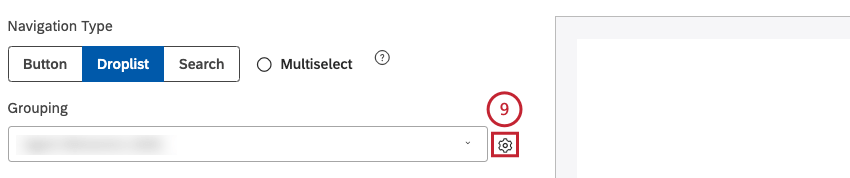
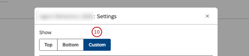
Adding a Droplist Selector
Qtip: Click Ok at the bottom-right of each of the Properties, Visualization and Filters tabs to apply the settings in each of these tabs, and then click Save at the top of the dashboard.
You can add a selector widget and set its navigation type to Droplist to display report items in a dropdown list.
Properties Tab
You can edit selector widget properties in the Properties tab. For information about adding a widget, please see Adding a Widget.
Visualization Tab
You can define report settings in the Visualization tab.


Qtip: Hover over the widget in Edit mode to view the hidden title.

Qtip: Multiple selections have an OR relationship.
Qtip: Click the plus ( + ) icon to view more options.
Qtip: When the custom inclusion list is used, the widget shows the same values every time the dashboard is opened. Using a custom inclusion list automatically ignores filters to ensure that you always see the custom values you define. When Custom is selected, the Filters tab is disabled.
Qtip: Using a custom inclusion list can speed up a dashboard because the widget doesn’t require an analytics request (provided the widget’s color palette or display order is not based on any metrics).
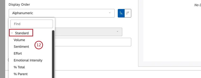
- Standard
- Metrics: Sort by a metric defined in Studio.
- Attributes: Sort by averages of a numeric attribute.
- Alphanumeric (default, ascending): Sort primary groupings alphanumerically, using the natural order.
- Model Display Order: Sort based on the display order of the topic model in Designer.
 Qtip: Click the plus ( + ) icon to view more options.
 Qtip: Click Sort Ascendingfor ascending sorting (A to Z). Click Sort Descending for descending sorting (Z to A).

- Volume: Sort by the number of records related to the selected groupings.
- Sentiment: Sort by the average sentiment of sentences from records related to the selected groupings.
- % Total: Sort by the volume percentage in relation to a report’s total.
- % Parent: Sort by the volume percentage in relation to a parent item.
- Effort: Sort by the average Effort score of sentences from records related to selected groupings.

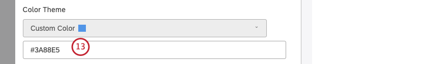
Qtip: Alternatively, you can enter the HEX code or the RGB code into the color code box.
- None: Make the widget canvas transparent.
- Default: Set the widget background to default white color (depending on your Studio’s color theme).
Filters Tab
In the Filters tab, you can further narrow down report data.

Qtip: Using a custom inclusion list in grouping settings automatically ignores filters and disables the Filters tab.
For information on widget filters properties, please see Applying Filters to a Widget.
Search Selector
You can use the search selector to directly search for text and numeric attribute values across multiple attributes to quickly find and apply relevant filter criteria in your dashboard. Here’s how it works:
- Start typing the value you’re looking for until it appears in the autocomplete suggestions, then select it. Search elements appear as buttons within the search box.
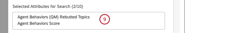
- You can search across up to 10 different attributes within one search selector.
- Selecting multiple elements resolves as an OR operator within the same attribute type, and as an AND between multiple attribute types.
For information about how to add a search selector, see the Adding a Search Selector section.
Adding a Search Selector
Qtip: Click Ok at the bottom-right of each of the Properties, Visualization and Filters tabs to apply the settings in each of these tabs, and then click Save at the top of the dashboard.
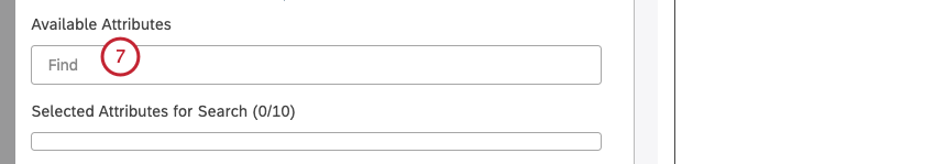
You can add a selector widget and set its navigation type to Search to display a search box that enables users to directly search for values across multiple attributes.
Properties Tab
You can edit selector widget properties in the Properties tab. For information about adding a widget, please see Adding a Widget.
Visualization Tab
You can define report settings in the Visualization tab.

Qtip: Hover over the widget in Edit mode to view the hidden title.
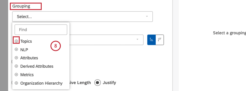
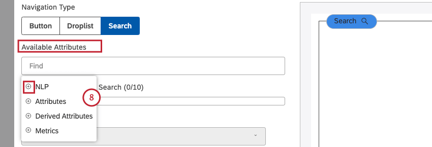
- NLP
- Attributes
- Derived Attributes
- Metrics
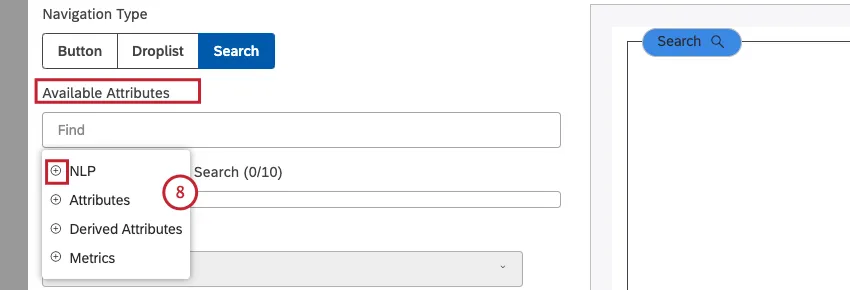 Qtip: The more attributes you add, the slower the response. For large projects, consider keeping the total number of attributes being searched as low as possible. One way to do this is to create themed searches—for example, one for product-related attributes, one for demographic attributes, one for geography-related attributes, and so on.Qtip: Click the plus ( + ) icon to view more options.
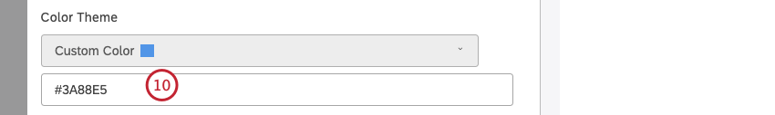

Qtip: Alternatively, you can enter the HEX code or the RGB code into the color code box.
- None: Make the widget canvas transparent.
- Default: Set the widget background to default white color (depending on your Studio’s color theme).

That's great! Thank you for your feedback!
Thank you for your feedback!