
Multiple Data Sources in Advanced-Reports
What's on this page
About Multiple Data Sources in Advanced-Reports
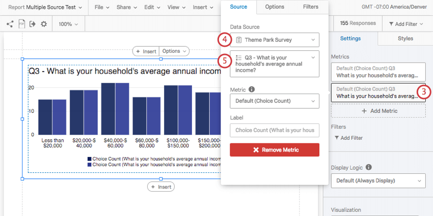
In the Reports section, you can add multiple data sources or metrics to a single visualization. This is extremely useful for a several reasons:
- Display data from different surveys in one visualization for easy comparison. For example, you can show 2018 and 2019 data side by side.
- Report on multiple metrics in one visualization. For example, you want to see Mean, Minimum, and Maximum next to each other.
- Compare how respondents of different demographics scored on each question. For example, amongst your customers who are coffee drinkers, those from Utah may give your cafe’s drink selection a different average CSAT than your customers from Washington.
Compatible Visualizations
Currently, three visualizations allow you to add more than one source or metric.
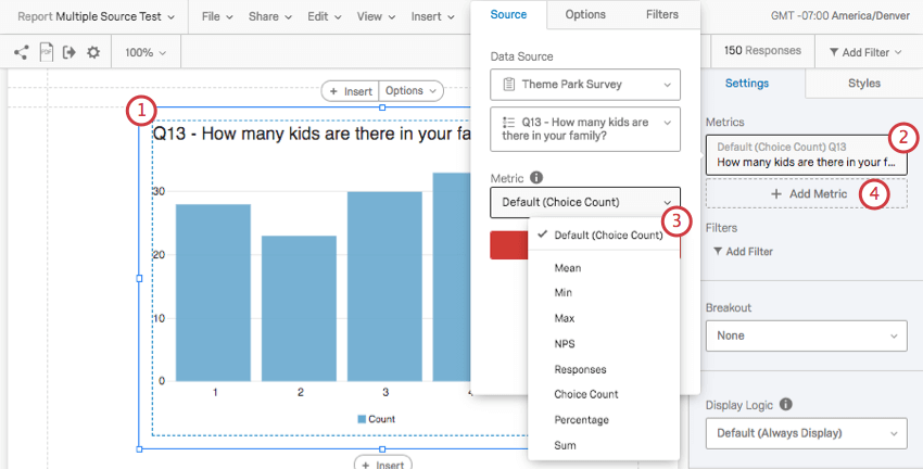
Adding Multiple Data Sources
Multiple Data Sources are a great way to compare data collected across surveys. The method described in this section is best for data where the choices are not numeric, but instead categorical, or subjective groups. For example, most Multiple Choice-style questions collect data in this format. These data sources can be displayed in two different formats (metrics): Choice Count or Percentage. It is best to choose one of these metrics and apply it to every data source you have in a visualization.
Qtip: Are you looking to compare data based on demographics you collected in your survey? When you’ve added more data sources, consider filtering those sources.
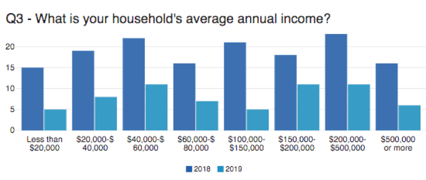
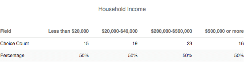
Example: Here is a Bar Chart comparing annual household income in 2018 and 2019.

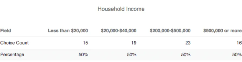
Qtip: Choice Count and Percentage are best shown side by side in a Data Table, where they appear as numbers. Because these two metrics are on different scales (one is an integer and the other is a percentage with a max of 100), Bar Charts and Line Charts do not make sense with this information.
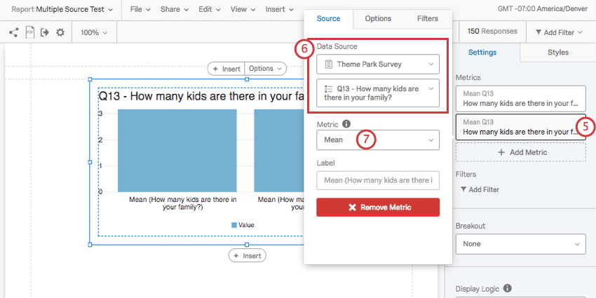
Adding Multiple Metrics
A visualization can display different numeric metrics side by side, so that different statistics for the same data can be displayed together. When using a numeric metric format, you can choose to display data in Mean, Min (Minimum), Max (Maximum), NPS (Net Promoter Score), Responses, and Sum format. This option is best for data collected from recoded Multiple Choice questions, and any question type that lets you collect numeric data.
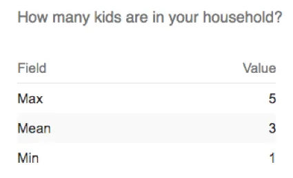
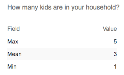
Example: In our survey, we asked how many children live in the respondent’s household. The Data Table below shows the minimum, mean, and maximum answers provided.
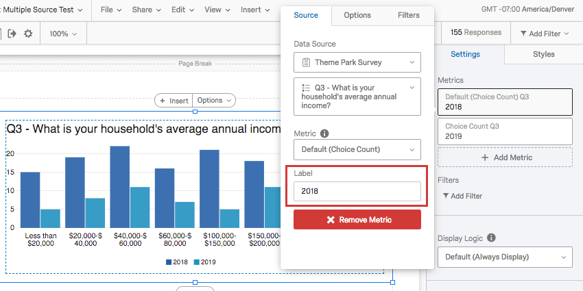
Label
When you click on your metric or data source, you can change the Label displayed on the visualization. By default, this can be on the longer side, displaying the question text and the chosen metric.
We highly advise you change these labels to be shorter and easier to read. Generally, you should name labels after the name of the data source or the metric you’re using, depending on what you are trying to communicate. You can rely on titles and text boxes to give additional information about the variable being displayed.
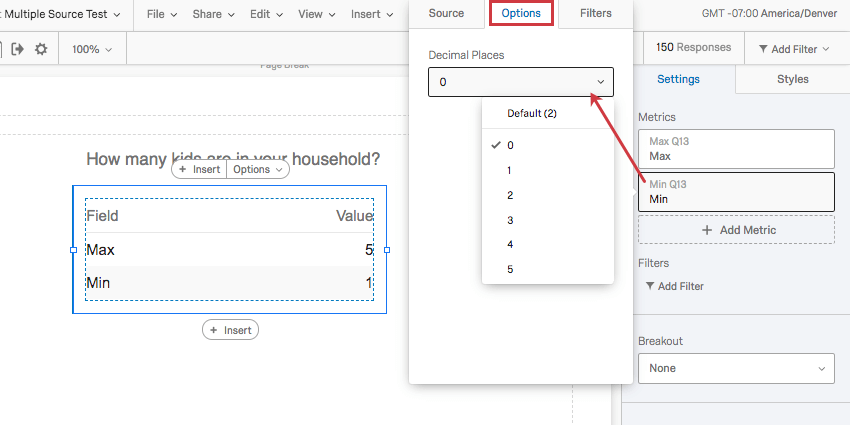
Options
On each Metric, you can change the number of decimal points you display. Click on a Metric, go to the Options tab, and select from the dropdown.
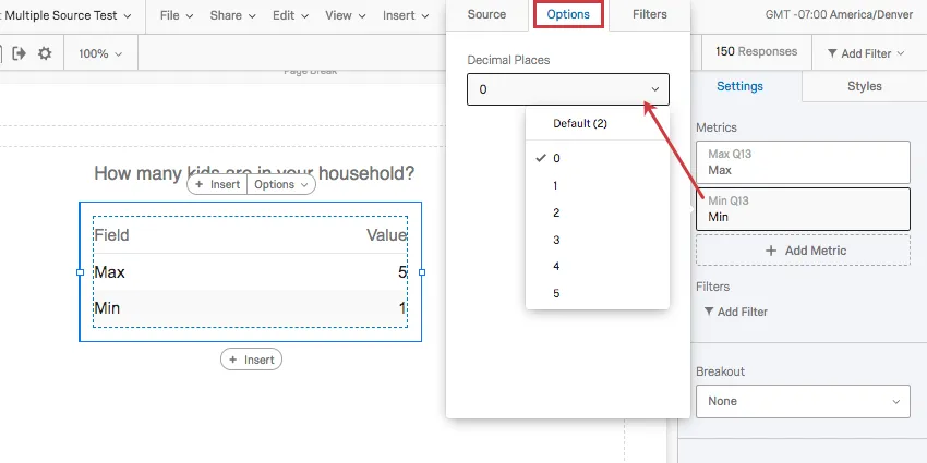
This option is only available for numeric Metrics, such as Mean, Min (Minimum), Max (Maximum), NPS (Net Promoter Score), Responses, and Sum.
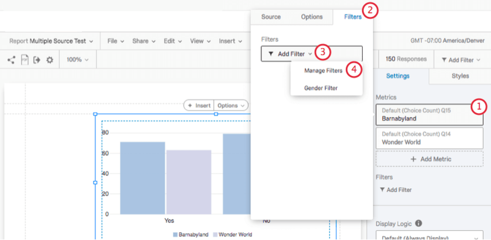
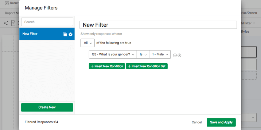
Adding Filters to Sources
Just as you can filter a report or filter an entire visualization, you can filter individual data sources. This can be useful if you want to compare scores by demographic. For example, you may wish to show the household income of respondents from Utah with children vs. respondents from Washington with children.
Qtip: Sometimes, your report may display data from a different survey in several places, and you want to glboally filter this survey’s data instead of adjusting each data source. See the Setting (Global) Filters for Additional Data Sources page for details on how to do this.
Qtip: For filters that don’t have multiple conditions (e.g., you just want to compare men vs. women), try using a breakout instead.
Types of Reports
This feature can be used in a few different types of report:
Qtip: See more on multiple data sources in 360 subject reports on this support page.
Qtip: See more on multiple data sources in EX report templates on this support page.
That's great! Thank you for your feedback!
Thank you for your feedback!