
Object Viewer Widget (Studio)
What's on this page
About the Object Viewer
Qtip: To modify dashboard widgets, a user must have an Edit Dashboard permission and be granted Can Edit permission for the specific dashboard. For information about widget permissions, please see Editing Widget Properties.
Attention: To ensure optimal Studio performance, there is a limit on the number of widgets that can be added to each dashboard. For more information, see Maximum Widgets per Dashboard.
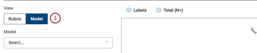
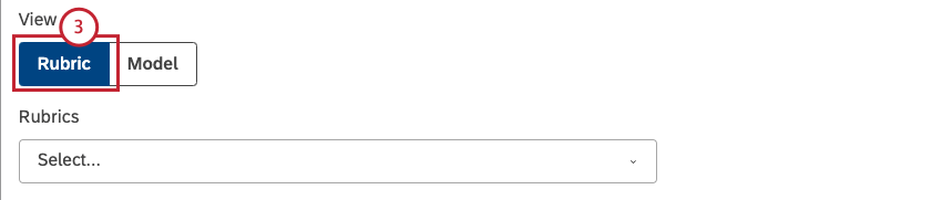
There are 2 object viewer widget types: the object viewer – model widget and the object viewer – rubric widget.
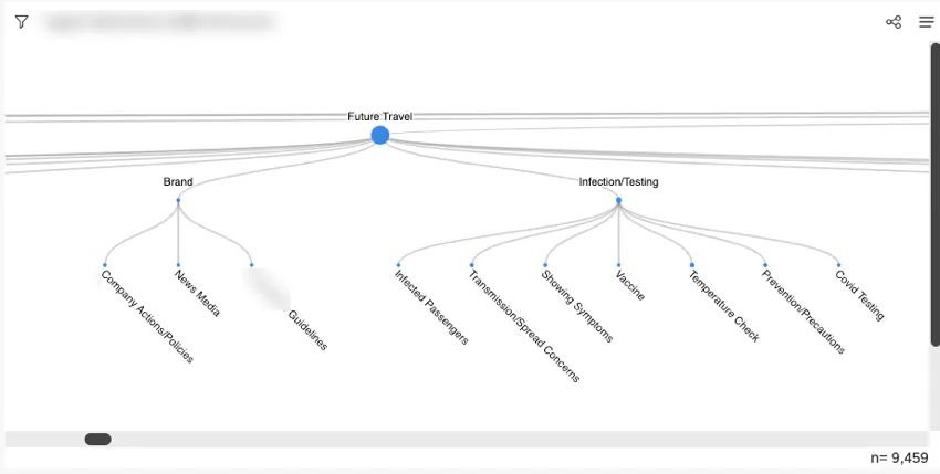
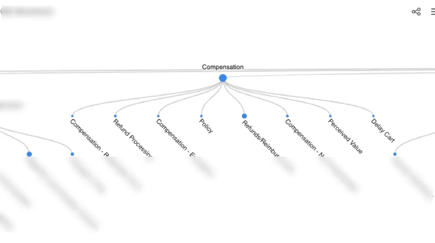
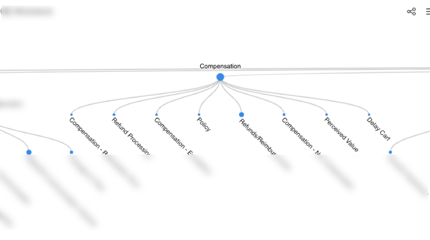
You can use the object viewer – model widget to visualize a categorization model as a hierarchy of topics presented as nodes in a tree with key metrics. This widget enables you to:
- Visualize the hierarchy of topics in a model.
- Drill down to specific topics.
- Filter other widgets by topics.
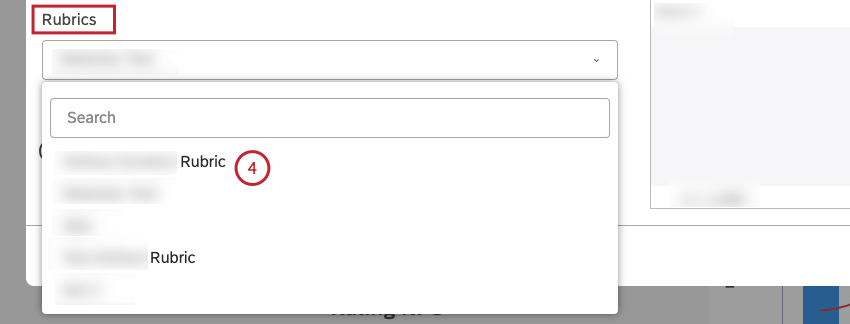
You can use the object viewer – rubric widget to share the underlying structure of your rubrics and provide the transparency required to interpret intelligent scores while maintaining the guardrails for editing the rubrics.
For information about editing widget properties, resizing or rearranging a widget, using a widget as a filter, creating a copy of a widget, applying filters to a widget and more, see Widgets (XM Discover).
Adding an Object Viewer – Model Widget
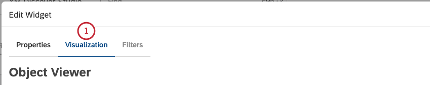
Qtip: Click Ok at the bottom-right of each of the Properties, Visualization and Filters tabs to apply the settings in each of these tabs, and then click Save at the top of the dashboard.
Properties Tab
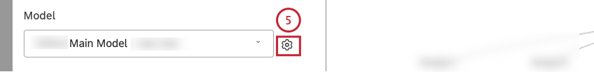
You can edit object viewer – model widget properties in the Properties tab. For information about adding a widget, please see Adding a Widget.
Visualization Tab
You can define report settings in the Visualization tab.

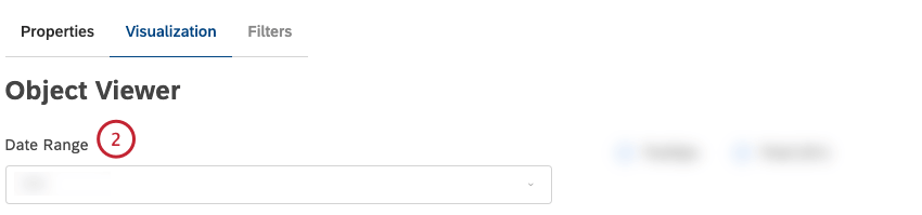
Qtip: Unless you set your widget to ignore the dashboard date range, the dashboard date range completely replaces the Date Range defined here.
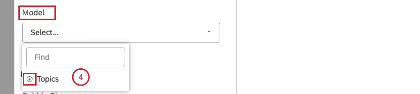
Qtip: Click the plus ( + ) icon to view more options.
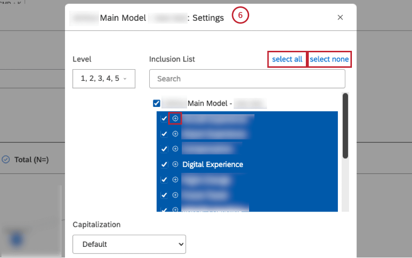
Qtip: Click the plus ( + ) icon to view more options.
Qtip: Click select allto select all topics or click select none to deselect all topics.
- Horizontal: Arrange items along the horizontal axis.
- Vertical: Arrange items along the vertical axis.


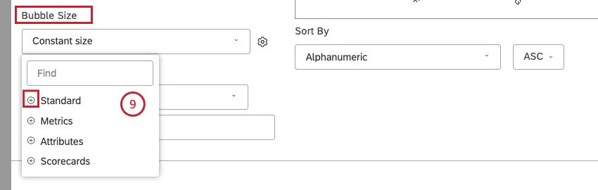
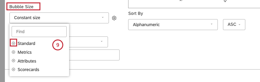
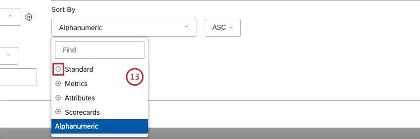
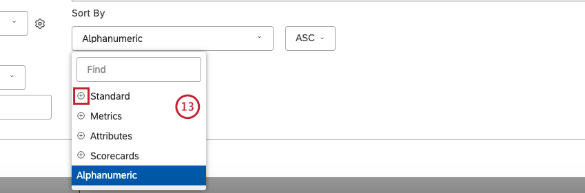
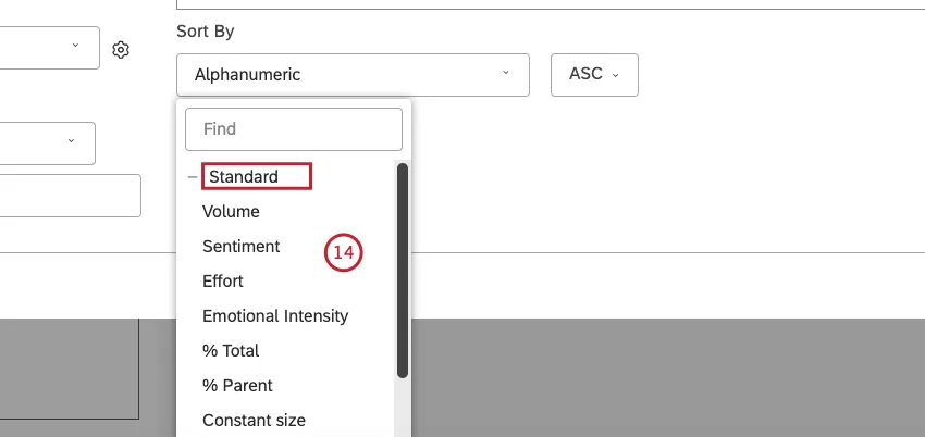
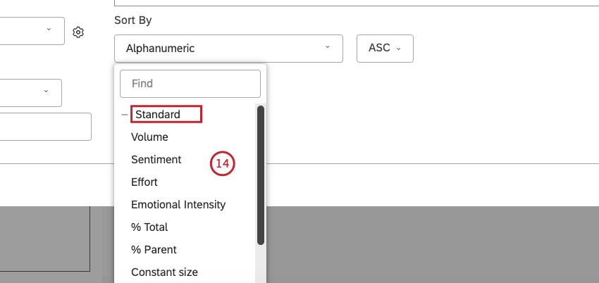
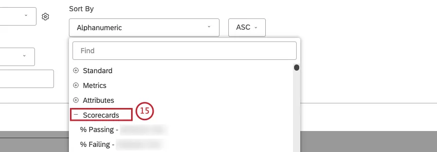
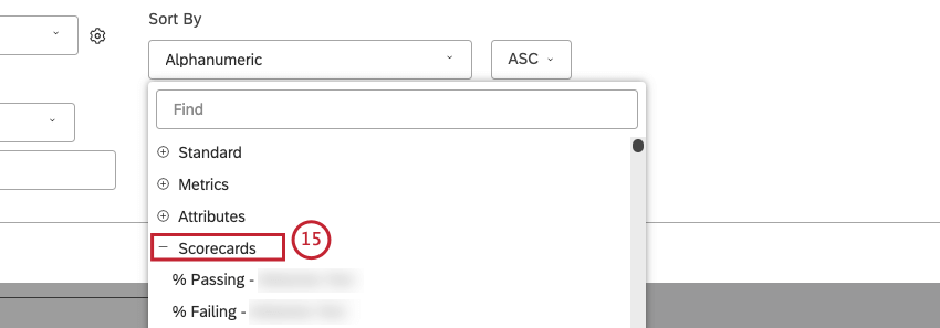
- Standard: Sort by Volume, Sentiment, Effort, Emotional Intensity, % Total, % Parent or Constant Size. More information about this calculation is in step 13.
- Metrics: Bubble size reflects the value of various out-of-the-box and custom metrics.
- Attributes: Bubble size reflects the calculated value of a selected attribute.
- Scorecards: Bubble size reflects the percentage of documents that pass or fail a selected rubric’s criteria.
 Qtip: Click the plus ( + ) icon to view more options.
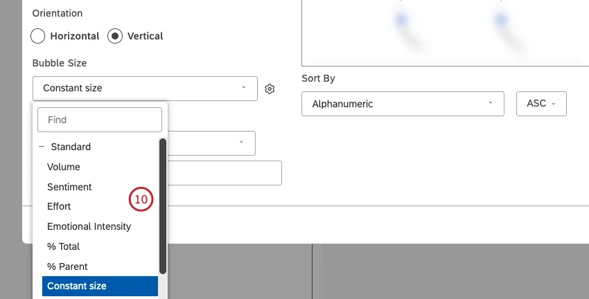
- Volume: Bubble size reflects the number of related documents.
- Sentiment: Bubble size reflects the average sentiment of sentences from related documents.
- Effort: Bubble size reflects the average Effort score of sentences from related documents.
- Emotional Intensity: Bubble size reflects the average strength of emotions expressed in related documents.
- % Total: Bubble size reflects the grouping’s volume contribution to the widget’s total volume.
- % Parent: Bubble size reflects the grouping’s volume contribution to its parent grouping’s volume.
- Constant size (default): Make all bubbles the same size.
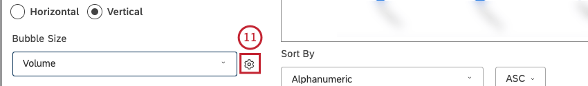
 Qtip: You can additionally adjust the overall bubble size by clicking the cog icon and selecting a number from 10 (largest size) to 1 (smallest size). The default size is 8.

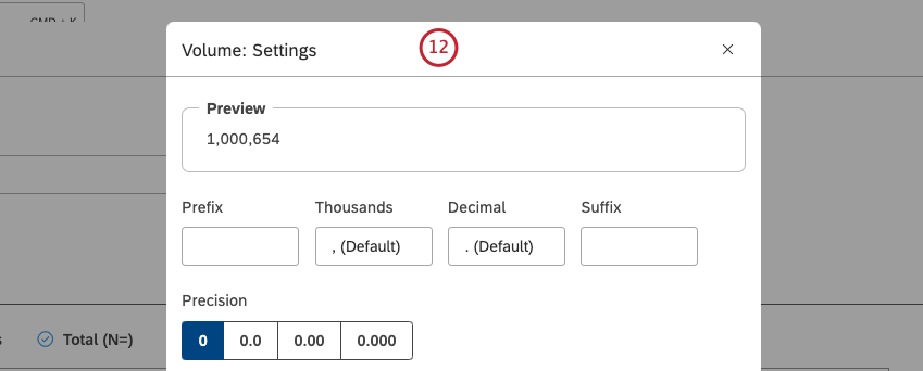
Qtip: Select the Use default metric formatting option to use the formatting defined in metric’s advanced options. This option is available only for filtered or custom math metrics.
- Standard: Sort by Volume, Sentiment, Effort, Emotional Intensity, % Total or % Parent.
- Metrics: Sort by a metric defined in Studio.
- Attributes: Sort by averages of a numeric attribute.
- Scorecards: Sort by the selected scorecard outcomes.
- Alphanumeric: Sort primary groupings alphanumerically, using the natural order.
- Model Display Order: Sort based on the display order of the topic model in Designer.
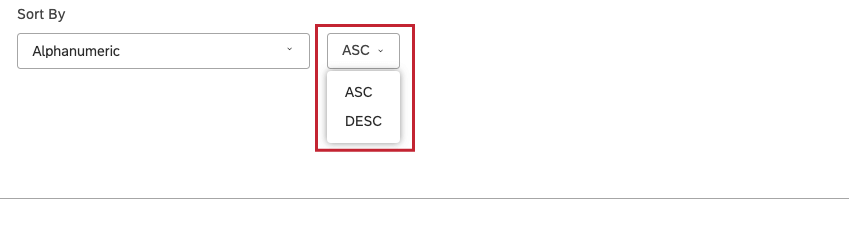
 Qtip: Click the plus ( + ) icon to view more options.Qtip: Select ASC to apply ascending sorting or select DESC to apply descending sorting.

- Volume: Sort by the number of documents related to the selected groupings.
- Sentiment: Sort by the average sentiment of sentences from documents related to the selected groupings.
- Effort: Sort by the average Effort score of sentences from documents related to selected groupings.
- Emotional Intensity: Sort by the average Emotional Intensity of sentences from documents related to selected groupings.
- % Total: Sort by the volume percentage in relation to a report’s total.
- % Parent: Sort by the volume percentage in relation to a parent item.
- % Passing – [rubric name]: Sort by the percentage of documents that passed the selected rubric’s target.
- % Failing – [rubric name]: Sort by the percentage of documents that failed the selected rubric’s target.
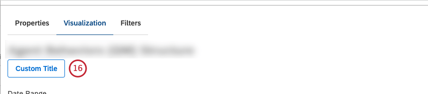
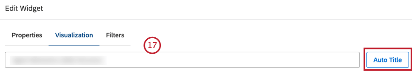
Qtip: Alternatively, click Auto Title to keep the automatically generated report title.
Filters Tab
In the Filters tab, you can further narrow down report data.
For information on widget filters properties, please see Applying Filters to a Widget.
Using the Model Viewer
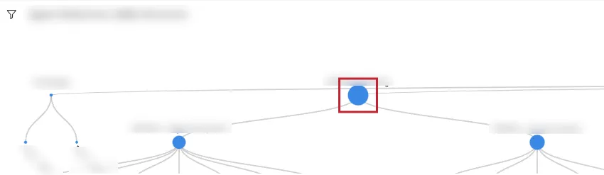
After you add a model viewer widget to your dashboard, you can navigate the model’s hierarchy and use drilling:
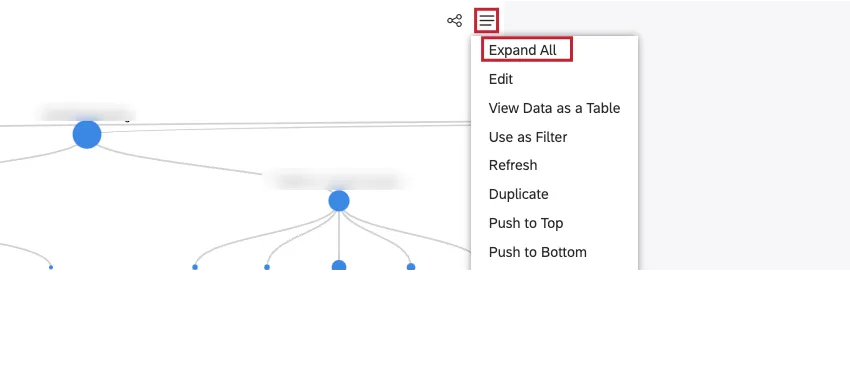
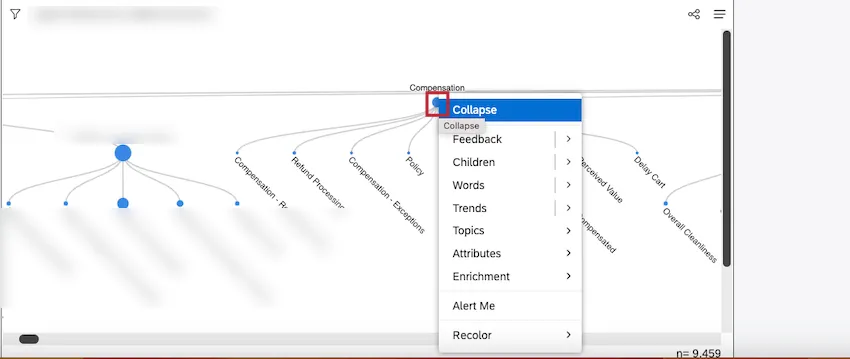
- To collapse or expand an entire tree: Click the root node of the model.
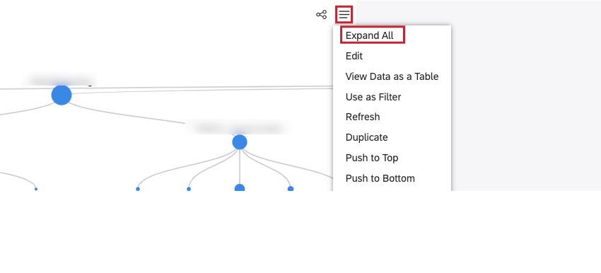
 Qtip: Alternatively, you can click the Widget Options menu in the top-right corner of the widget and click Expand All to show an entire tree.
- To collapse or expand a topic group: Click a specific topic group to hide or show its subtopics.
- To open a drilling menu: Right-click a topic node.
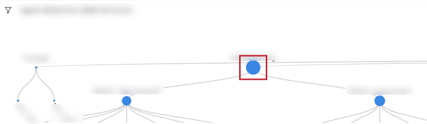

Left-click behavior depends on the item you click:
- Expanded topic group: Collapse the topic group.
- Collapsed topic group: Expand the topic group.
- Topic leaf when widget is not used as filter: Filter child widgets by this topic.
Adding an Object Viewer – Rubric Widget
Qtip: Click Ok at the bottom-right of each of the Properties, Visualization and Filters tabs to apply the settings in each of these tabs, and then click Save at the top of the dashboard.
Properties Tab
You can edit object viewer – model widget properties in the Properties tab. For information about adding a widget, please see Adding a Widget.
Visualization Tab
You can define report settings in the Visualization tab.
Qtip: The widget’s title always displays the name of the rubric.

Qtip: Unless you set your widget to ignore the dashboard date range, the dashboard date range completely replaces the Date Range defined here.
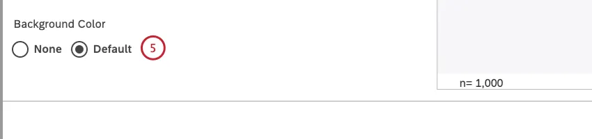
- None: To use a transparent background.
- Default: To use a standard widget background (white).

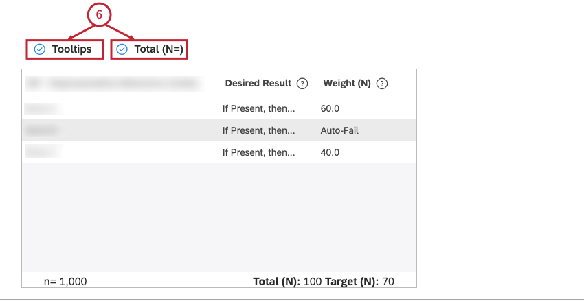
- Tooltips: To show tooltips next to column headers. Deselect the Tooltips checkbox to hide these tooltips.
- Total (N=): To show the total number of documents scored by the rubric. Deselect this checkbox to hide this total.
For more information on document volume, see Displaying Total Volume on Widgets (Studio).
 Qtip: This widget ignores all filters.
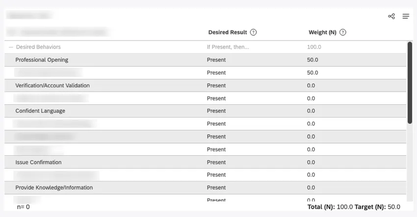
Using the Rubric Viewer Widget
Rubric details update dynamically when any change is made to the rubric. For any enabled rubric, this widget shows the following information:
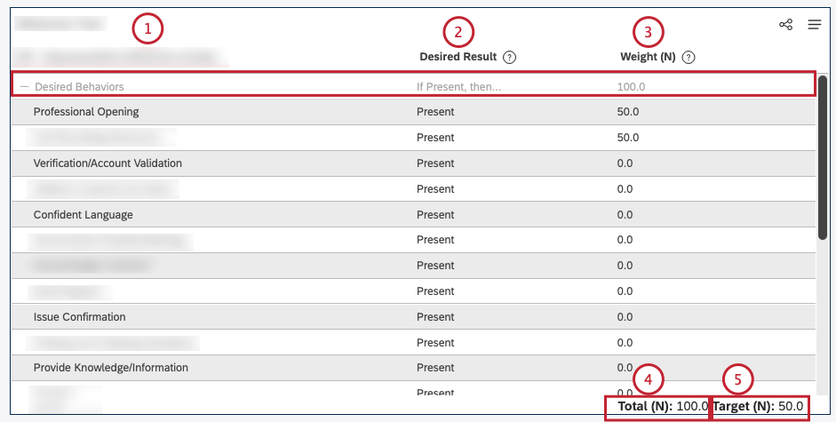
Qtip: All non-score-bearing node rows are grayed out, including topic name, desired result, and weights.
Qtip: Viewers can switch between normalized and raw values.
Qtip: Scores displayed in reporting widgets show normalized values only.
Qtip: Viewers can switch between normalized and raw values.
Qtip: Scores displayed in reporting widgets show normalized values (that is, Total = 100).
Qtip: Viewers can switch between normalized and raw values.
Qtip: Scores displayed in reporting widgets are based on normalized targets (that is, Target (N) / 100).
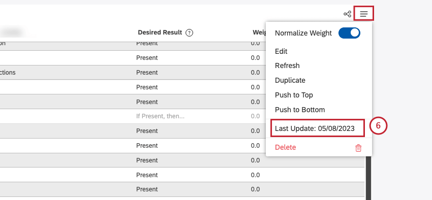
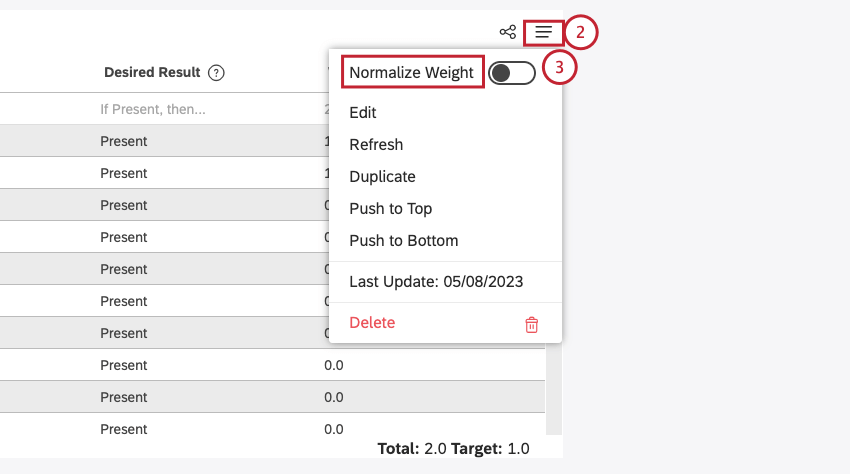
Switching Between Normalized and Raw Weight
By default, when you add a rubric viewer widget to your dashboard, the weights assigned to each topic, as well as the total and target values, are shown as normalized values. Viewers can switch between raw and normalized weights.
That's great! Thank you for your feedback!
Thank you for your feedback!