
Results-Reports Breakouts
What's on this page
Qtip: There is a new version of Results available. To opt in to the new Results Dashboards, navigate to the Results tab and click Try it now.

About Breakouts
You can group your visualizations by multiple questions or fields using breakouts. For example, demographic questions for age, income, or gender can be used to filter other questions. Breakouts let you do some fun things:
- Breakout a visualization’s data
- Create a Time Series
- Apply a Report Breakout
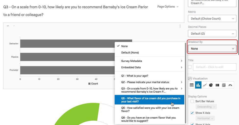
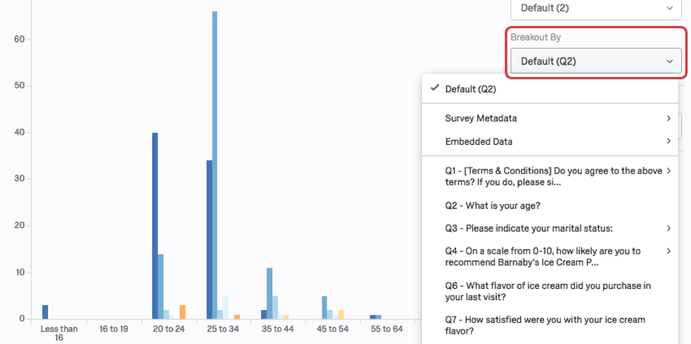
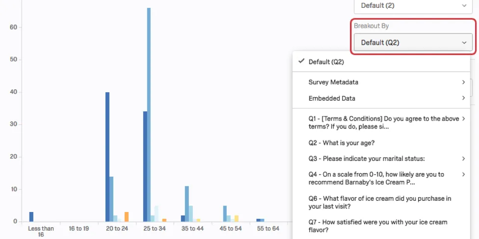
Breaking out a visualization creates groups based on the question, using the data source for the values and legend. To break out a visualization by another question or information field:
Sometimes you may not see a data variable as an option because that variable type is not compatible with breakouts (e.g., a Text variable). If your Embedded Data field was automatically assigned the wrong variable type (and thereby can’t be used for a breakout), you can do the following to remedy the situation:
Removing Breakouts
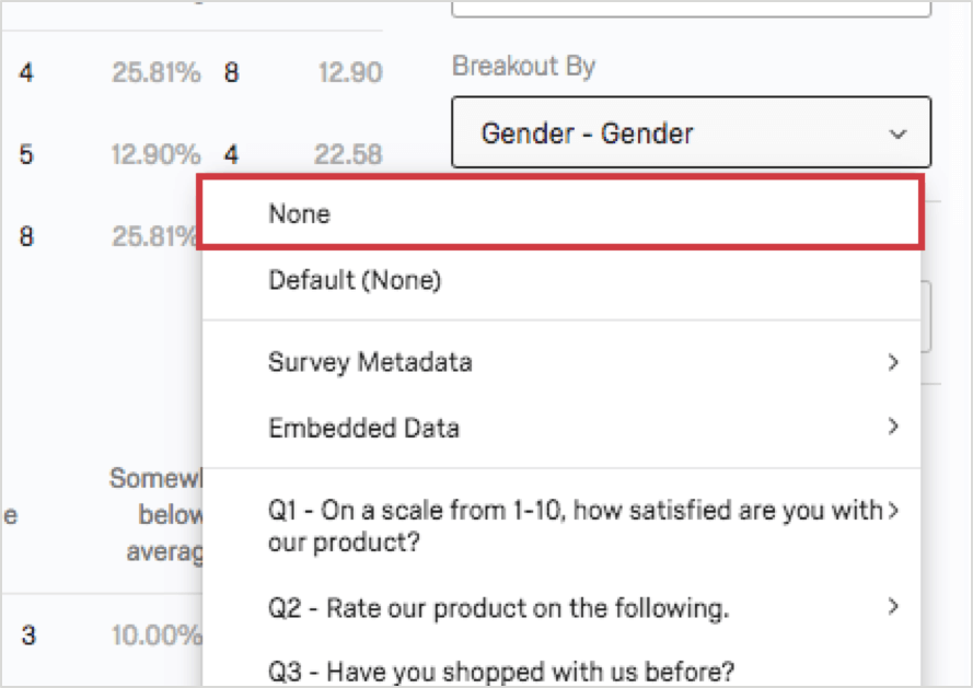
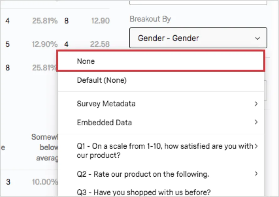
To remove the Breakout, click the dropdown and select None.
You can only add one breakout at a time to a visualization.
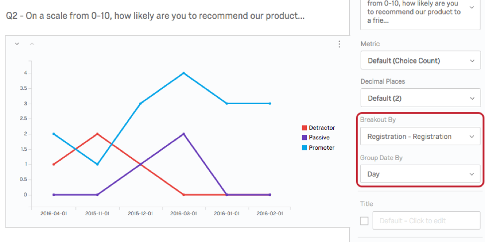
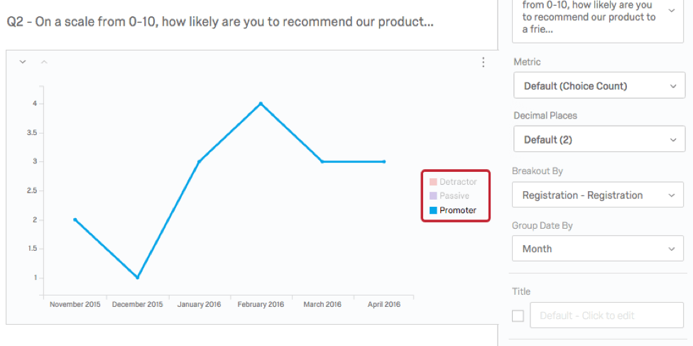
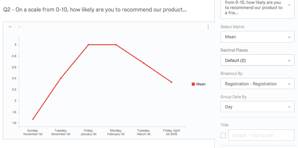
Create a Time Series
If you are interested in trends over time, use Breakout By to create a time series.
For example, to create a time series for a support satisfaction question:
Applying a Report Breakout
Rather than applying a breakout to one visualization, you can apply it to the entire report. To do this:
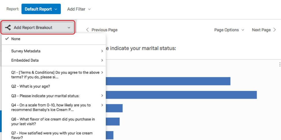
Adding a report breakout applies to compatible visualizations across your report. You can still make changes to specific visualizations after applying a report breakout.
Compatibility
The following visualizations are compatible with breakouts:
FAQs
Can I break down the information in a visualization into groups based on other data?
Can I break down the information in a visualization into groups based on other data?
See Breakouts for Advanced-Reports or Breakouts for Results-Reports, depending on the reporting you are using.
That's great! Thank you for your feedback!
Thank you for your feedback!