
Period Over Period Reporting (Studio)
Suite
Customer Experience
Product
Qualtrics
What's on this page
About Period Over Period Reporting
Period over period reporting lets you compare 2 similar time periods in the same widget. This is a setting available in both line and bar widgets.
Creating Period Over Period Reporting
Edit or create a line or bar widget.
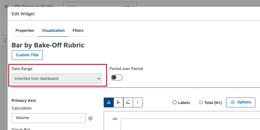
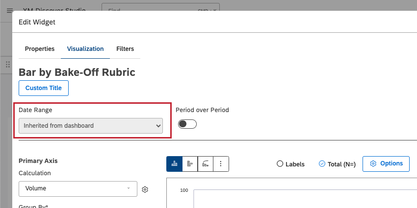
Set a Date Range for your widget.

Qtip: If you have a dashboard-wide date range filter applied, you may see Inherited from dashboard. Unless you set your widget to ignore the dashboard date range, the dashboard date range completely replaces the date range defined in the widget. The Historical Period will dynamically adjust based on what the dashboard filter is set to.
Group the data by a time attribute and time scale of your choice.
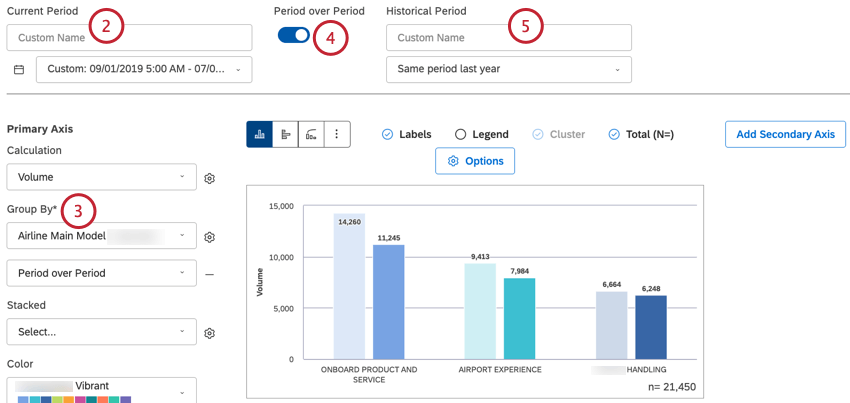
Select Period over Period.
Under Historical Period, select a time period from the dropdown. For an explanation of all the options available, see Date Range Filters.
Qtip: The historic period cannot be shorter than the Group By time scale.
Your historic period will be automatically set to the Series on your widget.
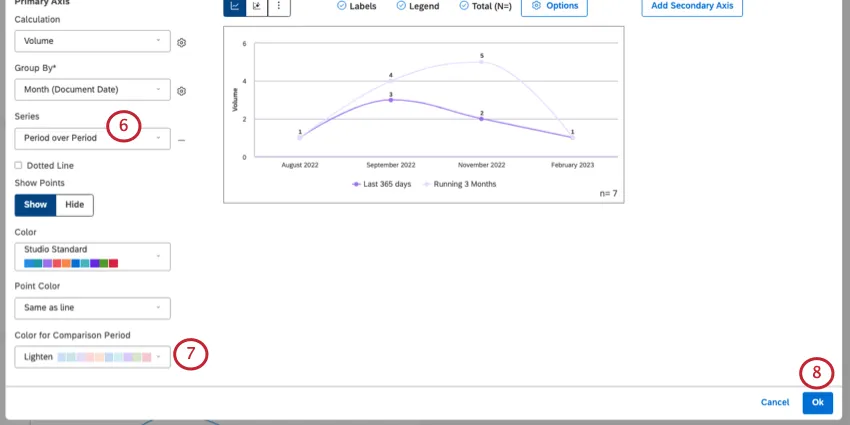
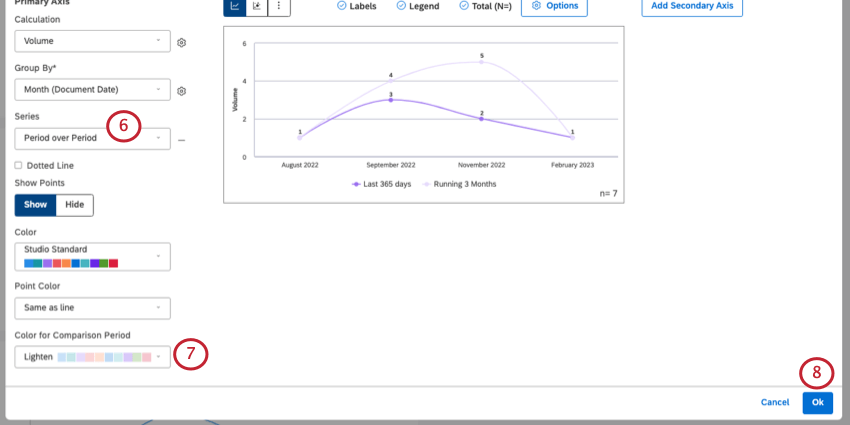
You can customize the color of the historic period with Color for Comparison Period.
Click Ok to save your widget.
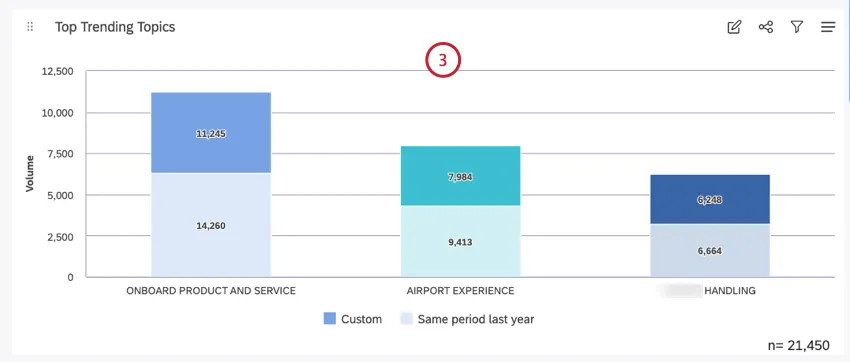
Side-by-Side vs. Stacked Bar Charts
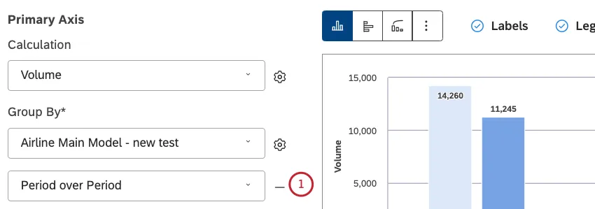
When you enable period over period reporting in a bar widget, the secondary grouping is set to Period over Period by default. This lets you compare historic and current periods side by side.

If you want to stack the comparison periods instead, do the following:
Remove this secondary grouping using the minus sign ( – ).

Under Stacked, select Period over Period.
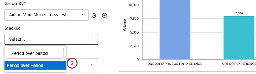
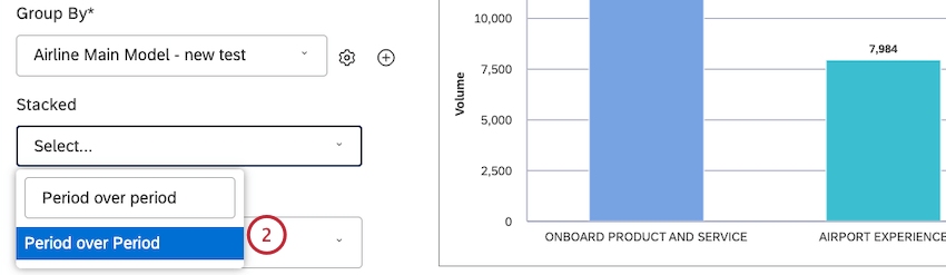
Your bar chart is now stacked.

Sorting by Multiple Groupings
When a widget has only one grouping added to it, it’s clear what order the different data points are being sorted in. But as you add more groupings to a widget, there’s more data to consider.
Here’s the order groups are sorted by in period over period reporting:
- Side-by-side comparisons: Sorting is based on the current period.
- Stacked comparisons: Sorting is based on the sum of current and historic periods. Qtip: Usually we sort stacked columns by their parent calculation value (see Stack Size for details). However, there is no “parent” calculation in case of period over period stacking, which is why we add them together in this case.

That's great! Thank you for your feedback!
Thank you for your feedback!