
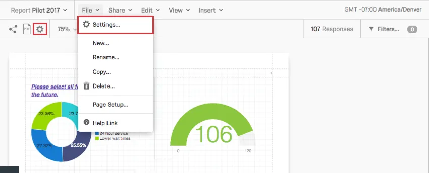
Global Advanced-Reports Settings
What's on this page
About Global Settings
You can adjust global settings for the font color, font size, margins, and other aesthetic features for your whole report.
To adjust the global settings for a report, go to one of the following:
The information on this page applies to both survey advanced-reports and 360 reports unless otherwise specified.
Qtip: These settings automatically apply to visualizations you haven’t edited. Once you edit a visualization, global settings will no longer apply to it.
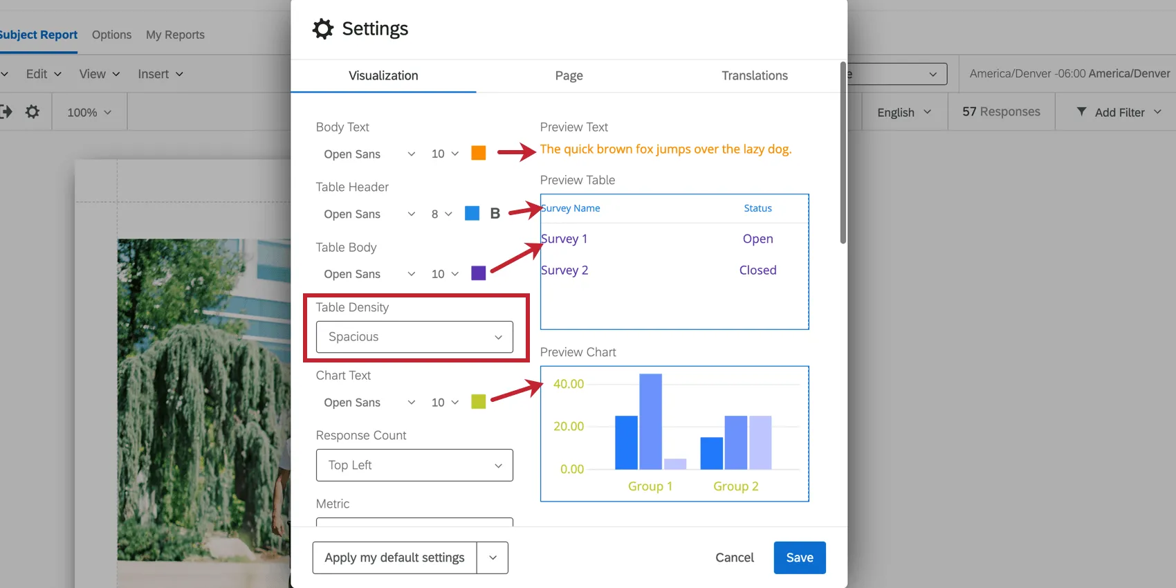
Visualization Tab
On the Visualization tab, you can adjust global settings for visualizations. This affects their default font, decimals, colors, and margins. As you make adjustments, the visualizations on the right of the window will adjust, so you can preview your changes before saving them.
Fonts and Table Density
For each portion of the report, you can adjust the font face, the font size, and the font color. For table headers, you can also make the font bold, if desired.
Click the corresponding dropdown to change the font face or size.
Qtip: Changes made to the Body Text Format apply to the global header and footer, in addition to any text areas you might insert into the report.
You can also adjust the Table Density to determine how close or far apart the text in a table is.
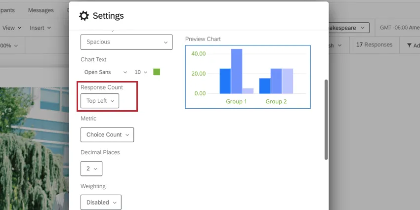
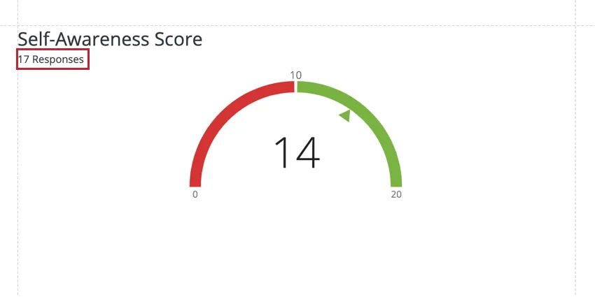
Response Count
This option is only available in 360 reports. The Response Count displays how many responses make up the data in a given visualization. You may choose to show the response count in either the top left or top right corner of your visualizations, or choose to hide the response count altogether.
Metric
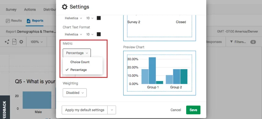
Change what metric appears in your visualizations by default.
Choice Count is the number of times each choice was selected by a respondent. For answers where the respondent can choose more than one answer, this may mean the numbers add up to more choices made than people who responded.
Percentage is the percentage a choice makes up of all the choices in a question. Like Choices Count, this is also based on the number of choices made, not the number of respondents.
Decimal Places
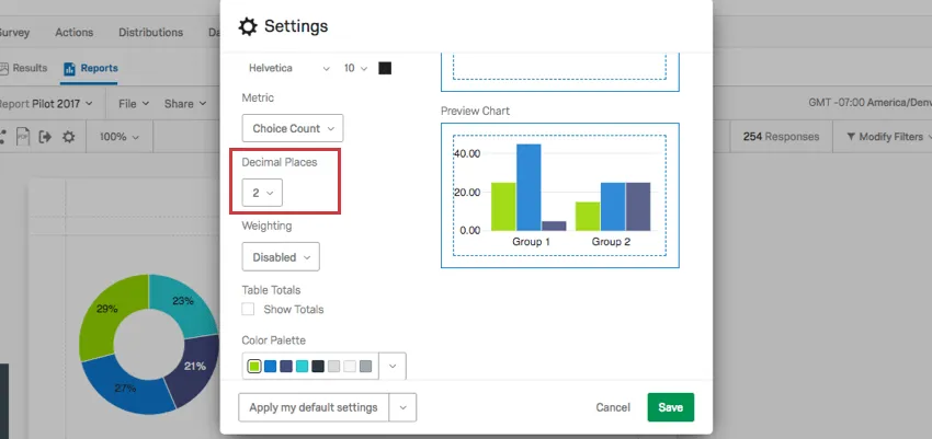
The Decimal Places dropdown allows you to choose how many decimal places display with your numeric data. This setting affects both charts and graphs.
Weighting
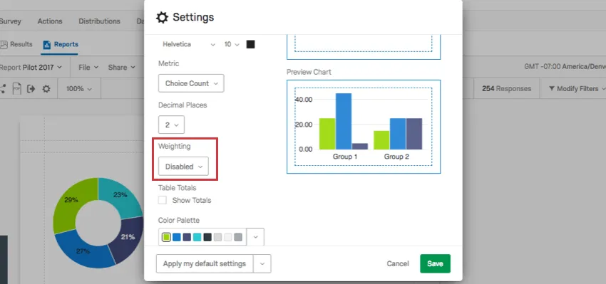
This option is not available in 360 reports. If you have set up Response Weighting, determine if you will use the weighted values in your report or if you will use the unweighted data.
Select Disabled to use unweighted data in the report. Select Enabled to use the weights.
Table Totals
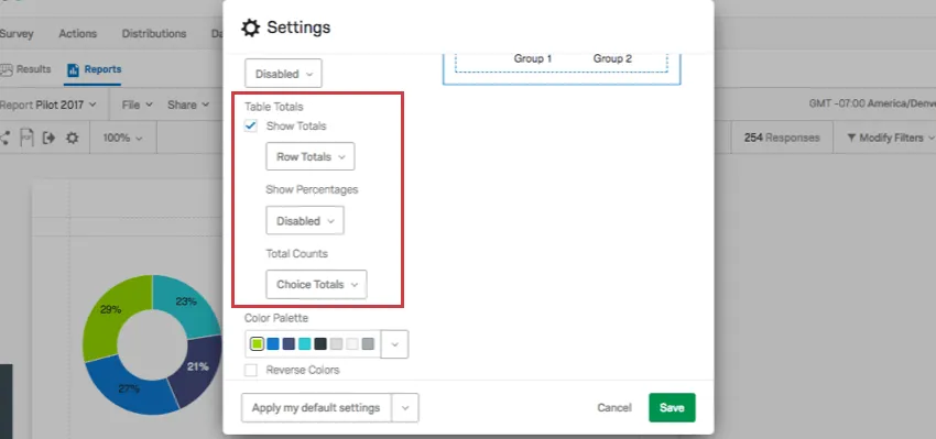
Table Totals allow you to calculate and display the total sum of each row or column in a Data Table visualization. When deselected, you will not be able to add Table totals.
Below are the options included when you enable Table Totals.
- Show Totals: Decide between totals being displayed for rows or columns.
Show Percentages: Decide if you would like to display percentages next to each value in a data table.
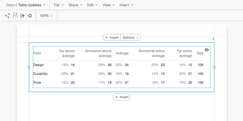
- Total Counts: This option is useful if you are reporting on a multiple select-style question, where respondents can choose multiple answers.
- Choice Totals: Base data on the number of choices. This can add up to more than the number of respondents because respondents can choose multiple answers for one question.
- Respondent Totals: Base data on the number of respondents. This will only ever add up to the number of respondents who answered the question. If the respondent skipped a question, then this number may be less than the number of completed responses you’ve received.
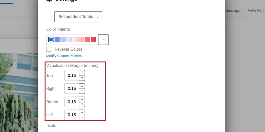
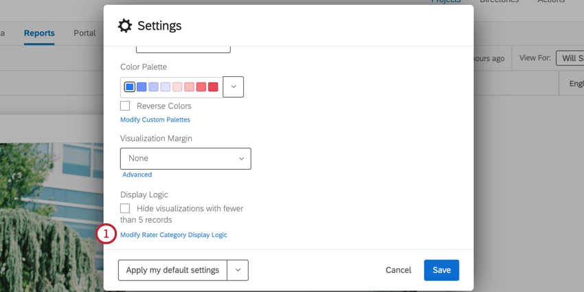
Visualization Margin
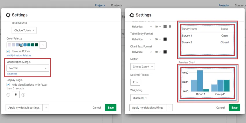
Under Visualization Margin, you can select how much space appears between one visualization and the next. These margins are represented by solid and dotted blue lines around each chart and graph. These lines only appear to you when building your report, and will not appear in exports or print outs.
Your options include None, Compact, Normal, and Spacious.
To precisely set your margin dimensions, click Advanced below your margin settings. You can then specify the default margin on each side of your visualizations.
Display Logic
Qtip: This is not the same as Display Logic in the survey editor.
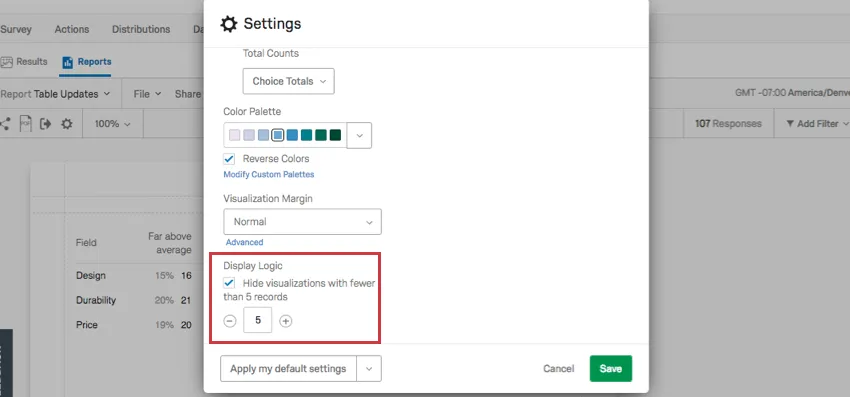
Display logic can be found in the Visualization tab. When selected, display logic lets you set the default anonymity threshold of your report. Determine how many people must answer a question before the visualization appears in the public link to the report. (This data will remain in PDF exports.)
This feature is important in making sure no one knows who answered what. If there’s no display logic set and Barnaby is the only person to answer the survey, everyone who looks at the report will know what answers Barnaby gave to the survey.
Qtip: For 360 reports, check out Rater Category Display Logic for information about how to limit data being shown based on the relationships of the submitted evaluations.
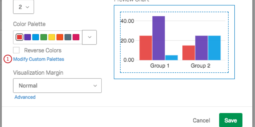
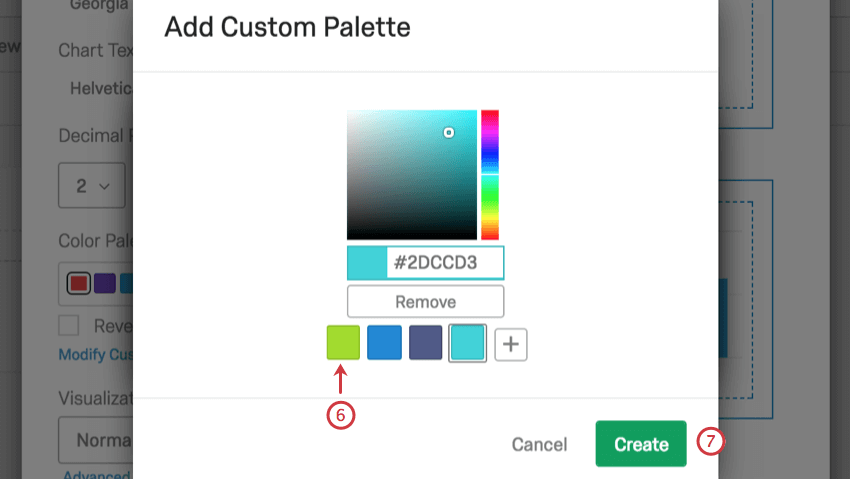
Color Palette
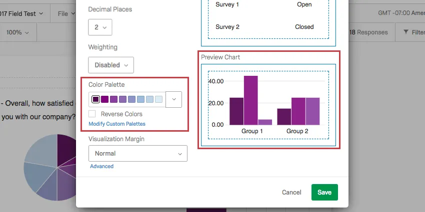
Click the dropdown to select the colors you want your chart visualizations to appear in by default.
Select Reverse Colors to reverse the order the colors in the palette appear.
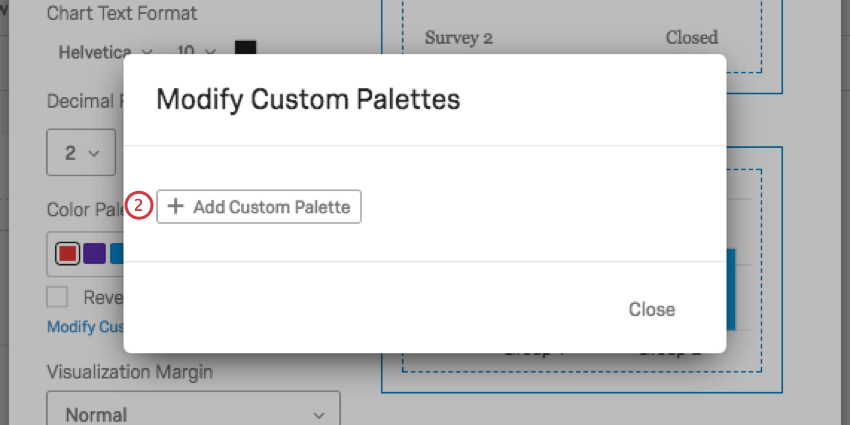
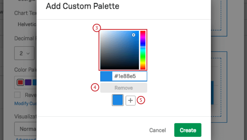
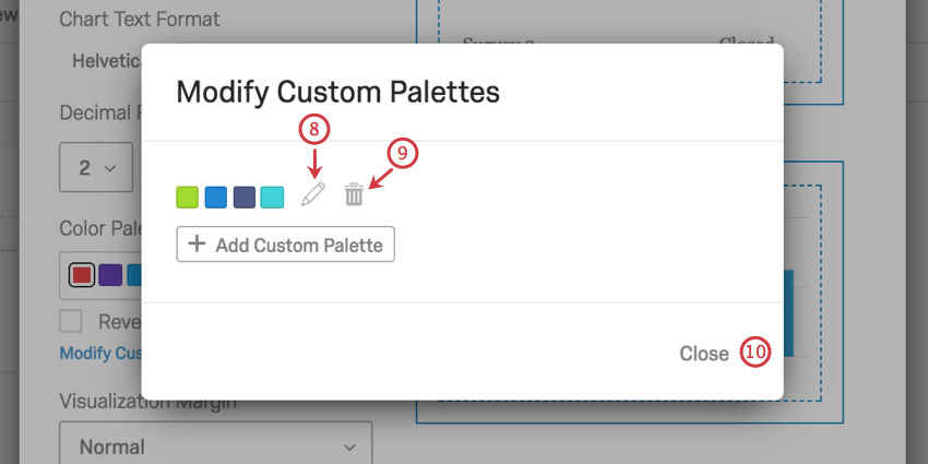
Modifying Custom Palettes
In addition to choosing from preset color palettes, you can create your own custom palette to use in your reports.
Default Settings
It can be a hassle to edit your colors, fonts, and visualizations over and over again. Global Settings help you create a standard style for your whole report, but what about when you create a new report? Do you have to start editing your global settings all over again?
Thanks to Default Settings, you can choose your favorite global settings for reuse over and over again. Any new reports you create will take on your personalized default settings, and you can easily switch old reports over.
Applying Default Settings
When you click the default settings dropdown arrow, you have three options:
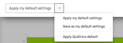
- Save as my default settings: Allows you to save changes you’ve made on this window as personalized default settings. This option does not apply changes to the report you’re working on, but saves them for reuse. These default settings will be applied to new reports you create.
- Apply my default settings: Apply the default settings you saved earlier.
- Apply Qualtrics default: Go back to the default Qualtrics settings.
Page Tab
The Page tab on the global settings window allows you to adjust how the report will appear when printed or saved as a PDF.
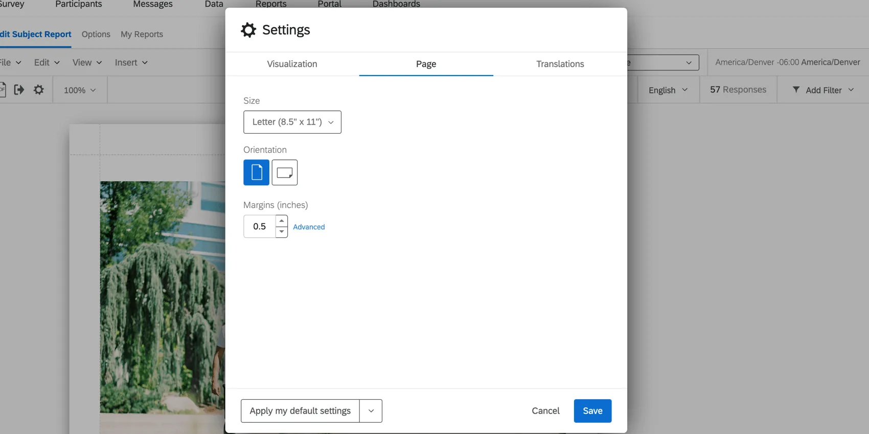
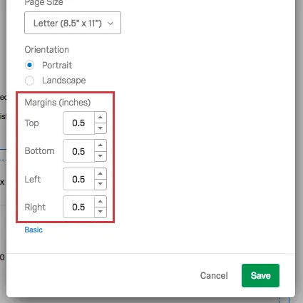
- Page Size: Decide the size of paper that each page of your report should fit on when printed. Letter is standard printer paper size.
- Orientation: Decide the orientation of the page. Portrait is standard.
- Margins: Decide the size of the margins. By default this is in inches, but you can change it to centimeters in the Locale or Translations tab.
Qtip: If you click Advanced on your margins, you can determine the margins on the top, bottom, and sides of the page independently.
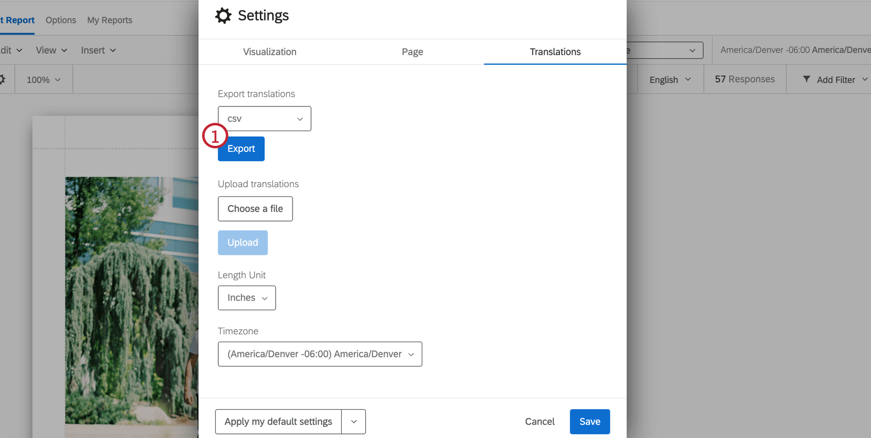
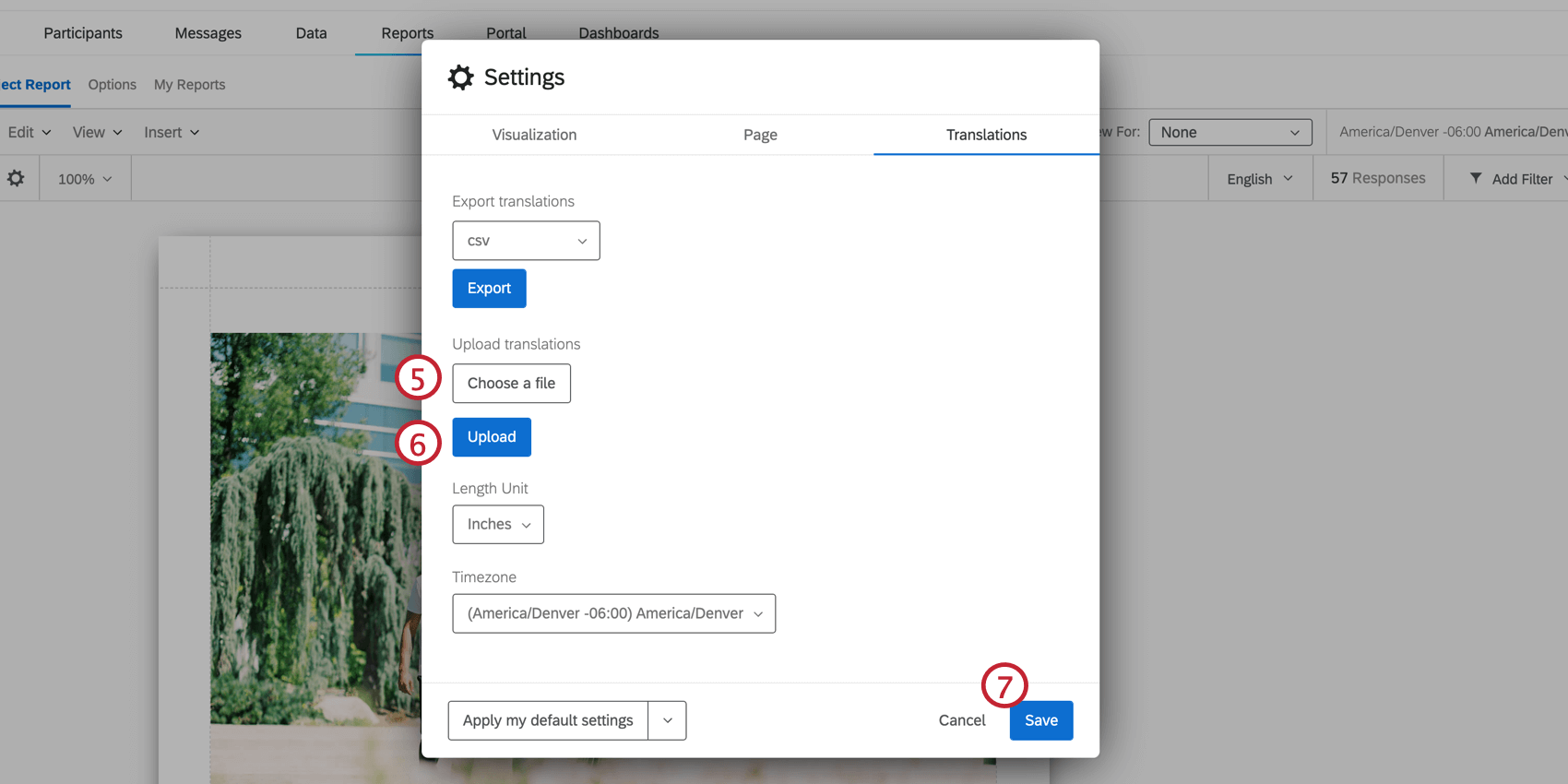
Translations Tab
Qtip: The Translations tab is only available for 360 reports.
The Translations tab allows you to make changes for language, default measurements, and time zone.
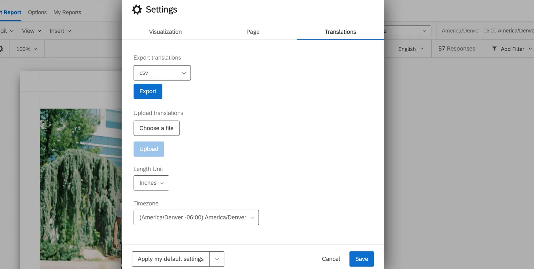
- Export translations: Click Export to export the translations from the subject report to the file type indicated in the dropdown. More information can be found on our Translating a Survey page.
- Upload translations: Upload a translation file to add a translation to your report. More information can be found on our Translating a Survey page.
- Length Unit: The default unit used to measure margins in your report.
- Timezone: The time zone of your report. If you adjust filters based on time, they will obey this global time zone rather than the time zone in your account settings.
Uploading 360 Subject Report Translations
For a list of languages supported, see the Languages in Qualtrics page.
- See the List of Language Codes page for guidance about each language column.
- Follow the file’s exact formatting for creating your translations.
- Use the English column (EN) as a guide.
- Copy and paste to ensure formatting is correct. Do not delete or rearrange the columns, as this will cause the import to fail and translations to be lost.
- Do not delete the strings of numbers and letters – these are internal IDs that identify the parts of the dashboard you are translating.
Locale Tab
The Translations tab allows you to make changes for the report’s default measurements and time zone.
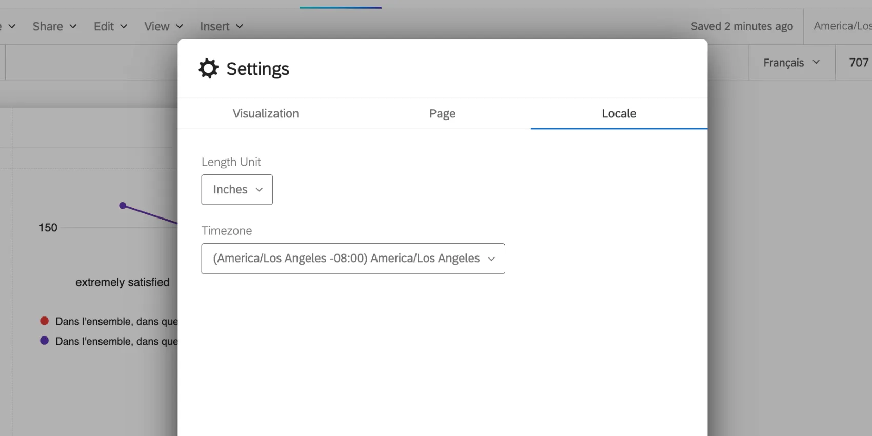
- Length Unit: The default unit used to measure margins in your report.
- Timezone: The time zone of your report. If you adjust filters based on time, they will obey this global time zone rather than the time zone in your account settings.
Rater Category Display Logic
Qtip: Rater category display logic is only available for 360 reports.
Rater Category Display Logic is used to customize the conditions under which a data source is displayed based on how many responses have been submitted by evaluators that have a specific relationship with the subject. You can set logic that allows you to hide or display a data source under specific conditions. Typically this is used to protect response anonymity when there is a low response rate. For example, if only one of the subject’s Peers respond, then the subject knows who gave the responses they’re seeing in the Peer graphs and tables. Hence, you should hide Peer data until a certain amount has been collected.
Qtip: Rater Category Display Logic only applies to widgets broken out by rater groups.
Creating Rater Category Display Logic
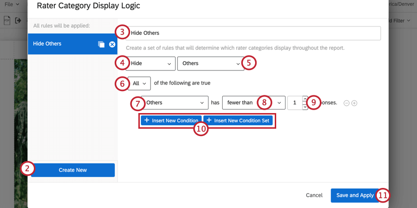
Example: If I wanted to hide manager responses below a certain threshold, I would select Manager.
Attention: You can add up to 30 conditions.
Using Multiple Rater Category Display Logic Conditions
You can create multiple rater category display logic conditions that will apply to your subject report. After creating rater category display logic conditions, they’ll be saved in the sidebar of display logic editor. You can click on a given condition set to view its conditions and edit them as needed. To remove a display logic set from your report, click the X next to the display logic’s name.
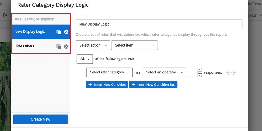
Qtip: Pressing Cancel after you create a new set of rules does not delete those rules. You must delete the rule by hitting X next to its name, then Save and Apply.
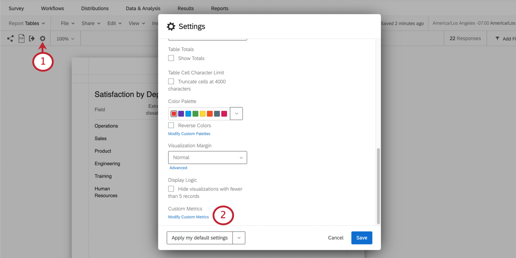
Custom Metrics
You can make your own custom metrics in reports. Using equations and existing project fields, you can create new results that can then be displayed in text areas in your report.
Qtip: Custom metrics are a great replacement for math operations in reports.
Qtip: This page is about a feature in survey reports, report templates, and 360 subject reports. This page does not refer to the CX Dashboard Custom Metrics feature.
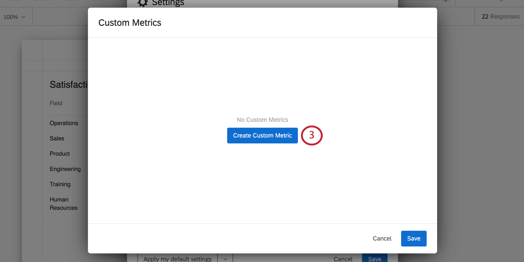
Creating a Custom Metric
This is where you can view all the custom metrics you created for this report, and create new ones.
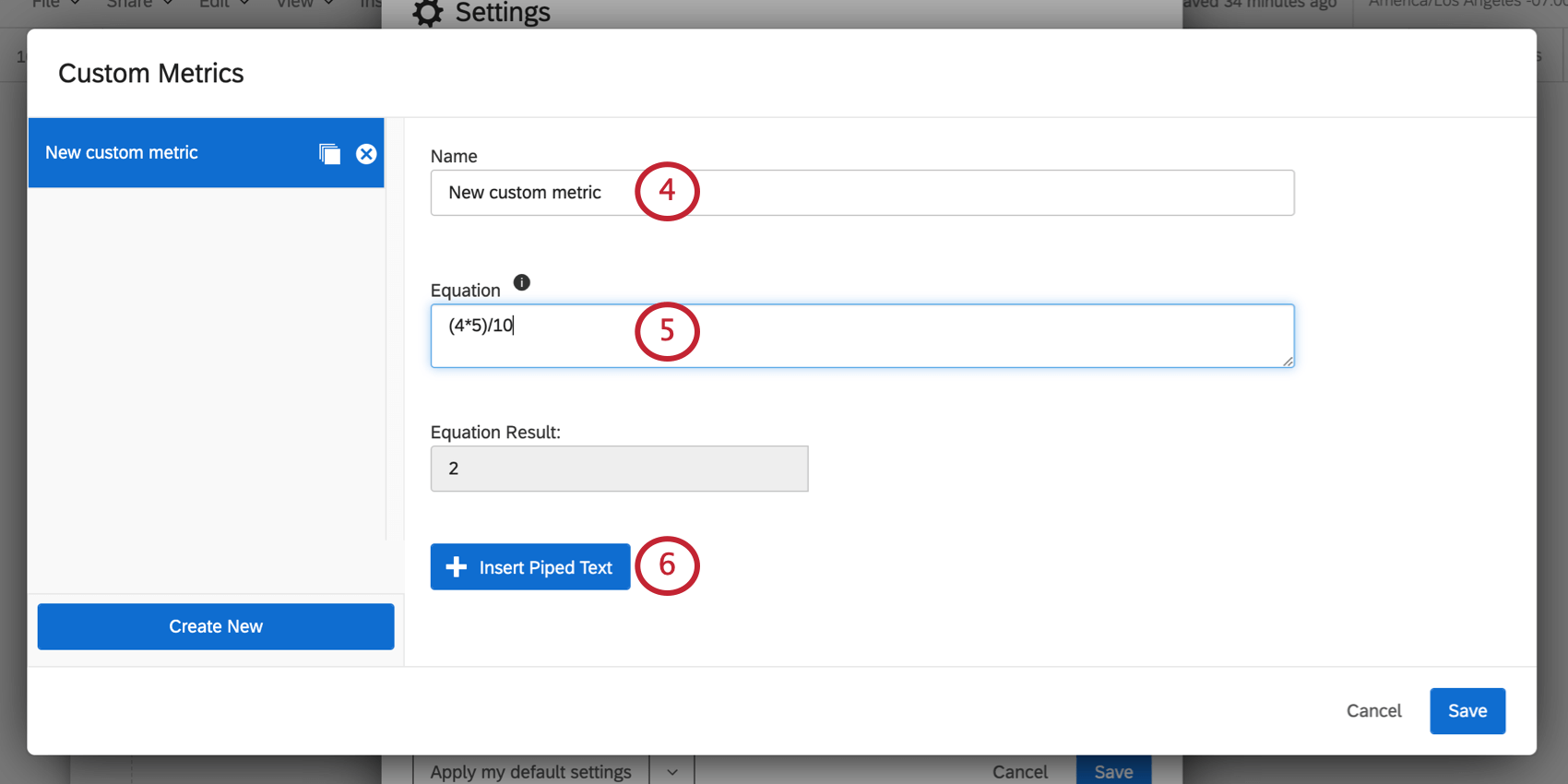
Qtip: The Equation Result field will show you the output of the equation you created, even if you insert piped text.
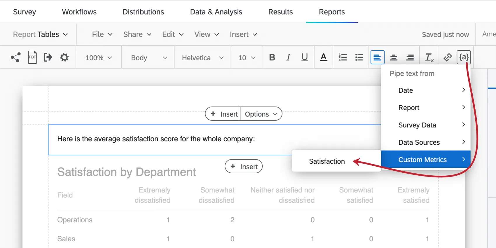
Inserting Piped Text
You can insert existing data into your metrics using piped text. This allows you to calculate new values based on data you’ve already collected.
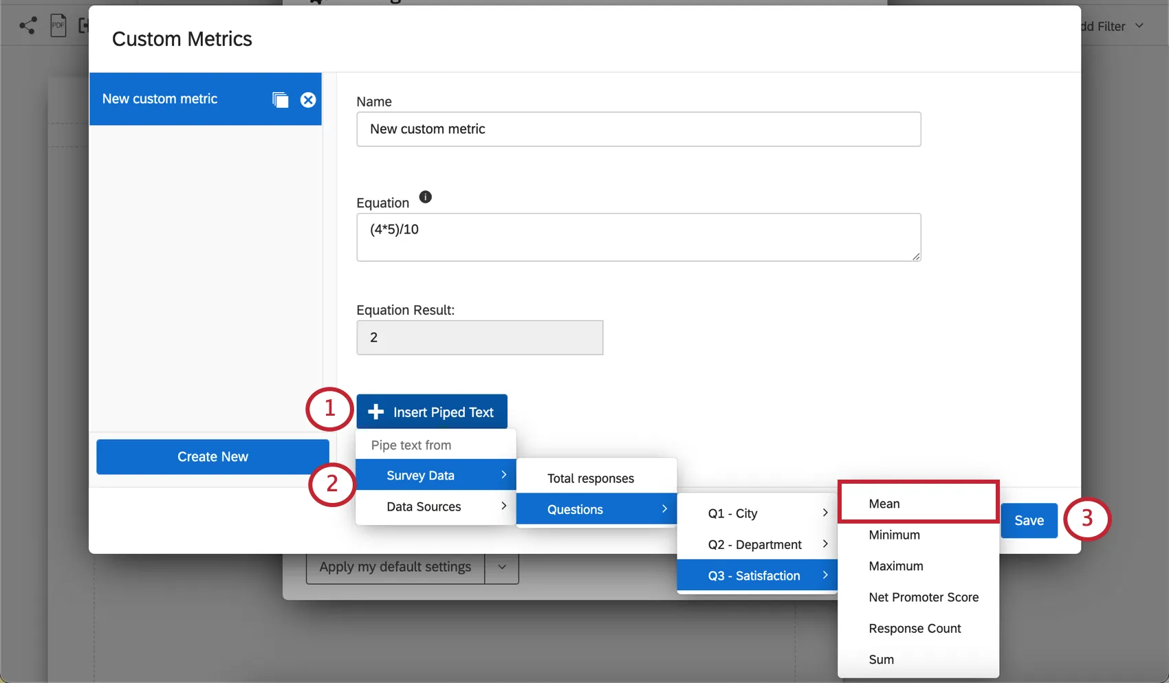
Example: In the screenshot above, we chose the same project we created the report in. We then chose the mean of the satisfaction score because we’re interested in the average satisfaction of the respondents we surveyed.
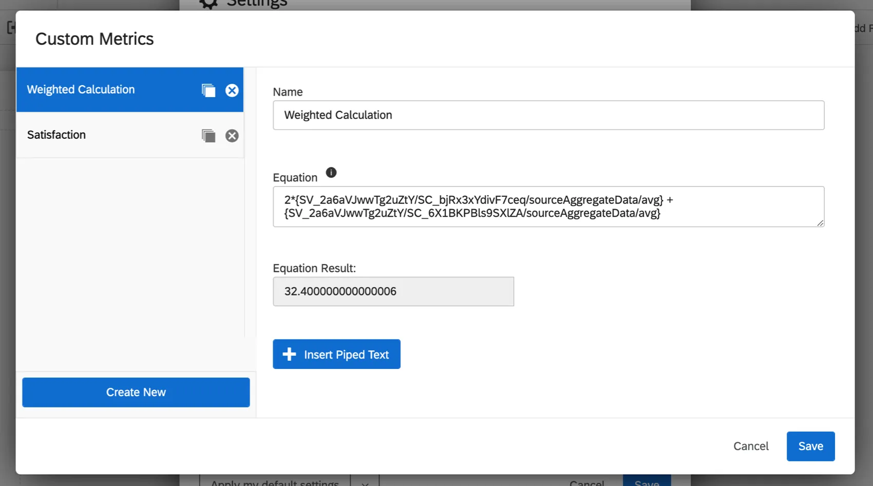
Example: We want to create a weighted calculation. We have two scoring categories we want to include: communication and openness. We want to weight the average communication score 2 times, then add it to the average openness. Here’s how we combine them in a custom metric:
Qtip: If you’re creating a custom metric in a survey project, you can only pipe values from other survey projects. If you’re creating a custom metric in a 360 project, you can only pipe values from other 360 projects, and so on.
Syntax
You can use periods for decimals (e.g., 3.14) but you cannot use commas (e.g., 100,000).
Spaces between numbers and operators do not affect the equation’s result. For example, 3 + 3 and 3+3 would have the same result of 6.
Available Operations
Addition, Subtraction, Multiplication, and Division
1 + 2 – 3 / 4 * 8 results in -3.
Parentheses
Parentheses may be added to specify order of operations.
( 1 + 2 – 3 ) / 4 * 8 results in 0.
Qtip: Custom metrics follow the standard order of operations: parentheses, exponents, multiplication, division, addition, subtraction.
Not Supported
Custom metrics do not support exponents or any other operations not listed above.
Using Custom Metrics in Reports
Click on or create a text area. Click on the text area until you see the rich content editor, then use the piped text menu ( {a} ) to select a custom metric.
Managing Custom Metrics
You can edit a custom metric’s name and equation at any time.
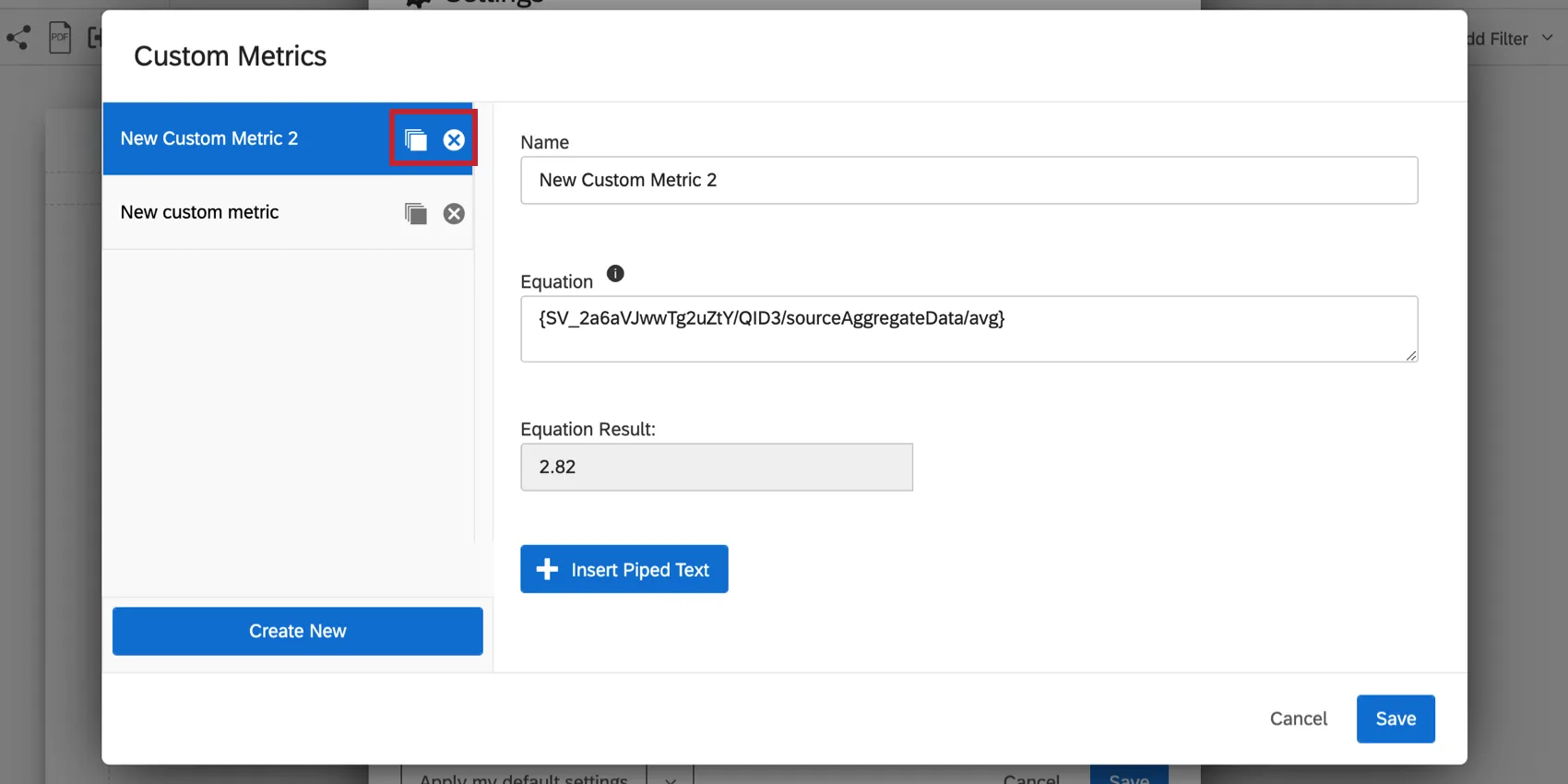
You can also copy a custom metric or click the X to delete it.
FAQs
Can I change the default settings on a report instead of editing each visualization one at a time?
Can I change the default settings on a report instead of editing each visualization one at a time?
You can learn how to change your default settings on Results-Reports on the Global Results-Reports Settings support page, and you can learn how to change the default settings for Advanced-Reports on the Global Advanced-Reports Settings support page.
That's great! Thank you for your feedback!
Thank you for your feedback!