
Survey Theming
What's on this page
About Survey Theming
Creating a beautiful survey is easy with Qualtrics survey themes. Each theme contains default colors, fonts, and styling for your survey. In the Look and feel menu, you’ll find the survey theme library, which contains all your available survey themes. In addition, your license may include custom survey themes, designed to match your organization’s branding. You’ll also find other options for customizing your survey’s theme, like changing your survey’s layout, background, and logos.
If you would like to make a custom them for your organization, and you are a Brand Administrator, check out the easy-to-use Themes tab.
How To Apply Themes
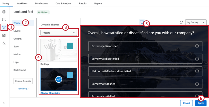
Theme Types
Dynamic Themes are a preselected combination of features that can be edited under the General, Style, Motion, Logo, and Background sections of the Look & feel editor. They offer a much more user-friendly and modern way of customizing a survey theme theme. They’re free, accessible (meeting WCAG 2.1 standards), and compatible with innovations like the New Survey Taking Experience.
Dynamic themes appear at the top of the list of available themes. If you are a Brand Administrator, you can create dynamic themes yourself that your whole organization can use.
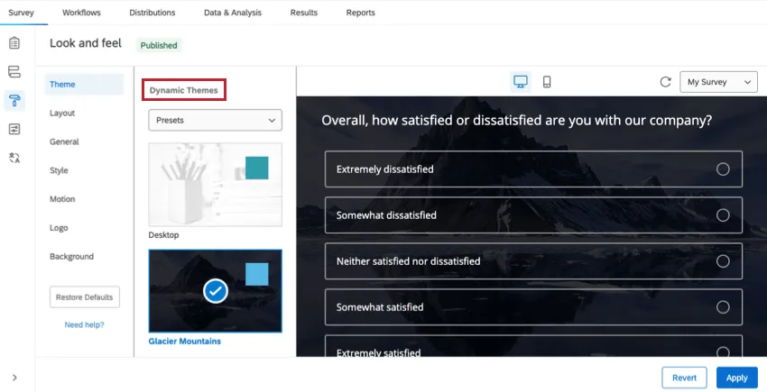
All Qualtrics preset themes are dynamic themes. Furthermore, a majority of themes you use in Qualtrics, whether branded or not, will be dynamic.
The other type of themes are static themes. Static themes are an older, legacy feature. Under Static Themes, you’ll see a list of customized themes, if anyone from your brand requested a theme in the past. You cannot edit these themes’ Layout, Logo, or Background, since those settings are built permanently into the theme’s code. However, you can still edit the header in the General section, meaning you can add logos, but not remove or change existing ones.
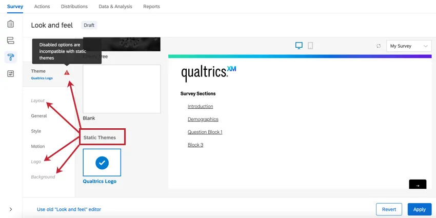
Attention: In the above image, the Layout, Logo, and Background sections are greyed out since they are incompatible with static themes. Additionally, a red alert triangle appears next to the theme name when a Static theme is selected.
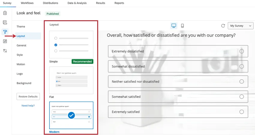
Layout
Qtip: Instead of selecting a layout, try the new survey taking experience.
Your survey’s Layout controls features that determine how your questions and other survey elements look to respondents. This includes features such as button styling, question padding, and progress bar appearance. Layouts can only be applied to dynamic themes. The four layout styles available to you are Flat, Modern, and Classic.
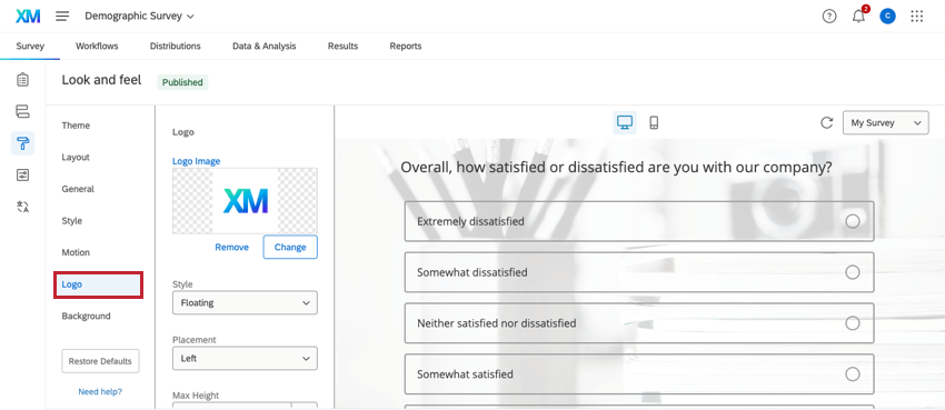
Survey Logo
The Logo section of the Look & feel menu allows you to upload an image to be used as your survey’s logo.
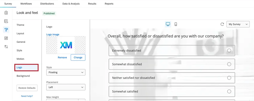
- Logo Image: See a preview of your chosen logo. Click Change Image to choose a new logo from your library. To remove your logo entirely, click Remove Image.
- Style: Decide whether the logo is Floating (default, allowing the logo to appear as is) or Banner (putting the logo on a banner background, often in the Primary Color).
- Placement: Decide where on the top of the page the logo should be positioned.
- Max Height: Determine the height of the logo. The width will scale automatically to avoid stretching.
- Mobile Scaling: Determine how you want the logo size to adjust relative to the default size. If your logo is large, it may be better to adjust this percentage lower. This setting affects both desktop and mobile views.
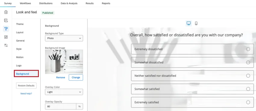
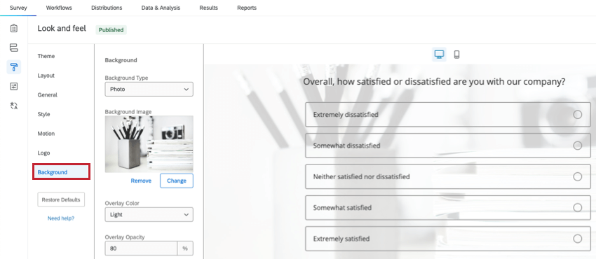
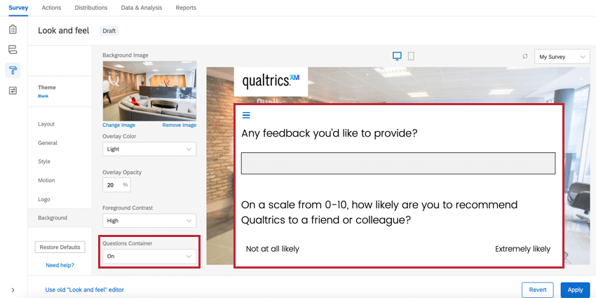
Survey Background
The Background section of the Look & feel menu allows you to customize your survey’s background. You can choose a solid color background or upload an image to be used as the background.
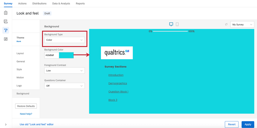
Color Background
To use a solid color background, select Color as the Background Type. Then, click the color block under Background Color to select your color. If you know the HEX color code for the color you’d like to use, enter it next to the color block.

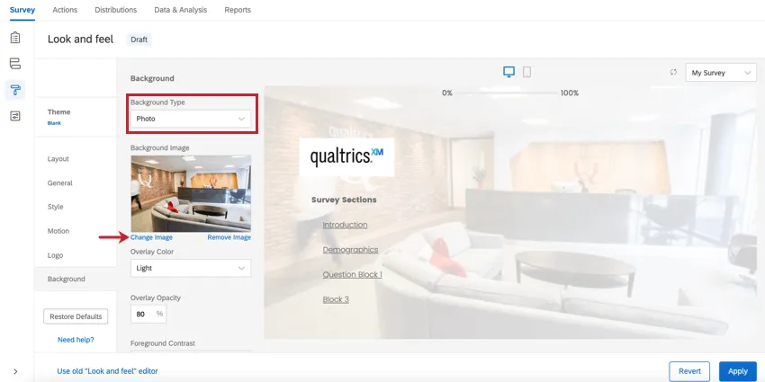
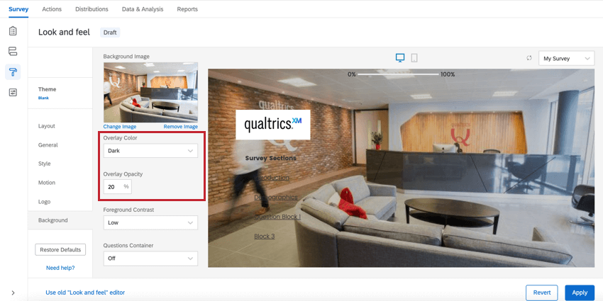
Image Background
To use an image as your survey background, select Photo as the Background Type. Click Change Image below the Background Image box and select an image from your library. Note that whatever image you choose will adjust to the screen’s size, so it’s best to choose a very large, high-resolution image.
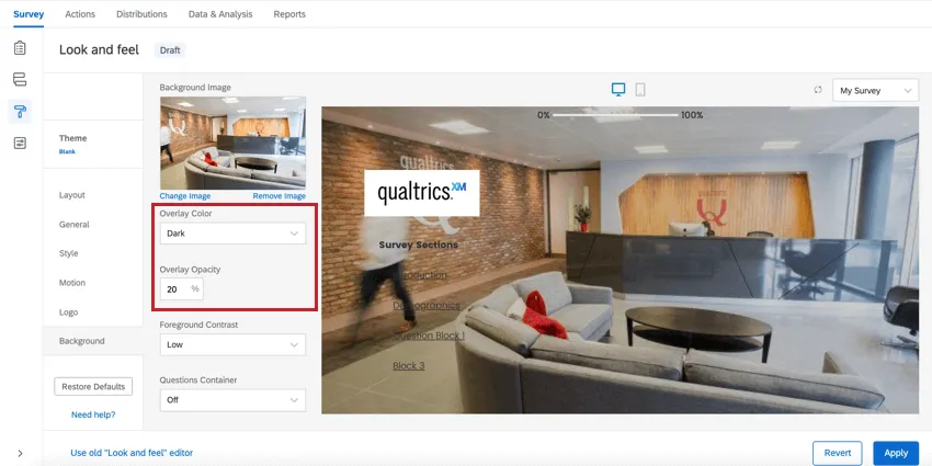
You may also select an Overlay Color, covering your background with a layer of black (Dark) or white (Light). The Overlay Opacity lets you decide how opaque or translucent the overlay is.
Additional Background Options
Regardless of background type, you can set a Foreground Contrast. To determine this, we select a gray scale color that adheres to a proper contrast ratio of 4.5, which is WCAG compliant. To increase the contrast between the text and background, change this to Medium or High. High is always white or black. We also take into account the background image and overlay color/opacity when determining the proper foreground color. This setting is the same as the foreground contrast found in the Style section.
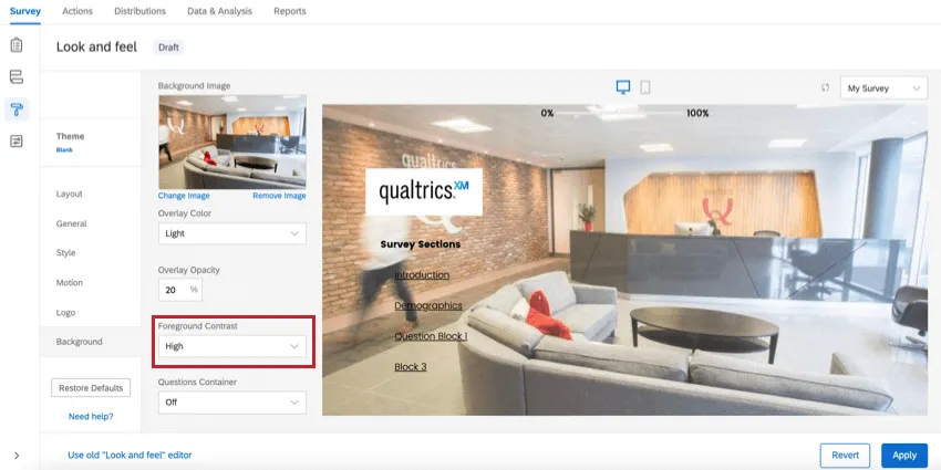
You can also set a Questions Container. This option puts whitespace around your questions. This can often be preferable for themes that have detailed photo backgrounds, and where the text is still hard to read even with all contrast options set to high.

Choosing the Best Theme
Now you know how to apply a theme. But how do you choose – or design – the right one? Are some themes more accessible than others? And do some themes collect better data than others?
All Qualtrics themes are screen-reader accessible and compatible with mobile devices. However, here are some other ideas to keep in mind when designing or selecting a theme:
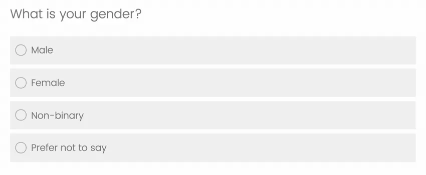
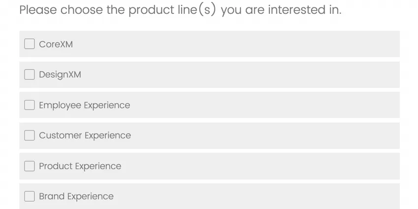
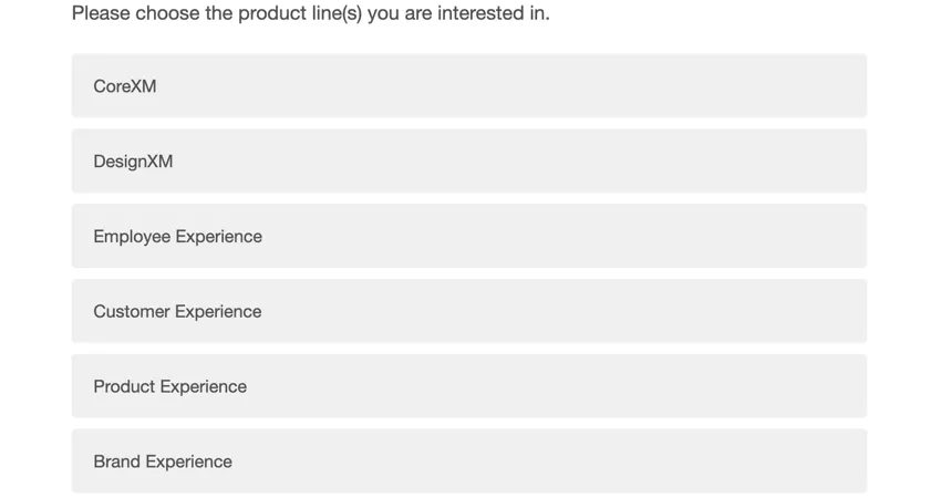
- The type of answer choice buttons you use can affect how respondents answer your questions. There are three types of buttons: radio, check boxes, and flat. Radio buttons and check boxes are often better than flat buttons. Radio buttons indicate the respondent should only give one answer, while check boxes imply they can choose multiple. Flat buttons, however, are the same for both multi and single select questions. Differentiating between the two improves the rate that respondents give honest and correct answers.
- Radio buttons:
- Check boxes:
- Flat buttons:
- Radio buttons:
- Font size can be adjusted however you want, and it’s important to choose a size and face that is optimal even in mobile environments.
- You want to make sure the next and back buttons are clear and readable.
- Progress bar placement can sometimes affect respondent experience. If it’s at the top, it’s inconvenient to scroll up to every time. If it’s at the bottom, it doesn’t distract from questions .
- All question types are compatible with all Qualtrics themes! However, when customizing a theme, you want to make sure that sleek Javascript-heavy questions like Rank Order and Pick, Group and Rank work to their best ability.


Example: The Blank Preset theme boasts all of these features while allowing you to easily customize the other aspects of your survey’s look.

FAQs
How can I change the background/theme of my survey?
How can I change the background/theme of my survey?
How do I update or report problems with static themes?
How do I update or report problems with static themes?
That's great! Thank you for your feedback!
Thank you for your feedback!