
Text iQ Table Widget (CX & EX)
What's on this page
About the Text iQ Table Widget
The Text iQ table widget allows you to report on the sentiment for each of your text topics in an easy-to-read format that comes with a handy legend along the bottom. You can even drill into sentiment of different topics in your topic hierarchy.
Attention: This widget type is currently not available for all licenses. If you’re interested in this feature, contact Account Services.
Attention: This page is about the use of Text iQ table widgets directly inside a Dashboard. You must have access to Text iQ in either CX or EX dashboards to use this widget.
Attention: This widget is not compatible with fields from a DXA dataset.
Using Text iQ in Your Dashboard
Before you can use the Text iQ table widget, you must set up your dashboard for text analysis. The setup is slightly different depending on the type of dashboard you are using (CX or EX).
For CX Dashboard projects and Pulse, see In-Dashboard Text iQ Setup.
Qtip: Custom calendars are not compatible with Text iQ Table and Text iQ bubble widgets. This means that if a dashboard page is filtered for a custom time period, any Text iQ widgets on the page will not function correctly.
For Engagement, Lifecycle, Ad Hoc Employee Research, and Employee Journey Analytics dashboards, see EX Dashboard Text iQ Setup.
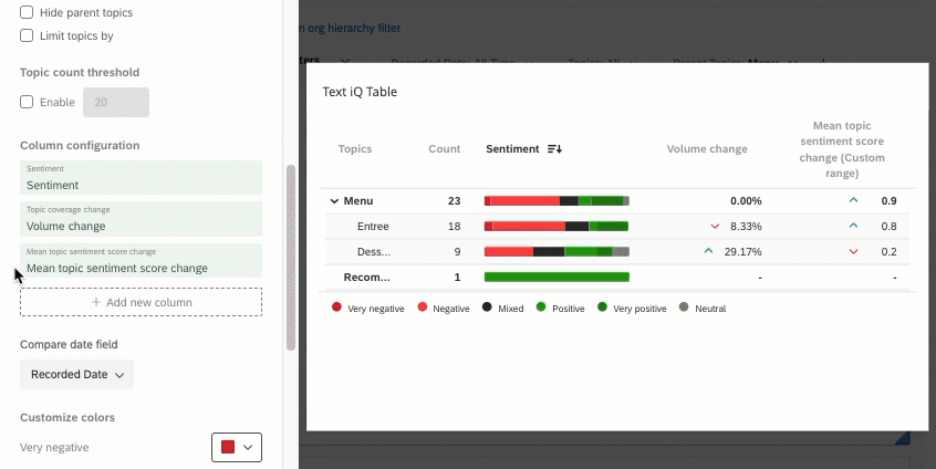
Column Configuration
You can customize the columns in your Text iQ table, choosing what information you feel is important, the timeframes of comparison, and even deciding how it’s labeled.
Qtip: Topic names and the count of how many responses appear for each topic are always included, by default. Remember you can hide individual topics you don’t want to display or limit which topics are included by response count.
The following columns can be added and removed as desired:
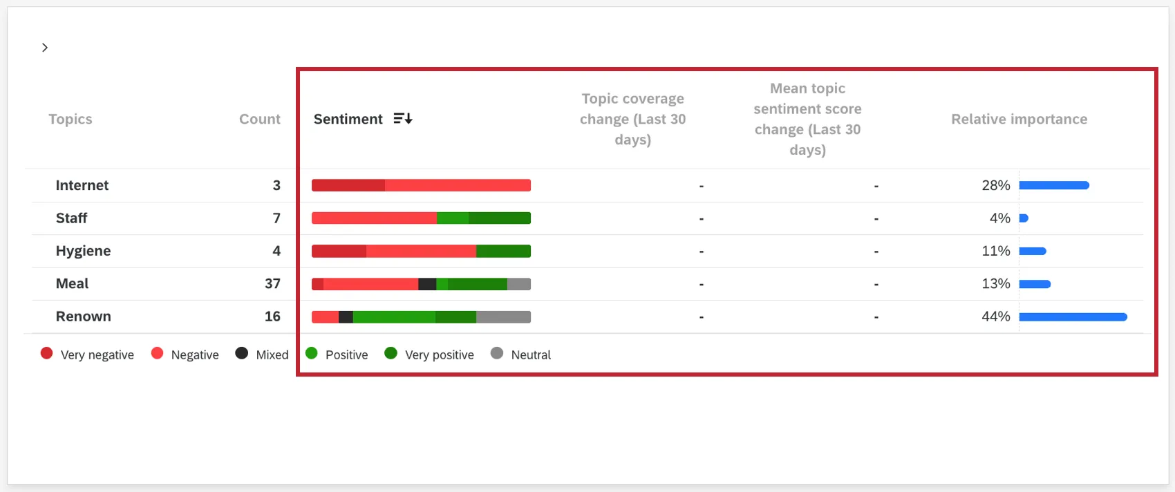
Sentiment: A bar for each topic that is segmented into the sentiments respondents expressed for that topic. The size of each segment is determined by the percentage of respondents who matched that sentiment. If you hover over the bar, you can see this exact value.

Qtip: Remember you can adjust the colors used to indicate each type of sentiment.
- Topic coverage change: The change in the proportion of responses tagged with each topic. Represented as a percent of increase or decrease. This is calculated by taking the proportion (percentage) of responses from the earlier time window and subtracting it from the later time window.
- Mean Sentiment Score change: The change in sentiment score for each topic. If the sentiment hasn’t changed for that particular topic, there will be a zero ( 0 ) instead.
Relative Importance: The relative importance (weight) of a topic for a given score. This field allows you to visualize how certain topics influence business metrics such as NPS. For more information about the statistics behind calculating relative importance, see this support page.
Qtip: If using the relative importance field, you must use 20 or fewer text topics. The widget will choose 20 topics automatically if there are more than 20 topics. To change the selected topics, click the Exclude button while editing the widget and then select the topics you would like to include. See the excluding topics section for more information.

Attention: It’s not recommended to include the Relative Importance column if the total response count across all data sources exceeds 5 million. Analyses above this threshold may timeout or fail.
Attention: After adding the relative importance column, it may take up to 1 hour for the calculation to complete. This column will recalculate if you collect new responses or make changes in Text iQ. When calculating, the relative importance column will show a loading message while the rest of the widget will load as normal. Note that newly collected responses will be on a small delay of up to 1 hour before they’re incorporated in the relative importance calculation.
Arrows are used to indicate the direction of the change for volume and sentiment. If a change column shows zero ( 0 ), that means there was no change. If a change column shows a dash ( – ), that means there is no data to display. The colors of these arrows cannot be changed.
Qtip: If the topic coverage change is downward, that means there were fewer (and perhaps no) responses for that particular topic. That means there may be no mean sentiment score change for that corresponding column.
Adding New Columns
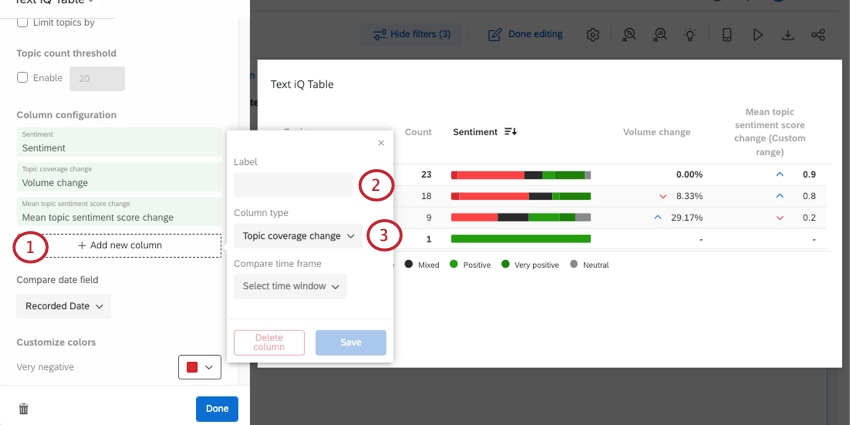
Qtip: If under “Compare time frame” you select “Last week” or “Last month,” then the data will be compared against this week / this month, including data collected so far for today. A day’s data stops at 11:59 PM in the dashboard’s time zone.
Qtip: You can click on a column in the widget editing pane to rename it or change the timeframe.
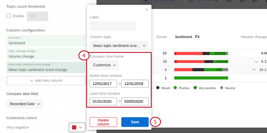
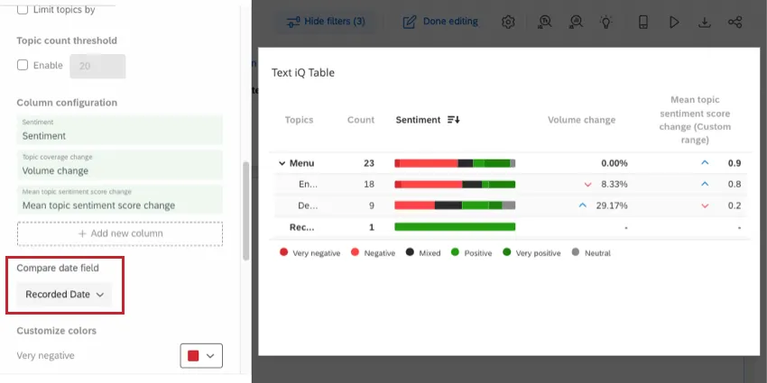
Specifying the Date Used in Change Columns
Any topic coverage change or mean sentiment score change columns you include in the widget will operate off of the same date field. To specify what date field you want to use, use the Compare date field dropdown.
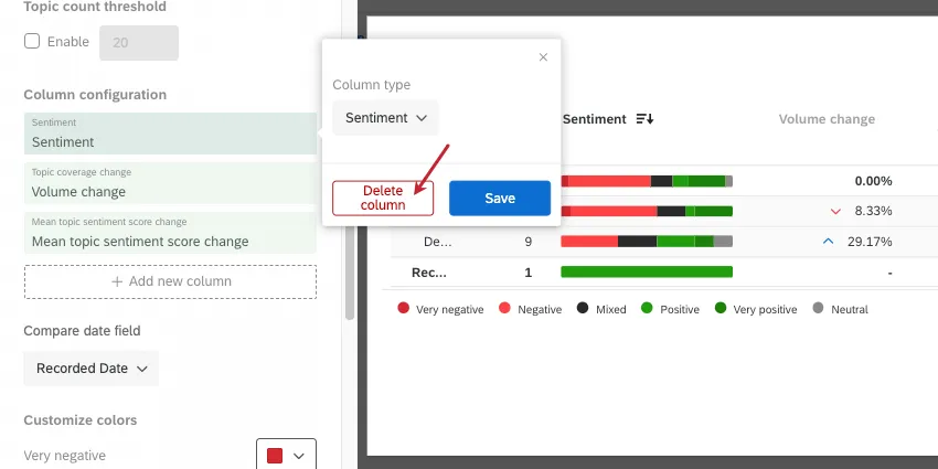
Deleting Columns
Click the name of the column in the widget editing pane and select Delete column to remove it from the widget.
Reordering Columns
You can change the order that your columns appear in your widget. Hover over a column in the widget editing pane and click the icons to drag it.
Widget Customization
Hide Parent Topics
If you’ve built out topic hierarchies, then some of your topics may have topics nested below them – these are referred to as parent topics and are automatically included in your analysis. If you’d like to exclude parent topics, select Hide parent topics.
When you limit topics, parent topics will be hidden automatically.
Qtip: Any topics you display in your widget can be translated.
Limiting Topics
The Limit topics by option allows you to restrict the topics displayed in your widget. You can choose whether you want to highlight positive or negative sentiments, and whether you want to limit by count or percentage. Limiting by count compares the number of responses, whereas limiting by percentage compares the ratio of the sentiments within the topics.
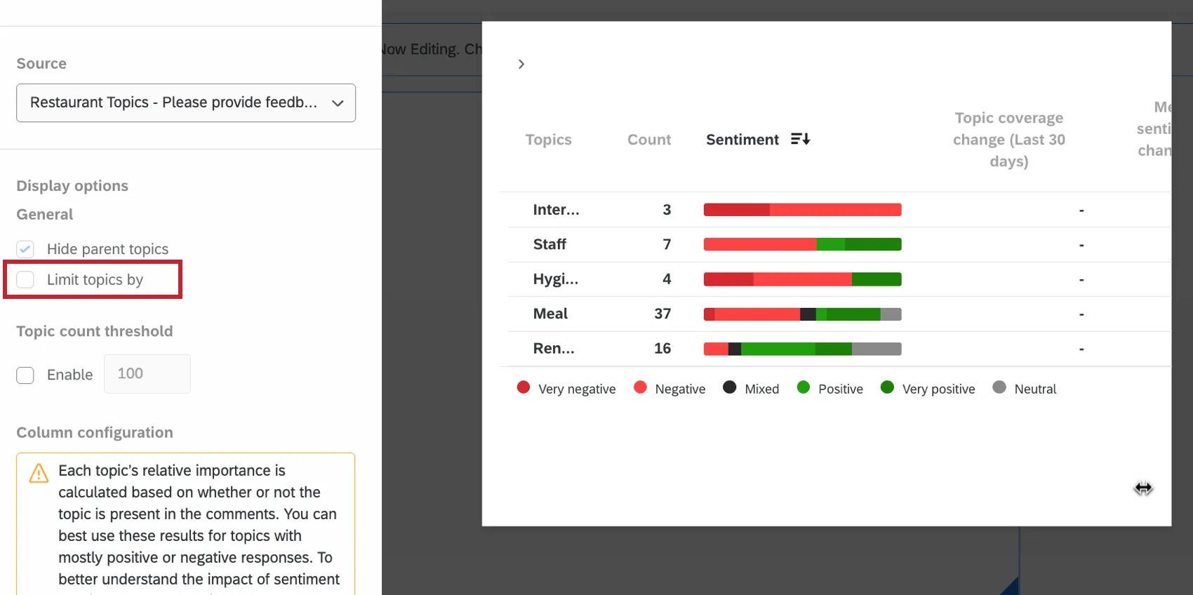
When you limit topics, parent topics will be hidden automatically.
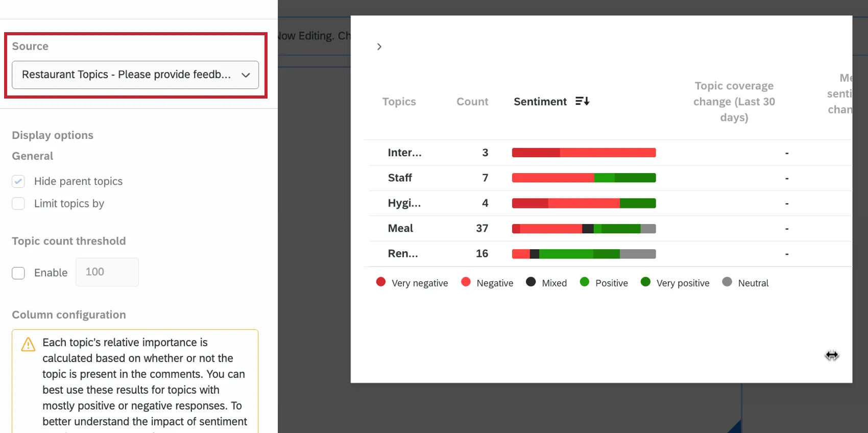
Source Filter
You can use the Source dropdown to select which parent question you want to display.
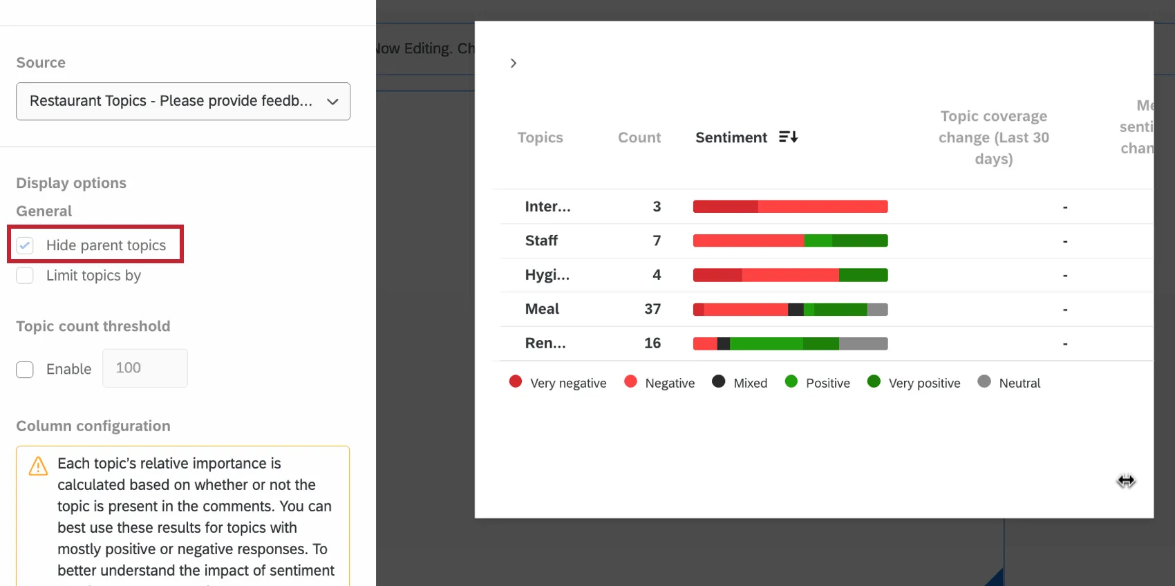
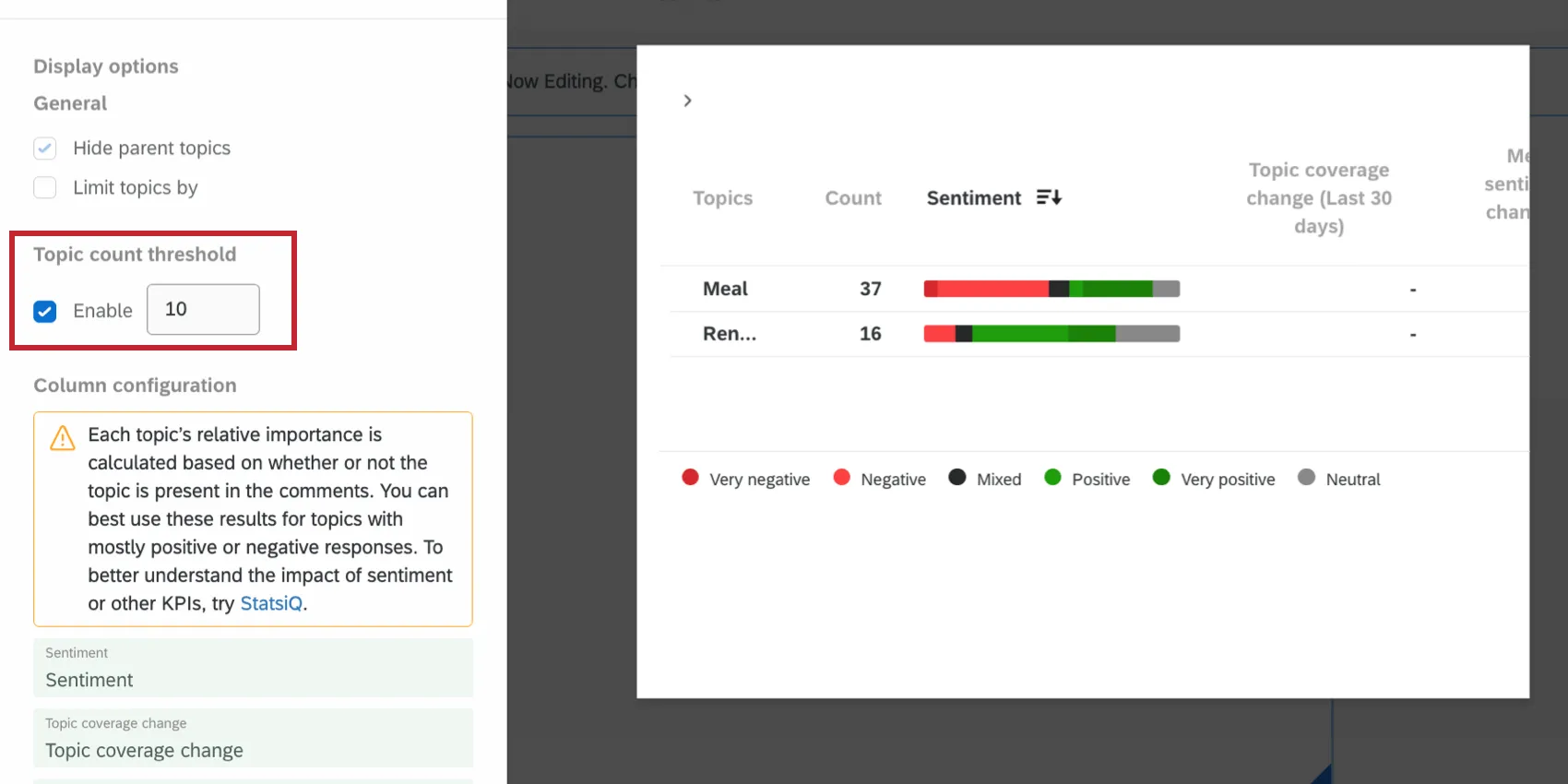
Topic Count Threshold
Topic count thresholds allow you to exclude topics from the widget that don’t reach a specified number of responses.
Qtip: If a parent topic is hidden due to a topic count threshold, then all associated child topics will also be hidden, even if the number of responses tagged with the child topics exceeds the threshold.
For example, in this screenshot, only topics with 10 or more responses are listed. The only topics listed are Meal (23 responses) and Renown (12).
Customize Colors
You can change the colors that correspond to each sentiment to better match the style of your XM program. Choose from a color palette, or enter a hex code.
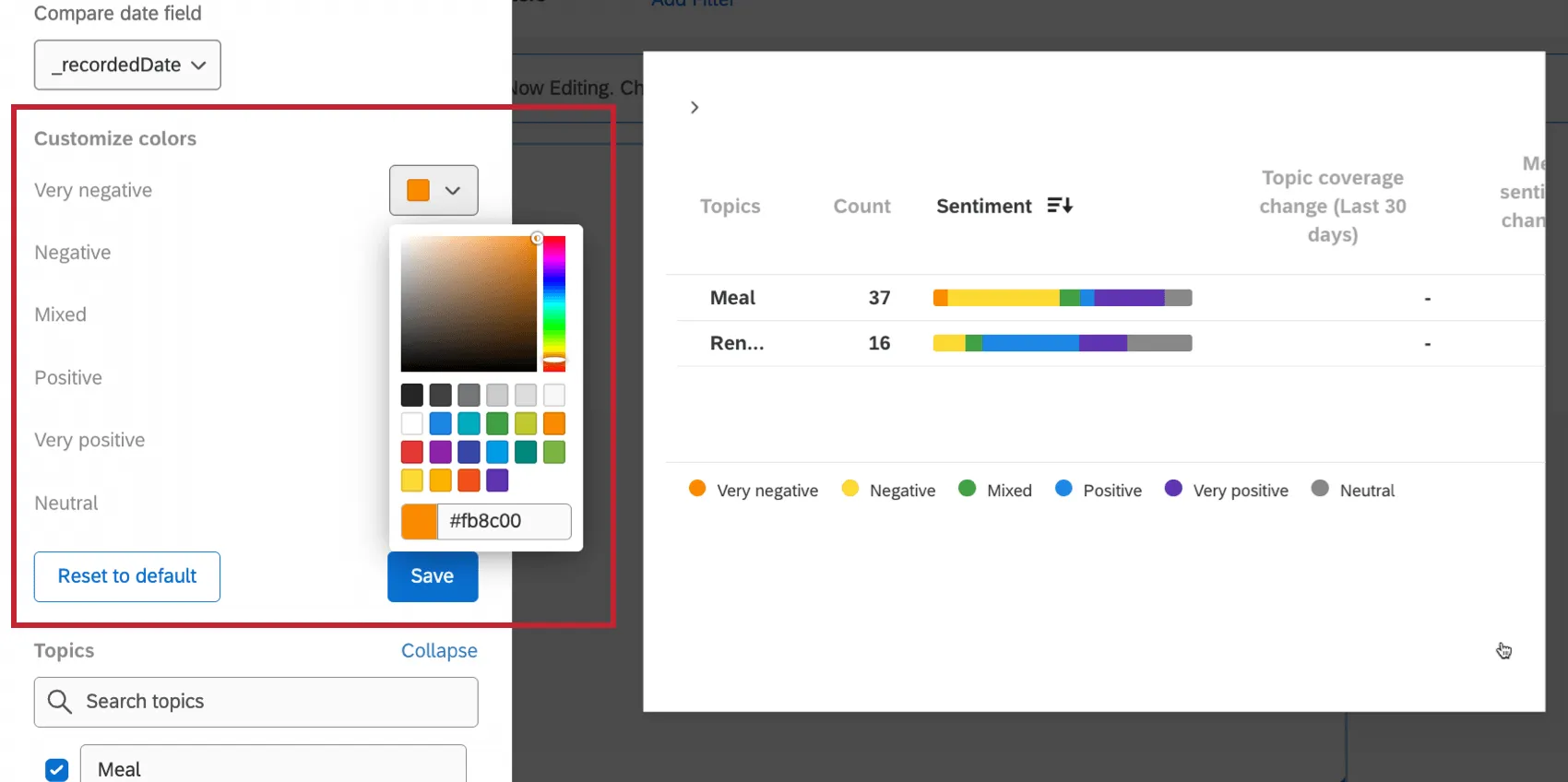
You can reset your widget’s colors to default settings by clicking Reset to default at the bottom of the widget editing pane.
Color edits only affect bars; they do not affect blue up and red down arrows.
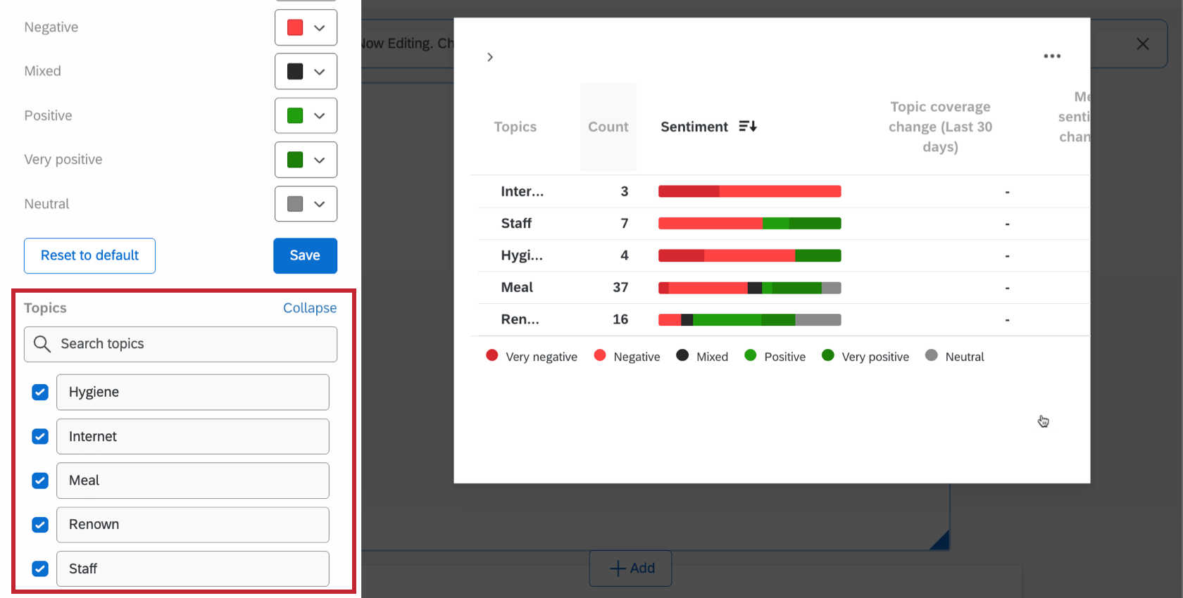
Excluding Topics
If you’d like to hide or remove specific topics from the widget,
Sorting the Table
Click a column heading to adjust how the table is sorted. You can sort topics by alphabetical, count by lowest or highest, and by sentiment. You can also choose if the rows are sorted by the percentage or count of the respective sentiments.
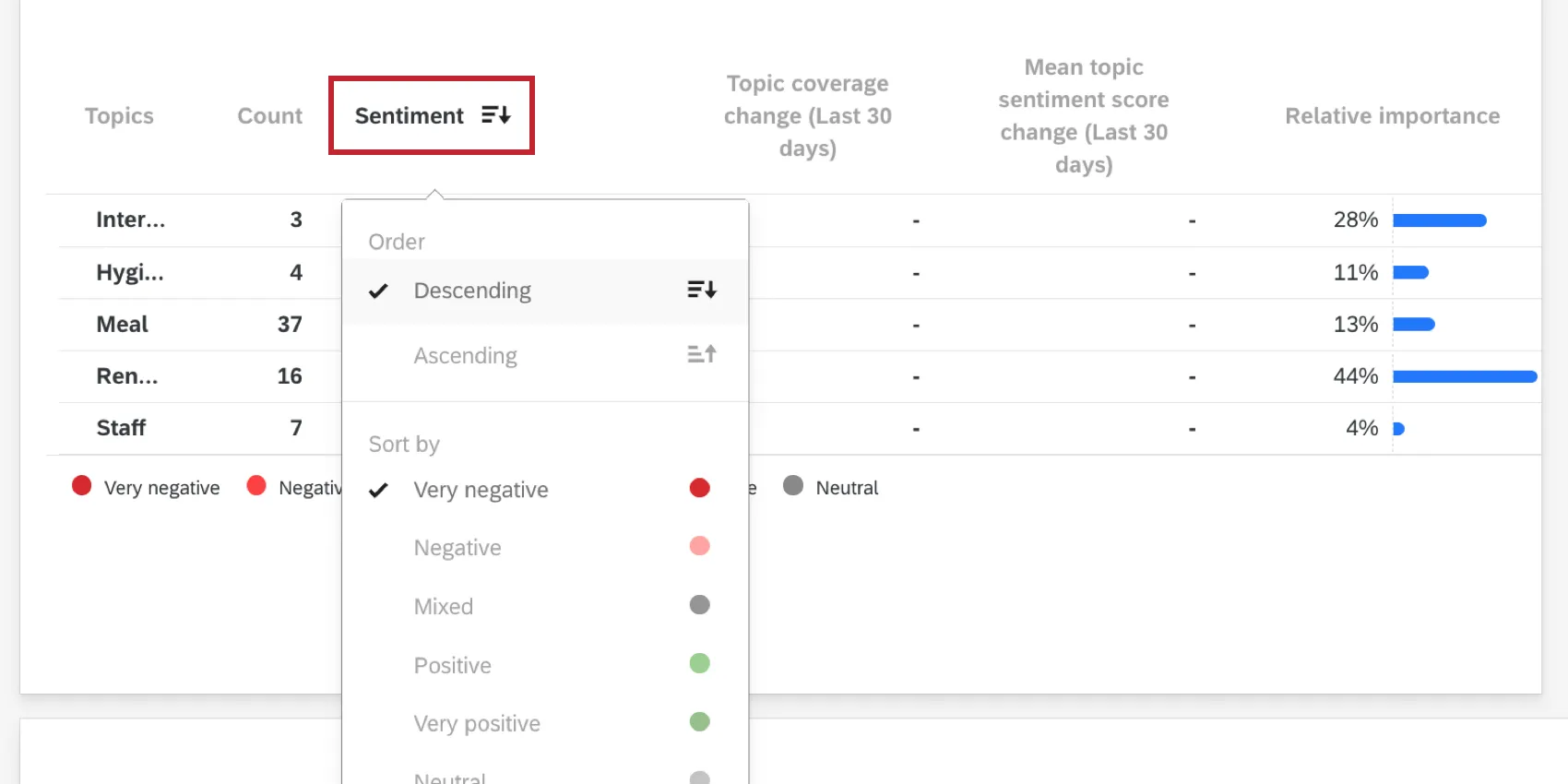
To remove custom sorting, click Reset to default.
Filtering
When you click on a parent or standard topic, you will create a page filter. By default, this filter will act inclusively – this means that any response with this topic will be included on the page. In the screenshot below, even though we are filtering for the “Entree” topic, we still see 4 “Dessert” responses, because there were at least 4 responses collected with both the “Entree” and “Dessert” topics tagged.
Once added, these filters can be edited the same way as other dashboard page filters. For example, you can set exclusive filters. If you set an exclusive filter on the screenshot below, only responses tagged “Entree” and nothing else would appear (e.g., the 4 responses where “Dessert” was also tagged would no longer appear).
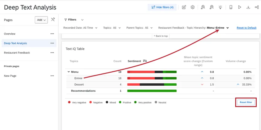
If you want to remove all topic filters added to your dashboard page, you can click Reset filter on the lower-right of the widget.
Qtip: You cannot disable the ability to filter by clicking a topic.
FAQs
I want to use survey Text iQ in my dashboard instead. How do I make that work?
I want to use survey Text iQ in my dashboard instead. How do I make that work?
See Using Survey Text iQ in a CX Dashboard for more details.
I have multiple datasets on my dashboard. Can I use this feature with all of my widgets?
I have multiple datasets on my dashboard. Can I use this feature with all of my widgets?
- Changing which dataset your widget shows: Not all widgets can have their referenced dataset switched. Some can only use the default dataset. For a compatible list, see this section.
- Showing multiple datasets in the same widget: Not all widgets can show multiple datasets’ results at the same time. For a compatible list, see this section.
That's great! Thank you for your feedback!
Thank you for your feedback!