
Responsive Dialog
What's on this page
About Responsive Dialog Creatives
The responsive dialog is a type of guided intercept available for Website / App Insights projects. Responsive dialogs help you make accessibility-compliant overlays for your website that are responsive to different device sizes.
Once you have access to this feature, the Responsive dialog is available alongside other creatives.
Creating a Responsive Dialog
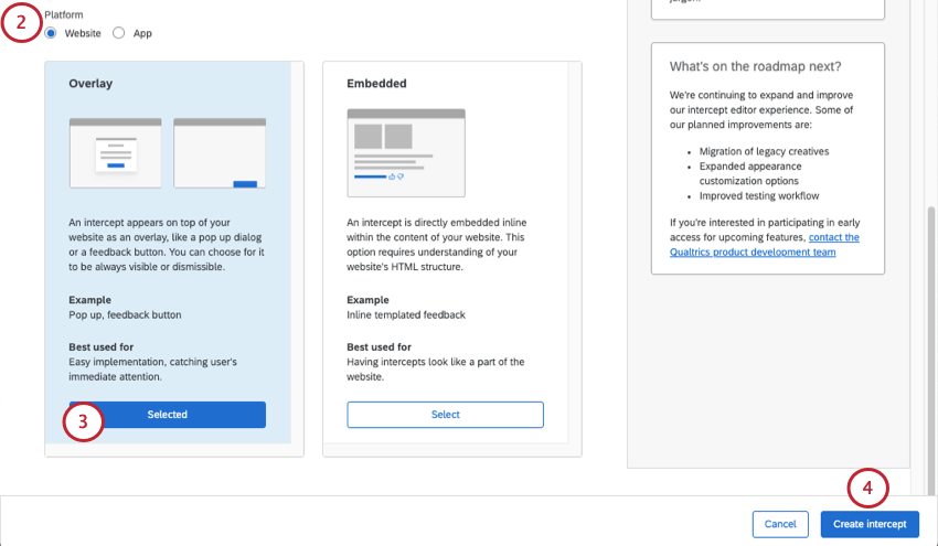
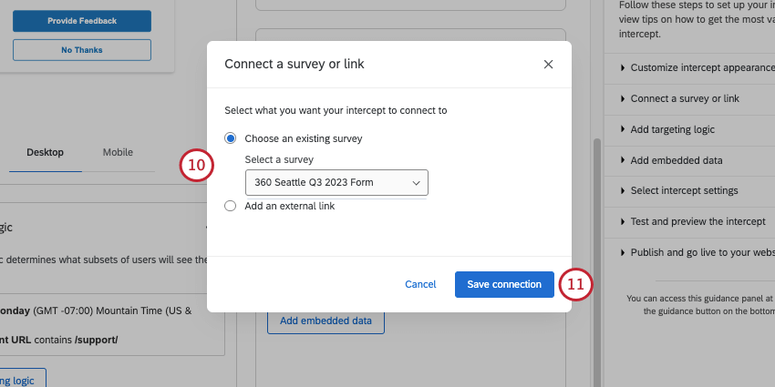
- Choose an existing survey: Link to a survey you have access to. Make sure the project you want to use is open and has an available anonymous link.
- Add an external link: Paste a full URL.
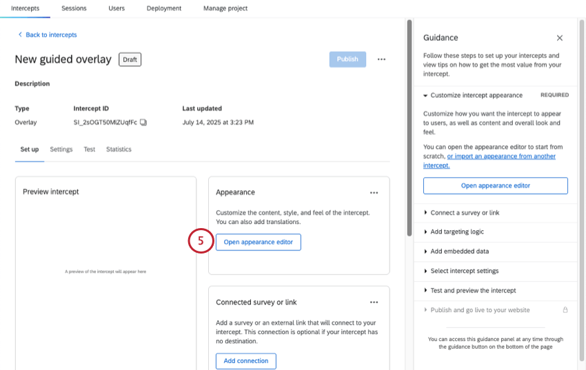
Qtip: For the last setup steps and details on launching, you can also see Creating Guided Intercepts.
Size & Style
In the Size & Style section, you can customize the overall look and feel of the creative as follows:
Standard Size & Style Options
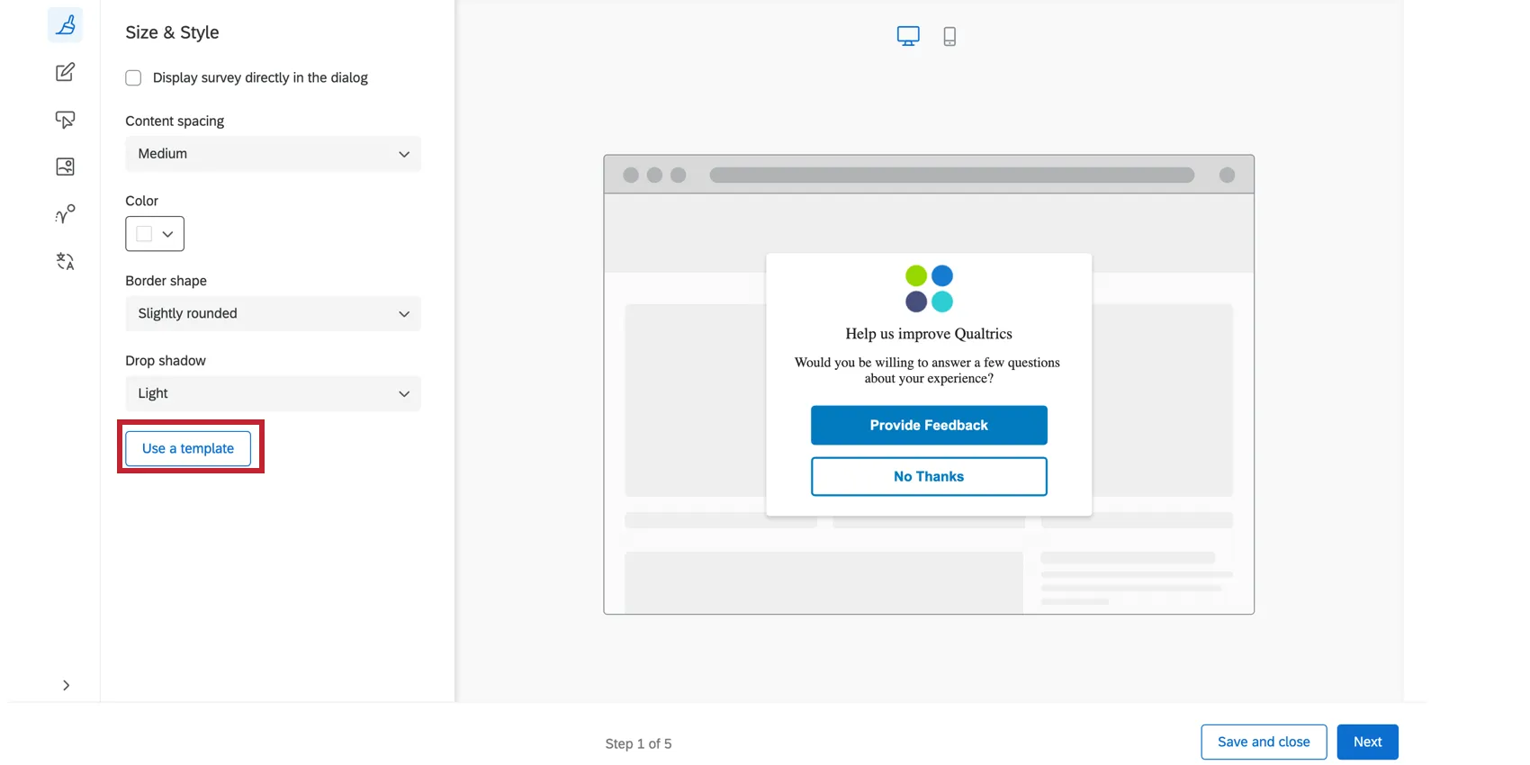
These are the options that appear if you do not use an embedded target, and leave Display survey directly in the dialog deselected.
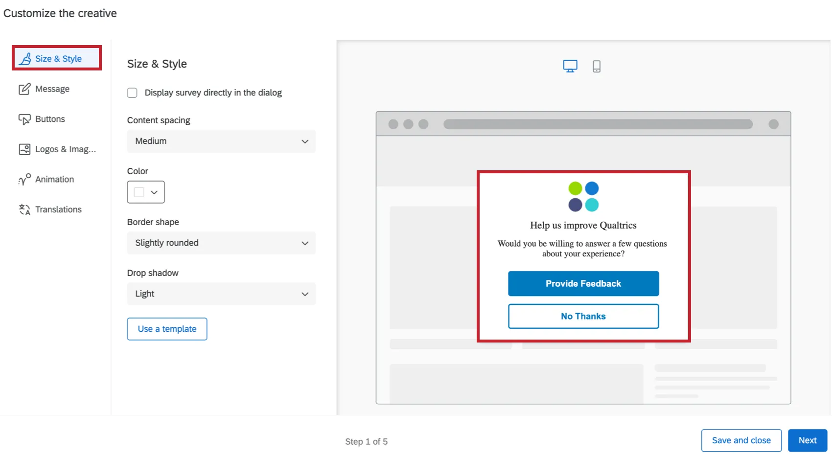
- Content spacing: Configure the density of the text on your creative. You can choose either Compact, Medium or Spacious.
- Color: Configure the background color of the creative by choosing from the color picker palette.
- Border shape: Configure the border radius of your creative. This determines how rounded the corners are. You can choose from None, Slightly Rounded, Moderately Rounded, Very Rounded.
- Drop shadow: Configure the drop shadow surrounding your creative. You can choose from None, Light, Medium, Heavy.
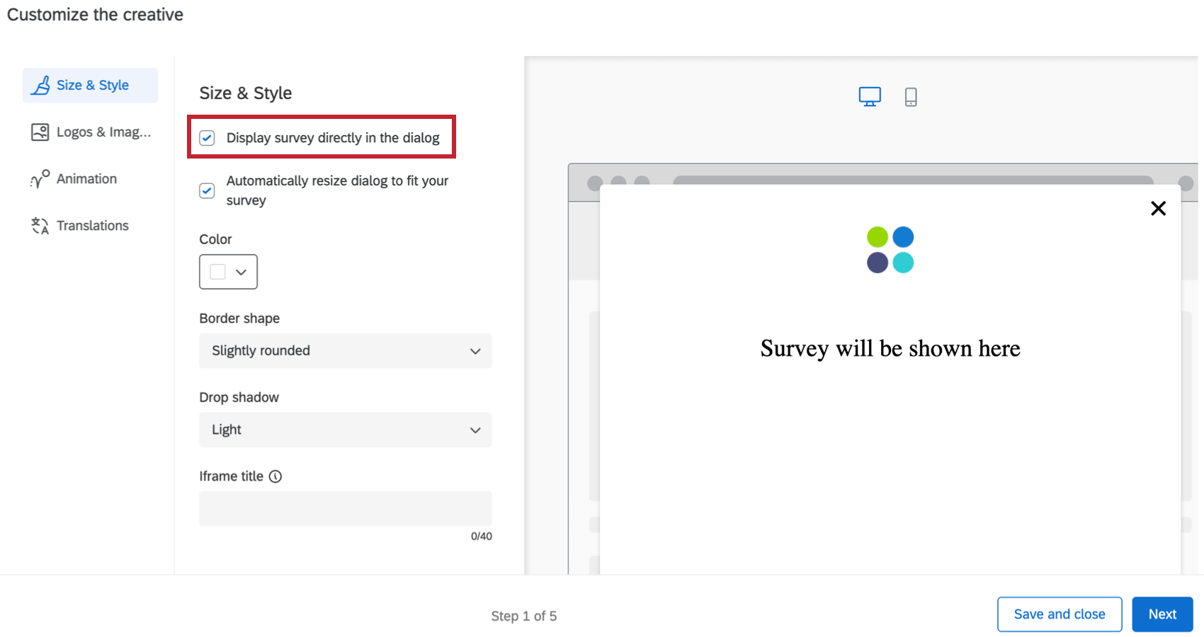
Display Survey Directly in Dialog
When you select Display survey directly in dialog, the survey will be embedded on the creative, instead of linked with a button. To test the full and accurate experience of the survey in the creative, use the bookmarklet. See Test Intercepts for more.
Qtip: This setting will override the display options set on action sets connected to this creative. For more information on action set display options, see Display Options.
Selecting this option removes the Message and Buttons tabs because you will no longer have a message or buttons on the Responsive Dialog, aside from what is already set in your target survey. Selecting this option also means you have different Size & Style settings:
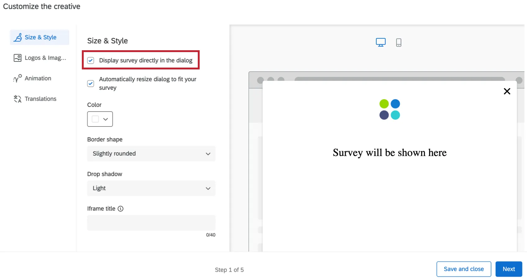
- Automatically resize dialog to fit your survey: Automatically resize the responsive dialog to fit the survey you are displaying in the dialog. The window will automatically resize according to the length of the first page of your survey.

Qtip: If you’d like to make the responsive dialog creative automatically scale to a larger size, add additional questions to your first page of the survey or add additional spacing to your survey. To make the responsive dialog smaller, move questions to other following pages, add page breaks, or decrease the spacing within your survey.
- Color: Configure the background color of the creative by choosing from the color picker palette.
- Border shape: Configure the border radius of your creative. This determines how rounded the corners are. You can choose from None, Slightly Rounded, Moderately Rounded, Very Rounded.
- Drop shadow: Configure the drop shadow surrounding your creative. You can choose from None, Light, Medium, Heavy.
- Accessibility
- Iframe title: This text will be read by a screenreader when the visitor navigates to the embedded window. Qtip: Providing Iframe titles during your dialog creation ensures your dialog is accessible to users.
- Iframe title: This text will be read by a screenreader when the visitor navigates to the embedded window.
Qtip: Click the arrow in the bottom left to display section labels. To display only the section icons, click Hide Labels.
USE A TEMPLATE
If you would like to import a survey theme into the creative’s style settings, click Use a template.
Themes are created by the Brand Administrator for the use of users in their brand. Select a brand from the dropdown menu, then click Import. If you would like to add a theme to this list, reach out to your Brand Administrator for more information.
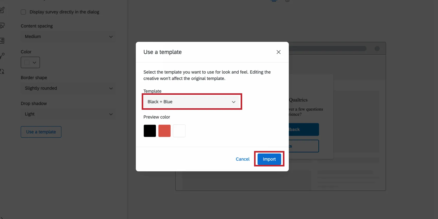
Importing a theme template will adjust the following settings for the creative:
- Primary Color
- Secondary Color
- Background Color
- Question Text Size
- Answer Text Size
- Question Spacing
- Foreground Contrast
- Logo
Qtip: The settings in the creative are disconnected from the theme used as a template. The creative’s settings do not update if the template theme changes, and changing the creative’s settings will not change the template theme.
Custom CSS
You can customize the CSS of the responsive dialog as desired by clicking the Customize CSS button. You can add custom classes and properties in addition to the default ones. Edits made here may not be reflected in the preview; remember to test your intercept before deployment by completing the guided setup.
Attention: The following code is provided as-is and requires programming knowledge to implement. Qualtrics Support does not offer assistance or consultation on custom coding. You can always try asking our community of dedicated users instead.
-Click here to view the default CSS for responsive dialogs-
-Click here to view the default CSS for responsive dialogs-
Qtip: Make sure to replace the INTERCEPT_ID in the below snippet with your intercept’s ID.
/* Use classes below to override responsive dialog styles.

Attention: The following code is provided as-is

and requires programming knowledge to implement.

Qualtrics Support does not offer assistance or consultation on custom coding.

You can always try asking our community of dedicated users instead.

For help with custom code go to https://community.qualtrics.com/custom-code-12 */

/* Style shadowbox that appears behind dialog. NOTE: Changes to this shadowbox will not be reflected in the previewer */

.QSIWebResponsiveShadowBox {

/* font-family: Arial, Helvetica, sans-serif; */

/* z-index: 1; */

/* margin-top: 10px !important; */

/* white-space: normal !important; */

}

/* Style the container's fade */

.QSIWebResponsive-creative-container-fade {

/* */

}

/* Style the main container of the web responsive dialog */

.QSIWebResponsiveDialog-Layout1-INTERCEPT_ID_content {

/* line-height: 1em !important; */

/* margin: 0 0.5em 0 0 !important; */

/* width: auto !important; */

/* font-size: inherit !important; */

/* font-weight: normal !important; */

/* font-style: normal !important; */

/* display: inline !important; */

/* color: #000000 !important; */

}

/* Style the logo container section of the creative */

.QSIWebResponsiveDialog-Layout1-INTERCEPT_ID_logo-container {

/* display: inline-block !important; */

/* margin-right: 5px !important; */

}

/* Style the text container section of the creative. This includes the header section and description section */

.QSIWebResponsiveDialog-Layout1-INTERCEPT_ID_text-container {

/* display: inline-block !important; */

}

/* Style the headline section of the creative */

.QSIWebResponsiveDialog-Layout1-INTERCEPT_ID_headline {

/* font: inherit !important; */

}

/* Style the description section of the creative */

.QSIWebResponsiveDialog-Layout1-INTERCEPT_ID_description {

/* font: inherit !important; */

/* background: transparent !important; */

/* border: none !important; */

/* padding: 0 !important; */

/* vertical-align: middle !important; */

/* margin: 0 0.4em 0 0 !important; */

/* cursor: pointer !important; */

}

/* Style the container that houses the button(s) */

.QSIWebResponsiveDialog-Layout1-INTERCEPT_ID_button-container {

/* display: inline-block !important; */

}

/* Style the first button in the dialog */

.QSIWebResponsiveDialog-Layout1-INTERCEPT_ID_button-1 {

/* font: inherit !important; */

/* padding: .4em .4em !important; */

/* min-width: 3em !important; */

/* line-height: 1em !important; */

/* border-radius: 4px !important; */

/* border-width: 1px !important; */

/* border-style: solid !important; */

/* cursor: pointer !important; */

/* background: #FFF !important; */

/* color: #000 !important; */

/* border-color: #000 !important; */

}

/* Style the second button in the dialog */

.QSIWebResponsiveDialog-Layout1-INTERCEPT_ID_button-2 {

/* font: inherit !important; */

/* padding: .4em .4em !important; */

/* min-width: 3em !important; */

/* line-height: 1em !important; */

/* border-radius: 4px !important; */

/* border-width: 1px !important; */

/* border-style: solid !important; */

/* cursor: pointer !important; */

/* background: #FFF !important; */

/* color: #000 !important; */

/* border-color: #000 !important; */

}

/* Style the button that closes the dialog */

.QSIWebResponsiveDialog-Layout1-INTERCEPT_ID_close-btn {

/* display: inline-block !important; */

/* margin-right: 5px !important; */

}

}
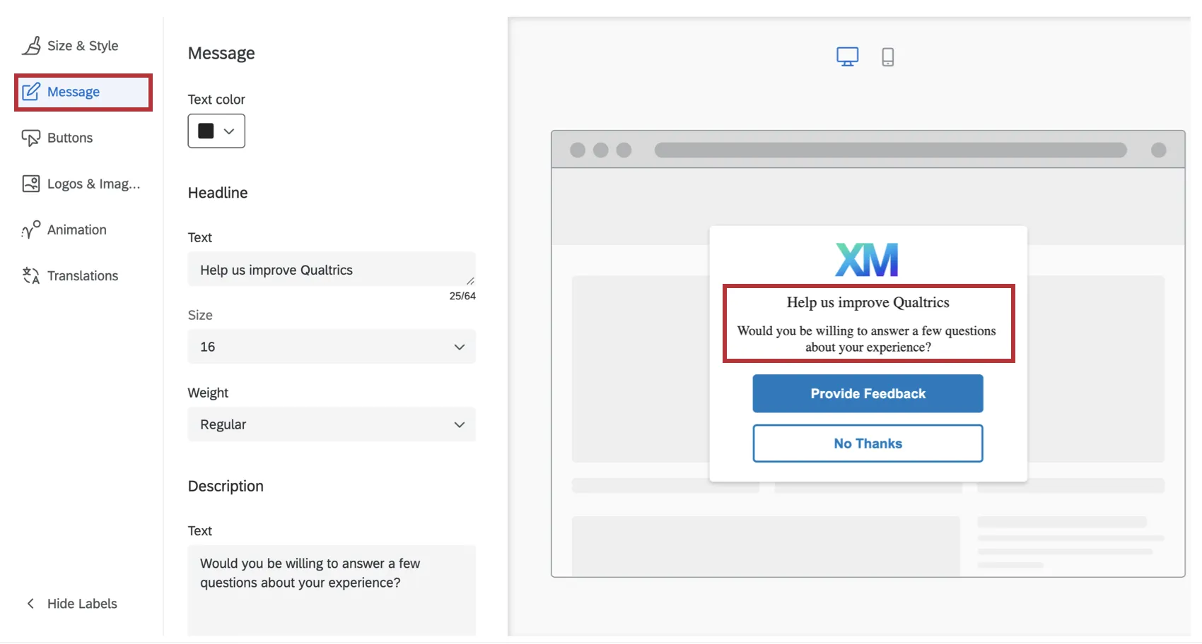
Message
In the Message section, you can the configure the Headline and Description that shows up on your creative. The headline should generally be a short phrase that captures the visitor’s attention, while the description gives more detail as to why the creative has appeared to them.
The font will be adopted from the website that displays the creative. For both the Headline and Description, you can customize the actual text, font size, and font weight.
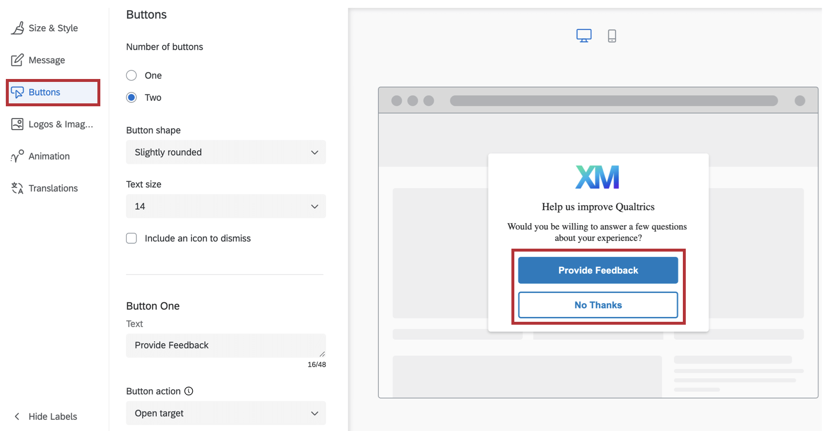
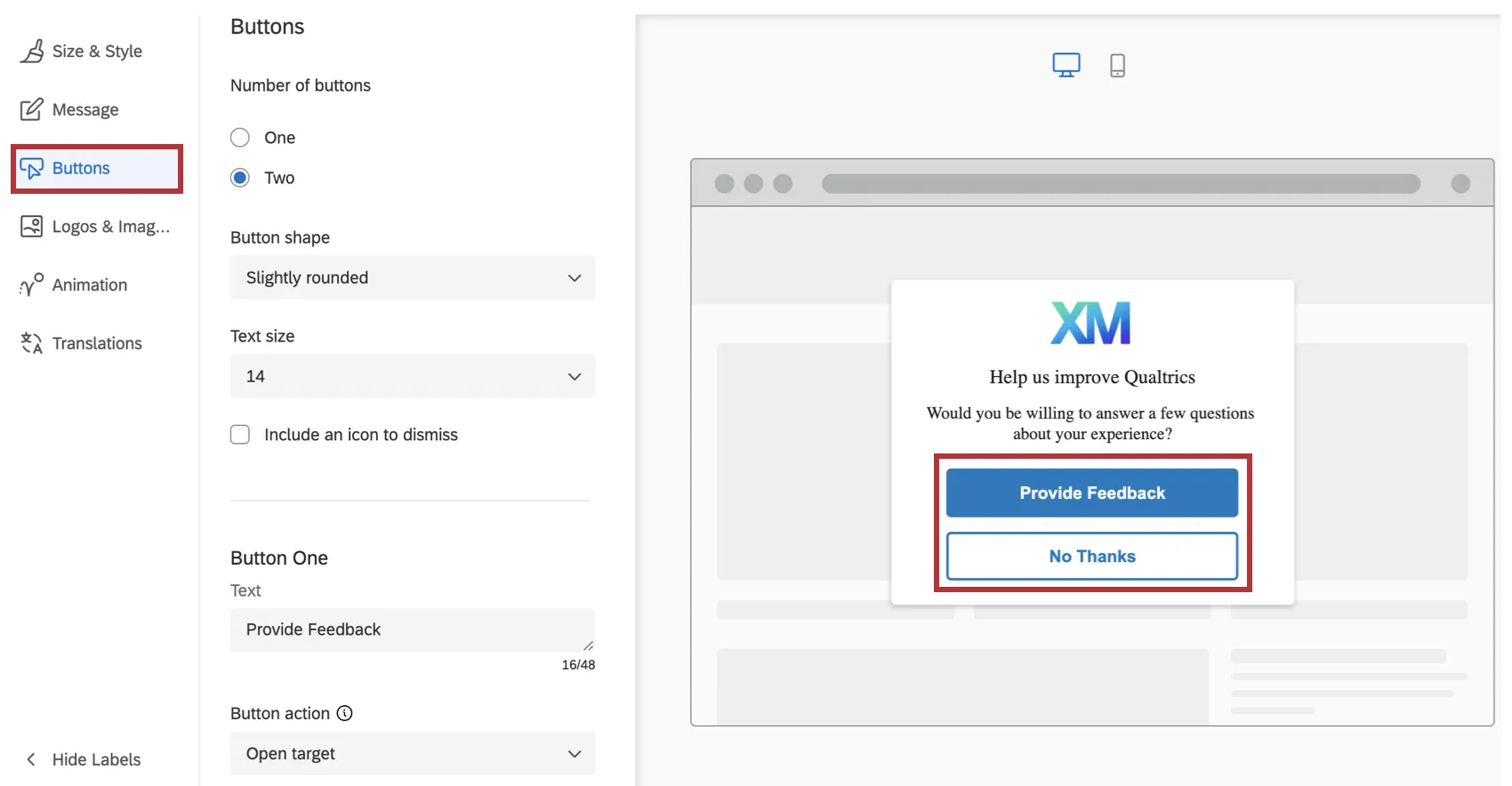
Buttons
In the Buttons section, you can configure options specific to the number, appearance, and target for each button.
- Specify your Text. This is what the button says.
- Choose the Button Action to either Open Target or Dismiss Intercept. Open Target indicates that this button will open the target that you specify in your intercept criteria. Dismiss Intercept will simply close the intercept.
- Choose your Label Color, Background Color and Border Color using the color picker palette.
- Designate an ARIA label. By default, screen readers will read the text that you specify for the button label. However, in some cases, you may want the screen reader to read additional context, such as, “Click on this button to open up a new survey window.” In this case, you can specify the ARIA label for the button controls. Attention: To make your creative accessible, the ARIA label must match or include the button text.

Qtip: Button fonts must be set explicitly in the CSS of your site. If the font is not set, buttons will use the font defaults set by the user’s browser.
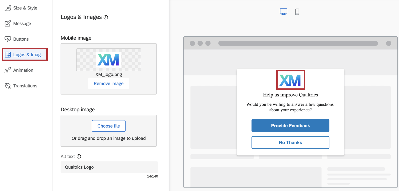
Logos & Images
In the Logos & Images section, you can specify 1 or more images/logos to include on your creative.

You can choose to upload a separate image for Mobile or Desktop, so that different images will be displayed depending on whether the creative is seen on a Mobile or Desktop browser. You can also upload the same image but with different resolutions to optimizing the display on either type of device browsers.
Qtip: If you only upload an image for Mobile, that image will be used for Mobile as well as Desktop browsers. However, if you only upload an image for Desktop, that image will only be used for Desktop browsers.
To make the image accessibility compliant, you also have the ability to specify the Alt Text to go with the images. (Alt Text is a feature that allows screen readers to describe an image to visually impaired users.)
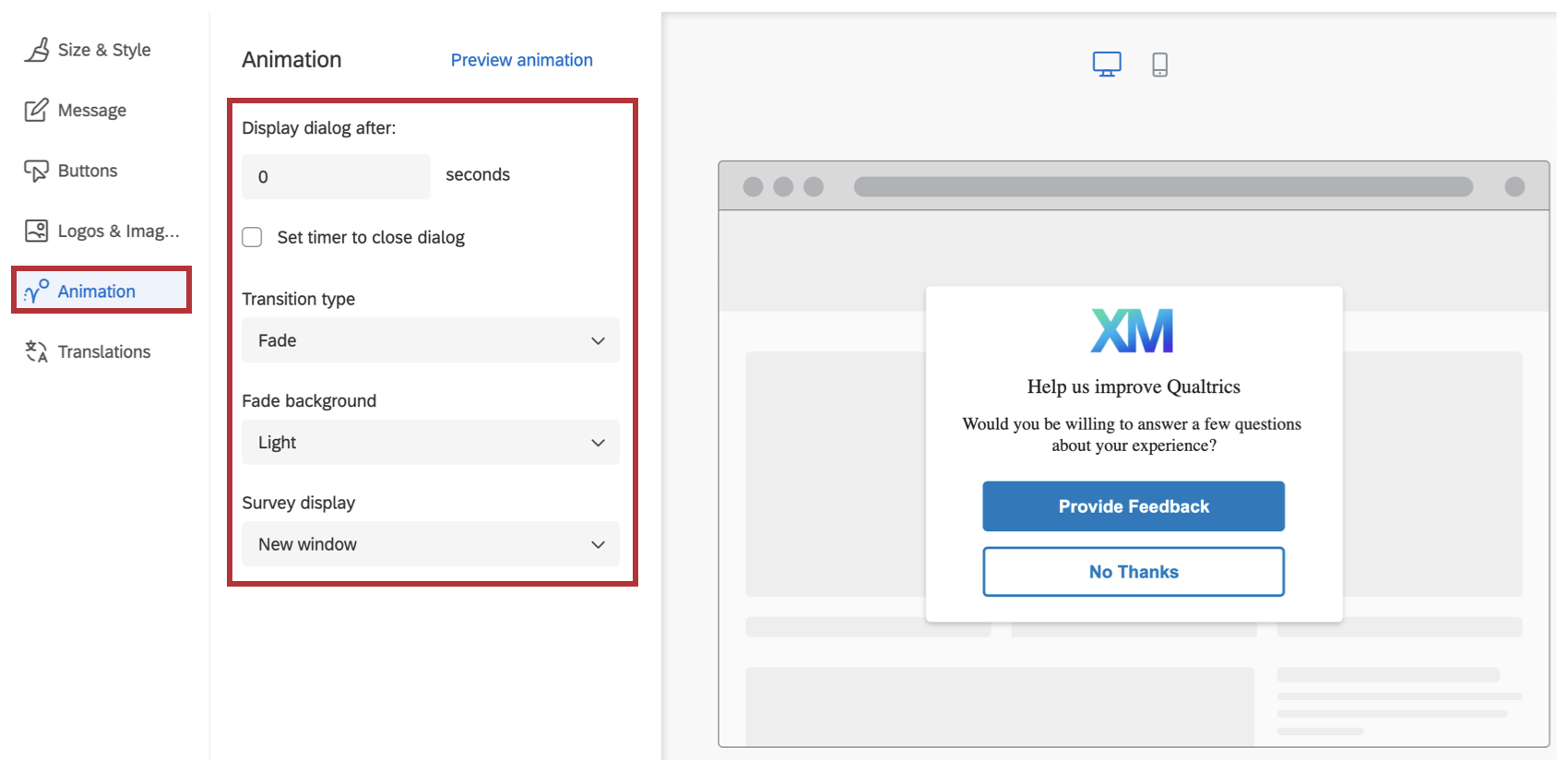
Animation
In the Animation section you can choose the type of animation (Fade or Slide In) you want for your creative as it appears on the screen.

- Display dialog after: The number of seconds after the user meets the intercept conditions (e.g., clicks into the app) that this dialog appears.
- Set timer to close dialog: Determine how long after the dialog appears that it should close itself. Deselect this option to force the user to close the dialog to remove it from the screen.
- Transition Type: Choose whether the creative fades or slides onto the screen when it appears. If you choose Slide In animation, then you can also select the final position of the creative on the screen (Top Left, Top Right, Bottom Left, Bottom Right). Qtip: Using the Slide In transition type makes this creative behave like a Slider Creative.Qtip: Fade displays a full-screen overlay and traps keyboard focus in the dialog. Slide In on desktop does not overlay the page and does not trap focus, so keyboard users can continue tabbing through the page. On mobile, Slide In uses an overlay and traps focus like Fade.
- Fade Background: The color of the device’s screen behind the creative (None, Light, Medium or Dark).
- Survey display: Where the survey will be displayed (New window, Embedded window, Current window, PopUnder window, or New tab).
As needed, you can preview your animation settings on this screen as well, by clicking on Preview Animation.
FAQs
What’s the difference between standalone intercepts, guided intercepts, and guided creatives?
What’s the difference between standalone intercepts, guided intercepts, and guided creatives?
Guided intercepts are when you create features like responsive dialogs, templated embedded feedback, feedback buttons, and embedded app feedback using these steps. Also known as guided setups, guided intercepts combine the visual element of a creative and the settings of a creative into one easy-to-follow flow that will guide you from start to finish.
Guided creatives are when you create features like responsive dialogs, templated embedded feedback, feedback buttons, and embedded app feedback using these steps instead. With a guided creative, you need to create a separate intercept to pair it with. You still get the improved creative editor, but not the rest of the guided setup.
I created a responsive dialog as a creative, but I want to use it as a guided intercept instead. Can I switch it over?
I created a responsive dialog as a creative, but I want to use it as a guided intercept instead. Can I switch it over?
Can I save guided setups to the library?
Can I save guided setups to the library?
That's great! Thank you for your feedback!
Thank you for your feedback!