-

Qualtrics Platform -

Customer Journey Optimizer -

XM Discover -

Qualtrics Social Connect
Viewing Journey Paths
About Viewing Journey Paths
A journey path diagram is a type of visualization that shows the flow between different journey milestones. This diagram depicts the different paths that travelers take when moving between milestones.
After your journey is published live and has started to process travelers, go to the Journey paths tab of your journey to view the journey path diagram.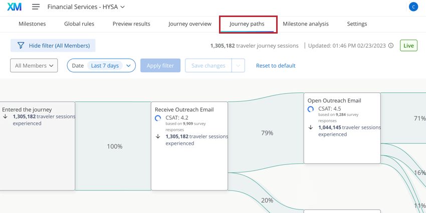
Reading the Journey Paths Diagram
The journey paths diagram is read from left to right. The first node in the journey paths diagram is the Entered the journey node. All travelers who entered your journey are represented by this node (in other words, these are travelers who met your journey’s entry criteria). Note that not all travelers may leave this node – if a traveler does not meet any milestone entry criteria, then they’ll remain at Entered the journey without moving down any other journey paths.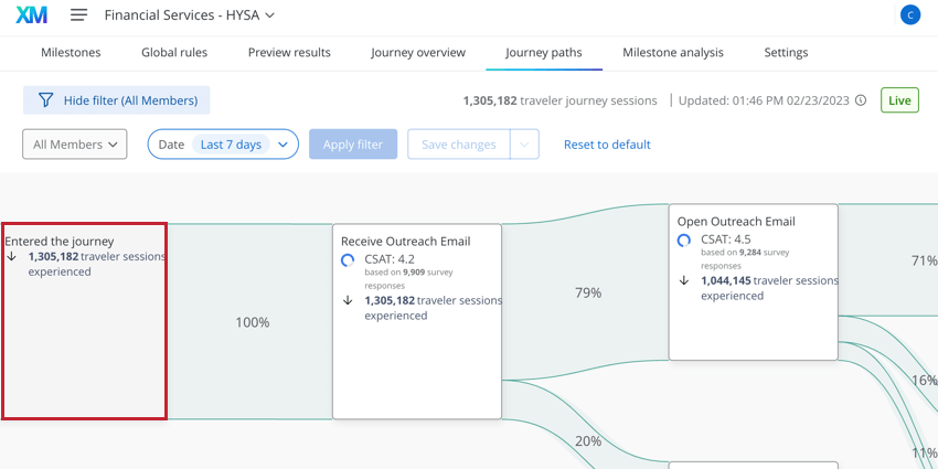
The green bar between nodes is called a transition and represents a traveler moving between milestones. The transition contains a percentage that represents the percentage of travelers who moved on to the linked milestone. In the example below, 100% of travelers transitioned to the “Receive Outreach Email” milestone after entering the journey.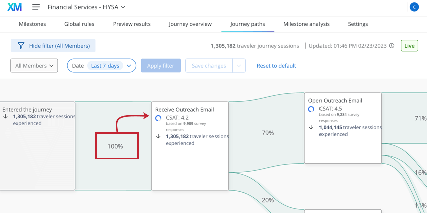
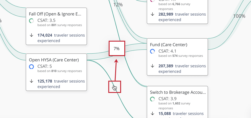
The remaining nodes in the journey paths diagram represent your different journey milestones. Each node will display the milestone name, the number of travelers that reached the milestone, and a CX metric (if you’ve configured it). There can be multiple transitions both to and from your milestone, depending on the different paths that travelers take when navigating your journey. Because of this, a milestone may be represented multiple times in this diagram. Each journey is different and no two journey path diagrams look the same!