
Feedback Button
What's on this page
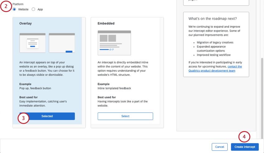
About Feedback Button
The feedback button is a subtle way to collect feedback from website visitors without interrupting what they’re doing. Feedback buttons appear as a tab on the side of a page, and when clicked, they either slide out to show more information, or expand as a new overlay over the screen. Regardless of how they are implemented, feedback buttons make it easy for visitors to initiate the feedback process.
If you look to the left of this support article, you’ll see an example of a feedback button in action!
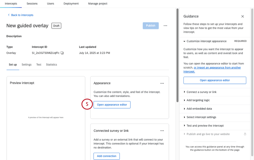
Creating a Feedback Button
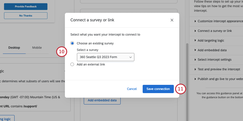
- Choose an existing survey: Link to a survey you have access to. Make sure the project you want to use is open and has an available anonymous link.
- Add an external link: Paste a full URL.
Qtip: For the last setup steps and details on launching, you can also see Creating Guided Intercepts.
Look and Feel
Qtip: This is separate from the Look and feel editor of Qualtrics surveys.
In the Look & Feel section, you can customize the overall look and feel of the creative as follows:
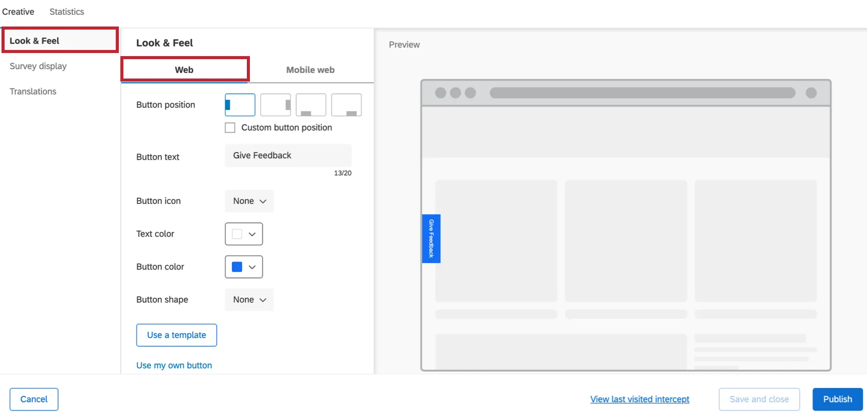
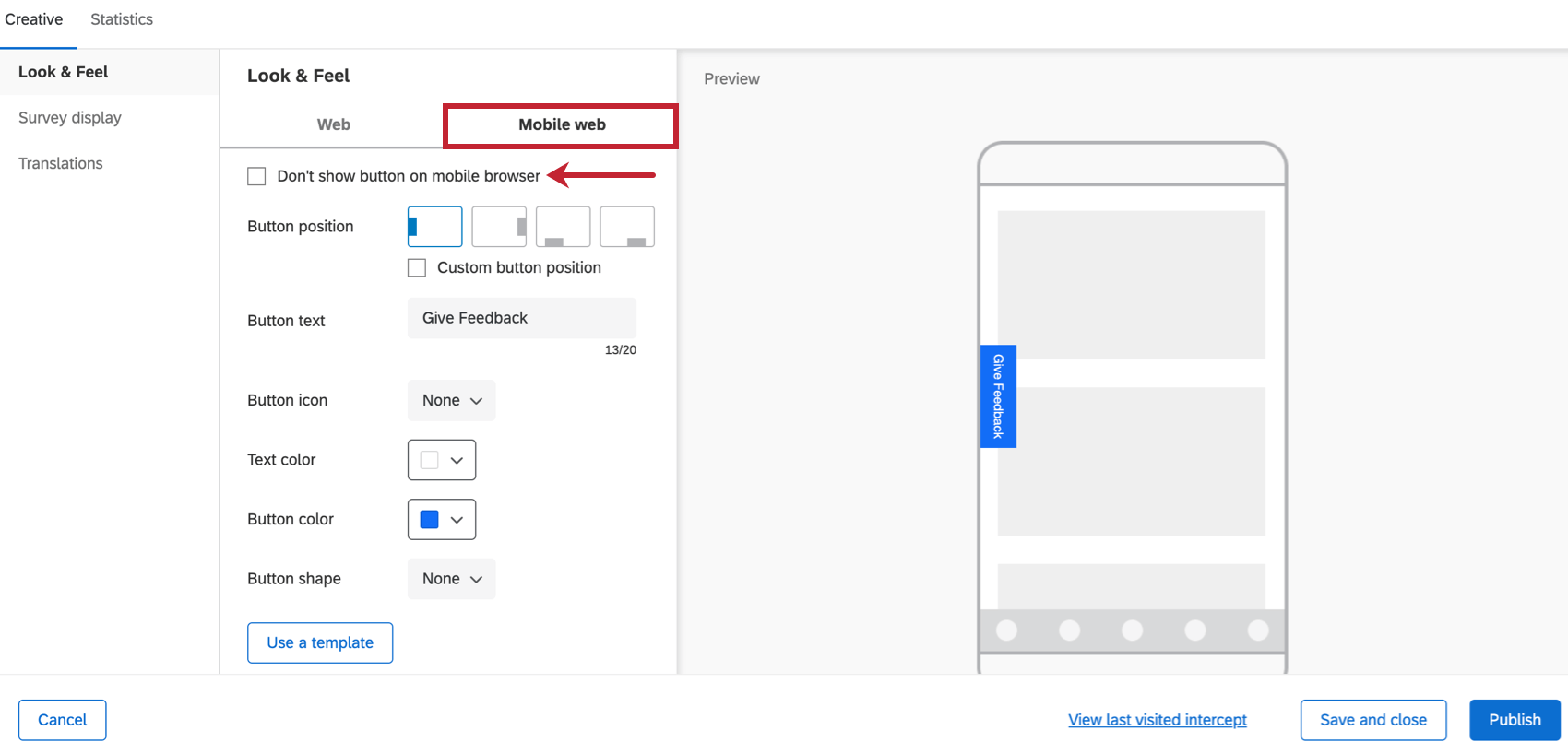
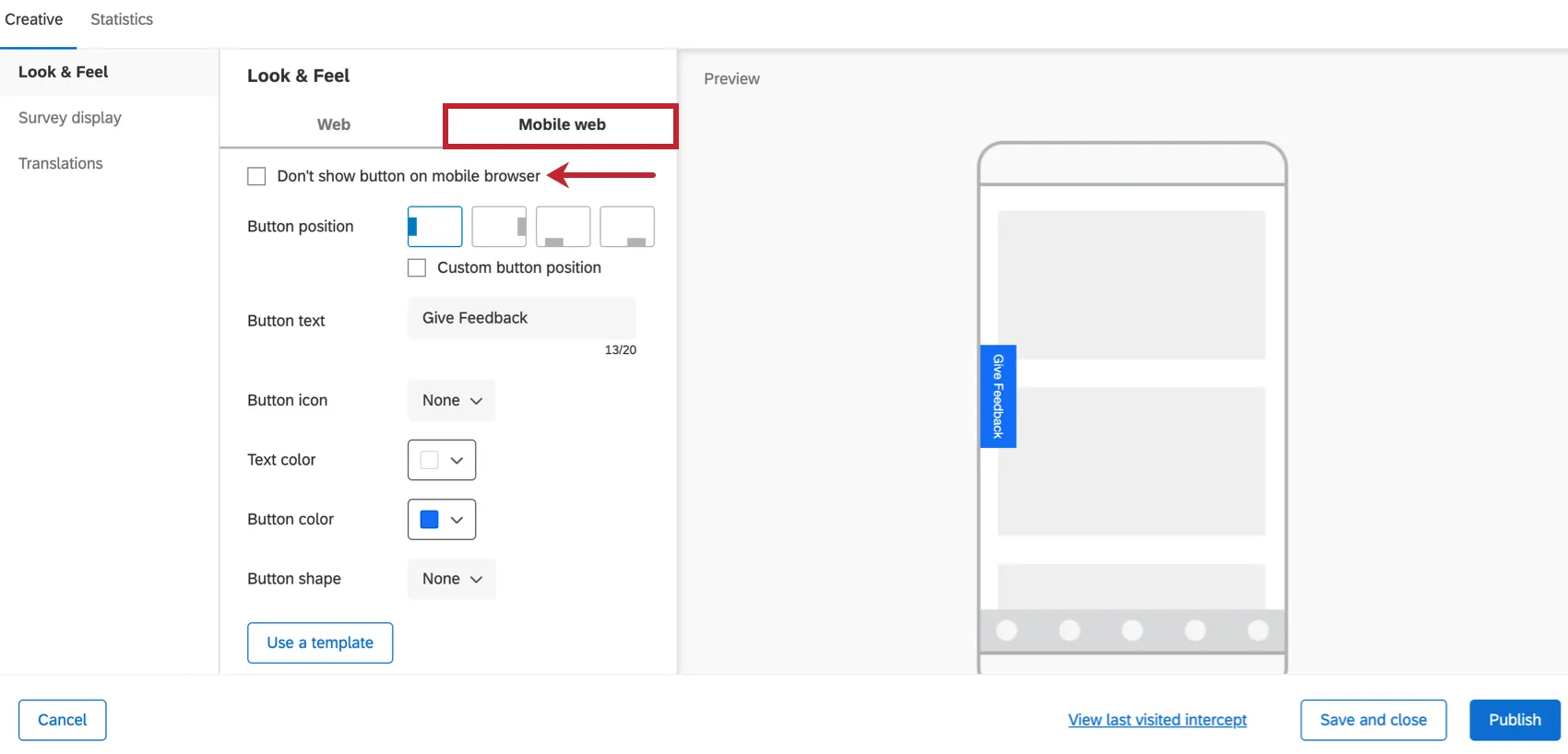
- Button position: Configure where the button should appear on the webpage.
- Button text: Specify the text on the button.
- Button icon: Choose the icon that you would like to show on the button to the left of your text.
- Text color: Choose the color of your button text.
- Button color: Choose the color of the button itself.
- Button shape: Configure the border radius of your button. This determines how rounded the corners are.
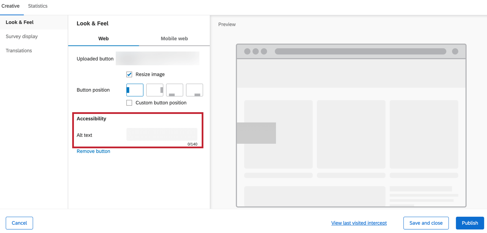
- Use my own button: Upload your own image to use as the button. You have the option to use the image size as-is or resize it to the appropriate size. If you use your own button, you will get a field where you can enter alt text for it, for use with screen reading technology.

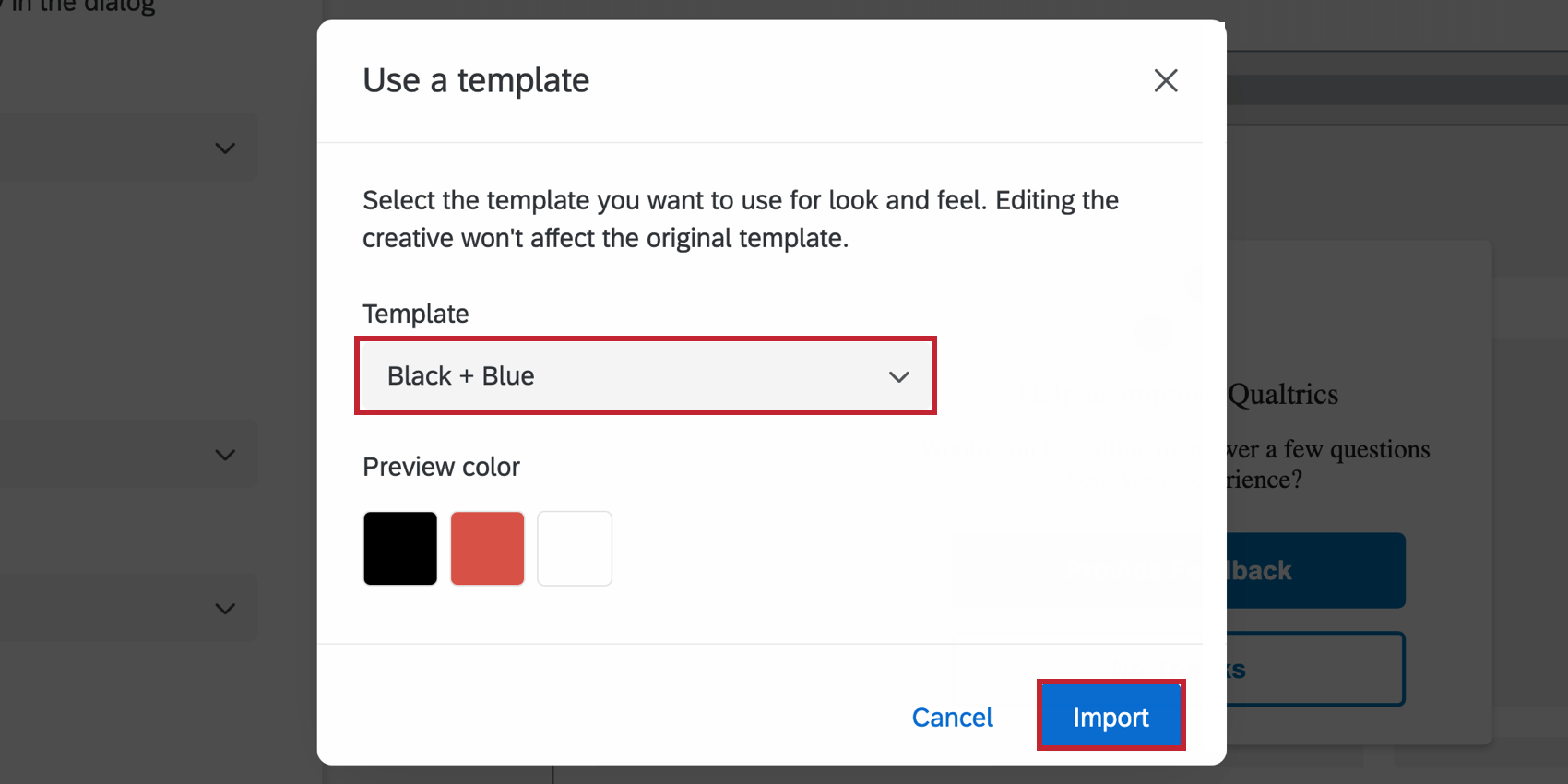
- Use a template: Use a survey theme as a template for the creative’s style settings. This will import the primary color and question spacing settings of that survey theme.
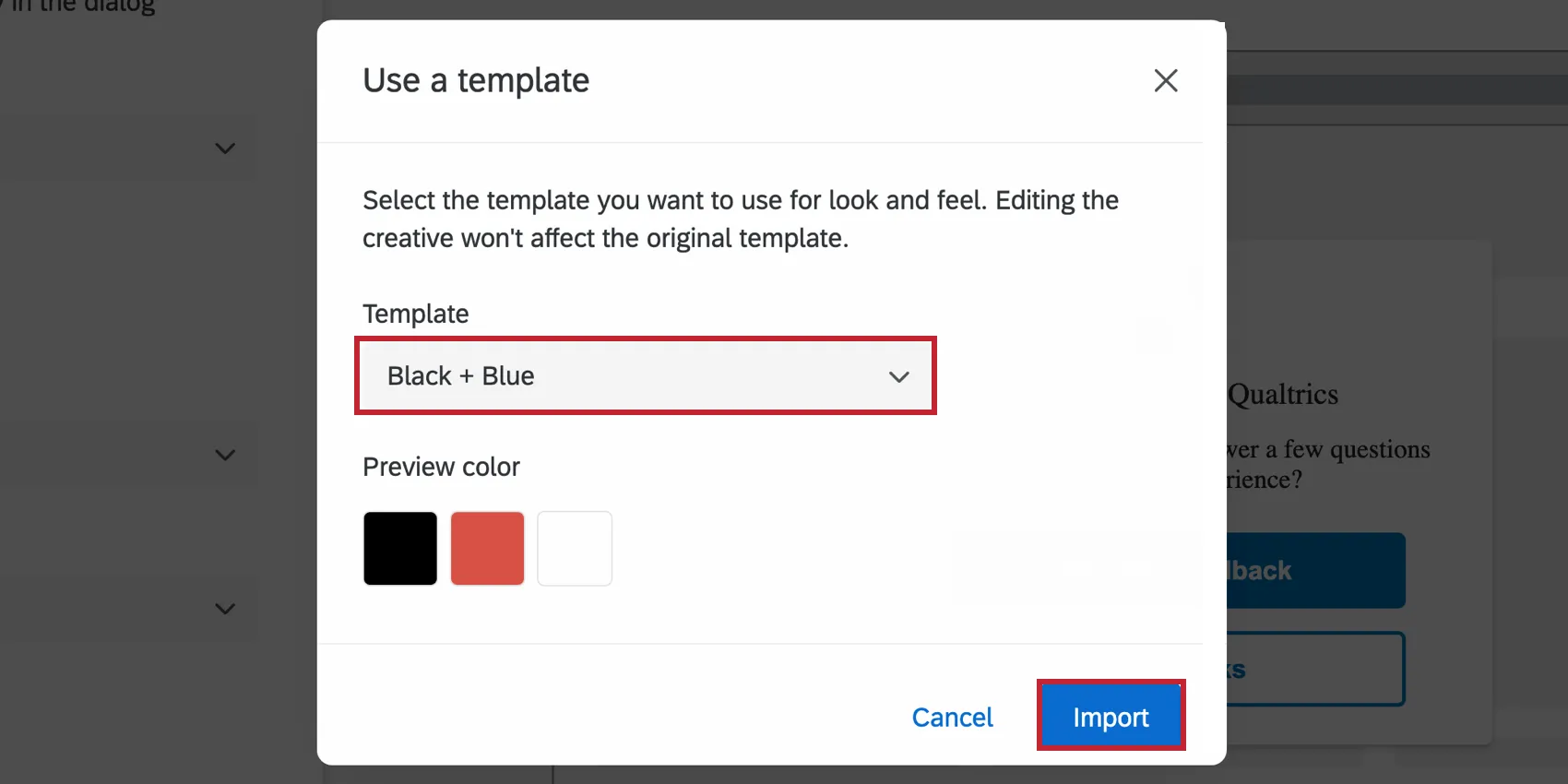 Qtip: The settings in the creative are disconnected from the theme used as a template. The creative’s settings do not update if the template theme changes, and changing the creative’s settings will not change the template theme.
- Customize CSS: Customize the CSS of the feedback button as desired. You can add custom classes and properties in addition to the default ones. Edits made here may not be reflected in the preview; remember to test your intercept before deployment by completing the guided setup. Attention: The following code is provided as-is and requires programming knowledge to implement. Qualtrics Support does not offer assistance or consultation on custom coding. You can always try asking our community of dedicated users instead.
 Warning: If there are multiple feedback buttons on the same page, custom CSS will affect all buttons on the page. The CSS of the intercept that was loaded last will be applied to all intercepts on the page. We recommend only using 1 feedback button on a page when using custom CSS.
All the above options can be separately configured to control how the feedback button will display for desktop web vs. mobile web browsers – using the Web (Desktop) or Mobile web tabs.
For Mobile web, there is also an option to completely disable this creative, if needed. Select Don’t show this button on mobile browser to turn it off for mobile.
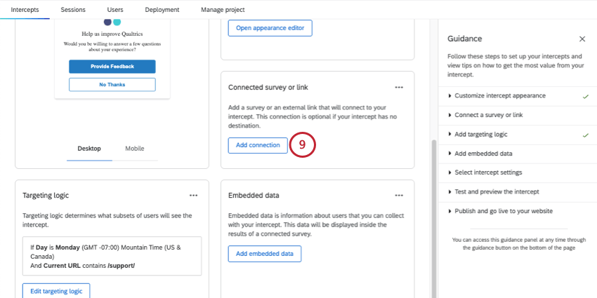
Survey Display
In the Survey display section, you can control how the actual survey shows up once the user clicks on the feedback button.
Qtip: Embedded Data is captured after the first click in the intercept. If a user does not click into the intercept, no embedded data will be collected.
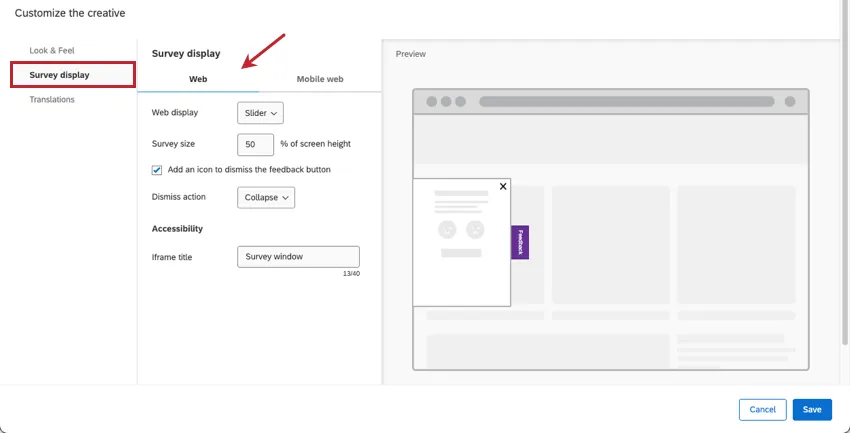
The survey display options for Web (Desktop) are:
- Web display: This setting changes how the survey attached to your feedback button displays on your website.
- Slider: The survey will show up in a slider that slides in and out. You can control what happens when visitors close the slider.
- Overlay: The survey will show up in an embedded window. When visitors click X to close the overlay, the Feedback button will still appear on the side of the webpage if they want to reopen it.
- New window: The survey will show up in a new window. If you select this option, there are no additional settings you need to complete, including iframe title.
- Slider settings:
- Survey size: Control the survey size (height) on your page in terms of percentage of overall page height. Only an option if you choose Slider for web display.
- Add an icon to dismiss the feedback button: Add the option for users to make the feedback button go away.
- Dismiss action: If you add an icon to dismiss the feedback button, you can decide what kind of dismiss action is used:
- Collapse: The feedback slider closes back up, but the button remains on the side of the webpage.
- Remove: The feedback button and slider disappear from the page altogether.
- Overlay settings:
- Automatically resize dialog to fit your survey: This setting helps you avoid issues with scrolling in your embedded survey by automatically resizing the dialog to fit it.
- Fade background: Set how dark the background behind the overlay should be.
- Iframe title: If you’ve added an embedded target to your corresponding intercept, add a title that screen readers can interpret.
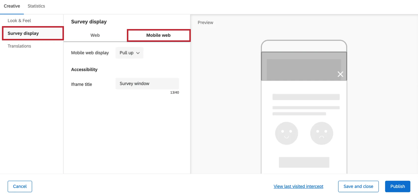
The survey display options for Mobile web are:
- Mobile web display:
- Pull up: The survey will show up in a pull-up window that will cover a part of the screen. If you have add an icon to dismiss the feedback button enabled, clicking the X will dismiss the embedded survey, but you’ll still see the feedback button and be able to re-select it, if desired. Qtip: The appearance of the pull-up window can be adjusted using custom code which requires programming knowledge to implement. Qualtrics Support does not offer assistance or consultation on custom coding. You can always try asking our community of dedicated users instead. If you’d like to know more about our custom coding services, please contact your Qualtrics Account Executive.
- New tab: The survey will show up on a new browser tab. If this is selected, you will not have the option to add an iframe title because you will navigate to a new browser tab for the survey instead.
- Pull up: The survey will show up in a pull-up window that will cover a part of the screen. If you have add an icon to dismiss the feedback button enabled, clicking the X will dismiss the embedded survey, but you’ll still see the feedback button and be able to re-select it, if desired.
- Iframe title: If you’ve added an embedded target to your corresponding intercept, add a title that screen readers can interpret.
Qtip: For mobile iOS devices, we recommend you set the creative to display on the side of the page rather than the bottom.
Feedback Button Changes
Attention: If your feedback creative has different options than what is displayed on this page, or if it was created before September 27, 2019, chances are it is an entirely different creative called the feedback tab (not the feedback button). This is an older creative that is technically a different creative than the one described on this page. You can no longer create the older Feedback Tab, although if you created one in the past, it will never be deleted or disabled.
However, we encourage you to create a new feedback button and try the experience described on this page. This new version is user-friendly and accessible without the need for additional JavaScript-based updates that were required in the past. For example, you can easily set different desktop and mobile options right inside the creative, instead of having to use separate creatives customized with unique actions in an intercept.
FAQs
How do I make my survey appear automatically without users having to click the creative?
How do I make my survey appear automatically without users having to click the creative?
What’s the difference between standalone intercepts, guided intercepts, and guided creatives?
What’s the difference between standalone intercepts, guided intercepts, and guided creatives?
Guided intercepts are when you create features like responsive dialogs, templated embedded feedback, feedback buttons, and embedded app feedback using these steps. Also known as guided setups, guided intercepts combine the visual element of a creative and the settings of a creative into one easy-to-follow flow that will guide you from start to finish.
Guided creatives are when you create features like responsive dialogs, templated embedded feedback, feedback buttons, and embedded app feedback using these steps instead. With a guided creative, you need to create a separate intercept to pair it with. You still get the improved creative editor, but not the rest of the guided setup.
I created a responsive dialog as a creative, but I want to use it as a guided intercept instead. Can I switch it over?
I created a responsive dialog as a creative, but I want to use it as a guided intercept instead. Can I switch it over?
Can I save guided setups to the library?
Can I save guided setups to the library?
That's great! Thank you for your feedback!
Thank you for your feedback!