
Spotlight Insights (EX)
What's on this page
Qtip: This page describes functionality available to Engagement and Lifecycle projects only. For more details on all EX project types, see Types of Employee Experience Projects.
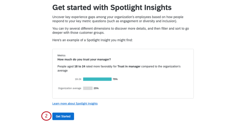
About Spotlight Insights
After running an Employee Experience project and collecting all your data, it can sometimes be overwhelming to determine where your company should focus its efforts. With spotlight insights, Qualtrics can help you identify the most promising areas of improvement. Simply choose what metrics, demographic breakouts, and comparisons you want to run, and Qualtrics will provide you a straightforward report highlighting key experience gaps.
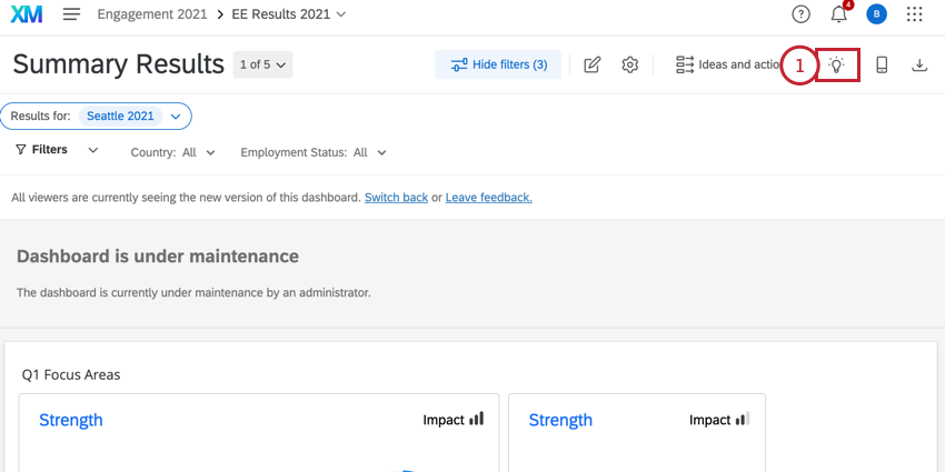
Qtip: To use insights, you must be a Brand Administrator, EX Administrator, or Employee Insights Admin, or you must have permission to edit the dashboard in your participant information window.
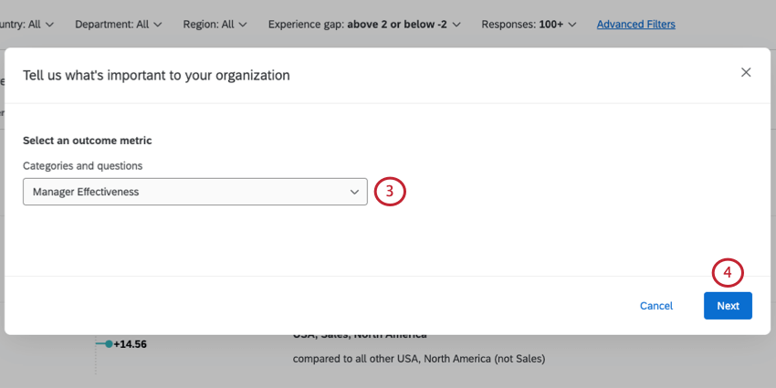
Setting Up Insights
Attention: In order for Qualtrics to generate insights, all relevant questions must first be mapped in the Scales part of your Dashboard Settings.
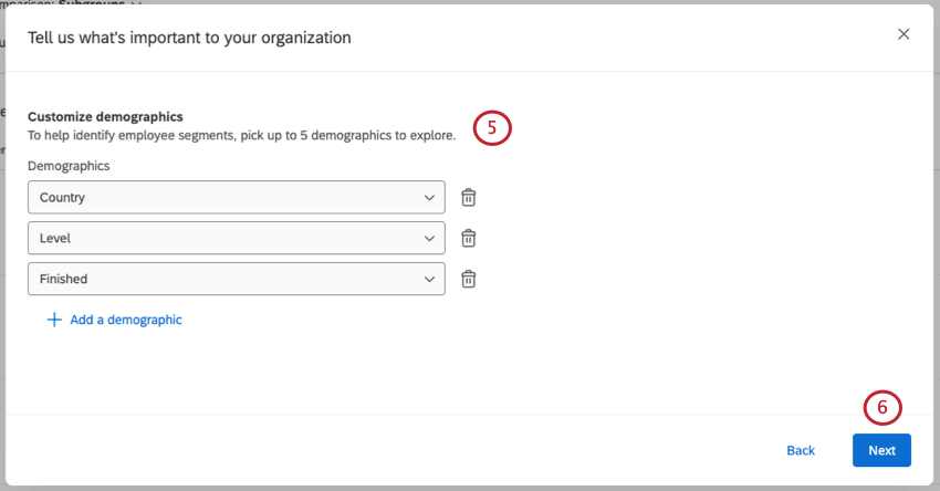
Qtip: It’s best to stick to attributes with a finite number of unique values. For example, there are so many postal codes you may not have enough responses per value to see meaningful results if you chose this field. Fields with 2000 unique values or more cannot be selected.
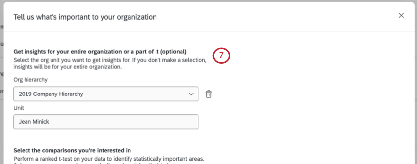
Example: You’d like to see the performance of female engineers vs. the rest of the company from 2020-2021.
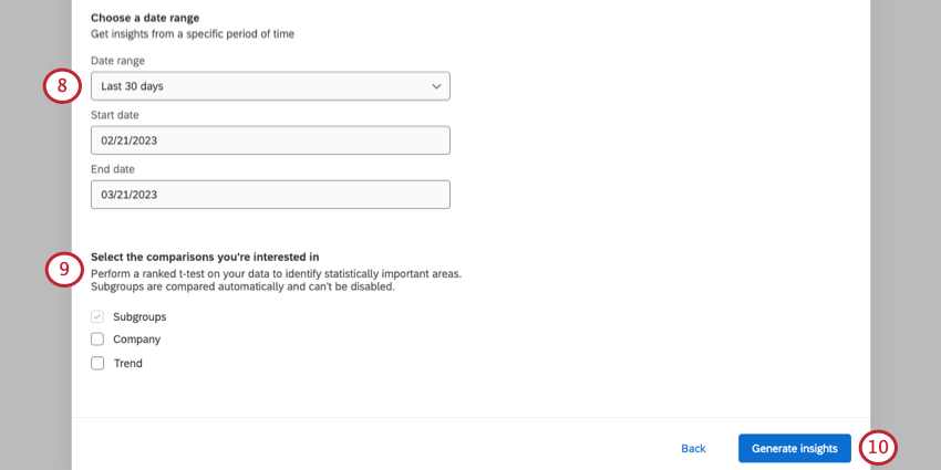
Qtip: The date used here is based on the recorded date field. This cannot be changed to another date field.
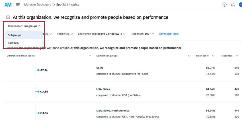
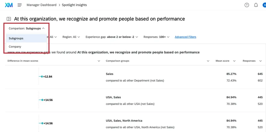
- Subgroups: This comparison is enabled by default and cannot be disabled. This comparison looks for demographic subgroups that have a score which is statistically significant from the rest of your organization (excluding the subgroup itself).
- Company: This comparison compares demographic subgroups against the company as a whole (including the subgroup itself) and identifies subgroups whose differences in scores indicate a statistical significance.
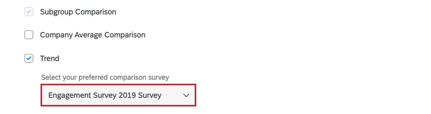
- Trend: You can only select this comparison if you have multiple surveys mapped into your dashboard. This comparison lets you compare your current project’s data against another project’s data to see how scores have changed over time.

Qtip: If you select trend comparison, a dropdown menu will appear for you to select which survey to compare against.
Qtip: Your insights may take up to 30 minutes to calculate. Feel free to exit this page and return later while we analyze your data.
Navigating Insights
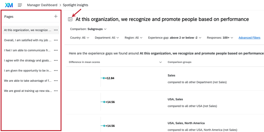
To change what metric or priority you are analyzing for, use the Pages menu to the left. There is a button next to it that you can use to open and close this menu.
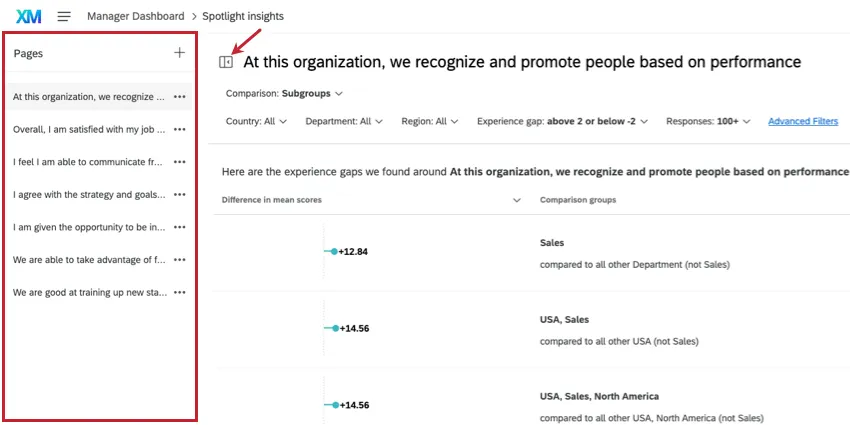
Once you’re on a page, you can select which insights you want to view by using the Compare dropdown at the top.
In order to help you focus on the areas most promising of improvement, Qualtrics orders the insights list based on our ranking algorithm. This algorithm surfaces more interesting insights towards the top of the list by calculating the number of survey respondents affected and the width of the experience gap. Therefore, large experience gaps that affect a large number of respondents will be displayed higher in the list than small experience gaps that affect only a small number of respondents. You can still use the page filters and sorting to view the insights in a different way.
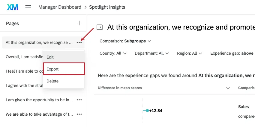
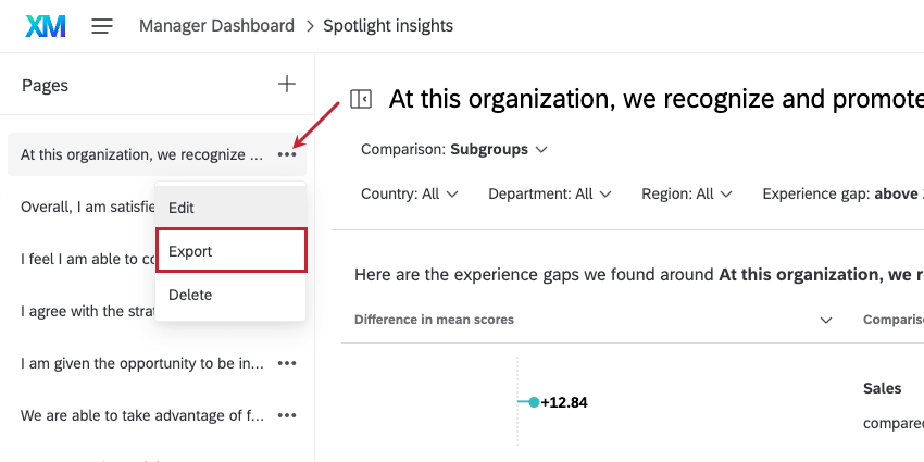
Qtip: You can export a page of insights to CSV or TSV. Any filters or comparisons you have selected will be applied to the data.
To return to your dashboard, click the dashboard name in the navigation bar.

Adding Insights
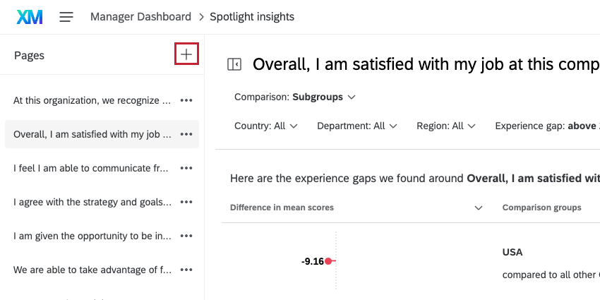
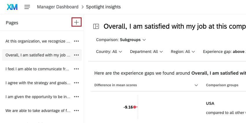
You can keep multiple runs of spotlight insights without the results getting overridden. Different runs will be saved as separate pages to the left.
To generate additional insight, use the plus sign ( + ) on the Pages menu. You have a limit of 8 pages.
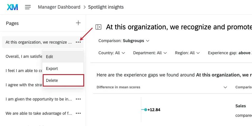
Qtip: To delete an insight, click the dropdown next to the page name and click Delete.
Editing Insights
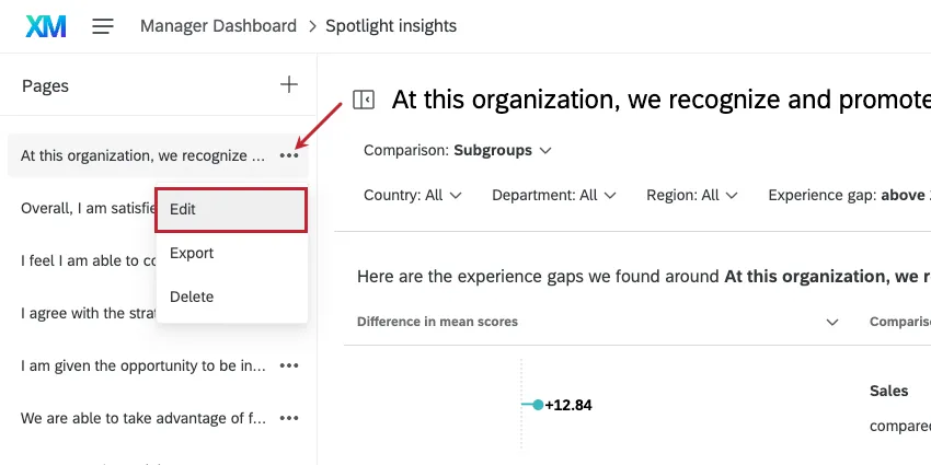
If you need to edit a run, click the dropdown next to the insight’s page, then click Edit. Please note that if you edit these settings, you will need to wait while we generate your new insights.
Editing an insight replaces its results. Note that you can generate a new insight instead.
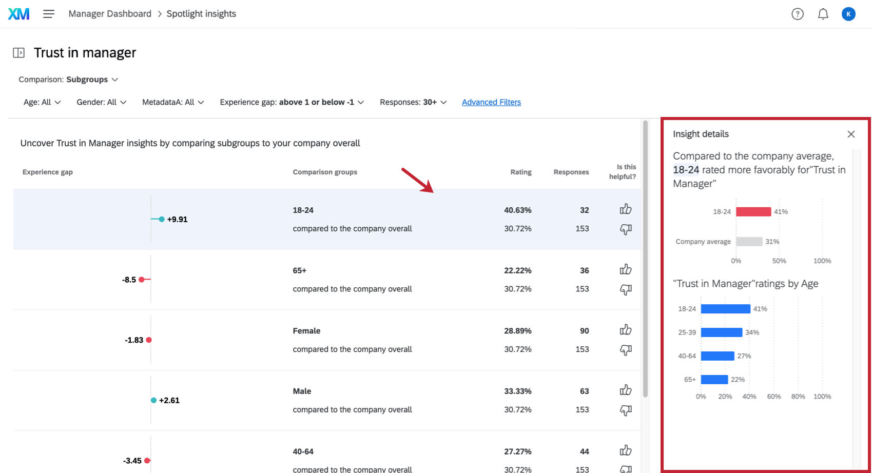
Insight Details
When you click on an insight, additional details will open in a pane to the right. If you generated insights for a specific org hierarchy unit, the details pane will contain a breakout chart for the leader compared to their child units and parent unit.
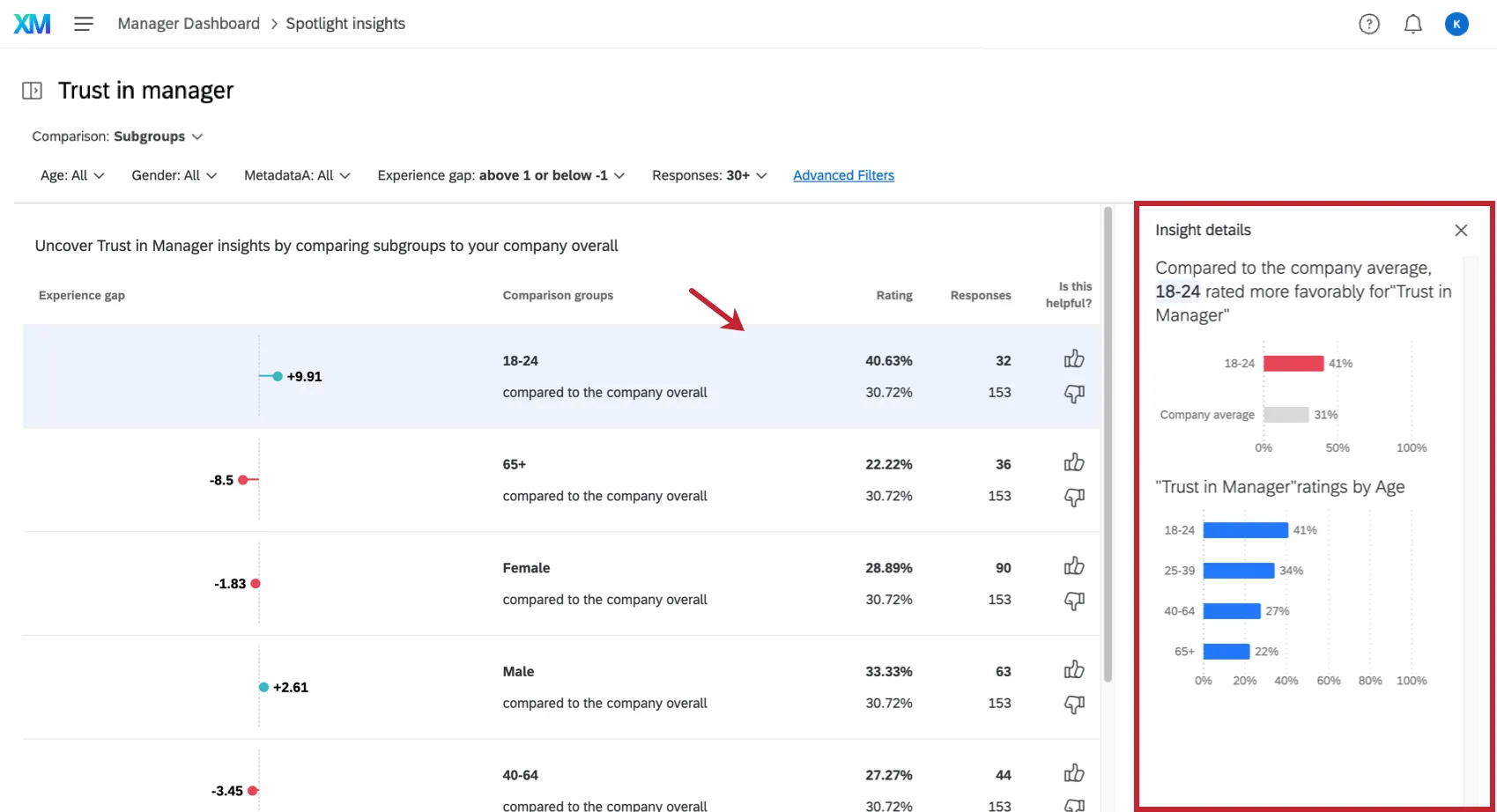
The details pane will explain the insight in simple language with a chart. Then there will be a graph displaying the performance of other groups within the same demographic category so you have a visual representation of how favorably or unfavorably this group has rated the item in question compared to the other groups.
Example: In the screenshot above, we see how this age group, 18-24, scored on “Trust in Manager” compared to the rest of the company. This comes with a graph to visually represent how much more favorably this age group rated this item. Then there’s a breakdown of how other age ranges score on this item for added context.
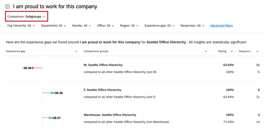
Subgroup Comparison
The Subgroups comparison contains demographic groups that we noticed showed a statistically significant difference from other groups in the company.
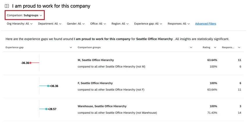
In the insight, you have the following attributes:
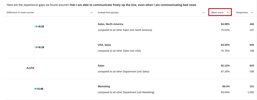
- Experience gap: The difference between the subgroup’s score and the comparison group’s score. The raw scores for each can be found in the Rating column.
- Comparison groups: The subgroup that is being analyzed & the group that the subgroup is being compared against. Note that the subgroup is excluded from the comparison group. Example: For example, let’s say I have three office locations: Provo, Seattle, and Chicago. If my subgroup is Provo, then the comparison group is Seattle and Chicago. Your comparison group will indicate which demographic is excluded.

- Rating: The subgroup’s score for the selected metric. The comparison group’s score is found below this number
- Responses: The number of responses in the subgroup. The number of responses in the comparison group is found below this number.
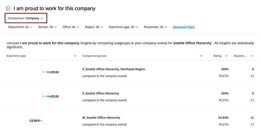
Company Comparison
The Company comparison displays which subgroups have a statistically significant score compared to your organization as a whole. It’s important to note that the subgroup is compared against the entire company, which includes the subgroup.
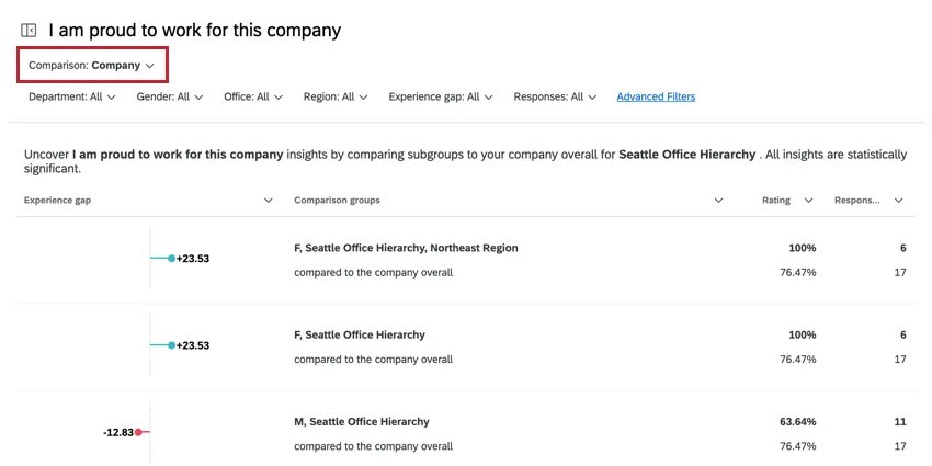
In the insight, you can find the following attributes:
- Experience gap: The difference between the subgroup’s score and the comparison group’s score. The raw scores for each can be found in the Rating column.
- Comparison groups: The subgroup that is being analyzed & the group that the subgroup is being compared against (i.e., the entire company). Example: For example, let’s say I have three office locations: Provo, Seattle, and Chicago. If my subgroup is Provo, then the comparison group is Seattle, Chicago, and Provo (i.e., all office locations for the entire company).
- Rating: The subgroup’s score for the selected metric. The comparison group’s score is found below this number
- Responses: The number of responses in the subgroup. The number of responses in the comparison group is found below this number.
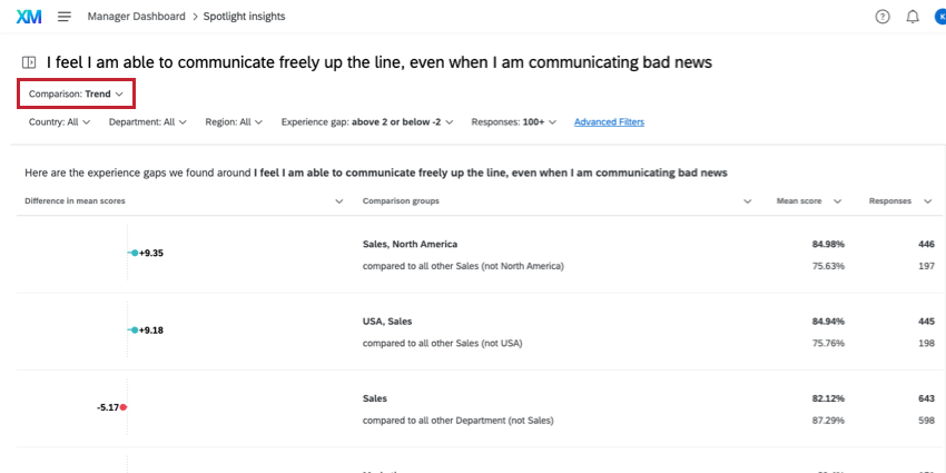
Trend Comparison
Qtip: Remember, to use the trend insights, you must have a second data source mapped into your dashboard.
The Trend insight shows how different demographic group scores changed between your two surveys. The two projects you are comparing will appear at the top of the report, highlighted in red below.
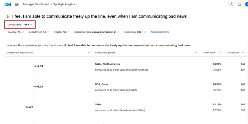
In the insight, you can find the following attributes:
- Experience gap: The difference between the subgroup’s score and the comparison group’s score. The raw scores for each can be found in the Rating column.
- Comparison groups: The subgroup that is being analyzed & the group that the subgroup is being compared against. Note that the subgroup is excluded from the comparison group. Example: For example, let’s say I have three office locations: Provo, Seattle, and Chicago. If my subgroup is Provo, then the comparison group is Seattle and Chicago.
- Rating: The subgroup’s score for the selected metric. The comparison group’s score is found below this number
- Responses: The number of responses in the subgroup. The number of responses in the comparison group is found below this number.
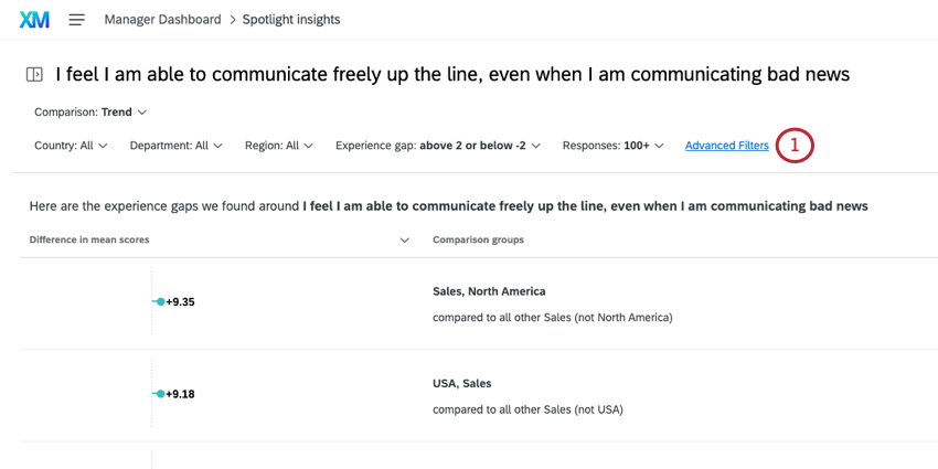
Filtering Insights
You can filter your insights based on the insight attributes in order to narrow down your insights.
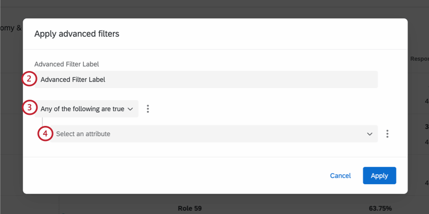
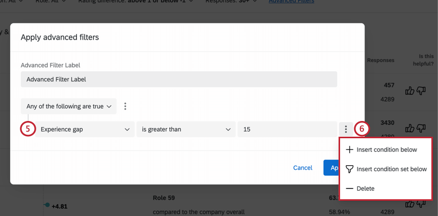
Example: We’re interested in big experience gaps, so we filter for Experience gap is greater than 15.
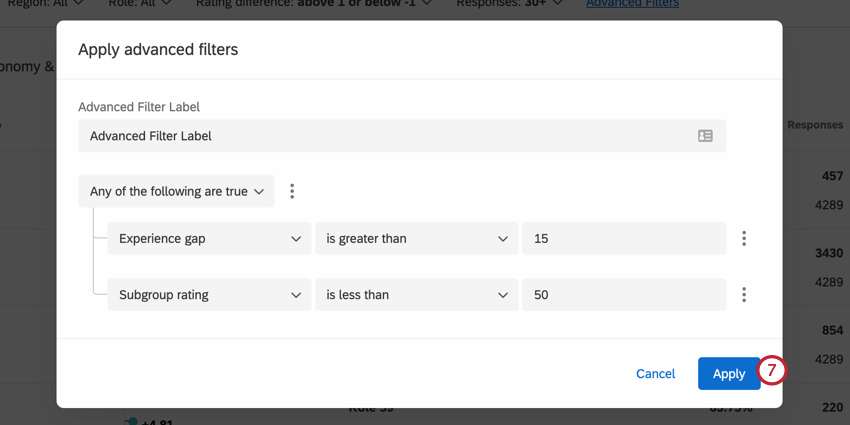
To edit your filter, simply click Advanced Filters again and make any desired changes before applying the filter again.
Sorting Insights
To sort your insights, click the header of the attribute you want to sort by. An arrow will appear next to the attribute indicating if it’s sorted in ascending or descending order. Click the header again to cycle through the sorting order or to stop sorting altogether.

That's great! Thank you for your feedback!
Thank you for your feedback!