
Gap Chart (360)
What's on this page
About the Gap Chart
The Gap Chart visualizes the difference, positive or negative, between two rater groups. The x-axis of your chart is average score.
The table automatically compares data from Self and Others, but can display data from any two different rater groups. For example, you can show the gap between how colleagues rate the subject and how their manager does. The gap is calculated by subtracting the results of the second rater group from the first rater group.
Qtip: For another visualization that can illuminate the gaps between two groups’ perception of the same subject (e.g., self vs. other), see the Hidden Strengths / Improvement Areas support page.
Qtip: Gap charts can only be used in 360 reports.
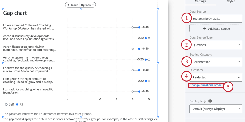
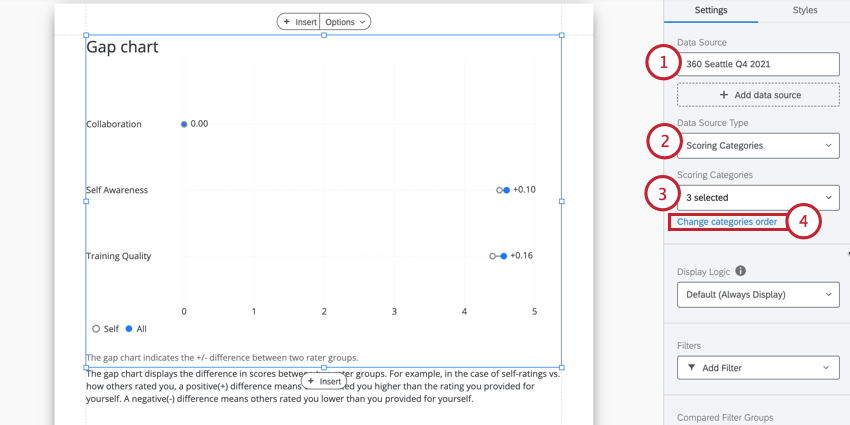
Data Source
You must set up scoring categories before you use a gap chart in your report. The gap chart can show data in two different ways:
Qtip: Gap charts only show data from one 360 project at a time. If you want to highlight gaps across different 360 projects, you should add a separate chart for each survey you want to compare.
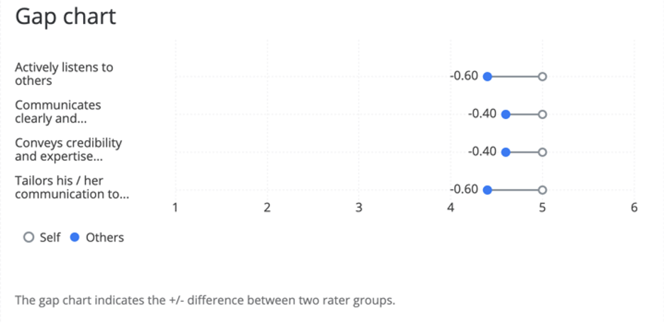
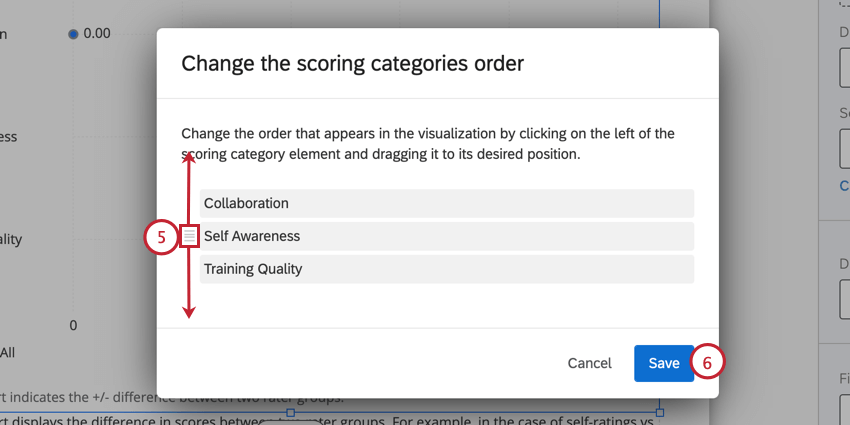
Comparing Questions in a Scoring Category
Example: On the item “Actively listens to others,” other evaluators rated the subjects 0.60 points lower on average than the subject rated themself.
Qtip: If your x-axis values look larger than you’d expect an average score to be, check your survey questions’ recode values. These are safe to edit any time during, before, or after data collection.
Comparing Scoring Categories
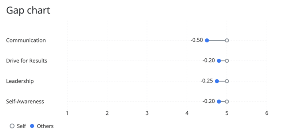
Example: Of all items in the “Communication” scoring category, other evaluators tended to rate the subject lower by 0.50 points than the subject rated themself.
Display Logic
Display logic is a means of hiding a chart or table if not enough responses have been collected yet. It works the same way in this visualization as it does in all other 360 visualizations. See the linked page for more details.
Filters
By default, the gap chart doesn’t have a filter attached. However, it is pulling data from “All” evaluations of the subject. This is because you can choose what rater groups you are comparing in the table.
This filter setting can be used to filter the table by other demographics or employee metadata (e.g., a specific office or region), and is not a good use for rater group filters. See 360 Basic Filtering for a guide on more general filtering.
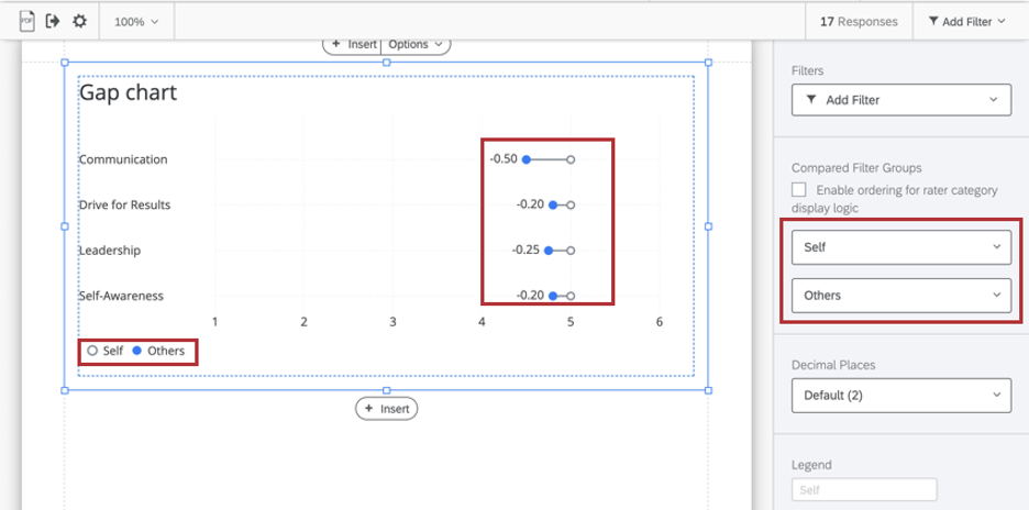
Compared Filter Groups
Use the dropdowns to designate what rater groups should be compared in your table. By default, this is self (how the subject evaluated themselves) vs. others (how others evaluated the subject), but it can be any two filter groups you want.
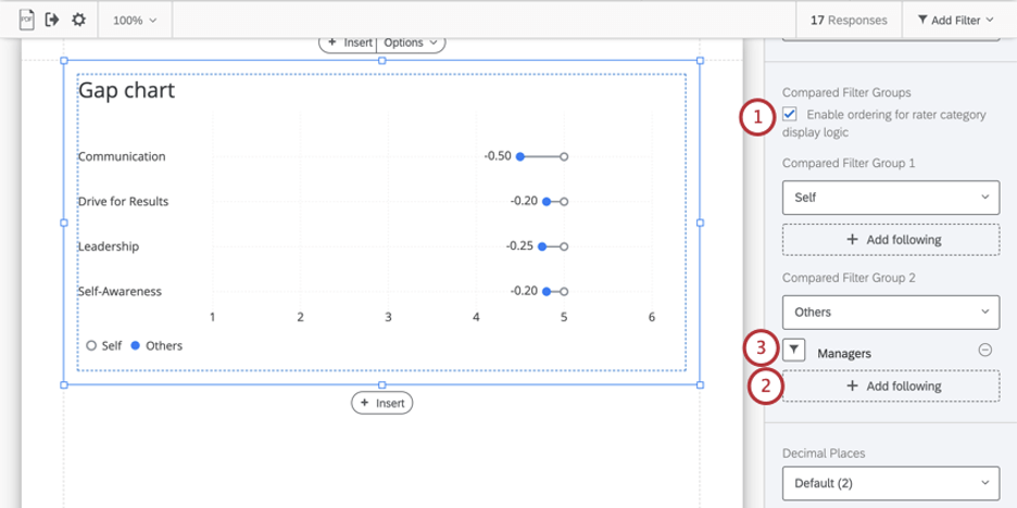
Rater Category Display Logic
Rater category display logic allows you to customize the conditions under which a data source is displayed. For example, you can set logic that allows you to hide or display a data source under specific conditions.
If you have rater category display logic set up in your report, then you can configure your gap chart so that other filter groups are substituted in the event that rate category display logic hides them.
Example: Your gap chart is set up to compare how the subjects rated themselves vs. how their managers rated them. However, you have rater category display logic that hides manager’s ratings if no response is provided. In the event a manager doesn’t respond, you set up your gap chart to compare the subjects self-assessment vs. all “Others.”
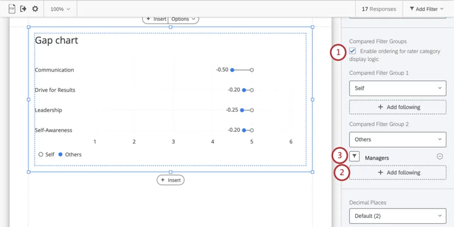
To remove substitute filter groups, use the minus sign ( – ) next to its name. You can add multiple substitutes. The table will check them in the order they are listed.
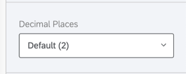
Decimal Places
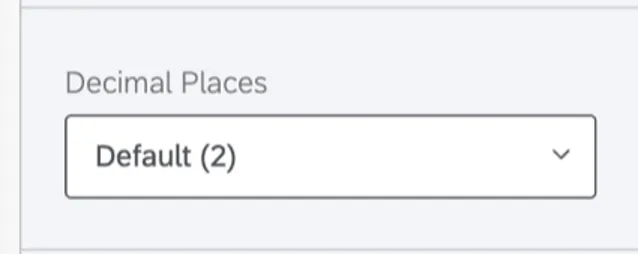
Adjust the number of decimal places displayed in numbers on the table. Pick from 0 to 5.
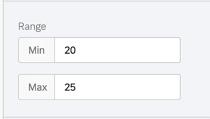
Range
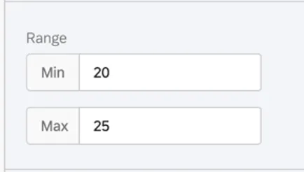
The range will adjust the x-axis of the chart. You can erase the value you’ve entered to allow the chart to automatically set a minimum and maximum value.
Qtip: Remember that your edits are applicable to all subjects’ reports – if you make your range too narrow, the chart may look good to some subjects and not others.
Footer
The footer contains the following text, which explains how the agreement chart works so subjects can better understand their reports. Select or deselect the Footer checkbox to either hide or display this footer.
The gap chart indicates the +/- difference between two rater groups. Qtip: You can add your own custom text using a text area.
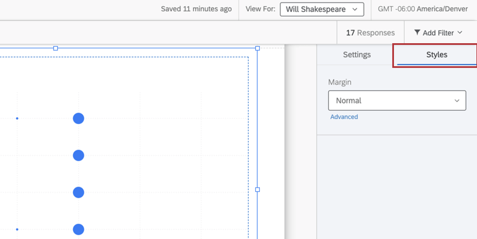
Styles
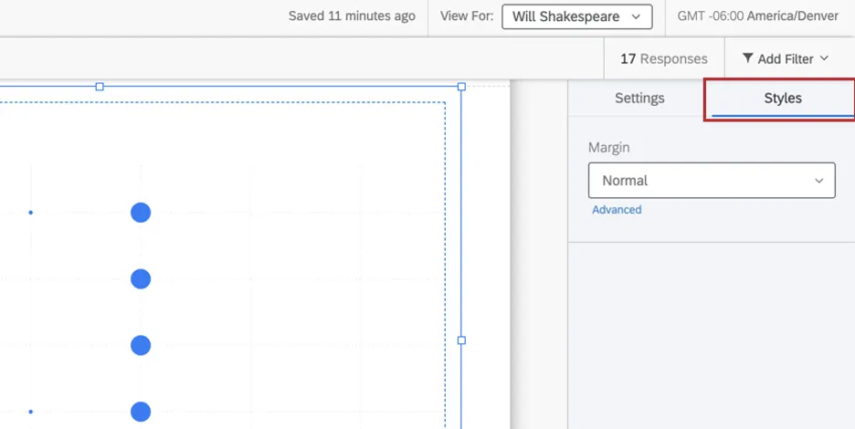
Switch to the Styles tab to adjust the margins around the edge of your chart. Switch to Advanced to adjust margins on each side independently of each other.
That's great! Thank you for your feedback!
Thank you for your feedback!