
Rater Group Filters (360)
What's on this page
About Rater Group Filters
In 360 reports, you can create filters that help you narrow down subject-specific data by the different “rater groups” (or relationships) that evaluated them.
Since different groups of evaluators may have different views of the subject, it can be useful to organize the results in ways that make those distinctions apparent. For example, you might want to have separate tables displaying the subject’s feedback from their manager, and another graph that combines all colleagues’ assessments of the subject in one place. You may also want to identify the gaps between one group of raters and another, or break out high and low scoring items by the different relationships the raters had to the subject (e.g., managers vs. peers vs. self).
Qtip: Rater group filters serve a similar purpose to data sources in the old 360 reports. The primary difference is that, whereas old 360 reports combined the data source survey (e.g., 2020 data vs. 2019 data) with the ability to filter data by the relationship to the subject, 360 reports separate these two functions. This page focuses on filtering / breaking out data by the relationship to the subject.
Default Rater Group Filters
These are the filter groups included in your report by default. If you need to make additional filters for rater groups, see Creating a Rater Group Filter.
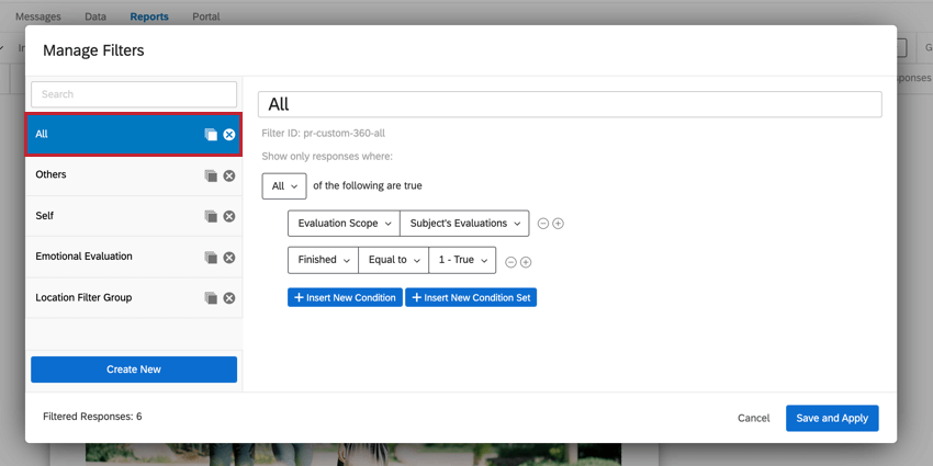
- All: This filter displays all finished subject evaluations.

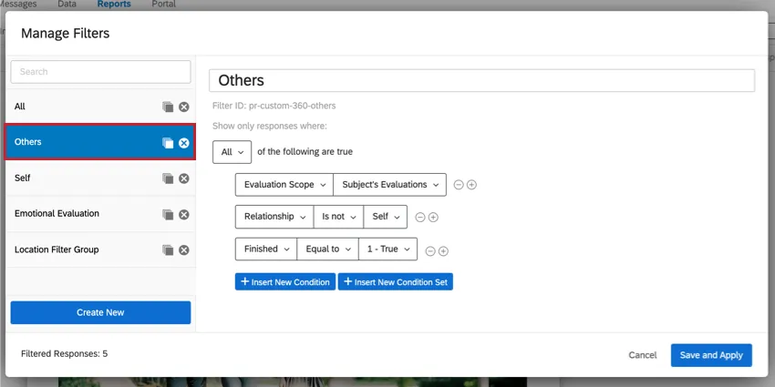
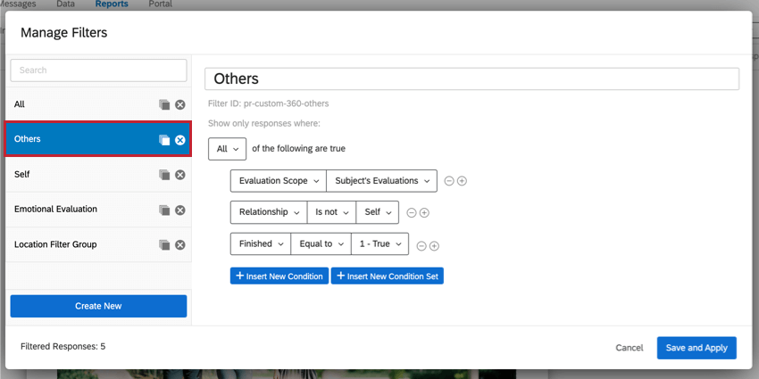
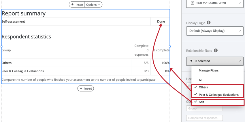
- Others: This filter displays all finished subject evaluations submitted by people other than the subject themself.
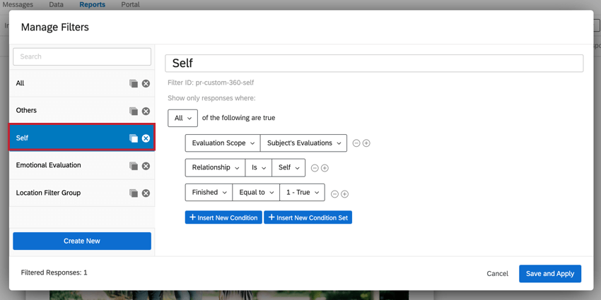
- Self: This filter displays the subject’s self-evaluation.

Creating a Rater Group Filter
Examining Rater Group Filters
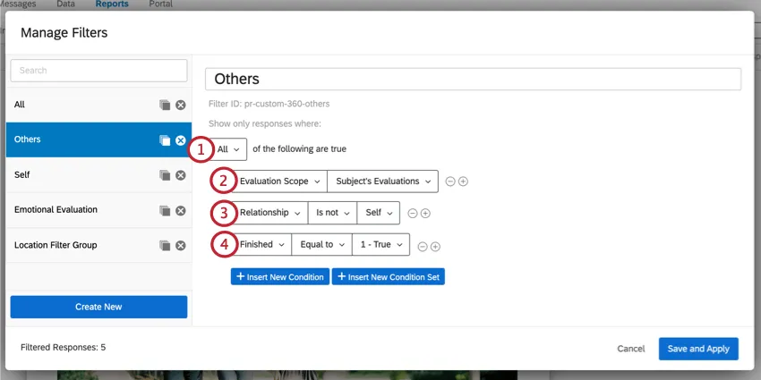
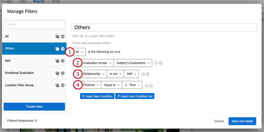
Before jumping into building our own rater group filters, let’s take a look at the default “Others” filter to see what aspects make an effective rater group filter.
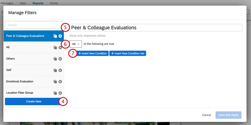
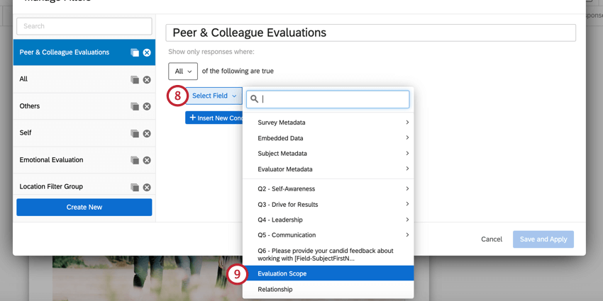
Creating a New Rater Group Filter
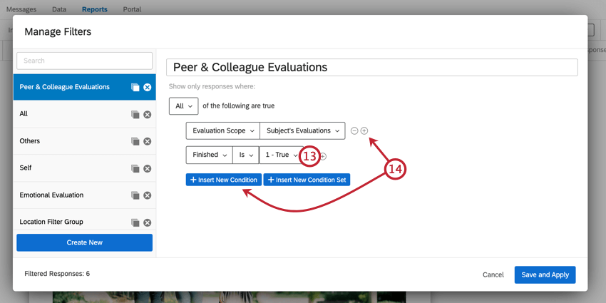
Qtip: When “all” the conditions are true, each condition is linked by an implicit “and.” When “any” of the conditions can be true, each condition is linked by an implicit “or.”
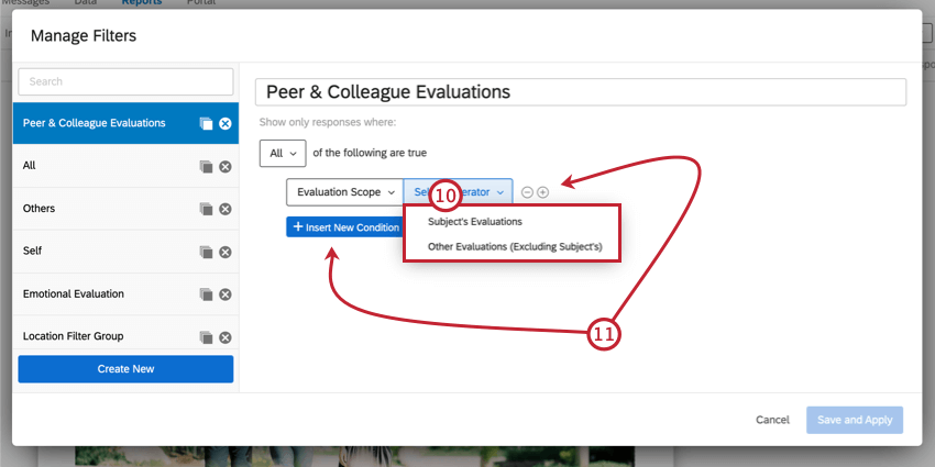
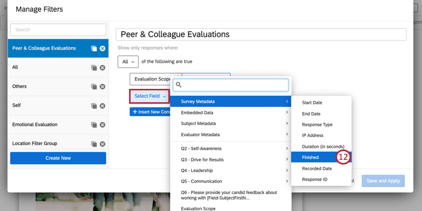
Qtip: This condition is technically optional, but we recommend including it in your rater group filters.
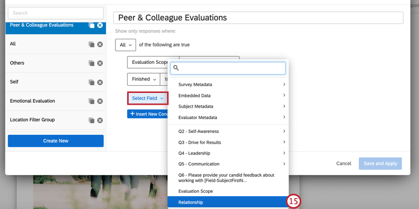
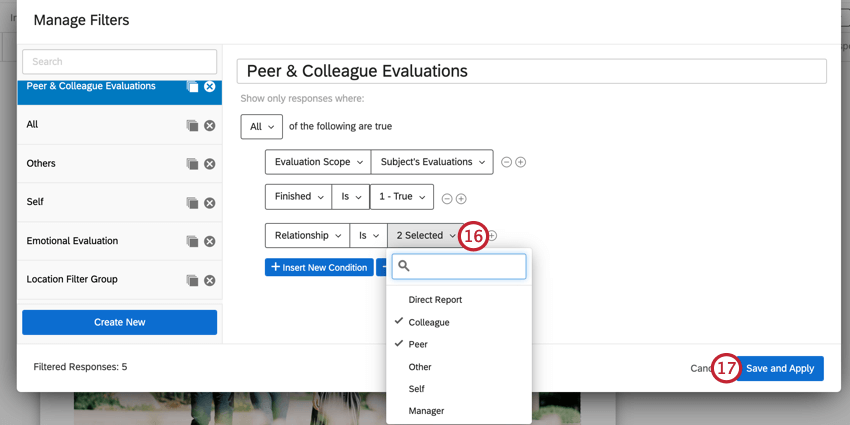
Qtip: You can select multiple relationships!
Qtip: You can continue to add conditions as needed. For example, you could add a condition to only show responses that scored the subject above a certain threshold.
Adding Filter Groups to Visualizations
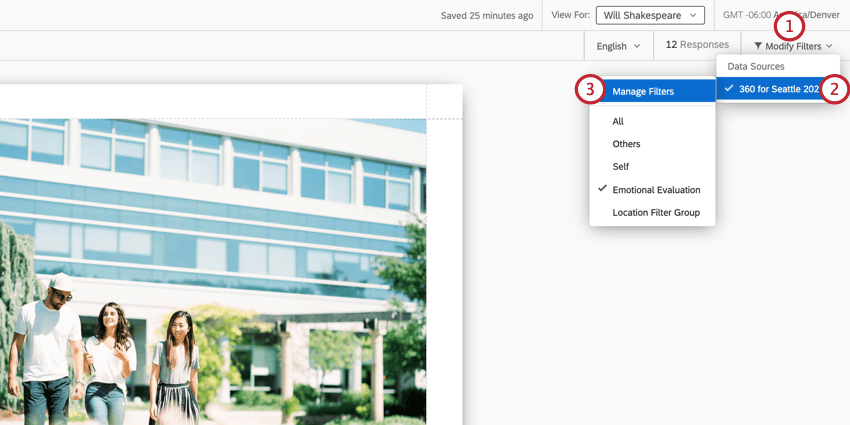
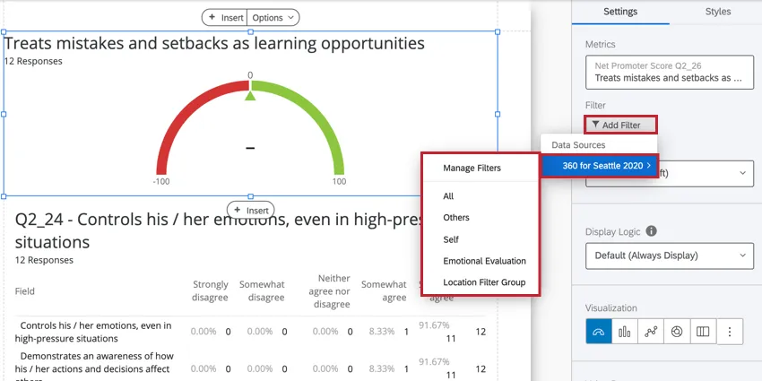
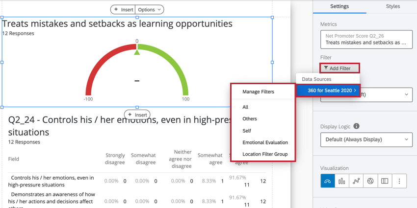
To add your filter group to a visualization, click Add Filter in the visualization editing window and then select your desired filter group. You can also click Manage Filters to create a new one.
Applying Different Filters to a Visualization
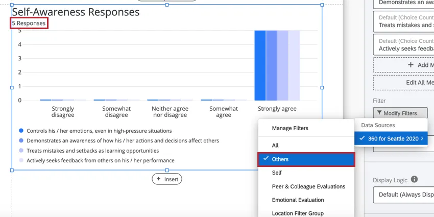
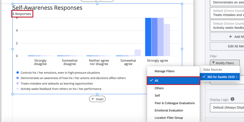
Let’s take a look at how applying different filters can affect the data in a visualization. In the below bar chart, the All filter is applied, and we can see that the visualization contains six responses. This includes all responses for the subject which includes their self evaluation as well as any evaluations submitted by other evaluators about the subject.

If we instead wanted to view data for all evaluations submitted about the subject, but not including the subject’s self-assessment, we can then use the Others filter. After applying the filter, we can see that the data in the visualization has adjusted, and now only five responses are shown since the subject’s self-assessment is now excluded.
Visualizations that break out by rater groups
The following visualizations let you use your rater group filters to break out the subject’s results.
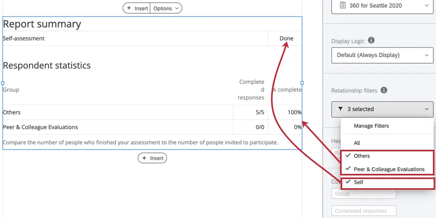
Example: Below is a Report Summary Table with three different rater group filters applied.
Visualizations that let you compare two or more rater group filters
The following widgets let you compare between two or more rater group filters:
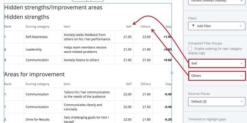
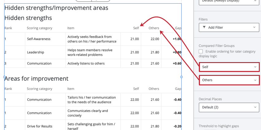
Example: Below is a Hidden strengths/improvement areas visualization that is comparing the self evaluation against the evaluations submitted by others.
Visualizations best suited for the “All” Filter
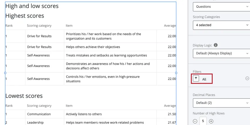
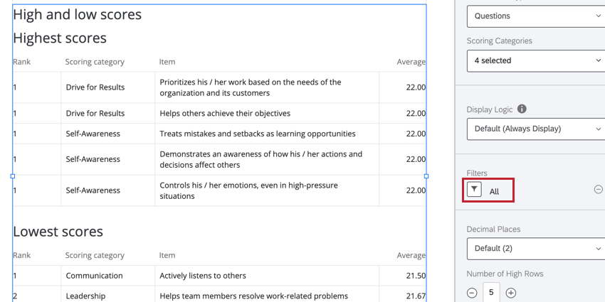
Example: Below is a High and Low Scores visualization with the All filter applied so we can see the data for every evaluation.
That's great! Thank you for your feedback!
Thank you for your feedback!