
Breakdown Trends Widget (CX)
What's on this page
About Breakdown Trends Widgets
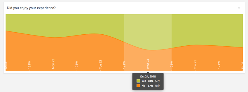
The breakdown trends widget displays segmented data across a set time period. The chart breaks out the data from a particular field into proportional sections in the same way as a breakdown bar, but the relative proportions will change across the chart with time.

Types of Dashboards
This widget can be used in a few different types of dashboard. This includes:
Field Type Compatibility
The breakdown trends widget is compatible with the following field types:
- Number Set
- Text Set
- Multi-Answer Text Set
Only fields with the above types will be available when selecting the Source for the breakdown trends widget.
Widget Customization
For general settings that apply to most widgets, see Building Widgets. Customization unique to the breakdown trends widget will be detailed below.
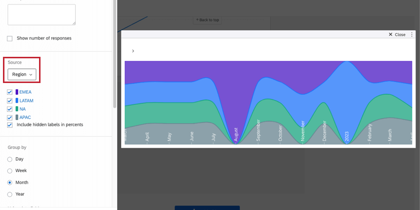
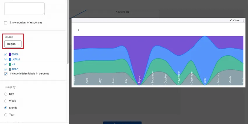
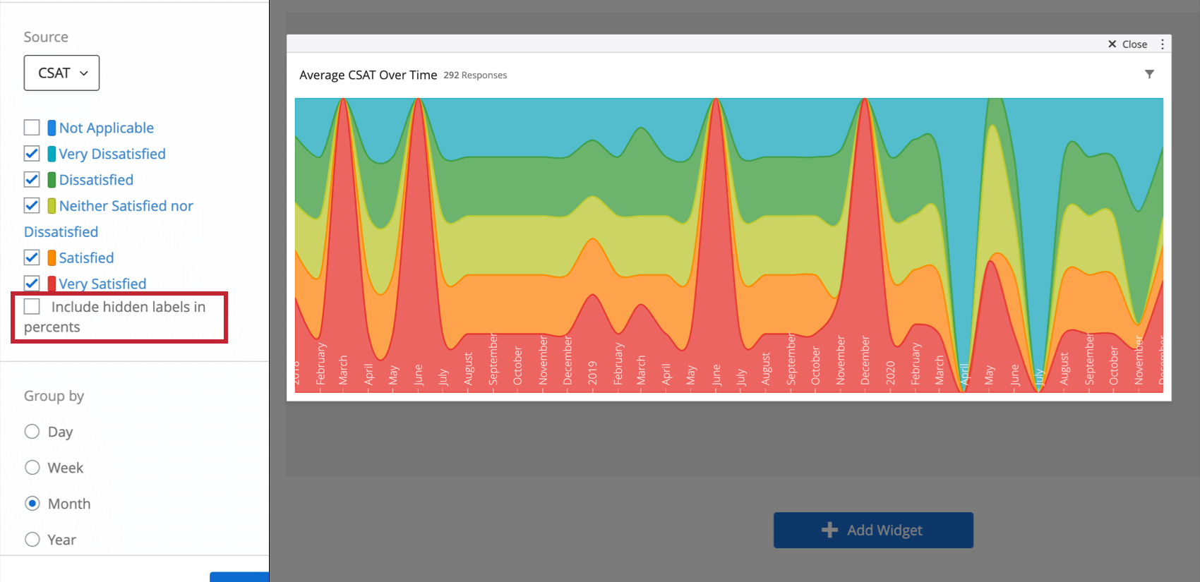
Include hidden labels in percents
Once you’ve added a source to your widget, you’ll be able to hide, rename, and reorder the labels on your widget. If you decide to hide certain labels, you’ll have to decide whether you want to include this data when percentages are calculated in the widget (i.e., percentages displayed in tooltips). If not, deselect Include hidden labels in percents.

Example: You make a breakdown bar widget displaying satisfaction results (very satisfied, very dissatisfied, etc.). You want to know the percentage of respondents who answered each way. Your question included a “Not Applicable” option you’d like to hide and exclude from the widget’s results. Deselect the “Not Applicable” label and deselect the Include hidden labels in percents option.
Group by
The breakdown trends widget gives you the option to choose how you group the time axis. The four options are Day, Week, Month, and Year. Which option is most appropriate will depend on the timescale over which you would like to look at changes in the data.
Using date field
In this section, you will choose the date field from your dataset that you would like to use as the date range on the widget. Only fields with a field type of Date will be available for selection.
Area Style
The area style of the chart determines how the changes in the data proportions are displayed. Line connects the data point for each time increment directly with a straight line. Spline connects each data point with a smooth line. Step keeps the size of the data proportions constant across each time increment, causing a step between increments.
Date Labels
By default, the labels for the time increments are Hidden. These labels can be displayed across the bottom of the chart by selecting Show inside chart.
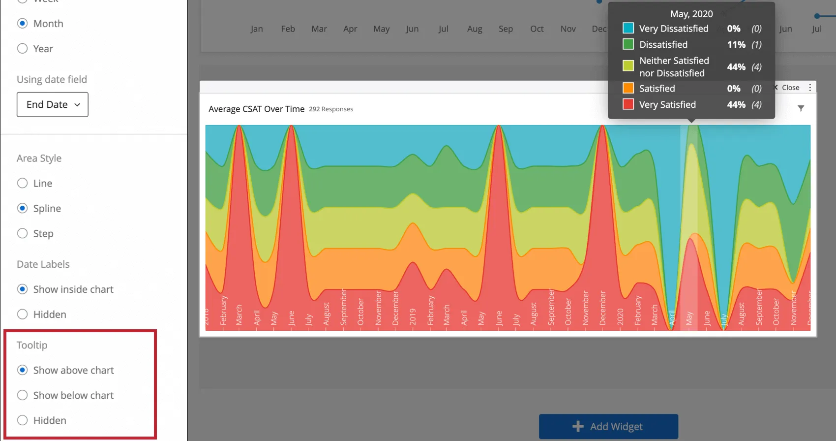
Tooltip
When you hover over a breakdown trends widget, a tooltip can appear to display what the percentage of each response was for each time period. You can determine whether this tooltip opens above the chart (pictured), below it, or whether it is hidden, thus not appearing on hover.
FAQs
I have multiple datasets on my dashboard. Can I use this feature with all of my widgets?
I have multiple datasets on my dashboard. Can I use this feature with all of my widgets?
- Changing which dataset your widget shows: Not all widgets can have their referenced dataset switched. Some can only use the default dataset. For a compatible list, see this section.
- Showing multiple datasets in the same widget: Not all widgets can show multiple datasets’ results at the same time. For a compatible list, see this section.
That's great! Thank you for your feedback!
Thank you for your feedback!