
Star Rating Widget (CX)
What's on this page
About Star Rating Widgets
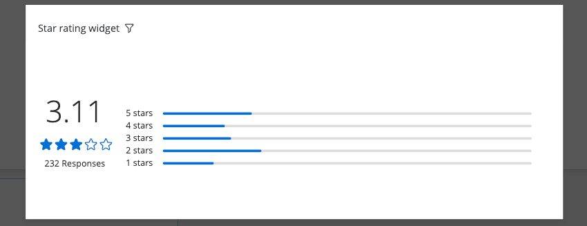
The star rating widget displays data from rating questions as stars. The widget includes a graphic star scale, a numeric average value, and a breakdown of individual star ratings.

Qtip: The star rating widget can be used with data from any numerical ranking question even if the original question was not a star-style slider question.
Qtip: The star rating widget does not allow for half step ratings. Only full star ratings can be displayed.
Types of Dashboards
This widget can be used in a few different types of dashboard. This includes:
Field Type Compatibility
The star rating widget Metric is only compatible with the Number Set field type. You can also select fields from Measure Groups.
Widget Customization
For basic widget instructions and customization, visit the Building Widgets support page. Continue reading for widget-specific customization.
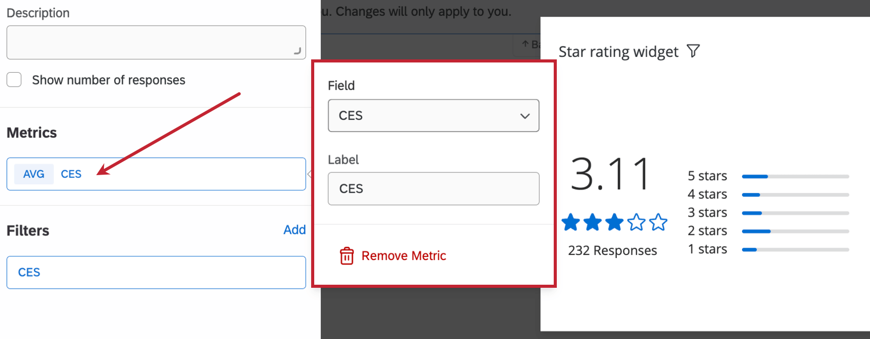
Metrics
You will need to specify a metric when adding a star rating widget. This is the minimum setup you must do to display data in the widget. When selecting Metric, you can also edit the metric’s Label (i.e., give it a name).
Go to the Filters section to filter your displayed metric.
Any dashboard fields with the number set field type can be selected as metrics.
Qtip: You may see a message that reads “The number of ratings in your data source (6) is greater than the number of stars you want to display (5). Change the maximum number of stars to be equal to or greater than the number of values. Alternatively, recode your values to properly display this widget.” This means you either need to adjust the maximum number of stars (described below) or adjust how your field is recoded in the dashboard settings.
Filters
You can filter your widget in the Filters section. See Adding Widget Filters for more information.
Display Options
You can customize how your widget looks in the Display section while editing your widget.
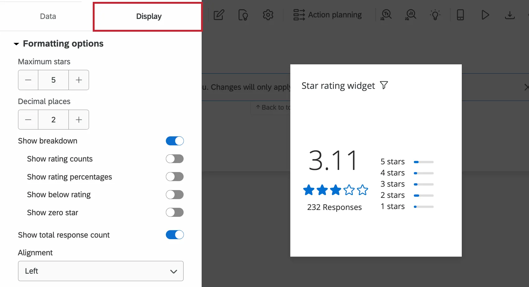
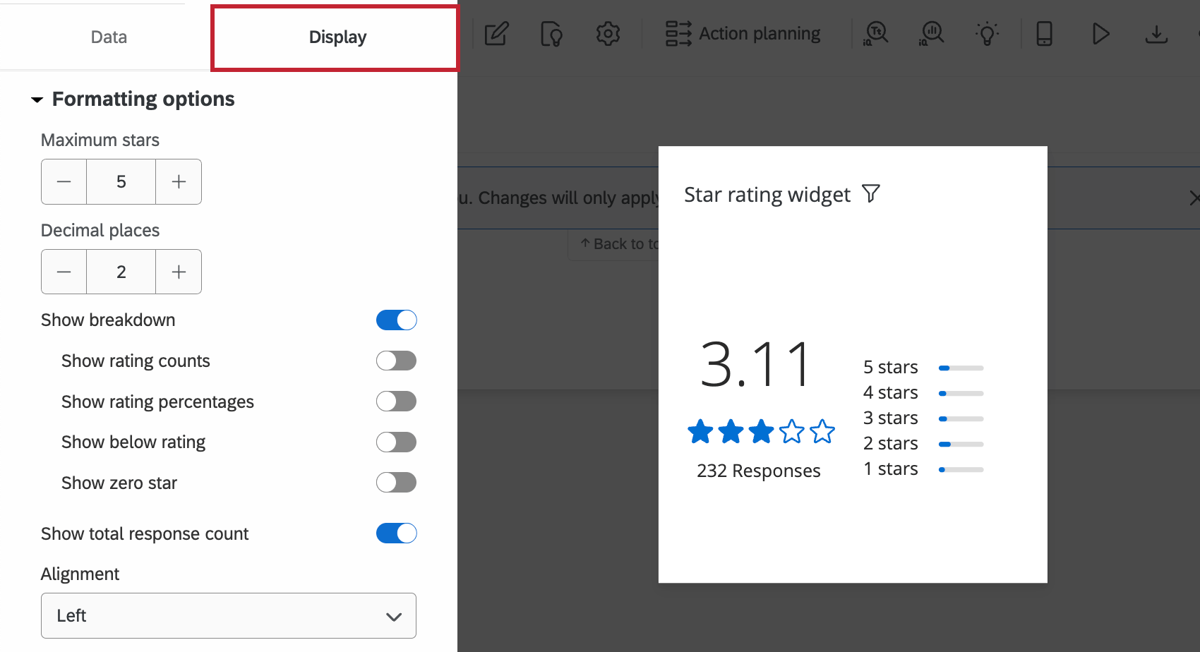
Formatting Options
This section lets you configure the setup of your star rating widget.
- Maximum stars: The maximum number of stars displayed in your widget. For example, if your source metric is a 5 point scale, the widget should have a maximum of 5 stars.
- Decimal places: The number of decimal places that will be used when displaying the average rating. This applies to both the overall rating and any breakdown counts or percentages you choose to display.
- Show breakdown: When disabled, only the average rating will be displayed. When enabled, a column for each rating will be displayed. The additional options below will also appear.
- Show rating counts: Next to each breakdown, display the number of times each rating was given in addition to the bar.
- Show rating percentages: Next to each breakdown, display the percentage of responses for each rating, in addition to the bar.
- Show below rating: Display the rating breakdown below the average rating, instead of to the side.
- Show zero star: If you allowed respondents to give 0 stars, you can choose whether you want to show the number of respondents who did this.
- Show total response count: Display the total number of received responses underneath the average rating.
- Alignment: Select if the average rating will be on the left or right of the rating breakdown.
Color Scheme
In this section you have the ability to set the color for the number, star, and line sections of the widget separately. Use the color picker to select a custom color, or enter a specific hex code.
Widget Styles
- Widget container: Controls the border around the widget. Your options include:
- Use dashboard default: The widget border will match what is set in the dashboard theme options.
- On: The widget will have a border around it.
- Off: The widget will not have a border around it.
- Widget Header: Controls the widget’s title appearance. Your options include:
- Always show: Always display the widget’s title.
- Show on hover: Display the widget when a dashboard hovers their mouse over the widget.
- Never show: Do not display the widget’s title.
FAQs
I have multiple datasets on my dashboard. Can I use this feature with all of my widgets?
I have multiple datasets on my dashboard. Can I use this feature with all of my widgets?
- Changing which dataset your widget shows: Not all widgets can have their referenced dataset switched. Some can only use the default dataset. For a compatible list, see this section.
- Showing multiple datasets in the same widget: Not all widgets can show multiple datasets’ results at the same time. For a compatible list, see this section.
That's great! Thank you for your feedback!
Thank you for your feedback!