
Distinctive Image Associations Widget (BX)
What's on this page
About the Distinctive Image Associations Widget
Brand image refers to the measurement of consumers’ perception of a brand through its association with relevant attributes. However, it is well established that brand usage influences endorsement – respondents who are users of a brand can describe it better than other brands, and are therefore more likely to to select it as being associated with each attribute. This means that bigger brands tend to receive more votes as being associated with each attribute, regardless of what that attribute is. This skews the brand image in favor of bigger brands.
Another factor that skews brand selection for particular attributes is linked to “prototypicality” of the attribute. Prototypicality is the degree to which an attribute defines category membership (e.g., all shampoo brands score highly on “cleans hair”, so this attribute has high prototypicality).
Distinctive image associations (also known as brand image profiling) is a technique that controls for usage and prototypically biases to determine what features/attributes help to distinguish one brand from another. It works by calculating the attribute ratings a brand would get if it was undifferentiated, and compares those with actual ratings. The difference in expected and actual rating results in a unique score that eliminates the influences of brand and attribute size score that gets plotted. It is an insightful analysis tool used to determine a brand’s strengths and weaknesses relative to its competitors across all attributes.
Qtip: Brands with fewer than 50 responses to a given brand imagery question will be excluded from Distinctive Image Associations calculations.
Data Requirements
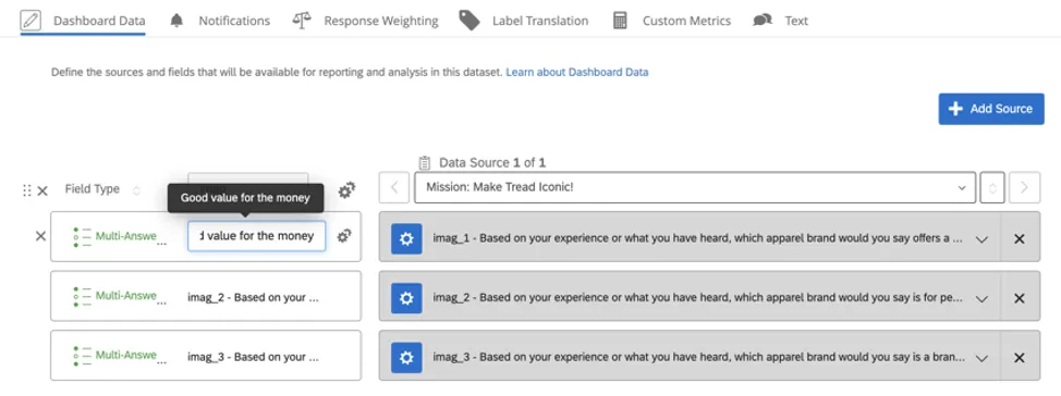
Multiple-select questions with the same options should be loaded into the Distinctive Image Associations widget. For example, you may have questions that ask, “Based on your experience or what you have heard, which of the following jewelry brands would you say offers a good value for the money? Select all that apply.” The answers are the various brands you are investigating. It should be the same traits for every brand.
These fields should be mapped as Multi-Answer Text Sets.
Qtip: Don’t worry – if you’re using the pre-made Brand Tracker dashboard, we have already mapped this content for you. These are the questions included in the “Imagery” block of your survey. Sometimes these are named after the attributes they measure (“offers a good value for the money”) or in the format “imag_#” (with “imag” standing for “brand imagery”). If desired, you can always rename them based on the attributes they’re supposed to measure, so they’re easier to identify. For example, the question from earlier could be named “Good value for the money” instead of imag_1.
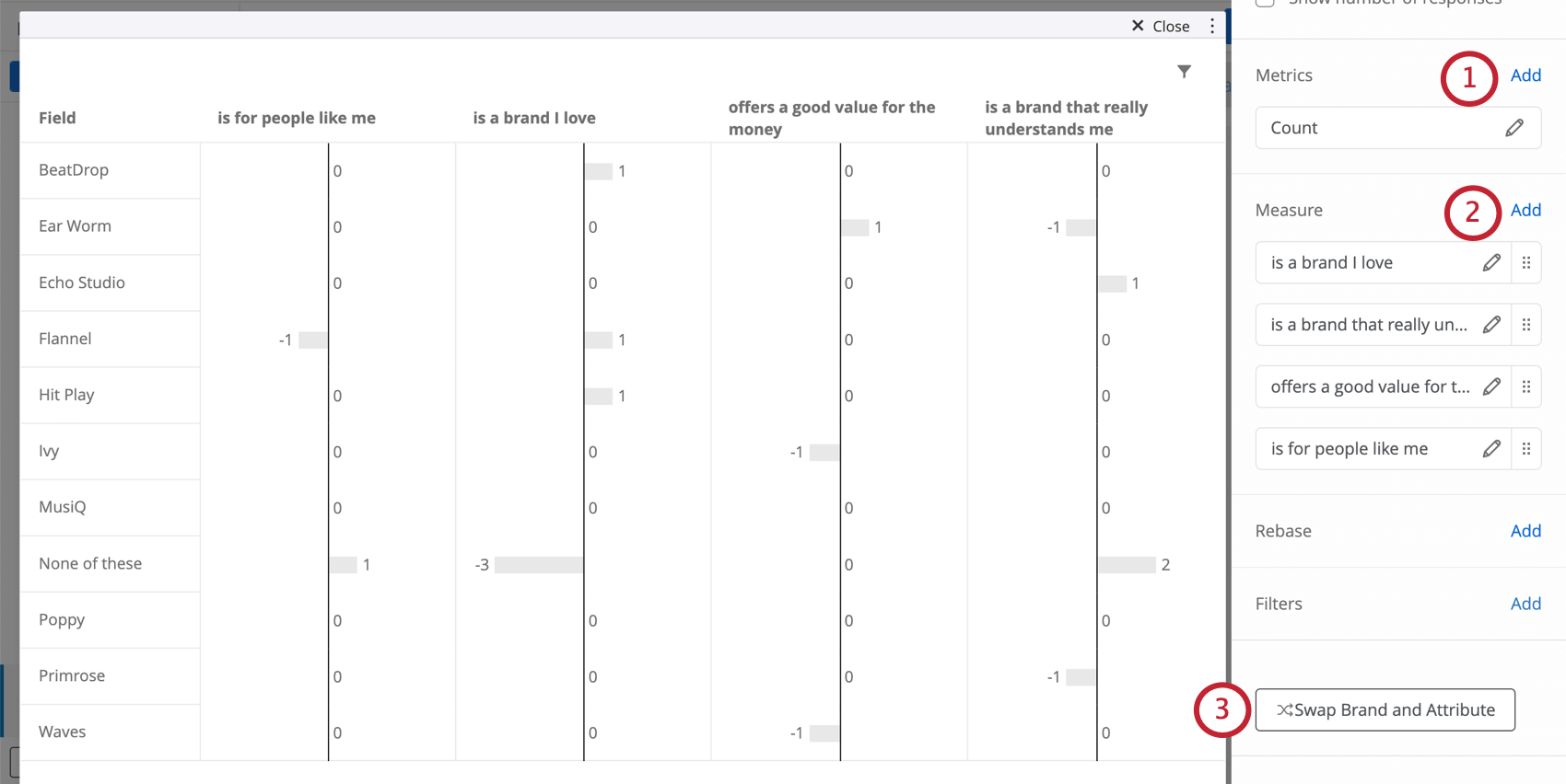
Setting Up the Widget
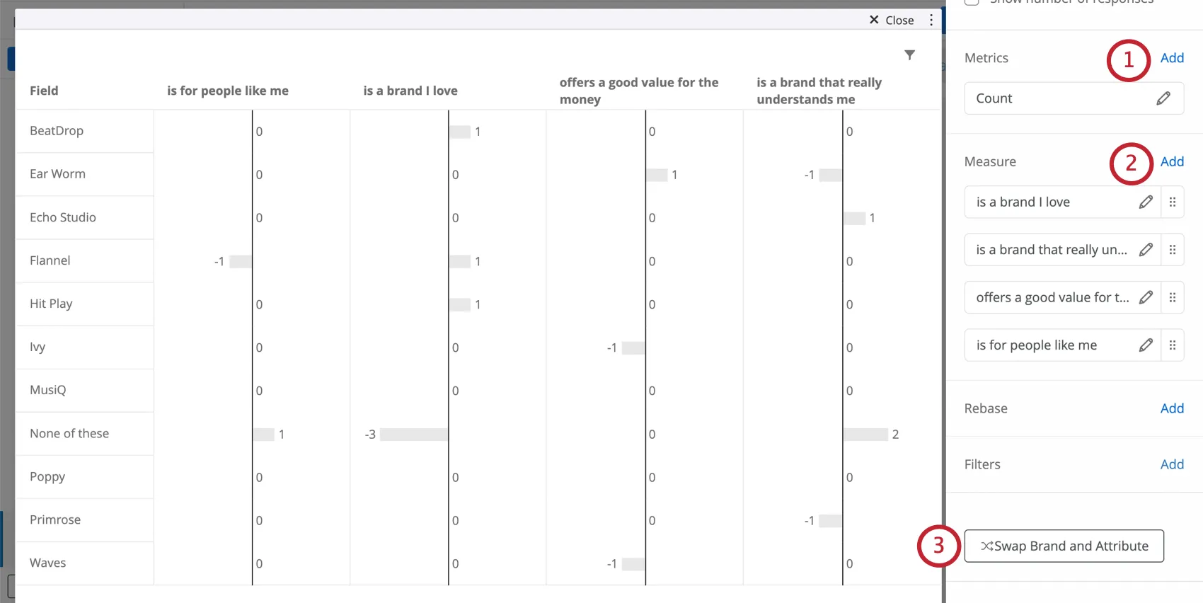
Qtip: You should only add one metric. Leave this as Count. Do not change the metric type or add filters to the metric. Edits to additional options such as label or decimal places will not be reflected in the widget.
Qtip: Do not use negative or strongly worded attributes in this widget! For example, it’s okay to use an attribute that was framed as “good value for the price,” but not one that was framed as “bad value for the price.” Negative attributes will skew the analysis. Likewise, attributes must not be strongly worded – “excellent value for the price” will not work as well as “good value for the price.” Strong adjectives may lead to different underlying response patterns and skew the analysis.
If possible, hide the None of these option by deselecting the checkbox. This prevents the results from being skewed.
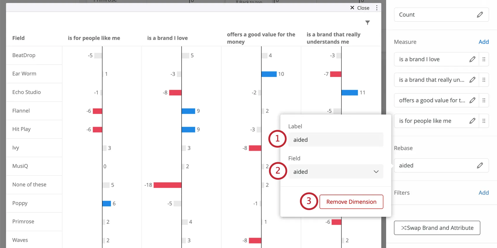
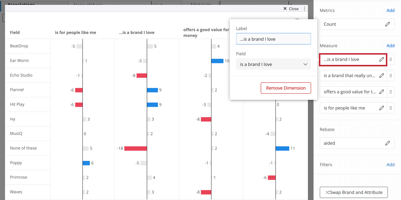
Qtip: Remember that if you can either use the data mapper to edit the names or values of your fields to be short and chart-friendly, or you can edit them right inside the widget, as shown below.
Rebasing on Aided Awareness
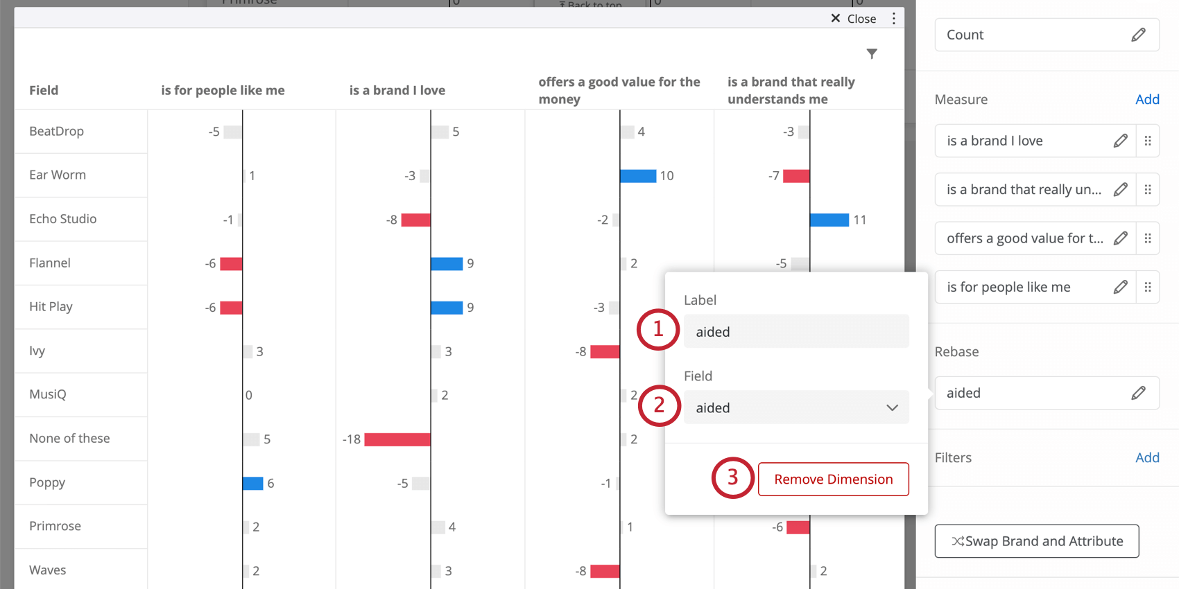
By default, the Distinctive Image Associations widget is rebased on total count; each imagery attribute is divided by the total count of the survey responses. You also have the option to rebase using aided awareness. If you do this, then for each imagery attribute, the count for a specific brand will be divided by the number of people aware of that brand. This helps reduce the brand size factor so that larger brands can be compared better with smaller brands.
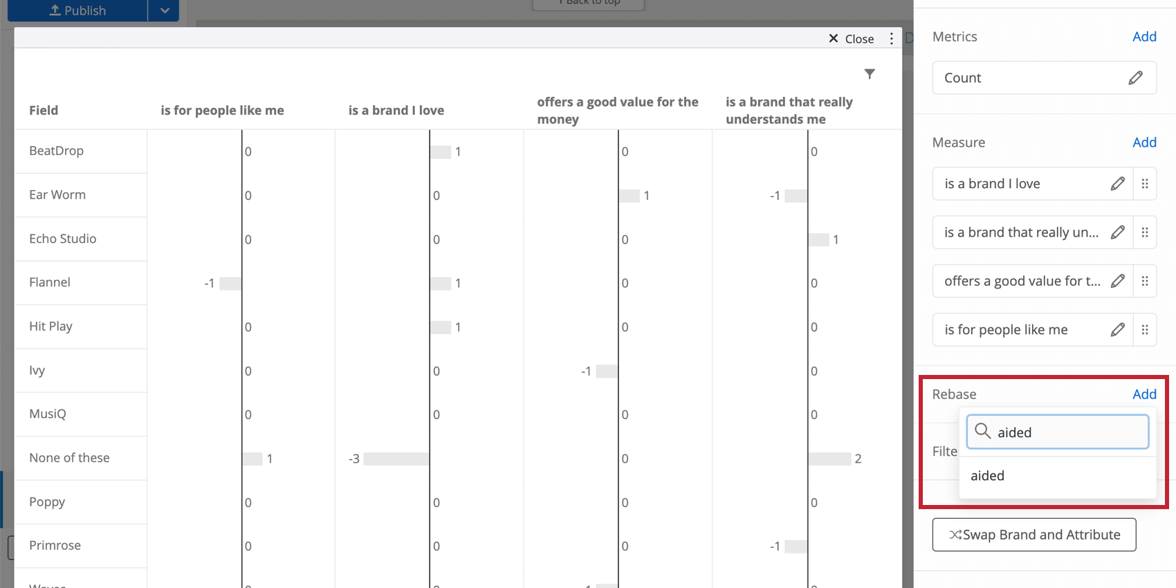
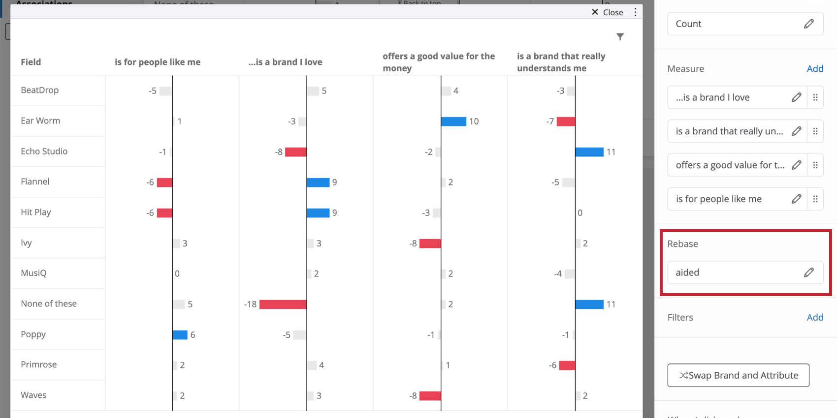
Qtip: You should either leave the Rebase field blank (thus basing it on total count) or use aided awareness. Selecting another field will skew results.
Editing the Rebase Field
Select the field you used to rebase the widget. You have the following options:
Interpretation
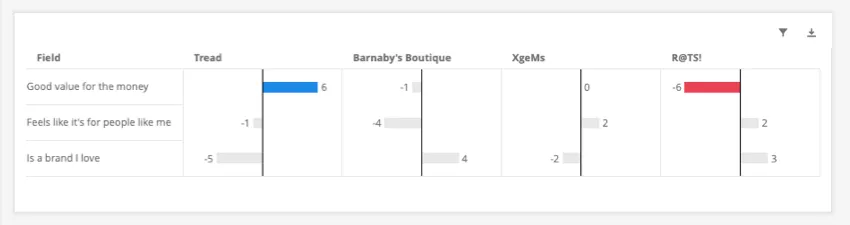
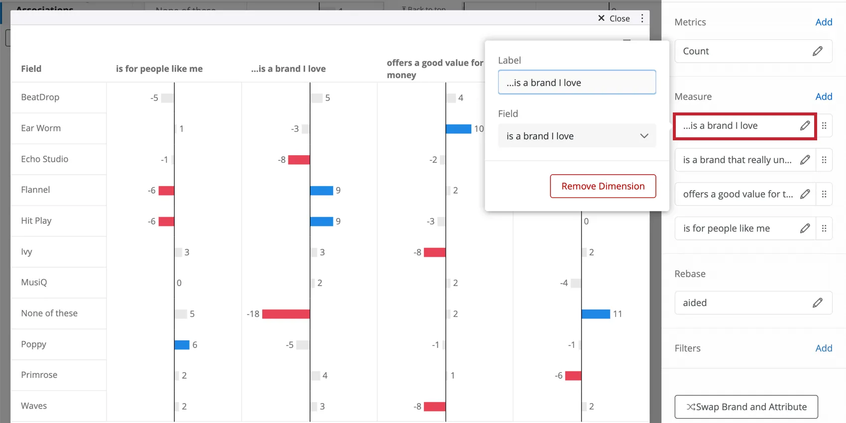
This widget is useful for determining what distinguishes your brand versus others; in other words, highlighting its strengths and weaknesses. Negative values are where your brand can use improvement, and positive values are strengths. Pay special attention to color-coded values.
Qtip: When there’s a value of greater than 5, it will be color-coded as blue. When a value’s less than -5, it will be highlighted as red. These values are highlighted because this great of a difference is a good indicator of significance. The reason for this threshold is that it highlights the major deviations for each brand whilst avoiding focusing on minor deviations that may come from sampling variation.
We recommend trying to analyze a maximum of 8-10 brands at a time. This analysis is a comparison, so as you add and remove brands, the results may change somewhat.
Qtip: When tracking image profiles over time, be aware of the expected volatility when comparing brand ratings across time periods, due to sampling and non sampling errors.
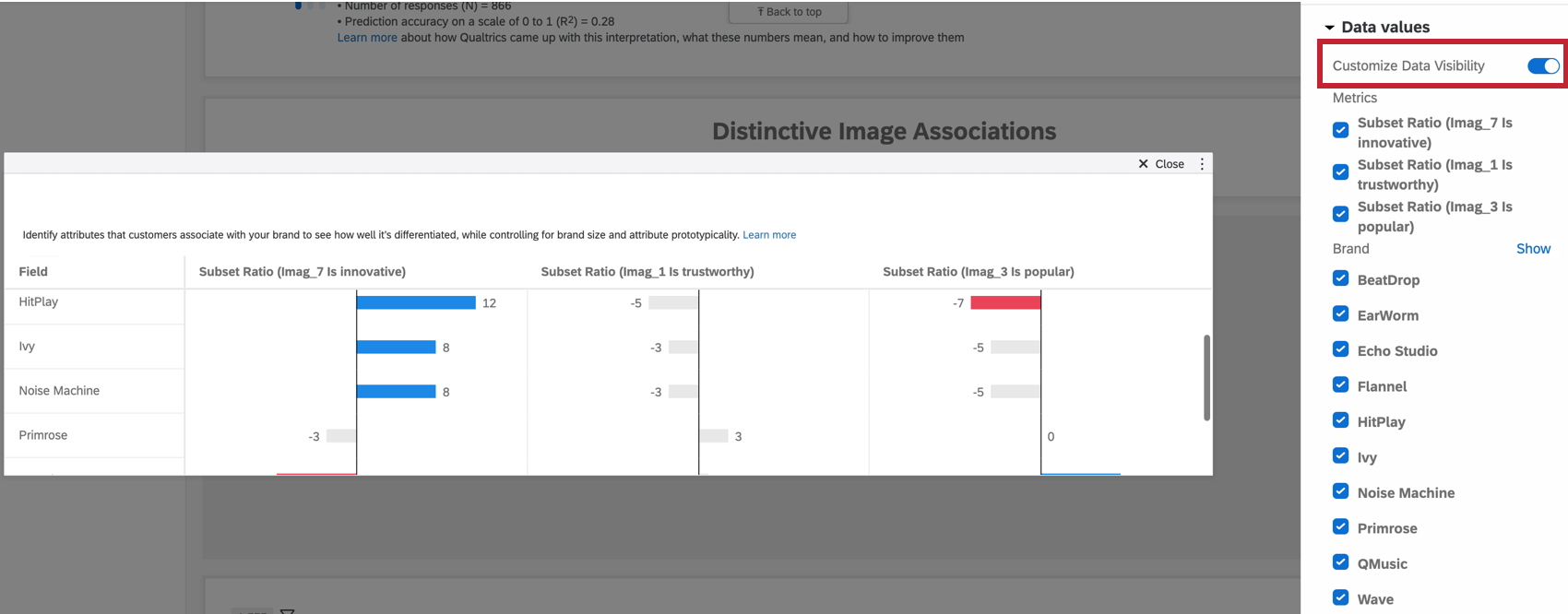
Data Values Display Options
Click Data values to configure which data is visible in the widget. By enabling Customize Data Visibility, you can select which brands and metrics to display. This can be useful when you need to focus on specific brands or brand perceptions in your report.
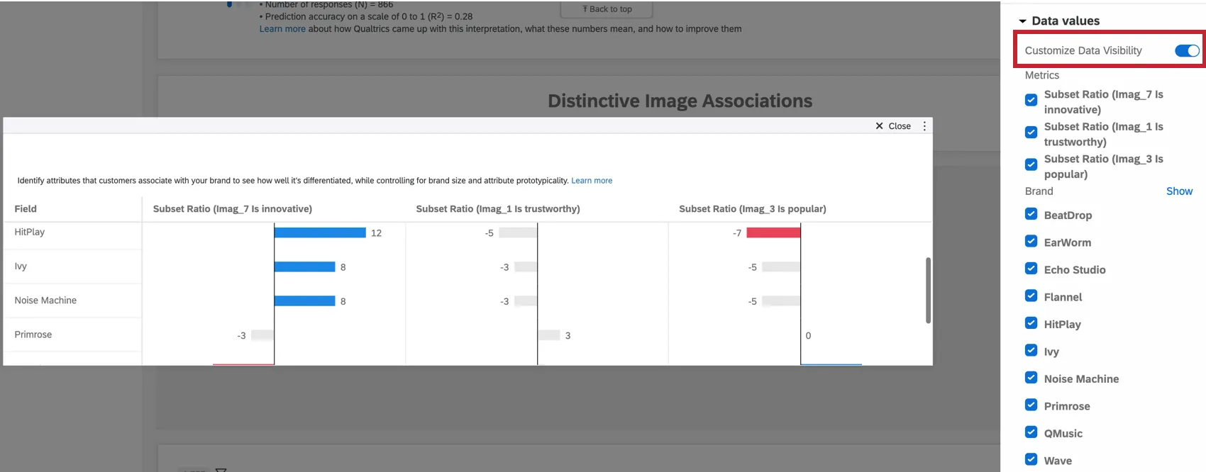
To hide brands or metrics from the widget, uncheck the box to the left of each item.
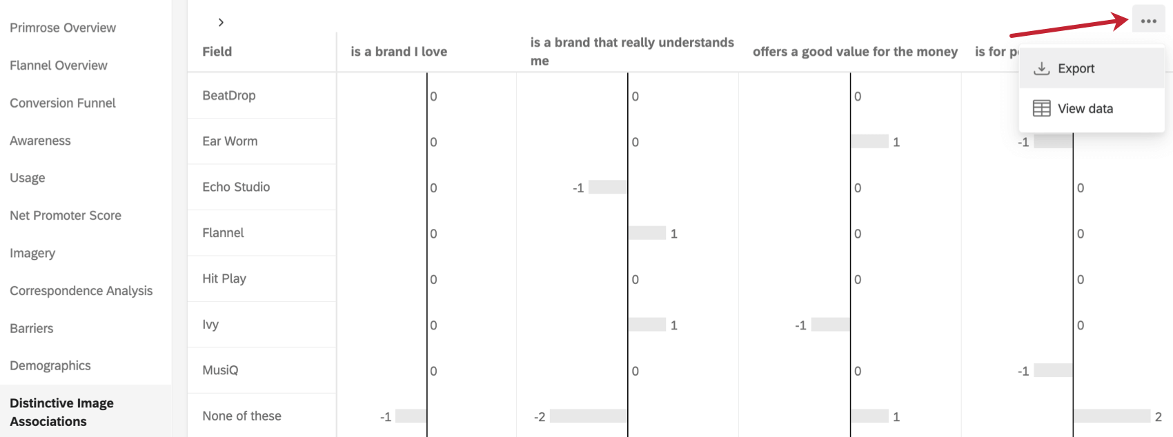
Additional Options
Click on the three horizontal dots in the top-right corner of your widget to view additional options.

- Export: Export your widget as a JPG, PDF, CSV, or TSV.
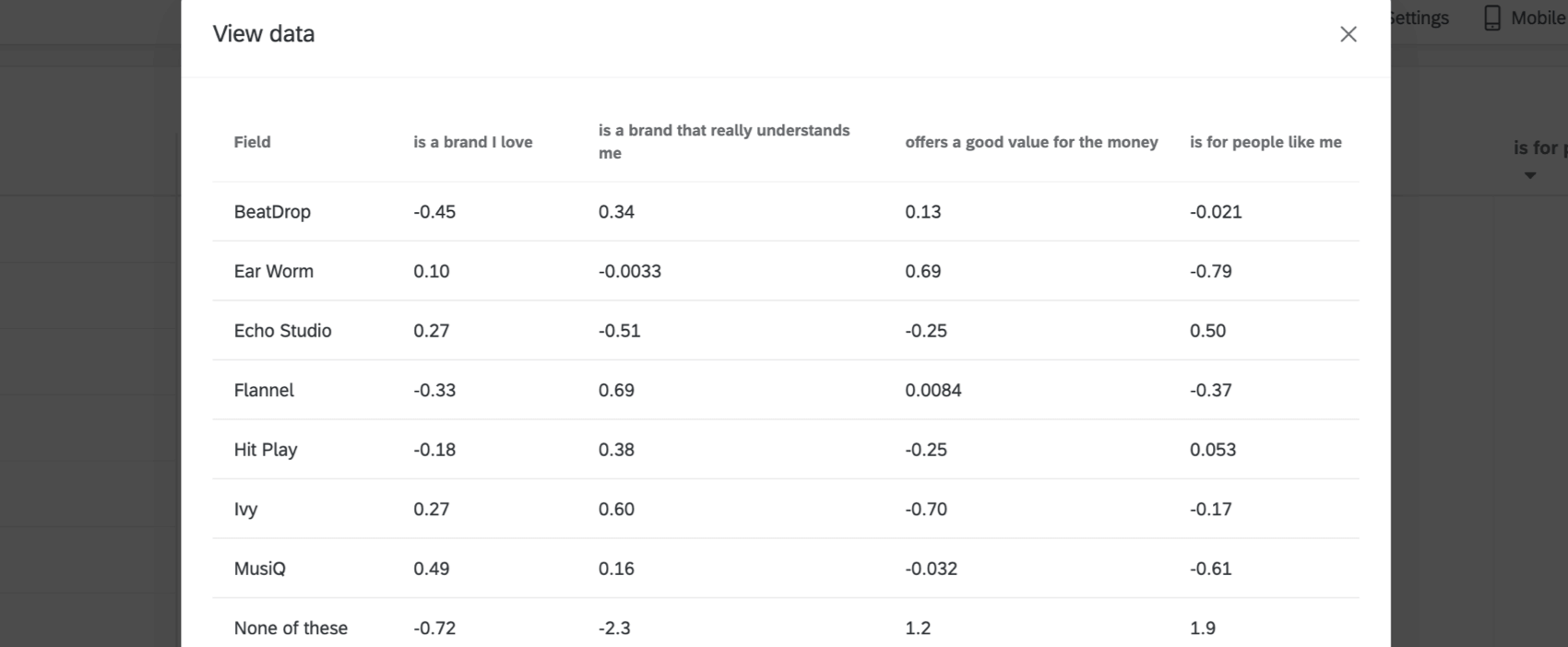
- View data: View a table containing data on all the image associations within your widget.

FAQs
How do custom metric filters interact with page filters in BX dashboards?
How do custom metric filters interact with page filters in BX dashboards?
That's great! Thank you for your feedback!
Thank you for your feedback!