
Report Summary Table (360)
What's on this page
About the Report Summary Table
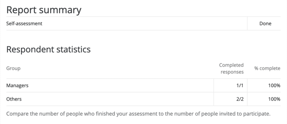
The Report Summary Table breaks out 360 completion rate by the different rater groups who evaluated a subject. Use this visualization to determine the number of completed responses and percentage of evaluations that have been completed.
Qtip: If column names are getting cut off, try either renaming columns or adjusting the default font size of visualizations in the global report settings.
Qtip: Report summary tables can only be used in 360 reports.
What the Report Summary Displays
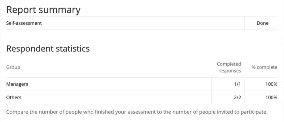
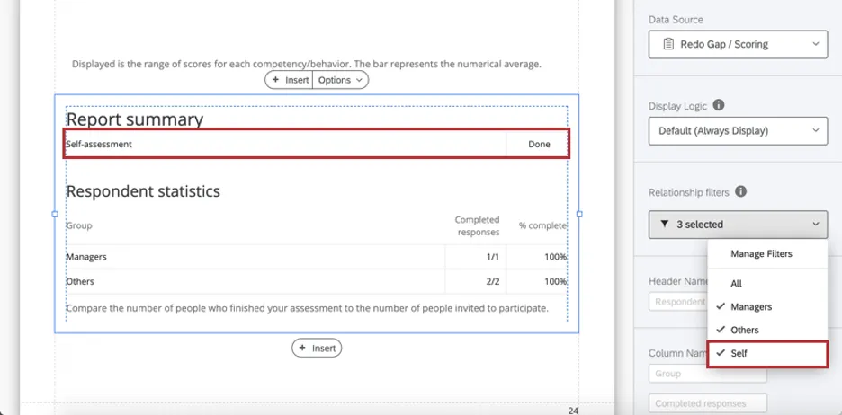
On the first row, the report summary shows whether the self-assessment has been completed.
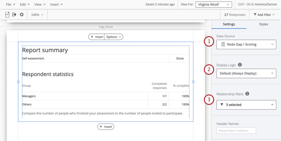
Qtip: If you didn’t require self-assessments in your 360, you can remove this row by going to Relationship filters and de-selecting Self.

Under “Respondent statistics,” the report summary compares the number of people who finished an assessment of the subject to the number of people invited to participate. For each rater group, there’s a ratio of how many evaluators from each group completed their assessment of the subject, and the resulting percentage of completion.
Attention: The report summary table does not count incomplete responses. See more on what counts as an incomplete response.
Setting Up a Report Summary
Qtip: If you want to add relationships not included by default, see the rater group support page.
Qtip: “All” is excluded by default because it counts all evaluations, regardless of whether they include self, others, managers, peers, and so on, whereas this table is meant to break out completion rates by different relationships.
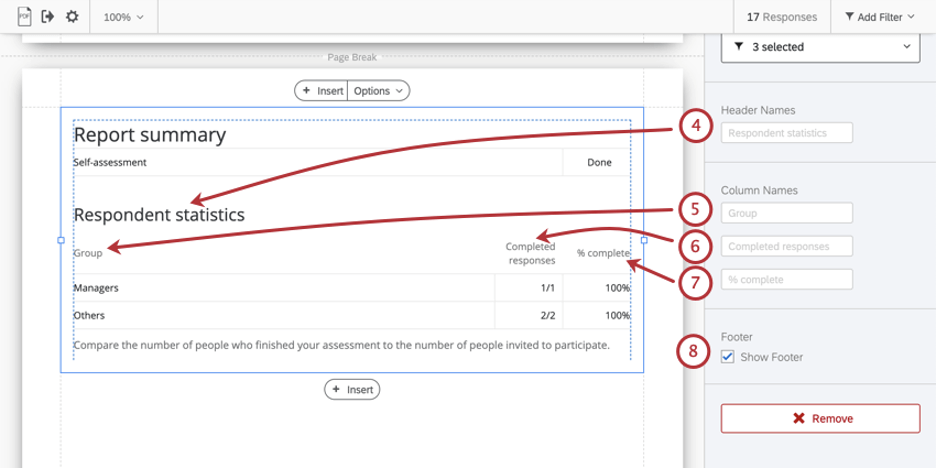
- Compare the number of people who finished your assessment to the number of people invited to participate.
Qtip: You can add your own custom text using a text area.
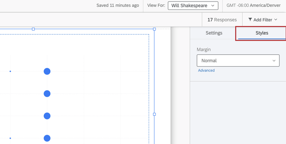
Styles
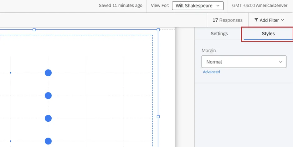
Switch to the Styles tab to adjust the margins around the edge of your chart. Switch to Advanced to adjust margins on each side independently of each other.
That's great! Thank you for your feedback!
Thank you for your feedback!