
Coaching Priorities Widget
What's on this page
About the Coaching Priorities Widget
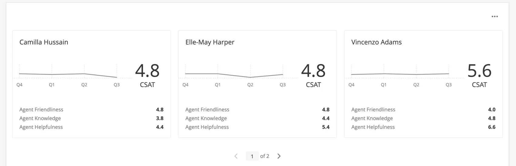
The coaching priorities widget can show contact center leaders a summary of their team’s performance, helping them determine where to focus coaching efforts. This new, agent-centered view provides insight into key operational and experience metrics, allowing leaders to focus on the right agents at the right time.
This widget pairs extremely well with dashboard hierarchies. We recommend using the unique identifier you set for your agent ID.
Qtip: This feature is available in Dashboard projects to those who have purchased Customer XM for Customer Care. Please reach out to your Account Executive if you are interested in getting access.
Field Type Compatibility
The coaching priorities widget is compatible with several different field types, based on the widget field you are filling out.
- Agent ID: Text Set and Text Value fields
- Agent Name: Text Set fields
- Chart:
- Data field: Custom metrics, Number Set fields, and Numeric fields
- Time period: Date fields
- Coaching type:
- Customer rating: Number Set fields and Numeric fields
- Agent self-rating: Number Set fields and Numeric fields
- Key metrics: Custom metrics, Number Set fields, and Numeric fields
We will discuss the importance of each of these fields in the next section, when we cover the steps needed to set up the coaching priorities widget.
Setting Up the Coaching Priorities Widget
This section will go over the fundamental setup required for the coaching priorities widget.
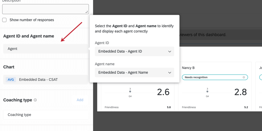
Agent ID & Agent Name
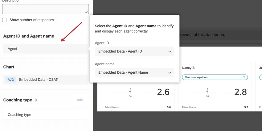
- Agent ID: The unique employee identifier. It’s recommended you use Qualtrics unique identifiers. You can also use any field that identifies an agent and has unique values; for example, agent email.
- Agent Name: This is what will actually display on the widget to identify the agent. We recommend adding the agent name here, but you can do other identifiers if you prefer.
Qtip: You must add an Agent ID and Agent name in order for the coaching priorities widget to display data. If your data only contains one field or the other, you can choose to duplicate one of those fields in your dashboard mapping, give it a separate name, and select the duplicate value for the mandatory field you didn’t map.
Example: Our survey only includes agents’ names, not their IDs. But our agent name field stores first and last names, meaning each value is unique, so this field can easily serve as an ID. When mapping my dashboard data, I add the agent ID field twice, once as “Agent Name” and once as “Agent Name 2.” When I build my coaching priorities widget and need to add an agent ID, I select the “Agent Name 2” field.
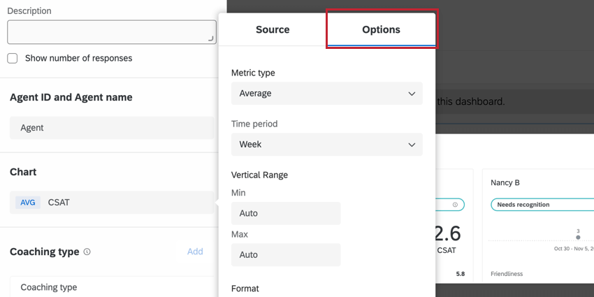
Chart (Source)
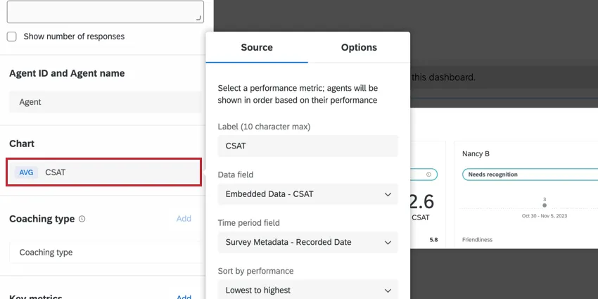
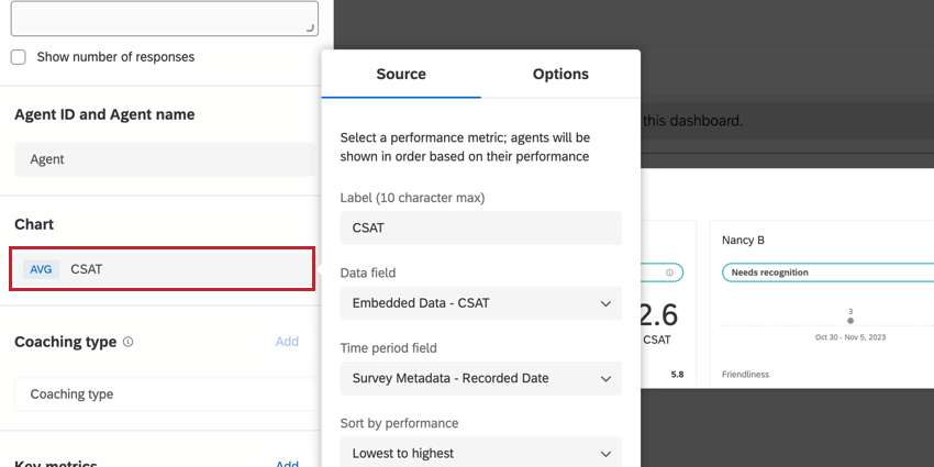
In the Chart section, there are three fields to fill out: the label, the data field, and the time period field.
- The Label is static text describing the Data field you’ve selected. It can be 10 characters, maximum. You can also choose to exclude the label, if you feel your widget title / description is clear enough about what fields you’re displaying.
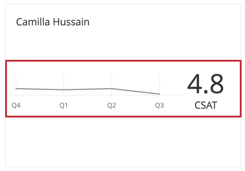
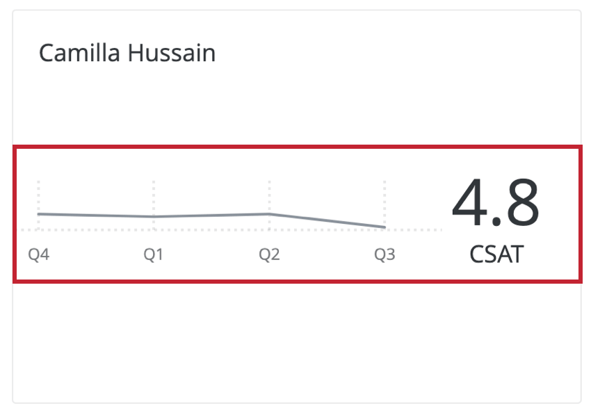
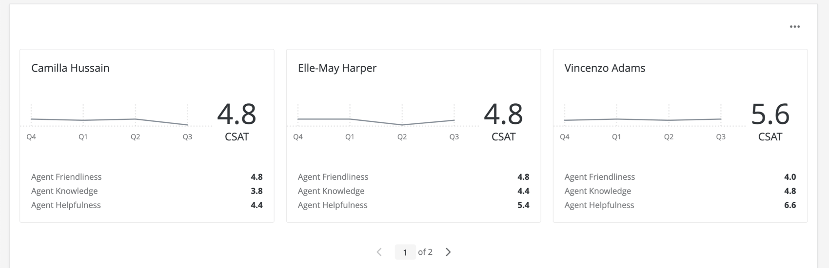
- The Data field is the field you’d like to use to model agent performance. This is the value being visualized in the widget. It is shown with a trend line and a numeric value, pictured in a completed widget below. The order of agent cards will also be determined based on the Data field.
 Qtip: When selecting a Data field, we recommend choosing a metric that’s important to you and your team. It can be a custom metric your company created, such as “Agent performance score,” or it can be an industry standard, like CSAT or NPS.
- Finally, select a Time period field to show the data trended over time.
Chart Options
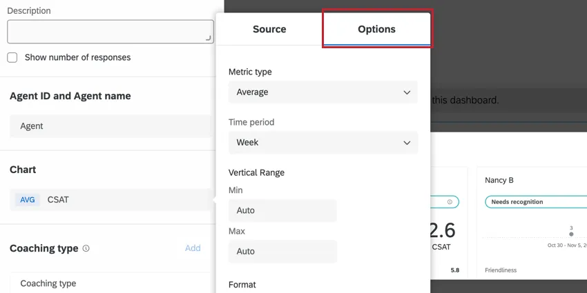
Use the Options tab of the Chart to change the time scale (the x-axis of the widget), the minimum and maximum value of data field (the y-axis of the widget), the metric format (number or percentage), and the number of decimal places.
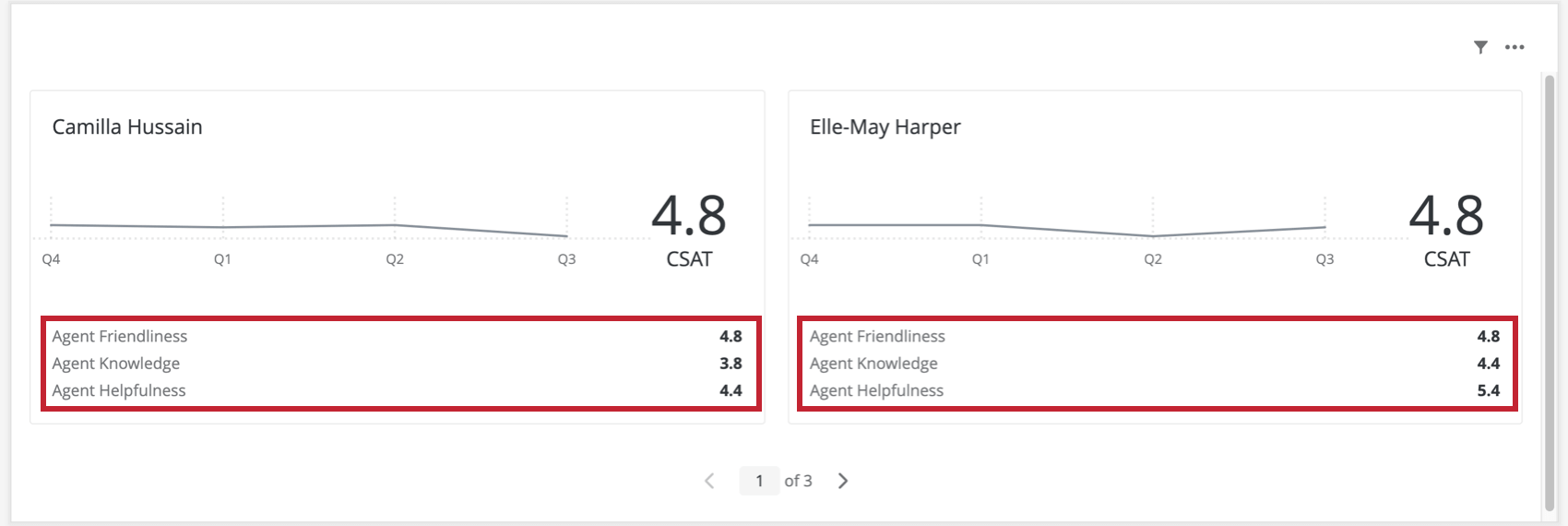
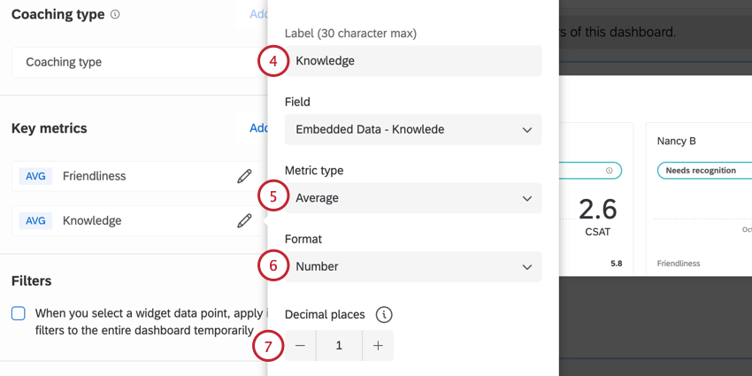
Key Metrics
In the Key metrics section, a user can add up to three additional key performance indicators. These are included at the footer of the widget for each agent, as shown below.
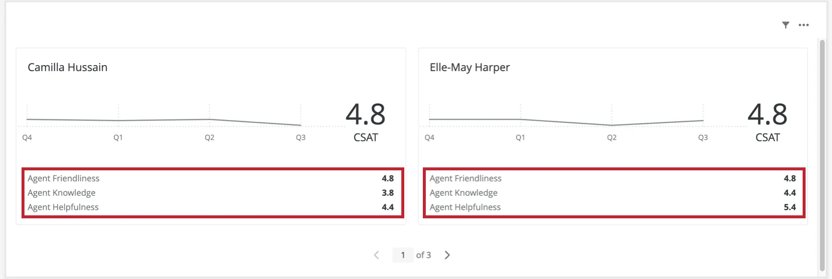
To add key metrics:
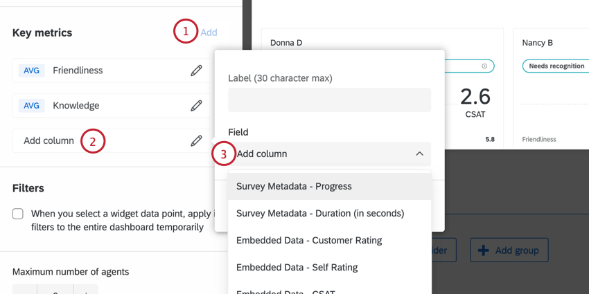
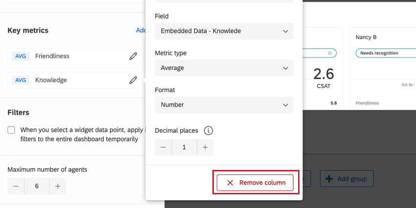
You can drag and drop the order key metrics appear in the widget by using the dots to the right of each metric’s name. To remove a key metric, click its name, then select Remove column.

Qtip: Key metrics are optional.
Widget Customization
For instructions on options available to all widgets, such as resizing, titles, and so on, see Building Widgets.
The following options are unique to the coaching priorities widget.
Filters
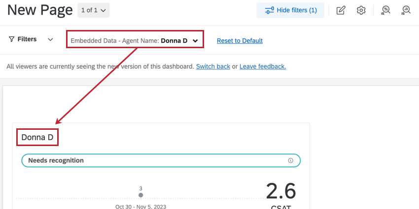
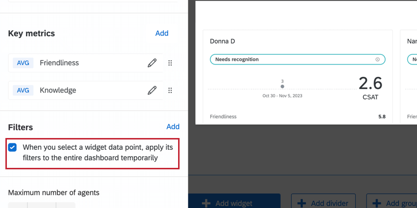
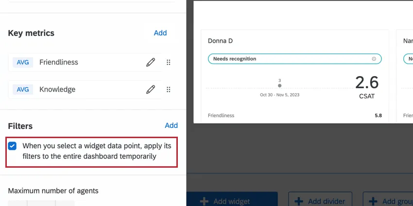
If you’d like, you can make it so that whenever an agent’s name is clicked, the entire dashboard is filtered to show only data for that agent.
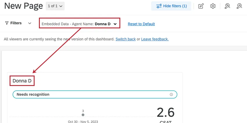
This behavior can be enabled by going to the Filters section of the widget editing pane and selecting When you select a widget data point, apply its filters to the entire dashboard temporarily.
For details on adding other kinds of filters to your widget, see the Filtering CX Dashboards page.
Maximum Number of Cards
Customize the total number of cards the widget should display by adjusting the Maximum number of cards option.
Qtip: The order of agent cards is based on the data field configured under the chart settings.
FAQs
I have multiple datasets on my dashboard. Can I use this feature with all of my widgets?
I have multiple datasets on my dashboard. Can I use this feature with all of my widgets?
- Changing which dataset your widget shows: Not all widgets can have their referenced dataset switched. Some can only use the default dataset. For a compatible list, see this section.
- Showing multiple datasets in the same widget: Not all widgets can show multiple datasets’ results at the same time. For a compatible list, see this section.
That's great! Thank you for your feedback!
Thank you for your feedback!