
Button Widget (Studio)
Suite
Customer Experience
Product
Qualtrics
What's on this page
About the Button Widget
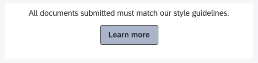
The button widget lets you add a button to your dashboard that can link anywhere you want. For example, you could link to Qualtrics surveys to gather feedback, or link company resources, like help articles and brand guidelines.
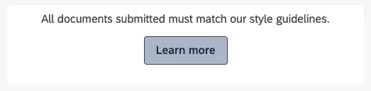
All hyperlinks in button widgets will open in a new tab.
Qtip: The button widget is great for hyperlinking resources. However, if you want to create a button that acts as a dashboard filter, you should check out the selector widget instead.
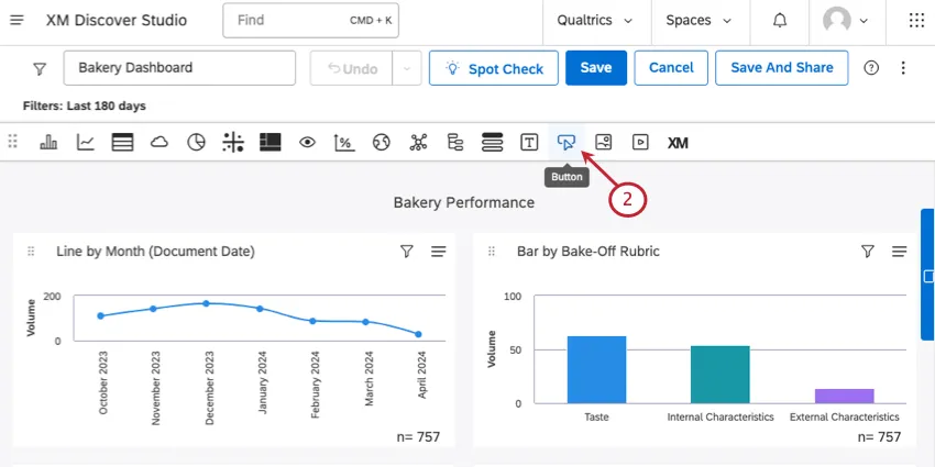
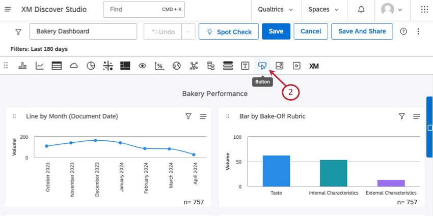
Creating a Button Widget
From the widget types, select Button.
Type your Button Text.
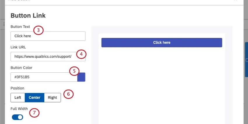
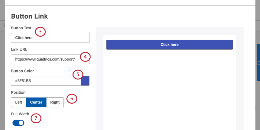
Paste in a full Link URL.
Choose your button’s color. You can paste in a hex code, or click the color to open a color palette menu.
Set the Position of the button in the larger widget whitespace. Your options are:
- Left
- Center
- Right Qtip: If you have instructional text, the Position setting will also adjust the text’s alignment.

If you’d rather the button fill up the entire width of the widget, select Full Width.
If you’d like to include instructional text with your button, select Include Instructional Text. Then type out your message. You can also set the Text Placement above or below the button.

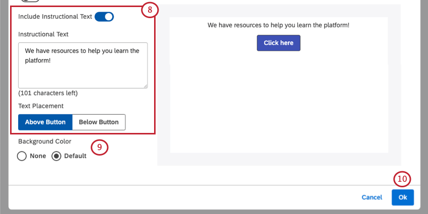
Qtip: You have a limit of 150 characters for instructional text. Only plain text is supported. You cannot add formatting or line breaks.
For the Background Color of the widget, choose between the following:
- None: The widget should have a transparent background.
- Default: The widget should have a background that matches the default color.
When finished, click Ok.
Qtip: To move, resize, or edit your widget’s properties, see Widgets Basic Overview.
That's great! Thank you for your feedback!
Thank you for your feedback!