
Viewing & Analyzing Employee Journey Analytics Data
What's on this page
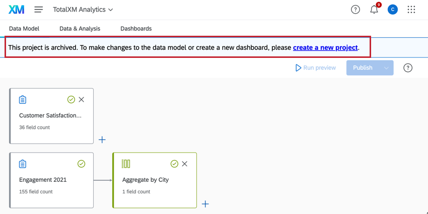
Attention: Projects created before November 6, 2024 use the old data model and have been placed in an Archived state. You cannot edit, publish, or refresh the data model in archived projects. Previously published data, dashboards, participants, and Stats iQ will continue to be available and operational, however dashboard creation and copying is disabled in archived projects. Archived projects cannot be copied; create a new project instead.
About Viewing & Analyzing Employee Journey Analytics Data
Once your data model has been created, either from scratch or with a guided workflow, you will be able to view and analyze the resulting output dataset. Using Stats iQ and dashboards, you can gather insights, understand correlations, and drive other descriptive analysis between different projects in an EX program.
Qtip: This page only describes how to view and analyze data in Employee Journey Analytics projects.
Viewing Your Data in Data & Analysis
Once generated, your output dataset will appear in the Data & Analysis tab. In this tab you can view your data and analyze it in Stats iQ. This tab is identical to the Data & Analysis tab within other survey projects. For more information on viewing and analyzing your data, see the linked support pages:
- Data & Analysis Basic Overview Attention: The field editor is not available in the Data & Analysis tab since you can edit fields directly in your data model instead. Exporting data from this tab is not supported.

- Stats iQ Basic Overview
Attention: Text iQ is not available in Employee Journey Analytics projects. Instead, perform text analysis in the projects you’d like to use in your data model.
Qtip: Stats iQ is an add-on feature not included in the standard Qualtrics license. If you do not have a Stats iQ section, please contact your Qualtrics Account Executive for more information.
Creating a Dashboard
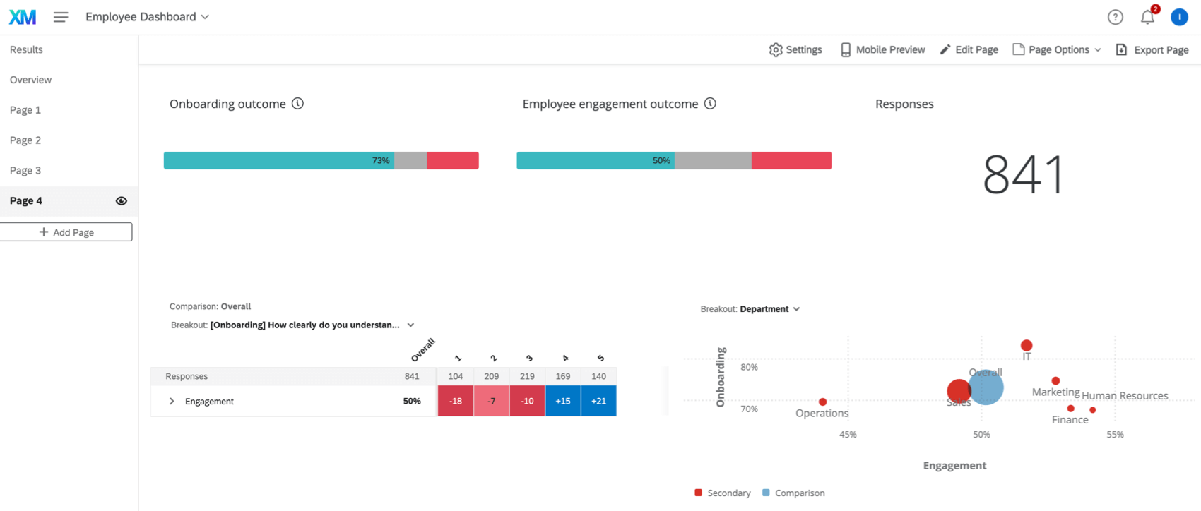
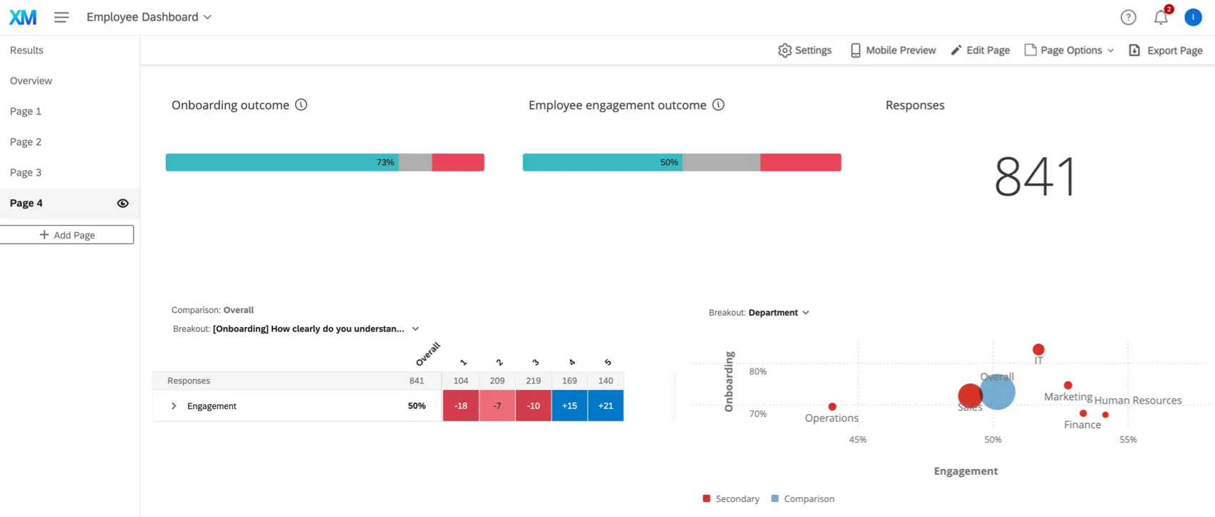
The Dashboards tab of your Employee Journey Analytics project is where you can visualize the data in your combined dataset. With your dashboard you can gain insights on the data from multiple EX projects. Data in this dashboard is automatically updated when new responses are collected, but the updates may not be immediate. You can manually refresh your dataset to update your dashboard’s dataset.
Please be aware of the following when using dashboards in Employee Journey Analytics projects:
- The dashboard data settings are not available. All changes to the dashboard’s dataset should be made in your data model instead.
- Your dashboard’s output dataset cannot be used as a data source in any dashboards outside of the journey project.
- This dashboard cannot be filtered by data source.
- Comparison and demographic breakout widgets are not available at the moment, but will be made available in the future.
- When enhanced confidentiality is enabled, field-level confidentiality settings will default to the most restrictive option.
- There is no longer an option to exclude partial responses, as partial and non partial responses may be joined together into a single field in the data model. You can still use dashboard filters to exclude partial responses.
Sharing the Dashboard
You can give participants either view-only access to the dashboard, or give them full edit access.
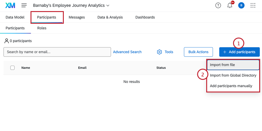
- Import from file: Add users by uploading a file. See Importing Participants for detailed instructions.
- Import from Global Directory: Add users from your Employee Directory who match certain criteria you set. See Importing Participants from the Employee Directory for detailed instructions.
- Add participants manually: Add users from your Employee Directory by manually selecting them. See Manually Adding Participants for more information.
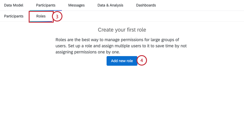
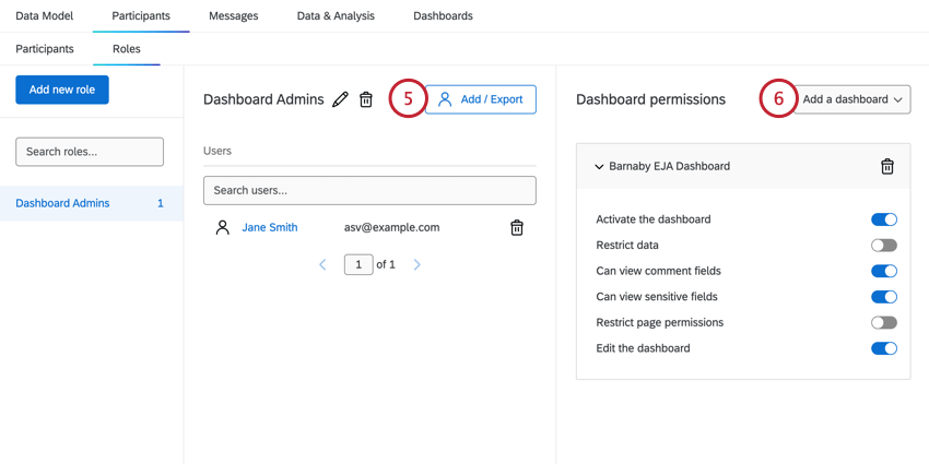
Qtip: To create an admin role that has access to all data and can edit the dashboard, enable all dashboard permissions except for “Restrict data” and “Restrict page permissions.”
Attention: Unlike other EX projects, this project does not include survey respondents, as the Employee Journey Analytics project type combines data from previous surveys. There are also no Org Hierarchies within this project type.
That's great! Thank you for your feedback!
Thank you for your feedback!