
Describe Data
What's on this page
About Describing Data
Describe visualizes and summarizes a variable, enabling you to get a feel for how your data is structured, examine any issues with your data, and think up hypotheses to explore later. If you have multiple variables selected when you elect to describe, one analysis will be produced for each variable, and they’ll be presented in the same order that they appear in the left-side variable pane.
Qtip: You may have up to 750 cards in your workspace. If you reach this limit, an error will appear when you try to create a new card, warning you that your oldest cards will be deleted.
Qtip: At the top of the card will be a green (and sometimes red) line. If you click on it, you will see the amount of responses marked as “Included,” “Missing,” or “Excluded by filter” for that specific card. If a response is marked “Missing,” it means that the respondent did not answer the question being Described.
Describing Numbers and Ranks
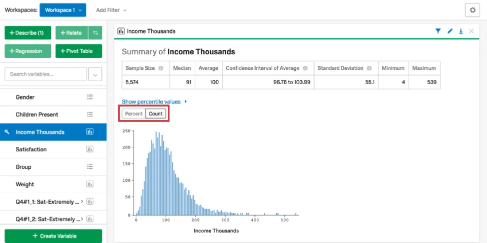
When you choose to describe a numbers variable, a card will be created that includes a histogram and a numerical summary. The numerical summary includes the mean, median, minimum, and maximum, as well the confidence interval and standard deviation of the variable. Click Percent or Count to change how the data is displayed in the histogram.
Qtip: You can recode Categories and Checkbox variables in Stats iQ. For variables you cannot recode, try creating a custom variable instead.
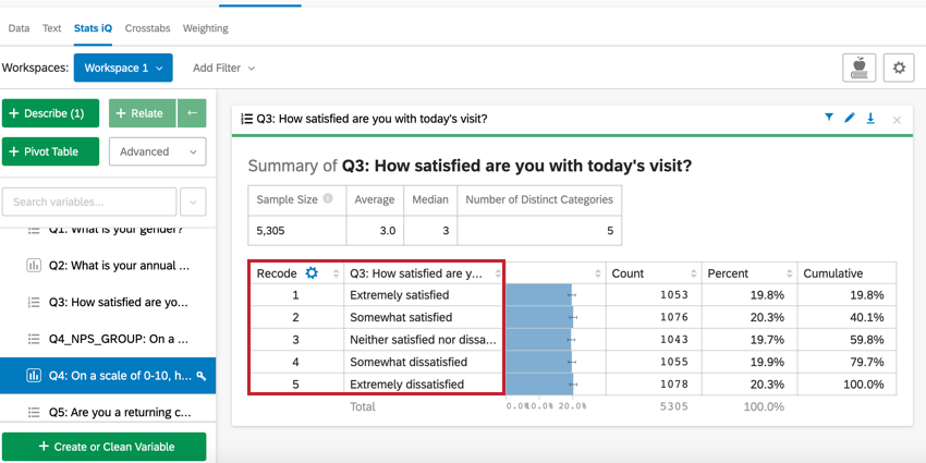
Describing Categories
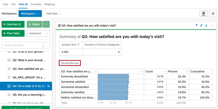
When describing a categories variable, a card is created that displays the count of each category in the variable and the relative and cumulative percentage of each level.
Reorder/Recode
Qtip: You can also recode categories variables from your Variable Settings.
Click Reorder/Recode to change the order in which the categories are displayed on the card and to assign your categories numerical values. This is most often useful when your categories have a specific order, e.g. “Happy” > “Okay” > “Sad”. Recoding your categories to have a number value also helps improve some statistical analyses, such as regressions.
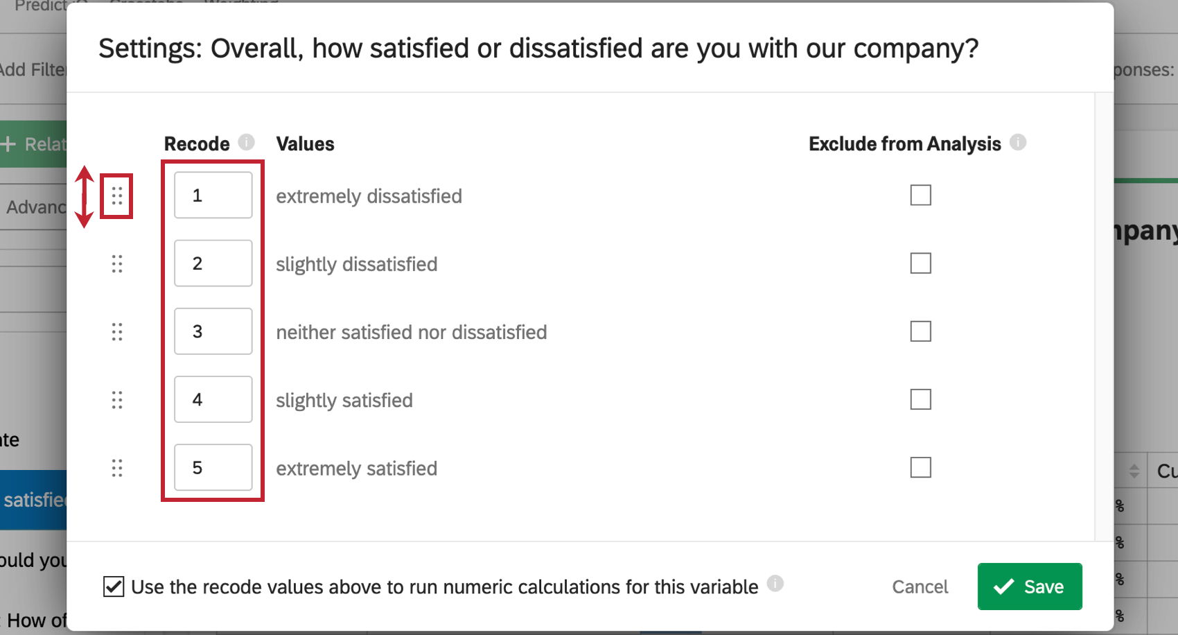
A pop-up will appear in which you can set recode values for your categories as well as reorder how they appear in the card. Click and drag the dots next to a category to reorder it. Enter a number in the Recode box to assign a number value to a category.

If you’d like to exclude a category from analysis, check the Exclude from Analysis box. This is generally used for responses such as “Not Applicable” or “Other”.
You can also select Use the recode values above to run numeric calculations for this variable to ensure these recodes are used in other Stats iQ analyses for this variable.
When finished editing, click Save. Your variable will now be reordered in the card and the recode values will appear in the card as well.

Qtip: After clicking “Save,” you may see a pop-up asking to Apply settings to other variables. Stats iQ will recognize other similar variables in your dataset and attempt to apply the same settings to these variables. If desired, you can apply your recode values to these variables as well. Check the box next to any variables you’d like to have the same recode values.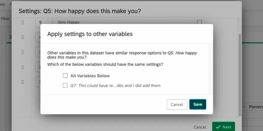

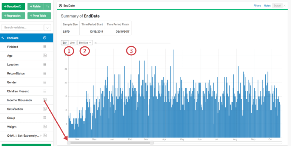
Describing Dates
When describing a time variable, a card is created with a timeline that displays the number of datapoints in a given time period. This time period size can be changed directly on the card by adjusting the slider below the graph.
To adjust the features of the graphical output, use the options in the top-left:
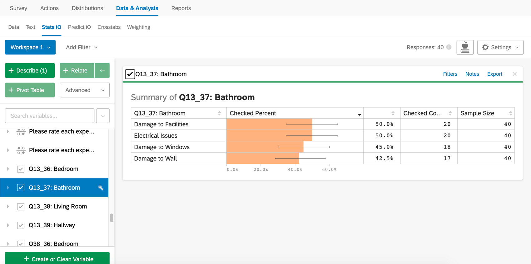
Describing Checkboxes
When describing a checkbox variable, a card is created that displays a table similar to that created by describing a categorical variable. For checkbox variables, though, the percentages will not sum to 100% since respondents could have selected several different checkboxes.
Qtip: With checkbox variables, the sample size includes data, even if respondents didn’t answer the question. You can add a filter to the card to change the sample size and adjust if necessary.
FAQs
What are the options for analyzing my data in Stats iQ?
What are the options for analyzing my data in Stats iQ?
- Describe: Selecting a variable from the list and then clicking Describe will give you a visualization of the data contained in that variable. Use this when you would like to see how the data for a certain variable is distributed.
- Relate: Selecting two variables and then clicking Relate will run a statistical analysis of the relation between the two variables. Use this when you would like to know how strongly two variables are correlated.
- Pivot Table: Selecting two or more variables and clicking Pivot Table will create a table that displays the values of the variables as rows and columns. The cells can be set to display a variety of different information including column and row percentage, Sum, and Variance. Use this when you would like to compare the overlap between specific values of a set of variables.
- Regression: Selecting two variables and clicking Regression will give the mathematical relationship between the variables. Use this when you would like to predict values for one variable based off of the values of another.
- Cluster: Selecting two to ten demographic variables and clicking Cluster will display groupings of traits most likely to occur together, thus revealing the population segments captured in your data.
What do the different variable types mean in Stats iQ?
What do the different variable types mean in Stats iQ?
I don't know what this statistical term means. Can you tell me?
I don't know what this statistical term means. Can you tell me?
- Statistical tests: ANOVA, T-test, and Chi-squared are all statistical test that Stats iQ performs to test whether or not the relationship between two variables is significant. These tests are used to generate a P-Value.
- P-Value: This value represents the probability that the observed results would be seen if no correlation between the variables exists. A lower P-Value means more correlated data.
- Effect Size: The effect size is a measure of how large the correlation between two variables is. This is measured in different ways depending on the type of the statistical test performed. Examples are Cohen’s d, Pearson’s r, and Cramer’s v. The larger the effect size value, the more correlated the variables are.
How do I get my new responses to show up in Stats iQ?
How do I get my new responses to show up in Stats iQ?
How are analysis cards ordered in my Stats iQ Workspace?
How are analysis cards ordered in my Stats iQ Workspace?
What’s Stats iQ? / Where’s Statwing?
What’s Stats iQ? / Where’s Statwing?
What do I do if my data isn't loading properly?
What do I do if my data isn't loading properly?
That's great! Thank you for your feedback!
Thank you for your feedback!