
Breakdown Bar Visualization
What's on this page
About Breakdown Bars
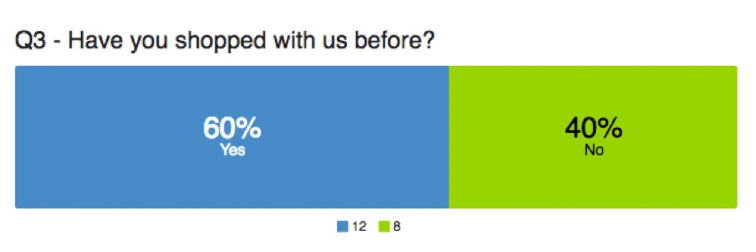
Breakdown bars are chart visualizations you can customize in the Reports section. The possible answer choices are each represented as a segment of the bar, taking up space proportional to how many respondents selected or were assigned the value. This makes them great for displaying percentage data, much like the Pie Chart. Breakdown bars are the default visualization for Net Promoter® Score groups.
Customization
For basic visualization instructions and customization, visit the Visualizations Overview support page. Continue reading for visualization-specific customization.
Labels and Legend
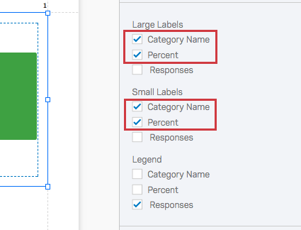
Since the segments of the Breakdown Bar can change based on the responses coming in, you can select what information to label, and at what size. For information that may take up too much space on the bar itself, you can move it to the legend instead.
The information you can include in your labels is as follows:
- Category name: The answer choice text or field value name.
- Percent: The percentage of respondents who selected or were assigned the value.
- Response count: The number of respondents who selected or were assigned the value.
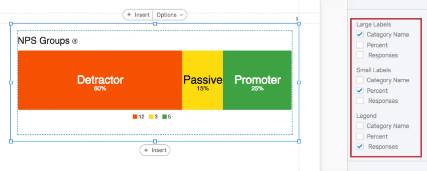
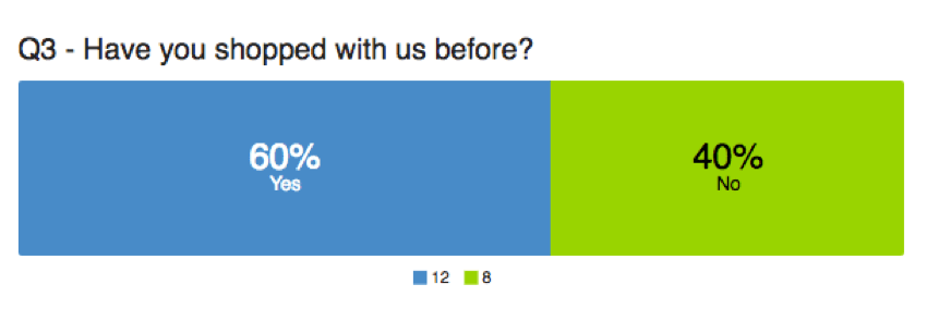
In the example above, the category names are written as large labels, the percentage of respondents who fit each category are written as small labels, and the number of respondents who belong to each category have been allocated to the legend.
You are allowed to include the same information in each area, so be sure when adjusting these settings that you deselect settings you don’t want to include anymore.

Qtip: When the segment is too small, the labels won’t show up anymore. Resize with caution.
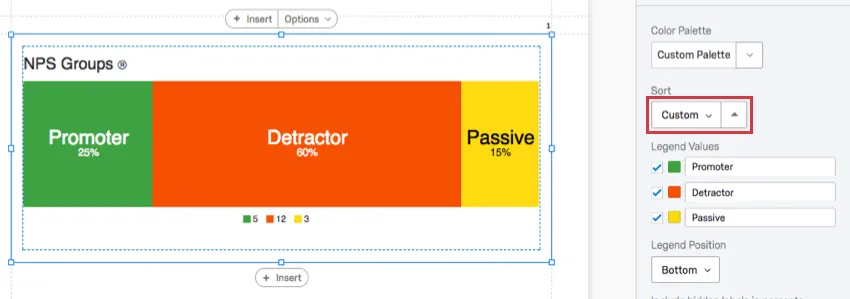
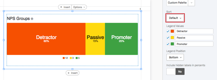
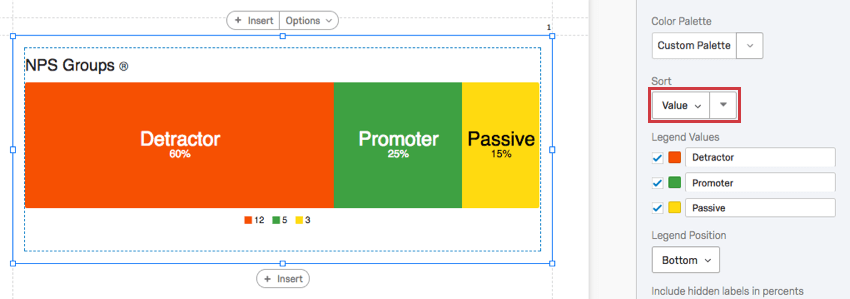
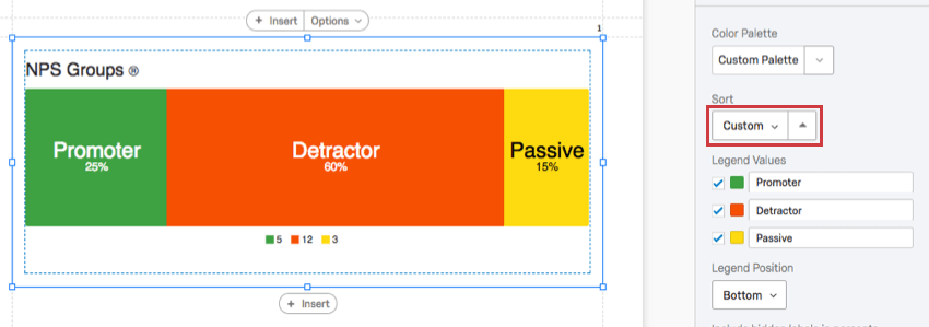
Sort
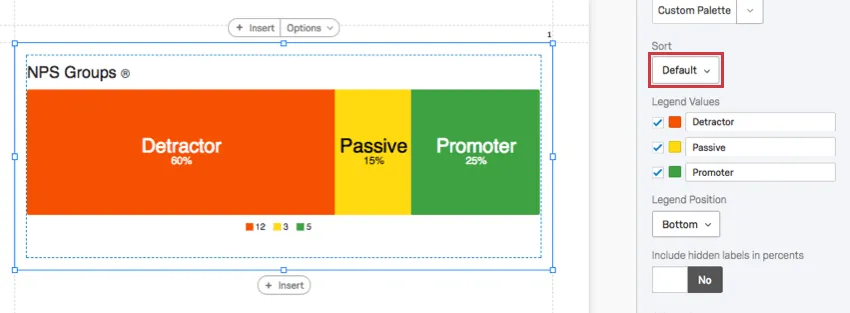
By default, your choices appear in the chart in the order they appear in the question. However, you can change this with the sort function.
- Default: Sort choices by the order they appear in the survey.
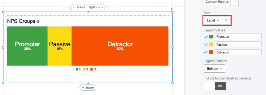
- Label: Sort choices by the original, unedited order of the labels.
- Value: Sort choices by the associated values. For example, if your metric is choice count, you can sort by the most to least chosen option, or the reverse.

- Custom: Since you can drag and reorder the legend values, you can reorder values as you please and then reverse this order.

Changing the order of the values and then clicking the arrow will automatically change your sort settings to Custom.
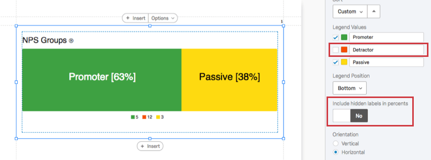
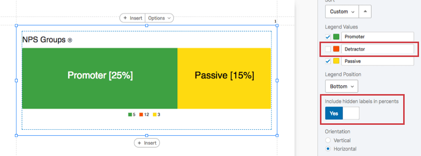
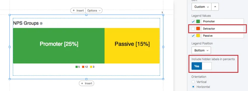
Include hidden labels in percents
You can hide the labels in your legend, excluding answer choices from your visualization. When you do this, you have the option to exclude these choices from the calculation of percentages in the chart, or to include them even though they’re not shown.
Note how the percentages change in the examples below, before and after this option is enabled.
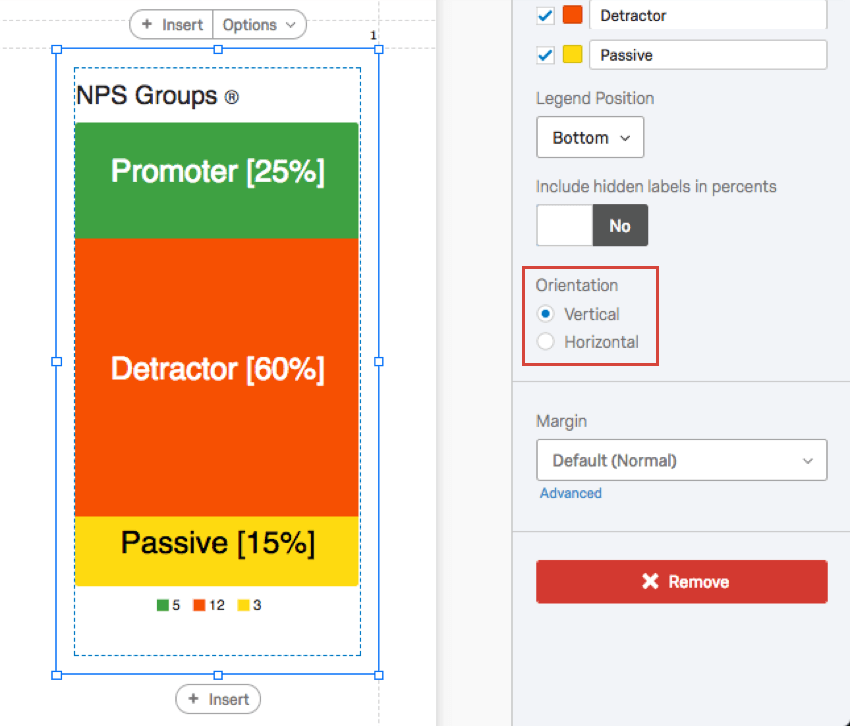
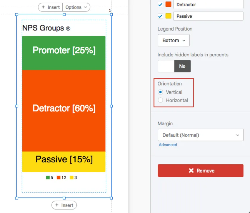
Orientation
Choose whether you want your bars to be stacked horizontally or vertically. Changing your orientation might take some resizing of the visualization before your labels look right again.
Incompatible Fields
Breakdown Bars are compatible with most scaled and discrete data, such as any question with a multiple choice option. It is easier to list the fields they are not compatible with, which includes:
- Text Entry question
- Form field question
- Open text fields on other questions, such as Text Entry Matrix Tables, text entry columns on Side by Sides, and “Other” text boxes
- Signature question
- Slider
- Constant Sum
- Filter Only Embedded Data
- Text Embedded Data
- Number Set Embedded Data
- Manual Text variables
- Numeric manual variables
- Formulas
- Survey Metadata Duration (how long it took for respondents to take the survey)
- Survey Metadata Progress (how far respondents got in the survey before the response was recorded)
In general, open text and continuous numeric data do not work well with Breakdown Bars. Breakdown Bars are better at showing percentages of a whole, and so are not as useful for statistical data like averages.
Types of Reports
This visualization can be used in a few different types of report:
That's great! Thank you for your feedback!
Thank you for your feedback!