

Creating an Executive Overview (CX)
What's on this page
About Creating an Executive Overview
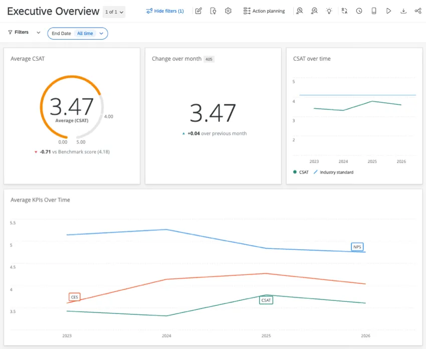
Customer Experience programs can generate a lot of different feedback, so it can be tricky deciding what data you should show to your executive stakeholders. This support page shows how to build a basic “Executive Overview” for your dashboard. We recommend that you include:
- A widget highlighting your outcome metric (e.g., NPS or CSAT).
- A line chart showing KPI trends over time.
How your data compares to industry benchmarks.
Resources Before You Start
In case you haven’t made a dashboard before, here are some important pages to get you started:
Qtip: As we explain each widget in an Executive Overview, we’ll also give advice on field types to help make data mapping easier.

Qtip: We recommend adding a page filter using a date field (e.g., End Date). This lets executives narrow down results by the most recent data, or hop back in time to see previous performance.
Outcome Metric
First, highlight an outcome metric for your CX program. By putting this number front and center, you showcase current CX performance. Common CX outcome metrics include:
- CSAT (customer satisfaction)
- NPS (net promoter score)
- CES (customer effort score)
For more on how to choose an outcome metric, see our blog on how to measure customer experience.
When you built your survey, your outcome metric was probably a multiple choice question written as a scale, a star rating, a number scale question, an NPS question, or something similar. This field should be mapped in your dashboard as a Number Set.
Recommended Widgets for Outcome Metrics
For additional setup steps, see the linked widget pages.
Create a number chart or gauge chart.
Qtip: Number charts have a plainer design, and are better for showing a change delta over time. Gauge charts show maximum and minimum scale values alongside the actual score, and can be used to show comparison deltas against industry benchmarks.
Give your widget a clear title. E.g., Average CSAT.
Under Metrics, select Average, then your chosen outcome metric.

On a number chart, you can Show change since and display how the data has changed over a time frame.

On a gauge chart, make sure your Value ranges match the metric’s scale.
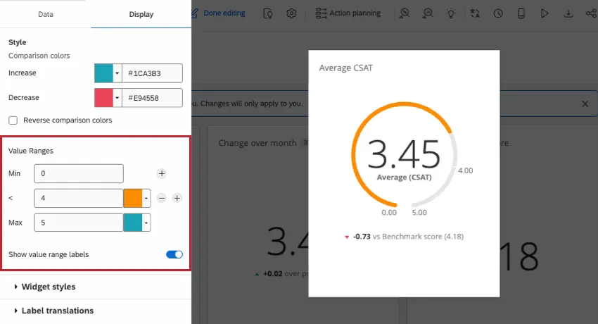
Example: If your CSAT is rated on a 1-5 scale, your minimum value should be 1 and your maximum should be 5. You can then choose a score in the middle that denotes the cutoff between high and low performance (e.g., 4).

KPI Trends Chart
KPIs (or key performance indicators) are the metrics you use to measure your performance and the impact of the work on the business. A KPI trend chart can show your stakeholders how one or more key metrics have changed over time.
When you built your survey, your KPIs were probably a multiple choice question written as a scale, a star rating, a number scale question, an NPS question, or something similar. These KPIs should be mapped in your dashboard as Number Set fields.
The best way to show change over time is by using a line chart.
- See this example on how to show a metric over time in a line widget.
If you have multiple KPIs, you can add multiple Metrics.
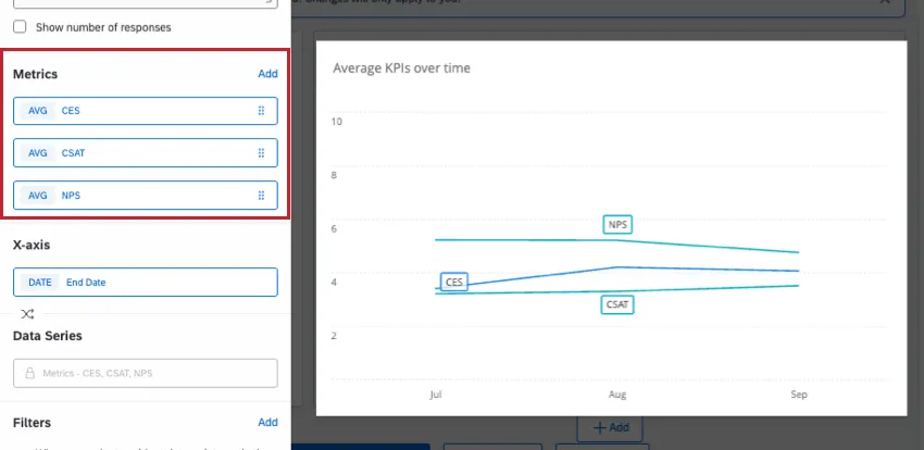
- You can distinguish different metrics with colors and a legend.
Industry Benchmarks
So far, we’ve shown how to display your company’s performance. But how will viewers know if the results are optimal? Although it helps that most metrics are rated on a finite scale, aiming for a 5 out of 5 performance may not always be feasible, and doesn’t tell you how competitors are doing. This is where benchmarks come in.
Qualtrics provides pre-made industry benchmarks based on research by Experience Management scientists, so you can measure your organization’s performance on common KPIs. Data for many benchmarks is refreshed annually, offering up-to-date performance metrics.
Browse a list of CX benchmarks, or explore them in-platform to see what best matches your KPIs. Once you’ve chosen a premade benchmark to use, there are a few ways to use them in your dashboard.
Displaying a Benchmark as the Main Metric in a Widget
Here, we created another Number Chart and used it to display the Agent Effectiveness benchmark. That way we can display our own CSAT and the industry standard side-by-side.
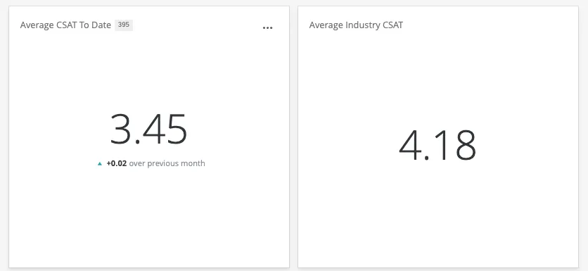
Follow these steps to add a benchmark as a widget’s main metric.
Displaying a Comparison Delta
A delta shows the change between two numbers – in this case, the difference between your outcome and the industry benchmark. Here, we took a gauge chart that already shows our CSAT and added the Agent Effectiveness CSAT benchmark as a comparison. We can see this difference between the main score and the benchmark at the bottom of the widget.
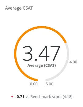
- Create your gauge chart.
Next to Comparisons, click Add.
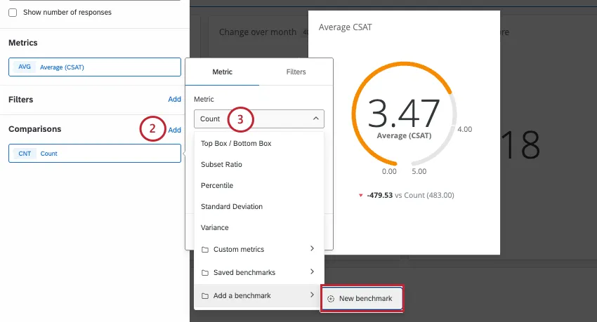
- Under Metric, choose to add a new benchmark.
Select the industry benchmark you’re interested in.
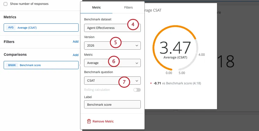
- Set the version.
- Set the Metric to Average.
- Choose the benchmark question. In this case, we chose CSAT because it’s the same KPI.
Adding a Goal Line on a Chart
Here, we took a line chart showing average CSAT over time, and added the Omnichannel CX (US) benchmark as a comparison line.
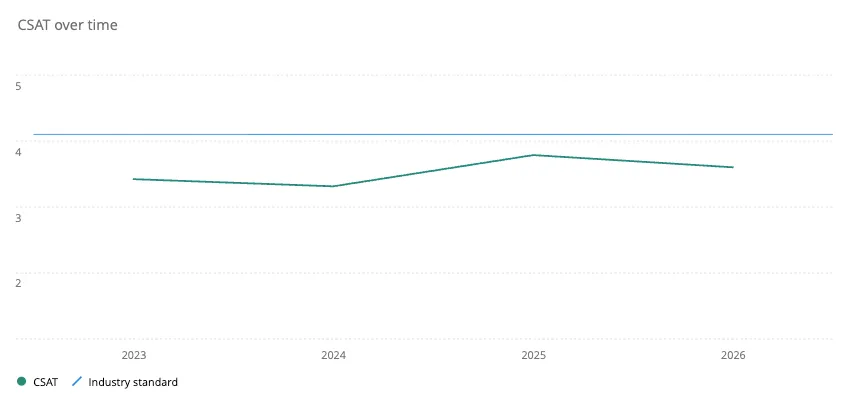
- Create the line widget showing the CSAT trend.
Next to Comparisons, click Add.
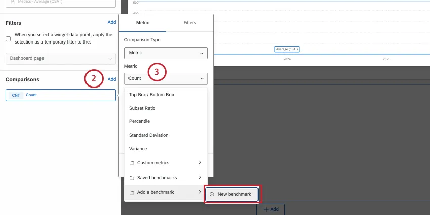
- Under Metric, choose to add a new benchmark.
Select the industry benchmark you’re interested in.
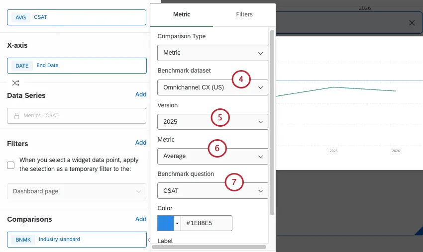
- Set the version.
- Set the Metric to Average.
- Choose the benchmark question. In this case, we chose CSAT because it’s the same KPI.
Because we chose the Omnichannel CX (US) benchmark, we need to choose Filters.
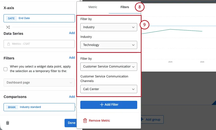
- This dashboard is for a tech company’s customer support team. So we set the industry and customer service channels accordingly.
FAQs
Are there survey features that aren't compatible with my CX Dashboard?
Are there survey features that aren't compatible with my CX Dashboard?
The count in my Number Chart widget does not match the count for the same value that I see in other widgets in CX Dashboards. Why is this?
The count in my Number Chart widget does not match the count for the same value that I see in other widgets in CX Dashboards. Why is this?
Why are my metrics adding up to 99 or 101 instead of 100?
Why are my metrics adding up to 99 or 101 instead of 100?
33.60 + 33.60 + 32.80 = 100
Whereas if you choose to display no decimals with the same dataset:
34 + 34 + 33 = 101
Widgets can’t show infinite decimals, which means that regardless of decimal settings, some data will eventually have to be rounded up. This means that small deviations, like adding up to 99 or 101 instead of 100, work as intended.
How do I add a comparison to my widget?
How do I add a comparison to my widget?
I followed all of the steps, but I don’t see my comparison line on my widget. What do I do?
I followed all of the steps, but I don’t see my comparison line on my widget. What do I do?
What information can I filter industry benchmarks by?
What information can I filter industry benchmarks by?
What’s the difference between making an industry benchmark in the editor and using a one-time benchmark?
What’s the difference between making an industry benchmark in the editor and using a one-time benchmark?
Benchmarks made in the editor can be added to a widget as a comparison, appearing as a goal line. Benefits of the benchmark editor include the ability to explore data beforehand and being able to reuse the configurations you created in the editor, including filter groups. When creating benchmarks from the same Qualtrics study, you can also map a few rows at once, making it easier to create more benchmarks at a time.
One-time benchmarks appear as the primary metric in a widget (although you can often add more metrics to the same widget for comparison). Benefits of “one-time benchmarks” include speed and ease of use. In general, we recommend using these if you only want to create one or two benchmarks in your dashboard.
That's great! Thank you for your feedback!
Thank you for your feedback!