
Bar Chart Visualization
What's on this page
About Bar Charts
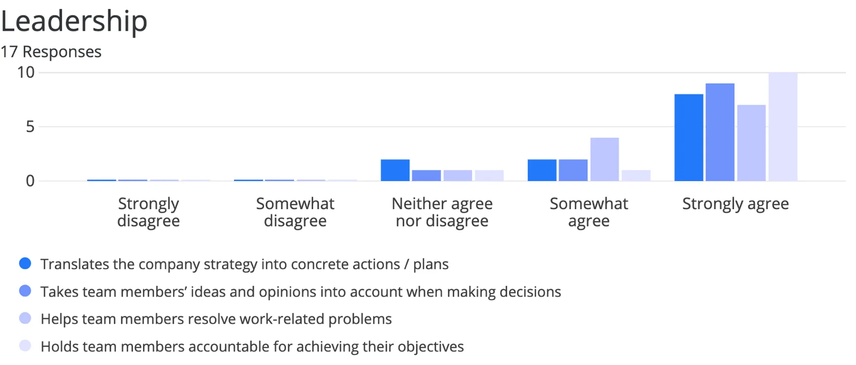
The Bar Chart is a chart visualization that you can customize in the Reports section. Each choice in a question is represented as a bar, and the length of each bar is proportional to the value being measured. One axis of the visualization shows the specific answer options being compared, and the other axis represents a discrete value (e.g., counts or percentages of respondents with that option).
Qtip: Don’t like your table colors or fonts? Head over to the Global Settings to change them for the whole report!
Customization
For basic visualization instructions and customization, visit the Visualizations Overview support page. Continue reading for visualization-specific customization.
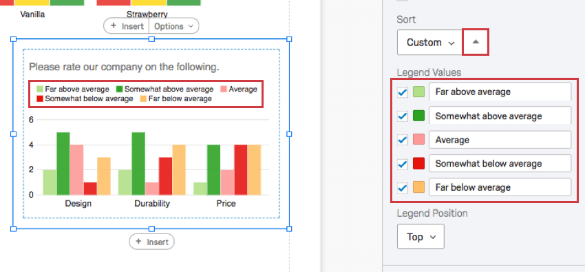
Sort
Qtip: This option only appears for questions with two dimensions. For example, Matrix Tables (which have statements and scales), Pick Group and Rank (which have items and groups), and visualizations with a breakout.
By default, your answer choices (or Legend Values) are displayed in order from top to bottom. By selecting Custom, you can drag and drop your legend values into a different order.
Reverse your sort order by clicking the arrow button.

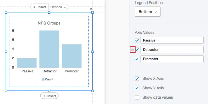
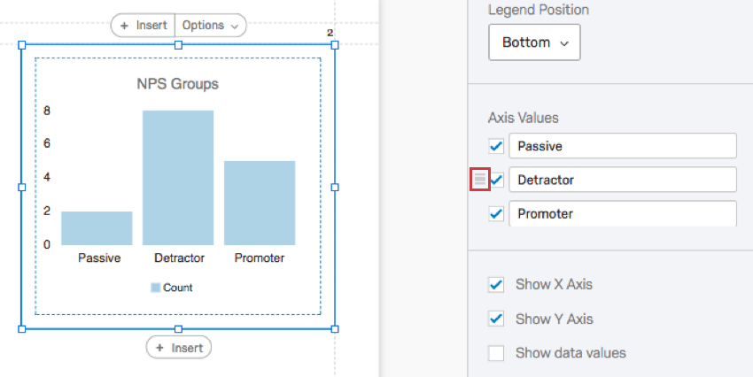
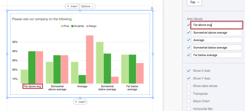
Axis Values
Sometimes, you may have a question with many choices, but you only want to display a few in your graph. The Axis Values section allows you to hide answers you don’t want to include in your chart by deselecting the checkmark to the left of the choice.
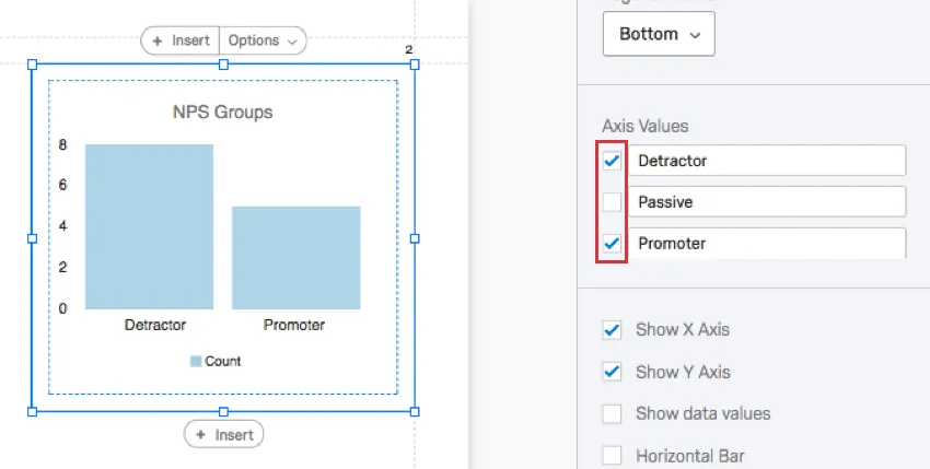
You can also click and drag values to change the order they appear in the chart. First hover over the value, then click and drag the icon to the left.
To rename a visualization, click into a field and start typing. This does not affect the name of the choice in the survey or in other data.

Qtip: Want the Axis Value to revert back to its default name? Just erase what you’ve written, and it’ll automatically go back to what is was before.
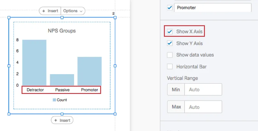
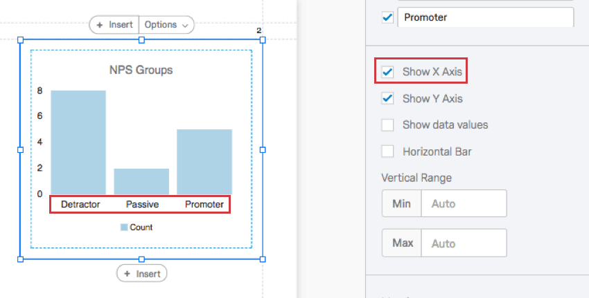
Show X Axis
When deselected, the X axis will be removed.
Qtip: This is the y-axis of a horizontal Bar Chart.
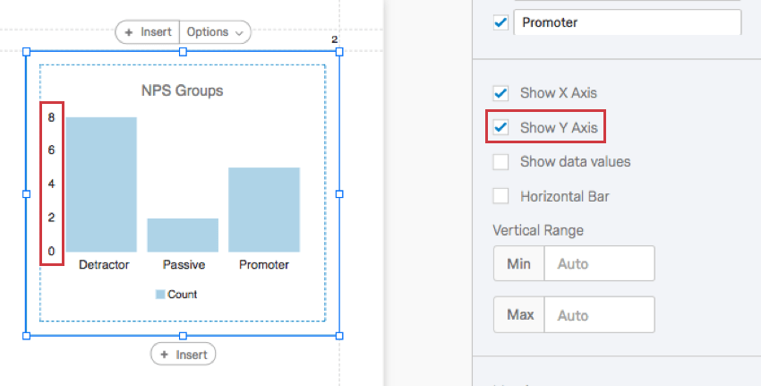
Show Y Axis
When deselected, the Y axis will be removed.

Qtip: This is the x-axis of a horizontal Bar Chart.
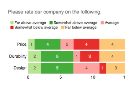
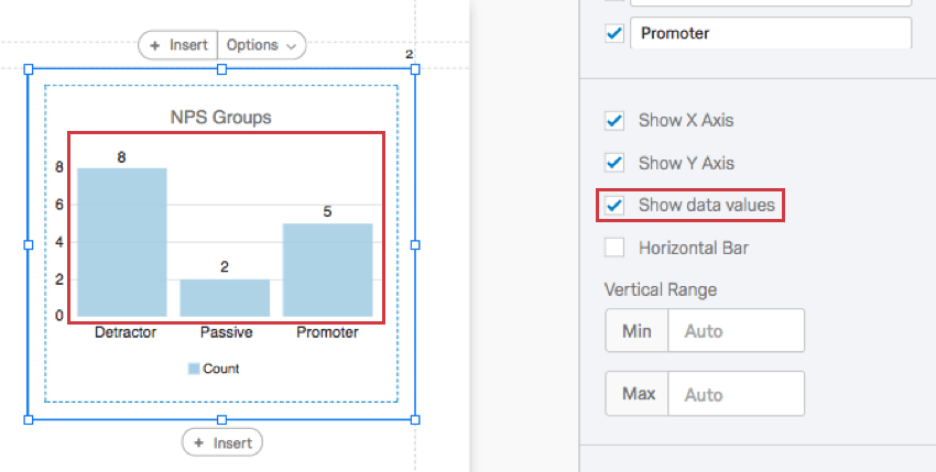
Show data values
When selected, the values will display with each choice’s bar. This can be helpful for charts with longer X axes, so that the value is displayed with each bar and the person viewing the report does not have to estimate the values based on the scale lines.

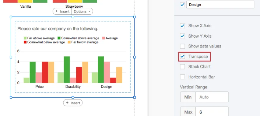
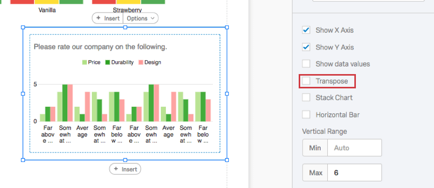
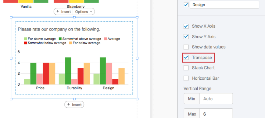
Transpose
Qtip: This option only appears for questions with two dimensions. For example, Matrix Tables (which have statements and scales), Pick Group and Rank (which have items and groups), and visualizations with a breakout.
When selected, the items listed on the X axis and the items listed on the Y axis will switch places.

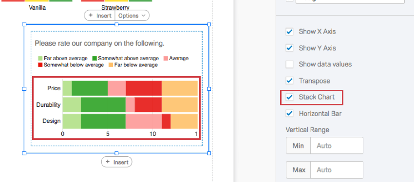
Stack Chart
Qtip: This option only appears for questions with two dimensions. For example, Matrix Tables (which have statements and scales), Pick Group and Rank (which have items and groups), and visualizations with a breakout.
When selected, the bars within each category will be stacked on top of one another instead of being displayed separately.
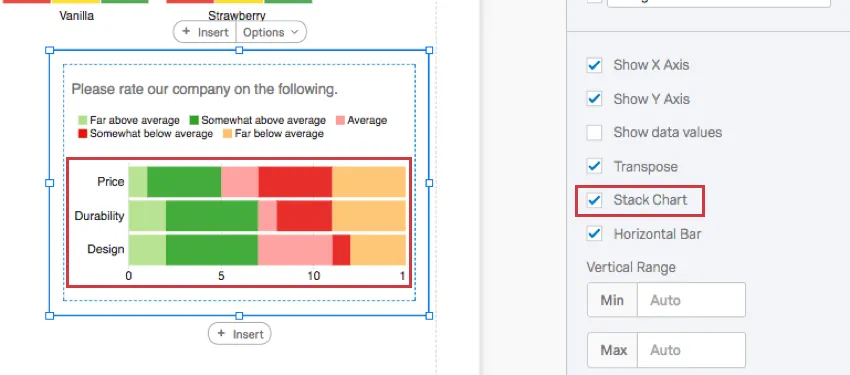
Qtip: Pair this setting with Show data values to clarify the data in your chart!

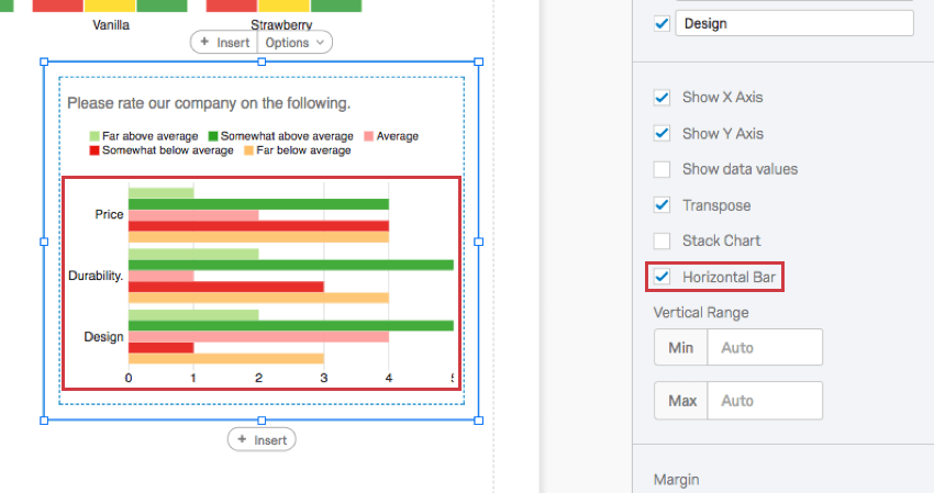
Horizontal Bar
When selected, your bar graph will become horizontal.

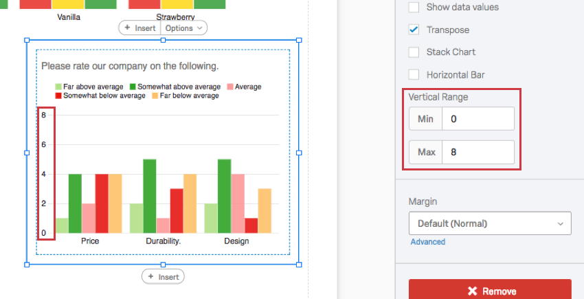
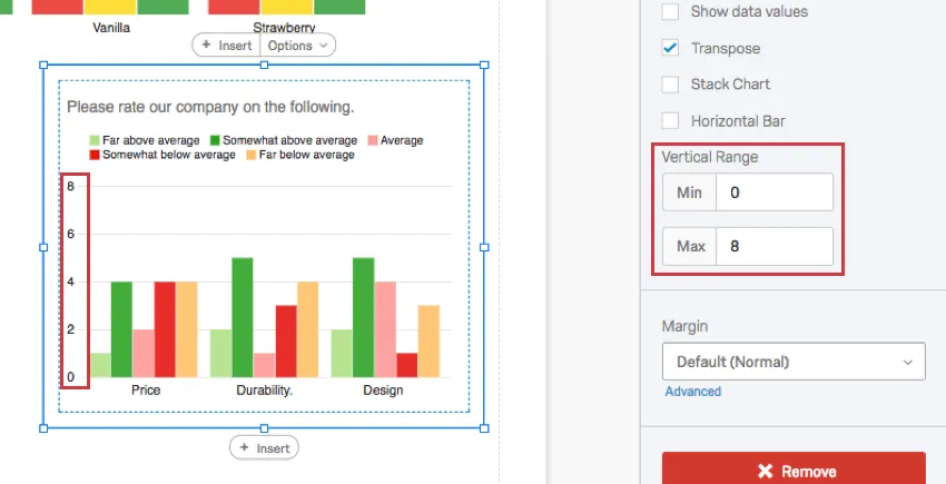
Vertical Range
The Vertical Range refers to the scale points displayed on the visualization’s axis. The visualization tries to account for maximum and minimum values automatically, but if your visualization looks funny, or you want to adjust the appearance of your data, you can manually type new minimum and maximum values in the field.
Qtip: This feature does not change the actual question’s scale points. It merely changes the range of the data that fits onto the visualization.
Qtip: If you are using Percentage as your metric, then remove 2 decimal places when typing minimum and maximum values. For example, if you want your maximum to be 100%, just type 1.
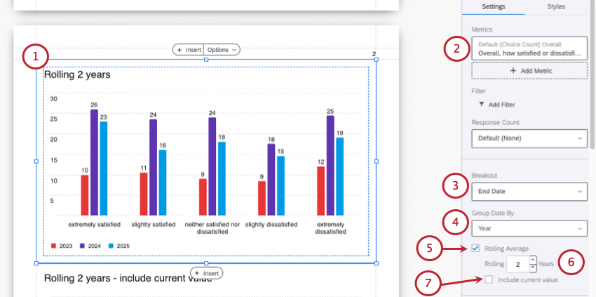
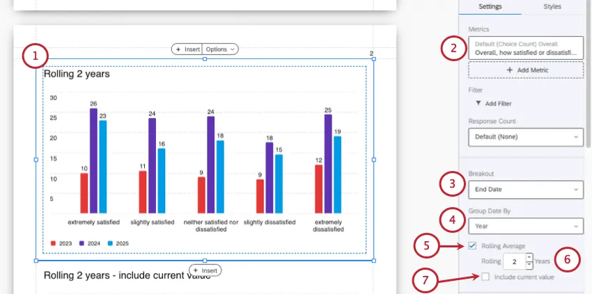
Rolling Averages
Rolling averages help you sort through natural variations in results to identify real trends, as opposed to momentary changes in traffic. Rolling averages take a series of points, where those points can be the result of any sort of metric calculation, and average them over a window of specified size (time period). This means the resulting average is independent of sample size for any given period.
Example: Let’s say you have NPS data for the past 30 days. If you choose to get the rolling average of every 3 days, you can get the average of the NPS scores in a rolling window of 3 NPS scores broken out by days. Then, every 3 days of data collection, a new average of NPS scores would be generated for you.
Rolling averages are not available to all visualization types or date groupings, so be careful to follow the steps below.
Incompatible Fields
Bar Charts are compatible with almost every kind of variable in Qualtrics because they can display both discrete data (e.g., a finite, five point scale) and continuous data (e.g., a question where respondents type in their age). This includes most question types, survey metadata, embedded data, and custom variables, such as Formulas or Bucketed variables.
Below are the few variables Bar Charts are not compatible with:
- Text Entry questions lacking numeric validation
- Form field questions lacking numeric validation
- Open text fields on other questions, such as Text Entry Matrix Tables, text entry columns on Side by Sides, and “Other” text boxes lacking numeric validation
- Heat Maps with no regions defined
- Signature question
- Filter Only Embedded Data
- Text Embedded Data
- Text manual variables
In general, Bar Charts are incompatible with open text content that is not numeric.
Qtip: Be careful with numeric data collected from open-ended questions and with finite scales that have hundreds of choices. A Bar Chart cannot comfortably display hundreds of choices!
Types of Reports
This visualization can be used in a few different types of report:
That's great! Thank you for your feedback!
Thank you for your feedback!