
Building Appearance Layouts
What's on this page
About Building Appearance Layouts
Qtip: The sections on this page describe editing an Overlay creative within Appearance Studio. For information on editing an Embedded creative, see Embedded Creatives.

This page covers how to build an appearance layout for a digital intercept. A layout is made of multiple elements. Each individual element is a different component of your digital intercept. This includes text boxes, graphics, embedded surveys, and more.
You will build your appearance layout in the Build tab of Appearance Studio.
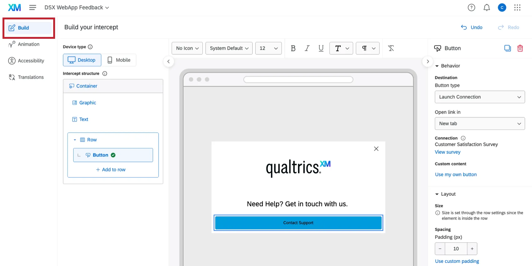
The following elements are available for customizing your layout:
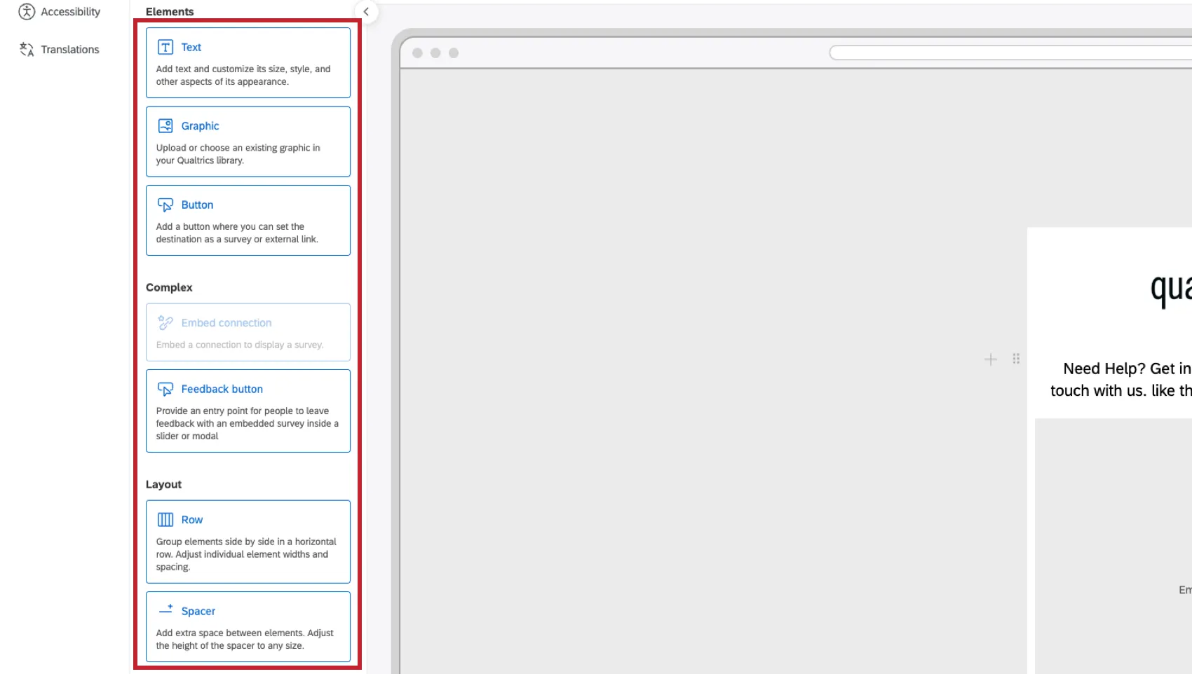
- Text: Add a text box.
- Graphic: Add a graphic.
- Button: Add a button for visitors to click which launches a survey or opens an external link.
- Embed connection: Embed a survey or agent directly in the intercept.
- Feedback button: Add a feedback button for users to click to open the intercept.
- Row: Group elements together in rows to have them appear horizontally instead of vertically.
- Spacer: Add empty space in between other elements.
Undoing Edits & Saving Changes
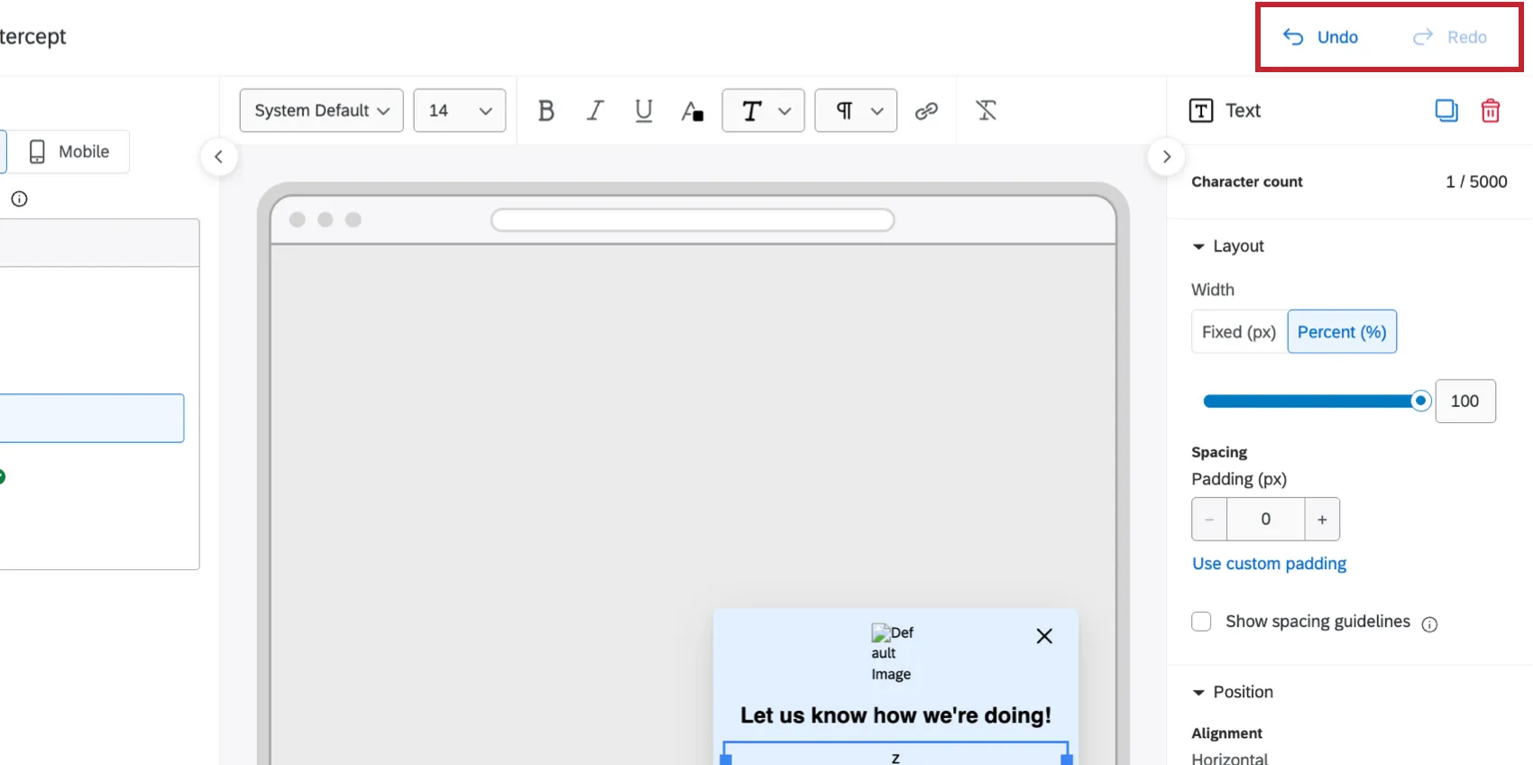
Appearance Studio is a flexible editor that gives you control over saving and reverting changes to your appearance layout. As you edit your layout, you can use the Undo and Redo buttons to revert and restore actions as needed (for example, if you accidentally deleted a text box element).
Your edits are not finalized until you click the Save appearance button at the bottom of the editor.
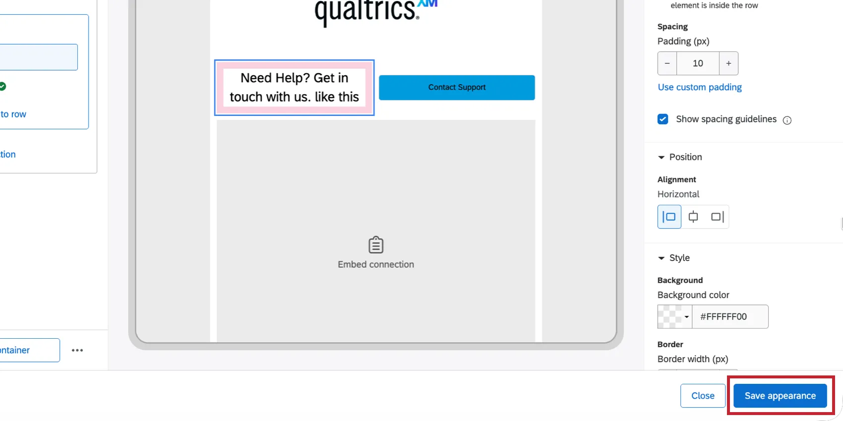
Attention: Once saved, you will no longer be able to undo or redo actions performed before saving. Please note that you cannot revert your layout to a previously saved version.

After saving the appearance, you can test the new look on your site and then publish the changes to the live intercept. This works the same as publishing any change to a live intercept. See the following pages for more information:
Moving Elements
Elements will appear in a vertical list in Appearance Studio. The order that the elements appear in this list determines the order that the element appears in your layout. The top element will be farthest to the left while the bottom element will be farthest to the right, with everything else appearing in between.
The easiest way to rearrange elements is to click on them with your mouse and drag them to a new spot in the list.
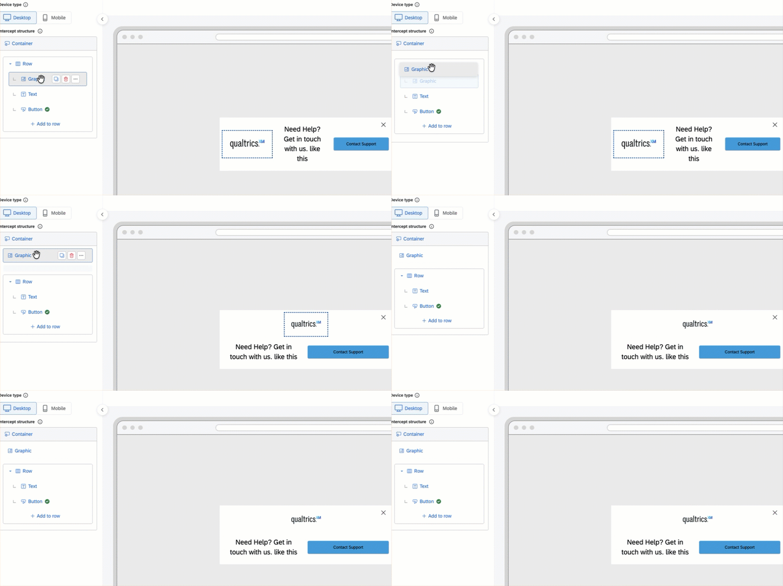
However you can manage an individual element by hovering your mouse over it and choosing an option:
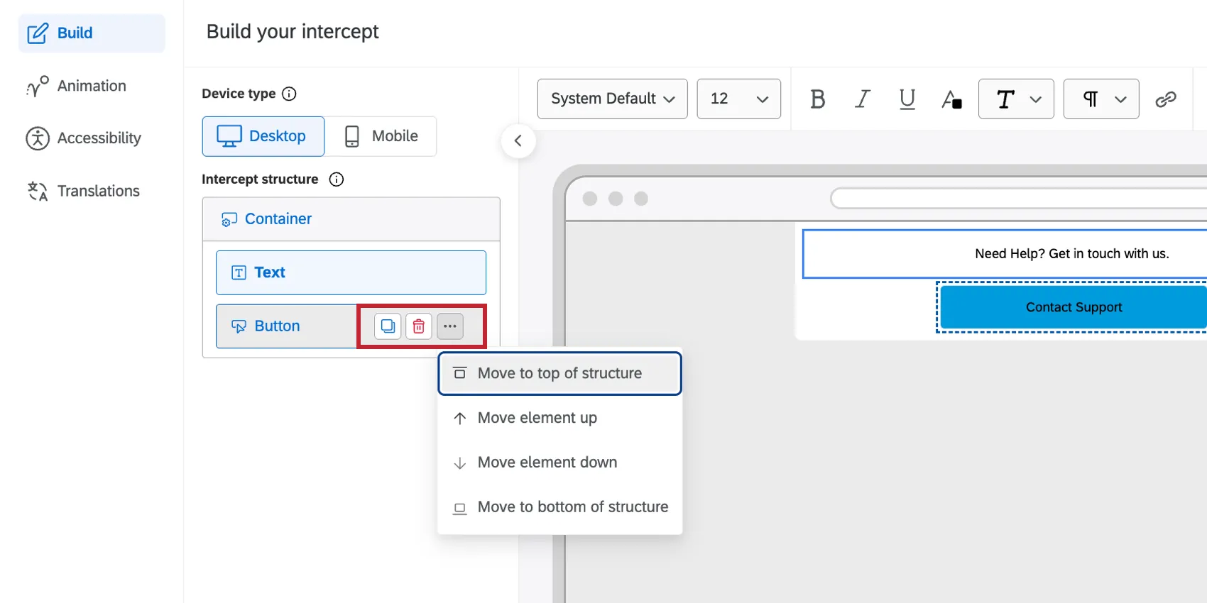
- Copy: Creates a duplicate of the element.
- Delete: Deletes the element.
- Move to top of structure: Moves the element to the top of the list of elements.
- Move element up: Moves the element up 1 position in the list of elements.
- Move element down: Moves the element down 1 position in the list of elements.
- Move to bottom of structure: Moves the element to the bottom of the list of elements.
Setting the Intercept Container
The container holds all the elements of your intercept and determines how they appear on your site. All elements will be nested under the container.
Qtip: A single container supports up to 15 elements. The Feedback button is excluded from this limit.
Click on a container to open its settings. You can then customize the following:
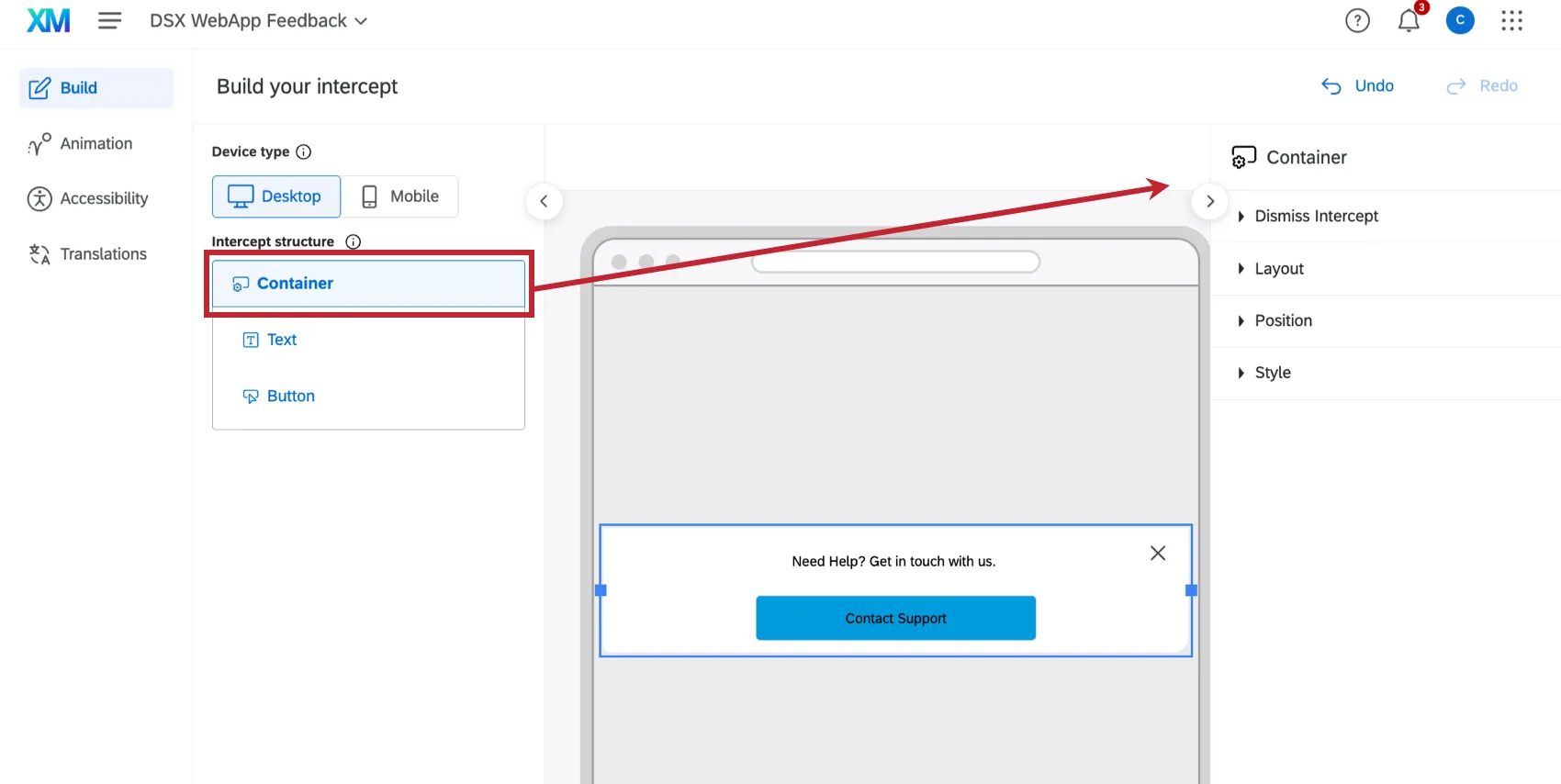
Dismiss Intercept settings:
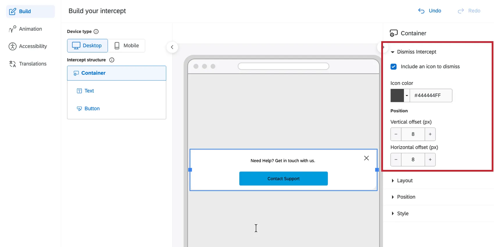
- Enable Include an icon to dismiss If you want to include an ‘X’ to dismiss your intercept. Note that you don't have to include an "X." You can add a button that dismisses the intercept instead.
- Set the Icon color.
- Determine the vertical and horizontal offset, in pixels.
The Layout settings control the following:
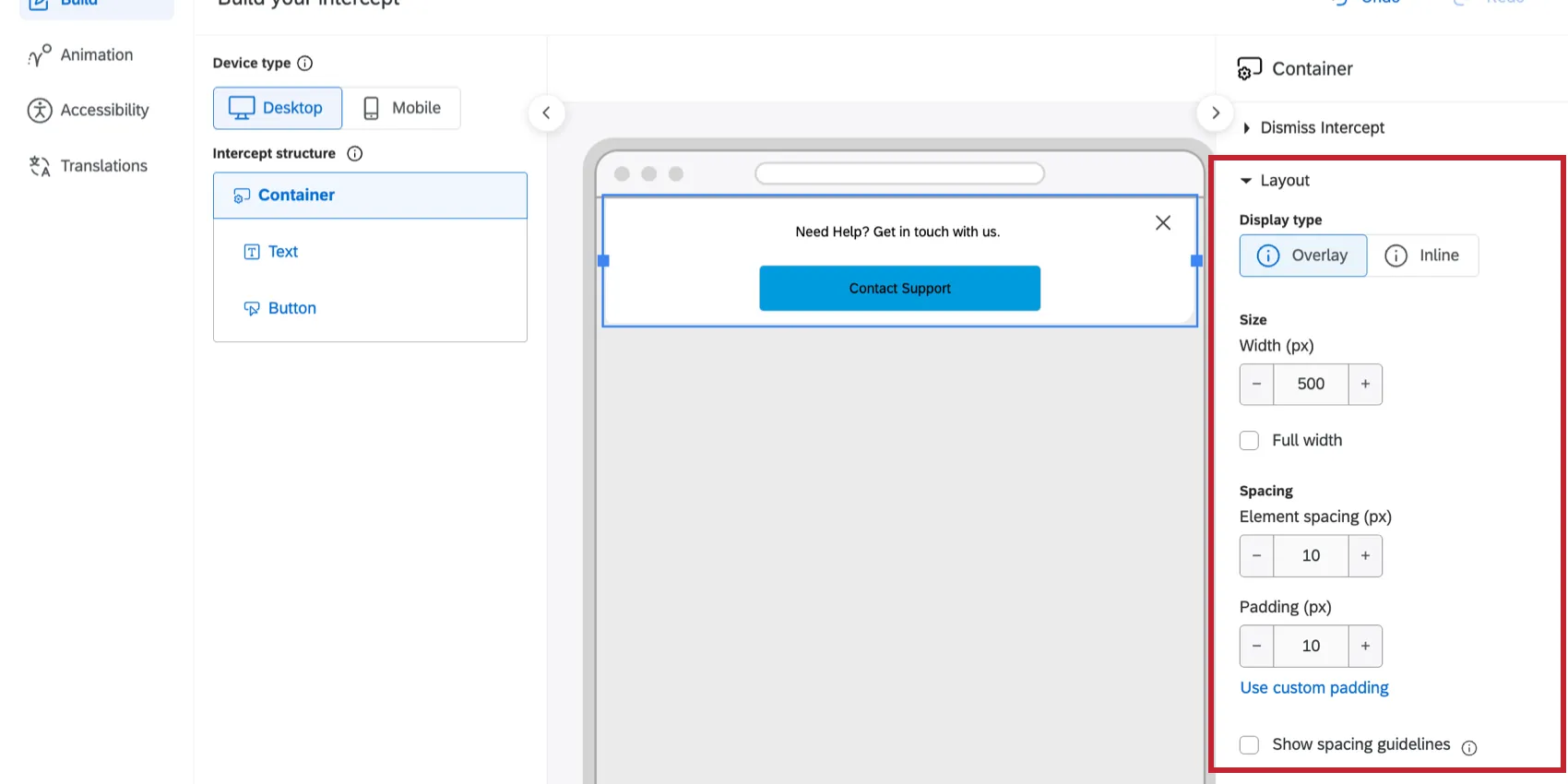
- Display type: Determines the creative placement. Choose between Overlay (floats on top of site content) or Inline (embeds into the page, pushing content up or down).
- Width (px): Controls the maximum width of the appearance, in pixels. You can also toggle Full width so the container is always the full width of your webpage.
- Element spacing (px): Defines the default vertical gap between elements stacked within the container.
- Padding (px): Controls the margin size inside the container’s border, pushing all internal elements inward. Select “Use equal padding” to apply the same value to all four sides, or unselect it to set Top, Bottom, Left, and Right padding individually.
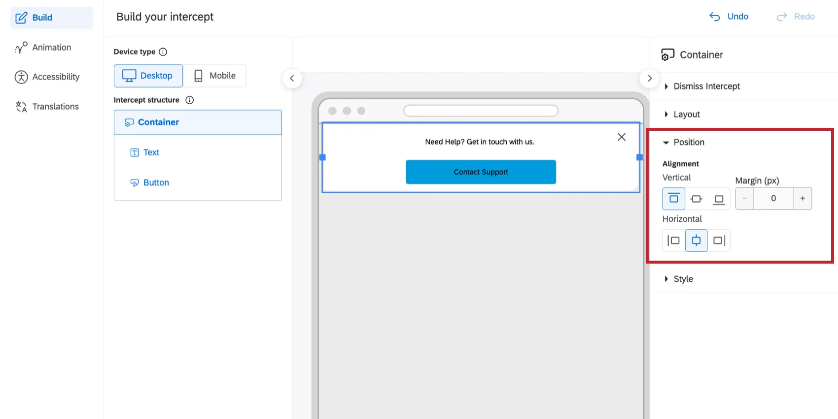
If your display type is set to Overlay, then choose the Position of the container on the webpage by setting the horizontal and vertical alignments, and selecting if you’d like to include a margin.
Under Style, customize the container’s appearance:
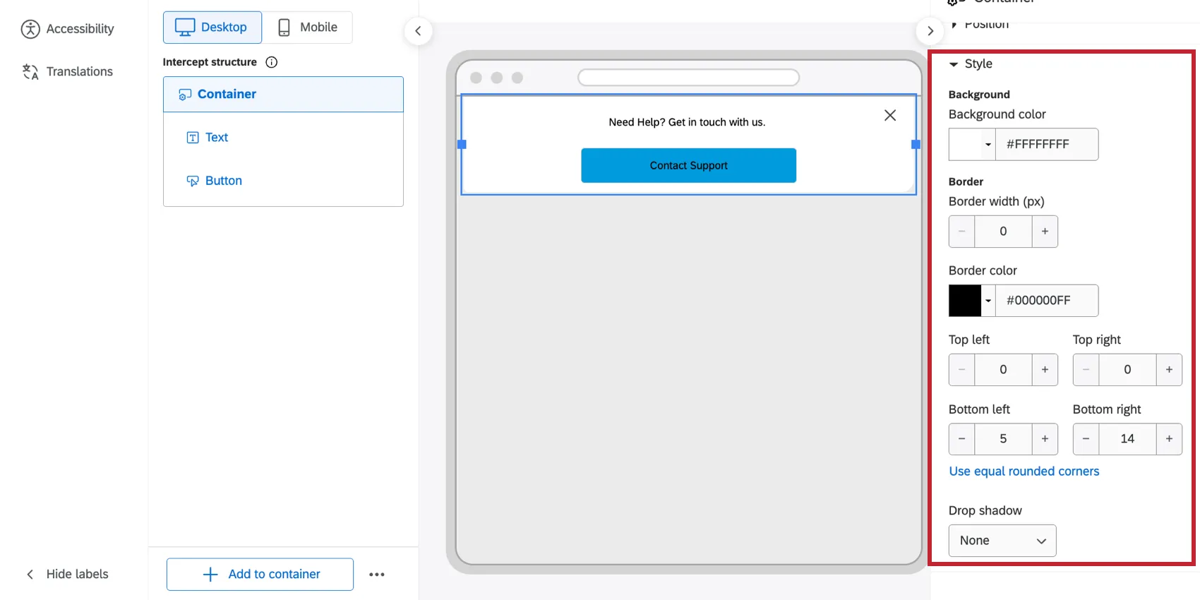
- Background color: Choose a color or enter the HEX or RGBA value. You can also pick transparent by using the ‘No-color’ option.
- Border: Define the border width (px) and border color.
- Rounded corner (px): Increases the curve of the intercept's outer corners. Select “Use custom rounded corners” to define different curves for the top, bottom, left, and right or select “Use equal rounded corners” to apply the same setting to each corner.
- Drop shadow: Applies a shadow behind the intercept frame. Choose from None, Light, Medium, or Heavy.
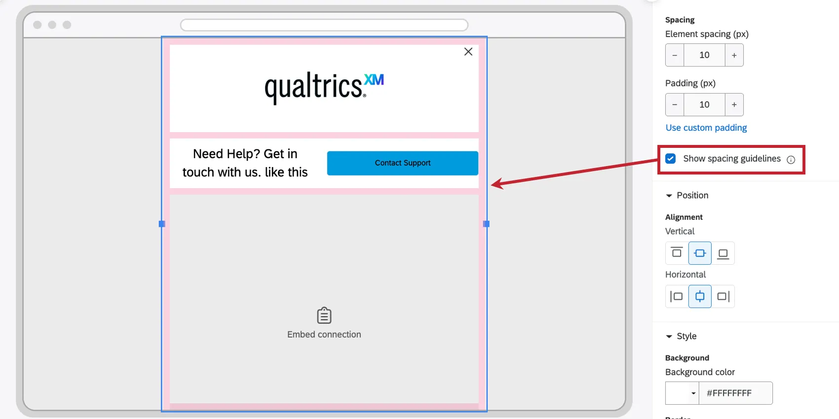
Qtip: Enable Show spacing guidelines to display the spacing and padding for the selected element, highlighted in pink. You can view spacing guidelines at the container level, the row level, and the individual element level. Spacing guidelines can help you visualize how your elements are laid out relative to each other.
Formatting Text
You can customize the text in your layout. This includes text elements and other elements that have text components, like buttons and feedback buttons.
This section will cover how to add a text element, but the general text editing principles apply to anywhere you can edit text in Appearance Studio.
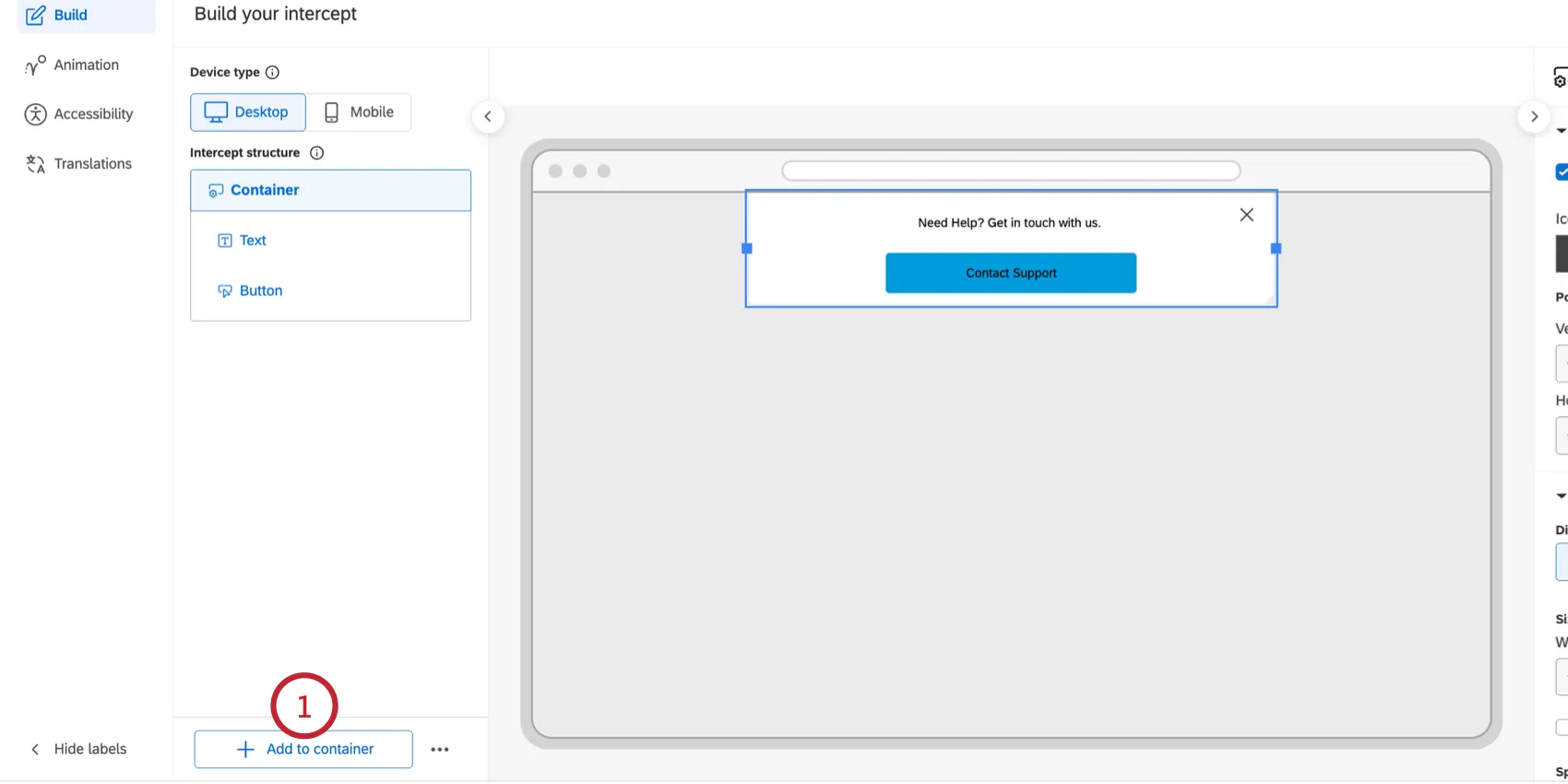
Click Add to container.
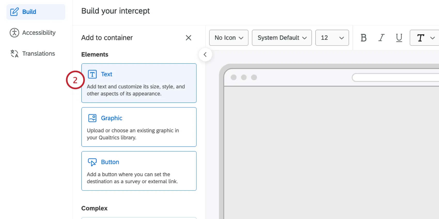
Select Text.
Add your text in the text box. Highlight any text you’d like to apply formatting to.
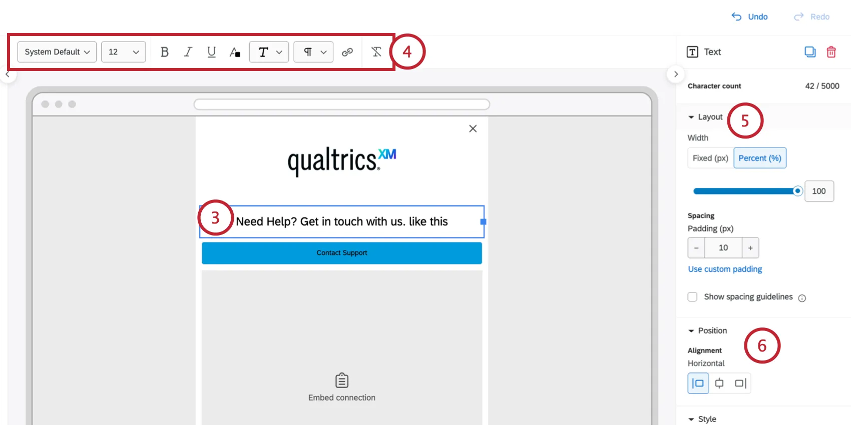
Use the toolbar to adjust text formatting:
- Font family: The typeface used. Select “System Default” to automatically inherit the font of the website where the intercept is deployed.
- Font size: The size of the text in pixels. The default is 12.
- Text format: Options include Bold, Italic, Underline, Text color, and Highlight color.
- Alignment: Aligns text to the Left, Center, or Right of its container block.
- Hyperlink: Link to an external URL, or launch your connected survey.
- Strip formatting: Remove the formatting for selected text, reverting back to default settings.
You can adjust the text box size under Layout with the following settings:
- Width: Adjust the width of the box.
- Percent (%): Scales the text box size relative to its container.
- Fixed (px): Fixed pixel width of the text box.
- Padding (px): Adjust the padding to add space inside the text block's background. You can use equal or custom padding for top, bottom, left, and right sides.
If the text box is less than 100% of the width of the container you can configure its Position by choosing a Left, Center, Right alignment.
The Style settings allow you to customize the following:
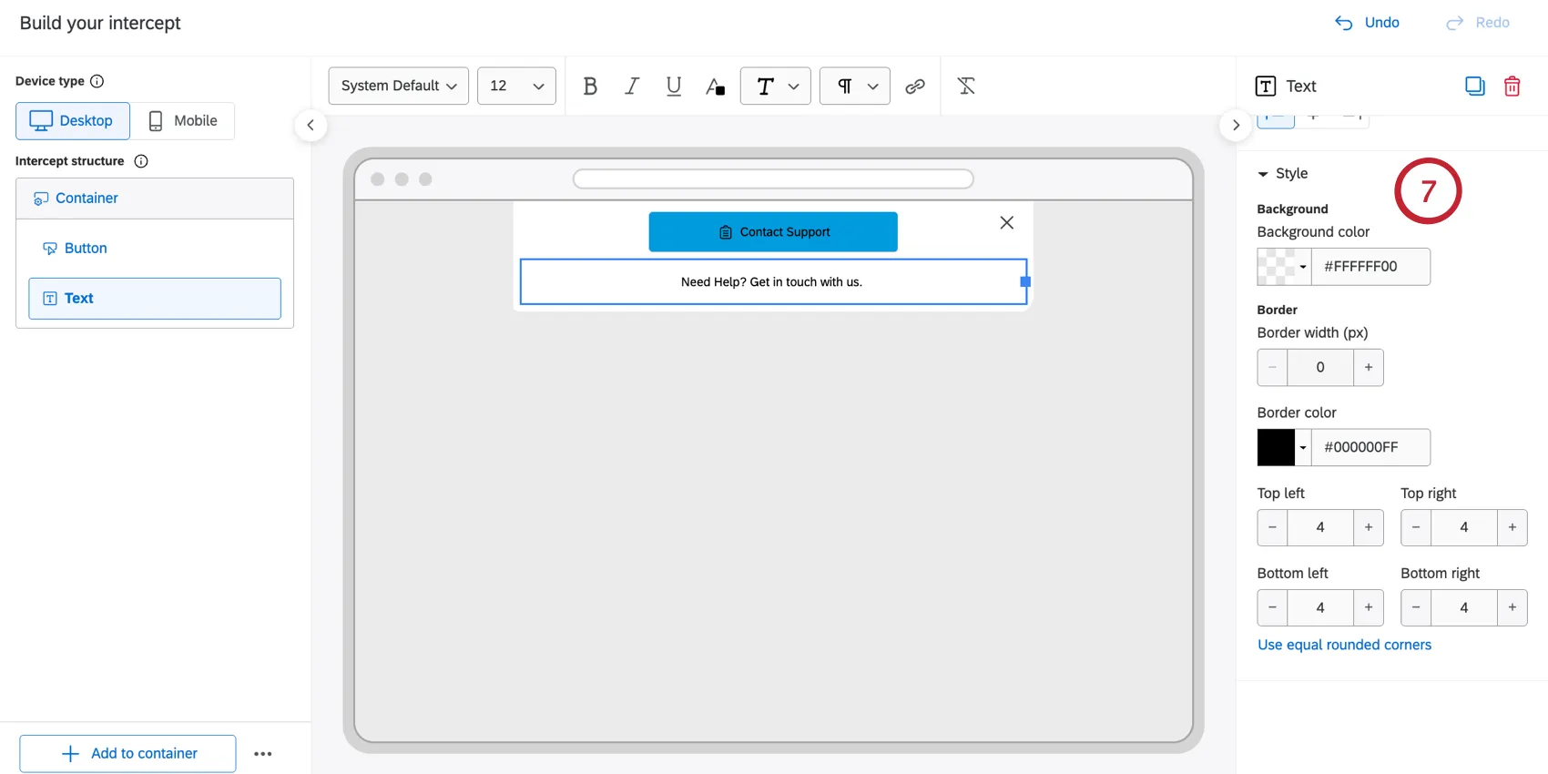
- Background & Border: Apply a specific Background color, Border width, and Border color.
- Rounded Corners: Adjust the rounding of the text box corners, separate from the overall appearance container. You can use equal or custom rounded corners for the 4 corners.
Adding Graphics
You can insert images into your appearance layout using the Graphic element.
Qtip: Supported file types are JPEG, PNG, and GIF. The maximum file size is 25MB.
Click Add to container.
Select Graphic.
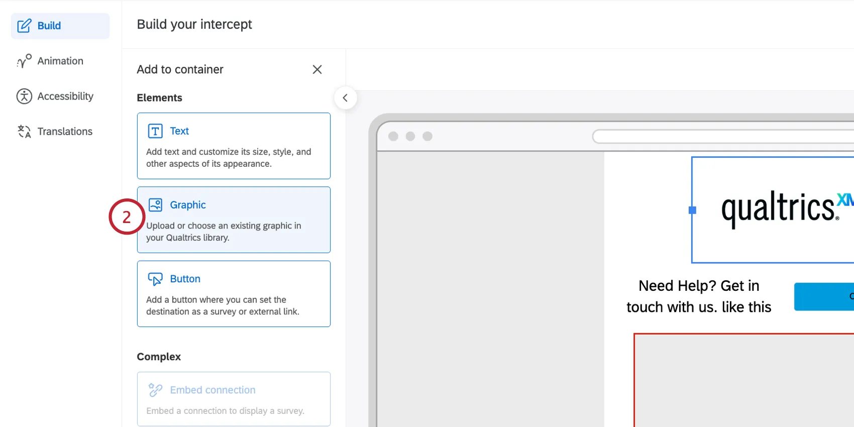
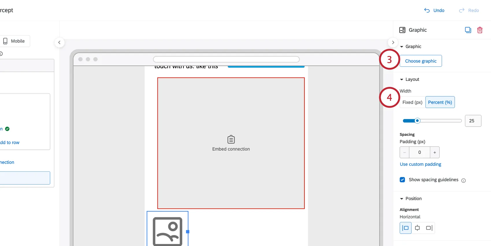
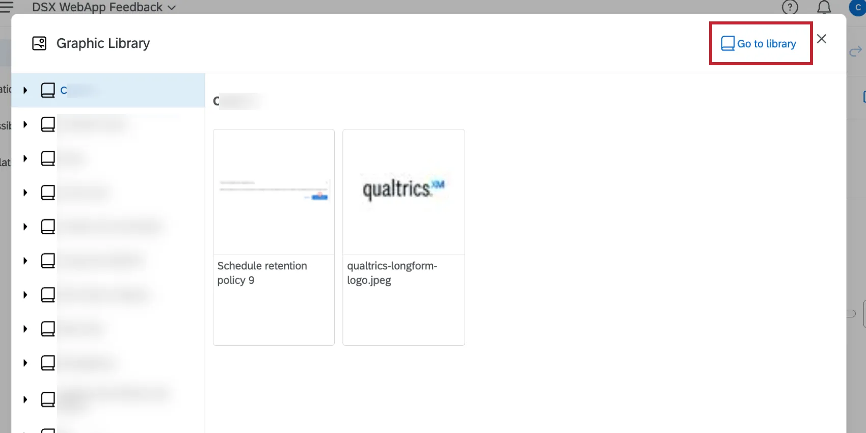
Click Choose graphic and select any image you have access to.
Qtip: To add a new graphic, select Go to library and then upload the graphic to your library.
Configure the image size under the Layout section:
- Width: Select Fixed (px) to set the image to a specific pixel width. Select Percent (%) to scale the image relative to its container.
- Padding (px): Adjust padding to create a frame around the image. You can apply the same padding around each side of the image, or click “Use custom padding” to set an independent padding width for each side.
If the Image is less than 100% of the width of the container you can configure its position in the Position section. Set the image’s alignment to Left, Center, or Right.
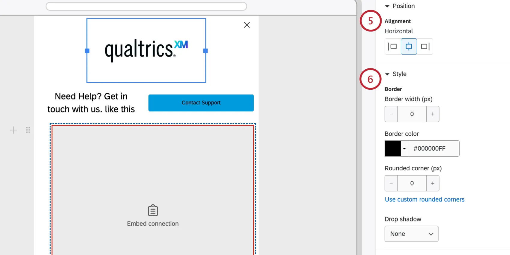
The Style section lets you set a border and drop shadow:
- Border, Border color & Rounded corners: Add a colored border to the graphic and adjust the corner radius to create rounded or circular images.
- Drop shadow: Applies a shadow effect. Options include None, Light, Medium, or Heavy.
Button Elements
Buttons drive visitor action. You can add a button to your appearance layout and define what happens when a button is clicked, customizing its appearance across different interactive states.
Click Add to container.
Select Button.
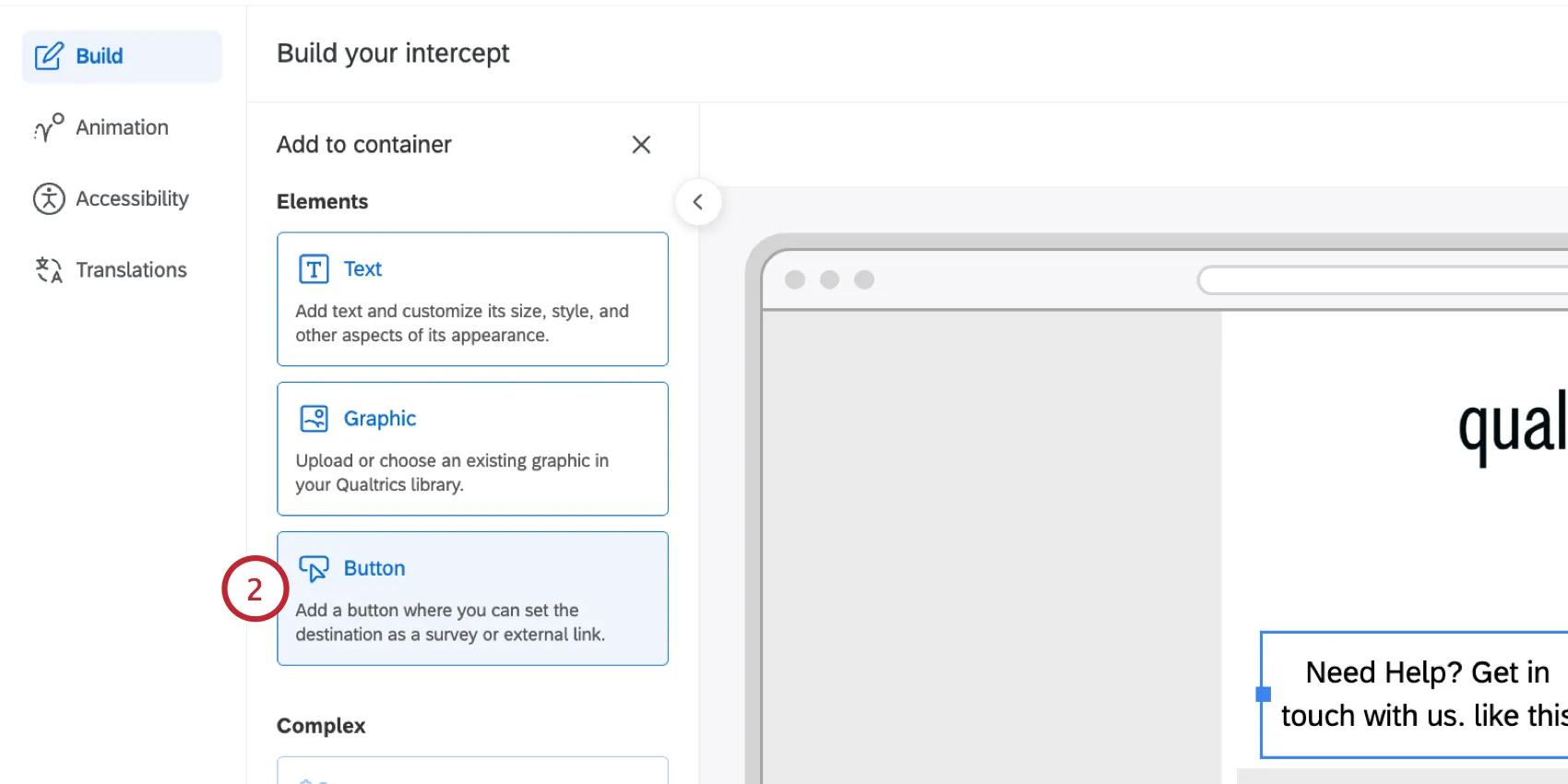
Customize the text for your button. Use the toolbar at the top to set the font, size, and add additional formatting like an icon. See Customizing Text for more information.
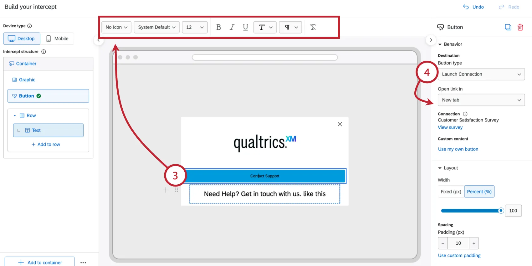
Qtip: Select “System Default” to automatically inherit the font of the website where the intercept is deployed. For accessibility, the button text and icon must share the same color, so per-word or per-letter color formatting isn't available on buttons.
Choose the Button type and configure the additional options:
- Launch Connection: Opens a linked Qualtrics connection set in the intercept connection settings. You can choose to open the connection in a new tab, a new window, the current window, or in a new overlay.
Qtip: You are limited to 1 connection per intercept. This means that while you can add as many connection buttons as you like, those buttons can only link to the single connection destination. This is the same connection referenced by the Embed Connection element.
- External link: Redirects the user to a specified URL. Enter the full page URL. You can choose to open the URL in a new tab, new window, or current window.
- Dismiss: Closes the intercept.
Configure the Layout for the button:
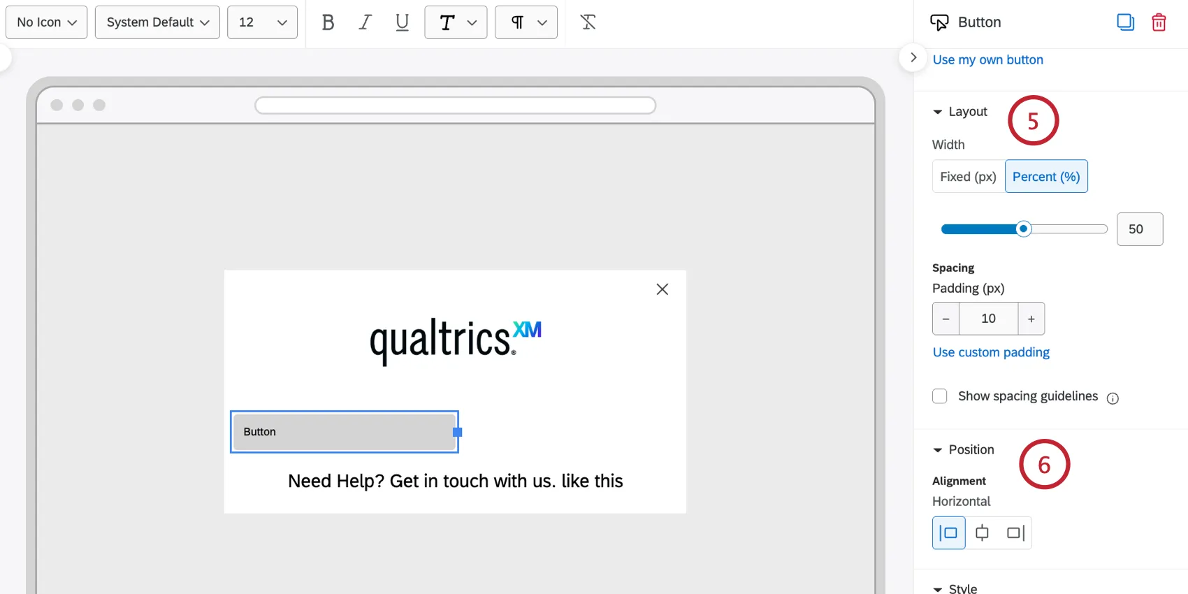
- Adjust the Width of the button. Choose Width (%) to scale the button width relative to its container. Choose Use fixed width (px) to lock the button to a specific pixel width.
- Change the Padding (px), which controls the space between the button text and border. Click Use custom padding to adjust the spacing on each side of the button individually.
If the button is less than 100% of the width of the container, you can configure its Position. Select an Alignment from Left, Center, or Right-aligned.
You can customize the look for each Button state individually:
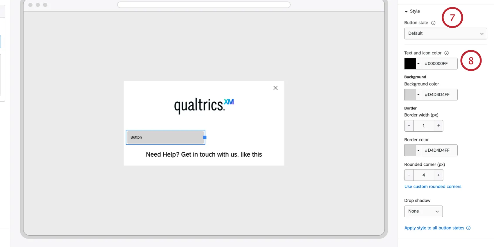
- Default: How the button looks before the user interacts with it.
- Hover: How the button looks when the user hovers their cursor over it.
- Active: How the button looks when clicked.
Set your button’s appearance for the selected state
- Colors: Define the Background color, Text color, and Icon color (if an icon is used).
- Border & Corners: Set the Border width, Border color, and Rounded corner (px) radius (e.g., set a high corner radius to create pill-shaped buttons).
- Drop shadow: Applies a shadow effect. Options include None, Light, Medium, or Heavy.
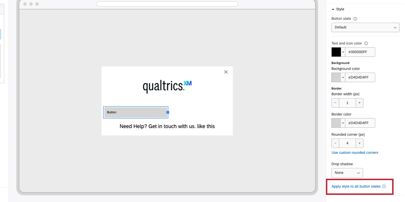
Qtip: You can set the Background color, Text color, and Border for each state independently. To save time with a consistent experience across states, configure the Default state and then click the option to Apply style to all button states.
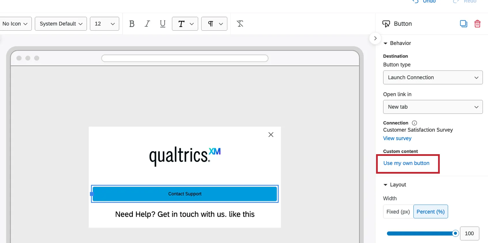
Qtip: You can replace the button text with a graphic by clicking Use my own button and then choosing an image from your graphics library.
Embed Connection
The Embed connection element allows you to embed a survey, agent, or external site inside your creative. This element can be placed, sized, and moved in your layout like any other element.
Qtip: Want to embed a survey connected to a button (a feedback button or slider)? Use the Feedback Button element instead.
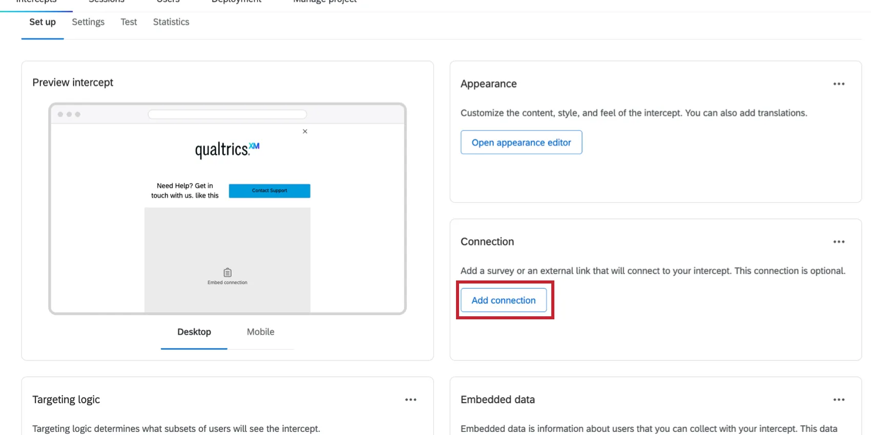
First, you’ll need to add a connection to your creative. In the guided intercept setup, click Add connection and select the resource you’d like to display.
Then, follow these instructions to add the element to your layout:
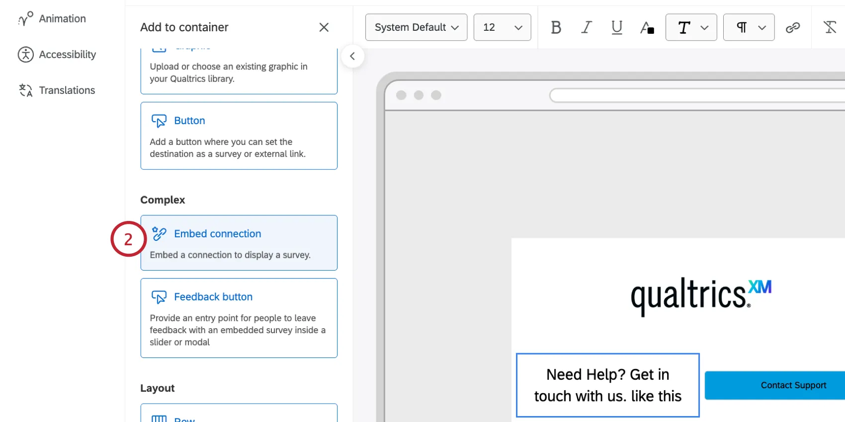
Click Add to container.
Select Embed connection.
Auto-close after survey completion: When enabled, the intercept will attempt to close automatically once the user reaches the end-of-survey message.
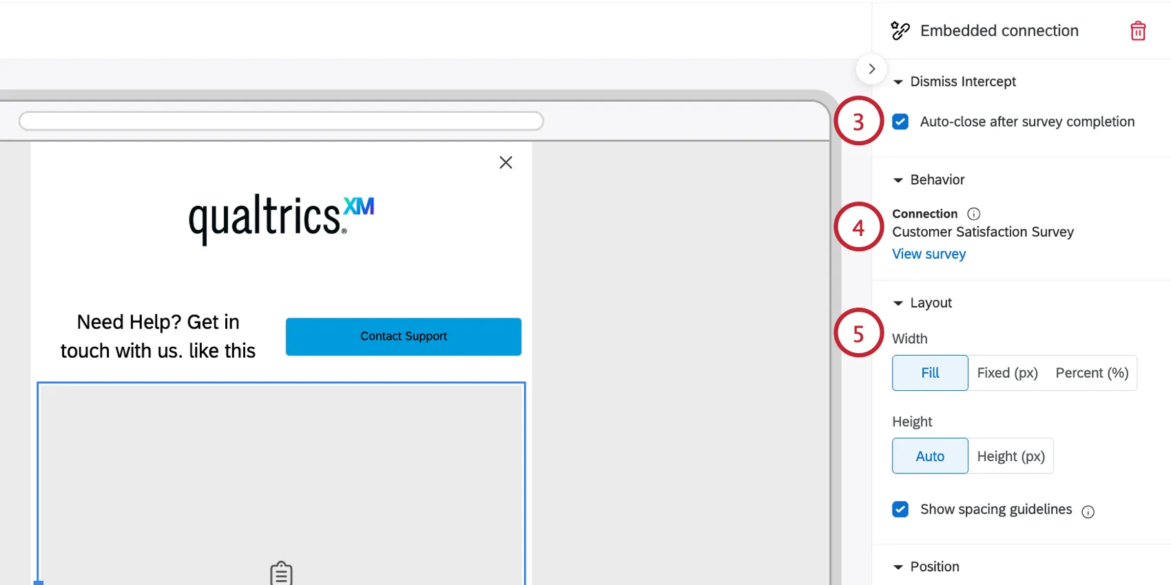
The Behavior section shows which will be displayed to visitors. Click View survey to view the survey in the survey editor.
Layout: Adjust how you’d like the element to fit the creative:
- Width: Choose from Fill, Fixed (px), or Percent (%).
- Fill: Completely fills the space the survey is in. If it is in a row, it fills the entire width available in the row. If the connection is not in a row, it fills 100% of the appearance's set width (whether the appearance is set to full width, 500px, etc.).
- Fixed (px): Sets the connection to a specific pixel width. You can only set a pixel width smaller than the appearance width, or smaller than the column width the connection is placed in.
- Percent (%): Sets the connection width relative to its container (1–100%). If it is in a row, this is a percentage of the available column width in that row. If it is not in a row, it is a percentage of the available appearance width.
Qtip: Start with “Fill” unless you need more granular customization for sizing and spacing based on other design constraints.
- Height: Choose from Auto or Height (px):
- Auto: Sets the connection size based on the survey's configuration (for example, a one-question survey produces a smaller auto height than a 3–4 question survey). Auto height attempts to show all questions and the “Next” button. If the survey height exceeds the webpage height, the survey will be scaled down to the webpage size.
- Height (px): Manually set a specific pixel height for the connection, but be aware of your survey height. If your survey is taller than the set height, a scroll bar will be added. If your survey is shorter than the set height, there will be extra white space added.
Position: Choose the alignment for the element (left, center, or right-aligned). If the Embed Connection is less than 100% of the width (not using Fill, and below 100% when using %), you can set its alignment.
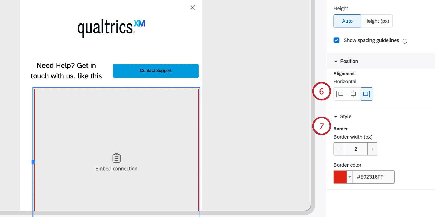
Style: Add a colored border to the element.
Optimizing for Embedded Surveys
Surveys added to your appearance layout also have their own editing, colors, and configuration within the survey editor. This lets you build robust, highly custom surveys, but you must take care to ensure continuity between your appearance and your survey. Here are some tips and tricks to follow:
- Add your logo in 1 place. If your survey has a logo, you likely don't need one in your appearance, and vice versa.
- Use the same primary hex code from your survey in your appearance for text, buttons, outlines, etc.
- To make a survey more compact in a website or mobile setting, try these theme settings:
- Question spacing set to “Compact.”
- Display Text Width set to “Full Width.”
- You can add custom CSS to your survey to further customize its appearance.
Attention: Custom coding features are provided as-is and require programming knowledge to implement. Qualtrics Support does not offer assistance or consultation on custom coding. You can always try asking our community of dedicated users instead. If you'd like to know more about our custom coding services, please contact your Qualtrics Account Executive.
Example: This CSS can reduce the gap between questions and the “Next” button:
#navigation { padding-bottom: 0rem; padding-top: 1rem; }This CSS can remove the header container (hides anything set in the theme header):
#header-container { display: none !important; }

Qtip: You can present a survey three ways: embed it directly in the appearance using the Embed Connection element, link it as a Launch Connection via a button, or add it as an external URL (with the anonymous link). Setting your survey as an Embed Connection is best practice, since it's easiest to edit, switch, and administer from the pre-built connection card.
Feedback Button
The Feedback Button is a special element you can add to your appearance. It adds a button to the side of your creative that users can click to open the intercept.
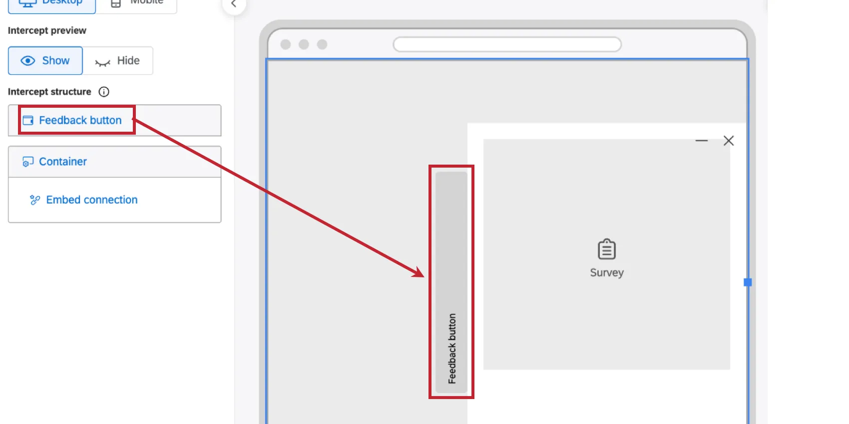
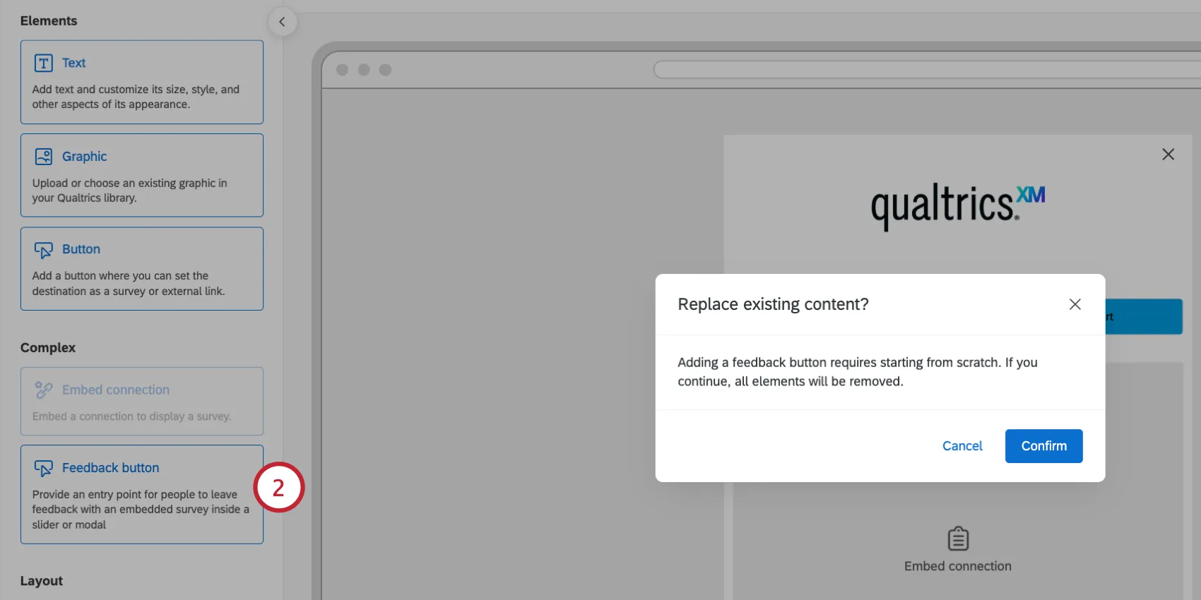
Attention: Adding a feedback button to your layout will remove any existing content.
Click Add to container.
Select Feedback button.
Customize the text for your button. Use the toolbar at the top to set the font, size, and add additional formatting like an icon. See Customizing Text for more information.
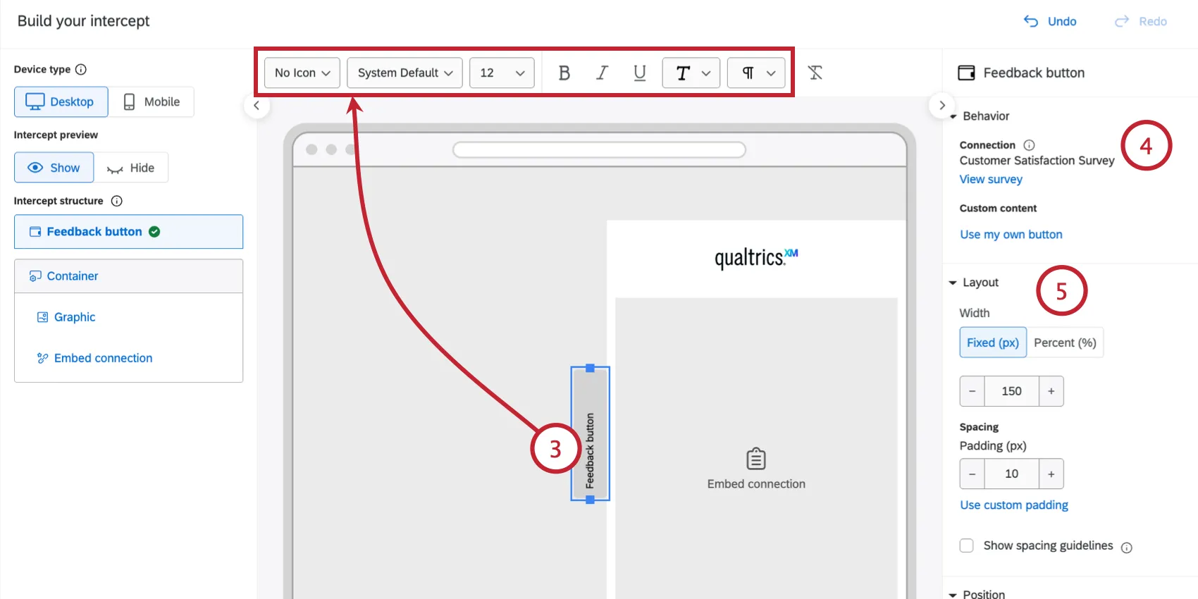
Qtip: Select “System Default” to automatically inherit the font of the website where the intercept is deployed. For accessibility, the button text and icon must share the same color, so per-word or per-letter color formatting isn't available on buttons.
An external connection will be automatically added to the feedback button. You can review what’s connected here. If you do not want a connection, then you can delete the Embed connection element.
Qtip: You are limited to 1 connection per intercept. This means that while you can add as many connection buttons as you like, those buttons can only link to the single connection destination. This is the same connection referenced by the Embed Connection element.
Configure the Layout for the button:
- Adjust the Width of the button. Choose Width (%) to scale the button width relative to the entire page. Choose Use fixed width (px) to lock the button to a specific pixel width.
Qtip: We recommend a width between 15–30%.
- Change the Padding (px), which controls the space between the button text and border. Click Use custom padding to adjust the spacing on each side of the button individually.
Configure the button’s Position which determines where the button and intercept appear on your site:
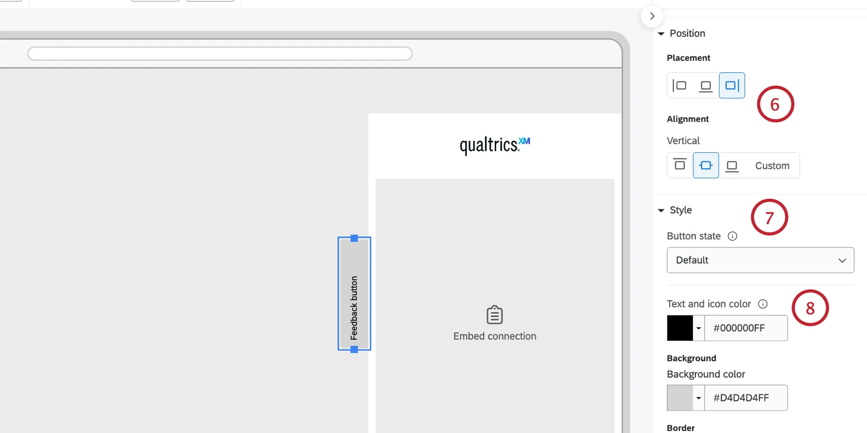
- Placement: Choose if the button is on the right, left, or top of the intercept. This will affect where the intercept appears on the page (for example, if the button is on top and center-aligned, then the intercept will appear at the bottom of the page).
- Alignment: Choose from Left, Center, and Right, or a custom alignment.
You can customize the look for each Button state individually:
- Default: How the button looks before the user interacts with it.
- Hover: How the button looks when the user hovers their cursor over it.
- Active: How the button looks when clicked.
Set your button’s appearance for the selected state:
- Colors: Define the Background color, Text color, and Icon color (if an icon is used).
- Border & Corners: Set the Border width, Border color, and Rounded corner (px) radius (e.g., set a high corner radius to create pill-shaped buttons).
- Drop shadow: Applies a shadow effect. Options include None, Light, Medium, or Heavy.
Qtip: You can set the Background color, Text color, and Border for each state independently. To save time with a consistent experience across states, configure the Default state and then click the option to Apply style to all button states.
Click on the Container and choose a Display method for the button:
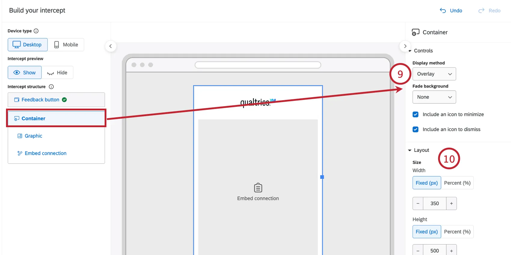
- Slider: The container is connected to the button. When users click the button, the container slides out underneath or next to it.
- Overlay: The container is not connected to the button. When users click the button, an overlay window appears in the center of the page. Overlay also lets you choose a fade background behind the overlay window.
- New Window: Opens the container in a new browser window.
Qtip: Because this is a new browser window, only an Embed Connection can be placed in the container. Other elements (Text, Graphic, Button, Row, Spacer) are not supported in new windows. Layout, height, and style controls are also unavailable, since the browser window controls those.
If displaying the container as a slider or overlay, you can customize the Layout and Style:
- Width and Height: Choose the container's width as a percentage of the page or a fixed pixel width, and choose a fixed pixel or percentage-based height.
- Padding / Element spacing: Same as the standard container controls.
- Padding (px): Controls the margin spacing inside the container's border, pushing internal elements inward.
Qtip: Click “Use equal padding” to apply the same value to all four sides, or you can set Top, Bottom, Left, and Right individually.
- Element spacing (px): Defines the default vertical gap between elements stacked within the container.
- Colors, background, corner rounding, and drop shadow: Same as the standard container controls.
You can add additional elements to your feedback button (for example, adding text to include a privacy policy).
Mobile Version
You can individually customize the feedback button placement and alignment for mobile devices:
Enable the Mobile view.
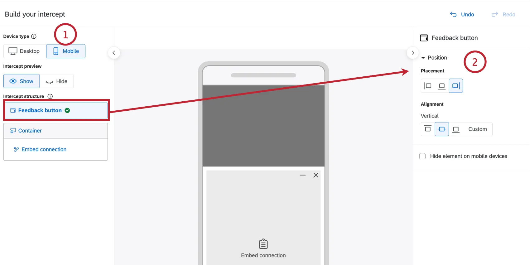
Click Feedback button to edit the following settings:
- Placement: Choose where the feedback button appears on the element.
- Alignment: Choose where on the screen the feedback button appears.
- Hide element on mobile devices: Enable this to hide the feedback button altogether on mobile.
Click Container to edit the Display method which determines how the feedback button appears on mobile:
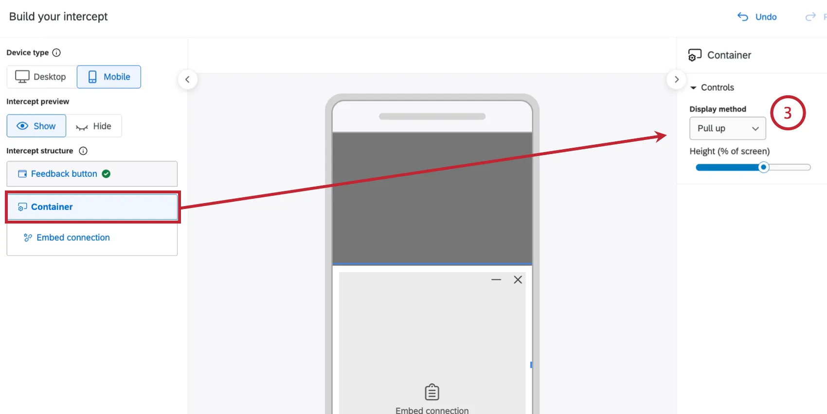
- Pull-up: The container slides up from the bottom of the screen. Choose the percentage of the mobile screen the pull-up should occupy.
- New tab: Tapping the feedback button opens the container's content in a new browser tab instead of as a slider or overlay.
Qtip: See Hiding Elements for Mobile for information on how to hide individual elements on mobile (for example, a graphic).
Rows
By default, the Appearance Studio stacks elements vertically inside your creative. However, you can rearrange elements horizontally by grouping them within a Row. You can think of the row as a sub-container that you place elements under to put them into a horizontal arrangement.
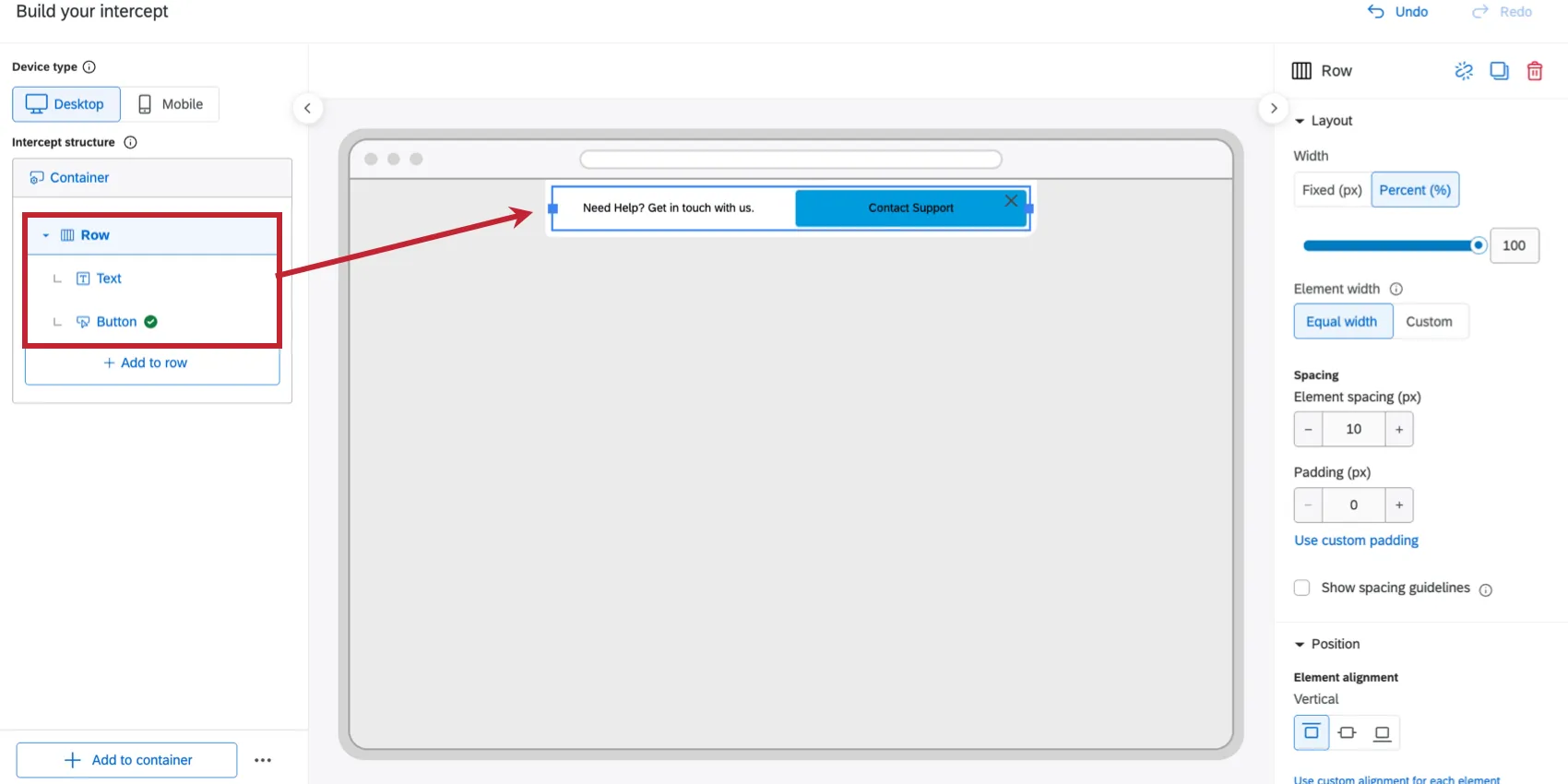
Qtip: If your elements are placed in a row, the element itself will not have size capability in the Layout section. The size of an element in a row is set at the row level instead.
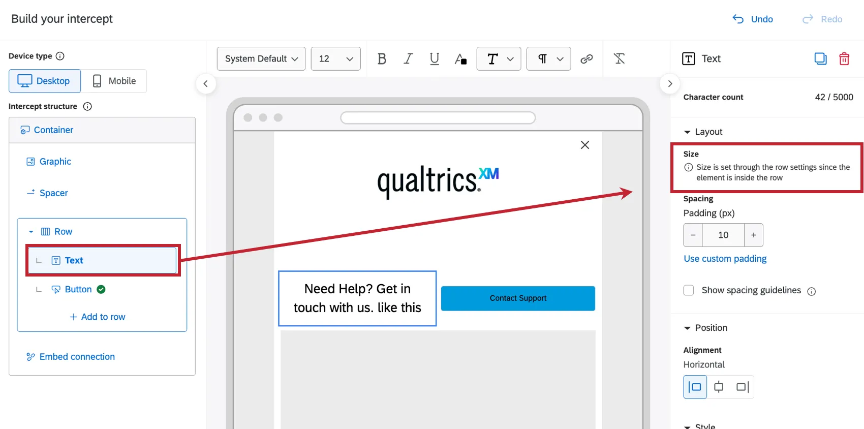
To add elements in a row:
Click Add to container.
Select Row.
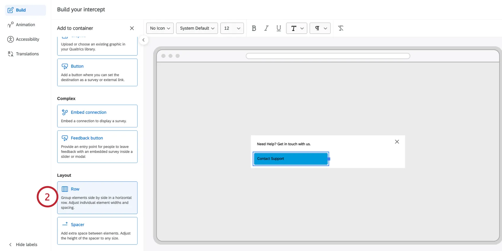
To add a new element in the row, click Add to row. You can add Text, Graphic, Button, and Spacer elements inside a row. See the linked section for more information about customizing these elements.
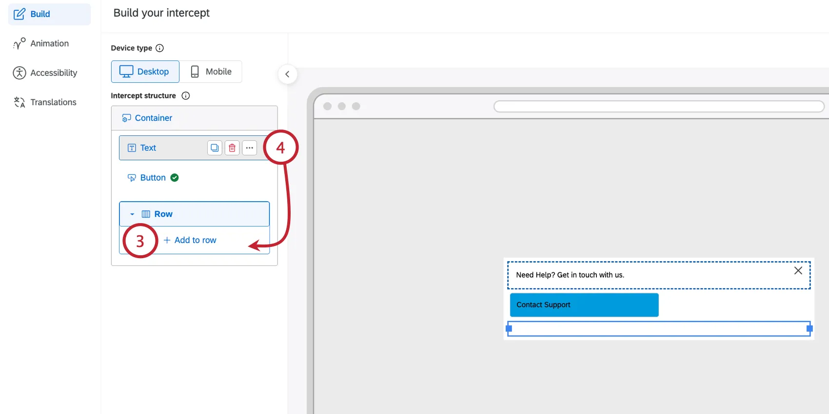
You can move existing elements by dragging and dropping them inside the row container.
Qtip: You may have up to 5 elements within a row. Elements will appear left-to-right in the creative in the same order they are listed in the editor.
Click on the row to open a side panel for customizing the row appearance. The following options are available for managing the row:
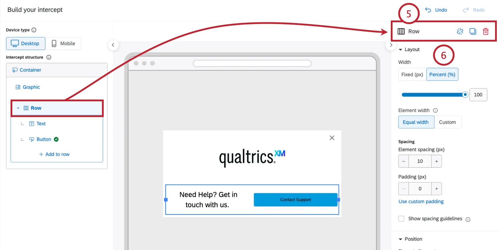
- Ungroup row: Ungroup the elements and delete the row element.
- Copy: Make a copy of the row and all elements inside it. This option is perfect for building a uniform grid of items.
- Delete: Deletes the row and all elements inside it.
Attention: Deleting a row deletes all content within it. If needed, you can immediately Undo your changes.
The Layout options contain the following settings for customizing how elements are laid out within the row:
- Width: Adjust the overall width of the row:
- Fixed (px): Set a specific pixel width for the row.
- Percent (%): Scale the row relative to the creative container.
- Element width: Adjust the width of individual elements in the row:
- Equal width: The row width will be split equally between elements.
- Custom: Set custom width percentages for each element. The total percentage cannot exceed 100%, but can be below 100%. If below 100%, Qualtrics will scale and add space between the elements where appropriate.
- Spacing: Adjust the spacing for elements within the row:
- Element spacing (px): Controls the horizontal gap directly between the elements sitting side-by-side. Increase this if elements feel too close together.
- Padding (px): Adds space inside the row, pushing all internal elements away from the row's outer boundary.
Select the Element alignment, which determines how each element aligns vertically inside the row. You can choose from Top, Middle, or Bottom.
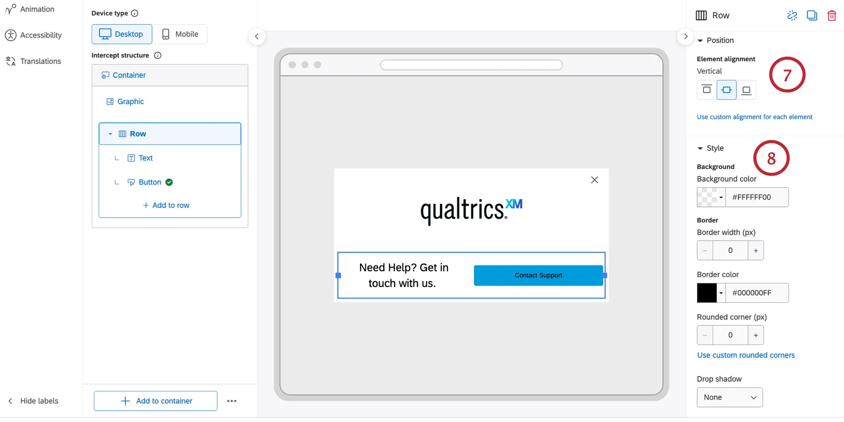
Qtip: Vertical positioning only affects elements that are shorter than the row's full height. An element set to 100% height fills the row and isn't affected.
Configure your row’s appearance with the Style options:
- Define the Background color.
- Border and Corners: Set the Border width, Border color, and Rounded corner (px) radius (e.g., set a high corner radius to create pill-shaped row).
- Drop shadow: Applies a shadow effect. Options include None, Light, Medium, or Heavy.
Qtip: Colors and edits on rows override the colors set on the container. If you’d like to have your row be transparent and inherit the container color, then set the row to ‘No Color.’
Qtip: Rows and their styling can be used to create different boxes and breakouts within your appearance layout. For example, if you wanted to make your appearance half white and half blue, you can add 2 rows and set their respective colors.
Spacers
Spacer elements add precise vertical gaps between other elements. Add them to a row to create a horizontal gap between elements in the same row.
Click Add to container.
Select Spacer.
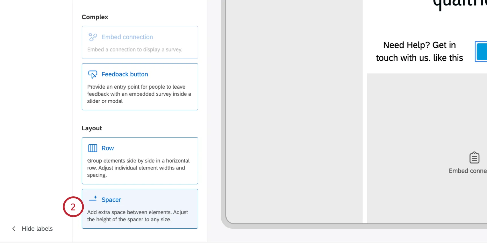
Adjust the Height (px) of the spacer, in pixels. The default is 50 px.
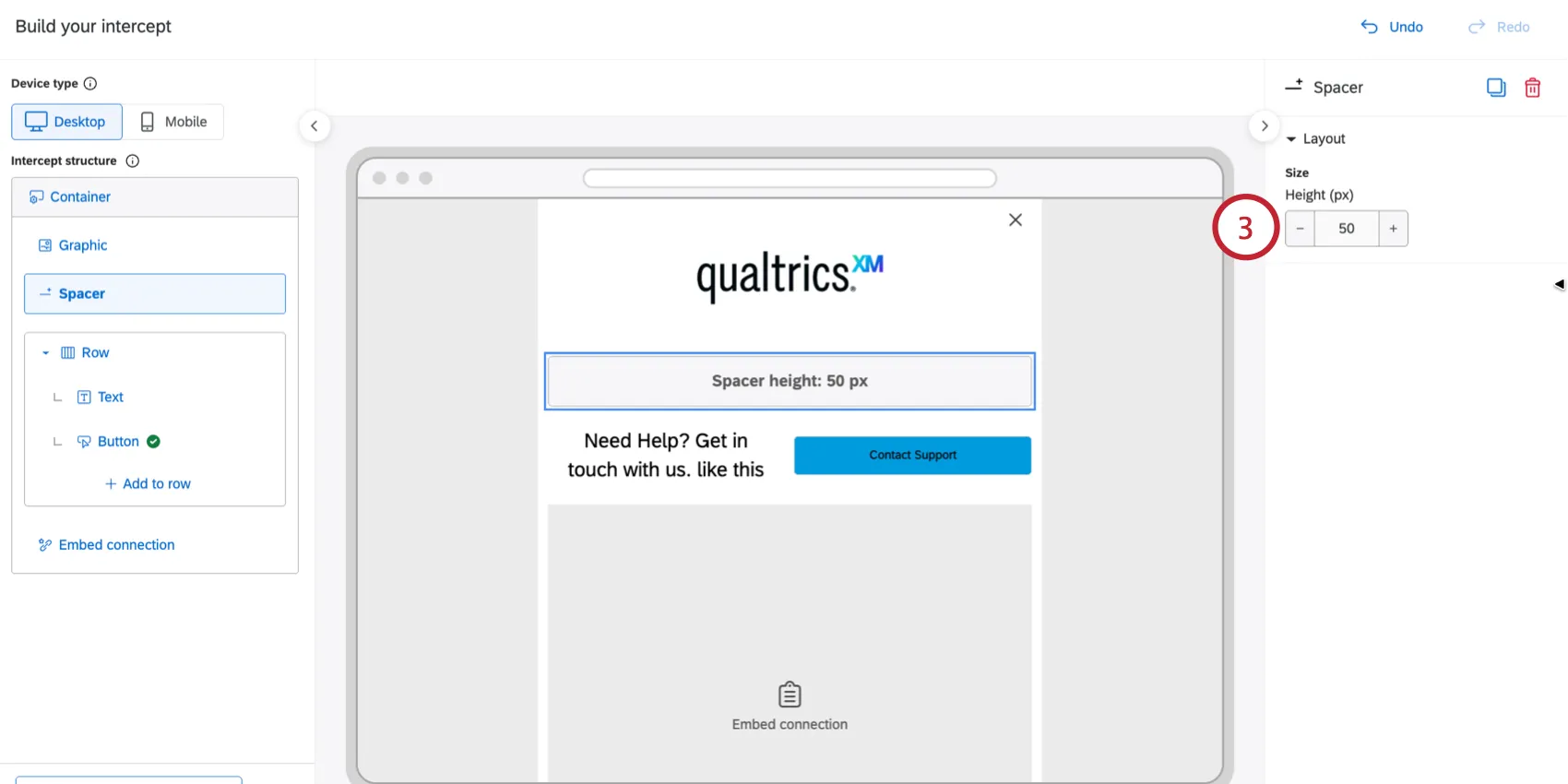
Qtip: If the spacer is in a row, then this is controlled by the row settings instead.
Customizing Experiences for Mobile
You can customize the experience for mobile devices by hiding specific elements only on mobile.
Enable Mobile view.
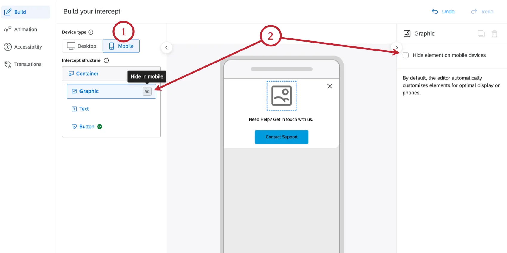
- Click the option to Hide element on mobile devices.
Qtip: The Mobile view shows responsive preview of your creative plus a focused set of mobile-only controls (hiding elements, and Feedback Button placement/alignment/display). All other layout and style edits must be made in the Desktop preview.
Layout Templates
There are a variety of layout templates available to you to help jumpstart building creatives. You can choose to start with a template, or switch to one later.
To change the layout, click the three dot menu next to the “Add to container” button and then choose an option:
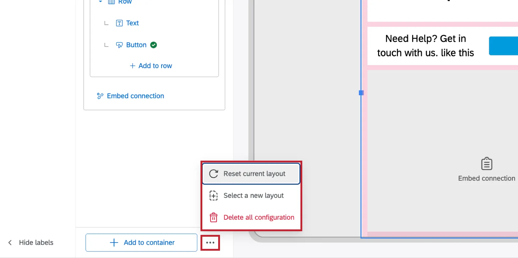
- Reset current layout: If you started with a template, this will revert the template back to the original configuration.
- Select a new layout: Switch to a different layout template. Choosing a template overrides anything currently on your creative.
- Delete all configuration: Starts a blank appearance.
Attention: If you delete or override your creative with a reset or by switching to a different layout, you cannot retrieve the previous build.
Default Overlay Templates
The following preconfigured layouts include:
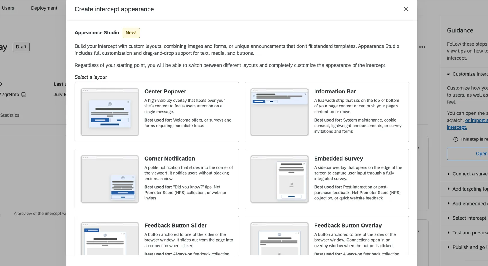
- Center Popover: A high-visibility overlay that floats over your site's content to focus users attention on a single message.
- Information Bar: A full-width strip that sits on the top or bottom of your page content or can push your page's content up or down.
- Corner Notification: A polite notification that slides into the corner of the viewport. It notifies users without blocking their main view.
- Embedded Survey: A sidebar overlay that opens on the edge of the screen to capture user input through a fully integrated survey.
- Feedback Button Slider: A button anchored to one of the sides of the browser window. It slides out from the page into a connection when clicked.
- Feedback Button Overlay: A button anchored to one of the sides of the browser window. Connections open in an overlay window when the button is clicked.
Default Embedded Templates
The following preconfigured layouts are available for embedded creatives:
- Inline Survey: A survey embedded directly within your website that lets users respond without interrupting their browsing.
- Call to Action Prompt: An inline prompt on your website that lets users interact within the page.
- Callout Card: An inline card embedded within your page content that highlights key messages without disrupting the surrounding layout.
Embedded Creatives
This section describes editing an embedded creative, and the options available specifically for embedded creatives. To edit an embedded creative within Appearance Studio, select Embedded as the type of intercept when creating a guided intercept. For information on editing Overlay creatives, see the other sections on this page.
Appearance Layouts
Within the appearance editor you can choose from an existing layout template, build a layout from scratch, or choose Templated feedback.
Qtip: You can switch between different layouts after creation, unless you choose Templated feedback. Templated feedback automatically creates a survey linked to the intercept and appearance. If you start with templated feedback and then remove it, you won't be able to recover the original appearance or its linked survey.
Embedded Appearance Differences
Embedded appearances are built the same way as overlay appearances, using containers, rows, and elements. Keep the following tips in mind when editing the appearance of an embedded creative:
- Container background: Set the container's background color to No color if you want the appearance to inherit your webpage's background.
- Container border: Add a border to the container if you want the appearance to read as a distinct card on the page.
- Unsupported elements: The following elements are not available within embedded appearances:
- A close button on the container
- A drop shadow on the container
- Entrance/exit animations or display timers
- Feedback Button / Slider Elements
Adding a CSS Selector
Embedded intercepts use a CSS selector to determine where on the appearance will appear on your webpage.
Open your browser's developer tools and find the element on the page that should contain the embedded appearance.
Right-click the element and copy its selector.
Click Choose CSS selector within appearance studio.
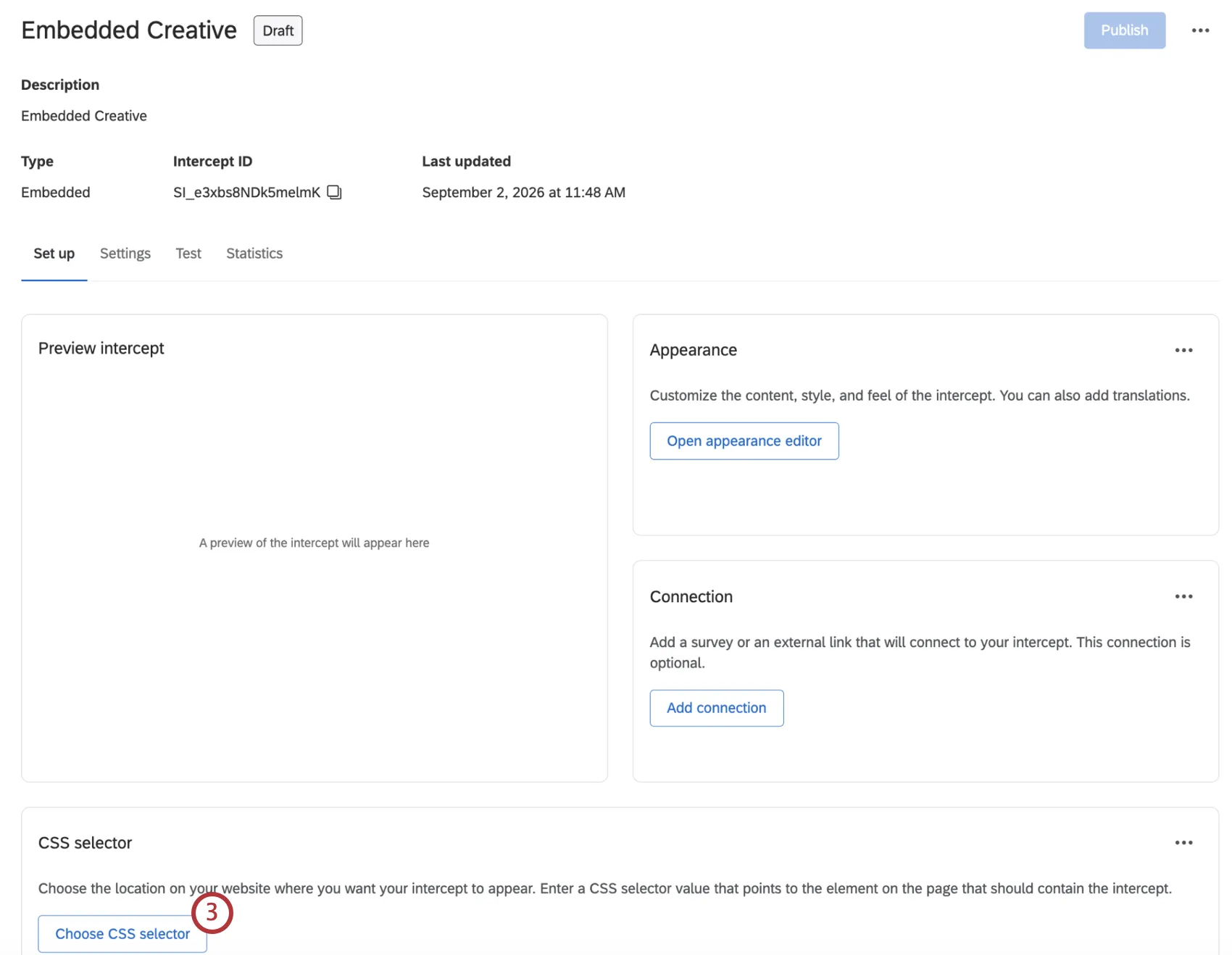
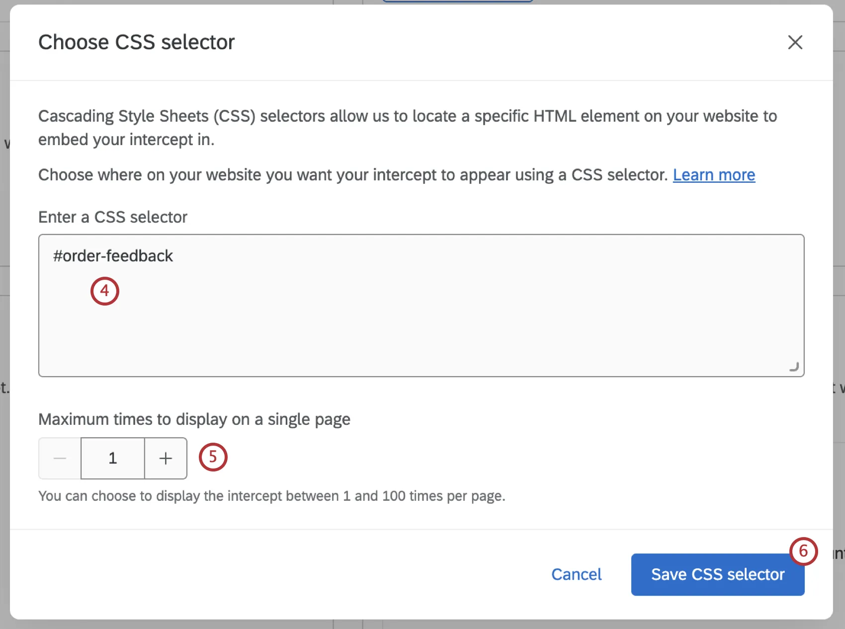
Paste the selector into the CSS Selector field.
If desired, set how many times the intercept will be displayed on the page if your selector matches multiple elements. For example, you can insert the same appearance after every article section on a page.
Click Save CSS selector.
Qtip: The embedded appearance will always be added to the end of the element matched by your CDSS selector. You can’t insert it at a different position within the element.
Embedded Sizing
The width and height of embedded appearances have more customization options than overlay appearances. These settings determine how the appearance resizes inside the element targeted by your CSS selector.
Width:
- Fill: The container will be 100% of the width of the parent element.
- Fixed: The container will have a set width.
Height:
- Auto: The container’s height will be adjusted according to its content. For example, a single-question survey will have a smaller height than a survey with 3-4 questions.
- Height: The container will have a set height.
Qtip: If you are embedding an agent, a fixed height is recommended. Since agent responses can be variable, keeping a consistent size is preferable to automatic height scaling. If you are embedding content that should adjust dynamically across all screen sizes or expand to accommodate content, auto height and width are recommended.
That's great! Thank you for your feedback!
Thank you for your feedback!