
Table Widget
What's on this page
About the Table Widget
The table widget lets you display dashboard data in a table. You can break data out into rows and columns as needed and even add an additional row/column for total calculations. This widget is easy to set up and is recommended as an alternative to the simple and pivot tables.

Types of Dashboards
This widget can be used in a few different types of dashboard. This includes:
- CX Dashboards
- Results Dashboards
- Employee Engagement
- Lifecycle
- 360
- Pulse
- Ad Hoc Employee Research
- Employee Journey Analytics
- Brand Experience
Field Type Compatibility
Table widget metrics are compatible with fields and categories (EX) with the following field types:
- Number Set
- Numeric Value
Only fields with the following field types will be available when selecting rows or columns:
- Date
- Text Set
- Multi-Answer Text Set
- Number set
- Drill Down (CX only)
- Measure Group (CX only)
Attention: Simple table widgets, such as Simple Table and Simple Chart, do not support translations at this time.
Basic Setup
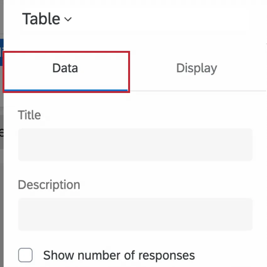
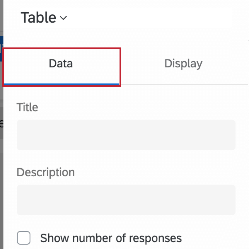
This section covers the most basic setup you need to know to build a table widget. All of this setup occurs in the default Data tab of the widget editing pane.
Metric
The metric is the data you want to display in your table. This can be as simple as a count of the number of responses in the dashboard, or the average value of a data point you’ve mapped to your dashboard.
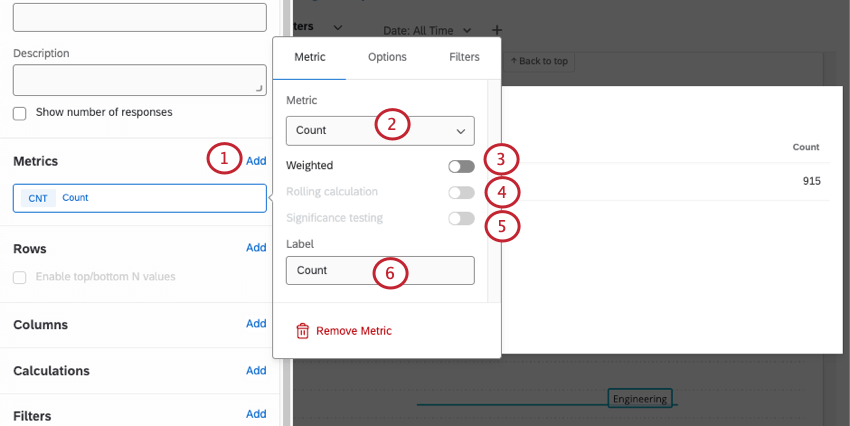
Qtip: For more on setting up weighting, see Response Weighting in CX Dashboards.
Qtip: Significance testing is only available for certain metrics, such as average, top / bottom box, NPS, and custom metrics. See Significance Testing in Dashboard Widgets for more details.
Qtip: For more details, see Rolling Calculations.
Qtip: If you add multiple metrics, each metric will be displayed on a row of your table, and you will not be able to add other kinds of rows. No more than 20 metrics are recommended.
You can add metrics until the cardinality of your widget reaches 5,000. If you exceed this limit, you will see the message “Too many results, please add a filter.” To display data in your widget, filter the widget so the cardinality of displayed fields is below 5,000. You can calculate the cardinality of your widget’s data by multiplying the total number of possible values for each field together. For example, if your widget displays two different fields, one with 300 possible values and another with 3 possible values, then your widget’s cardinality is 900.
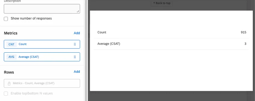
The metric is the minimum amount of information needed to display data in a table. However, if you want to do more with your table, there are other fields you can fill out.
Rows
When you add a field under Rows, each value of that field will be added to a new row in the table, allowing you to break out your chosen metric by specific groups.
Example: Instead of just showing the total number of responses in the dashboard, this table shows the number of responses from each department.

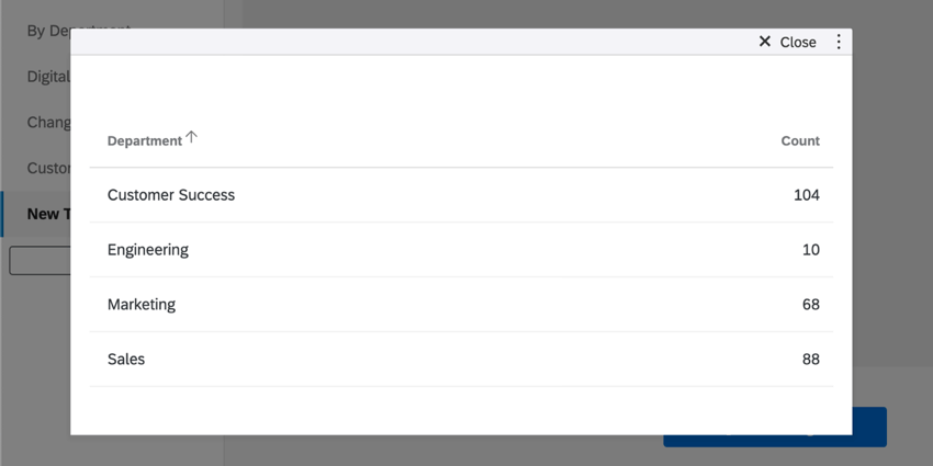
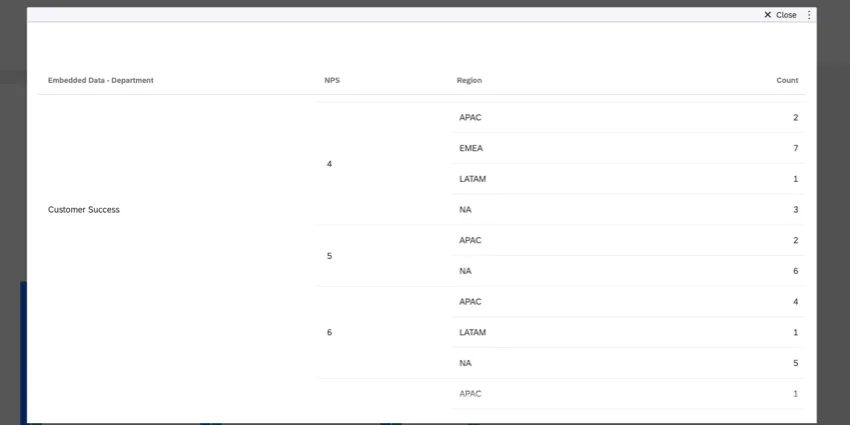
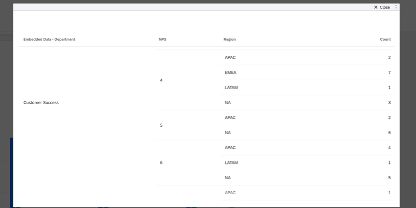
You can add a maximum of 3 fields to your rows. Once you add a second and third field, the data will be broken out so you can see the values for each possible combination of field values.
Example: Using the table widget from the previous example, we added 2 additional rows: NPS Score and Region. This allows us to see the number of responses for each department, broken out by NPS score and then broken out again by region.
Columns
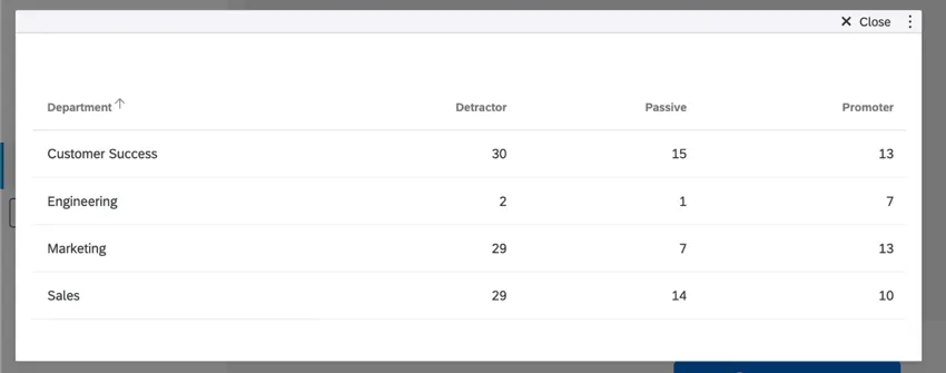
When you add a field under Columns, the values of that field will be added as columns to the table. You cannot add columns until you’ve added at least 1 field to your rows.
Example: This table displays the department as the row and the NPS group as the column. Now we can see the different number of responses for each department, separated by the different NPS groupings.

You can add a maximum of 3 fields to your columns. Once you add a second and third field, the data will be broken out so you can see the values for each possible combination of field values.
Example: Using the table widget from the previous example, we added 2 additional columns: Region and CSAT score. This allows us to see the number of responses for each department, broken out by NPS Group, then broken out by Region, and then again broken out by CSAT score.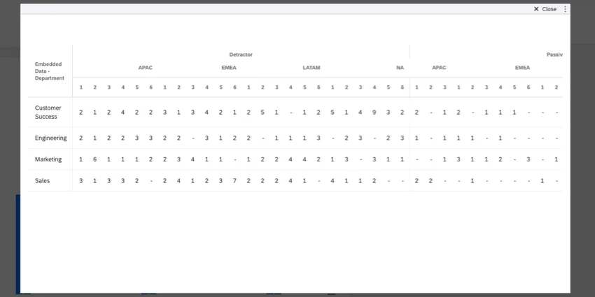
Calculations
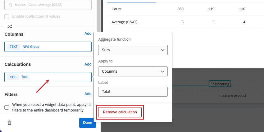
Qtip: This option is useful if you want to add a “Total” column/row to the end of your table!
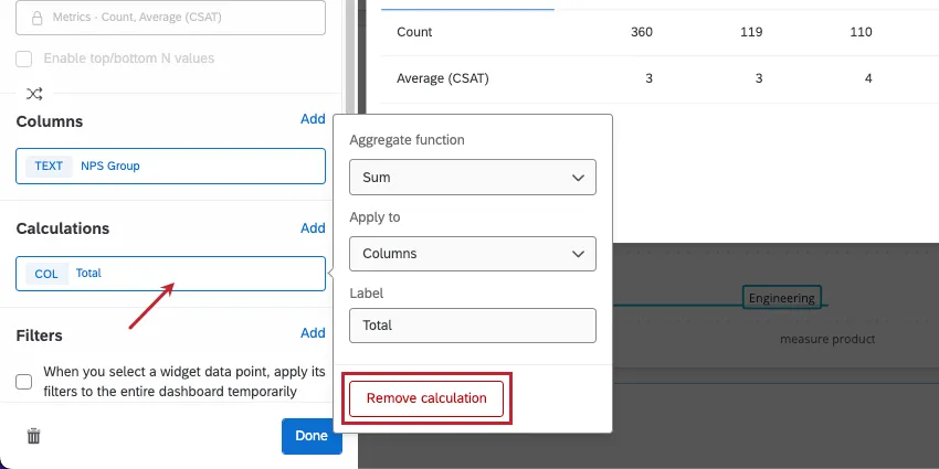
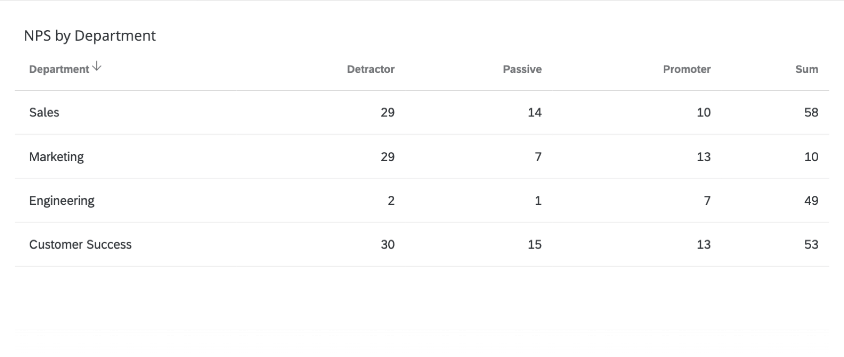
Under Calculations, you can add 1 additional column or row to your table. This can be used to calculate the sum (total), average, minimum, or maximum of all the values in that column or row.
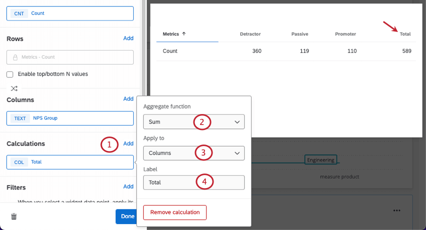
Example: The screenshot above shows how to create a “Total” column that adds the value of previous columns together. For example, the first row, in addition to showing all the different NPS groups in the Customer Success department, also shows there are 58 Customer Success responses total.
Widget Customization
Like all widgets, you can customize the table’s title, description, and filters, and you can decide whether to show the number of responses. For more widget editing tips that apply to all widgets, see our general widgets pages (CX, EX). For more customization specific to the table widget, read on.
Removing Fields
Click any field, then click the remove button to delete it from the widget.
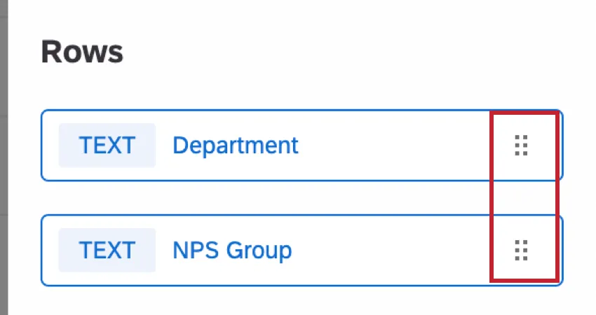
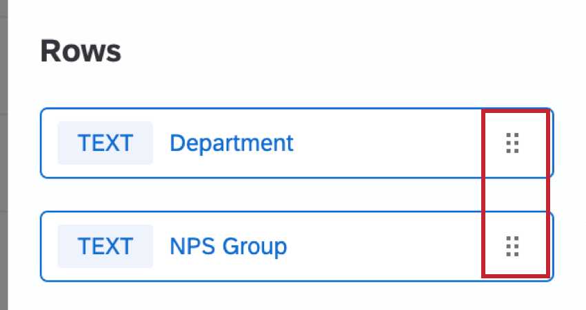
Reordering Fields
You can reorder fields you added as columns or rows. Click the dots on the right, then drag and drop the fields.
Significance Testing
Dashboards can help you understand whether the differences you see over time or between groups are statistically significant, and therefore worthy of driving important business decisions. With significance testing in tables, you can discover what data changes matter most.
See Significance Testing in Dashboard Widgets (CX) for more information. Although this is a CX Dashboards page, the functionality described is the same as in EX dashboards.
Reporting on data over time
When adding rows and columns to your table, you can choose date fields. These date fields allow you to report on how your metrics perform in certain groupings, or timeframes. To learn more about how these work, see Breaking Out Data by Dates.
Display Options
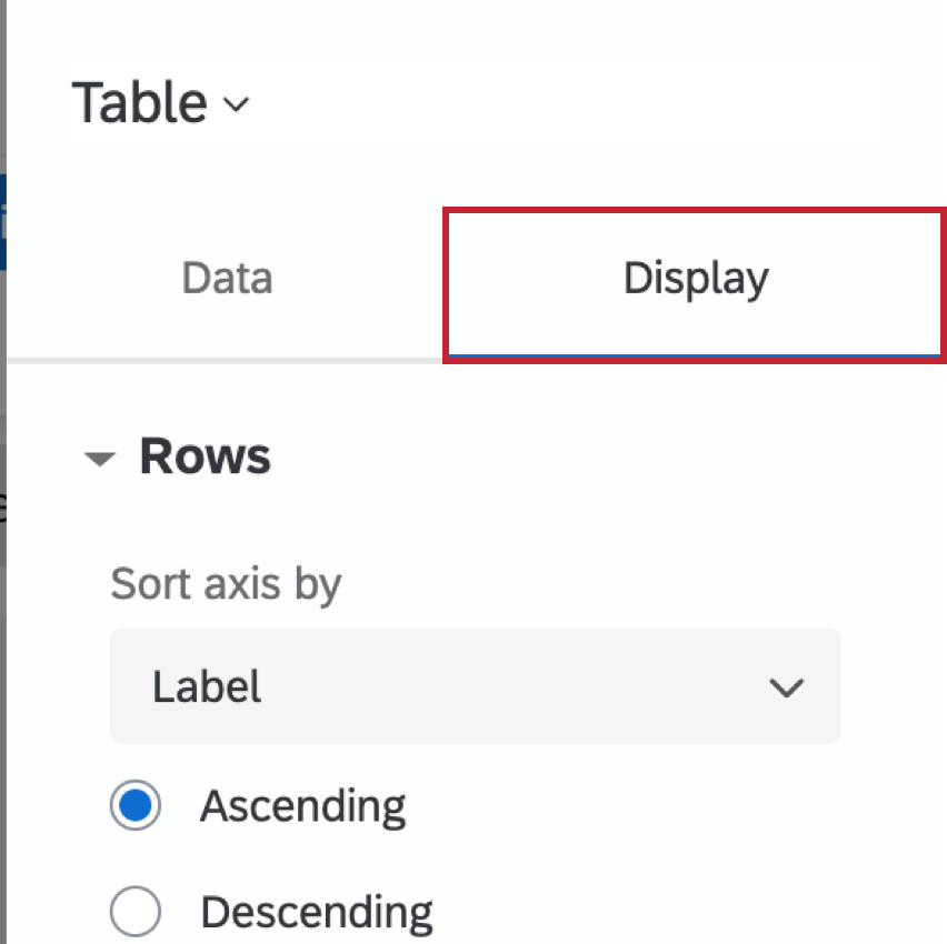
This section covers settings in the Display tab of the widget editing pane.
Qtip: You will need to complete the basic setup of the widget before you adjust any display options.
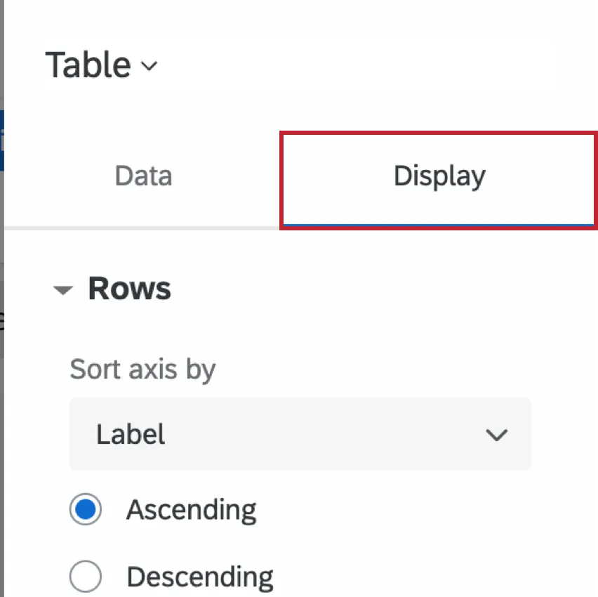
Rows
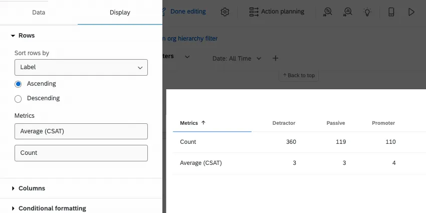
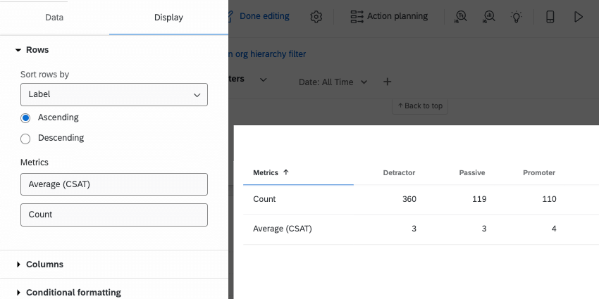
Under Sort axis by, choose how the values in your rows are sorted by default. Your options are by label (alphabetical), custom, or any columns you’ve added.
- If you choose Label, you can also choose whether rows should be sorted by ascending or descending order.
- If you choose Custom, you will be able to drag and drop the values of your rows into the order of your choice.
- You can also choose to sort by any columns added to the table. Example: In the screenshot above, we can also sort by the Detractor, Passive, and Promoter columns. For example, we could choose to sort the table so the departments with the most detractors appear first and the ones with the least detractors appear last.

Qtip: Dashboard users can manually adjust the direction of sorting (ascending/descending) in the table by clicking the headers.
You can also change rows’ labels here.
If you have added multiple different fields to your rows, you will be able to adjust sorting options independently for each row. Calculation rows (i.e., totals, sums) are excluded from sorting rules and will always appear last.
Columns
The display options for columns are the same as the ones available for rows.
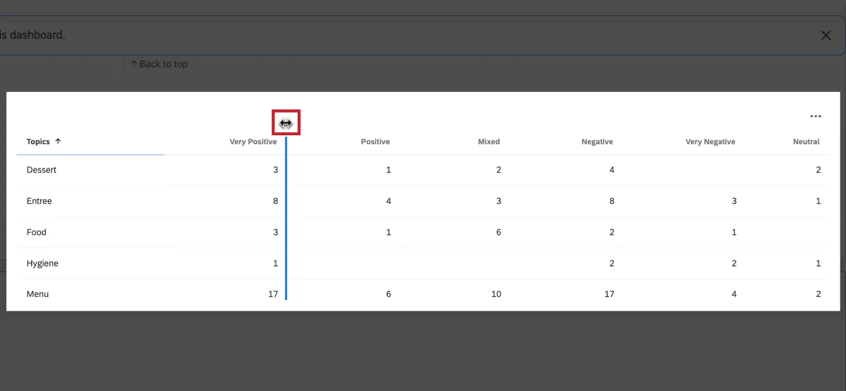
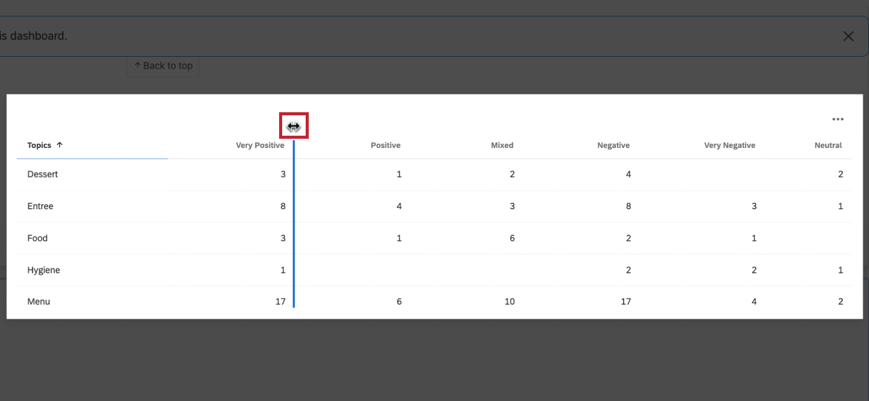
You can adjust the size of your columns by clicking on the border between columns and then dragging your mouse. Please note that if you attempt to resize a column and it would result in data breaking outside of the widget, then the resize will be prevented.
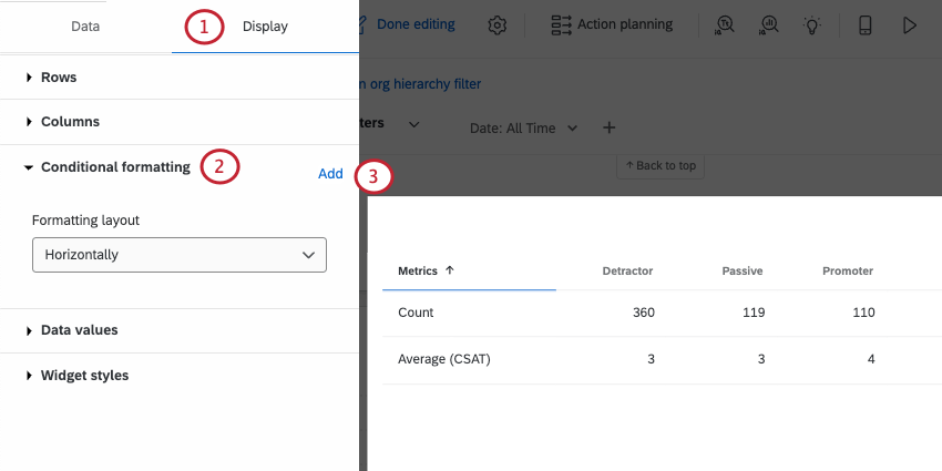
Conditional formatting
Data values
By default null (missing) values are hidden from the table and all its calculations and metrics. Therefore, we show an empty cell. However, if you would like to include these values, you can enable Show null values, which will show them as a dash ( – ) instead.
Conditional Formatting
Adding conditional formatting to your table allows you to specify how values in a certain range are formatted differently – for example, bolding results or changing their color once they fit within a certain numeric range. This is useful if you would like to be able to easily differentiate cells on the table based on their value.
You can add multiple formatting rules.
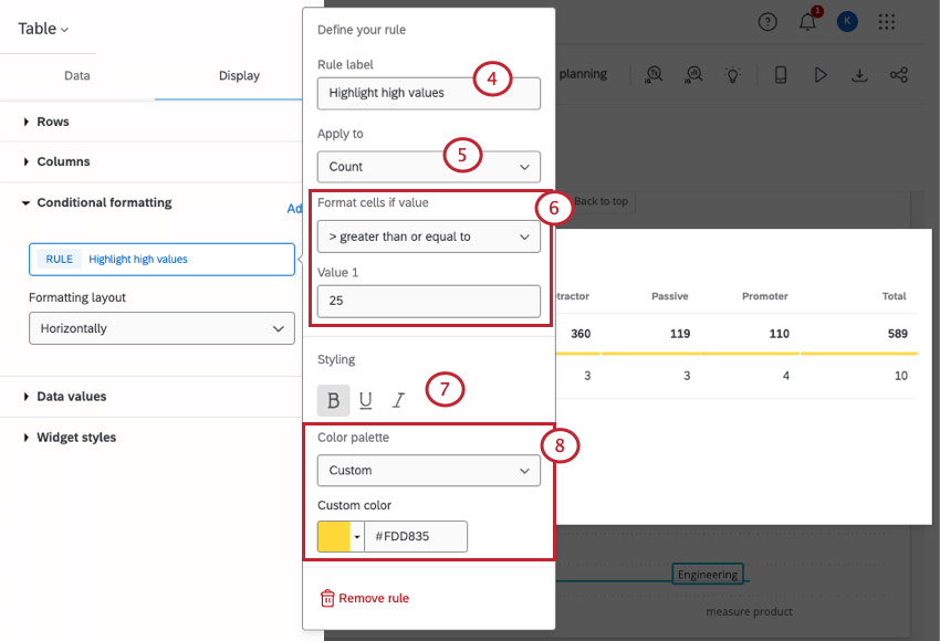
- Semantic: Use our preset semantic palette. You can then choose from 1 of 3 threshold labels:
- Good (green)
- Okay (yellow)
- Bad (red)
- Custom: Pick a color of your choice.
Both the text styling and color palette are optional steps, so you can mix and match which you use to highlight your chosen values.
Qtip: The semantic label itself does not appear on the table. Just the color does.
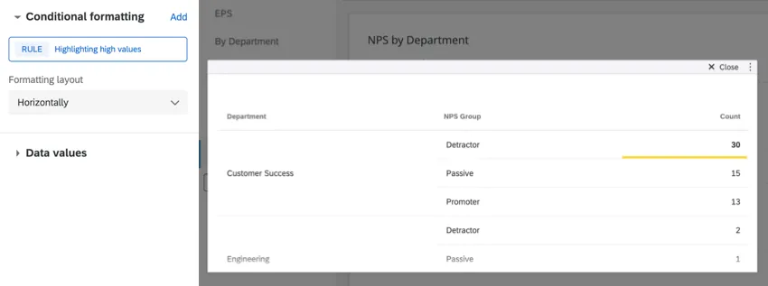
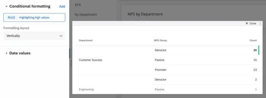
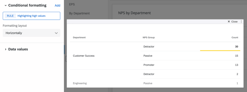
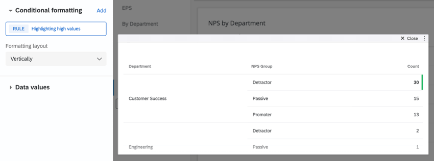
Formatting layout
This determines how highlighting is applied to values/value ranges that meet a rule. You can choose from highlights that are placed:
- Horizontally
- Vertically
Exporting Table Data
Warning: Exports are limited to 10,000 rows in most formats. The limit is 500 rows in PDFs.
You can export your table widget in many different formats. When exporting it to PDF, only responses that are currently visible in the widget will export. Check Include all widget content to export all data within the widget.
When you export your table widget as a CSV or TSV, tables are converted to a spreadsheet format, which can affect how multiple breakouts are displayed.
Every breakout combination gets its own row. If each dimension you’re using has a lot of possible values, that’s a lot of combinations, and a lot of rows. Thus, the number of rows in your file can dramatically increase based on the information you’re displaying in your table, increasing the likelihood you reach the file size limit.
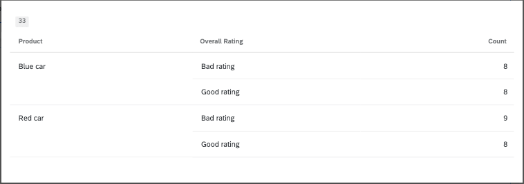
Example: Here’s a table widget that breaks out 2 products (a red car and a blue car) by the 2 ratings customers could give it (good or bad).
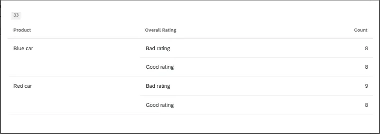
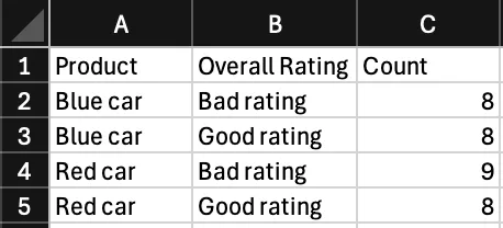
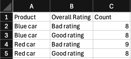
When exported to CSV, this is what this table looks like. Notice how each possible combination of color and rating gets its own row.
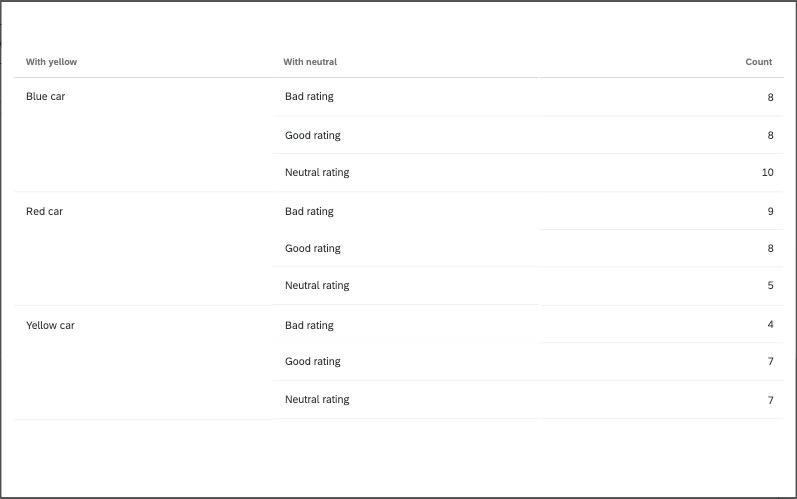
Now what if we added one more rating and one more car color? That would be 3 products broken out by 3 ratings.
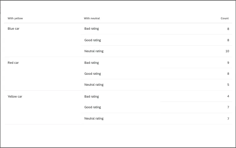
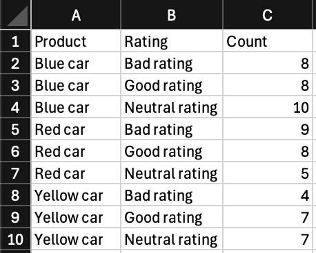
Now the number of rows has increased to account for new combinations. This is a very simple example, but you can imagine how a much more complex dataset could increase its table size much more drastically.

Qtip: Calculations are not included in exports.
Troubleshooting Table Size
The easiest way to decrease your table widget’s size is to limit the breakouts in your table. Here are a few ways you can accomplish this:
- Use filters to exclude values.
- Try making multiple, separate tables. If you want to see product by rating, maybe create a rating table for each product instead of using breakouts.
- Group values together. For example, individual ages could become age ranges instead.
- Exclude values from analysis that you aren’t interested in.
FAQs
What are aggregated metrics?
What are aggregated metrics?
Why are my metrics adding up to 99 or 101 instead of 100?
Why are my metrics adding up to 99 or 101 instead of 100?
33.60 + 33.60 + 32.80 = 100
Whereas if you choose to display no decimals with the same dataset:
34 + 34 + 33 = 101
Widgets can’t show infinite decimals, which means that regardless of decimal settings, some data will eventually have to be rounded up. This means that small deviations, like adding up to 99 or 101 instead of 100, work as intended.
I have multiple datasets on my dashboard. Can I use this feature with all of my widgets?
I have multiple datasets on my dashboard. Can I use this feature with all of my widgets?
- Changing which dataset your widget shows: Not all widgets can have their referenced dataset switched. Some can only use the default dataset. For a compatible list, see this section.
- Showing multiple datasets in the same widget: Not all widgets can show multiple datasets’ results at the same time. For a compatible list, see this section.
That's great! Thank you for your feedback!
Thank you for your feedback!