
Results-Reports Visualizations
What's on this page
Qtip: There is a new version of Results available. To opt in to the new Results Dashboards, navigate to the Results tab and click Try it now.

About Results-Reports Visualizations
Visualizations are tables or graphs that display your data. When you generate a report in the Results section, visualizations are created for you automatically, but you can always add more. Each visualization varies in its options and settings, however, there are some basic principles that apply to all or most visualization types, which we will detail on this page.
Qtip: This support page covers visualizations on Results.

If you are instead looking for information on visualizations in the Reports section, see Advanced-Reports Visualizations.
Visualization Types
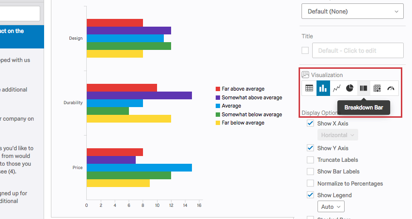
You can change the visualization by selecting the corresponding icon under the Visualization section. Hovering over the icon will tell you the name. For existing visualizations, the current type will be highlighted in blue.
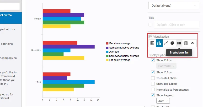
Each visualization varies in its options and settings, which you can find detailed on the linked pages.
Attention: Not every question type is compatible with every visualization. For example, it doesn’t make sense to have a Bar Chart option for Text Entry questions. For more specific details, see each visualization’s support page for a list of compatible or incompatible features.
Charts
Tables
Others
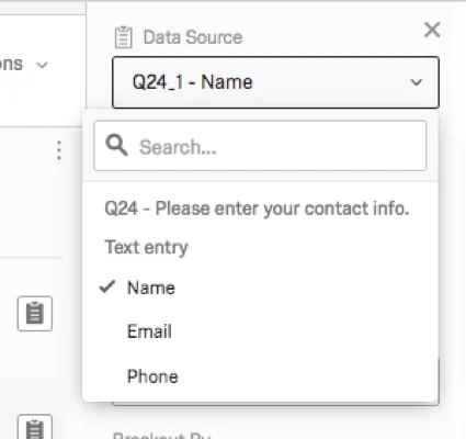
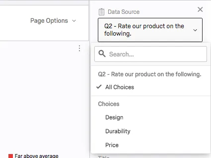
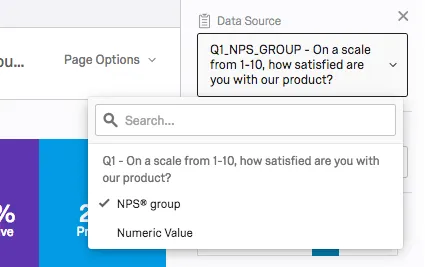
Data Sources
A data source is the source of the data you want your visualization to display. These sources can include questions you asked in the survey, or additional fields, such as survey metadata and embedded data.
To set or change a visualization’s data source, click on the visualization, then click the dropdown under Data Source.

Some pages of your report are specific to a question. In this case, you cannot change the data source, and this section will be grayed out. However, some question types, such as NPS and matrix questions, will have multiple options. More is detailed in the Survey Questions section below.
In contrast, you can always change the data source on a visualization on a custom page.
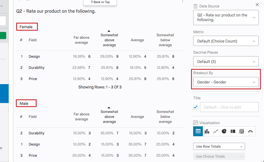
Warning: You can only load one field into the data source at a time! You cannot put two different questions into the same visualization. If you want to split results by other fields, such as by showing how men vs. women responded to a question, see the Breakouts section below.
There are three main types of data sources you can represent in a visualization: survey metadata, question answers, and Embedded Data. Depending on the particular type of information you select, you’ll have different visualizations available to use.
Survey Questions
There are many different question types in Qualtrics, and each question type has different visualizations it’s compatible with. Some question types have only one data source option (i.e., only one way to represent the data), but for other question types, you will have additional options. Possible options include the following:
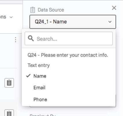
- Text Entry: For form field questions, you can choose which field you want to display.
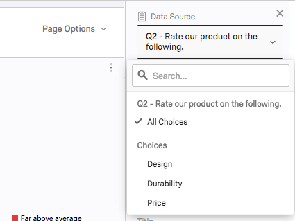
- Choices: For questions with multiple statements and choices (matrix, rank order, slider, etc.), you can choose to display either all the possible choices together or just one particular choice alone.
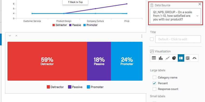
- NPS®: For NPS® questions, you can view the NPS® groups (Detractor, Passive, and Promoter, all calculated for you) or you can view the actual numeric values (0–10) the question displays to respondents.

Embedded Data
Embedded data is any extra information you’ve recorded in addition to your question responses. These include embedded data fields set in the survey flow and custom columns added in the Data & Analysis tab.
Embedded data fields don’t have multiple data source options, but the type of data captured in the field can affect what types of visualizations are available.
Qtip: Some visualizations won’t be available for your embedded data until you save it in a way that specifies what type of variable it is. For example, you have to specify that embedded data is numeric before it can be loaded into a statistics table. See the page on Embedded Data Options for more assistance. Similar rules also apply to manual variables.
Survey Metadata
Survey metadata is information automatically collected when a respondent takes a survey. Survey metadata fields include the following:
- Start Date: The date and time the survey was started.
- End Date: The date and time the survey was completed.
- Response Type: The type of response collected (survey preview, IP address, offline app, etc.). Qtip: A response type of IP Address means the response was collected via the anonymous link, individual links, or personal links.

- IP Address: The IP address collected from the respondent’s browser.
- Progress: The percent to which the survey was completed. For most respondents this will be 100. Qtip: If a response was incomplete and only recorded after the session expired, the progress will contain a lower number.
- Duration: The number of seconds it took the respondent to complete the survey.
- Finished: The status of the respondent’s survey (true = completed, false = incomplete).
- Recorded Date: The date and time the survey was recorded in the dataset.
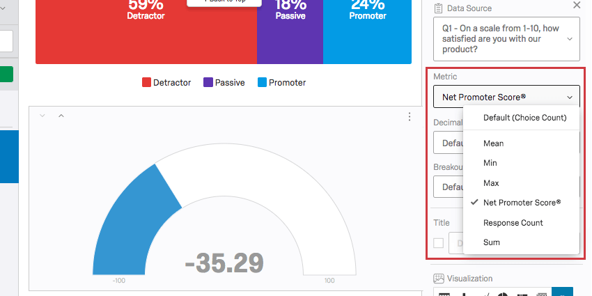
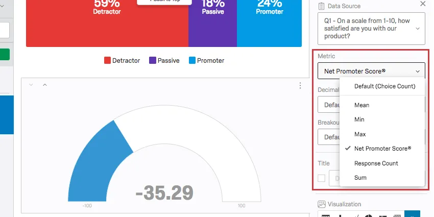
Metric
For some visualizations, you can select the metric (count, percentage, mean, etc.) being displayed. The exact options available will depend on both the particular data source and the visualization type selected.
Types of Metrics
- Mean: Display the average, or mean, of the collected responses.
- Min: Display the minimum value response. This will always be the lowest point on your scale if you have a multiple choice question, whereas a question where respondents can enter values in will be less predictable.
- Max: Display the maximum value response. This will always be the highest point on your scale if you have a multiple choice question, whereas a question where respondents can enter values in will be less predictable.
- Net Promoter® Score: This is a calculation of the Net Promoter® Score. Although you can technically select this metric for other question types, this metric is best for when your survey actually contains an NPS® question.
- Response Count: The number of people who responded to a question. Qtip: If your questions don’t have validation on them forcing respondents to answer, then this number can be lower than your number of total survey respondents.
- Choice Count: The number of times each choice was selected by respondents. Qtip: If you have questions where respondents can provide multiple answers, this number may be much larger than your respondent count.
- Sum: The total sum of all the respondents’ answers to the questions added together.
- Percentage: The percentage of respondents who chose each choice.
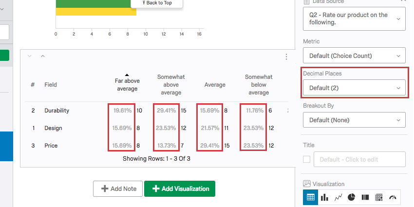
Decimal Places
You can determine how many decimal places display in your visualization.
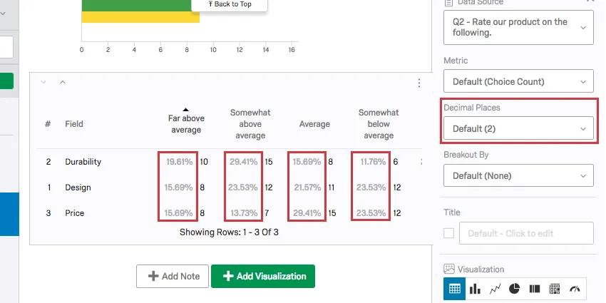
To adjust this globally, for all visualizations in your report, open your global options.
Breakouts
Have you ever wanted to display data from different samples side by side? Maybe you want your satisfaction bar graph to show how women responded and how men responded right next to each other. Maybe you want to show each store location’s data in the same graph. In that case, you may want to use a visualization breakout.
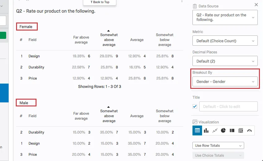
For additional information, visit the Results-Reports Breakouts support page.
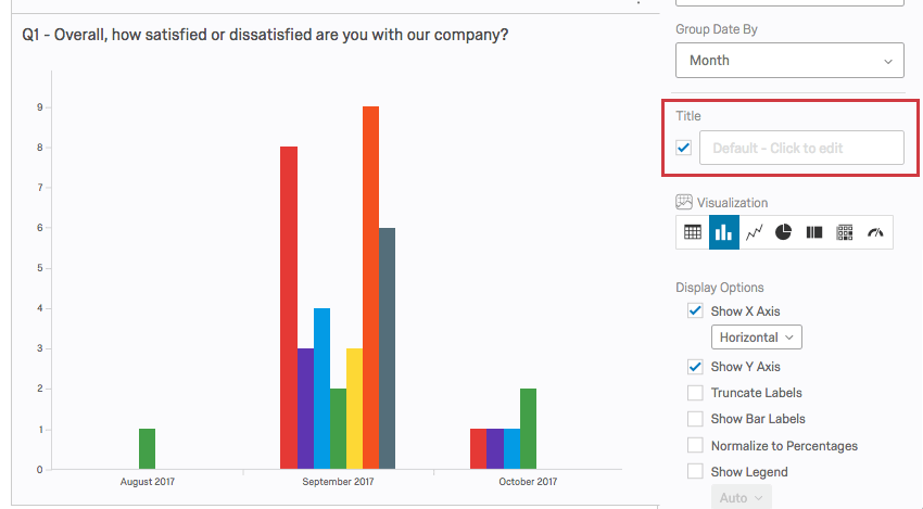
Title
Every visualization allows you to set a custom title for your table or graph.
Select the box next to the Title field to make the default title automatically appear. Type into the field to create your own custom title.
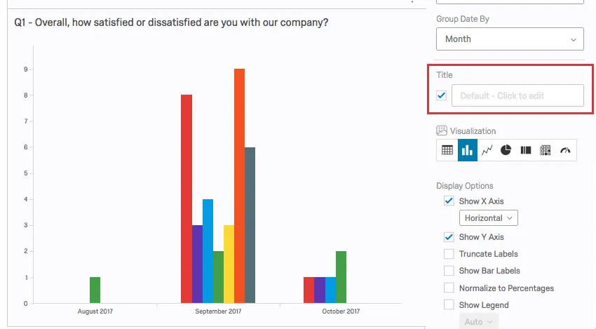
To return to the default title, just erase what you wrote.
Qtip: If your visualization is for one statement of a matrix table, you’ll want to check the title box so you know which statement the visualization is referring to.
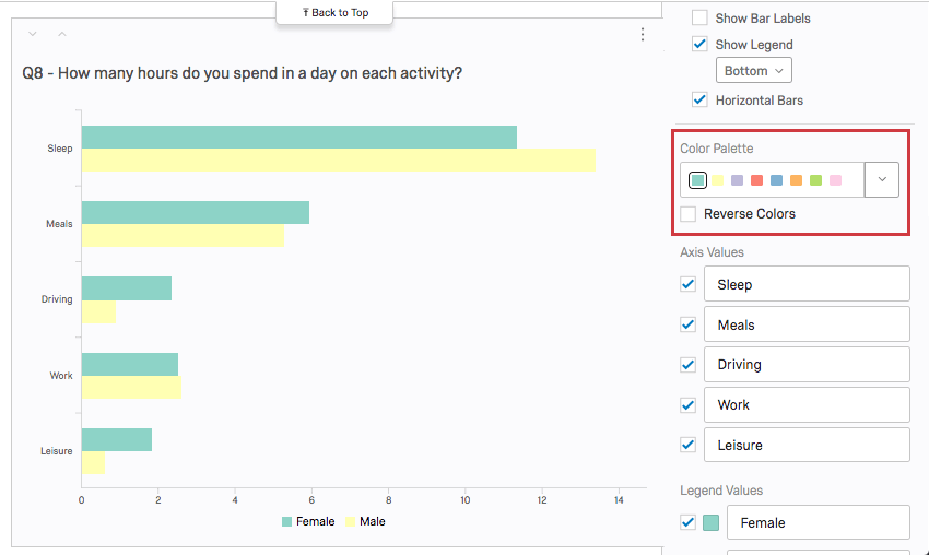
Color Palette
You can adjust the colors used in your chart type visualizations. Click the dropdown under Color Palette to select from a list of premade palettes.
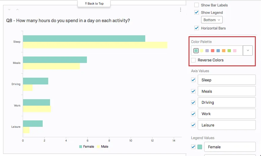
To reverse the order of the palette, select Reverse Colors.
Add your own custom palettes by clicking the dropdown and selecting Add Custom Palette. See Adding Custom Palettes page for more information.
Qtip: Change the default palette for all the visualizations in your report under global options!
FAQs
How can I export an individual response report to PDF? Is it possible to download them all at once?
How can I export an individual response report to PDF? Is it possible to download them all at once?
Unfortunately, exporting all individual responses to PDF at once is not possible. However, you can export all of your responses to a variety of formats (CSV, SPSS, etc.) by using our Export Data feature.
Why am I receiving the error message "Data source misconfigured for this visualization"?
Why am I receiving the error message "Data source misconfigured for this visualization"?
- The question was originally a different question type. Click on the visualization. If this doesn't resolve the issue, re-select the data source (e.g., the question linked to the visualization).
- A breakout was applied that the visualization did not accept. Change the visualization to a different type, and then change it back to the original visualization type.
- An incomplete results filter can cause this. Removing or finishing the filter can solve the issue. See Filtering Results for more details.
Why is my contact list information not appearing in any of my reports?
Why is my contact list information not appearing in any of my reports?
If you forgot to put Embedded Data in the Survey Flow, you can add it to your data retroactively, so long as there are values in the contact list. See the Embedded Data support page for further instruction.
Note that if the contact list information you’re trying to download was not included in the contact list at the time the members took the survey, retroactively adding the Embedded Data fields to the Survey Flow will not add that information to the reports later.
I want to use a certain visualization for my data, but that visualization option isn’t appearing when I choose my data source. Why?
I want to use a certain visualization for my data, but that visualization option isn’t appearing when I choose my data source. Why?
Some question types offer more than one data source (i.e., more than one way to represent their data), so you might be able to pick an alternative data source and use the desired visualization.
Can I change the default settings on a report instead of editing each visualization one at a time?
Can I change the default settings on a report instead of editing each visualization one at a time?
You can learn how to change your default settings on Results-Reports on the Global Results-Reports Settings support page, and you can learn how to change the default settings for Advanced-Reports on the Global Advanced-Reports Settings support page.
My visualizations from different questions are all on different pages in my Results-Report. Can I put them on the same page?
My visualizations from different questions are all on different pages in my Results-Report. Can I put them on the same page?
Note that in Advanced-Reports, you customize every page.
Can I add other columns of information to my visualizations?
Can I add other columns of information to my visualizations?
In the visualization editing pane for either visualization, you will be able to select Add Additional Columns.
No other visualization can add additional columns like this.
Can I break down the information in a visualization into groups based on other data?
Can I break down the information in a visualization into groups based on other data?
See Breakouts for Advanced-Reports or Breakouts for Results-Reports, depending on the reporting you are using.
I have a lot of questions in my survey and I would rather not export data for the entire survey. Is there a quick way I can see the entire response for an individual?
I have a lot of questions in my survey and I would rather not export data for the entire survey. Is there a quick way I can see the entire response for an individual?
That's great! Thank you for your feedback!
Thank you for your feedback!