
Advanced-Reports Visualizations
What's on this page
About Advanced-Reports Visualizations
Visualizations are the charts and tables you use to represent your data in the Reports section. While each visualization has its own special features, there are certain edits you can make to just about any visualization.
This page covers reports visualizations in survey advanced-reports and 360 reports.
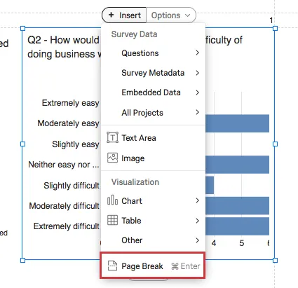
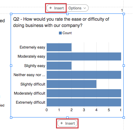
Insert Button
The Insert buttons allow you to insert a new visualization. The top Insert button adds visualizations above the existing one, and the bottom Insert button adds visualizations below them.

See the page on Adding and Removing Visualizations for more details on inserting visualizations.
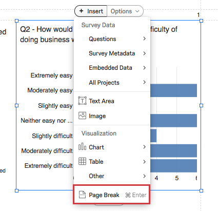
You can also use this option to add a Page Break when you click Insert and select Page Break.
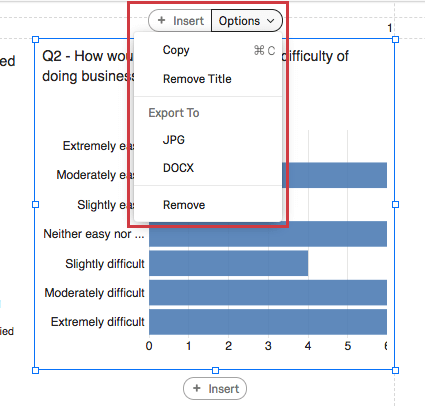
Options Button
When you click on a visualization, you will see the Options button.
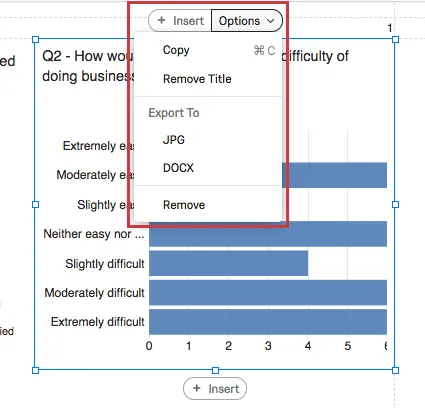
- Copy: Copy the visualization. Use Edit > Paste to paste.
- Remove/Insert Title: Remove or add the visualization’s title. This option is only available for charts and the Word Cloud.
- Export to: Save the visualization as a JPEG image or as a DOCX file.
- Remove: Delete the visualization.
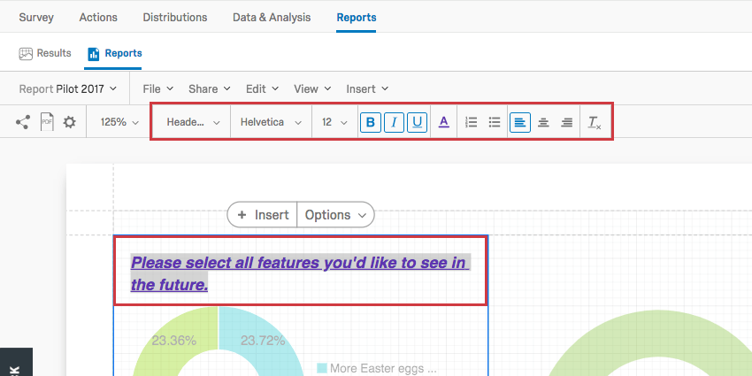
Editing Titles
Chart visualizations and the Word Cloud allow you to edit their titles if you double-click on them.
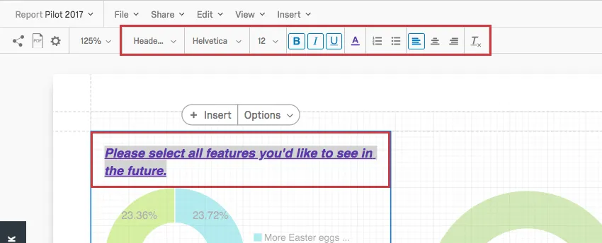
You can erase and retype the text of the title, adjust the font style, and change the format of the text with the Rich Content Editor, highlighted at the top.
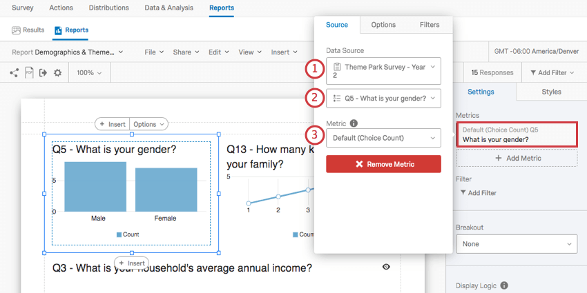
Data Source
When you set a data source for a visualization, you are telling it where its data is supposed to come from.
When you click on a visualization’s Metrics and look under Data Source, you will usually see the following fields:
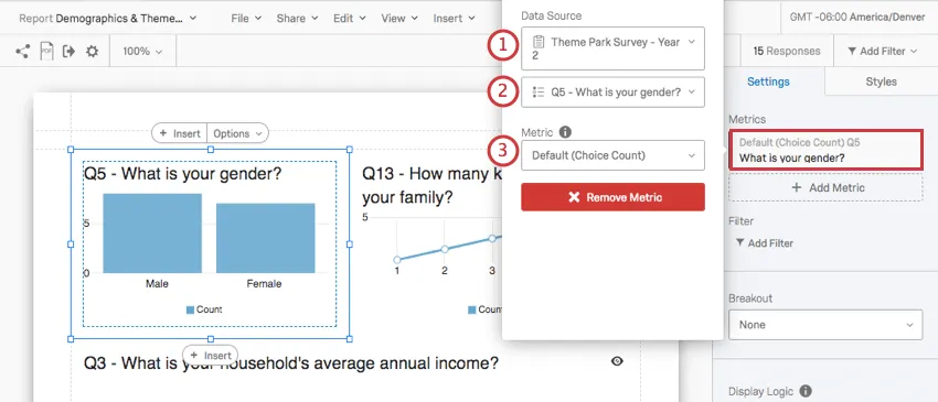
Qtip: Usually, this is the same survey you created the report in. But let’s say you want to include last year’s data on this year’s report for comparison. You can add a visualization that uses data from an older survey by clicking the dropdown with the name of your survey and selecting another one from your list of surveys.
The questions, Embedded Data, and metadata available to you will depend on the kind of visualization you want to create. For example, bar graphs are great for displaying the results of a Multiple Choice question, but not so great for displaying the results to a Text Entry question. Visit a visualization’s support page to learn more about what it is compatible with.
Qtip: Learn more about adding additional data sources to a visualization on the Multiple Data Sources in Advanced-Reports page. See Data Sources in New 360 Reports for information related to 360 reports.
Visualization-Level Filters
Visualization-level filters have the same conditions and functions as global report filters, except that they apply to the individual visualization instead of the whole report.
Visualization-level and global filters are always added on top of each other. For example, if you global filter isolates male data, and the visualization is filtered to only display data from respondents who indicated high dissatisfaction, the visualization will display only data from men who rated high levels of dissatisfaction.
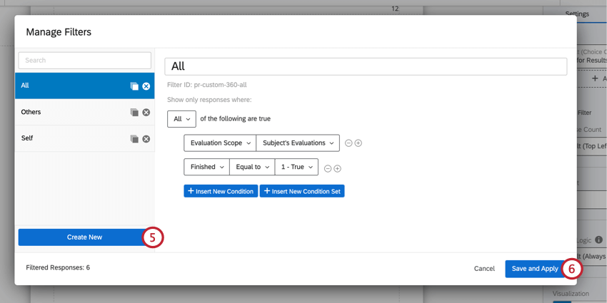
Attention: If using one of the default filters in a 360 report (e.g., All, Others, or Self), do not change the filter name or conditions. Best practices are not to edit the default filters. Instead, create a new filter using the directions below.
Adding Visualization Filters
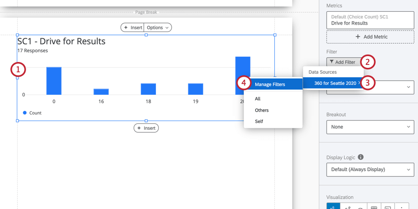
Qtip: If you’ve already created the filter you want to use, it will appear in a list below Manage Filters and you can select the filter here.
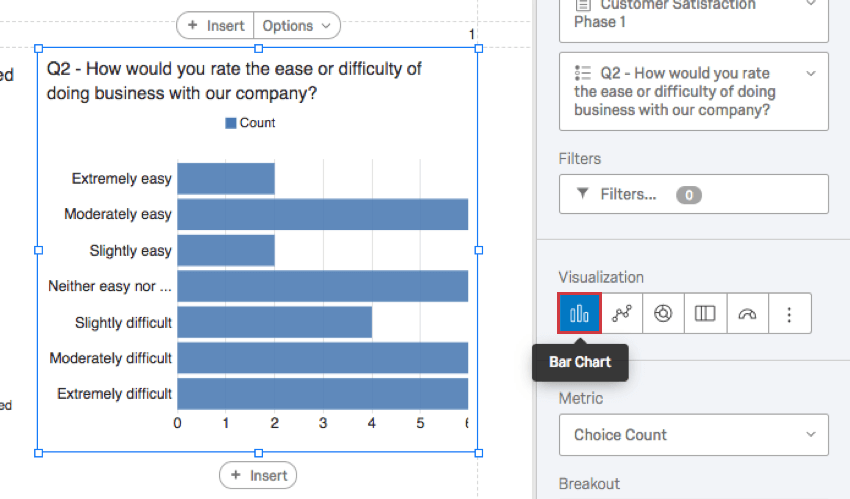
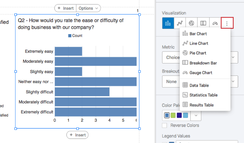
Visualization Type
You can change an existing visualization’s type. Click on an icon under the Visualization section to change the type.
The visualization type you are currently using will be listed first and highlighted in blue. When you hover over this icon, it will tell you the name.

If you don’t see the visualization you want, click the last icon on the right to view more visualization options.

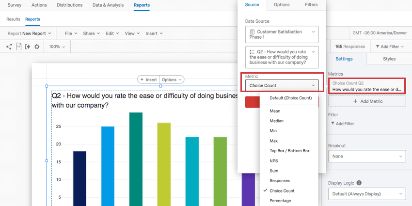
Metric
The Metric dropdown determines what format of data you want to include in your visualization. These options can vary based on the type of visualization you’ve chosen.
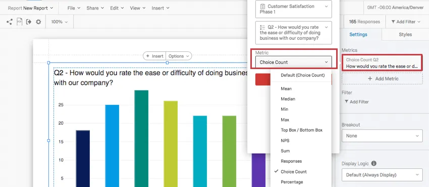
Types of Metrics
- Mean: Display the average, or mean, of the collected responses.
- Median: The median of your dataset is the exact midpoint. When all of your collected values as organized from smallest to largest, this value is right in the middle. Qtip: Qualtrics calculates the median using a non-deterministic percentiles aggregation to approximate the desired percentage counts at scale. The median, or 50th percentile, is accurate at about 99.9% on average.

- Min: Display the minimum value response. This will always be the lowest point on your scale if you have a Multiple Choice question, whereas a question where respondents can enter values in will be less predictable.
- Max: Display the maximum value response. This will always be the highest point on your scale if you have a Multiple Choice question, whereas a question where respondents can enter values in will be less predictable.
- NPS: This is a calculation of the Net Promoter® Score. Although you can technically select this metric for other question types, this metric is best for when your survey actually contains an NPS® question.
- Responses: The number of people who responded to a question. Qtip: If your questions don’t have validation on them forcing respondents to answer, then this number can be lower than your number of total survey respondents.
- Choice Count: The number of times each choice was selected by respondents. Qtip: If you have questions where respondents can provide multiple answers, this number may be much larger than your respondent count.
- Percentage: The percentage of respondents who chose each choice.
- Sum: The total sum of all the respondents’ answers to the questions added together.
Qtip: Learn more about adding additional metrics to a visualization on the Multiple Data Sources in Advanced-Reports page.
Compatibility
You can change the metric on the following visualizations.
- Bar Chart
- Line Chart
- Gauge Chart Qtip: This is the only visualization on the list that is not compatible with the Choice Count metric.
- Data Table
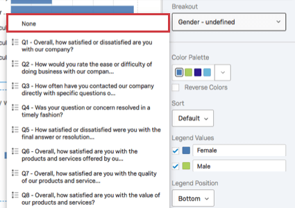
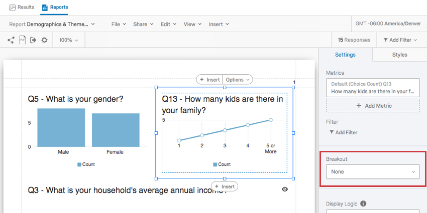
Breakout
Have you ever wanted to display data from different samples side by side? Maybe you want your satisfaction bar graph to show how women responded and how men responded right next to each other. Maybe you want to show each store location’s data in the same graph. In that case, you may want to use a breakout on your visualization.
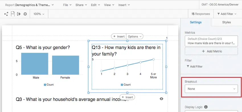
Click the Breakout dropdown and select the field you want to break out the data by.
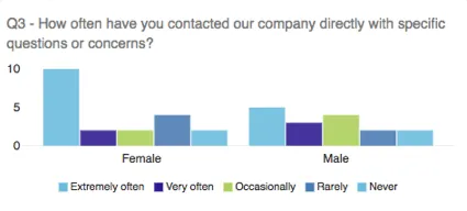
If you decide you no longer want a breakout on your graph, you can click the Breakout dropdown again and select None.
Qtip: Only one breakout can be added to a visualization at a time. For more detailed results, combine your breakouts with visualization filters!
Compatibility
The following visualizations are compatible with breakouts:
Qtip: For visualizations that don’t allow breakouts, try copying the visualization and adding visualization filters.
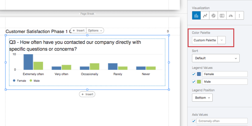
Color Palette
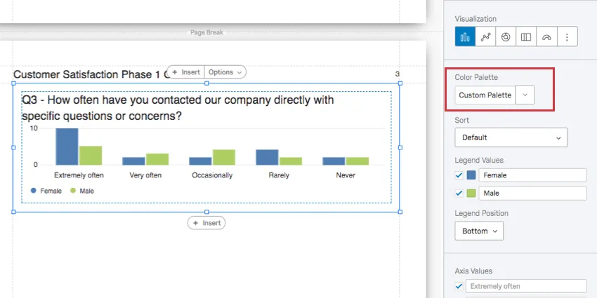
The colors used in your visualization. You can select a premade color palette or create one yourself.
Qtip: You can change the color palette for all the unedited visualizations in the report by going to the global visualization settings.
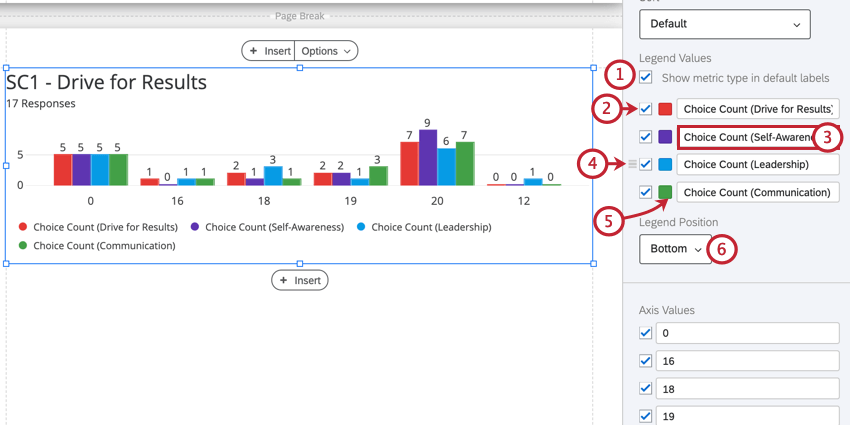
Legend Values & Position
On charts that display many different data points displayed in an array of colors, a legend can help us understand what the chart means. By editing the Legend, you can also edit how your chart looks, and make the data even clearer.
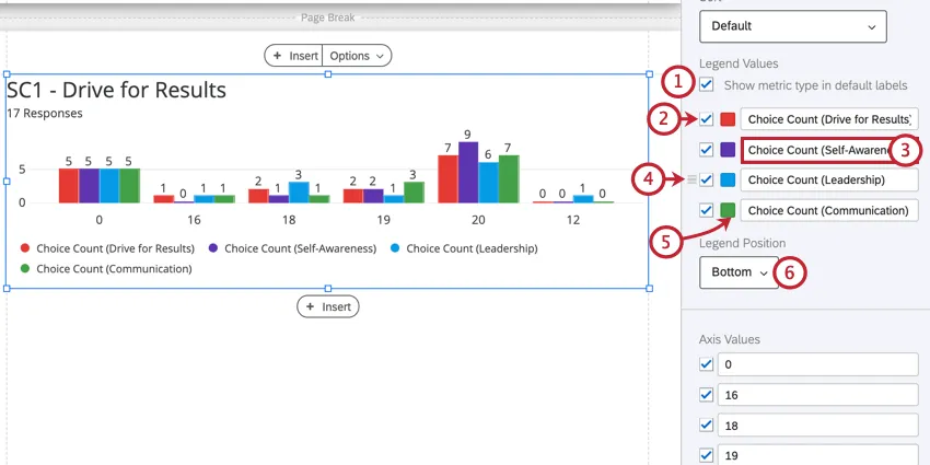
Compatibility
You can add a legend to the following visualizations. Those that have additional features available for their legends will have more information on their respective support pages.
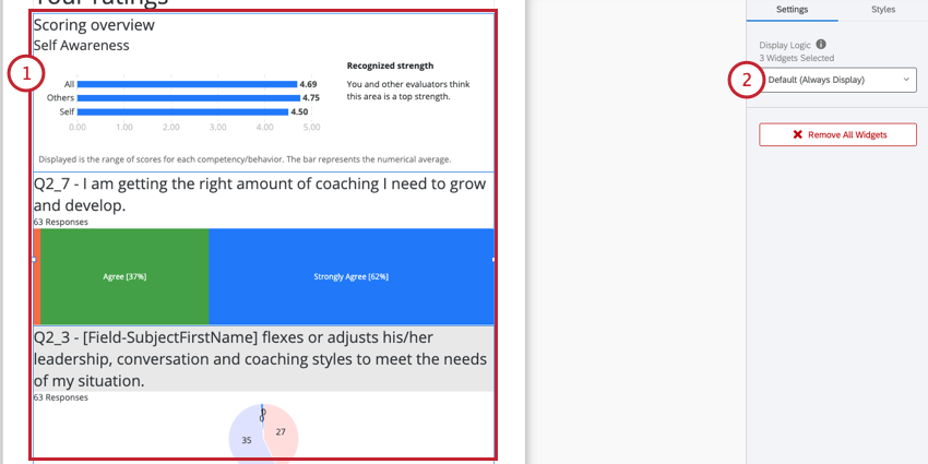
Display Logic
Qtip: This is not the same as Display Logic in the survey editor.
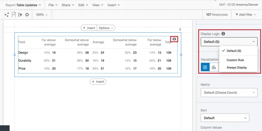
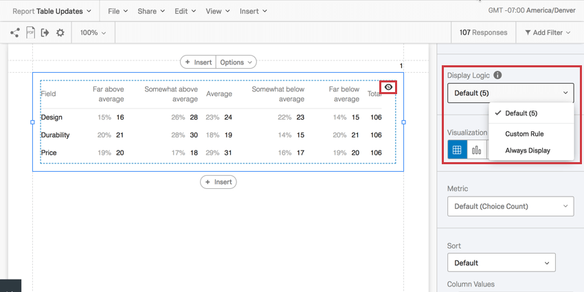
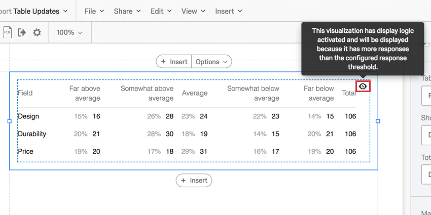
When set, Display Logic allows you to determine the anonymity threshold of your visualization. Determine how many people must answer a question before the visualization appears in the public link to the report. (This data will remain in PDF exports.)
You can decide if everyone sees the visualization, the default rule is followed, or to set a custom minimum number of responses. Hovering over the eye on a widget will tell you if it will be displayed or not.
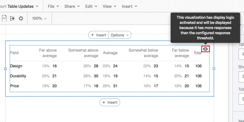
This feature is important in making sure no one knows who answered what. If there’s no display logic set and Barnaby is the only person to answer the survey, everyone who looks at the report will know what answers Barnaby gave to the survey.
Qtip: If your visualization shows multiple metrics, then display logic is evaluated for each metric and applied to the widget overall. For example, let’s say your widget shows Q1 and Q2 which have one and six responses, respectively. If you set your display logic to five responses, then the widget will not be displayed since Q1 only has one response.
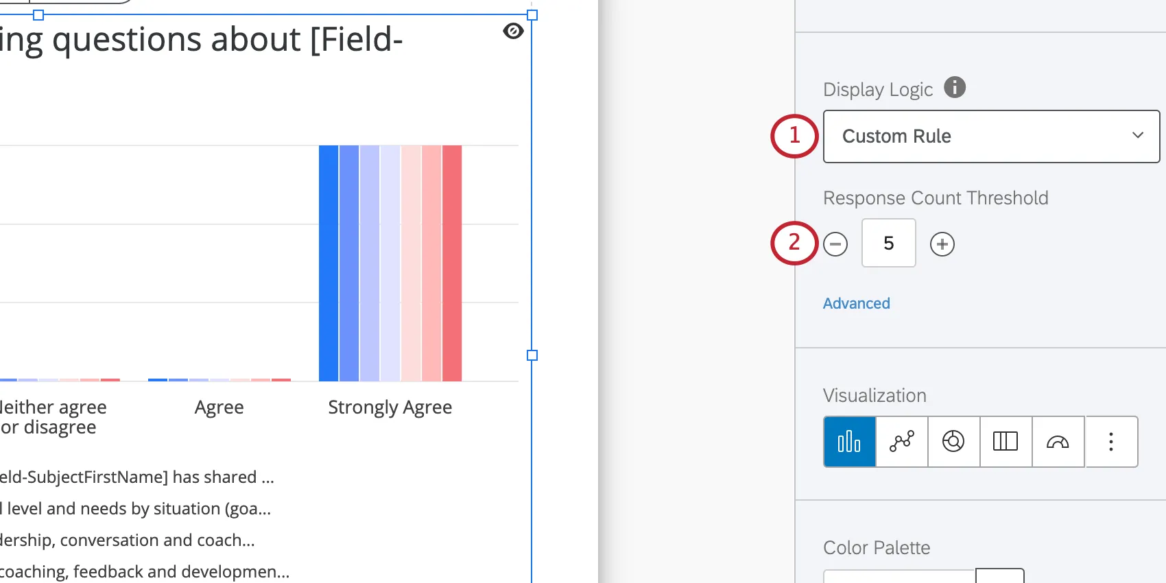
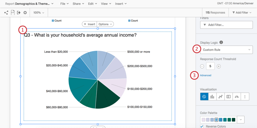
Response Count Threshold
The most basic setup of display logic acts as an anonymity threshold. With this setup, you specify the number of responses that must be collected before data appears in the visualization.
This feature is important in making sure no one knows who gave what answers. For example, if there’s no display logic set and Barnaby is the only person to submit an evaluation, everyone who looks at the report will know what answers Barnaby gave to the survey.
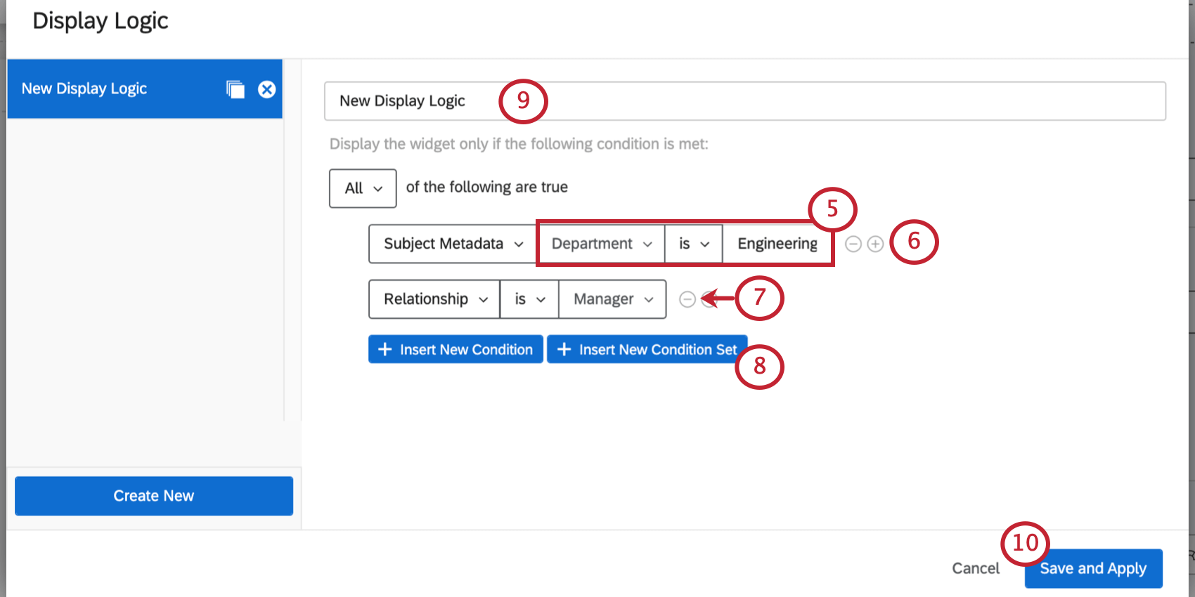
Advanced Display Logic
Advanced options allow you to add conditions and limit when the widget is displayed based off of answers provided to other questions.
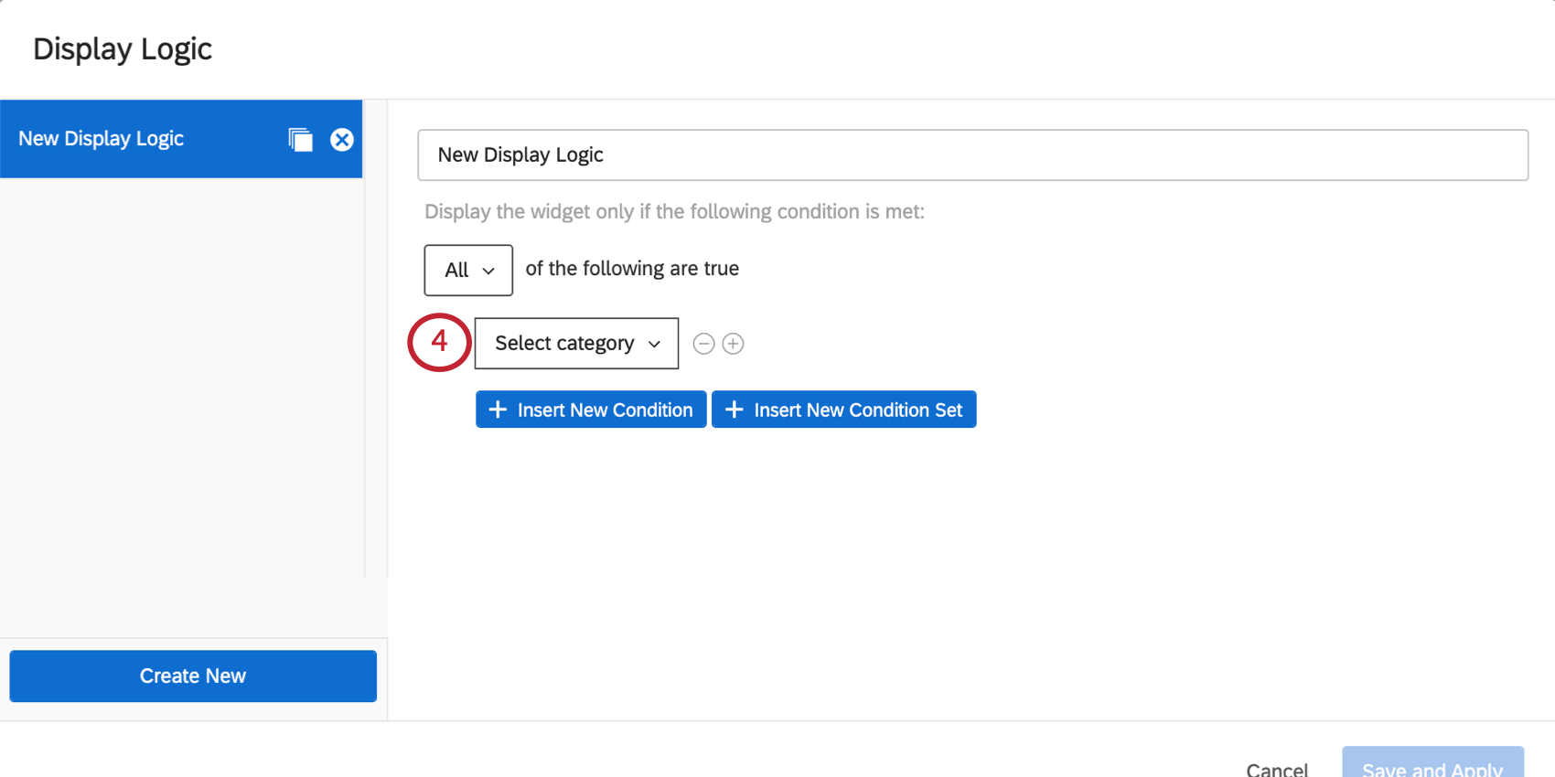
- Metric: This can be the mean, minimum, maximum, or sum for a given field, or the number of responses it received. When you select this option, you will also have to choose the field (i.e., survey question) you’d like to use, then specify a numeric value. You will be able to use equal to, greater than less than, not equal to, etc. Example: You want to make sure there’s at least 10 responses to the question whose data is displayed in this graph before it is shown in the subject report.

re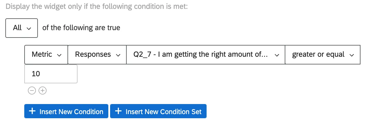
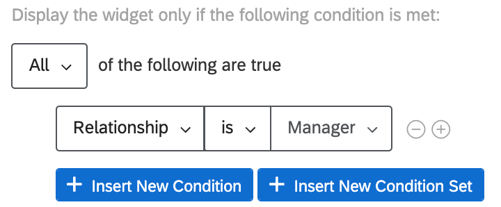
- Relationship: This option is only available in 360 reports. Restrict whether the visualization is displayed based on the relationship of the viewer to the subject. In general, only the Self and Manager relationships will be relevant, because these are the only people who can see a subject’s report. When setting a condition based on relationship, you can choose is or is not [a given relationship]. Example: We have included a graph or list of instructions we only want managers to see, and don’t feel necessary to show to subjects.

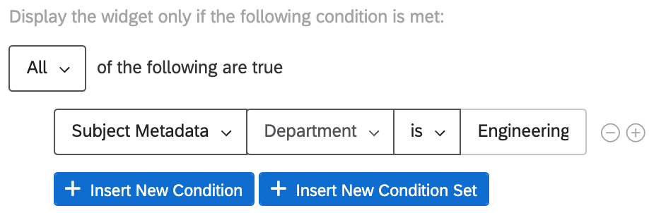
- Subject Metadata: This option is only available in 360 reports. Determine whether the visualization is displayed based on the subject’s metadata (not necessarily the metadata of the person viewing the report). When setting a condition based on metadata, you can choose is or is not [a given metadata value]. Example: Our yearly 360 has questions we only ask engineers, since they are specific to coding competencies. We only want to show graphs pertaining to these questions to subjects who are in the engineering department.

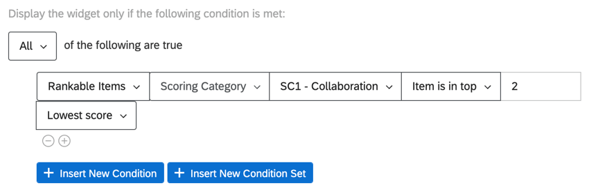
- Rankable items: This option is only available in 360 reports. Determine whether the visualization is displayed based on the subject’s ranking of your project’s scoring categories, or based on how the subject’s score ranked for a particular question. When setting a condition, you can choose Item has or Item is in top [number of highest or lowest scoring items]. Example: We have a widget that we want to display to subjects only if their scores for “Collaboration” are the lowest or second lowest.

Similarly, we can display a widget if subject scored the lowest on a particular question meant to measure collaboration.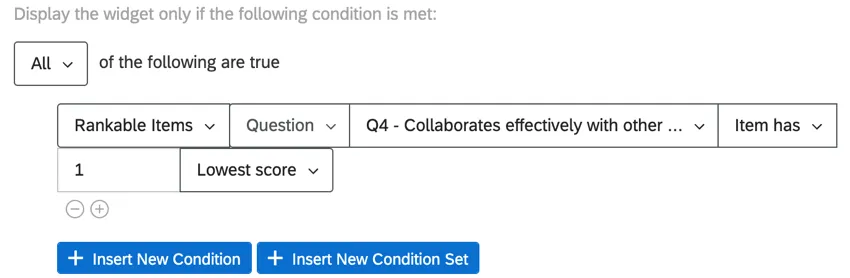 Qtip: You can think of “Item has” as “equals” and “Item is in top” as “includes.”


Any display logic you create, you can reuse in reports for the same survey later.
Example: Your survey has a question asking customers if they’ve ever tried the food at your theme park (Question A). Customers are also asked to rate their satisfaction with the food (Question B).
Your report has a Pie Chart showing food satisfaction (Question B). You can add Advanced Display Logic to determine this Pie Chart can only be displayed if more than 5 people say they’ve eaten food at the park (Question A) to determine you’re getting a big enough sample of the target population’s data.
Adding Display Logic to Multiple Visualizations
You can add the same display logic to multiple visualizations at the same time.

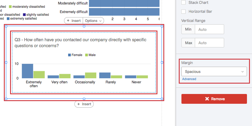
Margins
You can set the margins around your visualization. This helps you determine the amount of space between it and the visualizations around it.
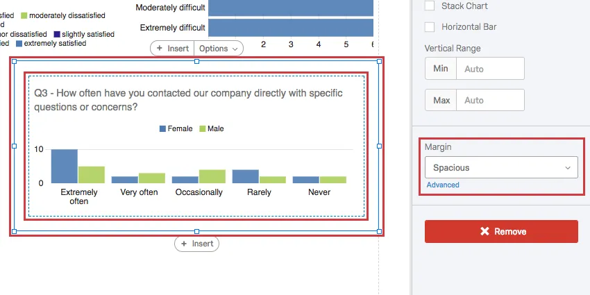
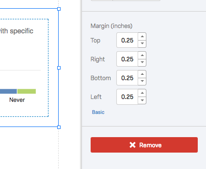
By clicking Advanced, you can individually adjust the margin on each side of the visualization.

Qtip: You can change the margins for all unedited visualizations at a time with the global visualization settings.
Visualization Categories
Below are the different categories of visualizations and links to their individual support pages.
Chart
- Bar Chart
- Line Chart
- Pie Chart
- Breakdown Bar
- Gauge Chart
- Gap Chart (360 only)
- Agreement Chart (360 only)
Table
- Data Table
- Statistics Table
- Results Table
- High and Low Scores (360 only)
- Hidden Strengths / Improvement Areas (360 only)
- Scoring Overview (360 only)
- Report Summary (360 only)
Other
FAQs
Can I change the default settings on a report instead of editing each visualization one at a time?
Can I change the default settings on a report instead of editing each visualization one at a time?
You can learn how to change your default settings on Results-Reports on the Global Results-Reports Settings support page, and you can learn how to change the default settings for Advanced-Reports on the Global Advanced-Reports Settings support page.
Can I add other columns of information to my visualizations?
Can I add other columns of information to my visualizations?
In the visualization editing pane for either visualization, you will be able to select Add Additional Columns.
No other visualization can add additional columns like this.
Can I break down the information in a visualization into groups based on other data?
Can I break down the information in a visualization into groups based on other data?
See Breakouts for Advanced-Reports or Breakouts for Results-Reports, depending on the reporting you are using.
That's great! Thank you for your feedback!
Thank you for your feedback!