
Data Analysis
Correspondence Analysis: What is it, and how can I use it to measure my Brand? (Part 1 of 2)
Correspondence analysis reveals the relative relationships between and within two groups of variables, based on data given in a contingency table. For brand perceptions, these two groups are brands and the attributes that apply to these brands. For example, let’s say a company wants to learn which attributes consumers associate with different brands of beverage products. Correspondence analysis helps measure similarities between brands and the strength of brands in terms of their relationships with different attributes. Understanding the relative relationships allows brand owners to pinpoint the effects of previous actions on different brand related attributes, and decide on next steps to take.
Correspondence analysis is valuable in brand perceptions for a couple of reasons. When attempting to look at relative relationships between brands and attributes, brand size can have a misleading effect; correspondence analysis removes this effect. Correspondence analysis also gives an intuitive quick view of brand attribute relationships (based on proximity and distance from origin) that isn’t provided by many other graphs.
In this post, we’ll walk through an example of how to apply correspondence analysis to a use case for different brands of soda products.
Let’s get started with the input data format - a contingency table.
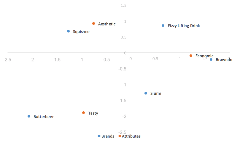
Contingency table
A contingency table is a 2 dimensional table with groups of variables on the rows and columns. If our groups, as described above, were brands and their associated attributes, we would run surveys and get back different response counts associating different brands with the given attributes. Each cell in the table represents the number of responses or counts associating that attribute with that brand. This ‘association’ would be displayed through a survey question such as ‘pick brands from a list below which you believe show ___ attribute’
Here the two groups are ’brand’ and ‘attribute’. The cell in the bottom right corner represents the count of responses for ‘Brawndo’ brand and ‘Economic’ attribute.
Residuals(R)
In correspondence analysis, we want to look at the residuals of each cell. A residual quantifies the difference between the observed data and the data we would expect - assuming there is no relationship between the row and column categories (here, those would be brand and attribute). A positive residual shows us that the count for that brand attribute pairing is much higher than expected, suggesting a strong relationship; correspondingly, a negative residual shows a lower value than expected, suggesting a weaker relationship. Let's walk through calculating these residuals.
A residual (R) is equal to: R = P - E, where P is the observed proportions and E is the expected proportions for each cell. Let’s break down these observed and expected proportions!
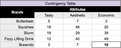
Observed proportions(P)
Observed proportions(P) is equal to to the value in a cell divided by the total sum of all of the values in the table. So for our contingency table above, the total sum would be: 5 + 7 + 2 + 18 … + 16 = 312. Dividing each cell value by the total results in the table below for observed proportions (P).
For example, in the bottom right cell, we took our initial cell value of 16/312 = .051. This tells us the proportion of our entire chart that the pairing of Brawndo and Economic represent based on our data collected.
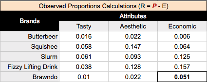
Row and column masses
Something we can calculate easily from our observed proportions, and will be used a lot later, are the sums of the rows and columns of our table of proportions, which are known as the row and column masses. A row or column mass is the proportion of values for that row/column. The row mass for ‘Butterbeer’, looking at our chart above, would be .016 + .022 + .006, giving us .044.
Doing similar calculations we end up with:
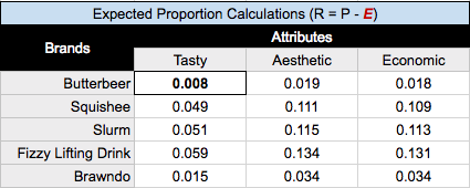
Expected proportions(E)
Expected proportions(E) would be what we expect to see in each cell’s proportion, assuming that there is no relationship between rows and columns. Our expected value for a cell would be the row mass of that cell multiplied by the column mass of that cell.
See in the top left cell, the row mass for Butterbeer multiplied by the column mass for Tasty, .044 * .182 = .008.
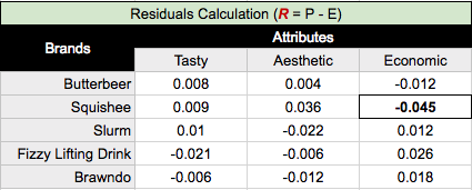
We can now calculate our residuals (R) table, where R = P - E. Residuals quantify the difference between our observed data proportions and our expected data proportions, if we assumed there is no relationship between the rows and columns.
Taking our most negative value of -.045 for Squishee and Economic, what we would interpret here is that there is a negative association between Squishee and Economic; Squishee is much less likely to be viewed as ‘Economic’ than our other brands of drinks.
Indexed residuals(I)
There are some problems with just reading residuals, however.
Looking at the top row from our residuals calculation table above, we see that all these numbers are very close to 0. We shouldn’t take the obvious conclusion from this that Butterbeer is unrelated to our attributes, as this assumption is incorrect. The actual explanation would be that the observed proportions (P) and the expected proportions (E) are small because, as our row mass tells us, only 4.4% of the sample are Butterbeer.
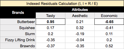
This raises a large problem about looking at residuals, in that because we disregard the actual number of records in the rows and columns, our results are skewed towards the rows/columns with larger masses. We can fix this by dividing our residuals by our expected proportions (E), giving us a table of our indexed residuals (I, I = R / E):
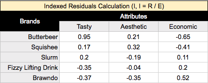
Indexed residuals are easy to interpret: the further the value from the table, the larger the observed proportion relative to the expected proportion.
For example, taking the top left value, Butterbeer is 95% more likely to be viewed as ‘Tasty’ than what we would expect if there were no relationship between these brands and attributes. Whereas at the top right value, Butterbeer is 65% less likely to be viewed as ‘Economic’ than what we would expect - given no relationship between our brands and attributes.
Given our indexed residuals(I), our expected proportions (E), our observed proportions (P), and our row and column masses, let’s get to calculating our correspondence analysis values for our chart!
Calculating coordinates for Correspondence Analysis
Singular Value Decomposition(SVD)
Our first step is to calculate the Singular Value Decomposition, or SVD. The SVD gives us values to calculate variance and plot our rows and columns (brands and attributes).
Here’s an explanation of how the SVD is calculated: https://www.displayr.com/singular-value-decomposition-in-r/
We calculate the SVD on the standardized residual(Z), where Z = I * sqrt(E), where I is our indexed residual, and E is our expected proportions. Multiplying by E causes our SVD to be weighted, such that cells with a higher expected value are given a higher weight, and vice versa, meaning that since expected values are often related to the sample size, ‘smaller’ cells on the table, where sampling error would have been larger, are down-weighted. Thus, correspondence analysis using a contingency table is relatively robust to outliers caused by sampling error.
Back to our SVD, we have: SVD = svd(Z). A singular value decomposition generates 3 outputs:
A vector, d, containing the singular values
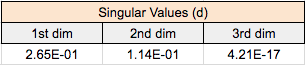
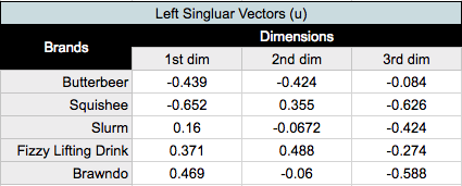
A matrix, u, containing the left singular vectors
A matrix, v, containing the right singular vectors.
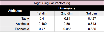
The left singular vectors correspond to the categories in the rows of the table, and the right singular vectors correspond to the columns. Each of the singular values, for calculating variance, and the corresponding vectors (i.e., columns of u and v), for plotting positions, correspond to a dimension. The coordinates used to plot row and column categories for our correspondence analysis chart are derived from the first two dimensions.
Variance expressed by our dimensions
Squared singular values are known as eigenvalues(d^2). The eigenvalues in our example are .0704, .0129, and .0000. Expressing each eigenvalue as a proportion of the total sum tells us the amount of variance captured in each dimension of our correspondence analysis, based on each dimensions’ singular value; we get 84.5% of variance expressed by our first dimension, and 15.5% in our second dimension (our third dimension explains 0% of the variance).
Standard correspondence analysis
We now are equipped with the resources to calculate the basic form of correspondence analysis, using what are known as standard coordinates, calculated from our left and right singular vectors. Previously, we weighted the indexed residuals prior to performing the SVD. In order to get coordinates that represent our indexed residuals, we now need to unweight the SVD’s outputs, by dividing each row of the left singular vectors by the square root of the row masses, and dividing each column of the right singular vectors by the square root of the column masses, getting us the standard coordinates of the rows and columns for plotting.
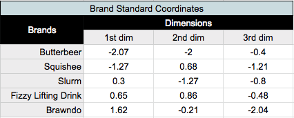
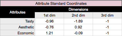
We use the two dimensions with the highest variance captured for plotting, the first dimension going on the X axis, and the second dimension on the Y axis, generating our standard correspondence analysis graph.
We’ve laid down the foundation of the calculations we need for standard correspondence analysis, In the next post we will explore the pros and cons of different styles of correspondence analysis, and which best suits our purposes of aiding in analysis of brand perceptions.