
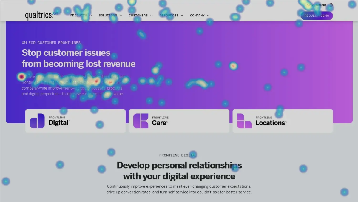
What is a heatmap?
A heatmap is a data visualization tool that uses color to convey intensity or frequency.
When used as data analysis tools, heatmaps act as a visual representation of activity that – in the world of websites, apps and digital tools – provide a clear way to understand user behavior by showing how website visitors interact with various onscreen elements.
The principles that determine the way a heatmap is displayed have been lifted straight from the concept behind thermal vision, thermal imaging, and weather mapping. With thermal imaging cameras, for example, different temperatures are displayed on a spectrum of color, from blue (cool) to red (hot).
That concept has been co-opted for UX and UI analytics to help visualize how much activity and attention various parts of a digital property receive.
Red = “Hot”
This indicates a lot of user activity, movement, or focus
Blue = “Cold”
Colder areas of your heatmap show less trafficked parts of the page
Other colors in-between – typically yellows and greens – represent the middle-ground, where yellow is warmer and green is cooler.
So if a specific button, block of text, or image is the first thing users gravitate towards, your website heatmaps will show those user interactions in bright red. If areas are being missed or skimmed over, they’ll be on the cooler end of that spectrum.
Tschneidr, CC BY-SA 4.0, via Wikimedia Commons
Heatmaps are often used to fine-tune user experience design by helping UX teams understand what is and isn’t working.
That might mean identifying things like:
- Core navigation that’s being missed
- Onscreen decoration being confused for interactive elements
- Images and other media that are or aren’t grabbing people’s attention
- How far visitors scroll down a page
- How much text is actually being read, and in what order
Free eBook: The Digital Experience Playbook
Benefits of website heatmaps
A website heatmap – or a heatmap for an app or program – is a really valuable way to understand how people are interacting with it.
Understand UX issues
If users are reaching dead-ends or entirely missing what you might otherwise think is an obvious next step – for example, a checkout page – then it’s time for a redesign. Heatmap tools help you learn what isn’t working from a UX or UI point of view, and fix things for future visitors.
Audit site or app content
If users aren’t scrolling down your page, or are skimming over entire sections, then you can use that information to reformat your content. That could be by cutting it down to make it more engaging, or reordering important information to areas where people are focusing their attention.
Build a digital experience analytics strategy
Incorporating heatmap information into your business’ analytics represents a step away from purely operational metrics to more experiential data that shows how customers are interacting with your channels.
That can be really powerful. Digital experience analytics is a foundational capability in modern businesses – and those who make use of modern data streams will find doing so well worth the investment.
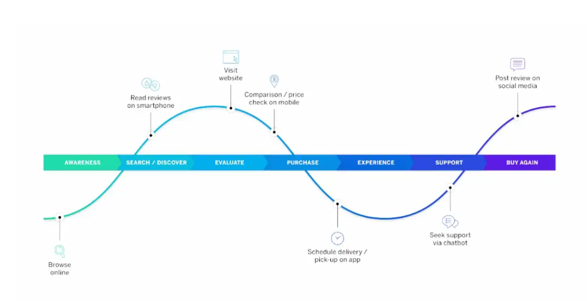
Digital customer experience journey stages and touchpoints
Forrester’s Total Economic Impact study, for example, found that organizations implementing comprehensive digital experience analytics solutions achieved an ROI of 368% over three years.
Limitations of website heatmap analytics tools?
Heatmaps are incredibly intuitive. You don’t need a degree in data analytics to see one and instantly understand what’s going on, which makes them a great tool for generating fast insights that everybody – across teams – can see and understand. That said, however, heatmaps do have some inherent limitations if you’re using them in isolation.
Heatmaps are visualizations of activity, but they can be fairly blunt instruments. That’s because they show the what, but not the why. In other words: a heatmap showing where user attention or clicks happen can point you in the right direction, but it won’t tell you what the cause of that visitor behavior is.
As such, heatmaps need to be partnered with other forms of behavioral data, customer feedback, and a healthy dose of intuition.
For instance, a heatmap showing that a lot of mouse activity happens on a specific button may at first seem great until it’s partnered with session replay data that reveals those clicks are rage clicks – that would imply that the button is broken.
Similarly, having eyes all over your product description can seem like a great sign from a copywriting point of view – until feedback gleaned from forms or social media reveals that customers can’t find how to actually make a purchase.
Types of website heatmap tool
Click heatmaps
Click heat maps show the most frequently clicked elements on a webpage through colored and shaded hot spots. This kind of heatmap can help identify your site’s most popular links, buttons, menus, etc., by showing where visitors click most often – as well as ones that aren’t being clicked as often as you’d like.
If a button or other item of page furniture is being clicked on above all the others, you’re going to want to ensure that it takes users to a page they expect and that that page is well-optimized for conversion or retention.
Scroll maps
Scroll maps visualize how far down on a page visitors are scrolling, by showing different heat gradients at various stages. This can help identify the “above the fold” area that gets the most views, as well as indicating just how far down a page people bother to look for the info they need.
If you have a web page with an overly lengthy product description, for example, you might find that people aren’t scrolling all the way to the bottom – where your call to action is. Your scroll maps would show that it’s worth repositioning those CTAs to where most people stop scrolling.
Movement heatmaps
Movement, or mouse tracking heatmap software, tracks cursor activity, clicks, and scrolls to reveal user flow patterns. They show the most trafficked areas and paths users take as a static snapshot. You might also be able to infer blocks of text people are reading the most, since people tend to hover their cursor on or near site sections they’re actively reading.
Mouse movement heatmaps are best combined with session replay tools that ‘recreate’ user visits to be able to show the actual behavior of their mouse (including things like rage clicks and dead clicks).
Eye-tracking heatmaps
Eye-tracking heatmaps use cameras and software that can actively tell where people’s focus is on each page, and in which order. This shows not only what’s grabbing their attention, but the order in which people scan a page for information.
Because eye-tracking requires camera access, it’s not something you can do without specialist consent. For that reason, eye-tracking heatmaps are often recorded in focus and user testing groups.
Mobile heatmaps
Applied to mobile sites and apps, mobile heatmaps highlight activities like tap locations and swipes on smaller screens. This is especially useful for understanding how the mobile version of your site stacks up against the desktop one.
Funnel heatmaps
A funnel heatmap isn’t a traditional heatmap, but rather a visualization tool that applies the same colouring system to a funnel that shows the number of people exiting a session on each page, for multi-page journeys. Looking for a free heatmap tool specifically for website funnels? Take a look at Google Analytics as a good starting point.
How to read visitor behavior in heatmap data
Reading what a website heatmaps has to show you is very simple on one hand, and just the start of a longer, more complex analytical process on the other.
Here’s how to get started:
Identify “hot” vs. “cold” areas
Look for intense hot spots that indicate heavy usage, versus cold blue areas with little activity. Focus your optimization efforts on hot areas, as this will have the most impact.
Find the most used elements
Buttons, menus, links, and content that show up in your heatmap data as bright hot spots are clear user favorites. These are priority items to refine and highlight.
Look for unexpected patterns
Heat spots in odd areas could show user behaviors you probably hadn’t intended. This may require design changes to guide users – or perhaps you can capitalize on existing user interest in those areas.
Watch for fall-off near the fold
If heat fades off quickly down the page, it likely signals too much “above the fold” content. You might want to reduce your content, spread it across the length of the page, and visualize that there’s more content further down.
Aid user flows
See where people navigate from hotspot to hotspot, then try to find – and replicate – things acting as facilitators to those flows.
Compare segments
It’s helpful to see how the heatmaps for a web page change depending on whether you’re looking at new or returning users. This will show that new users might be missing something your returning ones know about.
Track changes over time
Compare data from different time periods to measure the impact of your changes – hopefully you’ll be able to spot improvements to user flow and a reduction in drop-off.
Triangulate with other data
Combine heatmaps with session replay data, contact center feedback and survey responses to get a more complete understanding of what’s driving the way website visitors interact with it. The most important thing here is to use heatmap data in tandem with other analytics sources to discover what user experience issues or opportunities they point to. Heatmaps make UX data visible and readable, but they need proper human analysis to maximize their value.
How to create a website heatmap
To get started, you’ll need a website heatmap tool that can track various types of user input and visualize it for you – it’s not possible to create a website heatmap manually.
Top website heatmap tools
Looking for a tool to help you create accurate, impactful heatmaps? Here are a few top choices:
Qualtrics® Digital Experience Analytics tool
As part of our wider digital analytics toolset, Qualtrics® Digital Experience Analytics offers heatmaps, scroll maps and session replay tools that show how users interact with your digital channels – and where there’s room for improvement.
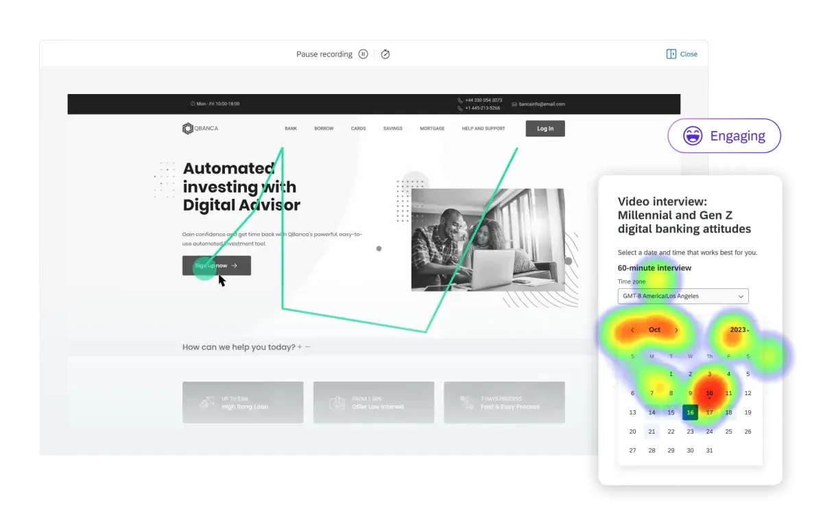
Qualtrics DXA click tracking and heatmap features
Hotjar
Hotjar delivers a variety of heatmap styles to help pinpoint the most utilized elements on websites based on click and movement concentrations. It can also produce scroll maps that indicate visibility and engagement relative to scroll depth.
FullSession
FullSession offers robust heatmap capabilities to help visualize website user activity and engagement. It can generate click and scroll-based heatmaps that highlight a site’s most trafficked elements and reveal activity levels across page content.
Digging deeper with digital analytics
Heatmaps are one of many tools that can help brands understand why users behave the way they do when they use a website or digital product. They provide powerful insights, but they work best when they’re complimented with wider, intelligently-connected digital experience analytics – that way you’ll garner a full, holistic view of user behavior.
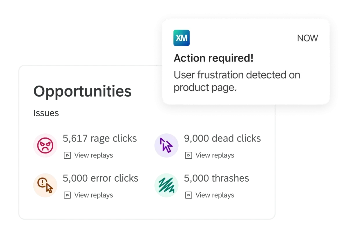
Identify and fix frustration signals like rage clicks, error clicks, dead clicks and mouse thrashes
Qualtrics DXA is a digital experience analytics solution that can produce rich user heuristics derived from session replay and smart user engagement scoring – along with powerful insights on what to do to improve user satisfaction.


