
What is user experience (UX) analytics?
If you own and operate a website or app, its user experience design is how you make it easy and simple to navigate. UX describes the characteristics of digital properties that make using them a breeze to use, in other words – which makes UX analytics the process of understanding and improving those characteristics and the user journeys they create.
UX analytics help you figure out where bottlenecks are in design and implementation – the things making people frustrated enough to leave your site or abandon a shopping cart – and make improvements.
As with every kind of analytical research, UX analysis is a long-term process. It relies on taking stock of where things are at now, making changes, and then seeing how trends improve before repeating the process.
Discover how to enhance the user experience with a digital analytics solution
What’s the business impact of understanding UX analytics?
With decades of web browsing experience and technological advances under their belt, the average consumer’s expectations for how websites or apps should behave are now sky-high.
Think about it: have you ever been frustrated by a site that fails to load, or has janky, unresponsive navigation? If something doesn’t work exactly as you want it to, in an instant, it usually feels out of step with the slickness of the phone or computer you’re accessing it on. And that causes frustration.
Left unattended, these are the kinds of issues that can cost companies thousands in lost sales. Adobe research, for instance, suggests that a massive 39% of consumers will stop engaging with a site if it takes too long to load, while HubSpot cites that 88% are less likely to return following a poor user experience.
Without UX analytics, you won’t know where these issues lie. And that’s an important point because most customers won’t tell you – they’ll just stop visiting. In fact, for every one customer that complains about a specific issue, 25 will have silently given up and taken their business elsewhere.
On the other side of the coin, successful UX analysis can be pretty transformative. It’s estimated that for every dollar invested in UX improvements, there’s an estimated $100 return on investment.
Understanding UX analytics tools
So how do you capture and understand people’s feelings about your UX? It’s a tricky science since people might not even be aware of their feelings and frustrations enough to verbalize them to you. The answer, then, often relies on using modern analytics tools that can understand and infer opinions from people’s actions.
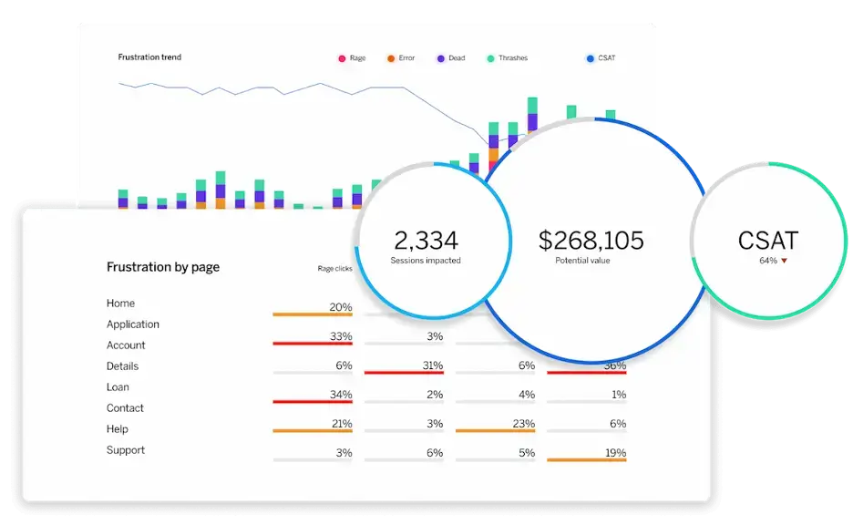
Qualtrics Digital Experience Analytics report showing user frustration signals by page in addition to key metrics – Sessions impacted, Potential value and CSAT
By tracking user behavior and assigning various values and points of meaning, UX analytics tools help website and app designers learn about what is and isn’t working – as well as highlight trends that can pinpoint why customer acquisition and retention aren’t where they ought to be.
These software suites are powerful assistants to UX and UI designers. They use a bunch of different tools to look at how users interact with your digital properties and spell out, in no uncertain terms, where their pain points lie.
What is a user experience dashboard?
The dashboard is the meat and potatoes of any good analytics suite. It’s where all the various heuristic and analytical signals are brought together into a snapshot that provides instant insight and an overview of trends.
Remember: If you’re on the hunt for a UX analytics suite, it’s super important to find one that can turn numbers into actionable advice – and it’s usually the dashboard that does it.
In UX terms, a good analytics dashboard will help you understand how things are trending by page or app section, visualize various data points, and see the full picture of online user behavior.
If you’re also using other analytics suites (like Google Analytics, for instance), you’ll want to opt for a UX analytics dashboard that can combine and collate information from those into one place, garnering you a macro-view of behavior across your digital properties.
Let’s look at UX analytics methods…
As with any kind of analysis, there are a bunch of different methods you can employ to get a better idea of the success of your UX design. Broadly, these fall into two categories: quantitative, or qualitative.
Some of these methods are indirect, some are direct. Some need to be proactively organized or managed, and some can be garnered automatically from digital analytics tools. The key difference is whether you’re acquiring data in the form of values or from actions and opinions.
Quantitative data capture methods used for UX analytics
Quantitative UX analytics data is numerical, which means it’s collected through means with specific, measurable parameters. Here are a few examples:
1. Web analytics
Most web analytics tools will be able to provide you with a good set of clues around UX performance, providing you can do a bit of detective work. For example, if you’re tracking page views and user journeys through your site but see a huge drop-off on one specific page, then you’ll know that there’s a UX issue to be tackled.
2. Pop-up surveys and user feedback widgets
It’s never a bad idea to solicit feedback from your users as often as you can without annoying them. Handled sparingly, pop-ups can be a great tool for this – you can use mini-surveys that simply ask customers for a 1-5 rating on various elements of your UX or digital design.
3. A/B testing
A/B testing lets you deploy two different versions of your site or app and deliver them to users randomly. This is really useful for testing out specifics. For example: does your site’s new nav bar funnel people toward your featured products more or less effectively than your old one?
Qualitative data capture methods used for UX analytics
Qualitative analytics methods provide insights based on behavior and opinions, which helps you understand the human side of the problem. The only downside? Without the right tools, it can be difficult to turn qualitative data into trends and patterns.
1. Interviews and focus groups
Data doesn’t come much more ‘qualitative’ than sitting down and asking real people what they think. While the results you get might be tough to turn into a pie chart, it’ll be invaluable insight that you can take straight to your design team.
2. In-depth surveys
These are the next step up from the pop-up 1-5 score-based surveys we mentioned above. If there’s space to add a text box, why not ask people what they think of your UX, and how they’d like to see you improve it?
3. Card sorting
Card sorting is an activity that asks participants to group various functions and sections of your website or app together to help you understand how they see their route to value. For example, while you may think that backpacks don’t belong in the same section as trekking poles, your customers might just see them both as ‘outdoor accessories’. Sometimes it’s difficult to see the wood for the trees when it comes to the user journey side of UX – focus groups and activities like card sorting can help you focus on what’s important.
Session replay: Bridging the gap
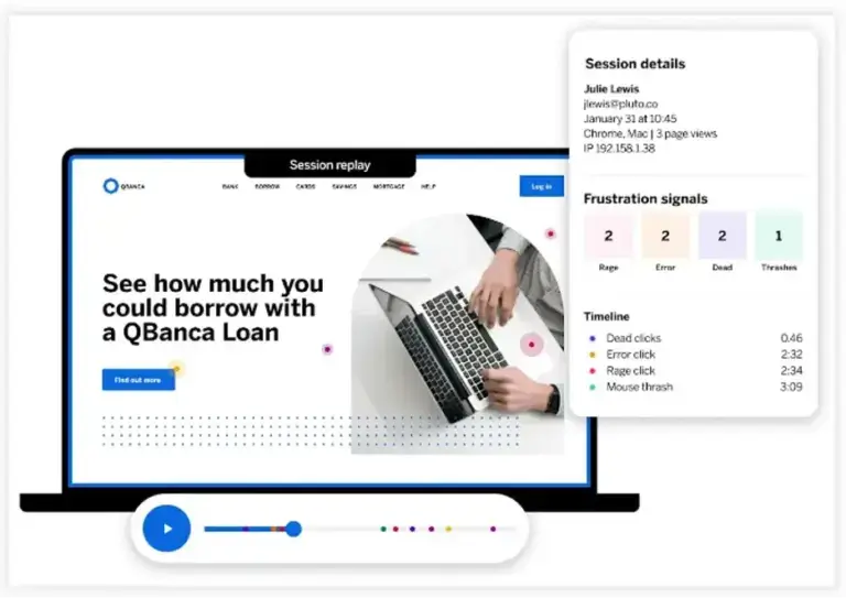
Session replay analytics report showing frustration signals for a specific user session
If you’re looking to capture qualitative and quantitative UX analytics at once, then session replay is the way to go. Session replay creates a visual reproduction of users’ journeys on your website or app, including a representation of mouse activity that includes a range of common activities:
Rage clicks
This is when a user interacting with your site clicks or taps the same area multiple times in a short spell, indicating that something either hasn’t worked or is taking too long.
Mouse thrashes
A mouse thrash is when the user moves their cursor back and forth quickly in irritation – again, this is usually because something has taken too long, or doesn’t what they expected
Error clicks
An error click is logged when the action doesn’t have the expected result, like a button not working, or a link being broken.
Dead clicks
Dead clicks are clicks on items of page furniture that have no interactive elements to them. Usually, this represents a UI misunderstanding, where a customer thinks something decorative is a button or will lead somewhere.
Ultimately, session replay helps you find the answers to three important questions:
- What are my customers trying to achieve?
- Are they able to achieve it easily?
- If not, why?
So what makes session replay both qualitative and quantitative?
Well, with software like Qualtrics’ Digital Experience Analytics solution, you’ll not only be able to see how people actually interact with your site in real-time, but you’ll be able to track trends and value-based data without having to watch thousands of sessions.
Remember: The right analytics tools should be able to turn data from multiple places into useful, actionable insight.
By capturing and understanding those key frustration signals, you’ll be able to act quickly to support customers, prevent lost revenue, and increase customer satisfaction. That way you can listen and understand every user’s experience without needing to ask a single question.
The impact that has is huge. It means you’ll be able to see and fix broken experiences in real time, improve conversion, and drive empathy.