
What is brand experience?
Brand experience refers to the holistic perception people hold about a brand, shaped by every interaction and impression.
From a logo or ad, to a conversation with customer service, to a user experience, to how the brand shows up in culture, and so much more – brand experience is the sum of them all. It’s what determines how we think, feel, and act toward the brands our lives cross with.
Brand experience is often confused as a marketing concept, but in reality it’s so much more. In fact, it can be a growth driver for an entire business – when properly understood and proactively improved.
Studies show that brand experience directly impacts customer satisfaction and loyalty. And that’s no surprise – when people consistently associate your brand with positive, distinctive experiences, they’re more likely to not only buy again, but also pay a premium and recommend you to others.
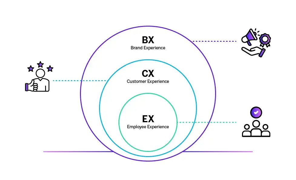
Brand experience vs. customer experience vs. employee experience
Although brand experience, customer experience, and employee experience overlap, they’re certainly not the same thing.
Customer experience centers on the quality of your customer journey and whether you, the brand, are meeting the expectations set by your brand experience. Employee experience shapes how engaged and empowered people inside your organization feel – which directly impacts the customer experience they deliver, and in turn reinforces (or undermines) the brand experience.
What fundamentally separates them both from brand experience is scope and directionality. Customer experience and employee experience focus on perspectives from specific groups, while brand experience serves as the foundational framework – the strategic boundaries and identity that define and shape what customer and employee experiences should be, rather than being shaped by them.
Brand experience also has a far greater scope in terms of impact: a strong brand experience doesn’t just shape repeat purchase, it attracts new customers, builds trust and creates resilience in competitive markets.
The core components of brand experience
A great brand experience doesn’t just happen.
It’s built on a clear brand promise – the expectations a company sets in the marketplace through every marketing activity, from advertising to pricing and packaging.
Brand experience is about defining and communicating the promise. Customer experience, in turn, is about proving that the promise holds true.
Brand promise
At its heart, the brand promise is the commitment a company makes to its stakeholders. It defines what people should expect every time they encounter the brand – not just in products or services, but in tone, behavior, and values.
A strong promise aligns all outward-facing brand activities – giving consumers a reason to believe, employees a sense of purpose, and prospects a reason to choose you over competitors. It sets the standard against which every interaction will be judged.
Take KIND Bars as an example. Their transparent packaging is part of the brand experience – not customer experience. It’s marketing, packaging, and positioning, all designed to communicate the brand’s promise of honesty and healthy ingredients to the consumer and convert them into a customer.
Customer experience as proof
Customer experience is the ‘proof’ side of the equation. Every customer touchpoint – from support interactions to product use – is an opportunity to validate what the brand claims.
The follow-up proof is almost instant in KIND’s case: the customer opens the wrapper, eats the bar, and finds that the ingredients, texture, and taste match the experience they were promised. In this instance, KIND is a great example of a brand bridging customer expectations and customer satisfaction.
While not always with such speed, this dynamic plays out across every brand. Brand experience sets expectations; customer experience delivers proof. When the two are positively aligned, brands build trust, emotional connection, and growth. When they aren’t, the result is often disappointment, distrust, and poor business outcomes.
In a crowded marketplace, the winning brands are those that align the promise they set with the experiences customers actually have – consistently and convincingly.
Free eBook: The Ultimate Guide to World-Class Brand Tracking
The psychology of brand experience: Building emotional connections
So, why does a positive brand experience leave such a strong impression on us? Unsurprisingly, the answer is rooted in human psychology.
As people, we don’t just buy products from brands; we buy how those products and brands make us feel. Those feelings shape our memory, influence our decisions and build trust – or distrust – over time. Researchers have found that customers with an emotional connection to a brand are far more valuable than those who are simply satisfied – spending more, staying longer, and recommending more often.
This is why brands that focus on creating positive emotional associations – adoration, appreciation, or trust – see stronger loyalty and higher lifetime value. Conversely, negative emotions such as frustration with a contact center, or disappointment at a lost delivery, can erode relationships very quickly.
The most successful brands deliberately design for emotional connection, ensuring that every interaction reinforces not only the functional benefits of the brand but also its deeper promise.
Done well, this turns consumers into customers and customers into advocates. It embeds loyalty and creates a compounding effect on business growth.
How customer experience connects with and extends brand experience
To understand the impact customer experience (CX) has on brand experience, think of the latter as an acquisition strategy and the former a retention strategy.
Brand experience shapes expectations in the market and builds psychological desire for your brand – even among people who aren’t customers yet. The goal is to create attraction and attachment, make your brand stand out in a category, spark preference, and drive consideration.
Porsche is a brand that excels at this. Many people aren’t Porsche customers – and lots never will be – but they aspire to be one. They’ll measure other cars against Porsche’s, carrying Porsche vehicles as a reference point in their minds. That’s brand experience at work.
Done well, CX then delivers on the promise that brand experience sets, ensuring that once people begin their customer journey, their experiences – like finally getting behind the wheel of a Porsche – reinforce the desire you’ve built.
When CX validates the expectations created by brand experience, it builds customer trust, loyalty, retention, and ultimately lifetime value.
How to develop a winning brand experience strategy
In today’s landscape, where consumer expectations shift quickly and competition is fierce, relying on instinct alone to create a positive brand experience simply isn’t enough.
You instead need to go back a step and create a brand experience strategy – the structure that determines exactly how you will consistently shape perceptions, build loyalty, and fuel growth. Without one, even the strongest brands are at risk.
Every brand’s strategy will look different – shaped by its promise, audience, and industry. But the path to building a great brand experience strategy follows four universal steps.
1. Form your brand foundations
Your foundations – purpose, mission, and core values – provide the anchor for a cohesive, consistent brand experience. They define the promise you’re making to consumers and set the standard for every interaction – giving clarity to your employees, direction to your marketing, and trust for your customers.
2. Understand where you’re at
To manage brand experience effectively, you need to know your starting point. This means understanding your target customers, mapping the touchpoints that influence their perceptions, and collecting feedback across them.
The right technology is key in getting this step right – specifically, tools that capture holistic brand health to give you a comprehensive view of performance across all data sources and in real-time.

3. Identify areas for improvement
Once you’ve captured where you stand, the next step is to spot the gaps between your promise and the proof you’re delivering. This could be inconsistent messaging, a confusing journey through your website, or touchpoints that frustrate rather than delight.
Data is again critical here: by analyzing feedback, uncovering patterns, and benchmarking against competitors, you can see where to focus your efforts for the biggest impact.
4. Measure and refine
Brand experience isn’t a one-off project. It’s an ongoing process of testing, learning, and improving.
Ongoing measurement is key to understanding if the changes you’re making are really moving the needle on your chosen key metrics. Insights should flow back into your strategy continuously, ensuring you evolve in line with your audience and market dynamics.
Remember, a winning brand experience strategy is always-on.
Brand experiences in the digital and physical worlds
Brand experiences today play out across two interconnected arenas: the digital and the physical.
These two worlds may be interconnected but they remain very different. Which is why – a lot of the time – creating brilliant digital and physical brand experiences demands separate approaches. The best brand experiences understand and act on this.
Designing digital brand experiences
From apps and augmented reality experiences, to email campaigns and social platforms, your digital presence defines how accessible, engaging, and consistent your brand feels.
The brands that excel in the digital domain understand that intuitive, tailored experiences are paramount – and leave users more likely to return and engage further.
Practical ways to strengthen digital experiences include:
- Designing simple, attractive, and mobile-first interfaces – and positive user experiences
- Using data to personalize content and recommendations for target consumers in real time
- Ensuring consistency across channels so consumers feel the same brand identity in an app as they do in direct marketing efforts
- Embedding feedback loops directly into digital touchpoints to catch and resolve friction quickly

Crafting physical and in-person brand experiences
In the physical world, experiences are shaped by environments, people, and tangible interactions. Whether it’s a flagship store, an in-person event, or even a boxed product, physical experiences offer opportunities to immerse existing and potential customers in your brand’s identity in a way digital can’t replicate – at least not yet.
That’s why the best physical brand experiences are particularly good at reinforcing the brand’s promise and creating unique memories for their audience.
Here are some practical thought starters for getting there:
- Creating environments that reflect brand values through layout, design, and ambiance
- Training employees to embody the brand in their behaviors, tone, and service delivery
- Using packaging, signage, or physical materials as storytelling tools that carry the brand into everyday life
- Gathering real-time feedback through kiosks, QR codes, or post-visit surveys to connect physical experiences back to insights
The importance of bridging these worlds
While different, it’s crucial to acknowledge that the digital and physical aren’t separate universes – they’re two sides of a single journey. Consumers move fluidly between them, often starting in one and finishing in the other.
Someone might discover a brand through a social media ad, read reviews online, and then head into a store to try the product. Or they might experience the brand in person at an event, then later deepen their engagement through a community platform or social media account.
The most successful brands ensure continuity between these worlds. They apply the same principles of usability, aesthetics, and personalization across every touchpoint so consumers feel the same brand identity no matter where they are – while ensuring a seamless handoff between digital and physical.
When a consumer sees alignment between digital promises and physical delivery, the brand feels reliable and authentic. On the flip side, gaps between the two – like a polished digital presence paired with poor in-store service – erode credibility fast.
How to measure brand experience: Key metrics and tools
Turning what is a broad concept into something tangible that can be managed and improved, measurement is the backbone of effective brand management and any cohesive brand experience strategy.
Without it you don’t know whether your brand promise is resonating, which touchpoints are strengthening or weakening perception, or how your efforts compare with competitors.
We can break brand experience measurement down into several metrics that, together, provide a clear picture of brand health and highlight where to take action:
- Brand awareness: How many people recognize your brand, recall it unaided or can identify it when prompted.
- Brand associations and attributes: The values, qualities, and emotions people connect with your brand – whether they see you as innovative, trustworthy, ethical, premium or something else.
- Perceived quality: How consumers judge the reliability, performance, or appearance of your offering versus expectations and competitors.
- Brand desire: Repeat purchase intent and willingness to recommend are indicators that show whether people will stick with you over time – as is Attitudinal Brand Equity. This is a survey-based measure of brand strength that captures the psychological desire people have for a brand, independent of their actual buying behavior. Using a Zipf distribution model, it ranks consumers’ preferences across all relevant brands and predicts how they’re likely to distribute their share of wallet – making it a strong predictor of future purchase probabilities and market share.
- Preference and usage: Whether consumers actively choose your brand over competitors, and how frequently they buy or use your products.
- Digital and social metrics: Website traffic, conversion rates, engagement on social channels, and sentiment expressed in online conversations.
To best capture these metrics and generate actionable insights from them, you need tools that can connect the dots across multiple sources.
The Qualtrics® Brand and Communication Research solution does this all through a single platform – integrating survey data with unsolicited feedback from social, search, and customer experience channels, to create a comprehensive view of brand health.
It enables organizations to track their brand across every channel, benchmark against competitors, and evaluate the real impact of campaigns by comparing perceptions before and after launch.
AI-powered sentiment analysis helps uncover how people truly feel, while dynamic dashboards make it easy to spot trends and act on them quickly. And by capturing both structured and unstructured data, Qualtrics Brand & Communication Research allows brand leaders to understand not just what consumers say, but also the emotions and behaviors behind those responses.
Common pitfalls in brand experience management
Spanning countless touchpoints, mountains of consumer data, and influenced by cultural context as much as by marketing campaigns, it’s safe to say that brand experience is complex.
That’s why, even with the best intentions, many organizations fall into traps that can undermine an otherwise excellent brand experience.
Avoiding these pitfalls is just as important as pursuing best practices – because missteps in brand experience can damage trust far quicker than they build it. Below are some of the most common mistakes organizations make when managing brand experience, and why they matter.
Crossing the line from helpful to intrusive
Collecting customer feedback and personal data is critical for shaping brand experiences that leave a lasting impression. But when these efforts cross the line into intrusive, even the best advertising campaigns and marketing communications can be received poorly.
Over-surveying consumers, asking for information that feels irrelevant, or using personalization that’s too granular can feel unsettling rather than helpful. The goal is to build trust, not erode it.
Forgetting inclusivity
We should all know by now that accessibility isn’t optional.
Across both digital and in-person settings, experiences that fail to account for people with different needs could be excluding members of your loyal customer base – alongside anyone those customers interact with.
From poorly designed websites that don’t work with screen readers, to physical environments without adequate access, these gaps create barriers that damage both brand perception and reach.
Designing for accessibility from the outset not only broadens your key audiences but also signals that your brand values inclusivity.

Delivering mixed signals
An increasingly common and easy trap to fall into in the digital age: a brand that feels polished in one channel but disjointed in another.
Consumers expect the same tone, aesthetics, and level of service whether they’re browsing a website, engaging with your digital marketing, walking into a store, or contacting support.
Inconsistent experiences are ultimately disappointing – weakening the brand promise and making it harder to build lasting connections.
The future of brand experience
The way brands create and manage experiences is of course changing rapidly.
Here are two major shifts that are reshaping the landscape right now.
AI as a catalyst for brand experience
Artificial intelligence (AI) is opening new possibilities for both how brands engage with consumers and how they understand them.
On the experience side, AI is already powering hyper-personalized recommendations, dynamic content, and conversational interfaces that adapt in real time to consumer needs. From predictive product suggestions in e-commerce to AI-driven creative that tailors campaigns for specific segments, the technology may be in its relative infancy but is already transformational – enabling levels of relevance and convenience that were previously impossible.
Behind the scenes, AI is also transforming how brands gather and act on insights. Instead of relying solely on periodic surveys, AI is making it possible to analyze vast amounts of structured and unstructured feedback – from social media, search, reviews, and direct interactions – to detect patterns in perception and emotion at scale.
At Qualtrics, we combine AI-powered sentiment analysis with dynamic dashboards – allowing brand leaders to see how campaigns are landing, benchmark against competitors, and adjust strategies quickly with confidence.
Navigating a fragmented marketplace
If AI is the enabler of greater personalization, the environment it operates in is becoming more complex – and fragmented. Shared cultural touchpoints that once united large audiences are fading; symbols, ideas, and even language resonate strongly with some groups, while alienating others.
The challenge for brands is to maintain a strong core identity – a set of values and promises that remain authentic and consistent – while adapting how those are expressed to resonate with different tribes, platforms and contexts.
That might mean using different cultural references, creative styles, or community-led activations for different audiences – without ever losing sight of the brand’s unifying essence. It’s a delicate balance: too much fragmentation risks diluting the brand; too little flexibility risks irrelevance.
As it becomes more difficult for brands to capture the full spectrum of sentiment across diverse communities, extra importance will go on brand management tools capable of pulling together omnichannel data and synthesizing it into coherent insights.
The brands that manage to stay relevant in an increasingly fractured cultural landscape will be those that can see across silos and act with nuance.