-

Qualtrics Platform -

Customer Journey Optimizer -

XM Discover -

Qualtrics Social Connect
Understanding Statistics
About Statistics
Welcome to Qualtrics Statistics. This is an overview of basic statistics that may be useful to you as you create and analyze projects in Qualtrics. We are going to cover some basic statistical concepts, apply them to the platform, and discuss some further options outside of Qualtrics.
Quantitative and Categorical Data
There are 2 types of data: quantitative and categorical.
Quantitative data is assessed on a numerical scale. Examples of quantitative data include age, height, or income.
Categorical data is assessed on a nominal scale. Examples of categorical data include gender, marital status, or occupation. Most data collected in a survey is categorical, where a count of the number of respondents that fall in a category is obtained.
Measures of Center
There are 3 measures of center used for quantitative data: mean, median, and mode.
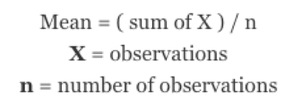
The mean, or average, is the best measure of center when data is roughly normally distributed or looks like a bell curve. The mean is found by summing all of the observations and dividing by the total number of observations.
The median, or middle value, is a good measure of center when data appears to be skewed. If you line up all of your observation in order, the median is the middle value.
The mode is the value that occurs most frequently in your data. It is not as commonly used as either the mean or the median.
Measures of Spread
There are a few useful statistics to measure the spread of your data: standard deviation, variance, and range.
A standard deviation is the average distance of the observations from their mean. Like the mean, a standard deviation should be used with roughly normally distributed data.
The variance is simply the standard deviation squared.
The range is the difference between the largest and the smallest value.
Statistics in Visualizations
A Statistics Table visualization in Qualtrics displays the minimum value, the maximum value, the mean, the variance, the standard deviation, and the total number of responses.
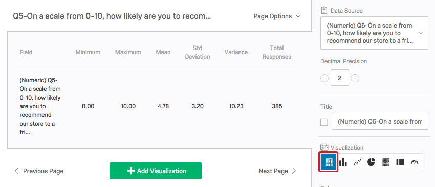
Since a value is coded for each response option in every question, Qualtrics will find these statistics whether the data is quantitative or categorical. It is up to you to decide if these statistics make sense in the context of your study.
For example, you could ask respondents what their favorite color is: red, yellow, blue, or green, coded as 1, 2, 3, and 4 respectively. Qualtrics will give you a mean, but it doesn’t make sense to have an average favorite color.
If you had respondents rate movies on a scale from 1 to 5 stars, a mean would be useful. Means like 2.98 stars or 4.32 stars make movies easy to compare.
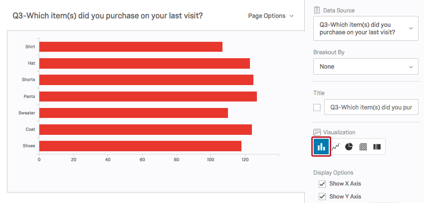
Qualtrics offers a variety of charts, graphs, and tables. A Bar Chart shows the frequency of responses in each answer choice category.
A Pie Chart shows these frequencies as a percentage of the pie.
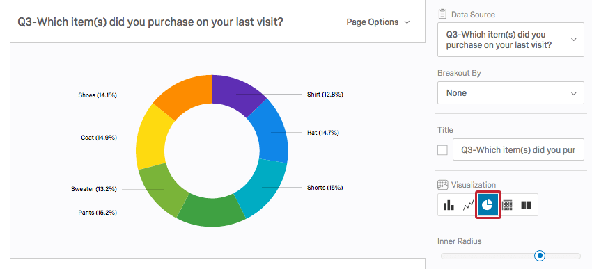
Both Bar Charts and Pie Charts make comparing the frequencies between categories very easy.
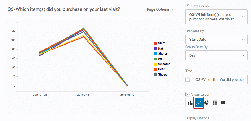
A Line Chart is a 2-dimensional scatter plot for ordered observations. It is a good way to see trends over time.
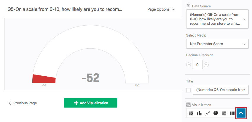
A Gauge Chart compares a chosen metric (e.g., average, sum) to a scale. Depending on the where the metric falls, the scale changes color. Gauge Charts are helpful for quickly comparing a value’s expected performance versus its actual performance.
Cross Tabulations
1 way to analyze categorical data is through a cross tabulation, also called a contingency table or a 2-way table. A cross tab records the number of respondents that have the specific characteristics described in the cells of the table.
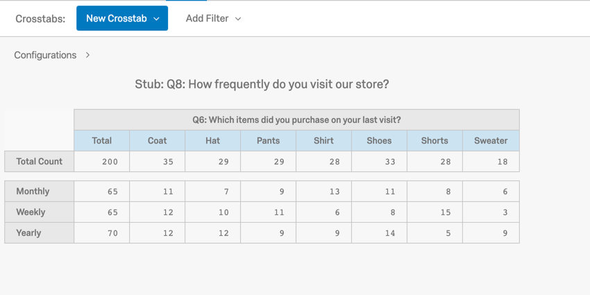
In this example, you can see the number of each item type that was purchased weekly, monthly, and yearly (e.g., 11 coats are purchased monthly).
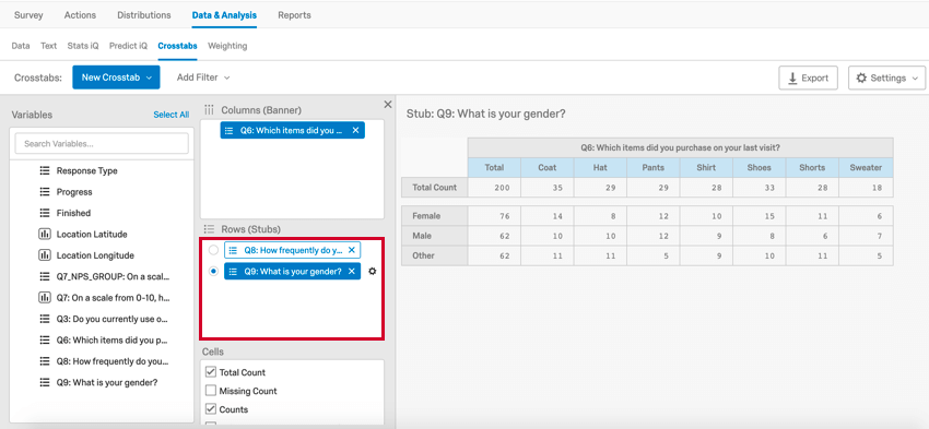
A cross tab consists of columns and rows, or banners and stubs, respectively, where each banner and stub pulls in frequency data from a question. Qualtrics will only allow you to select questions that are compatible for a cross tabulation (e.g., open ended text entry questions are not compatible with a cross tabulation). If you select multiple banners or stubs, you can select which banner or stub you’d like to view by clicking them in the cross tab editor. If you add a multilevel drill down to your cross tabulation, 1 variable will appear as a subcategory of another.
Chi-Square Test Statistic
The chi-square test statistic tests for significant relationship between a stub and a banner.
If you include multiple stubs and banners in your cross tab, Qualtrics will also produce multiple chi-square values, 1 for each banner and stub combination.
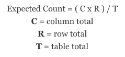
It is beneficial to know how a chi-square test statistic is calculated. First, you need to find the expected count for each cell, or the count you would expect the cell to have based on the row total, column total, and table total. To find an expected count, take the row total times the column total and divide the result by the table total.
Once you have the expected count, perform the following calculation:
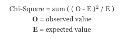
The chi-square test statistic is found by taking the observed value minus the expected value, squaring this difference, and dividing it by the expected value for each cell. These individual chi-square test components are then added together and the result is the chi-square test statistic. The chi-square value is then used to determine if the relationship between your variables is statistically significant.
P-Value
The chi-square test statistics, together with the confidence level, are used to find a p-value. A p-value determines whether the association between the 2 variables is statistically significant. A low p-value means that the observed table relationship would occur with very low probability, so there’s a significant relationship between the 2 variables. A low p-value is generally considered to be a figure less than .05.
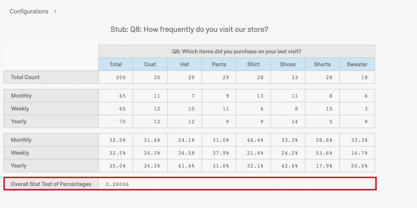
Our p-value is .28, which is not significant. Therefore, there is no relationship between frequency of visit and type of item purchased.
Additional Analyses
Further analysis for quantitative data, such as correlation and regression, can be taken to Excel or a statistical software package.
Correlation
The correlation coefficient, r, describes the strength and direction for a roughly linear relationship between 2 quantitative variables. The value of r always lies within -1 and 1, where values closest to -1 and 1 represent a strong correlation and values close to zero are weak. The plus or minus sign indicates the positive or negative direction of the relationship. Correlation values between -.3 and .3 are considered rather low, while correlation values between .7 and 1 or -.7 and -1 are considered to be high.
A key point to remember is that correlation is not the same as causation. Just because 2 variables are highly correlated does not mean that 1 of these variables causes the other 1 to occur.
Regression
Regression analysis can be used to make predictions for 1 variable based on 1 or more predictor variables. See the following pages for more help on regressions: