
Funnel Widget (BX)
What's on this page
About the Funnel Widget
Funnel widgets are a type of widget that only appear in Brand Tracker projects. They display the proportion of people that have different levels of interaction with a brand. For example, this widget can help you gauge how many people are aware of the brand versus how many people regularly use a product from that brand.
Qtip: There should generally be one Funnel widget per brand. If you want to look at data across multiple brands and compare, you should look to the competitive and trending charts that are also included in the premade Brand Tracker dashboard.
Interpretation
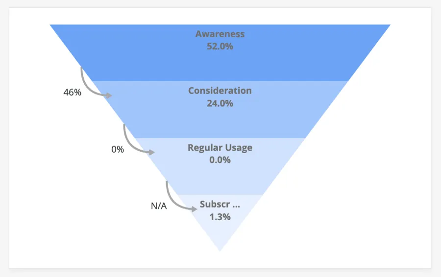
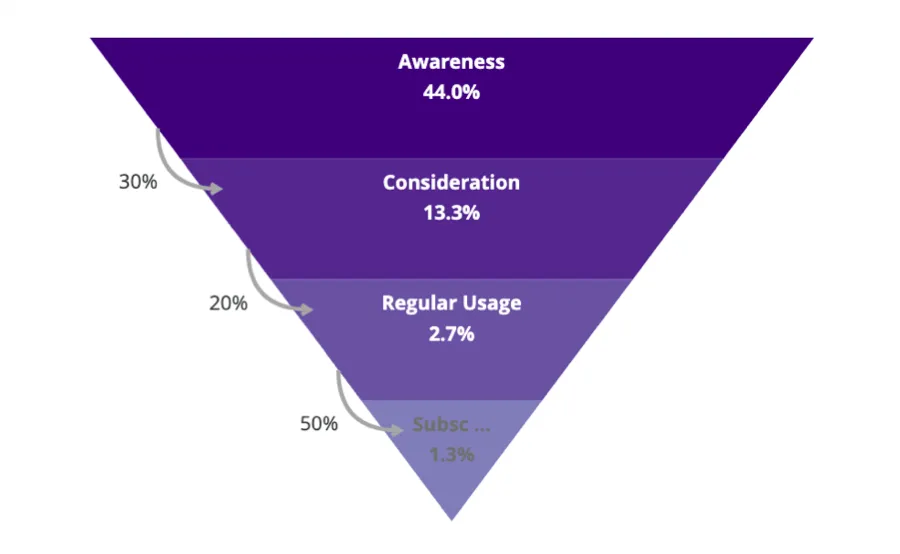
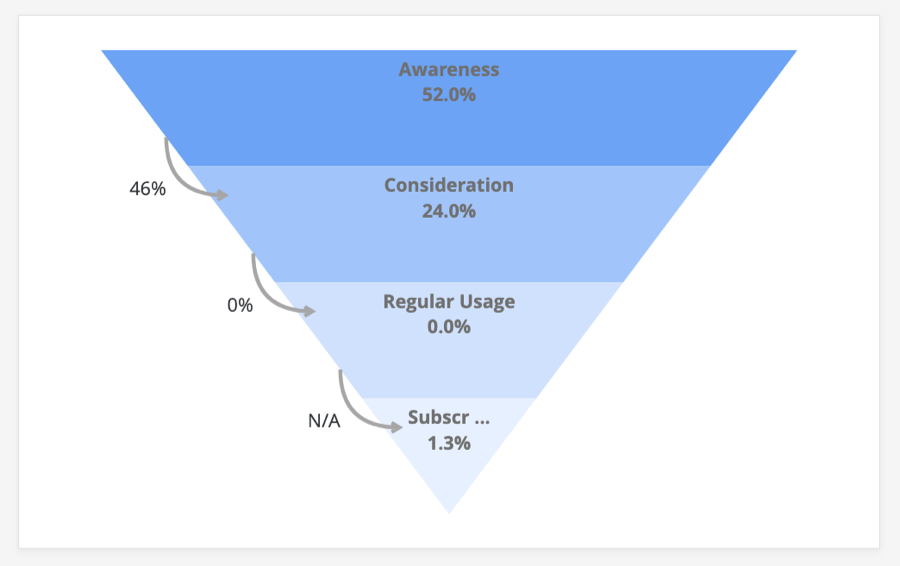
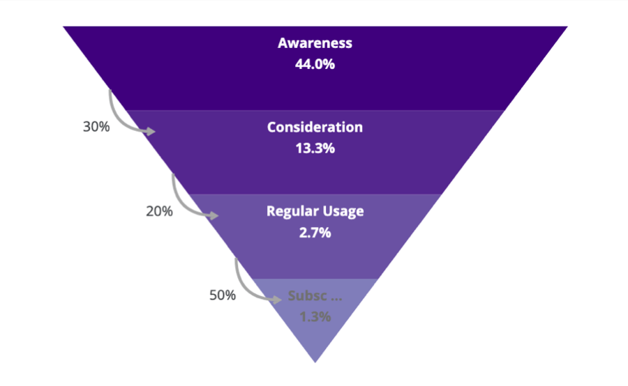
Funnel widgets are named for a concept called the Brand Funnel. The Brand Funnel is a phenomenon that measures the relationship between your brand and the customer, allowing you to assess the dropoff of a customer population from one level of brand interaction to the next.
For example, lots of people may know the name of your brand and what it sells (awareness); but fewer people will consider you when they’re making a purchase for that same domain, and fewer still will prefer your brand or feel deeply loyal to it over others in the same domain as regular users. The purpose of a funnel widget is to help you understand both the proportion of these populations and dropoffs as your brand attempts to convert more prospects into loyal customers.
Survey Setup
Before you design your survey or collect data, it’s important to think about what you want your brand funnel to look like.
See Conversion Funnel Reporting for guidance on the different kinds of funnel questions you can include, what brand trackers set up for you, and what your survey setup should look like if you’re adding any customization.
Dashboard Data Requirements
The Funnel widget was designed with multiple choice in mind. The Brand Tracker project will generally set up your data for you. However, if you have questions on how this has been prepared, or have customized your own Brand Tracker setup, see Data Mapping on the Conversion Funnels Reporting support page.
Widget Setup
Brand Funnels should only ever display data for one brand at a time. In these steps, we’ll go through the example of adding our demo brand, MusiQ.
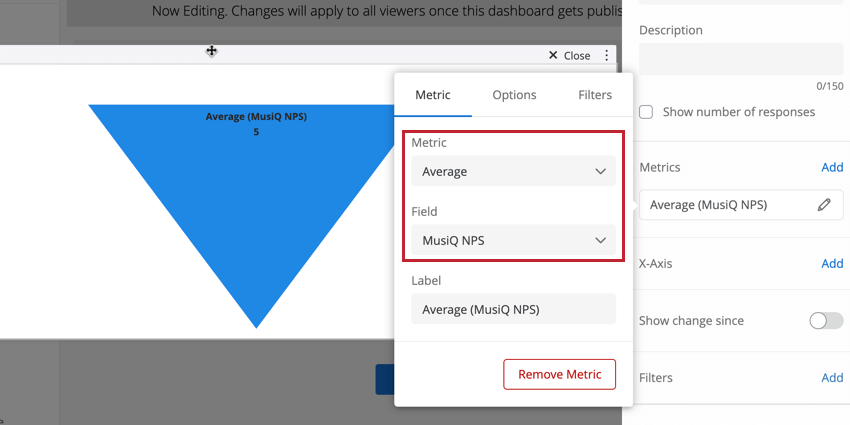
Example 1: We used multi answer multiple choice questions. I choose the relevant question, then choose the brand MusiQ.
Example 2: We had to set up special Embedded Data. I find the MusiQAwareness field, and select the value 1. See Data Preparation for more details on when these Embedded Data might be used.
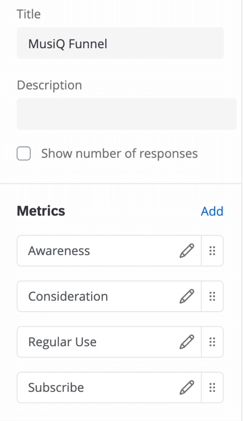
Qtip: You should order your metrics in the logical order of our funnel, so start with the broadest metric (usually awareness).
Qtip: If you haven’t mapped your Embedded Data field, that Embedded Data field will not appear in the metric list. You need to first set up labels as described in Data Mapping.
Qtip: If you haven’t grouped together top 2 box or similar in the survey, then you will need to either update the survey and dataset to do that (see Survey Set Up), or recode the values in the mapping (see FAQs).
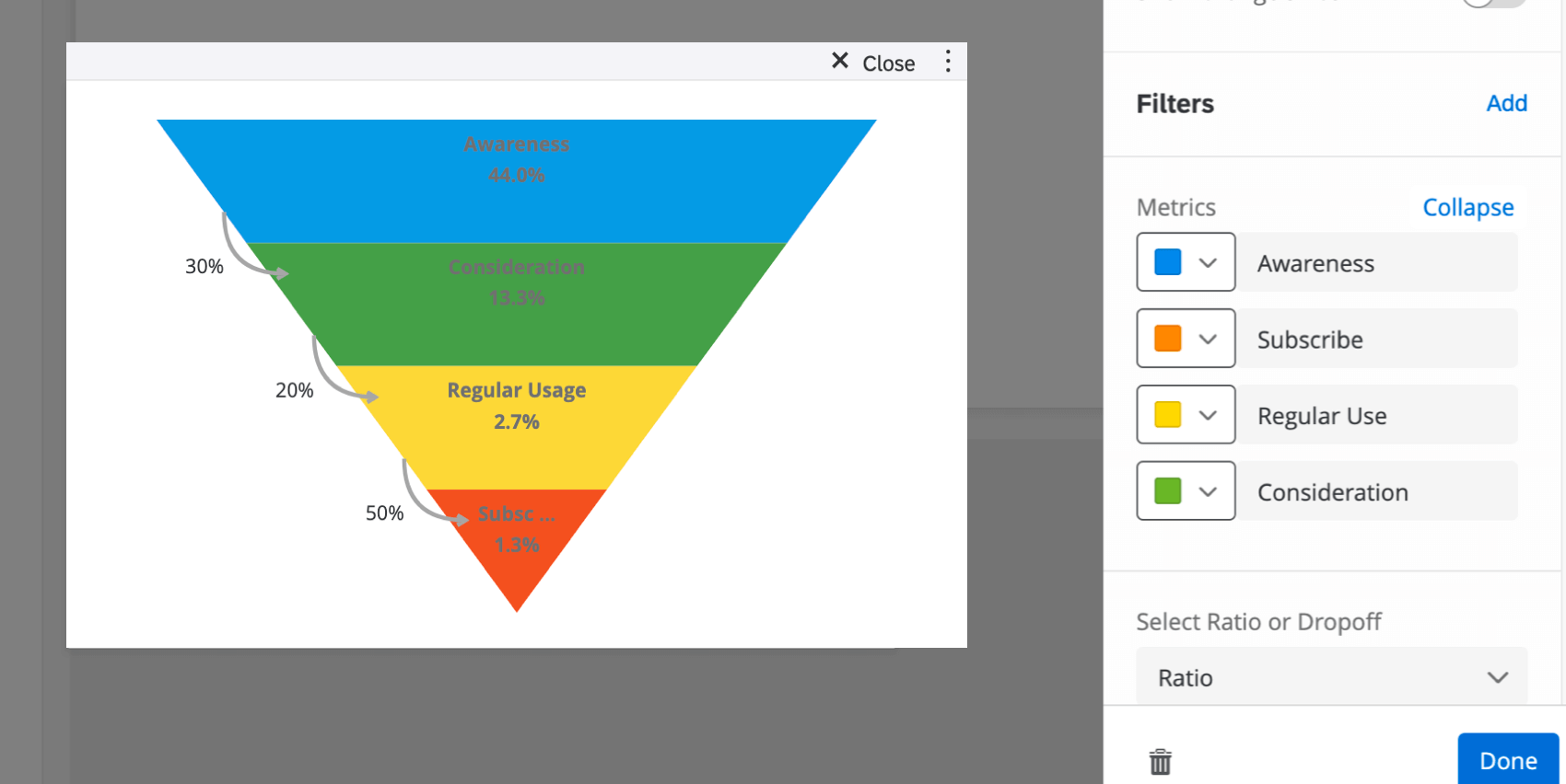
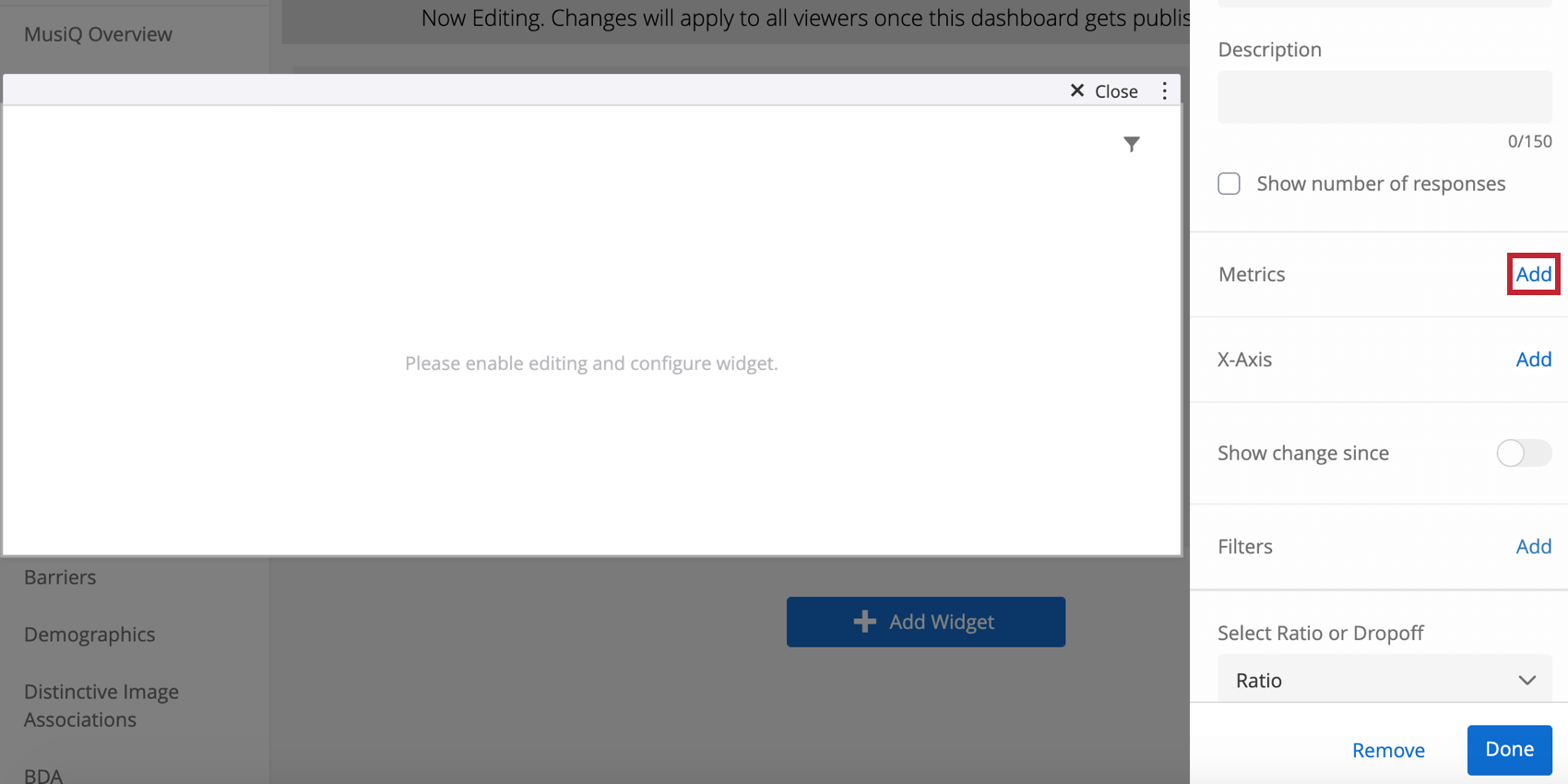
- Ratio: More common choice. How many are added onto each level.
- Dropoff: How many are lost at each level.
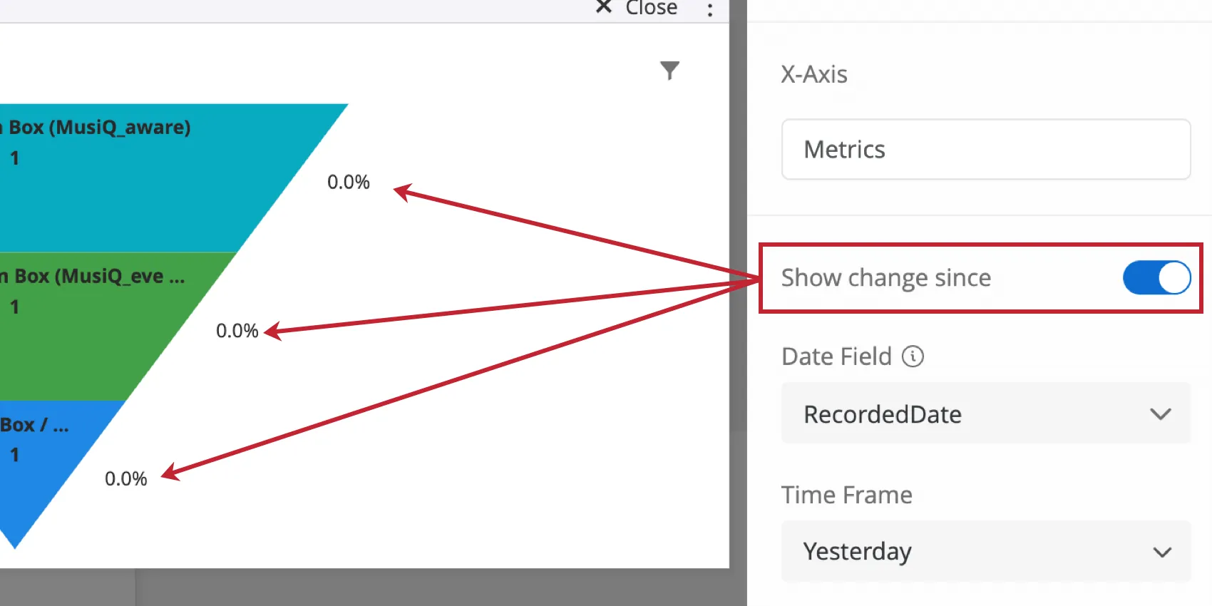
Show Change Since
The Show Change Since toggle lets you see how your field values have changed over time. After enabling this toggle, select the field to be used as the date, and the time frame you are interested in. The associated change will appear in your widget next to each field.
Qtip: Note that the percentages decrease as the funnel narrows, a sign of the logical order of the levels. If you’ve set up your widget and the percentages don’t get smaller, consider why.
Qtip: If a funnel level says N/A, that means that the entire population has dropped off, meaning there is no change left to calculate.
Additional Options
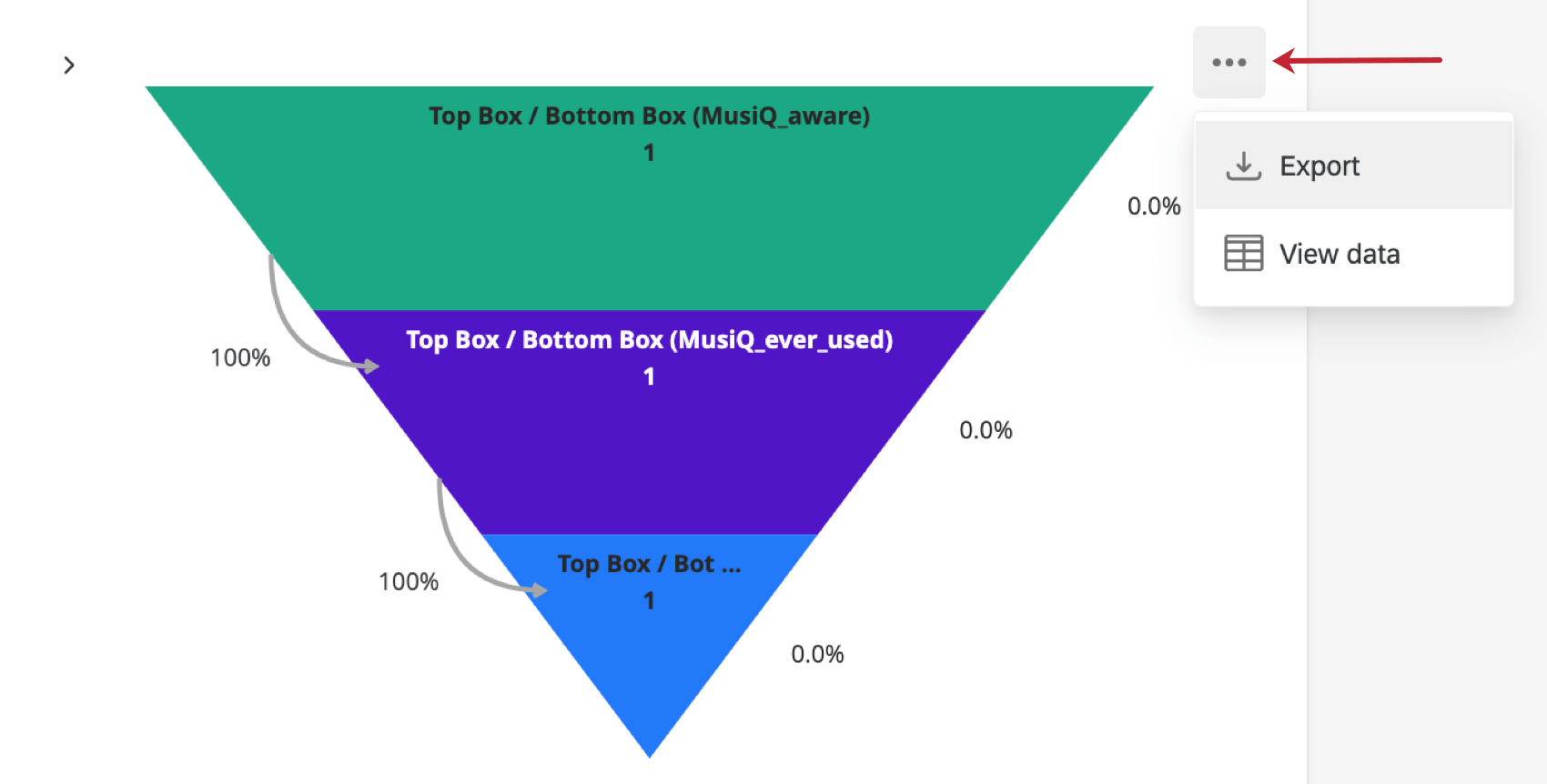
Click on the three horizontal dots in the top-right corner of your widget to view additional options.

- Export: Export your widget as a JPG, PDF, CSV, TSV.
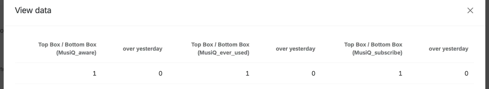
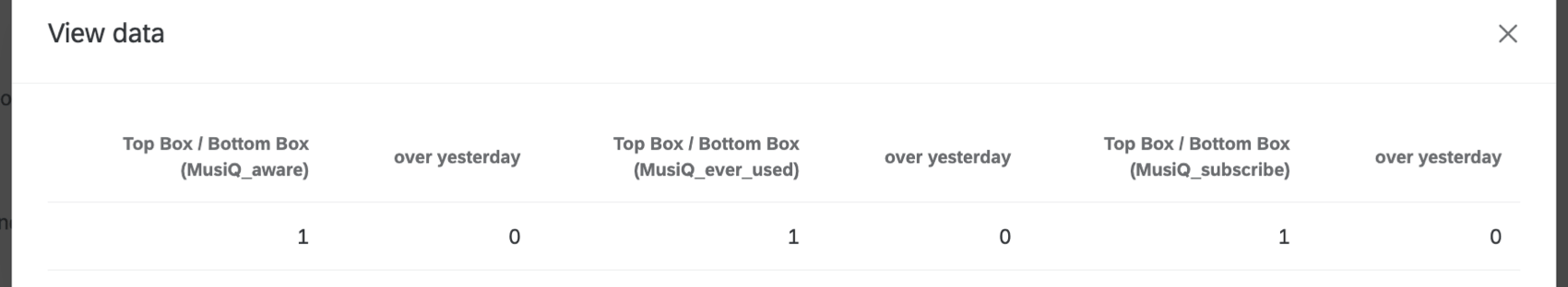
- View data: View a table containing all the data in your funnel.
FAQs
How do custom metric filters interact with page filters in BX dashboards?
How do custom metric filters interact with page filters in BX dashboards?
That's great! Thank you for your feedback!
Thank you for your feedback!