-

Qualtrics Platform -

Customer Journey Optimizer -

XM Discover -

Qualtrics Social Connect
Simulating Packages
About Simulating Packages
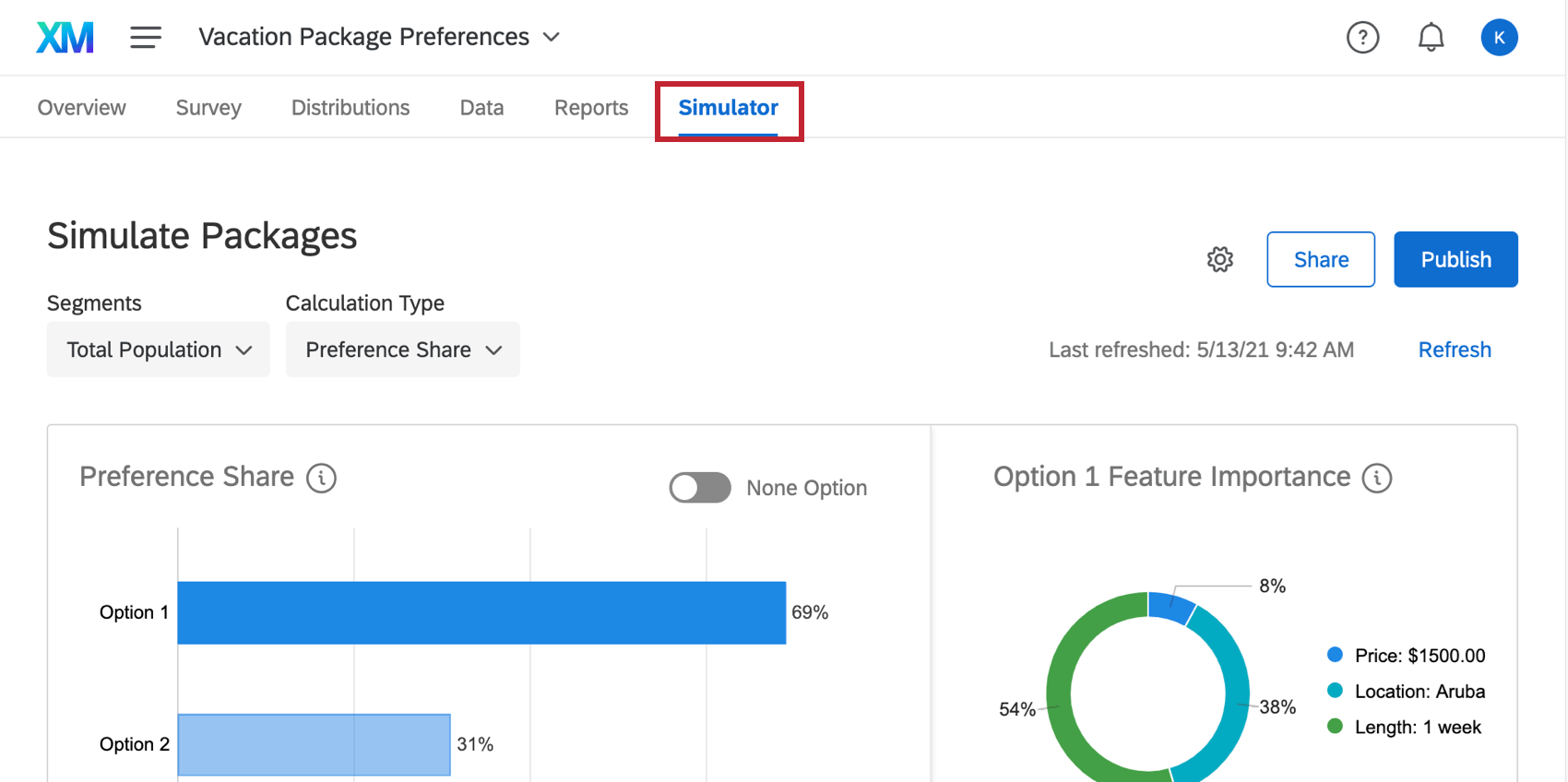
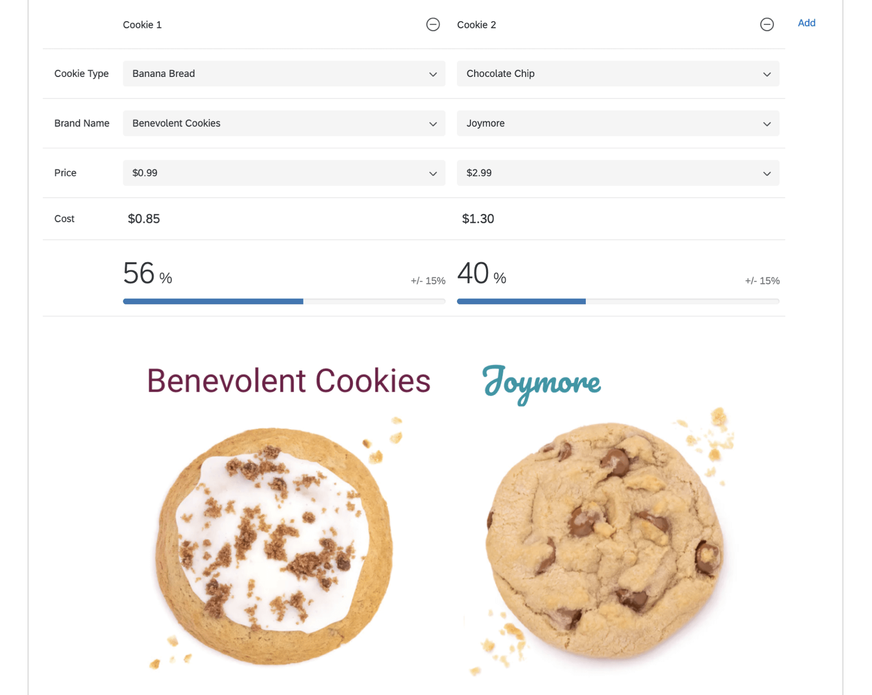
The Simulator tab allows you to simulate how respondents would react to different packages. By default, it tries to display the two packages with the highest contrast as Option 1 and 2, but it is important to adjust the simulator to get a better idea of the impact each package will have in comparison to each other.
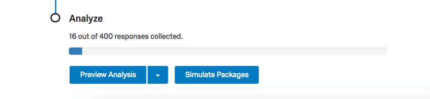
Qtip: You can also access the simulator from the Overview tab, by clicking Simulate Packages.
Qtip: The Simulator tab is only available in Conjoint projects. It is not available in MaxDiff.
Simulating Different Packages
In order to get the most out of your simulator, you will want to adjust the packages and see how the preference share adjusts. Packages with higher preference share are more favorable. The greater the contrast between Option 1 and 2, the better.
On the bottom of the page, select different features for each option using the dropdowns. If you’d like to compare more than two packages, click Add.
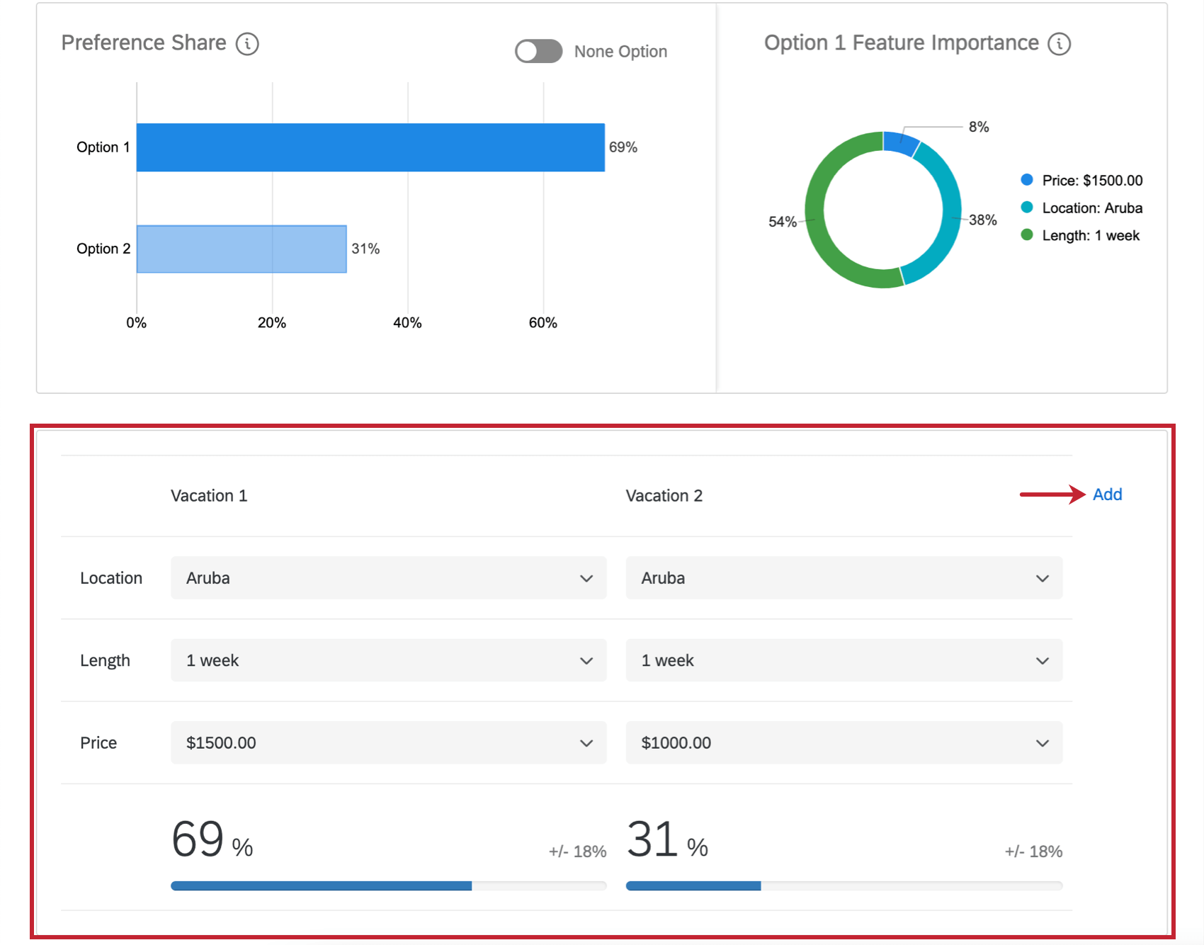
See how the preference share and feature importance graphs adjust based on the addition of a new option.
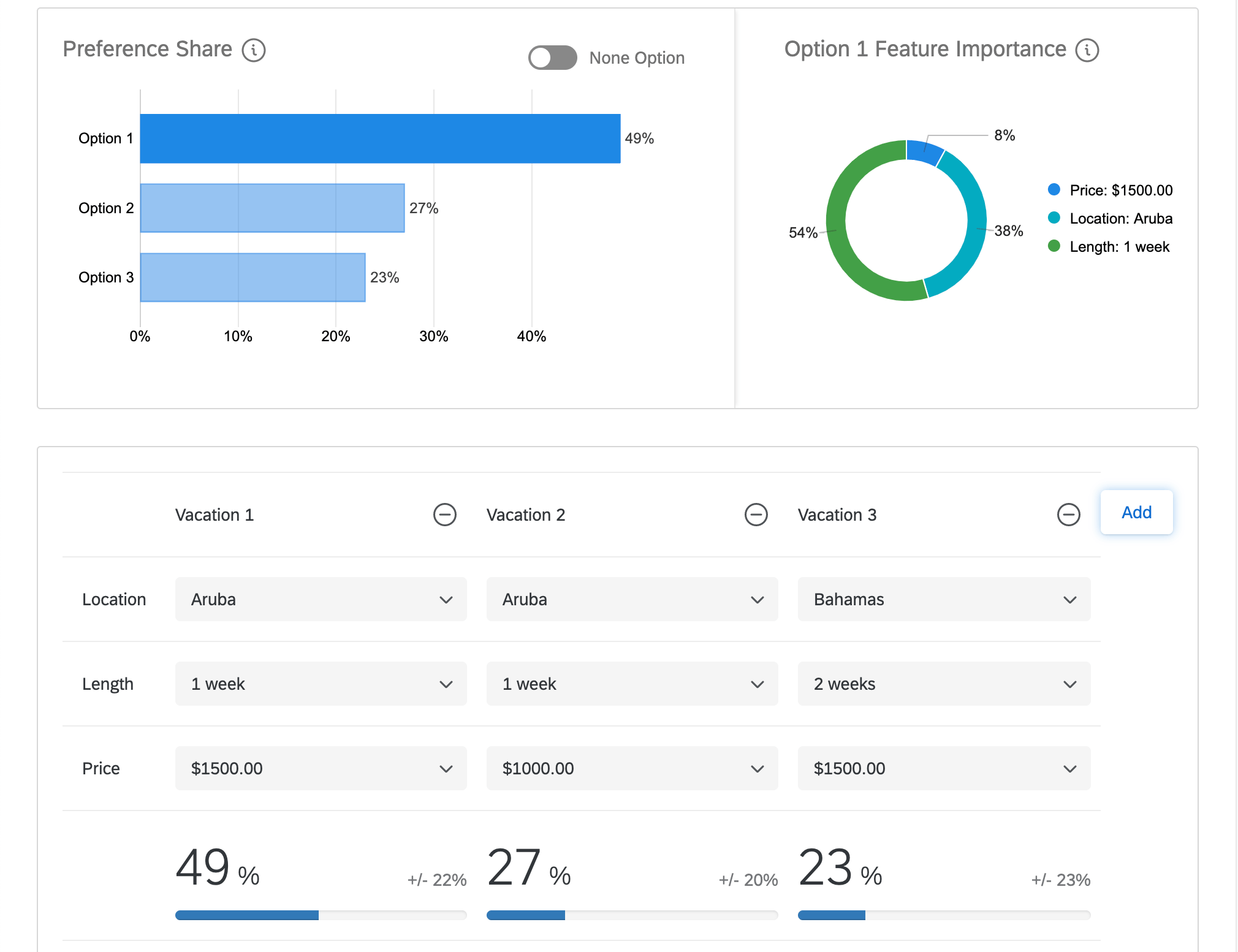
As you make adjustments to number of options or what’s included in each option, the percentage below each option will change. This percentage is called the preference share and is explained more in the next section.
Preference Share and Feature Importance
The graphs in the simulator display two different measures.
- Preference Share: The share of total preference/utility being created by the packages being tested in the simulator. The better performing a package will be for your customers, the more preference share it will control. (The higher the percentage in the bar graph.)
- Feature Importance: The feature importance here, in the simulator, is the amount of preference share being contributed by each of the individual features. The greater the feature importance score is for an option, the more it added to the option’s preference share in comparison to the other features.
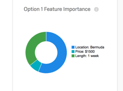
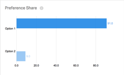
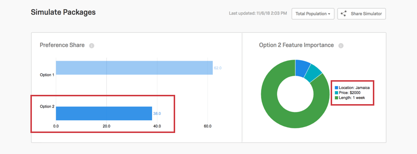
Selecting an option in the preference share bar graph to the left adjusts the feature importance displayed in the pie chart to the right.
Example: Option 1 was selected in the bar graph to the left. Option 1 is a vacation in Bermuda for 1 week that costs $1500. In the pie chart to the right, we see the feature importance for the location of Bermuda, the price of $1500, and the duration of 1 week.
Now, Option 2 is selected in the bar graph. Option 2 is a vacation in Jamaica that costs $2000 and lasts 1 week. The pie chart now displays the importance of the location of Jamaica, the price of $2000, and the duration of 1 week.
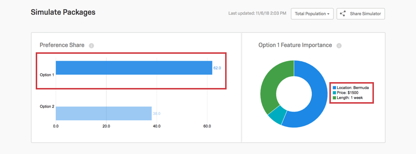
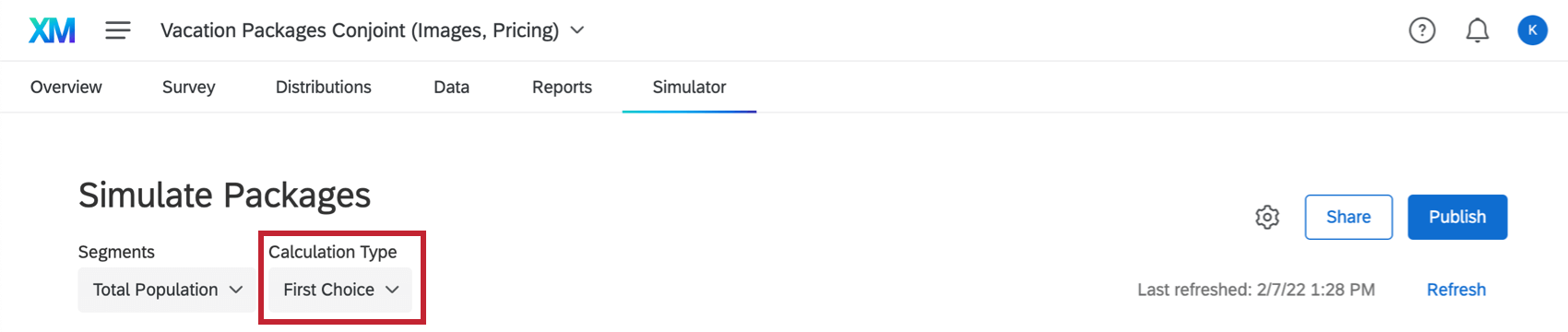
First Choice
If you switch Calculation Type to First Choice, you’ll be able to see what respondents are most likely to select as their first choice. This model assumes respondents will select the package with the highest utility.
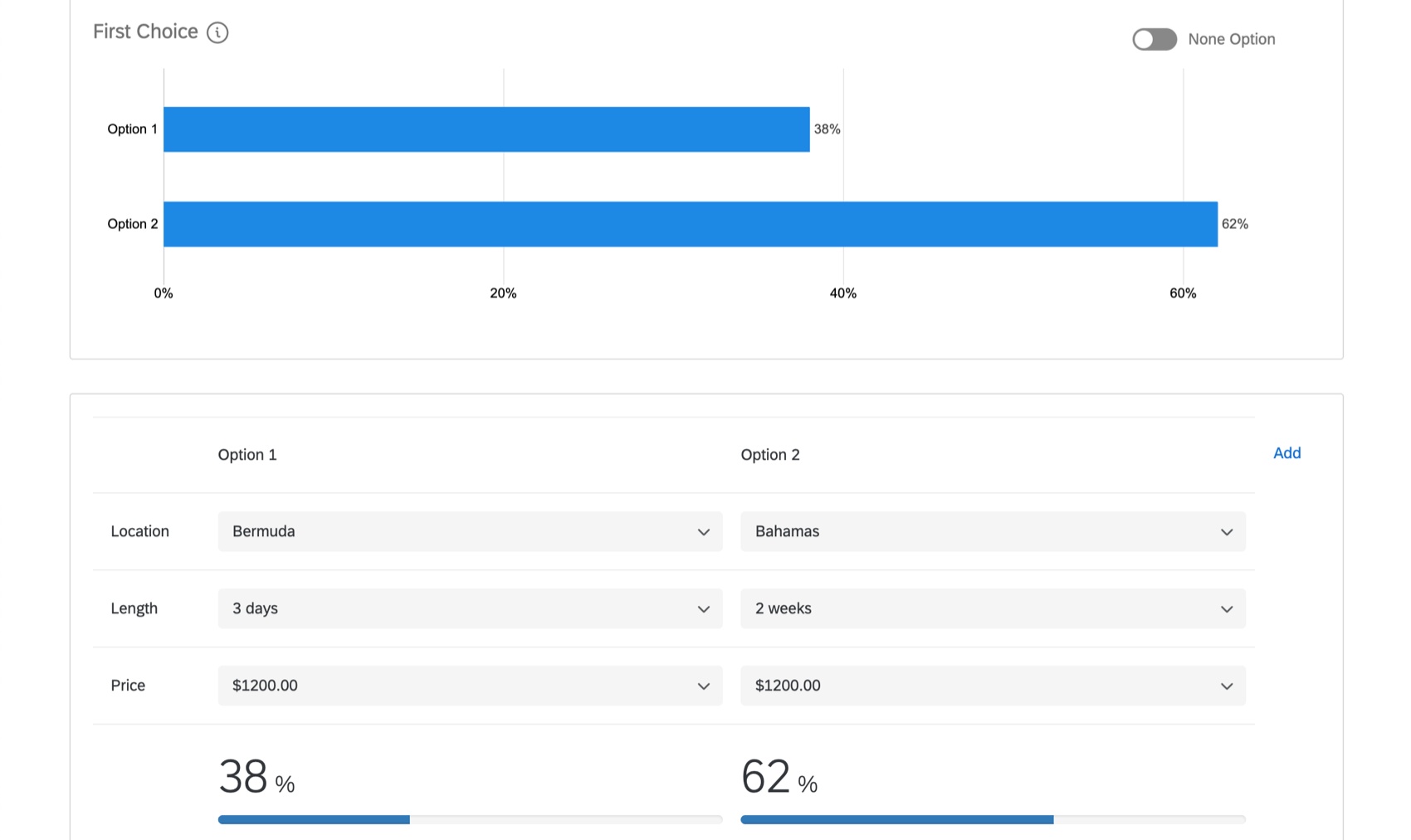
Make adjustments to your packages to see what percentage of your respondents are more likely to select a given option as a first choice. The calculation is determined by the total preference or utility being created by the packages present in the simulator.
Example: In the screenshot below, we see 62 percent of respondents are likely to choose Option 2 as their first choice.
There is more information available on first choice in the Reports section.
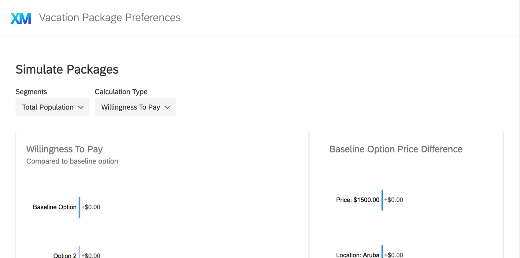
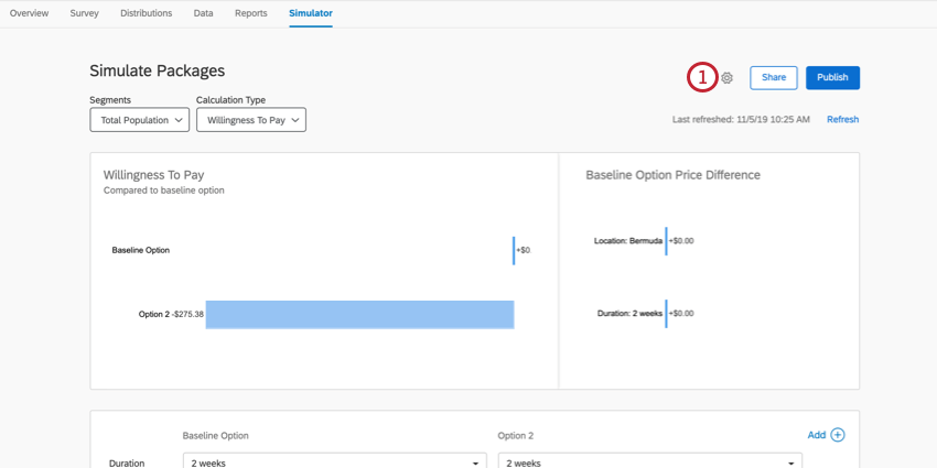
Willingness to Pay
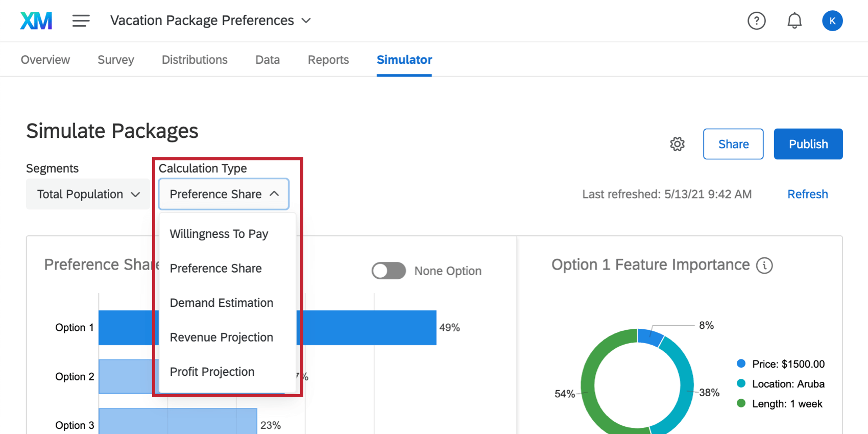
When you switch your calculation type to willingness to pay, you will no longer see reports in terms of Preference Share and Feature Importance. Instead, you can compare what respondents are willing to pay for different packages.
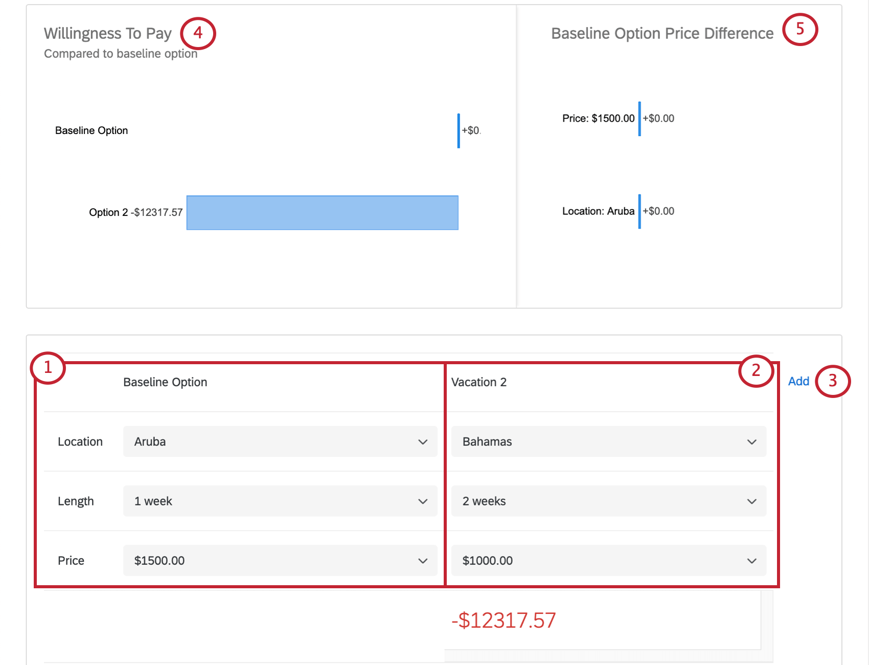
- The first package acts as the Baseline. This package is the basis of comparison against any other options you include.
- Option 2 is the package you want to compare your baseline to. As you modify this package, how much more or less your respondents are willing to pay for Option 2 than the baseline will be represented by the number shown beneath Option 2.
- Click Add to compare your baseline to more packages.
Qtip: Note that Option 3 will be compared to the baseline, not Option 2.
- This graph displays how much more or less your respondents are willing to pay for Option 2 than the baseline. The baseline is represented with a price of 0, and Option 2 is represented by the difference between the two.
- If there are major differences between what the respondent is willing to pay for different features in the baseline package, they will be represented in the Baseline Option Price Difference chart. In this example, there is not a major difference in what respondents would pay for the material or the color combination of this product – they just prefer to pay more for this product overall.
Demand Estimation
Qtip: To use this report, your conjoint project must contain the below:
- Your conjoint project contains either a “none” option or dual choice option. These types of questions are crucial in an effective price study project because it gives the customer the opportunity not to purchase any packages.
AND one of the following:
- You added a price in the features section of the project setup, OR
- Your project uses conditional pricing with the Vary prices to get feedback on price sensitivity option enabled.
The Demand Estimation report displays how your preference share (demand) is affected by price/price variation. With this graph, you can determine when your price or price multiplier is getting too high and is affecting demand.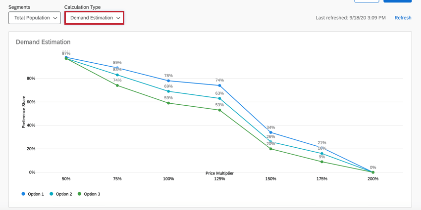
Below the report, you can configure the different packages that are in the report. Use the dropdown menus to select features for the different levels. Click the plus (+) sign to add another package to the report. See Simulating Different Packages for more information.
Revenue Projection
Qtip: To use this report, your conjoint project must contain the below:
- Your conjoint project contains either a “none” option or dual choice option. These types of questions are crucial in an effective price study project because it gives the customer the opportunity not to purchase any packages.
AND one of the following:
- You added a Price in the features section of the project setup, OR
- Your project uses conditional pricing with the Vary prices to get feedback on price sensitivity option enabled.
The Revenue Projection report displays your projected revenue at each price point. Simply put, revenue is calculated by multiplying demand by the price. You can use this graph to find which price or price multiplier leads to the most revenue for a given package.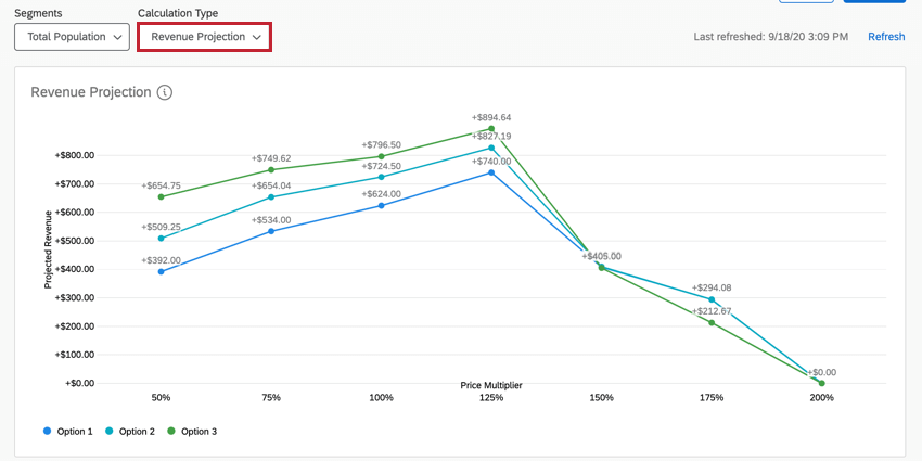
Below the report, you can configure the different packages that are in the report. Use the dropdown menus to select features for the different levels. Click the plus (+) sign to add another package to the report. See Simulating Different Packages for more information.
Profit Projection
Qtip: To use this report, your conjoint project must contain the below:
- Your conjoint project contains either a “none” option or dual choice option. These types of questions are crucial in an effective price study project because it gives the customer the opportunity not to purchase any packages.
- Your conjoint project uses cost analysis.
AND one of the following:
- You added a Price in the features section of the project setup, OR
- Your project uses conditional pricing with the Vary prices to get feedback on price sensitivity option enabled.
The Profit Projection report displays your projected profit at each price point. Profit is the projected revenue with the cost subtracted. You can use this graph to find what price or price multiplier leads to the highest profit.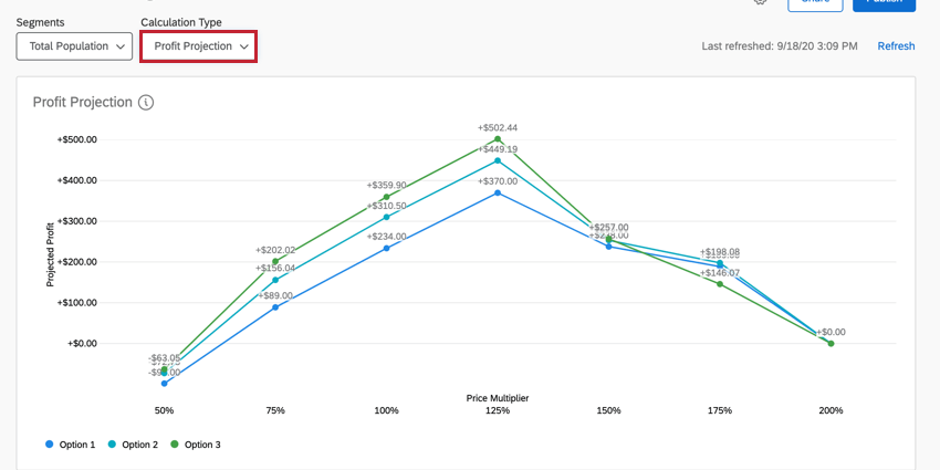
Below the report, you can configure the different packages that are in the report. Use the dropdown menus to select features for the different levels. Click the plus (+) sign to add another package to the report. See Simulating Different Packages for more information.
Sharing the Simulator
You can share a link to your simulator that colleagues can adjust to show different packages, just like in the product. This link is always protected by an elaborate password and can be disabled at any time.
This works just like sharing other Conjoint / MaxDiff reports. Follow the instructions at the linked page.
Using the Shared Simulator
Users will log in at the specific link using the given access code. Press Enter to submit.
The simulator is the same as what the owner of the project sees and can be adjusted the same way. When you refresh the page or leave and come back, you will need to give the passcode again and the settings will be the default.
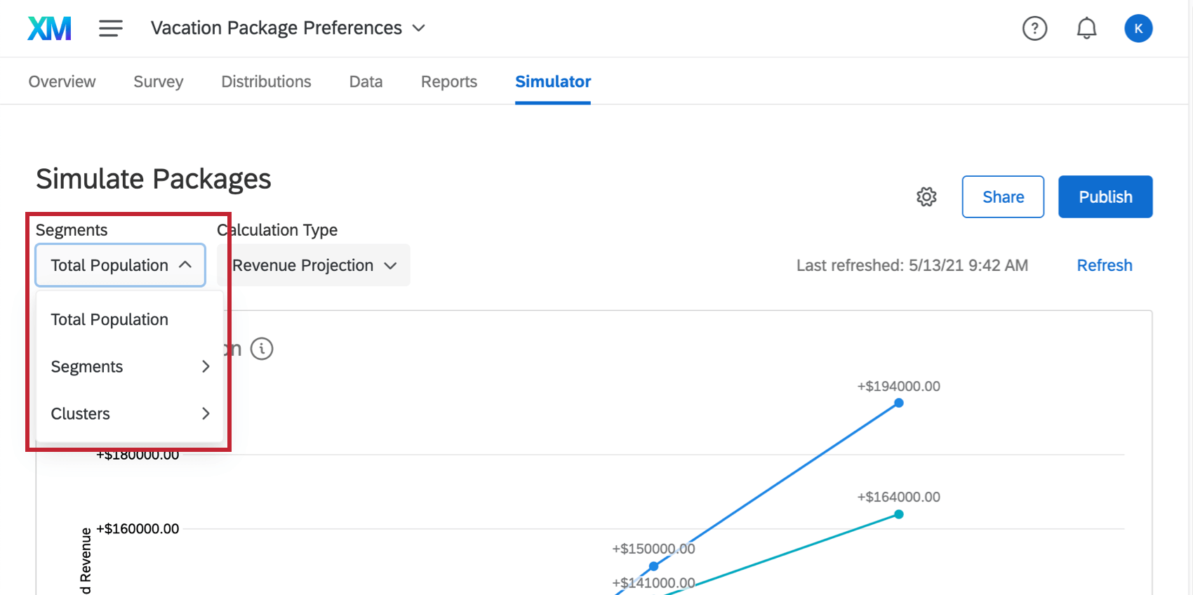
Total Population and Segmentation
The Total Population dropdown you may see in the upper-left is related to a feature called segmentation. If you collect survey data on demographics, segmentation is a great way to analyze how different groups of people have different package preferences, allowing you to optimize products for specific populations of customers.
To learn more about this feature, see the segmentation support page.
Refreshing the Simulator
When you visit the simulator after new data has been collected, a yellow banner will alert you that New responses have been collected since you last refreshed your report. This means the data you see may be from a previous batch of responses. This banner can be temporarily closed, but if you leave the page and come back without any data refreshes having taken place, it’ll pop up again.
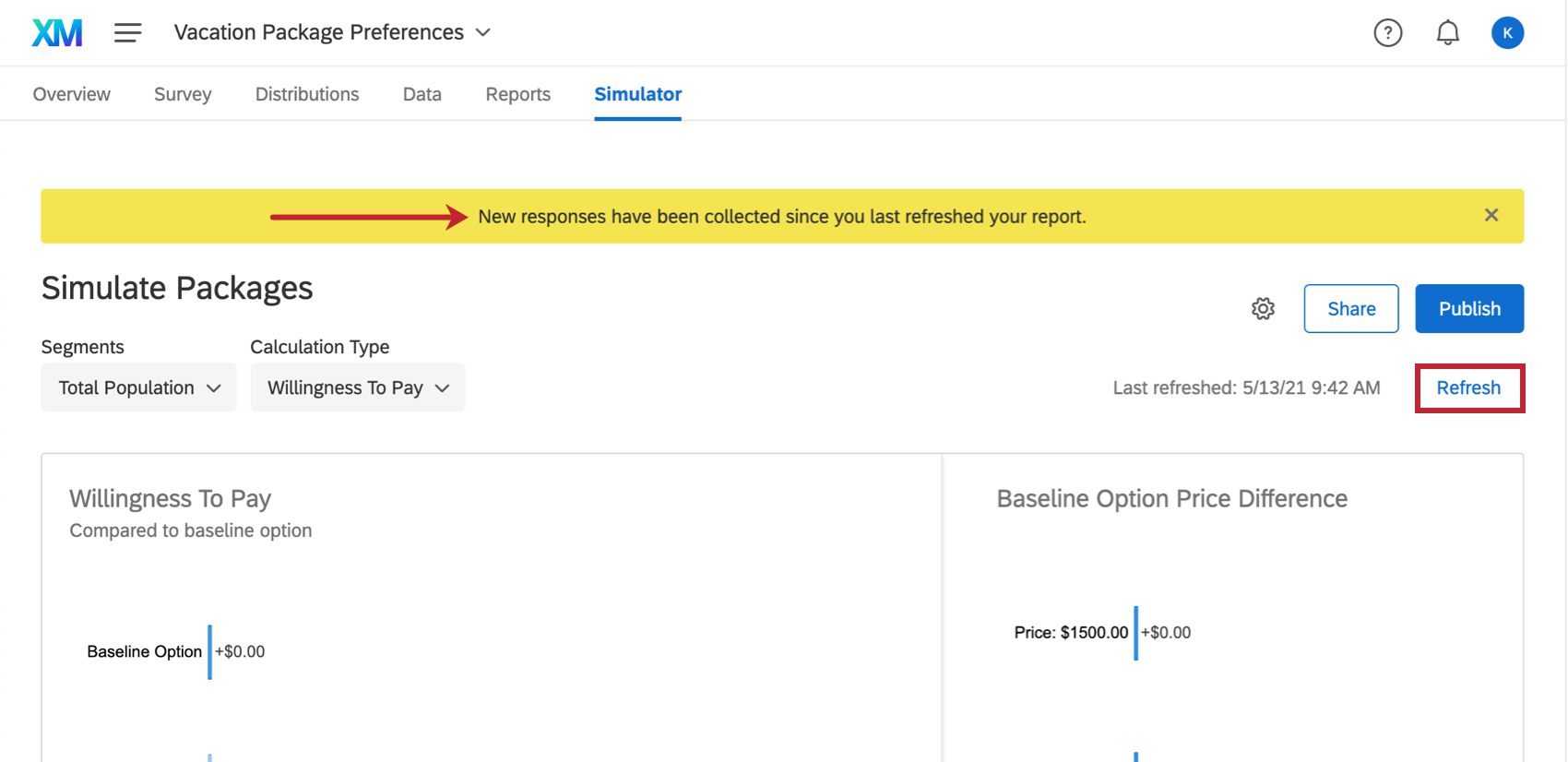
If you would like to manually refresh and force the report to update, click Refresh in blue on the upper-right.
Changing Simulator Display Names
You can change the display names of the features and levels of your conjoint or MaxDiff project so that your data is easier to visualize. This will not affect the feature and level names as they appear in your conjoint or MaxDiff survey.
- Click the gear icon on your simulator report.
- Enable Display Names.
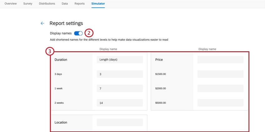
- Enter the text you want used in your simulator report.
Qtip: You can leave a field blank if you don’t want to change its display text.
- Click Save at the bottom of the editor.