
Demographic Breakout Widget (EX)
What's on this page
About the Demographic Breakout Widget
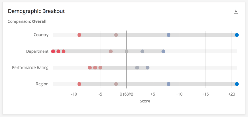
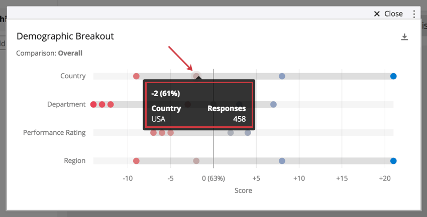
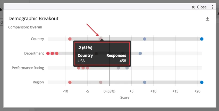
The Demographic Breakout widget allows you to look at a single engagement category or item, and break it out by teams within a demographic.
For example, this widget could isolate the fact that across tenure, newer hires have lower engagement on a certain item than those who have been with the company longer. If you’re measuring tenure by exact years or lengths of time, you can even isolate the exact groups where the engagement dropped.

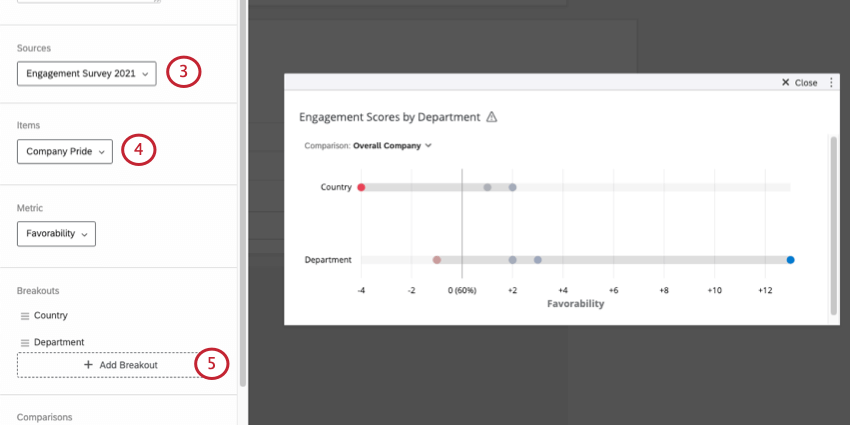
In addition, this widget allows you to add more demographics, breaking the item down by additional teams such as department, gender, country, or any variable you’ve recorded over the course of your Employee Engagement or Lifecycle project.
These widgets require a comparison because they provide insight on how teams performed in different datasets. For example, establishing a 2017 comparison for a 2018 dashboard allows you to identify if Customer Support’s engagement has dropped from one year to the next.
Qtip: Unsure which Employee Experience projects have this widget? See our Widget Types and Project Compatibility table.
Qtip: The colors in your Demographic Breakout cannot be changed, because the palettes are based on research done by Subject Matter Experts. The chosen color scheme highlights change without biasing data as inherently bad/good.
Setting Up the Widget
Qtip: If you only have one source mapped, you can ignore this step. See Adding Additional Sources if you’d like to add more.
Qtip: Consider adding a title or description to your widget to clarify the engagement item being measured to your dashboard users.
Qtip: It’s best to choose demographics, teams, and other tangible groups, such as Departments, Regions, and Tenure. Fields like Employee ID have too many values, and are too specific to the employee for the data to help you create company-wide action items.
Qtip: The “One Level Below” breakout will not work with any hierarchy unit that has more than 100 sub units. Additionally, your dashboard needs an org hierarchy filter to use this breakout.
Metrics and Change Display Options
The metric and display options on a Demographic Breakout widget determine how data is calculated, and how the differences are then communicated to dashboard users.
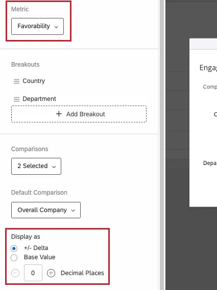
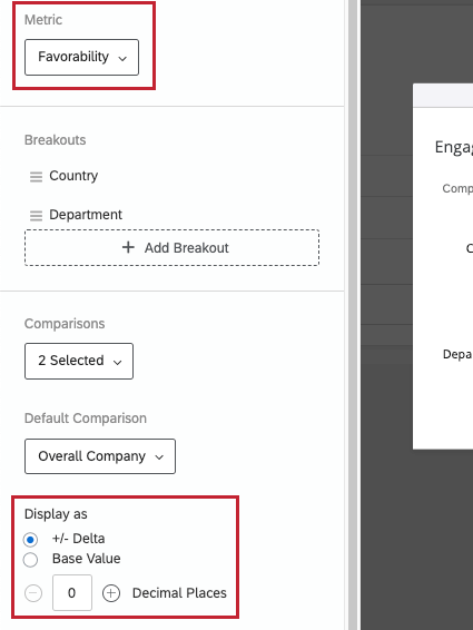
Metric
The metric is another field that determines how the numbers along the x-axis are calculated. You can either present results based on engagement or average.
- Favorability: Base your data on favorability. This is calculated as an engagement score, the percentage of participants who rated favorably on the set scale. For more on setting favorability scales, see Scales.
- Average: Base your data on the average value. In a Demographic Breakout, that means you see the average of everyone’s score in a group. Qtip: Depending on the number of scale points, it may be difficult to get a large range for average. Consider adjusting your value ranges to include decimals.

Change Display Options
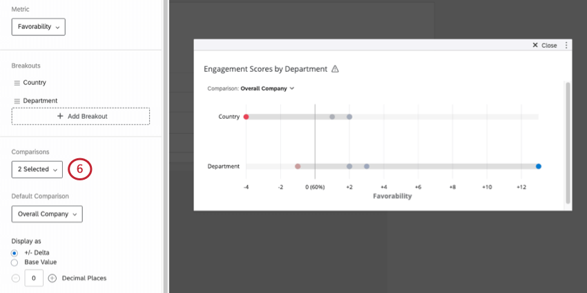
The Display As section determines how to quantify change. This determines how the x-axis of the widget is formatted. The change between the Source and the Comparison is also shown when you highlight over a data point.
+/- Delta is the amount change. Rather than a base value, delta is the amount added or subtracted between the compared values.
Example: If you see in the country row that USA is -2, that means its engagement in the chosen item is 2 less than the Comparison’s data for USA.
Base Value will give the percentage of engagement if your Metric is Favorability, and mean score if your Metric is Average. Instead of change, we see the flat value of how high or low engagement was.
You can add decimal places to your change.
Qtip: Consider adding a description to your widget to clarify the content to your dashboard users.
FAQs
Why is there only one source listed on my widget in my EX dashboard?
Why is there only one source listed on my widget in my EX dashboard?
That's great! Thank you for your feedback!
Thank you for your feedback!