
User-friendly Guide to Logistic Regression
What's on this page
What is Logistic Regression?
Logistic regression estimates a mathematical formula that relates one or more input variables to one output variable.
For example, let’s say you run a lemonade stand and you’re interested in which types of customers tend to come back. Your data includes an entry for each customer, their first purchase, and whether they came back within the next month for more lemonade. Your data might look like this:
| Return | Customer age | Sex | Temp. at first purchase | Lemonade color | Pant length |
|---|---|---|---|---|---|
| Didn’t | 21 | Male | 24 | Pink | Shorts |
| Returned | 34 | Female | 20 | Yellow | Shorts |
| Returned | 13 | Female | 25 | Pink | Pants |
| Didn’t | 25 | Female | 27 | Yellow | Dress |
| etc. | etc. | etc. | etc. | etc. | etc. |
You think that “Customer age” (an input or explanatory variable) might impact “Return” (an output or response variable). Logistic regression might yield this result:
At age 12 (the lowest age), the likelihood of return being “Returned” is 10%.
For every additional year of age, “Return” is 1.1 times more to be “Returned.”
This bit of knowledge is useful for two reasons.
First, it allows you to understand a relationship: older customers are more likely to return. This insight might lead you to bend your advertising towards older customers since they’ll be more likely to become repeat customers.
Second, and relatedly, it can also help you make specific predictions. If a 24-year old customer walks by, you could estimate that if they bought some lemonade, there is a 26% chance they’d later become a return customer.
Understanding Multiplication of Odds
Note that if we said “Returned” was “1.5 times more likely” in some situation than in another, we’re doing the following:
Odds were 1:9, also written 1/(1+9) = 10%.
The “odds for” (the 1) is multiplied by 1.5.
Now 1.5:9, also written 1.5/(1.5+9) = 14%.
Another example, this time of going from 50% likelihood to something 3 times as likely:
Odds were 1:1, also written 1/(1+1) = 50%.
The “odds for” (the left-side 1) is multiplied by 3.
Now 3:1, also written 3/(3+1) = 75%.
Now we’ll walk through the process of creating this regression model.
Preparing to Create a Regression Model
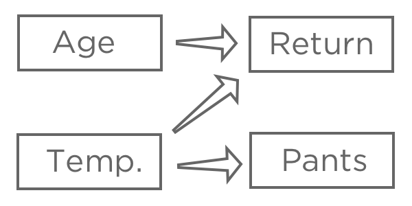
1. Think through the theory of your regression.
Once you’ve chosen a response variable, “Revenue,” hypothesize how various inputs may be related to it. For example, you might think that higher “Temperature at first purchase” will lead to higher likelihood of “Returned,” you might be unsure about how “Age” will affect “Return,” and you might believe that “Pants” (vs. shorts) is affected by “Temperature” but doesn’t have any impact on your lemonade stand.
The goal of regression is typically to understand the relationship between several inputs and one output, so in this case you’d probably decide to create a model explaining “Return” with “Temperature” and “Age” (also said as “predicting Return from Temperature and Age,“ even if you’re more interested in explanation than actual prediction).
You probably wouldn’t include “Pants” in your regression. It might be correlated with “Return” because both are related to “Temperature,” but it doesn’t come before “Return” in the causal chain, so including it would confuse your model.
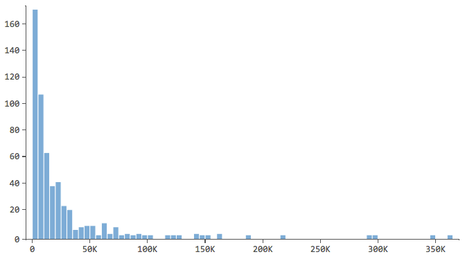
2. “Describe” all variables that could be at all useful for your model.
Start by describing the response variable, in this case “Revenue,” and getting a good feel for it. Do the same for your explanatory variables.
Note which have a shape like this…

…where most of the data is in the first few bins of the histogram. Those variables will require special attention later.
3. “Relate” all the possible explanatory variables to the response variable.
Stats iQ will order the results by the strength of the statistical relationship. Take a look and get a feel for the results, noting which variables are related to “Revenue” and how.
4. Start building the regression.
Building a regression model is an iterative process. You’ll cycle through the following three stages as many times as necessary.
The Three Stages of Building a Regression Model
Stage 1: Add or subtract a variable.
One by one, start adding in variables that your previous analyses indicated were related to “Revenue” (or add in variables that you have a theoretical reason to add). Going one by one isn’t strictly necessary, but it makes it easier to identify and fix problems as you go along and helps you get a feel for the model.
Let’s say you start by predicting “Revenue” with “Temperature.” You find a strong relationship, you assess the model, and you find it to be satisfactory (more details in a minute).
Return <– Temperature
You then add in “Lemonade color” and now your regression model has two terms, both of which are statistically significant predictors. Like this:
Revenue <– Temperature & Lemonade color
Then you add “Sex,” and the model results now show that “Sex” is statistically significant in the model, but “Lemonade color” no longer is. Typically you’d remove “Lemonade color” from the model. Now we have:
Revenue <– Temperature & Sex
That is, if you know the sex of the customer, knowing what color of lemonade they ordered doesn’t give you any more information about whether they’ll be a return customer.
You might investigate and discover that women tend to pick yellow lemonade more than men and that women are more likely to return. So it initially appeared that choosing yellow made a customer more likely to return, but in fact, “Lemonade color” is only related to “Return” through “Sex.” So when you include “Sex” in the regression, “Lemonade color” drops out of the regression.
Interpreting regression results takes a good deal of judgment, and just because a variable is statistically significant, doesn’t mean it’s actually causal. But by carefully adding and subtracting variables, noting how the model changes, and always thinking about the theory behind your model, you can tease apart interesting relationships in your data.
Stage 2: Assess the model.
Every time you add or subtract a variable, you should assess the model’s accuracy by looking at its r-squared (R2), AICc, and any alerts from Stats iQ. Every time you change the model, compare the new r-squared, AICc, and diagnostic plots to the old ones to determine whether the model has improved or not.
R-squared (R2)
The numeric metric for quantifying the model’s prediction accuracy is known as r-squared, which falls between zero and one. A zero means that the model has no predictive value, and a one means that the model perfectly predicts everything.
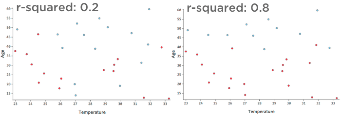
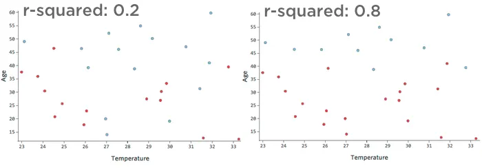
For example, the data represented on the left will lead to a much less accurate model than the data on the right. Imagine trying to draw a line through the scatterplot; you could almost completely separate blue (“Returned”) from red (“Didn’t”) on the right side, but on the left side it’d be hard to do so.
That is, the right side has a high r-squared; if you know “Temperature” and “Age,” you can determine “Returned” vs. “Didn’t” quite easily. The left side has a low-to-medium r-squared; if you know “Temperature” and “Age,” you have a pretty good guess as to whether it will be “Returned” vs. “Didn’t,” but there will be a lot of errors.
There’s no fixed definition of a “good” r-squared. In some settings it might be interesting to see any effect at all, while in others your model might be useless unless it’s highly accurate.
Any time you add a variable, r-squared will go up, so achieving the highest possible r-squared isn’t the goal; rather, you want to balance the model’s accuracy (r-squared) with its complexity (generally, the number of variables in it).
AICc
AICc is a metric that balances accuracy with complexity – greater accuracy leads to better scores and added complexity (more variables) leads to worse scores. The model with the lower AICc is better.
Note that the AICc metric is only useful for comparing AICcs from models that have the same number of rows of data and the same output variable.
Alerts
From time to time Stats iQ will suggest ways to improve your model. For example, Stats iQ may suggest that you take the logarithm of a variable (details on what that means).
Confusion Matrix and Precision-Recall Curve
The confusion matrix and the precision-recall curve are also useful tools for understanding how accurate your model is. And if you want to make predictions based on your model, these tools will help you do so. They’re not strictly necessary for getting a good understanding of what your model is telling you, so we put them in a different section about the confusion matrix and precision-recall curve
Stage 3: Modify the model accordingly.
If your assessment of the model found it to be satisfactory, you’re either done or you can go back to Stage 1 and enter more variables.
If your assessment finds the model lacking, you’ll use Stats iQ’s alerts to fix the issues.
As you modify the model, continually note the changing r-squared, AICR, and residual diagnostics, and decide whether the changes you’re making are helping or hurting your model.
FAQs
How do I create a new Stats iQ variable?
How do I create a new Stats iQ variable?
What are the options for analyzing my data in Stats iQ?
What are the options for analyzing my data in Stats iQ?
- Describe: Selecting a variable from the list and then clicking Describe will give you a visualization of the data contained in that variable. Use this when you would like to see how the data for a certain variable is distributed.
- Relate: Selecting two variables and then clicking Relate will run a statistical analysis of the relation between the two variables. Use this when you would like to know how strongly two variables are correlated.
- Pivot Table: Selecting two or more variables and clicking Pivot Table will create a table that displays the values of the variables as rows and columns. The cells can be set to display a variety of different information including column and row percentage, Sum, and Variance. Use this when you would like to compare the overlap between specific values of a set of variables.
- Regression: Selecting two variables and clicking Regression will give the mathematical relationship between the variables. Use this when you would like to predict values for one variable based off of the values of another.
- Cluster: Selecting two to ten demographic variables and clicking Cluster will display groupings of traits most likely to occur together, thus revealing the population segments captured in your data.
I don't know what this statistical term means. Can you tell me?
I don't know what this statistical term means. Can you tell me?
- Statistical tests: ANOVA, T-test, and Chi-squared are all statistical test that Stats iQ performs to test whether or not the relationship between two variables is significant. These tests are used to generate a P-Value.
- P-Value: This value represents the probability that the observed results would be seen if no correlation between the variables exists. A lower P-Value means more correlated data.
- Effect Size: The effect size is a measure of how large the correlation between two variables is. This is measured in different ways depending on the type of the statistical test performed. Examples are Cohen’s d, Pearson’s r, and Cramer’s v. The larger the effect size value, the more correlated the variables are.
How do I filter the data that appears in Stats iQ?
How do I filter the data that appears in Stats iQ?
How do I get my new responses to show up in Stats iQ?
How do I get my new responses to show up in Stats iQ?
How are analysis cards ordered in my Stats iQ Workspace?
How are analysis cards ordered in my Stats iQ Workspace?
What’s Stats iQ? / Where’s Statwing?
What’s Stats iQ? / Where’s Statwing?
What do I do if my data isn't loading properly?
What do I do if my data isn't loading properly?
That's great! Thank you for your feedback!
Thank you for your feedback!