
Dashboard Theme
What's on this page
Accessing Your Dashboard Theme
Qtip: This page is for editing your dashboard’s theme. To learn about editing the theme for your survey, check out the support page on Look & Feel.
CX, EX, and BX Dashboards
Regardless of whether you are working with a CX, BX, or EX dashboard, you can access your dashboard’s theme settings by doing the following:
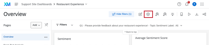
Results Dashboards
If you want to edit the theme on a results dashboard, click the Settings gear, then select Theme.
Qtip: Results dashboards do not have the Page Position or Show Page Icons settings.
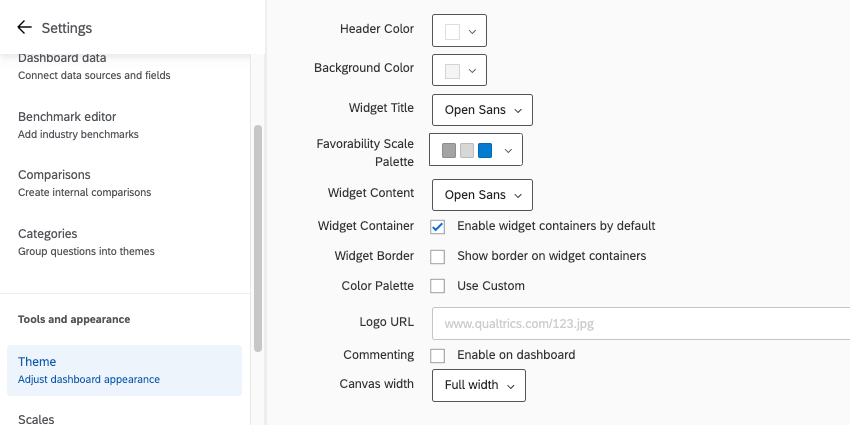
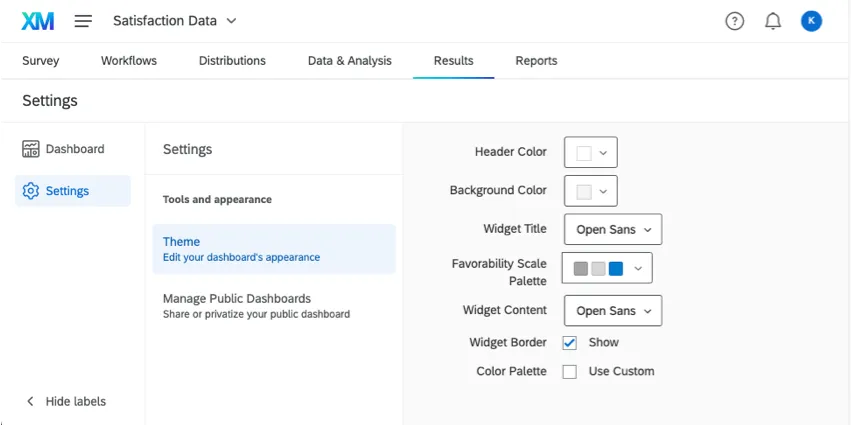
Editing Your Dashboard Theme
You are allowed to customize several aspects of your dashboard’s appearance. Once you’ve made changes to any of these settings, they are saved automatically.
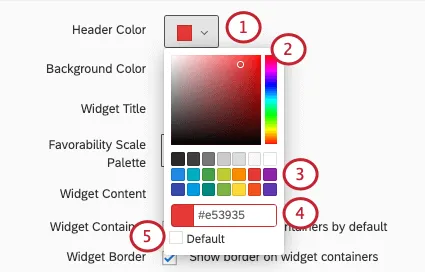
Header Color: Add a thin line of color beneath the topmost header of the dashboard. Also changes the color of the account settings icon.

Background Color: Change the color of the dashboard’s background. The background is the space between widgets, not the page navigation along the top or the background of the widgets themselves.
- Widget Title: Choose the font of your widgets’ titles.
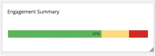
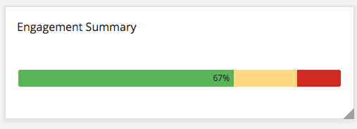
Favorability Scale Colors: This feature is used in EX dashboards that does not affect any widgets on CX dashboards. Choose from a list of preset color palettes for your scales, or create your very own custom palette. See our page on the Scale Settings (EX) for instructions on how to set which values correspond to each of the 3 colors. Below is an example of one of the widgets that uses the scales, the Engagement Summary widget (EX).
- Widget Content: Determine the font of the widget’s body.
- Widget Container: When checked, your widgets will have containers. Containers are the white space behind your widgets. This means if you choose a dashboard background color, that color fills in the background on your widget, not just the spaces between widgets.
- Widget Border: When checked, your widgets will have thin gray borders.
Color Palette: When Use Custom is selected, you can choose the default color palette for your widgets. The widgets will select colors in the order they are arranged in the palette. Click and drag colors to reorder them. Click a color and click Remove to remove it from the palette.
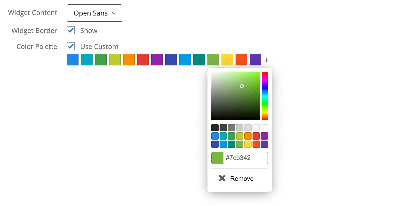

Qtip: If you’ve already edited your widget’s colors, changes to the default color palette will not affect this widget.
- Commenting: When checked, commenting will be enabled on the Response Ticker widget.
- Canvas Width: Determine the width of your dashboard.
Settings only included in EX Dashboards
- Logo URL: Paste in the URL for a logo. This will appear in the top-left of your dashboard.
Changing Colors
Types of Dashboards
The theme can be adjusted in a few different types of dashboard. This includes:
- CX Dashboards
- Results Dashboards
- Employee Engagement
- Lifecycle
- 360
- Pulse
- Ad Hoc Employee Research
- Employee Journey Analytics
- Brand Experience
Dashboard Export Permission
Qtip: This setting only appears for CX dashboards.
By default, when exporting pages and widgets as either a CSV or TSV, the data only comes in one format, without the option to switch between a more summarized table and “raw” individual response data. However, you can adjust this with a setting located on the Theme page, under Dashboard export permission.
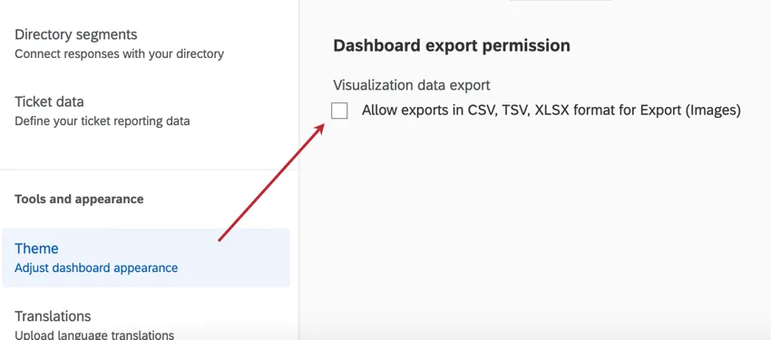
When you enable Allow exports in CSV, TV, XLSX format for Export (Images), the following export types are made available:
- XLSX: Visualized data in a Microsoft Excel-compatible file. For example, if you made a bar chart that shows average NPS over time by month, the XLSX file will show that same data in a table instead.
CSV and TSV: Comma and tab-separated files compatible with many software, such as Microsoft Excel, Google Sheets, and Qualtrics. These spreadsheet file types come in 2 export types:
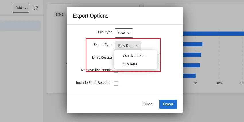
Visualized data: Data is shown as aggregated metrics, with each widget in a separate table. For example, if you made a bar chart that shows average NPS over time by month, you’ll see exactly that data in a table instead.

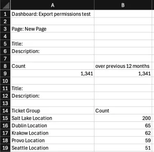
Example: Here, you see the dashboard name, the widget names and descriptions, and the metrics displayed in each table.
Raw data: Instead of exporting aggregated data, this version gives every individual record / response reflected in the data. Each column represents a field, and each row represents a record / response. The raw export type is more similar to the type of export you get from a survey in Data & Analysis.
Interaction between role permissions and theme settings
When you enable Allow exports in CSV, TSV, XLSX format for Export (Images) in the dashboard theme settings, it will behave differently based on the dashboard permissions applied to the user / their role.
- Allow view access: No exports available, regardless of what the dashboard export permission on the Theme page is set to.
- Allow export (Images), Theme setting disabled: Certain image formats are available, but CSV, TSV, and XLSX are not available, in either visualized or raw data formats.
- Allow export (Images), Theme setting enabled: In addition to certain image formats, you can export images in XLSX, CSV, and TSV. The CSV and TSV files only come in a visualized format.
- Allow export (All), Theme setting disabled: In addition to certain image formats, you can export images in XLSX, CSV, and TSV. The CSV and TSV files only come in a visualized format.
- Allow export (All), Theme setting enabled: All export formats available, including XLSX, and both raw and visualized versions of CSV and TSV data.
- Allow edit access: All export formats available, regardless of what the dashboard export permission on the Theme page is set to.
Qtip: Users who own (or administrate) the CX dashboard can always export all available file types, regardless of whether the theme setting is enabled or not.
Here are the theme and dashboard permission combinations in a table format:
| Allow view access | Allow export (Images) | Allow export (All) | Allow edit access | |
|---|---|---|---|---|
| Theme setting disabled | No exports available | Export images, no CSV, TSV, or XLSX | Export images, XLSX, and visualized CSV and TSV | All export formats available (including XLSX, raw and visualized CSV and TSV) |
| Theme setting enabled | No exports available | Export images, XLSX, and visualized CSV and TSV | All export formats available (including XLSX, raw and visualized CSV and TSV) | All export formats available (including XLSX, raw and visualized CSV and TSV) |
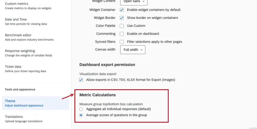
Metric Calculations
Qtip: The functionality outlined in this section is not available in EX, 360, Lifecycle, or Pulse dashboards.
By default, widgets aggregate all individual responses to calculate the top box / bottom box metric. If you want to calculate this metric using average scores of questions in the group instead of all individual responses, select Average scores of questions in the group under Metric Calculations in the theme settings.
- Aggregate all individual responses (default): Calculates how many survey responses were in the top box for each question, divided by the total number of responses to those questions.
- Average scores of questions in the group: Calculates an “average of averages” for questions in the measure group. For example, the top box of question 1 + top box of question 2 + top box of question 3, divided by the number of questions in the measure group.
Example: The following dataset will result in two different versions of the top box / bottom box metric depending on the metric calculation selected. Each metric calculation is shown below the table:
Question 1 Question 2 Question 3 Respondent 1 4 2 Respondent 2 4 4 4 Respondent 3 4 2 3 Respondent 4 4 Respondent 5 1 2 Count of Top Box (4s) 3 1 2 Count of Responses (excluding blanks) 3 4 4 Aggregate of all individual responses (default) = (3 + 1 + 2) / (3 + 4 + 4) = 54.55%
Average scores of questions in the group = ( (3/3) + (1/4) + (2/4)) / 3 = 58.33%
Qtip: Healthcare customers configuring measure group calculations for Top Box scores for CAHPS (Consumer Assessment of Healthcare Providers and Systems) surveys should select the Average scores of questions in the group setting, which aligns with the methodology used by CMS (Centers for Medicare & Medicaid Services).
That's great! Thank you for your feedback!
Thank you for your feedback!