-

Qualtrics Platform -

Customer Journey Optimizer -

XM Discover -

Qualtrics Social Connect
Website / App Insights Accessibility
Website / App Insights Accessibility Features
Website Insights projects have many features built in to make accessibility easy. In particular, we recommend trying a responsive dialog or feedback button, which were designed with accessibility in mind.
On this page, we’ll cover specific settings and best practices to improve your Website Insights project’s accessibility.
Creating an Accessible Responsive Dialog
Responsive dialogs are website overlays that were developed with accessibility in mind. Below, we’ll highlight some of the accessibility features you can expect to find:
- Easy to define Alt Text: If a custom icon is used within the dialog, we allow users to specify Alt Text to indicate the text that the screen reader should read when the focus is on the icon.
Qtip: If you select to Include an icon to dismiss the intercept, the alt text for the X button that appears in the upper-right of the dialog is “close.” This alt text is also localized.
- ARIA labels for button controls: By default, screen readers will read the text that you specify for the button label. However, in some cases, you may want the screen reader to read additional context, such as, “Click on this button to open up a new survey window.” In this case, you can specify the ARIA label for the button controls.
- Iframe titles for embedded surveys: If you want to embed a survey in your dialogue, it’s easy to add an iframe title for screen readers.
- Color contrasts for elements within the Creative itself: While Qualtrics cannot provide direct contrast guidance, you can adjust the color of your dialog’s buttons and text as needed.
Creating an Accessible Feedback Button Creative
Feedback buttons are tabs on the side of a page that a user can click to leave feedback. Here are some accessibility features the feedback button has:
- Iframe titles: Ability to specify an iframe title in the Animation section.
- Custom Button Alt-Text: By default, screen readers will read the text that you specify for the button label. However, in some cases, you may want to use a custom image instead for your button. In this case, you can specify alt-text for that button image.
- Iframe titles for embedded surveys: If you want to embed a survey in your dialogue, it’s easy to add an iframe title for screen readers.
- Color contrasts for elements within the Creative itself: While Qualtrics cannot provide direct contrast guidance, you can adjust the color of your button’s background and text as needed.
Adding Alt Text and Roles to Target Buttons for Legacy Creatives
If your Target is in the form of a button image you’ve uploaded, adding alt text and a role attribute helps the screen reader understand what the button’s supposed to say and do. This advice is for legacy creatives, like the pop over or infobar.
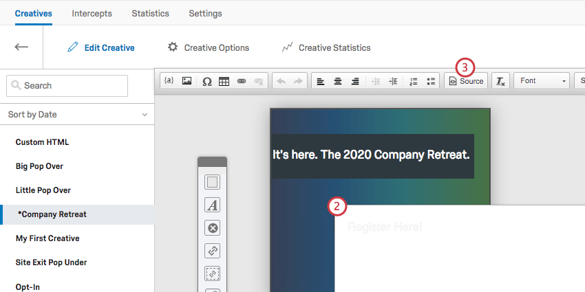
- Open your Creative in the Creatives tab.
- Double-click into the Target element that contains the image.
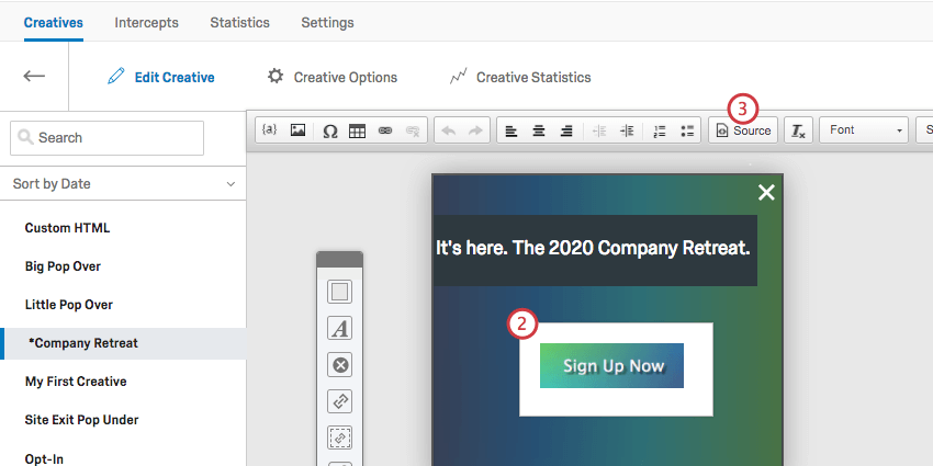
- Click Source.
- Inside the <img> tag, add an alt attribute
<img alt="text here" />to the tag and set the value equal to the text of the image.<img alt="Sign Up Now" ... />Qtip: Screen reading software will read aloud what is contained in the alt attribute when it arrives at the picture.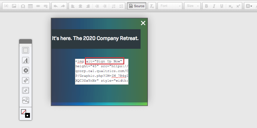
- Surround the <img> tag with a <span> tag.
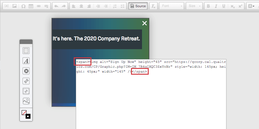
- Add a role=”button” attribute to the <span> tag.
<span role="button"><img .../></span>Qtip: The role attribute tells the visitor using a screen reader that this element is a button that can be activated.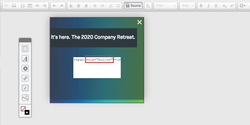
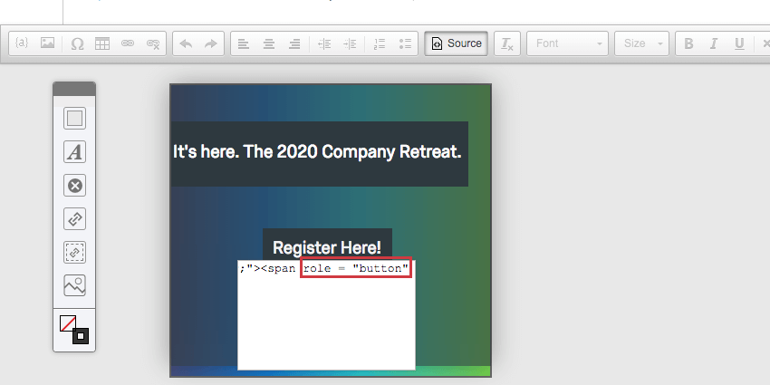
Standard Targets (Link Text)
- Open your Creative in the Creatives tab.
- Double click into the Target element that contains the text.
- Click Source.
- Add a role=”button” attribute to the <span> tag.
<span role="button" ... >Textbox content</span>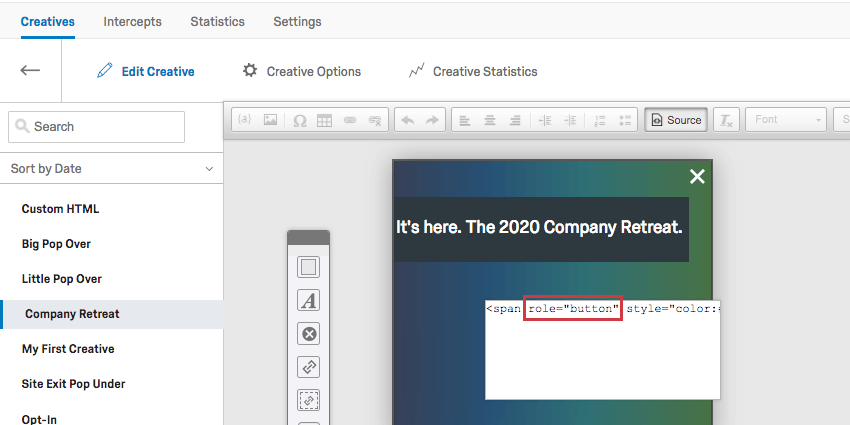
Adding Alt Text and Roles to Close Buttons for Legacy Creatives
Legacy creatives like pop overs and sliders require extra customization to make their close buttons accessible.
Close Button as Image
- Open your Creative in the Creatives tab.
- Double click into the Close element that contains the image.
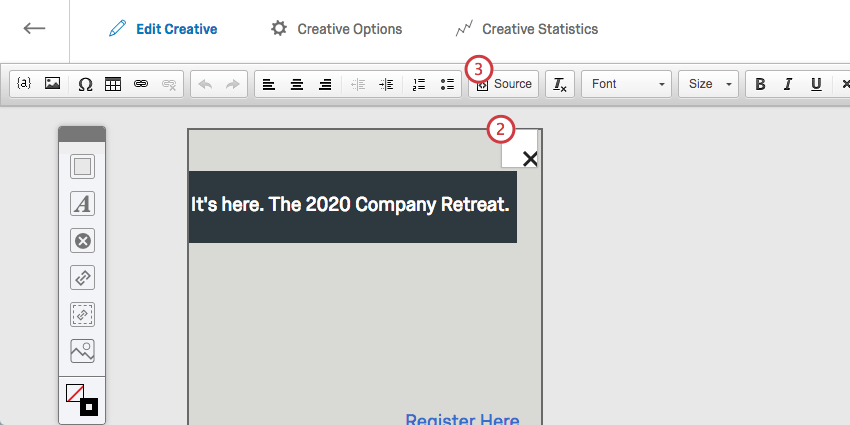
- Click Source.
- Add the alt=”close” attribute to the <img> tag.
<img alt="close" ... />Qtip: Screen reading software will read aloud what is contained in the alt attribute when it arrives at the picture.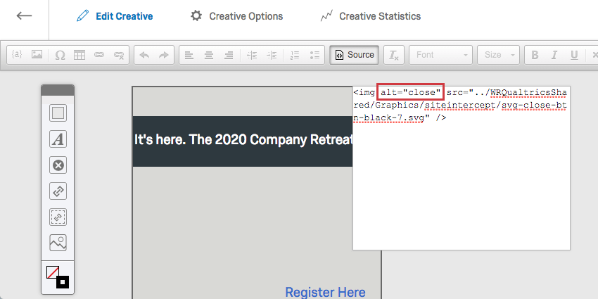
- Surround the <img> tag with a <span> tag.
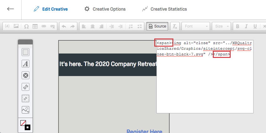
- Add a role=”button” attribute to the <span> tag.
<span role="button"><img .../></span>Qtip: The role attribute tells the visitor using a screen reader that this element is a button that can be activated.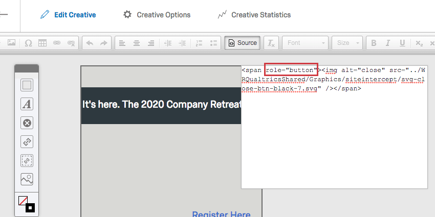
Close Button as Text
- Open your Creative in the Creatives tab.
- Double click into the Close element that contains the text.
- Click Source.
- Add a role=”button” attribute to the <span> tag.
<span role="button" ...>Textbox content</span>Qtip: The role attribute tells the visitor using a screen reader that this element is a button that can be activated.