
Split Axis Chart Widget (BX)
What's on this page
About the Split Axis Chart Widget
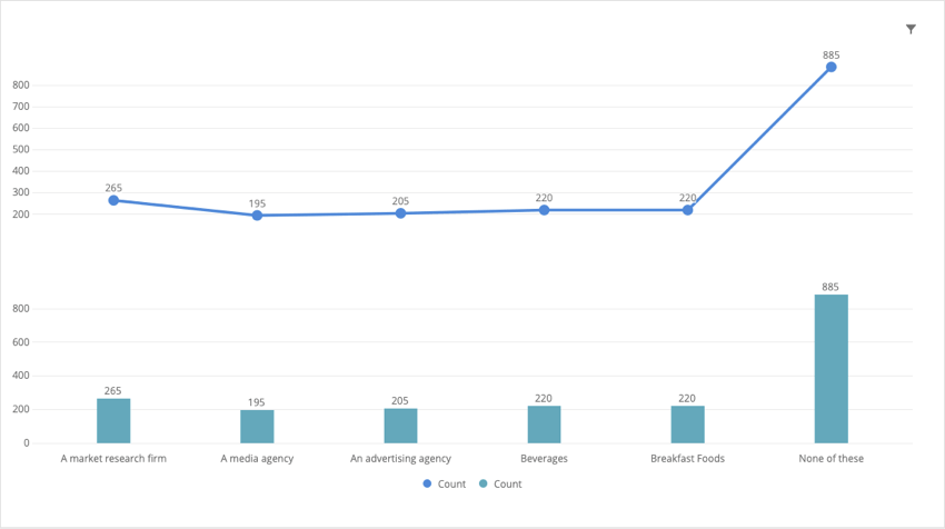
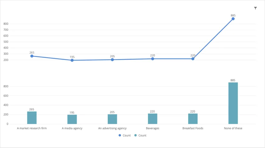
The split axis chart widget can be used in any brand tracker dashboard to compare two different metrics. This widget stacks the y-axis of a line chart on top of the y-axis of a bar chart.
Field Compatibility
The x-axis of a split axis chart widget is only compatible with the following field types:
- Date
- Number Set
- Multi-Answer Text Set
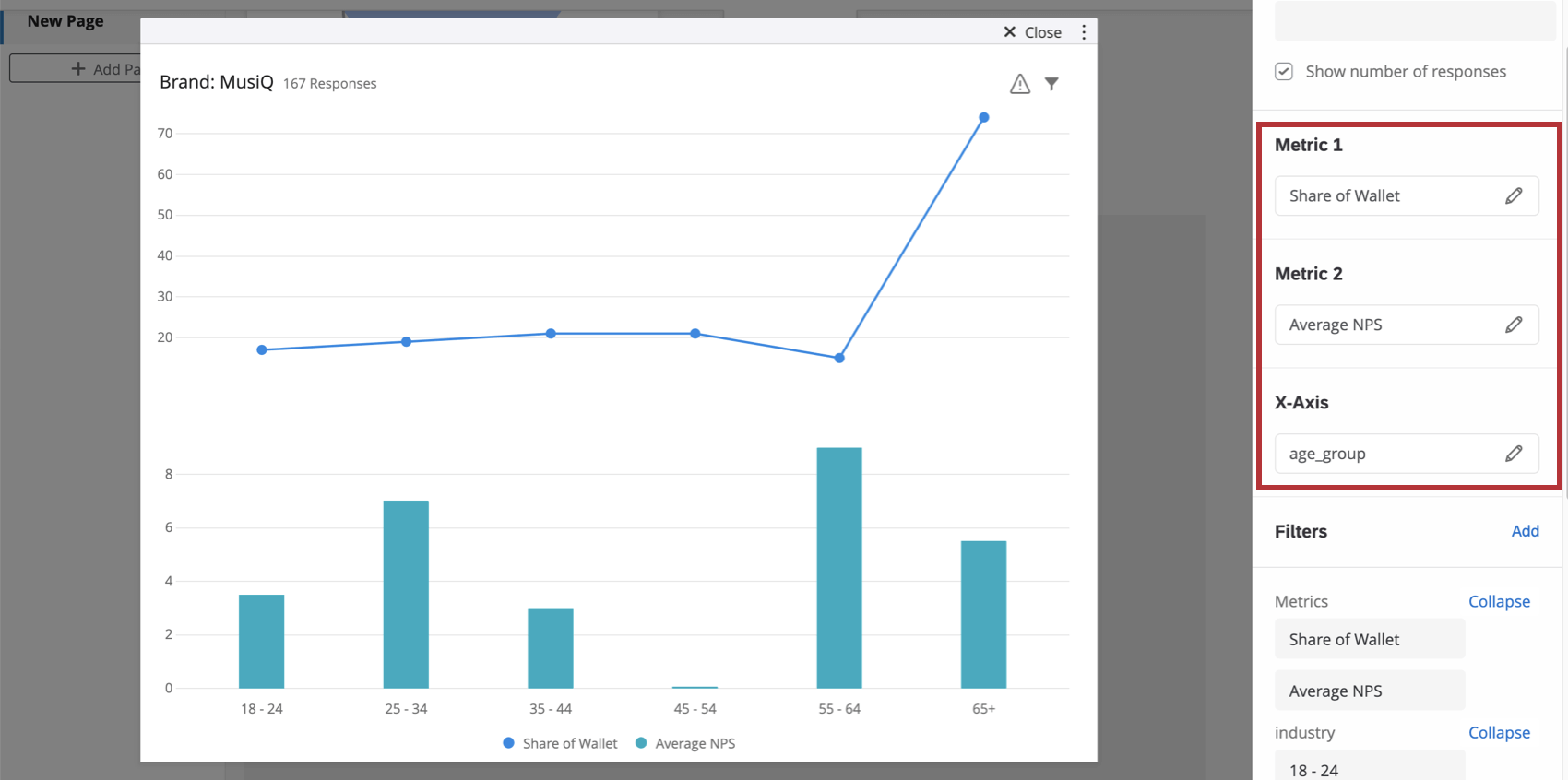
You can also add two metrics to the spit-axis chart. When calculating any metric other than count, you need a Numeric Value or Number set field.
Basic Setup

Qtip: This can be anything you like – for example, NPS, a satisfaction rating, or even a custom metric.
Qtip: For help configuring a metric, see the Widget Metrics support page.
Example: Often this is a demographic field or a date (so you can see change over time).
Widget Customization
For basic widget instructions and customization, visit the Building Widgets support page. Continue reading for widget-specific customization.
Display Options
- Show X axis: Display or hide the x-axis labels.
- Show Y axis: Display or hide the y-axis labels.
- Show data values: Display the value over every data point / bar in the chart.
- Show horizontal grid lines: Display or hide the horizontal lines on the chart.
Legend Options
You can modify the wording on axis and legend labels using the list of fields in the widget editing pane.
Qtip: Expanding and collapsing the list only affects what’s displayed in the editing pane, not the widget itself.
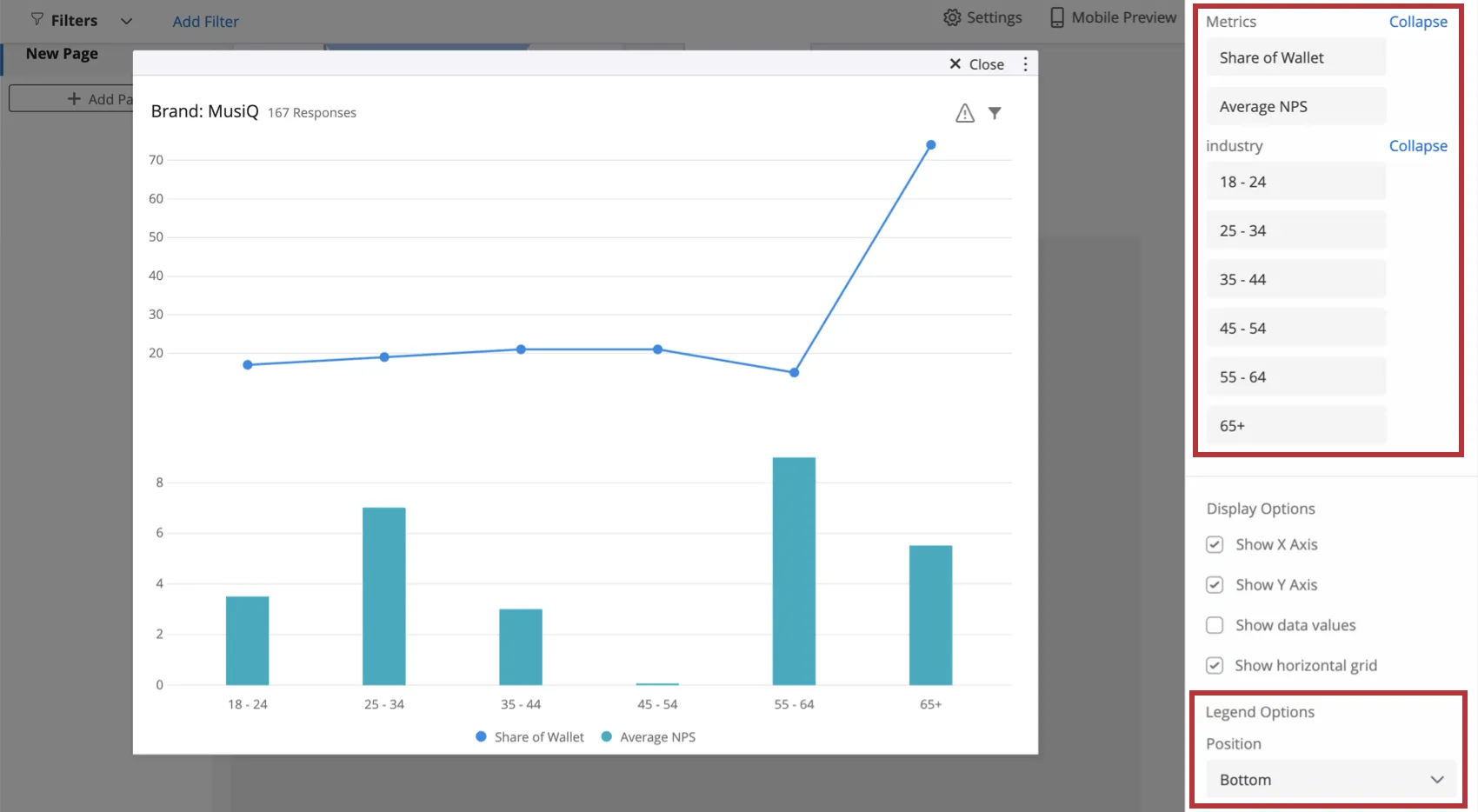
You can also configure whether you’d prefer the legend position to be at the bottom of the chart (pictured) or to the right.
Additional Options
Click on the three horizontal dots in the top-right corner of your widget to view additional options.
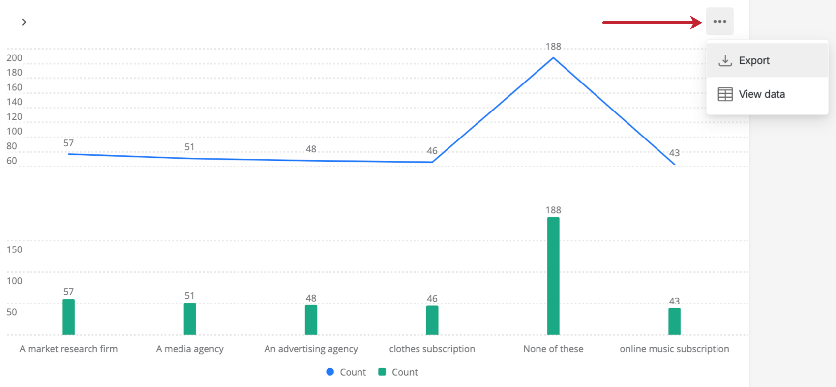
- Export: Export your widget as a JPG, PDF, CSV, or TSV.
- View data: View a table containing the data for all metrics in the widget.
FAQs
How do custom metric filters interact with page filters in BX dashboards?
How do custom metric filters interact with page filters in BX dashboards?
That's great! Thank you for your feedback!
Thank you for your feedback!