-

Qualtrics Platform -

Customer Journey Optimizer -

XM Discover -

Qualtrics Social Connect
Correspondence Analysis (BX)
About Correspondence Analysis
Correspondence analysis reveals the relative relationships between and within two groups of variables, based on data given in a contingency table. For brand perceptions, these two groups are:
- Brands
- Attributes that apply to these brands
For example, let’s say a company wants to learn which attributes consumers associate with different brands of beverage products. Correspondence analysis helps measure similarities between brands and the strength of brands in terms of their relationships with different attributes. Understanding the relative relationships allows brand owners to pinpoint the effects of previous actions on different brand related attributes, and decide on next steps to take.
Correspondence analysis is valuable in brand perceptions for a couple of reasons. When attempting to look at relative relationships between brands and attributes, brand size can have a misleading effect; correspondence analysis removes this effect. Correspondence analysis also gives an intuitive quick view of brand attribute relationships (based on proximity and distance from origin) that isn’t provided by many other graphs.
On this page, we’ll walk through an example of how to apply correspondence analysis to a use case for different (fictional) brands of soda products.
Let’s get started with the input data format – a contingency table.
Contingency Tables
A contingency table is a two-dimensional table with groups of variables on the rows and columns. If our groups, as described above, were brands and their associated attributes, we would run surveys and get back different response counts associating different brands with the given attributes. Each cell in the table represents the number of responses or counts associating that attribute with that brand. This “association” would be displayed through a survey question such as “Pick brands from a list below which you believe show ___ attribute.”
Here the two groups are “brands” (rows) and “attributes” (columns). The cell in the bottom right corner represents the count of responses for “Brawndo” brand and “Economic” attribute.
| Tasty | Aesthetic | Economic | |
| Butterbeer | 5 | 7 | 2 |
| Squishee | 18 | 46 | 20 |
| Slurm | 19 | 29 | 39 |
| Fizzy Lifting Drink | 12 | 40 | 49 |
| Brawndo | 3 | 7 | 16 |
Residuals (R)
In correspondence analysis, we want to look at the residuals of each cell. A residual quantifies the difference between the observed data and the data we would expect – assuming there is no relationship between the row and column categories (here, those would be brand and attribute). A positive residual shows us that the count for that brand attribute pairing is much higher than expected, suggesting a strong relationship; correspondingly, a negative residual shows a lower value than expected, suggesting a weaker relationship. Let’s walk through calculating these residuals.
A residual (R) is equal to: R = P – E, where P is the observed proportions and E is the expected proportions for each cell. Let’s break down these observed and expected proportions!
Observed Proportions (P)
An observed proportion (P) is equal to to the value in a cell divided by the total sum of all of the values in the table. So for our contingency table above, the total sum would be: 5 + 7 + 2 + 18 … + 16 = 312. Dividing each cell value by the total results in the table below for observed proportions (P).
For example, in the bottom-right cell, we took our initial cell value of 16/312 = 0.051. This tells us the proportion of our entire chart that the pairing of Brawndo and Economic represent based on our data collected.
| Tasty | Aesthetic | Economic | |
| Butterbeer | 0.016 | 0.022 | 0.006 |
| Squishee | 0.058 | 0.147 | 0.064 |
| Slurm | 0.061 | 0.093 | 0.125 |
| Fizzy Lifting Drink | 0.038 | 0.128 | 0.157 |
| Brawndo | 0.01 | 0.022 | 0.051 |
Row and Column Masses
Something we can calculate easily from our observed proportions, and will be used a lot later, are the sums of the rows and columns of our table of proportions, which are known as the row and column masses. A row or column mass is the proportion of values for that row/column. The row mass for “Butterbeer,” looking at our chart above, would be 0.016 + 0.022 + 0.006, giving us 0.044.
Doing similar calculations we end up with:
| Tasty | Aesthetic | Economic | Row Masses | |
| Butterbeer | 0.016 | 0.022 | 0.006 | 0.044 |
| Squishee | 0.058 | 0.147 | 0.064 | 0.269 |
| Slurm | 0.061 | 0.093 | 0.125 | 0.279 |
| Fizzy Lifting Drink | 0.038 | 0.128 | 0.157 | 0.324 |
| Brawndo | 0.01 | 0.022 | 0.051 | 0.083 |
| Column Masses | 0.182 | 0.413 | 0.404 |
Expected Proportions (E)
Expected proportions (E) would be what we expect to see in each cell’s proportion, assuming that there is no relationship between rows and columns. Our expected value for a cell would be the row mass of that cell multiplied by the column mass of that cell.
See in the top left cell, the row mass for Butterbeer multiplied by the column mass for Tasty, 0.044 * 0.182 = 0.008.
| Tasty | Aesthetic | Economic | |
| Butterbeer | 0.008 | 0.019 | 0.018 |
| Squishee | 0.049 | 0.111 | 0.109 |
| Slurm | 0.051 | 0.115 | 0.113 |
| Fizzy Lifting Drink | 0.059 | 0.134 | 0.131 |
| Brawndo | 0.015 | 0.034 | 0.034 |
We can now calculate our residuals (R) table, where R = P – E. Residuals quantify the difference between our observed data proportions and our expected data proportions, if we assumed there is no relationship between the rows and columns.
Taking our most negative value of -0.045 for Squishee and Economic, what we would interpret here is that there is a negative association between Squishee and Economic; Squishee is much less likely to be viewed as “Economic” than our other brands of drinks.
| Tasty | Aesthetic | Economic | |
| Butterbeer | 0.008 | 0.004 | -0.012 |
| Squishee | 0.009 | 0.036 | -0.045 |
| Slurm | 0.01 | -0.022 | 0.012 |
| Fizzy Lifting Drink | -0.021 | -0.006 | 0.026 |
| Brawndo | -0.006 | -0.012 | 0.018 |
Indexed Residuals (I)
There are some problems with just reading residuals, however.
Looking at the top row from our residuals calculation table above, we see that all these numbers are very close to zero. We shouldn’t take the obvious conclusion from this that Butterbeer is unrelated to our attributes, as this assumption is incorrect. The actual explanation would be that the observed proportions (P) and the expected proportions (E) are small because, as our row mass tells us, only 4.4% of the sample are Butterbeer.
This raises a large problem about looking at residuals, in that because we disregard the actual number of records in the rows and columns, our results are skewed towards the rows/columns with larger masses. We can fix this by dividing our residuals by our expected proportions (E), giving us a table of our indexed residuals (I, I = R / E):
| Tasty | Aesthetic | Economic | |
| Butterbeer | 0.95 | 0.21 | -0.65 |
| Squishee | 0.17 | 0.32 | -0.41 |
| Slurm | 0.2 | -0.19 | 0.11 |
| Fizzy Lifting Drink | -0.35 | -0.04 | 0.2 |
| Brawndo | -0.37 | -0.35 | 0.52 |
Indexed residuals are easy to interpret: the further the value from the table, the larger the observed proportion relative to the expected proportion.
For example, taking the top left value, Butterbeer is 95% more likely to be viewed as “Tasty” than what we would expect if there were no relationship between these brands and attributes. Whereas at the top right value, Butterbeer is 65% less likely to be viewed as “Economic” than what we would expect – given no relationship between our brands and attributes.
| Tasty | Aesthetic | Economic | |
| Butterbeer | 0.95 | 0.21 | -0.65 |
| Squishee | 0.17 | 0.32 | -0.41 |
| Slurm | 0.2 | -0.19 | 0.11 |
| Fizzy Lifting Drink | -0.35 | -0.04 | 0.2 |
| Brawndo | -0.37 | -0.35 | 0.52 |
Given our indexed residuals (I), our expected proportions (E), our observed proportions (P), and our row and column masses, let’s get to calculating our correspondence analysis values for our chart!
Calculating Coordinates for Correspondence Analysis
Singular Value Decomposition (SVD)
Our first step is to calculate the Singular Value Decomposition, or SVD. The SVD gives us values to calculate variance and plot our rows and columns (brands and attributes).
We calculate the SVD on the standardized residual (Z), where Z = I * sqrt(E), where I is our indexed residual, and E is our expected proportions. Multiplying by E causes our SVD to be weighted, such that cells with a higher expected value are given a higher weight, and vice versa, meaning that since expected values are often related to the sample size, “smaller” cells on the table, where sampling error would have been larger, are down-weighted. Thus, correspondence analysis using a contingency table is relatively robust to outliers caused by sampling error.
Back to our SVD, we have: SVD = svd(Z). A singular value decomposition generates 3 outputs:
A vector, d, containing the singular values.
| 1st dimension | 2nd dimension | 3rd dimension |
| 2.65E-01 | 1.14E-01 | 4.21E-17 |
A matrix, u, containing the left singular vectors (brands).
| 1st dimension | 2nd dimension | 3rd dimension | |
| Butterbeer | -0.439 | -0.424 | -0.084 |
| Squishee | -0.652 | 0.355 | -0.626 |
| Slurm | 0.16 | -0.0672 | -0.424 |
| Fizzy Lifting Drink | 0.371 | 0.488 | -0.274 |
| Brawndo | 0.469 | -0.06 | -0.588 |
A matrix, v, containing the right singular vectors (attributes).
| 1st dimension | 2nd dimension | 3rd dimension | |
| Tasty | -0.41 | -0.81 | -0.427 |
| Aesthetic | -0.489 | >0.59 | -0.643 |
| Economic | 0.77 | -0.055 | -0.635 |
The left singular vectors correspond to the categories in the rows of the table, and the right singular vectors correspond to the columns. Each of the singular values, for calculating variance, and the corresponding vectors (i.e., columns of u and v), for plotting positions, correspond to a dimension. The coordinates used to plot row and column categories for our correspondence analysis chart are derived from the first two dimensions.
Variance expressed by our dimensions
Squared singular values are known as eigenvalues (d^2). The eigenvalues in our example are 0.0704, 0.0129, and 0.0000. Expressing each eigenvalue as a proportion of the total sum tells us the amount of variance captured in each dimension of our correspondence analysis, based on each dimensions’ singular value; we get 84.5% of variance expressed by our first dimension, and 15.5% in our second dimension (our third dimension explains 0% of the variance).
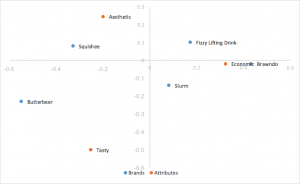
Standard correspondence analysis
We now are equipped with the resources to calculate the basic form of correspondence analysis, using what are known as standard coordinates, calculated from our left and right singular vectors. Previously, we weighted the indexed residuals prior to performing the SVD. In order to get coordinates that represent our indexed residuals, we now need to unweight the SVD’s outputs, by dividing each row of the left singular vectors by the square root of the row masses, and dividing each column of the right singular vectors by the square root of the column masses, getting us the standard coordinates of the rows and columns for plotting.
Brand Standard Coordinates:
| 1st dimension | 2nd dimension | 3rd dimension | |
| Butterbeer | -2.07 | -2 | -0.4 |
| Squishee | -1.27 | 0.68 | -1.21 |
| Slurm | 0.3 | -1.27 | -0.8 |
| Fizzy Lifting Drink | 0.65 | 0.86 | -0.48 |
| Brawndo | 1.62 | -0.21 | -2.04 |
Attribute Standard Coordinates:
| 1st dimension | 2nd dimension | 3rd dimension | |
| Tasty | -0.96 | -1.89 | -1 |
| Aesthetic | -0.76 | 0.92 | >-1 |
| Economic | 1.21 | -0.09 | -1 |
We use the two dimensions with the highest variance captured for plotting, the first dimension going on the X axis, and the second dimension on the Y axis, generating our standard correspondence analysis graph.
We’ve laid down the foundation of the calculations we need for standard correspondence analysis, In the next section we will explore the pros and cons of different styles of correspondence analysis, and which best suits our purposes of aiding in analysis of brand perceptions.
Types of Correspondence Analysis
Row/Column Principal Correspondence Analysis
Standard correspondence analysis is easy to calculate, and strong results can be drawn from it. However, standard correspondence is a poor choice for our needs; the distances between row and column coordinates are exaggerated, and there isn’t a straightforward interpretation of relationships between row and column categories. What we want for interpreting relationships between row (brand) coordinates, and interpreting relationships between row and column categories, is row principal normalization (or, if our brands were on our columns, column principal normalization).
For row principal normalization, you want to utilize the standard coordinates calculated above for your column (attribute) values, but you want to calculate the principal coordinates for your row (brand) values. Calculating the principal coordinates is as simple as taking the standard coordinates, and multiplying them by their corresponding singular values (d). So for our rows, we just want to multiply our standard row coordinates by our singular values (d), shown in the table below. For column principal normalization we would simply multiply our columns instead of our rows by our singular values (d).
| 1st dimension | 2nd dimension | 3rd dimension | |
| Butterbeer | -0.55 | -0.23 | 0 |
| Squishee | -0.33 | 0.08 | 0 |
| Slurm | 0.08 | -0.14 | 0 |
| Fizzy Lifting Drink | 0.17 | 0.1 | 0 |
| Brawndo | 0.43 | -0.02 | 0 |
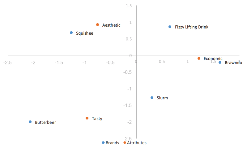
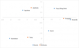
Substituting in our principal coordinates for our rows (brands), we end up with:
Because we scaled by our singular values, our principal coordinates for our rows represent the distance between the row profiles of our original table; one can interpret the relationships between our row coordinates in our correspondence analysis chart by their proximity to one another.
The distance between our column coordinates, since they are based on standard coordinates, are exaggerated still. Also, our scaling by our singular values in just one of the two categories (rows/columns) has given us a way of interpreting relationships between row and column categories. Given a row value and a column value, for example, Butterbeer (row), and Tasty (column), the longer their distance to the origin, the stronger their association with other points on the map. Also, the smaller the angle between the two points (Butterbeer and Tasty), the higher the correlation between the two.
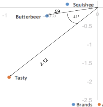
The distance to origin combined with the angle between the two points is the equivalent of taking the dot product; the dot product between a row and column value measures the strength of the association between the two. In fact, when the first and second dimension explain all of the variance in the data (add up to 100%), the dot product is directly equal to the indexed residual of the two categories. Here, the dot product would be the distance to origin of the two points multiplied by the cosine of the angle between them; .59*2.12*cos(41) = .94. Taking into account rounding errors, it is the same as our indexed residual value of .95. Thus, angles smaller than 90 degrees represent a positive indexed residual and thus a positive association, and angles larger than 90 degrees represent a negative indexed residual or negative association.
Scaled row principal correspondence analysis
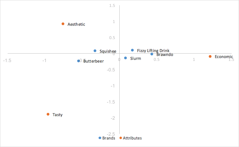
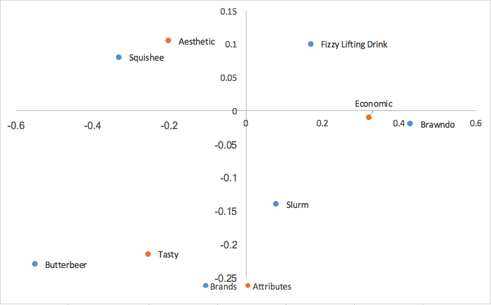
Looking at our chart above for row principal normalization, we have an easy observation – the points for our columns (traits) are much more spread out, and our points for our rows (brands) are clustered around the origin. This can make analyzing our graph by eye rather difficult and unintuitive, and sometimes impossible to read the row categories if they’re all overlapping. Luckily, there is an easy way to scale our graph to bring in our columns, while still keeping the ability to utilize the dot product (distance from origin and angle between points) to analyze the relationships between our row and column points, known as scaled row principal normalization.
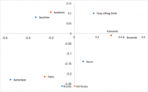
Scaled row principal normalization takes row principal normalization, and scales the column coordinates the same way we scaled the x-axis of the row coordinates – in other words, our column coordinates are scaled by the first value of our singular values (d). Our row values stay the same as row principal normalization, but now our column coordinates are scaled down by a constant factor.
| 1st dimension | 2nd dimension | 3rd dimension | |
| Tasty | -0.2544 | -0.501 | -0.265 |
| Aesthetic | -0.201 | 0.2438 | -0.265 |
| Economic | 0.321 | -0.02 | -0.265 |
What this means for us is that our column coordinates are scaled to fit much better with our row coordinates, making it much easier to analyze trends. Because we scaled all our column coordinates by the same constant factor, we contracted the scatter of our column coordinates on the map, but made no change to their relativities; we still utilize the dot product to measure the strength of associations. The only change is that when our first and second dimension cover all of the variance in the data, instead of the indexed residual being equal to the dot product of the two categories, it’s now equal to the scaled dot product of the two categories, which is the dot product scaled by a constant value of our first singular value(d). Interpretation of the chart stays the same as row principal normalization.
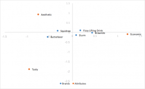
Principal correspondence analysis
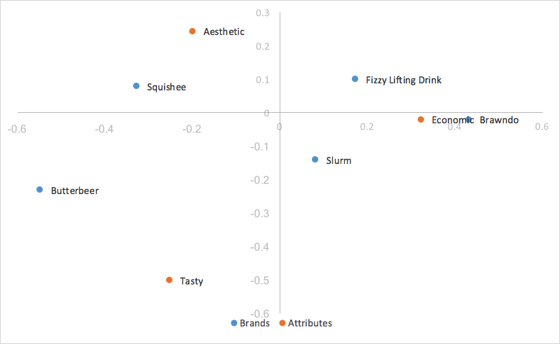
A final form of correspondence analysis that we will mention is principal correspondence analysis, also known as symmetric map, french scaling, or canonical correspondence analysis. Instead of only multiplying the standard rows or columns by the singular values(d) as in row/column principal correspondence analysis, we multiply both of them by the singular values. So our standard column values, multiplied by the singular values, become:
| 1st dimension | 2nd dimension | 3rd dimension | |
| Tasty | -0.2544 | -0.215 | 0 |
| Aesthetic | -0.201 | 0.105 | 0 |
| Economic | 0.321 | -0.01 | 0 |
Putting these together with our row values calculated in row principal analysis, we get:
Canonical correspondence analysis scales both the row and column coordinates by the singular values. What this means is that we can interpret our relationships between our row coordinates just like how we did in row principal correspondence analysis (based on proximity), AND we can interpret our relationships between our column coordinates similarly to column principal correspondence analysis; we can analyze relationships between brands and relationships between attributes. We also lose the row/column clustering in the center of the map from row/column principal analysis. However, what we lose from canonical correspondence analysis, is a way of interpreting relationships between our brands and attributes, something very useful in brand perceptions.
Side-by-side Comparison
Standard Correspondence Analysis
The easiest style of correspondence analysis to compute, using left and right singular vectors of SVD divided by row and column masses. The distances between row and column coordinates are exaggerated, and there isn’t a straightforward interpretation of relationships between row and column categories.
Row Principal Normalization Correspondence Analysis
Uses standard coordinates from above, but multiplies the row coordinates by the singular values to normalize. Relationships between rows (brands) is based on distance from one another. Column (attribute) distances are exaggerated still. Relationships between rows and columns can be interpreted by the dot product. Rows (brands) tend to be clumped in the center.
Scaled Row Principal Normalization Correspondence Analysis
Takes row principal normalization and scales column coordinates by a constant of the first singular value. Same interpretations drawn as row principal normalization, replacing dot product with scaled dot product. Helps remove clumping of rows in the center. This is the style of correspondence analysis which we prefer.
Principal Normalization Correspondence Analysis (Symmetrical, French Map, Canonical)
Another popular form of correspondence analysis using principal normalized coordinates in both the rows and columns. Relationships between rows (brands) can be interpreted by distance to one another; the same can be said for columns (attributes). No interpretation can be drawn for relationships between rows and columns.
Wrapping Up
In conclusion, correspondence analysis is used to analyze the relative relationships between and within two groups; in our case, these groups would be brands and attributes.
Correspondence analysis eliminates a skew in results from different masses between groups by utilizing indexed residuals. For brand perceptions for correspondence analysis, we utilize row principal (or column principal if the brands are placed on the columns) normalization, as this allows us to analyze relationships between different brands by their proximity to one another, and also allows us to analyze relationships between brands and attributes by their distance from the origin combined with the angle between them and the origin (the dot product), at the sacrifice of misrepresenting the relationship between attributes with exaggerated distances (which doesn’t matter to us as we don’t care about the relationships between attributes). We utilize the scaled row/column principal normalization to make it easier to analyze our graph at no cost. We want to make sure to keep in mind that we add up the variance explained from the X and Y axis labels (the first and second dimension) to view the total variance captured in the map; the lower this number is, the more unexplained variance there is in the data, and the more misleading the plot.
A last thing to remember is that correspondence analysis only shows relativities since we eliminated the mass factor of our data; our graph will tell us nothing about which brands have the “highest” scores in attributes. Once you understand how to create and analyze the graphs, correspondence analysis is a powerful tool that disregards brand sizing effects to deliver powerful and easy to interpret insights about relationships both between and within brands and their applicable attributes.