-

Qualtrics Platform -

Customer Journey Optimizer -

XM Discover -

Qualtrics Social Connect
Bubble Chart Widget (EX)
About Bubble Chart Widgets
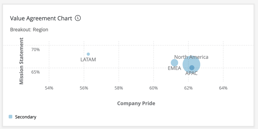
The bubble chart allows you to compare responses for two different questions or categories based on an assigned breakout. In the example below, we are looking at the favorability score (the percent of individuals that indicated a favorable score for a question, based on the scales set in the dashboard settings) for two different questions plotted against each other based on country. The size of the bubbles in the chart are based on both the response count and the response count relative to other bubbles. Therefore, the bubble with the smallest response count will be the smallest in size, and vice versa for the bubble with the largest response count.
Field Type Compatibility
The bubble chart widget Sources are only compatible with categories and fields with the Number Set field type.
The bubble chart widget Breakout is compatible with the org hierarchy, participant metadata, and fields with the following field types:
- Number Set
- Text Set
- Multi-Answer Text Set
Widget Customization
For basic widget instructions and customization, visit the Widgets Overview support page. Continue reading for widget-specific customization.
Basic Setup
- Give your widget a Title. The title appears at the top of the widget.
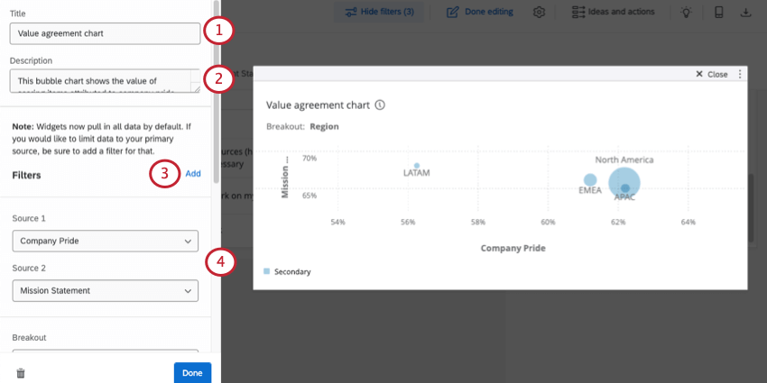
- Enter a Description for your widget. The description appears when dashboard viewers click the widget’s title.
- If desired, click Add to add filters to your widget. See Adding Widget-Level Filters for more information.
Qtip: If your dashboard has multiple data sources, the widget will display data from all sources. To limit the data in your widget to a single source, add a widget filter.
- For Source 1 and Source 2, choose the questions or categories that you want to display in the widget. Source 1 is the widget’s x-axis, while Source 2 is the widget’s y-axis. See Field Type Compatibility for more information about what fields you can choose here.
- In the Breakout field, choose one or more fields to break out the data in your widget. The number of values for your field will correspond to the number of bubbles on your chart. So, if you choose a field called Region and it has the values AMER, EMEA, and APAC, 3 bubbles will appear on your chart. See Field Type Compatibility for more information about the fields you can choose here.
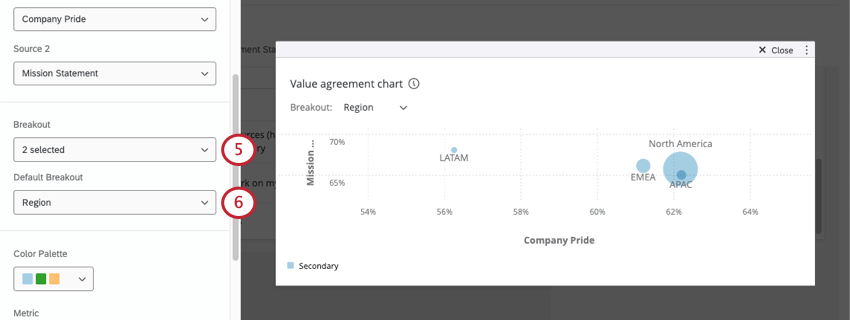
- If you added multiple breakouts, choose a Default Breakout. This breakout will be applied to the widget by default for all dashboard viewers, but they will be able to change the applied breakout by using a dropdown menu under the widget’s title.
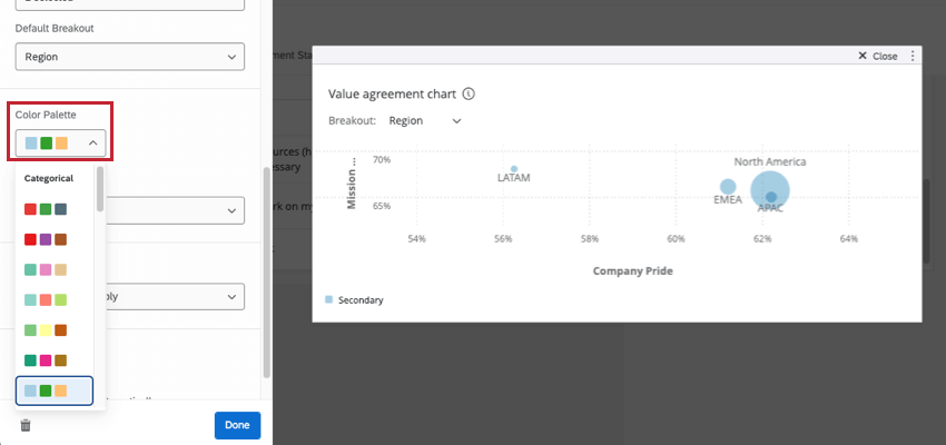
Color Palette
Select the color palette that you would like to use for your bubbles on the widget.
Metric
The metric determines how the numbers along the widget x- and y-axes are calculated. You can either present results based on engagement score or average score.

- Favorability: Base your data on favorability. This is calculated as an engagement score, which is the percentage of participants who rated the field favorably according to your dashboard’s scales. If you select favorability, your axes will be shown as a percentage. For more on setting favorability scales, see Scales.
- Average: Base your data on the average value for the field. In a bubble chart widget, that means you see the average of everyone’s score in a breakout group. If you select average, your axes will be shown as a number.
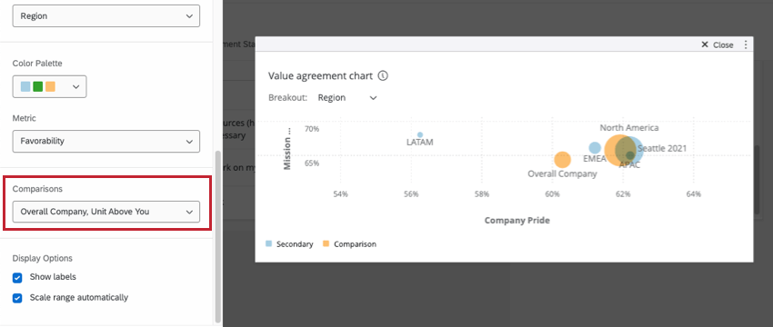
Comparisons
You can add comparisons to your bubble chart widget. In order to add a comparison to the widget, you will to ensure that you have at least one comparison added in your Comparisons section of your dashboard settings. Note than you can add multiple comparisons, if you would like.
Display Options
The widget display options let you decide additional customization options about how your data appears in your widget. 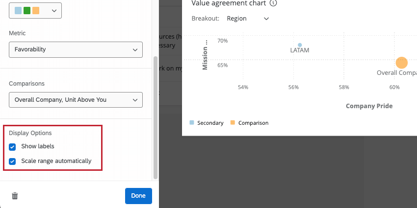
- Show labels: Adds labels to each bubble, showing which bubble represents which breakout value.
- Scale range automatically: Automatically adjusts your widget axes so that your data is represented on a meaningful scale.
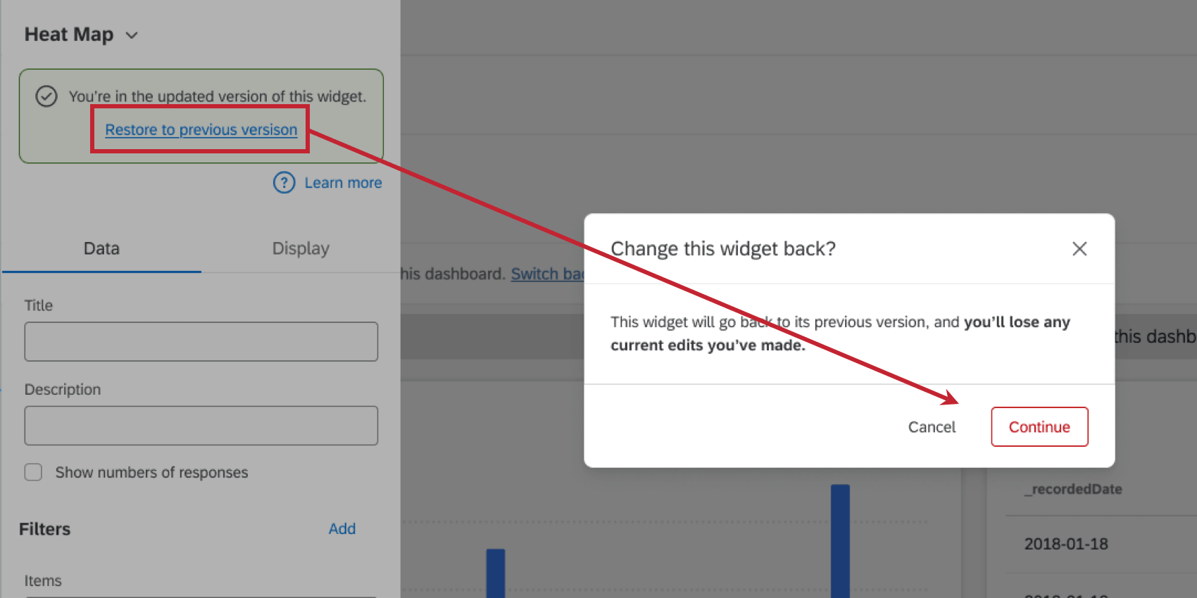
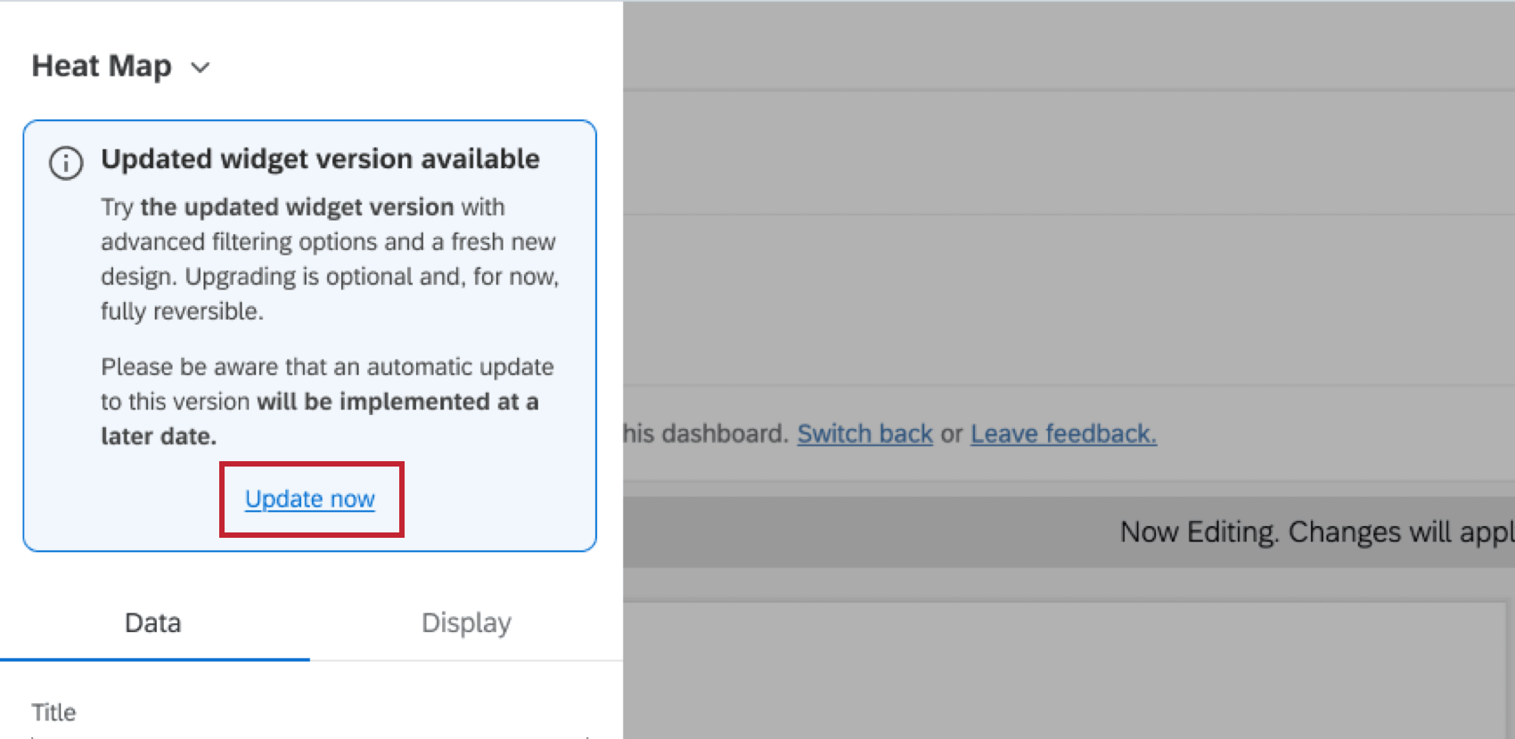 If desired, you can revert to the old version by clicking Restore to the previous version. Please note that any new edits you may have made will be lost when reverting the widget.