
Number Chart Widget
What's on this page
About Number Chart Widgets
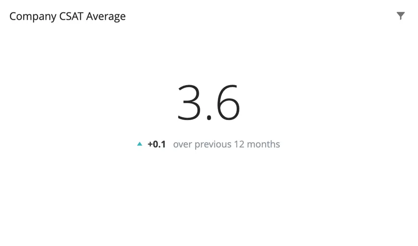
The number chart widget displays a single numerical value. This value is based on a single metric. Depending on the metric chosen, the numerical value displayed can be based on a field from your dataset.
Types of Dashboards
This widget can be used in a few different types of dashboard. This includes:
- CX Dashboards
- Results Dashboards
- Employee Engagement
- Lifecycle
- Pulse
- Ad Hoc Employee Research
- Employee Journey Analytics
- Brand Experience
Field Type Compatibility
The number chart is based primarily on a metric. Certain metrics, such as average, require a field from the dataset. Only fields with the following field types will be available when selecting a field for these metrics:
- Numeric Value
- Number Set
- Measure Group (CX)
In EX dashboards, you can also select categories, so long as they are a numeric value or number set field type.
Widget Customization
Qtip: You cannot adjust title alignment on a number chart widget.
Basic Setup
To set up a number chart widget, you will be required to add a metric. If you choose a metric other than count, you will be required to choose a field for the metric. The field specifies where the value of the number displayed in the widget is being pulled from.
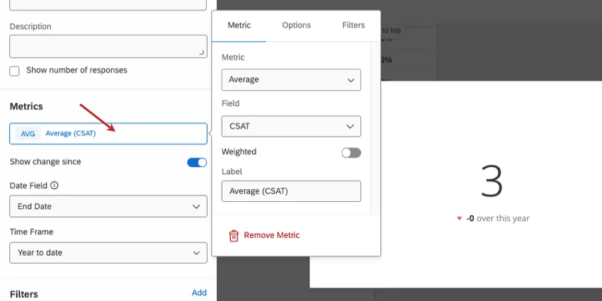
To learn more about all of the metrics available for your number chart widget and all the ways you can customize them, see Widget Metrics.
Qtip: In the Options tab of your metric, you can display the metric in a number, percent, or currency format. You can also set the number of decimal places you would like to display.
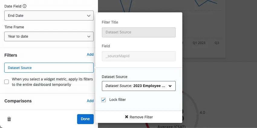
Qtip: If you have multiple data sources mapped, all source data will be displayed in the widget together. You will need to use a widget-level filter to ensure only one data source is displayed at a time. You can even lock this filter, if you don’t want dashboard users to adjust it.
Show Change Since
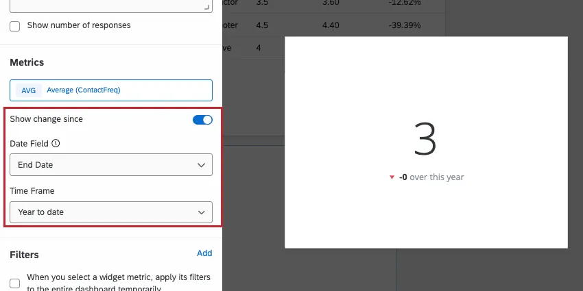
Checking the box next to Show change since allows you to display how the displayed numerical value has changed over a particular time period. The options for the Time Frame are:
- Yesterday
- 1 week ago
- 1 month ago
- 3 months ago
- 12 months ago
- Month to date
- Quarter to date
- Year to date
Qtip: “Show change since” compares the metric over the the current period to the equivalent point in the previous time period. For example, if your widget displays data spanning from Monday to Friday and you enable “Show change since” for “1 week ago,” then the displayed change is calculated based on the data from Monday to Friday of last week (i.e. Sunday and Saturday are excluded since they aren’t included in the current period).
Attention: Choosing Yesterday as the time frame will show changes since midnight, not all changes from the past 24 hours.
Under Date Field, select a date field from your dataset that you would like to use to base the selected time period on.
Qtip: If there are page/widget filters for Date, for the Show change since option, you should select the same Date field that the filter uses.
The values for this widget are calculated in the following manner:
- Current Value: Central, largest number. The chosen metric, filtered according to any filters applied at the page or widget level.
- Previous Value: Smaller, subscript number. The chosen metric, filtered according to any filters applied at the page or widget level, with the date range offset by the amount of time you select under “Show change since.”
Style
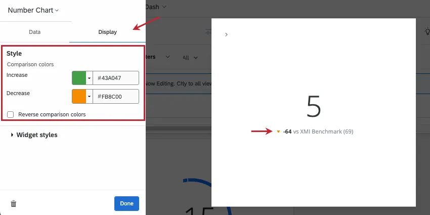
Go to the Display tab. If you’re showing change since or adding a comparison, you can change the trend colors shown under the chart. By default, if your displayed metric has decreased over time (or is less than the comparison), then the trend arrow will be red. The arrow will be blue if the displayed metric has increased over time (or is greater than the comparison).
You can customize the colors assigned to increase and decrease trends. You can enter a hex code, RGB, or select a custom color from a color wheel by clicking the arrow next to Increase or Decrease.
Select Reverse trend colors if you’d like the colors to be reversed.
Migrating Legacy Number Chart Widgets
Attention: All legacy number chart widgets will eventually be automatically migrated to the new version described on this support page. You can follow the instructions below to migrate your widget early and provide feedback about the migration experience.
Legacy number chart widgets cannot take advantage of all customization features outlined on this page. You can update a legacy widget to the new version by clicking the Change now link at the top of the customization panel.
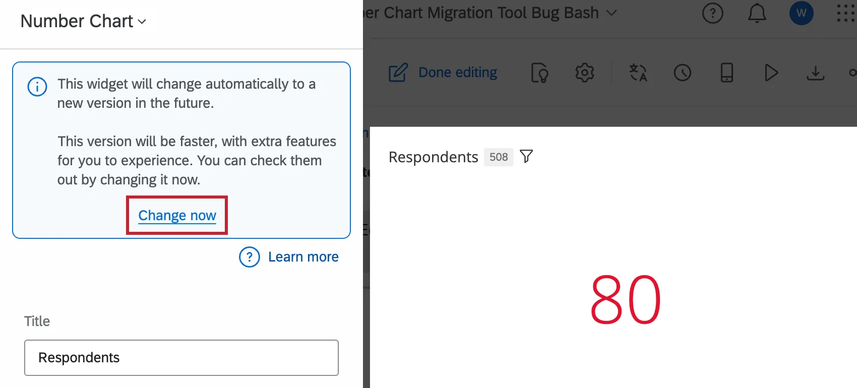
The widget will refresh to the new version while keeping your existing settings. You can then customize your widget further; see Widget Customization for more information.
Providing Feedback & Reverting Changes
We’d love to hear any and all feedback you have about the widget migration experience. Follow the below steps to submit feedback to us. You can also temporarily revert your widget back to the legacy experience for 7 days after you initially migrated it. After 7 days it cannot be reverted.
In your updated widget, click Undo at the top of the customization panel.
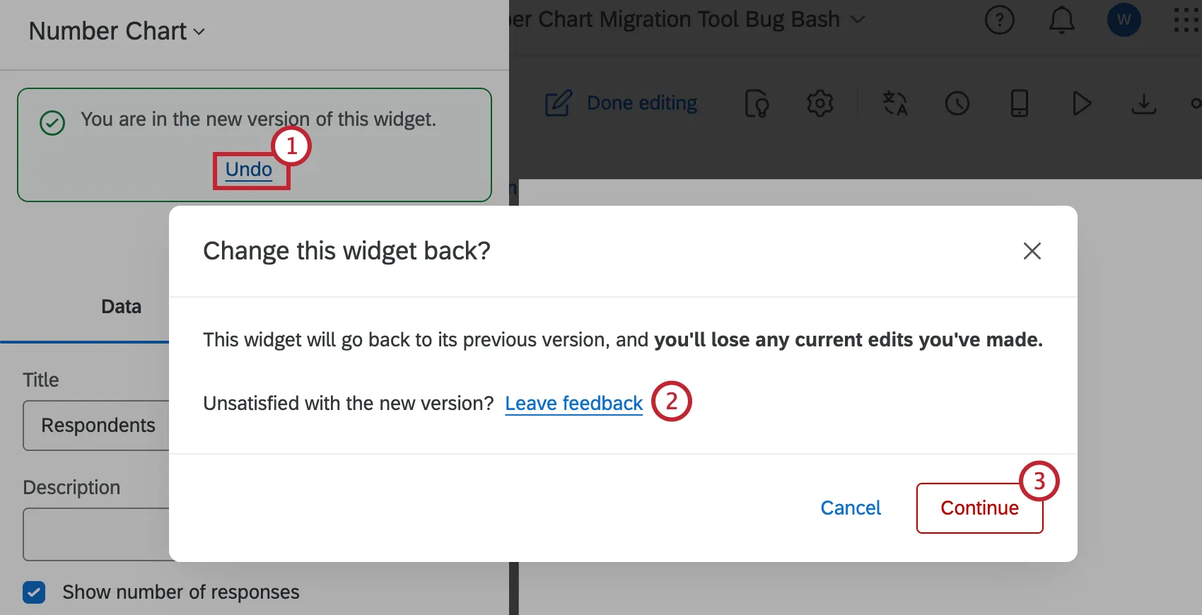
To provide feedback, click the Leave feedback link in the popup message. This will open a survey in a new tab in your browser window.
To revert your widget to the legacy version, click Continue. To keep the newer version of the widget, click “Cancel” instead.
Attention: If you revert back to the legacy widget, any edits you’ve made will be lost. All widgets will eventually be permanently migrated to the new widget experience automatically.
FAQs
The count in my Number Chart widget does not match the count for the same value that I see in other widgets in CX Dashboards. Why is this?
The count in my Number Chart widget does not match the count for the same value that I see in other widgets in CX Dashboards. Why is this?
How do I add a comparison to my widget?
How do I add a comparison to my widget?
Why are my metrics adding up to 99 or 101 instead of 100?
Why are my metrics adding up to 99 or 101 instead of 100?
33.60 + 33.60 + 32.80 = 100
Whereas if you choose to display no decimals with the same dataset:
34 + 34 + 33 = 101
Widgets can’t show infinite decimals, which means that regardless of decimal settings, some data will eventually have to be rounded up. This means that small deviations, like adding up to 99 or 101 instead of 100, work as intended.
That's great! Thank you for your feedback!
Thank you for your feedback!