
Simple Table Widget
What's on this page
About Simple Table Widgets
Warning: This widget is being deprecated and is no longer supported. For the same functionality with a more flexible setup, use the table widget.
The simple table widget organizes data into a table with one or more metrics as columns and the values of a field from the dataset as rows.
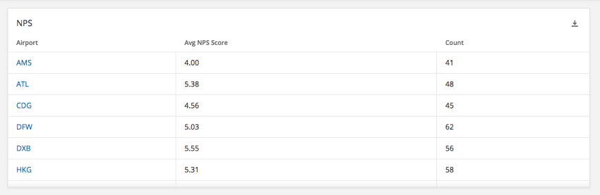
This widget can be used in a variety of dashboards, such as EmployeeXM (engagement, lifecycle, ad hoc employee research, and 360), CustomerXM, and brand trackers.
Field Type Compatibility
The simple table widget metric is compatible with fields and categories (EX) with the following field types (CX|EX):
- Number Set
- Numeric Value
Only fields with the following types will be available when selecting the Rows for the Simple Table widget:
-
- Date
- Text Set
- Multi-Answer Text Set
- Number set
- Drill Down (CX only)
- Measure Group (CX only)
Attention: The simple table widget does not support translations at this time.
Basic Setup
Simple tables can be configured in a lot of different ways – it’s all dependent on your data visualization needs. Here we’ll cover the primary fields you can fill out to start displaying data in your widget.
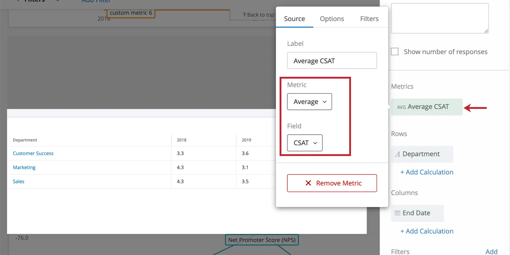
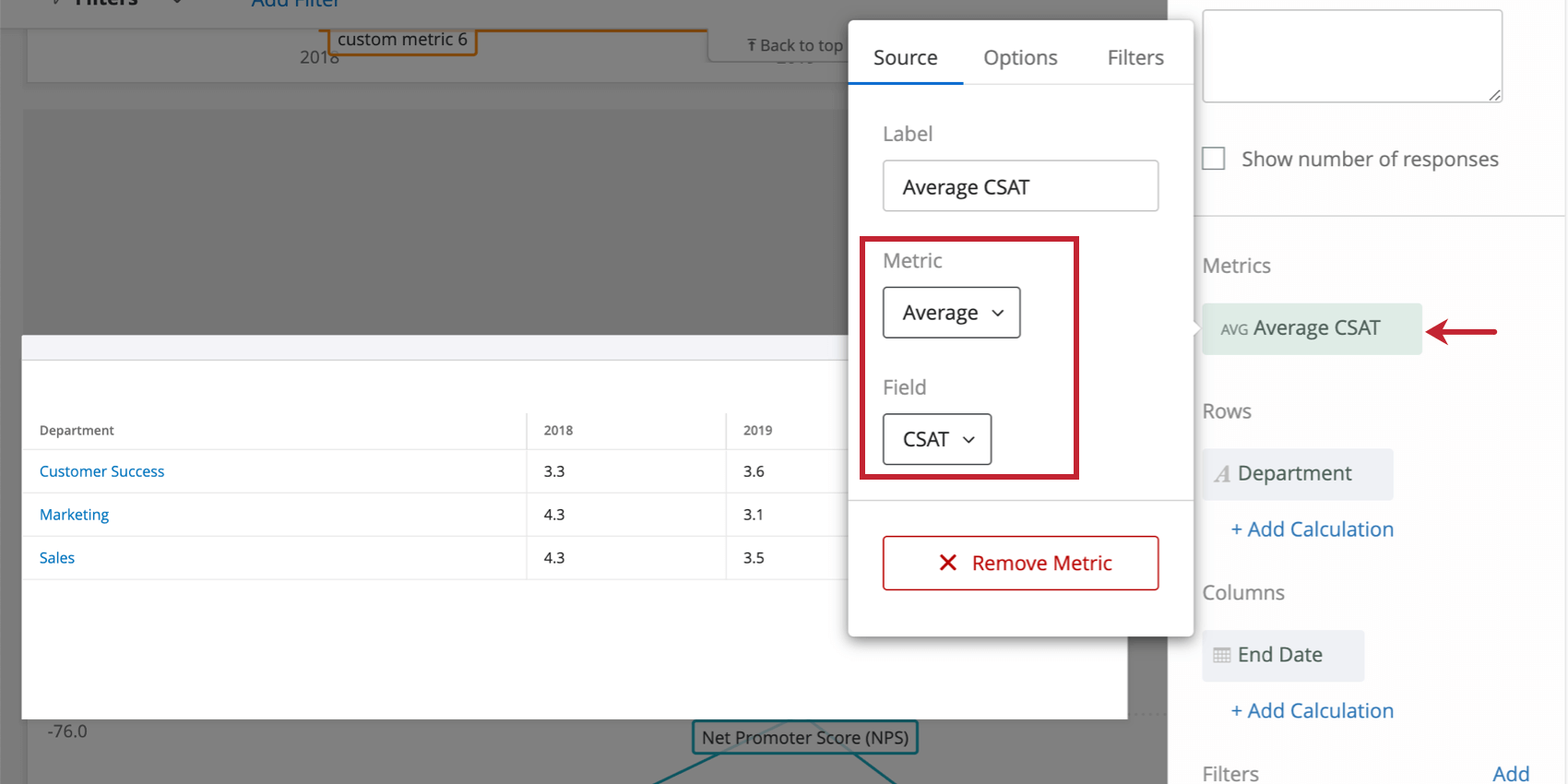
Your available metrics include:
- Count: Display response counts from the selected fields (i.e., number of respondents choosing a value in a five-point scale)
- Average: Exhibit the average value for a selected field.
- Minimum: Show the minimum value of a selected field.
- Maximum: Present the maximum value for a selected field.
- Sum: Pull in the sum of all values for a selected field.
- Net Promoter Score: Identify the Detractors, Passives, and Promoters from NPS questions.
- Correlation: Input Pearson’s r value for the correlation between two fields.
- Top Box / Bottom Box: Display the percentage of responses that fall into a specified range of values.
- Subset Ratio Metric: The number of people who selected a specific choice divided by the number of respondents. It can be used when you are looking to visualize a proportion. See Subset Ratio Metric for more information.
Qtip: You have many different metrics to choose from, including count (number of responses), average, sum, maximum, minimum, and more. To learn more about what each metric means and how to configure them, see Widget Metrics.
Qtip: If you add multiple metrics, you won’t be able to add a column breakout, since the columns of your table will be broken out by the different metrics you’ve added.
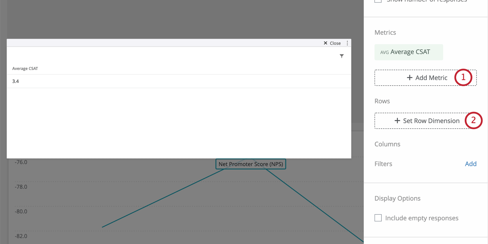
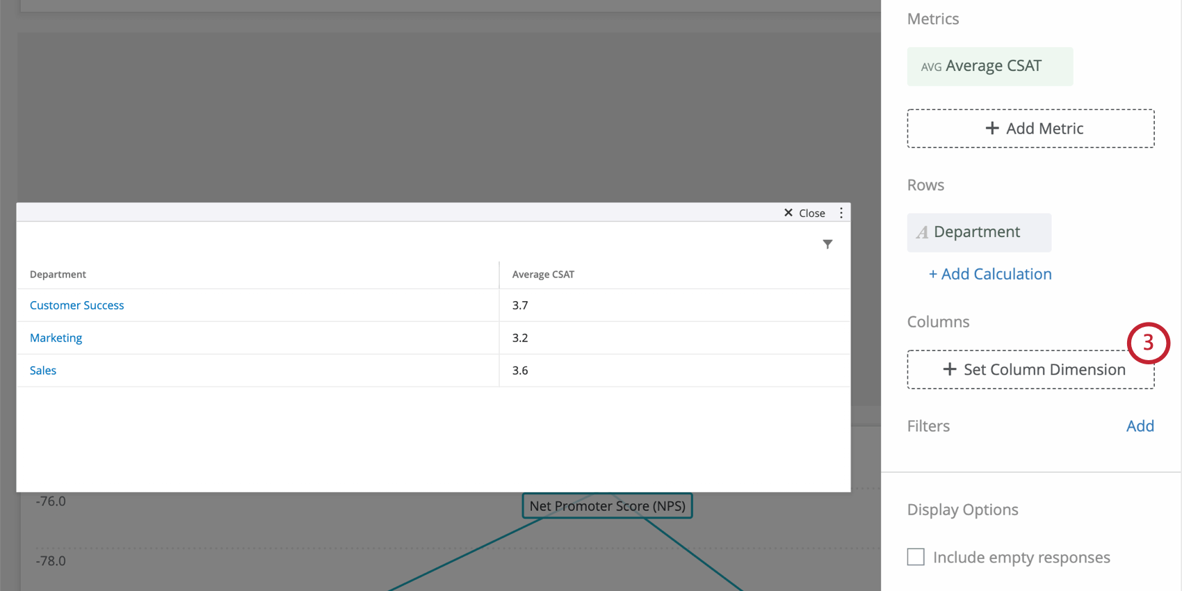
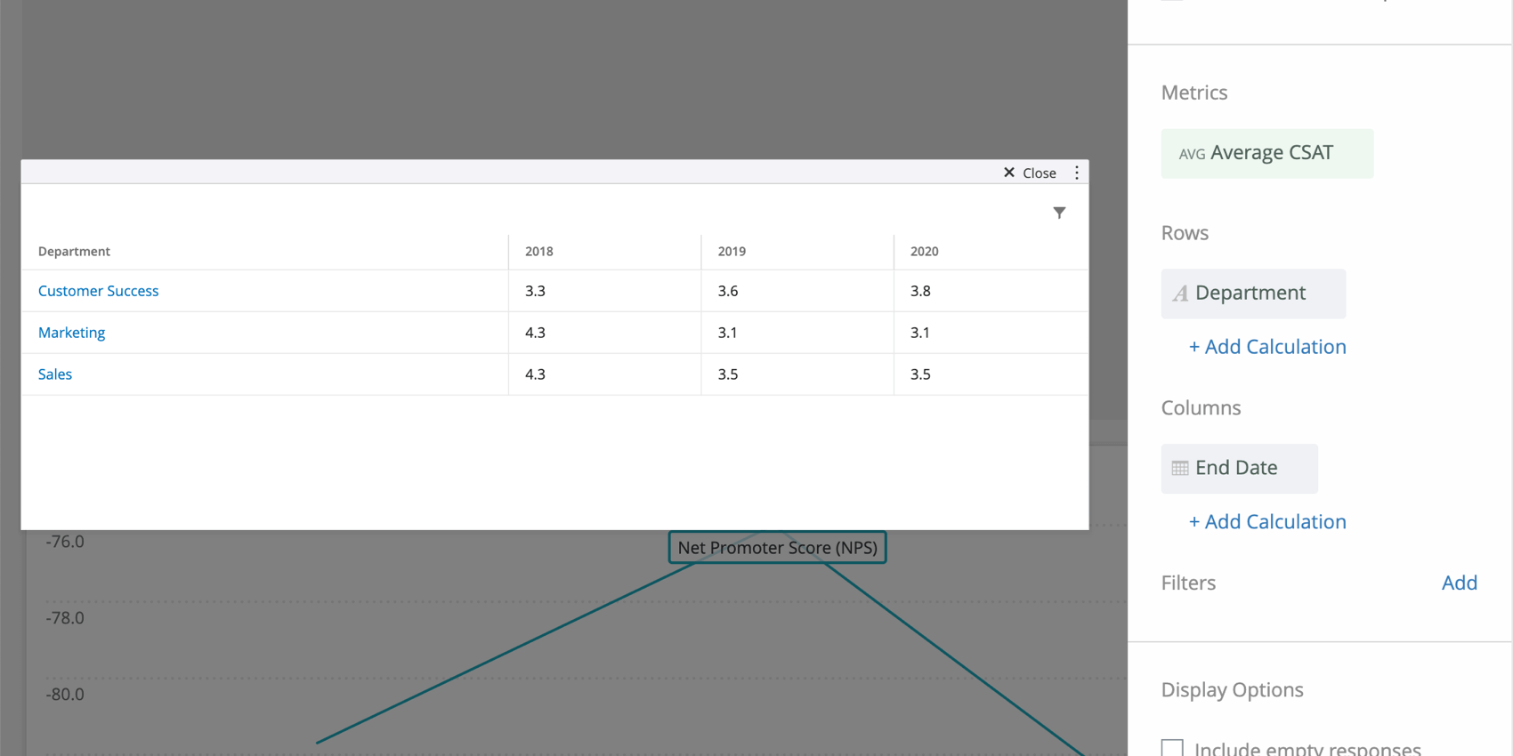
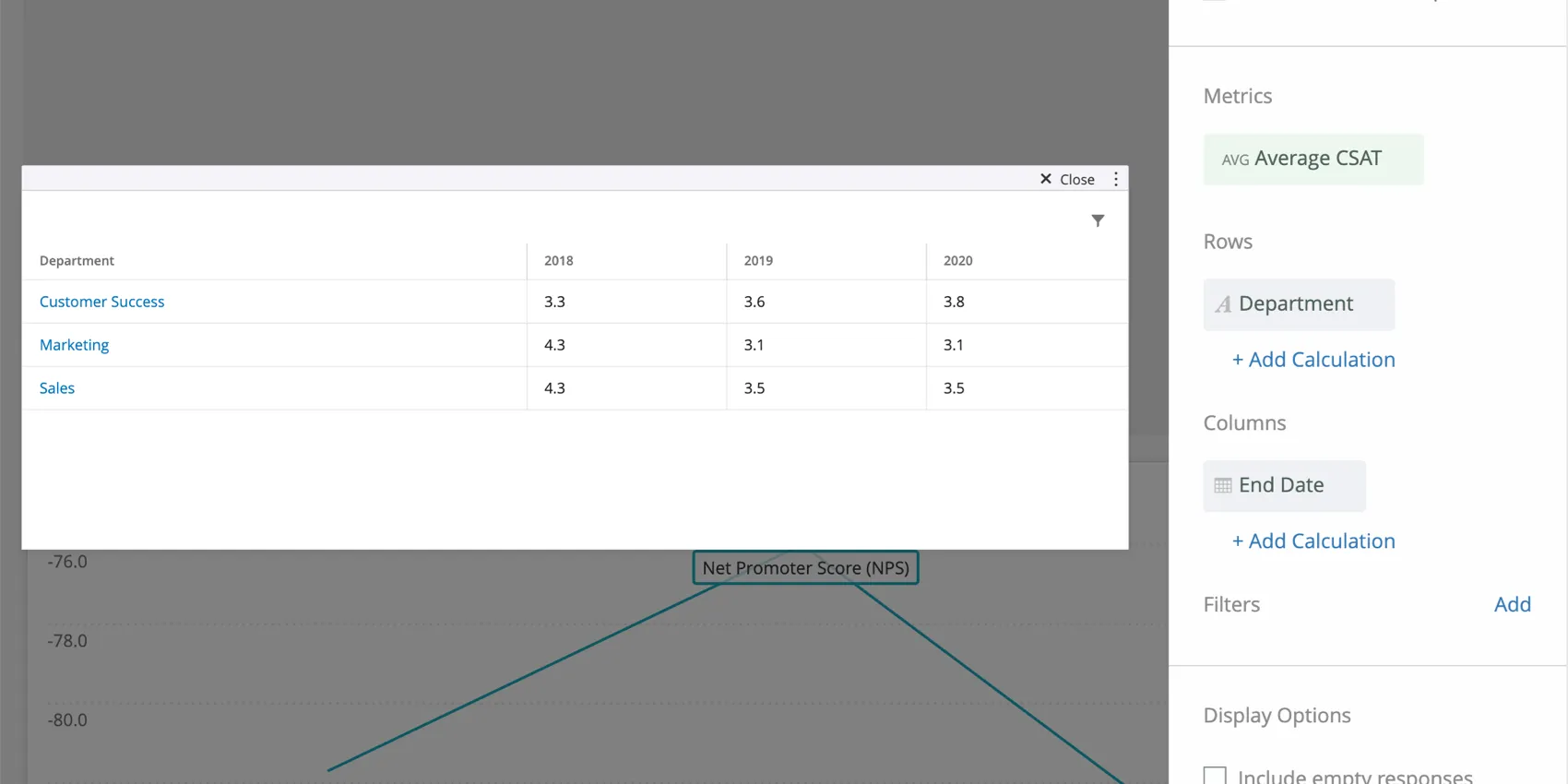
Example: If we add department as a row dimension, we can see average CSAT by each department, instead of just one average CSAT value for all the data in the dashboard.
Example: This table shows average CSAT per department per year. So we can see the CSAT for Marketing in 2018 was 4.3, in 2019 was 3.1, and so on.
Qtip: When selecting a metric, every metric except count will need a field specified. Only a field with the type Number Set or Multi-Answer Text Set will be available. For more on metric options and filters, see Widget Metrics.
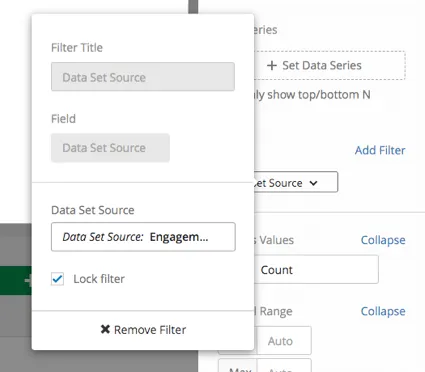
Qtip: If you have multiple data sources mapped, all source data will be displayed in the widget together. You will need to use a widget-level filter to ensure only one data source is displayed at a time. You can even lock this filter, if you don’t want dashboard users to adjust it.
Widget Customization
Include empty responses
When you select Include empty responses, you will show rows of your table even when a given response or row of data has no information for any of the fields you’ve added to the table.
This setting can be found under “Display Options.”
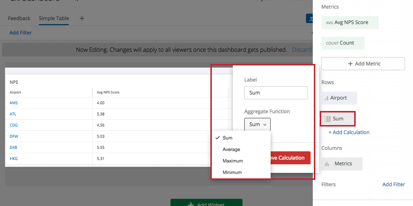
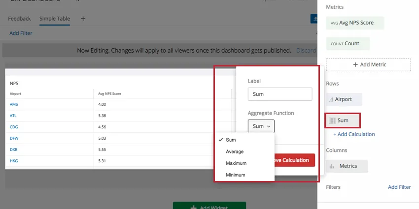
Add Calculation
Clicking Add Calculation under the selected rows adds a calculation column to the table. The default calculation is sum. Sum displays the total for each column in the Sum row. Clicking the calculation box allows you to pick a different aggregate function. The available calculations are: sum, average, maximum, and minimum.
Qtip: Any averages generated in this fashion will be unweighted.
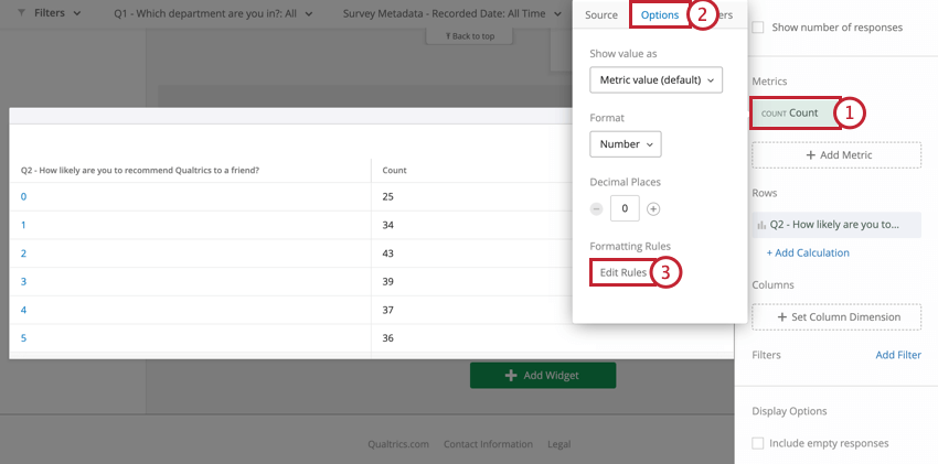
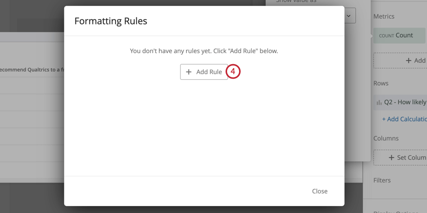
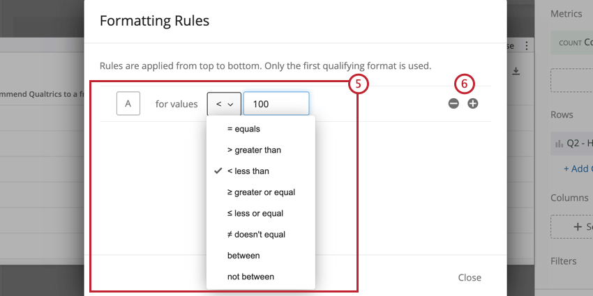
Formatting Rules
Adding formatting rules to your metric allows you to specify how values in a certain range are formatted on the Simple table. This is useful if you would like to be able to easily differentiate cells on the table based on their value. To access formatting rules:
Significance Testing
Dashboards can help you understand whether the differences you see over time or between groups are statistically significant, and therefore worthy of driving important business decisions. With significance testing in simple line charts and simple tables, you can discover what data changes matter most.
See Significance Testing in Simple Charts & Simple Tables (CX) for more information.
Rolling Calculations
Rolling calculations are a means of applying a metric over a set of data points composed of multiple periods. The rolling calculations options are rolling averages and rolling metrics.
See Rolling Calculations in Widget Metrics for more information.
FAQs
If I have two sources mapped in my Dashboard Data, how can I make it so this widget only displays data from a single source in my EX dashboard?
If I have two sources mapped in my Dashboard Data, how can I make it so this widget only displays data from a single source in my EX dashboard?
Can I build a Simple Table widget in CX Dashboards to display all of the data from a matrix question similar to the table that is created by default in Reports?
Can I build a Simple Table widget in CX Dashboards to display all of the data from a matrix question similar to the table that is created by default in Reports?
What are aggregated metrics?
What are aggregated metrics?
That's great! Thank you for your feedback!
Thank you for your feedback!